Course notes
Gradescope
Canvas
Discussion forum
Course information
Overview
Syllabus
Support
Course staff
Schedule
Useful links
FAQ
Reference sheets
Slides
Course notes
Application exercises
Homework
HW 01 - Prefresher
HW 02 - Grammar of graphics + layers
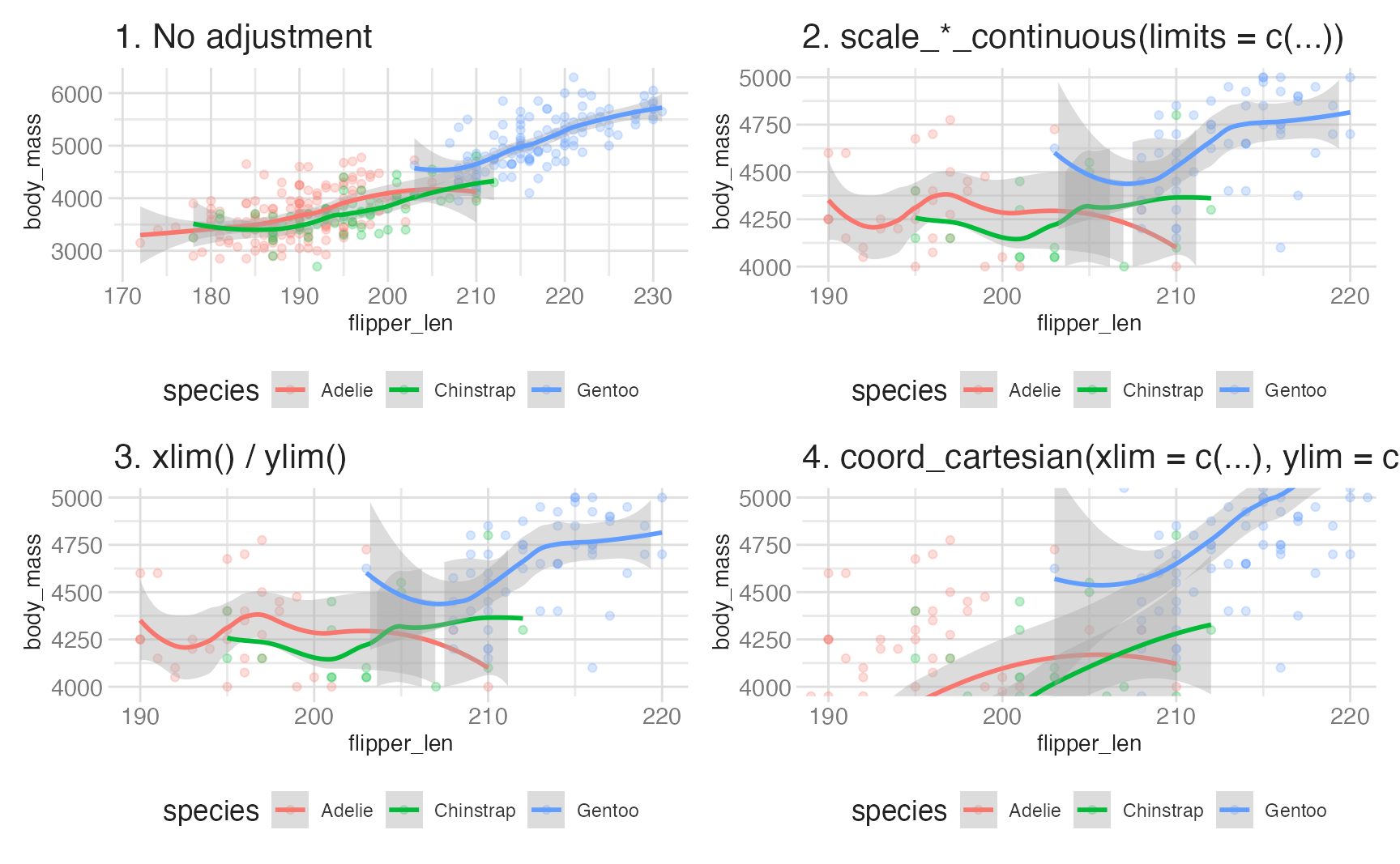
HW 03 - Stats, scales, and coordinate systems
HW 04 - Viz + wrangling + themes
Projects
Project 01
Project tips + resources
Quizzes
Quiz 01
Extra credit
Tutorials
Course notes
Modified
May 28, 2026
Annotating charts
There are two distinct strategies for placing text on a chart:
Data wrangling (I)
We’ll use the
penguins
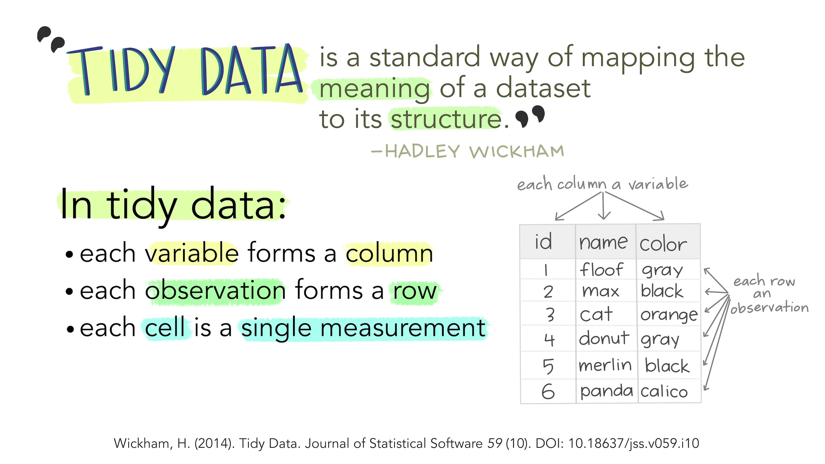
dataset throughout this lesson to demonstrate {dplyr} operations. If you need a reminder of its structure:
Data wrangling (II)
Data for real projects rarely lives in a single table. A hospital database might have separate tables for patients, visits, diagnoses, and prescriptions. A course system…
Deep dive: coordinates + facets
A
coordinate system
combines the
x
and
y
position aesthetics to produce a two-dimensional location on the plot. It also determines how axes and panel backgrounds are drawn.…
Deep dive: layers
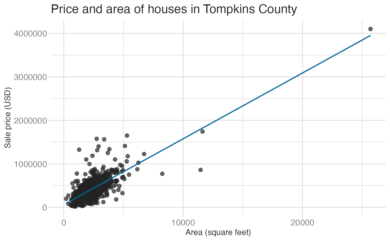
Throughout this lesson we’ll use data on houses sold in Tompkins County, NY from 2022–24, scraped from Redfin.
Deep dive: stats + scales + guides
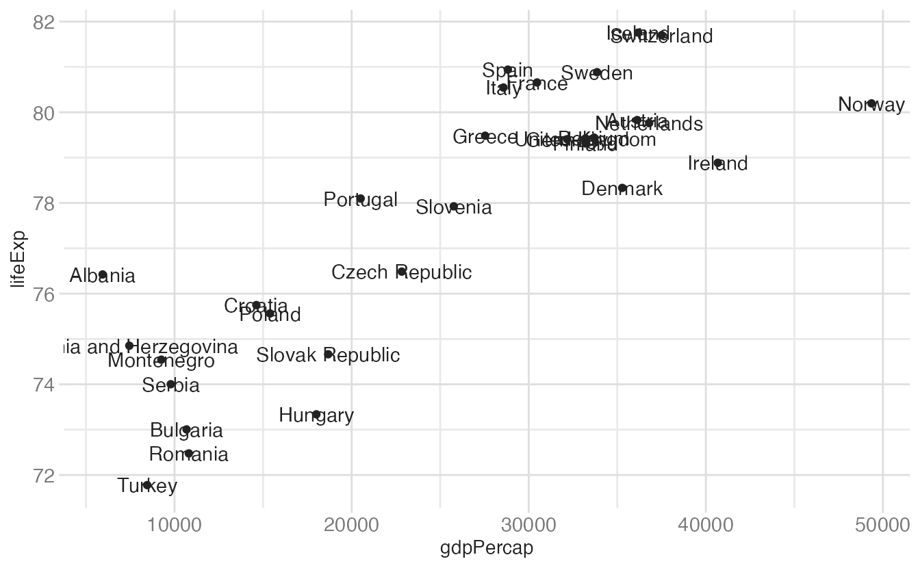
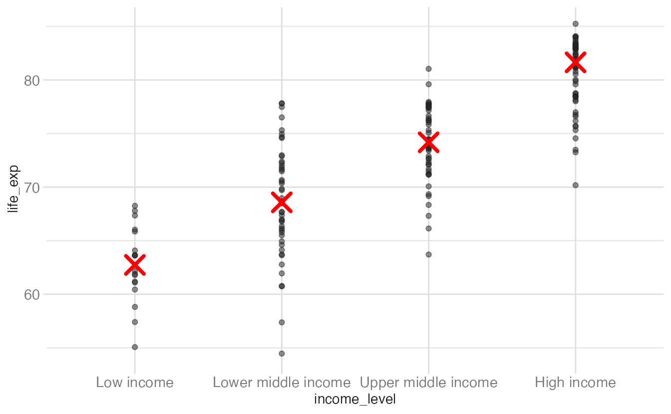
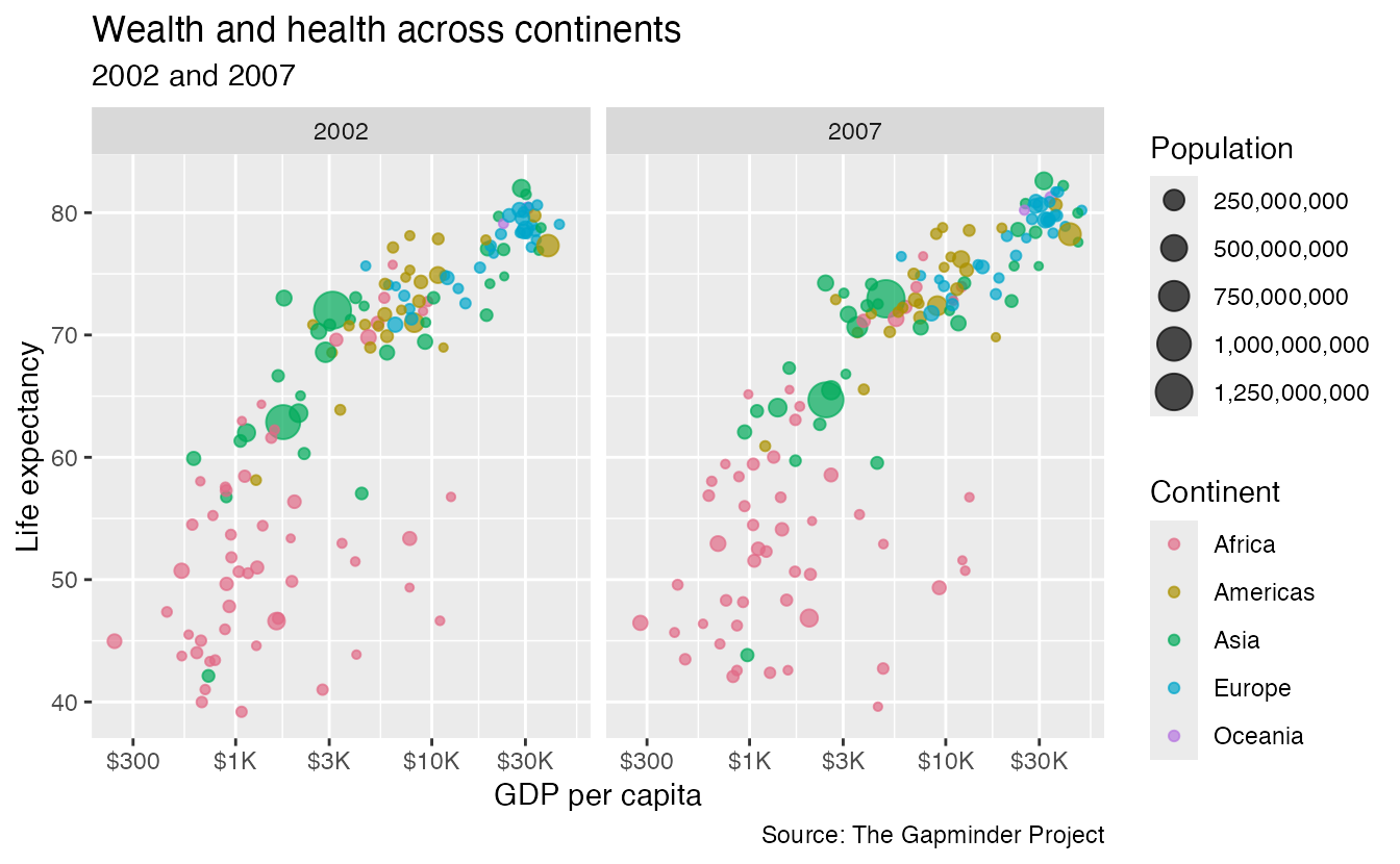
The World Bank publishes a rich and detailed set of socioeconomic indicators spanning several decades and dozens of topics. Here we focus on a few key indicators for the…
Deep dive: themes
A
theme
is a collection of visual settings that control every non-data element of a plot: text sizes and fonts, background colors, grid line weights, legend positions, axis…
Implementing accessibility
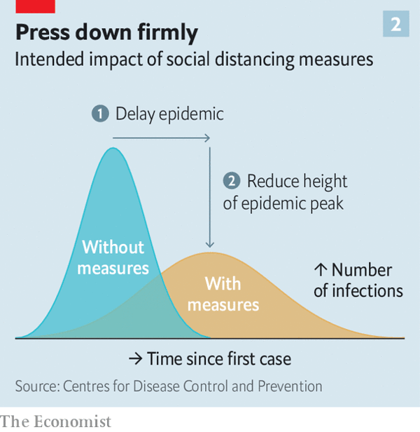
In early 2020, “flatten the curve” became one of the most widely shared data visualizations in history.
Optimizing color spaces
Color in data visualization serves distinct purposes. Using color that matches its intended purpose makes charts easier to read; mismatched color usage introduces confusion.
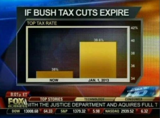
Qualities of great visualizations
In his book
The Truthful Art
, Alberto Cairo argues that a great visualization must satisfy five interconnected qualities:
The grammar of graphics
The
grammar of graphics
is a formal framework for describing statistical visualizations, originated by Leland Wilkinson in 2001
1
and extended by Hadley Wickham in his…
Visualizing spatial data (I)
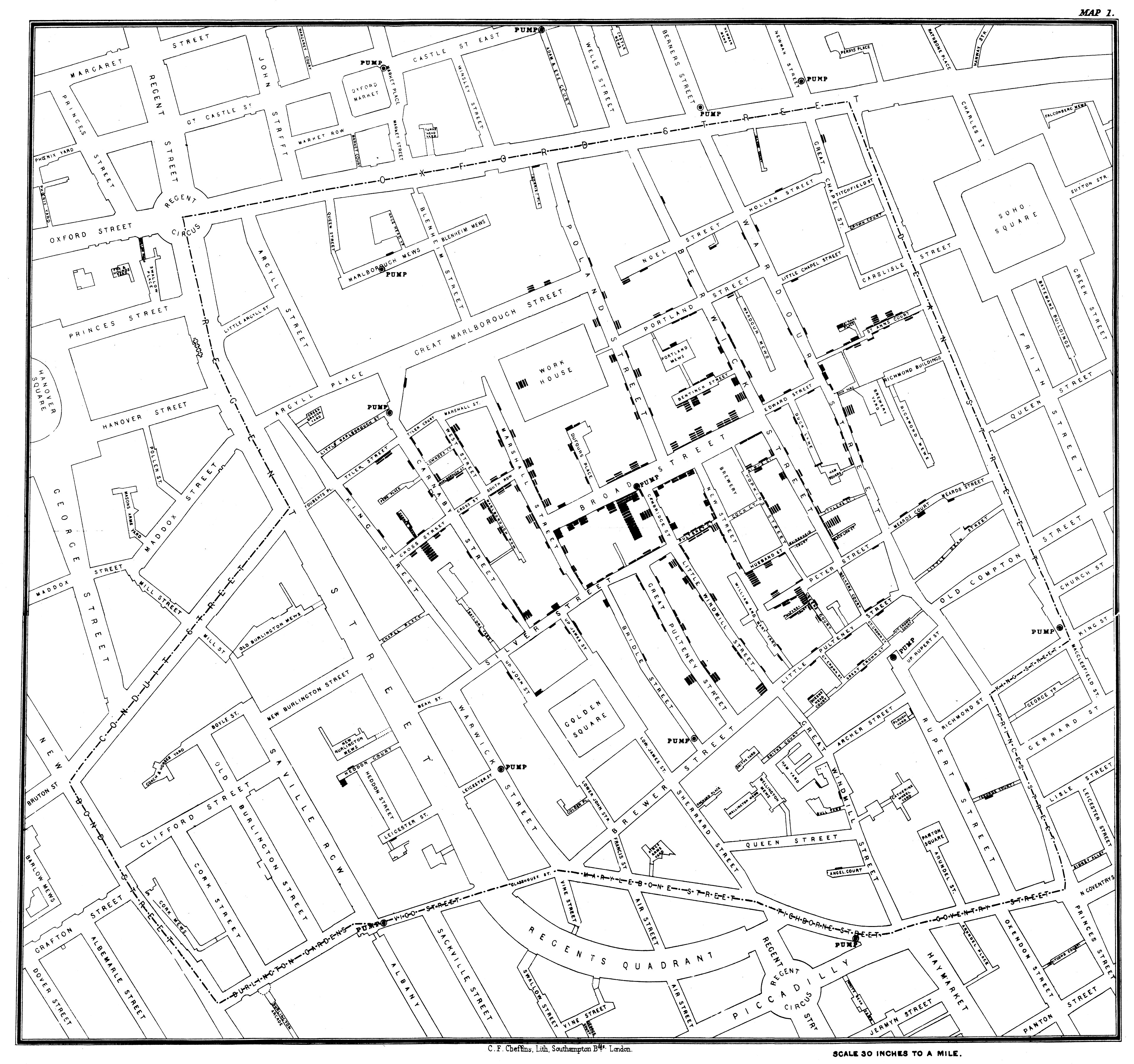
Data visualization and cartography have been intertwined since at least 1854, when Dr. John Snow mapped cholera deaths in London’s Soho district:
Visualizing spatial data II
Raster maps provide a photographic background but give no access to the underlying geography. For complete control over the geographic elements of your geospatial…
Visualizing survey data
A
poll
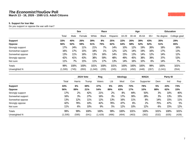
is a survey or inquiry into public opinion conducted by interviewing a random sample of people.
No matching items
Slides
Application exercises