Qualities of great visualizations
Notes
NoteLearning objectives
- Define Cairo’s five qualities of great visualizations
- Identify common truthfulness failures in data visualization
- Evaluate the effectiveness of a chart’s design against these criteria
TipSupplemental readings
A motivating visualization critique
In his book The Truthful Art, Alberto Cairo argues that a great visualization must satisfy five interconnected qualities:
- Truthful — based on honest, thorough research
- Functional — accurate depictions that allow the viewer to do something
- Beautiful — aesthetically pleasing in a way that invites exploration
- Insightful — reveals evidence that would be difficult to see otherwise
- Enlightening — changes our understanding of the world for the better
These are not binary criteria — each is a spectrum. A chart can be more or less truthful, more or less functional. The goal is to maximize all five simultaneously, which means making trade-offs deliberately.
Truthful visualizations
Truthful design doesn’t mean you must display all the complexity of a dataset. It means you shouldn’t obscure it.
Truthfulness requires two things: being honest with your audience and being honest with yourself. The latter — avoiding self-deception — is harder. It means not cherry-picking the time window that makes your trend look best, not truncating the axis to exaggerate a difference, and not choosing a chart type that hides important context.
Truncated axes
A truncated \(y\)-axis crops the axis below zero (or below a meaningful baseline), which visually exaggerates differences between values. This is one of the most common and most effective ways to mislead with data.
Here is a Fox News chart about the Bush tax cuts that manipulated the \(y\)-axis:
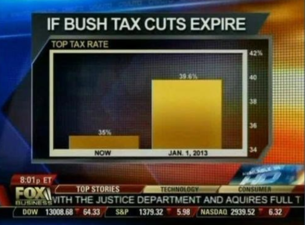
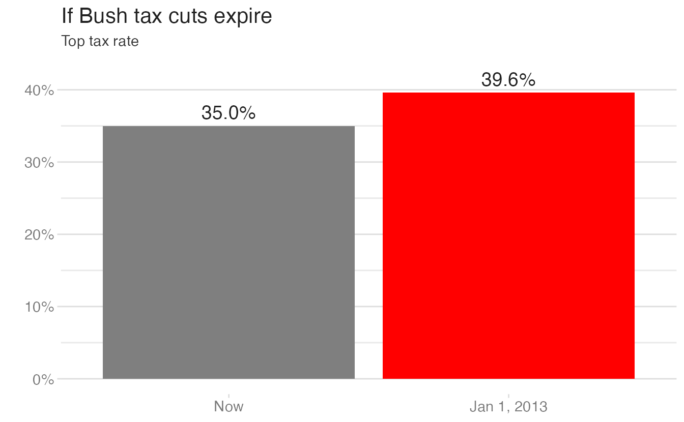
The \(y\)-axis starts at 34%, not zero, making a 13% relative increase look like a dramatic change. The corrected version uses a full \(y\)-axis and shows the same data honestly:1
With a zero baseline, the change from 35% to 39.6% is visible but proportionate — the bar for 2013 is about 13% taller than the current rate bar. The Fox News version made this look like a doubling.
When is it acceptable to truncate an axis? When zero is not a meaningful reference point for the data. For example, body temperature plotted from 95°F to 105°F does not mislead — no one has a temperature of 0°F. The question is whether the starting point distorts the perceived magnitude of the difference.
Functional visualizations
Choose graphic forms according to the tasks you wish to enable.
A functional visualization is one that lets the reader actually do something — compare values, identify trends, estimate proportions. Form should follow function.
Choosing the right graphic form
Consider obesity and poverty data by US county.
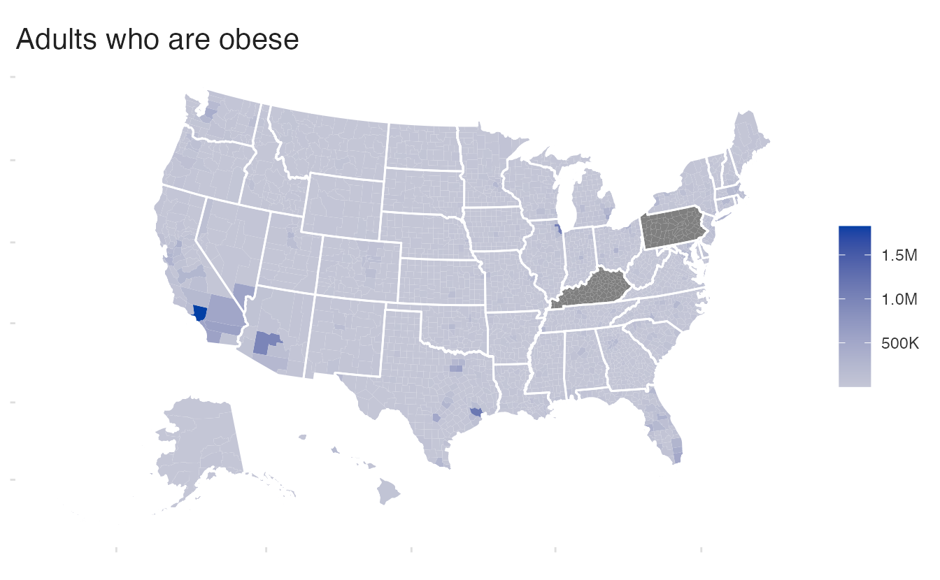
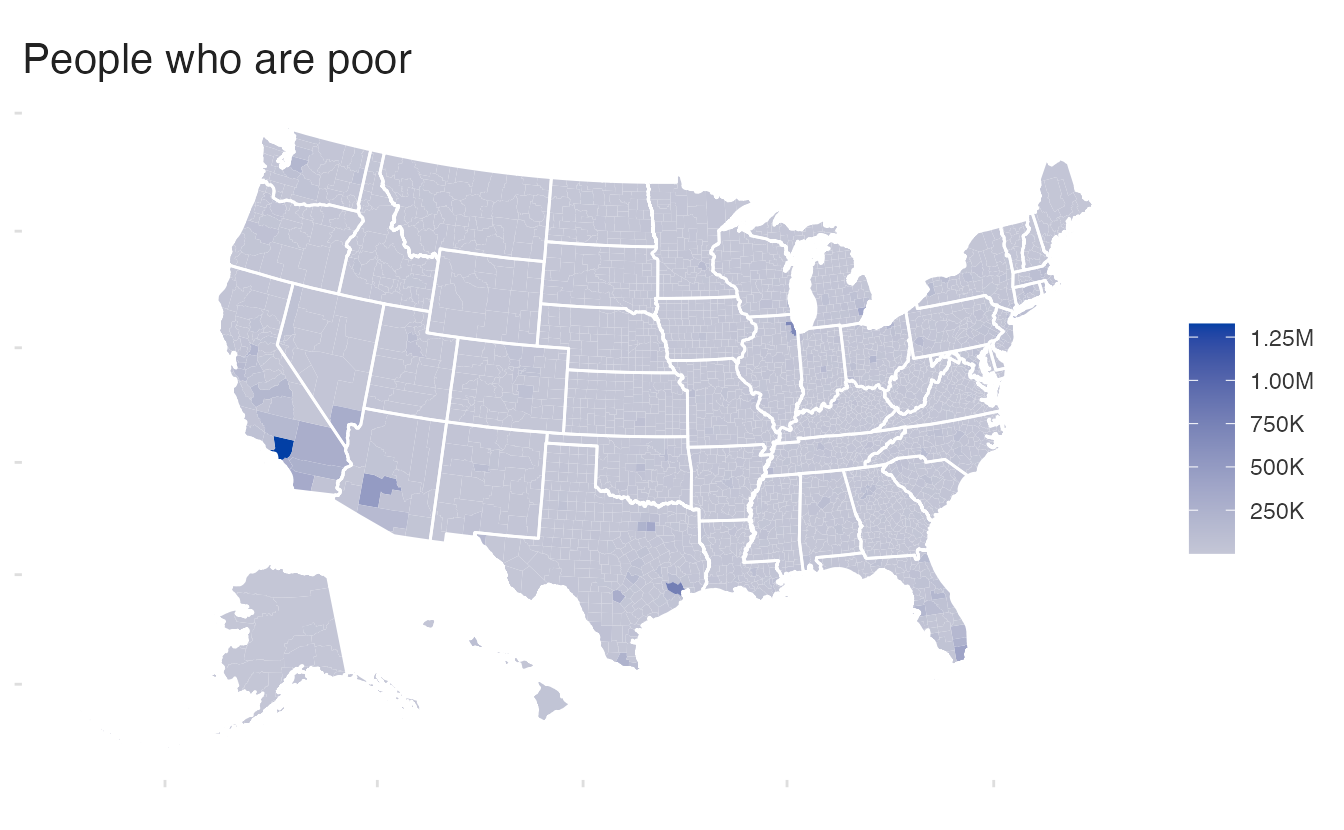
These maps show large urban counties as dark (high counts) and rural counties as light (low counts). But this pattern reflects population size, not rates. The functional question the reader likely wants to answer — “where are obesity and poverty most prevalent?” — is obscured by the confound.
Notice that these maps correlate strongly with the population distribution:
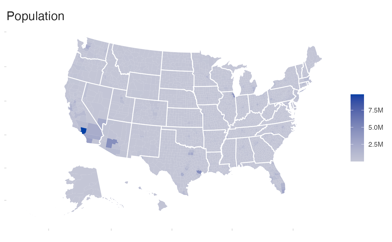
The pattern looks nearly identical to the obesity and poverty maps. Adjusting for population (showing rates or percentages, not counts) reveals the actual geographic story:
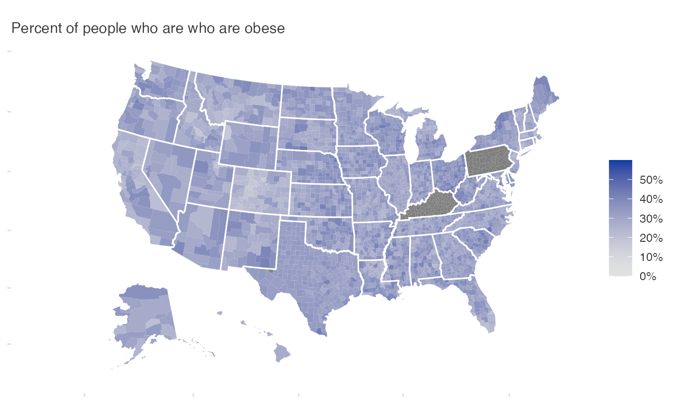
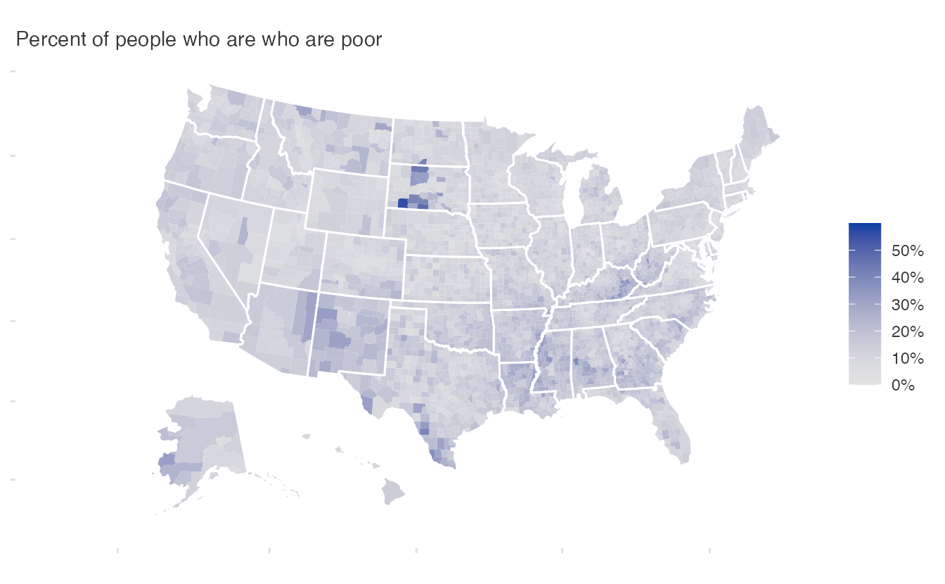
With rates, distinct geographic patterns emerge that the count maps obscured.
The right chart type for the relationship
When the question is about the relationship between two variables, a map is the wrong tool. A scatterplot directly shows the correlation:
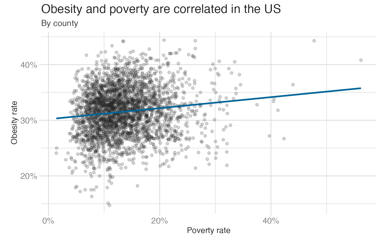
The scatterplot makes the correlation between poverty and obesity immediately visible — and with a regression line, the strength and direction of the relationship are quantified. No map can do this.
The key question when choosing a chart type: what comparison or relationship do you want to enable? Different questions require different graphic forms.
Beautiful visualizations
A measure of the emotional experience of awe, wonder, pleasure, or mere surprise that those objects may unleash.
People prefer to look at aesthetically pleasing things. A beautiful chart invites the reader to spend more time with the data. Cairo is careful to note that beauty is not decoration — it is a component of communication. But “beautiful” is also subjective.
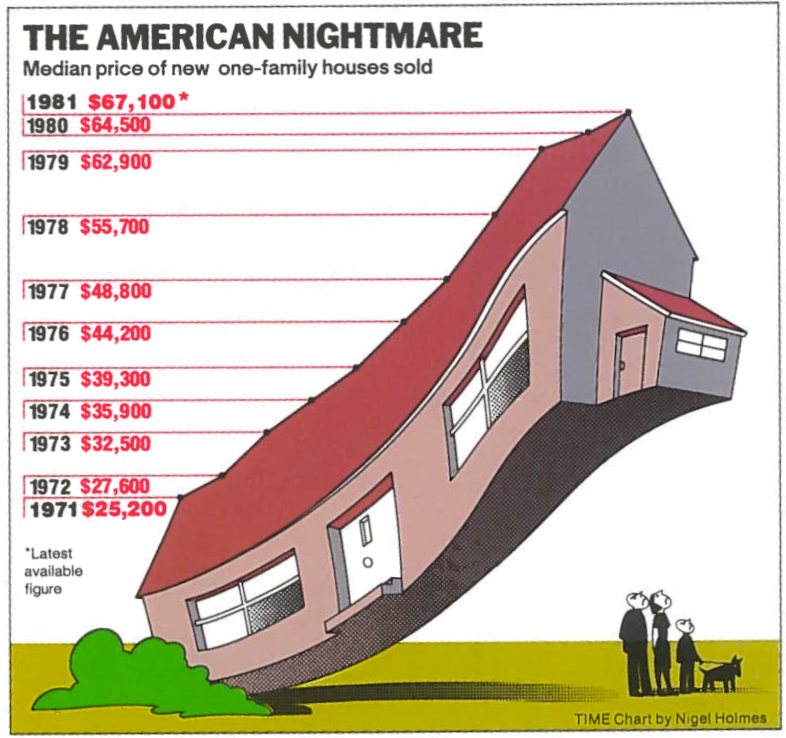
Some charts are beautiful through elaborate illustration:
Others achieve beauty through restraint — careful use of space, color, and typography:
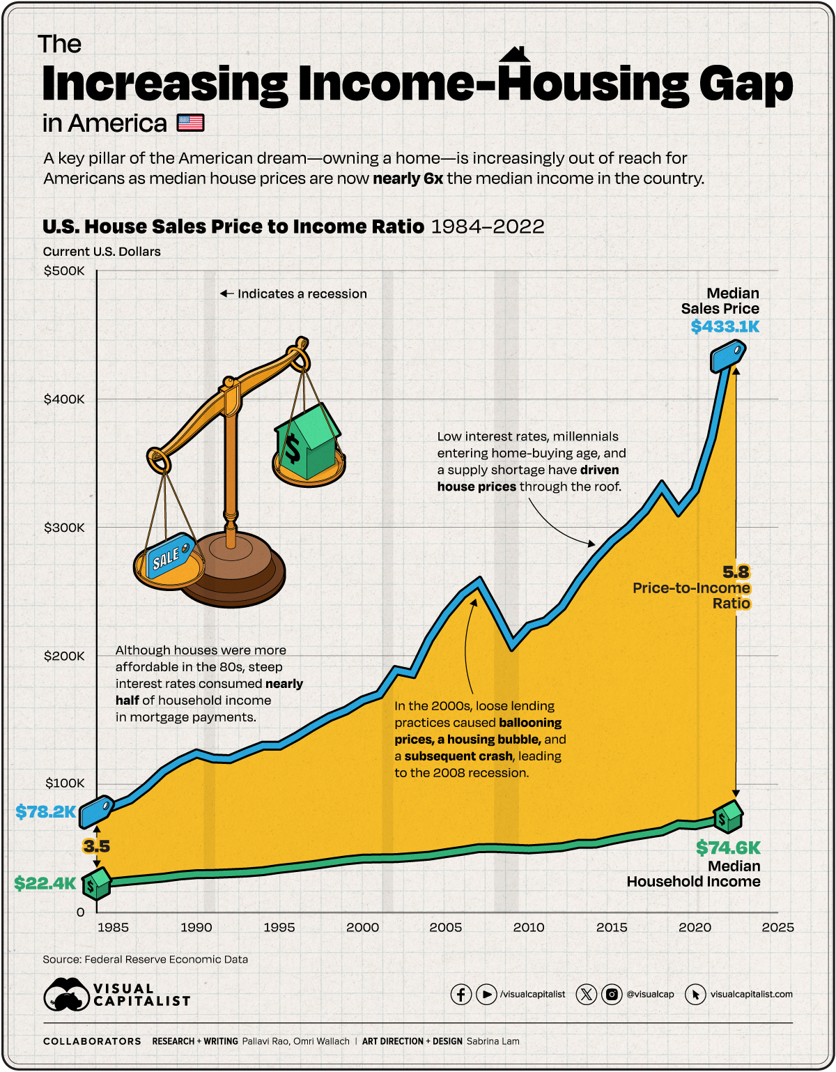
Both can be effective. The relevant standard is not a single aesthetic style, but whether the visual choices serve the story.
Insightful visualizations
Good visualizations clear the path to making valuable discoveries that would be inaccessible if the information were presented in a different way.
There are two types of insight: spontaneous (the chart immediately reveals something unexpected) and knowledge-building (the chart deepens understanding over time). The best visualizations do both.
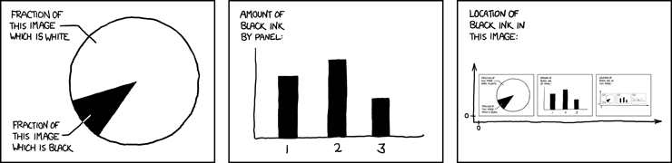
Avoid charts that reveal nothing new:
Consider a genuine example of spontaneous insight — the “hockey stick” chart of global temperature reconstructions:
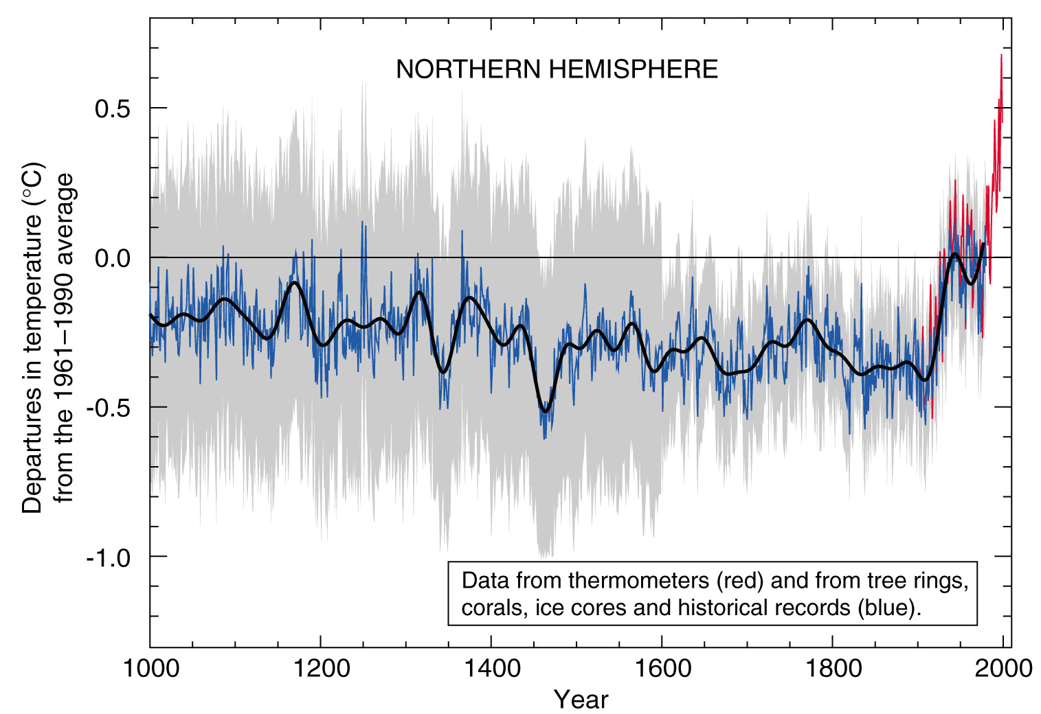
This chart revealed something that was invisible in the underlying data until plotted: a sharp, unprecedented upturn in global temperatures beginning in the 20th century. The insight would be inaccessible from a table of numbers.
Knowledge-building insight is more gradual, and often found in interactive visualizations or dashboards that allow the reader to explore different facets of the data. For example, an interactive map of COVID-19 cases by county over time can reveal patterns of spread and hotspots that evolve in ways that a static chart cannot capture.
Enlightening visualizations
Do good with data.
Enlightening visualizations go beyond insight to change how we understand the world — and ideally, motivate action. Not all topics are equally important. Choosing to visualize socially relevant data — and doing it well — is itself a form of advocacy.
Consider this chart of mental health trends among young adults:
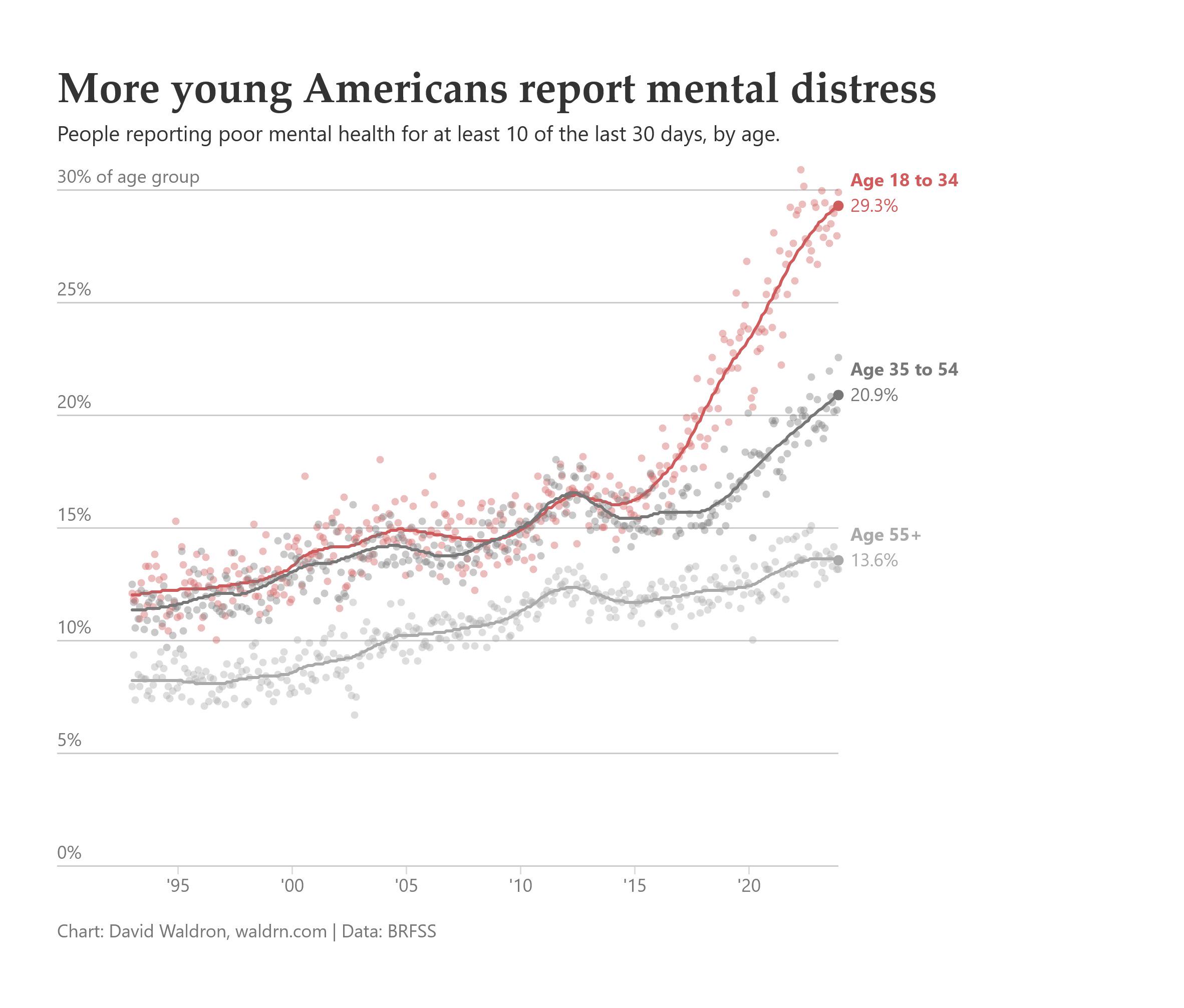
This chart is enlightening because it highlights a significant public health issue — the rising rates of mental distress among young adults. The trend is clear, prompting questions about underlying causes and potential interventions. By visualizing this data, the chart can raise awareness and potentially influence policy discussions around mental health resources and support for young people.
Contrast this with a lighter example of localized cultural insight — what Britons call the game of ringing a doorbell and running away:
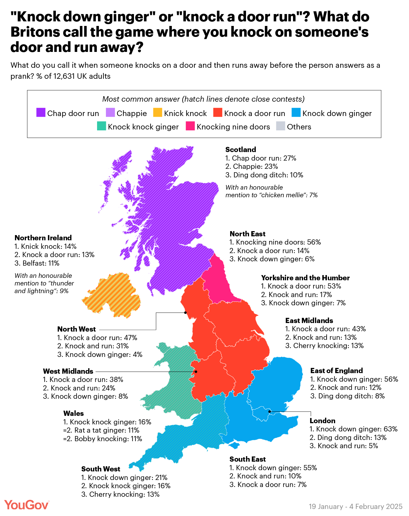
The second chart is not socially urgent. It’s not to say that all visualizations must be about serious, weighty topics, but instead that we should be deliberate about what we choose to visualize and elevate important issues through data.
Summary
Cairo’s five qualities provide a framework for evaluating and designing effective visualizations:
- Truthful: Do not truncate axes to exaggerate differences; do not imply causation from correlation; verify that your data actually supports your claim
- Functional: Choose the graphic form that enables the task the reader needs to perform; rates often communicate more accurately than counts
- Beautiful: Aesthetic choices invite engagement; both ornate and restrained styles can be effective if they serve the story
- Insightful: The best charts reveal patterns that would be invisible in raw data; design for both spontaneous and cumulative understanding
- Enlightening: Choosing to visualize important topics is itself a design decision; use data for good
Acknowledgements
Framework from Alberto Cairo, The Truthful Art. Material derived in part from STA 313: Advanced Data Visualization.
NoteSession information
─ Session info ─────────────────────────────────────────────────────────────────────────
 setting  value
 version  R version 4.6.1 (2026-06-24)
 os       macOS Golden Gate 27.0
 system   aarch64, darwin23
 ui       X11
 language (EN)
 collate  en_US.UTF-8
 ctype    en_US.UTF-8
 tz       America/New_York
 date     2026-09-24
 pandoc   3.4 @ /usr/local/bin/ (via rmarkdown)
 quarto   1.10.18 @ /usr/local/bin/quarto

─ Packages ─────────────────────────────────────────────────────────────────────────────
 ! package      * version date (UTC) lib source
 P brand.yml      0.1.0   2025-11-06 [?] RSPM
 P chromote       0.5.1   2025-04-24 [?] RSPM
 P class          7.3-23  2025-01-01 [?] CRAN (R 4.6.1)
 P classInt       0.4-11  2025-01-08 [?] RSPM
 P cli            3.6.6   2026-04-09 [?] RSPM
 P colorspace   * 2.1-3   2026-07-12 [?] RSPM
 P crayon         1.5.3   2024-06-20 [?] RSPM
 P DBI            1.3.0   2026-02-25 [?] RSPM
 P digest         0.6.39  2025-11-19 [?] RSPM
 P dplyr        * 1.2.1   2026-04-03 [?] RSPM
 P e1071          1.7-17  2025-12-18 [?] RSPM
 P evaluate       1.0.5   2025-08-27 [?] RSPM
 P farver         2.1.2   2024-05-13 [?] RSPM
 P fastmap        1.2.0   2024-05-15 [?] RSPM
 P forcats      * 1.0.1   2025-09-25 [?] RSPM
 P generics       0.1.4   2025-05-09 [?] RSPM
 P ggplot2      * 4.0.3   2026-04-22 [?] RSPM
 P glue           1.8.1   2026-04-17 [?] RSPM
 P gtable         0.3.6   2024-10-25 [?] RSPM
 P here         * 1.0.2   2025-09-15 [?] RSPM
 P hms            1.1.4   2025-10-17 [?] RSPM
 P htmltools      0.5.9   2025-12-04 [?] RSPM
 P htmlwidgets    1.6.4   2023-12-06 [?] RSPM
 P httr           1.4.8   2026-02-13 [?] RSPM
 P jsonlite       2.0.0   2025-03-27 [?] RSPM
 P KernSmooth     2.23-26 2025-01-01 [?] CRAN (R 4.6.1)
 P knitr          1.51    2025-12-20 [?] RSPM
 P labeling       0.4.3   2023-08-29 [?] RSPM
 P later          1.4.8   2026-03-05 [?] RSPM
 P lifecycle      1.0.5   2026-01-08 [?] RSPM
 P lubridate    * 1.9.5   2026-02-04 [?] RSPM
 P magrittr       2.0.5   2026-04-04 [?] RSPM
 P otel           0.2.0   2025-08-29 [?] RSPM
 P patchwork    * 1.3.2   2025-08-25 [?] RSPM
 P pillar         1.11.1  2025-09-17 [?] RSPM
 P pkgconfig      2.0.3   2019-09-22 [?] RSPM
 P prismatic      1.1.2   2024-04-10 [?] RSPM
 P processx       3.9.0   2026-04-22 [?] RSPM
 P promises       1.5.0   2025-11-01 [?] RSPM
 P proxy          0.4-29  2025-12-29 [?] RSPM
 P purrr        * 1.2.2   2026-04-10 [?] RSPM
 P R6             2.6.1   2025-02-15 [?] RSPM
 P ragg           1.5.2   2026-03-23 [?] RSPM
 P rappdirs       0.3.4   2026-01-17 [?] RSPM
 P RColorBrewer   1.1-3   2022-04-03 [?] RSPM
 P Rcpp           1.1.2   2026-07-05 [?] RSPM
 P readr        * 2.2.0   2026-02-19 [?] RSPM
 P renv           1.2.2   2026-04-16 [?] RSPM
 P rlang          1.3.0   2026-07-05 [?] RSPM
 P rmarkdown      2.31    2026-03-26 [?] RSPM
 P rprojroot      2.1.1   2025-08-26 [?] RSPM
 P rvest          1.0.5   2025-08-29 [?] RSPM
 P S7             0.2.2   2026-04-22 [?] RSPM
 P scales       * 1.4.0   2025-04-24 [?] RSPM
 P sessioninfo    1.2.4   2026-06-04 [?] RSPM
 P sf           * 1.1-2   2026-07-23 [?] RSPM
 P stringi        1.8.9   2026-08-04 [?] RSPM
 P stringr      * 1.6.0   2025-11-04 [?] RSPM
 P systemfonts    1.3.2   2026-03-05 [?] RSPM
 P textshaping    1.0.5   2026-03-06 [?] RSPM
 P tibble       * 3.3.1   2026-01-11 [?] RSPM
 P tidycensus   * 1.8.1   2026-05-25 [?] RSPM
 P tidyr        * 1.3.2   2025-12-19 [?] RSPM
 P tidyselect     1.2.1   2024-03-11 [?] RSPM
 P tidyverse    * 2.0.0   2023-02-22 [?] RSPM
 P tigris       * 2.2.1   2025-04-16 [?] RSPM
 P timechange     0.4.0   2026-01-29 [?] RSPM
 P tzdb           0.5.0   2025-03-15 [?] RSPM
 P units          1.0-1   2026-03-11 [?] RSPM
 P uuid           1.2-2   2026-01-23 [?] RSPM
 P vctrs          0.7.3   2026-04-11 [?] RSPM
 P websocket      1.4.4   2025-04-10 [?] RSPM
 P withr          3.0.3   2026-06-19 [?] RSPM
 P xfun           0.60    2026-07-09 [?] RSPM
 P xml2           1.6.0   2026-06-22 [?] RSPM
 P yaml           2.3.12  2025-12-10 [?] RSPM

 [1] /Users/bcs88/Projects/info-3312/course-site/renv/library/macos/R-4.6/aarch64-apple-darwin23
 [2] /Users/bcs88/Library/Caches/org.R-project.R/R/renv/sandbox/macos/R-4.6/aarch64-apple-darwin23/46003b10

 * ── Packages attached to the search path.
 P ── Loaded and on-disk path mismatch.

────────────────────────────────────────────────────────────────────────────────────────
Footnotes
Drawn from How Charts Lie↩︎