HW 04 - Viz + wrangling + themes
This homework is due June 10 at 11:59pm ET.
Learning objectives
- Clean and wrangle data for visualization
- Use reference documentation to implement new chart types
- Create custom themes for {ggplot2} visualizations
Getting started
Go to the info3312-su26 organization on GitHub. Click on the repo with the prefix hw-04.
Clone the repo and start a new workspace in Positron. See the Homework 1 instructions for details on cloning a repo and starting a new R project.
General guidance
As we’ve discussed in lecture, your plots should include an informative title, axes should be labeled, and careful consideration should be given to aesthetic choices.
Remember that continuing to develop a sound workflow for reproducible data analysis is important as you complete the lab and other assignments in this course. There will be periodic reminders in this assignment to remind you to render, commit, and push your changes to GitHub. You should have at least 3 commits with meaningful commit messages by the end of the assignment.
Make sure to
- Update author name on your document.
- Label all code chunks informatively and concisely.
- Follow the Tidyverse code style guidelines.
- Make at least 3 commits.
- Resize figures where needed, avoid tiny or huge plots.
- Turn in an organized, well formatted document.
Packages
Exercises
Exercise 1
Design an ugly theme. Create a custom theme for {ggplot2} that is intended to look as ugly as possible. Break all the design rules we’ve learned in the class. Leverage your understanding of theme options, colors, fonts, etc. to make it truly hideous.
Apply your theme to this plot:
ggplot(
  data = penguins,
  mapping = aes(
    x = flipper_len,
    y = body_mass,
    color = species
  )
) +
  geom_point(
    mapping = aes(
      shape = species
    ),
    size = 3,
    alpha = 0.8
  ) +
  geom_smooth(method = "lm", se = FALSE) +
  scale_x_continuous(labels = label_number(scale_cut = cut_si(unit = "mm"))) +
  scale_y_continuous(labels = label_number(scale_cut = cut_si(unit = "g"))) +
  labs(
    title = "Penguin size, Palmer Station LTER",
    subtitle = "Flipper length and body mass for Adelie, Chinstrap, and Gentoo Penguins",
    x = "Flipper length",
    y = "Body mass",
    color = "Penguin species",
    shape = "Penguin species"
  )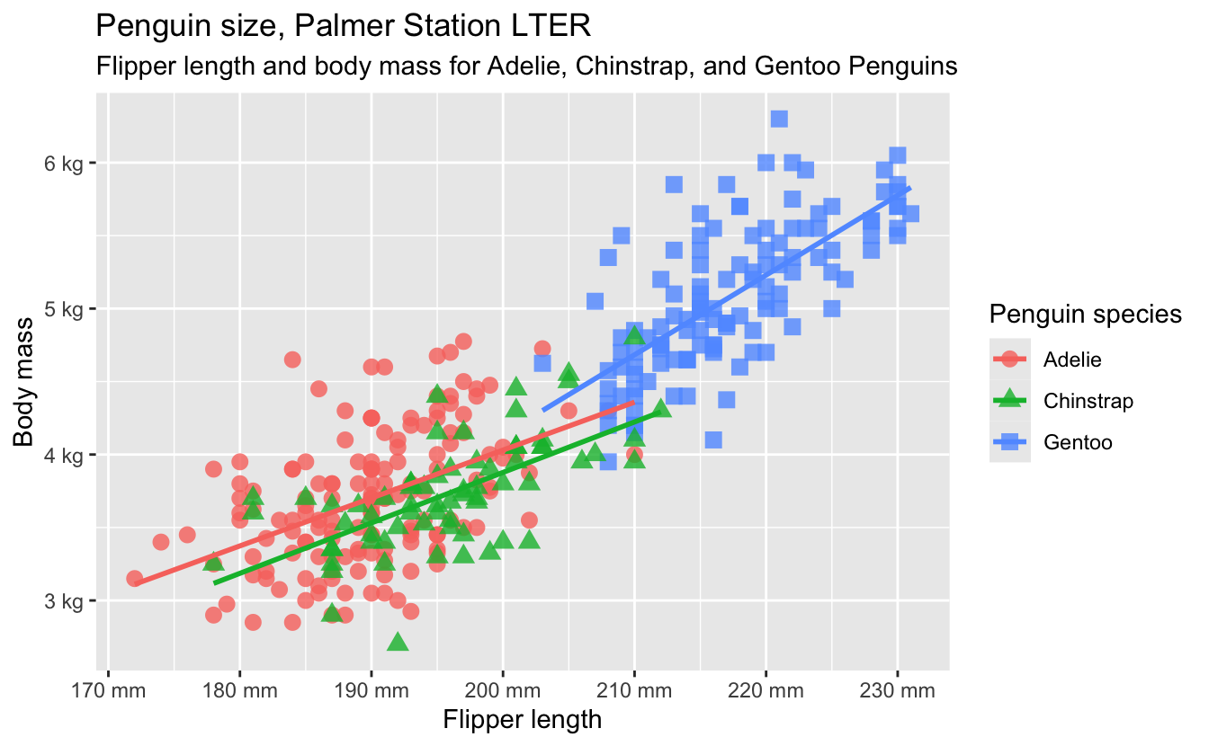
You can annotate the graph and modify the visual appearance of scales and themes in the plot, but do not change the data-components of the plot (e.g. it still needs to be a color-coded scatterplot showing the relationship between flipper length and body mass by species).
Exercise 2
Design a beautiful theme. Use the same graph from exercise 1, but this time create a beautiful, interpretable, aesthetically pleasing theme. Again consider how you can make use of theme options, colors, fonts, annotations, etc. to make an effective chart.
Store your theme as an R function. Document your design choices in 1-2 paragraphs. Use this theme for the rest of the exercises in this homework assignment.
Exercise 3
Implementing ridgeline plots. Social scientists often use vote-based measures of political ideology to study legislative behavior. The data you will use is from the NOMINATE scores, which are a common way to measure the ideology of members of Congress. You can find individual NOMINATE scores for every legislator from every term of the U.S. Congress since the 1st Congress in 1789 in HSall_members.csv.
You will use the “first dimension” scores (nominate_dim1) which in modern times are interpreted as identifying political ideology. Negative scores are interpreted as “liberal”, and positive scores are interpreted as “conservative”. Use an appropriate function from the {ggridges} package to make a ridge plot of partisan polarization in the U.S. Congress. How has the ideological makeup of the House of Representatives and the Senate shifted over time? Focus only on terms of Congress since 1945, and make sure to separately visualize the House of Representatives and the Senate. Include an interpretation for your visualization.
We have not created ridgeline plots previously. Use the package documentation to assist your implementation of this plot.
- Terms of Congress last for two years and are identified sequentially (e.g the 1st Congress ran from 1789-91, the 2nd Congress from 1791-93, etc.) The
congressvariable in the data set is a numeric variable that identifies the term of Congress. For interpretability, it would be helpful to instead label the graph based on calendar years rather than congressional terms. Feel free to decide how best to generate these labels. - Typically humans read content from top to bottom. Make sure your chart is oriented in a way that follows the natural flow of time.
Exercise 4
Follow the money. Vote-based measures of political ideology are common in social science research, but have certain limitations. Because they are based on observed voting behavior in political institutions, they can only be used to measure the ideology of individuals who have actually served in a political institution (i.e. individuals who run for office but fail to win election cannot be measured). Furthermore, voting-based measures for individuals who serve in different institutions are not directly comparable because they do not have significant overlap in the things for which they case votes (e.g. legislators vs. executives vs. judges, national vs. state politicians).
Fortunately there are other ways to measure ideology independent of voting behavior. Adam Bonica created the Database on Ideology, Money in Politics, and Elections (DIME) which provides comprehensive ideological mapping of not only elected officials, but also other political elites, interest groups, and donors by compiling “over 850 million itemized political contributions made by individuals and organizations to local, state, and federal elections covering from 1979 to 2024”. These contributions are collapsed into a single dimension Campaign Finance Score (CFScore) which measures the estimated ideology of all electoral candidates, recipients, and donors in the United States.
Whenever researchers introduce a new measure, they often will show that it correlates with existing measures of the same concept. Use the DIME dataset located in data/dime.csv to construct a visualization that compares the first dimension NOMINATE scores to the corresponding recipient CFScore (recipient.cfscore) for all legislators from the U.S. Congress.
Your chart should visually distinguish Democrats from Republicans. Avoid using the usual red-blue color coding for the parties since that combination has accessibility concerns (more on this later in the course).
Use faceting so the reader can distinguish each two-year Congressional term.
party_codeidentifies the partisan affiliation of each individual in the NOMINATE database.100is Democrats and200is Republicans. Given the dearth of alternative parties in U.S. politics, you can ignore all third-party legislators.-
icpsruniquely identifies each individual in the DIME database. From the documentation:ICPSR: Adjusted ICPSR legislator ID. Candidates that have never served in Congress are assigned IDs based off of their candidate IDs assigned by the FEC, NIMSP, or state reporting agencies. The four-digit election cycle is appended to the ID. Candidates that are active in multiple election cycles (or file to run for multiple seats during a single election cycle) will appear multiple times. This variable provides a unique row identifier.
You will need to prep this column to use it to combine the DIME dataset with the NOMINATE dataset.
Generative AI (GAI) self-reflection
As stated in the syllabus, include a written reflection for this assignment of how you used GAI tools (e.g. what tools you used, how you used them to assist you with writing code), what skills you believe you acquired, and how you believe you demonstrated mastery of the learning objectives.
Wrap up
Submission
- Go to http://www.gradescope.com and click Log in in the top right corner.
- Click School Credentials \(\rightarrow\) Cornell University NetID and log in using your NetID credentials.
- Click on your INFO 3312 course.
- Click on the assignment, and you’ll be prompted to submit it.
- Mark all the pages associated with exercise. All the pages of homework should be associated with at least one question (i.e., should be “checked”).
Grading
- Exercise 1: 10 points
- Exercise 2: 10 points
- Exercise 3: 15 points
- Exercise 4: 15 points
- Total: 50 points