HW 05 - Effective visual design + making data maps
Homework
Important
This homework is due June 15 at 11:59pm ET.
Learning objectives
- Clean and wrangle data for visualization
- Generate geospatial data visualizations
- Critique data visualizations using a consistent set of principles for graphical excellence
- Create effective visualizations that accurately represent data
Getting started
Go to the info3312-su26 organization on GitHub. Click on the repo with the prefix hw-05.
Clone the repo and start a new workspace in Positron. See the Homework 1 instructions for details on cloning a repo and starting a new R project.
General guidance
TipGuidelines + tips
As we’ve discussed in lecture, your plots should include an informative title, axes should be labeled, and careful consideration should be given to aesthetic choices.
Remember that continuing to develop a sound workflow for reproducible data analysis is important as you complete the lab and other assignments in this course. There will be periodic reminders in this assignment to remind you to render, commit, and push your changes to GitHub. You should have at least 3 commits with meaningful commit messages by the end of the assignment.
TipWorkflow + formatting
Make sure to
- Update author name on your document.
- Label all code chunks informatively and concisely.
- Follow the Tidyverse code style guidelines.
- Make at least 3 commits.
- Resize figures where needed, avoid tiny or huge plots.
- Turn in an organized, well formatted document.
Exercises
Exercise 1
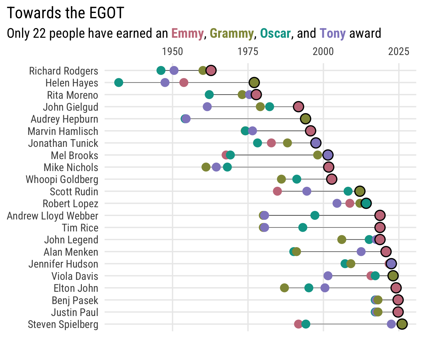
Towards the EGOT. The Emmy, Grammy, Oscar, and Tony Awards are four of the most prestigious awards in the entertainment industry. Winning all four of these awards is considered a significant accomplishment in American show business.

As of this date, only 22 people have achieved this feat. We want to visualize the winners and the time it took for them to earn an EGOT.
You can find a list of all EGOT winners and the years in which they won each award on Wikipedia. Scrape the data from the first table and clean it to reproduce the visualization below.
TipSome useful hints
- Use {rvest} to scrape the data from Wikipedia.
- The color palette used in the plot is “Dark 2” from the {colorspace} package.
- The font is Roboto Condensed.
- Some individuals won multiple awards in the same or consecutive years. To ensure each point is still visible, we offset each point based approximately on when during the year the awards ceremony is held. For the purposes of calculating these offsets, we assume the Emmy Awards are held in September, the Grammy Awards in January, the Academy Awards in February, and the Tony Awards in June.1
Exercise 2
Traffic stops in Tompkins County, NY. The Tompkins County Sheriff’s Office publishes an online dashboard tracking vehicle and traffic stops. The interactive map they publish showing the location of traffic stops could use some work.
data/tompkins-traffic-stops.geojson contains aggregated information on traffic stops initiated by the sheriff’s office. The data includes the location for each stop and the number of stops initiated during 2025.
Design and implement two geospatial visualizations depicting the geographic variation in traffic stops across Tompkins County. One plot should use raster map tiles from {ggmap} and the other should use vector data to draw the spatial features. It is up to you to decide how best to visually depict the traffic stops on the map. In a written reflection of at least two paragraphs, explain your design choices and which approach you believe is more effective at communicating the geographic variation in traffic stops across Tompkins County.
TipUse {tigris} to get vector spatial data
{tigris} is an R package that provides easy access to spatial data from the U.S. Census Bureau. You can use it to obtain vector spatial data for any region in the United States. It includes many types of geographic features, such as state/county boundaries, Census tracts, rivers, roads, rails, and more. Obtain the appropriate spatial data for Tompkins County and use it to create your vector map.
Exercise 3
Housing in the United States. Tell a short data-driven story about housing in the United States using data collected by the U.S. Census Bureau. The {tidycensus} package provides easy access to a wide variety of Census datasets (primarily the American Community Survey [ACS]), many of which include features related to housing. Use {tidycensus} to obtain your data and create a series of three visualizations that tell a story about housing in the United States. You can choose any topic related to housing that you find interesting, such as home ownership rates, housing affordability, or the age of housing stock. Be creative and use your judgment to determine what data to use and how to visualize it.
ImportantCore requirements
- At least one of the three visualizations must be a geospatial visualization.
- Use {tidycensus} to obtain the data for your visualizations. You can automatically retrieve spatial features for the data using
geometry = TRUE. - Your visualizations should be designed effectively and adhere to the principles of graphical excellence as identified by Alberto Cairo. In a written reflection of at least two paragraphs, explain your design choices and how they adhere to the principles of graphical excellence.
TipHelpful advice
- You will need to generate an API key to use the {tidycensus} package. Follow the instructions in the package documentation to obtain an API key and set it up for use in R.
- ACS data is available going back to 2005 or 2009 depending on the geographic unit.
- Use either raster map tiles and/or vector data to generate your maps.
- The Census Bureau publishes thousands of variables for each of their surveys. You can use
tidycensus::load_variables()to search for relevant features related to housing. Generative AI tools can also be helpful for brainstorming relevant variables to use for your visualizations, especially if it can identify the exact variable names that you need to retrieve the data.
Exercise 4
Visualizing election results. It is extremely common to visualize election results using maps. In the United States, election results are often visualized at the county level and look something like this:
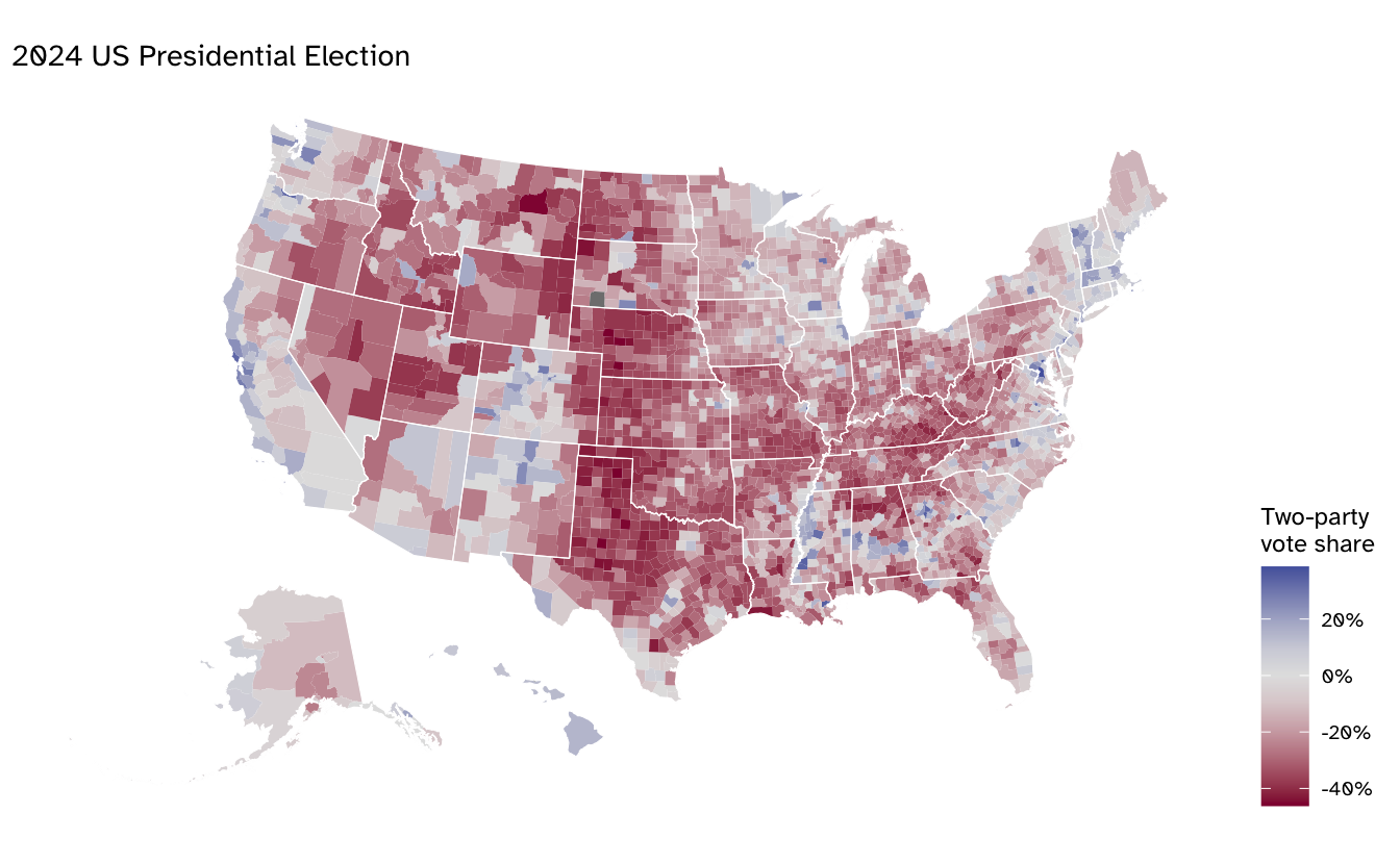
A problem with this design is that it can be misleading. The map emphasizes the land mass of counties rather than the population they contain. This can lead to a distorted view of the election results. For example, the map above makes it look like the overwhelming majority of the country voted for the Republican candidate, when in fact the Republican candidate only captured 51.5% of the two-party vote.
Design and implement an improved geospatial data visualization that corrects for this distortion. There are several ways you might think to design such a map. Feel free to research some approaches, but your implementation should be original. Along with the map, document your design choices and why you believe your approach is most effective.
TipHelpful advice
- The county election results can be found in
data/countypres_2000-2024.csv. To visualize the two-party vote share like above, you need to calculate the total number of votes received for the Democratic and Republican candidates in each county for 2024. You can then determine the share of votes that were cast for either of the candidates. - Alaska is annoying. They do not report election results at the county level, but instead for the voting district for the lower legislative chamber. To effectively incorporate Alaska into your map, you will need to obtain the Alaska voting district boundaries along with the county boundaries for the other 49 states.
- Connecticut is also annoying. In 2022, the state requested the Census Bureau and other federal agencies to stop using county boundaries for data reporting and instead use the boundaries for their “planning regions”. So spatial data files produced by the federal government after 2022 will not include county boundaries for Connecticut. But the election results in Connecticut are still reported at the county-level. Find a set of spatial boundaries for Connecticut that contain their previous counties, not the planning regions.
Generative AI (GAI) self-reflection
As stated in the syllabus, include a written reflection for this assignment of how you used GAI tools (e.g. what tools you used, how you used them to assist you with writing code), what skills you believe you acquired, and how you believe you demonstrated mastery of the learning objectives.
Wrap up
Submission
- Go to http://www.gradescope.com and click Log in in the top right corner.
- Click School Credentials \(\rightarrow\) Cornell University NetID and log in using your NetID credentials.
- Click on your INFO 3312 course.
- Click on the assignment, and you’ll be prompted to submit it.
- Mark all the pages associated with exercise. All the pages of homework should be associated with at least one question (i.e., should be “checked”).
Grading
- Exercise 1: 10 points
- Exercise 2: 10 points
- Exercise 3: 20 points
- Exercise 4: 10 points
- Total: 50 points
Footnotes
Historically these are the usual times of year for the ceremonies, though sometimes there are exceptions. Notably Elton John won his Emmy at the 75th Primetime Emmy Awards. Ordinarily that ceremony would have been held in September 2023 but due to ongoing labor disputes the ceremony was delayed until January 2024.↩︎