HW 03 - Stats, scales, and coordinate systems
This homework is due June 8 at 11:59pm ET.
Learning objectives
- Generate charts using polar coordinate systems
- Adjust guides to improve readability of visualizations
- Create small multiple plots to compare across categories
Getting started
Go to the info3312-su26 organization on GitHub. Click on the repo with the prefix hw-03.
Clone the repo and start a new workspace in Positron. See the Homework 1 instructions for details on cloning a repo and starting a new R project.
General guidance
As we’ve discussed in lecture, your plots should include an informative title, axes should be labeled, and careful consideration should be given to aesthetic choices.
Remember that continuing to develop a sound workflow for reproducible data analysis is important as you complete the lab and other assignments in this course. There will be periodic reminders in this assignment to remind you to render, commit, and push your changes to GitHub. You should have at least 3 commits with meaningful commit messages by the end of the assignment.
Make sure to
- Update author name on your document.
- Label all code chunks informatively and concisely.
- Follow the Tidyverse code style guidelines.
- Make at least 3 commits.
- Resize figures where needed, avoid tiny or huge plots.
- Turn in an organized, well formatted document.
Packages
Exercises
Exercise 1
Key lyme pie. The goal of this exercise is to recreate a pie chart in R and then improve it by presenting the same information as a bar graph. The pie chart to recreate is below and it comes from the Lyme Disease Association.1
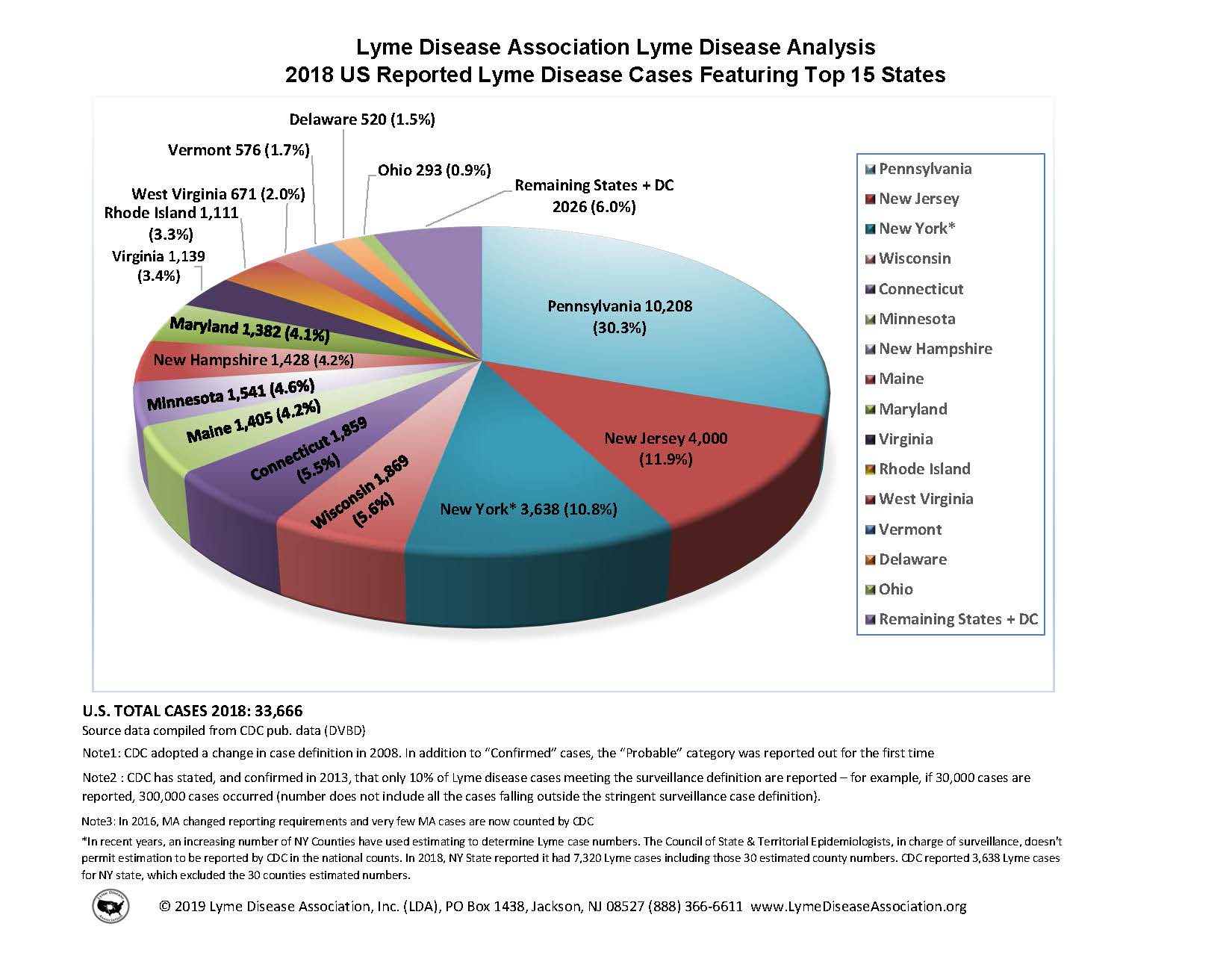
Below are the steps I recommend you follow and some guidance on what (not) to worry about:
First, create the data frame: Use the annotations in the visualization provided to do this. You should create the new data frame using the
tibble()or thetribble()functions.-
Then, recreate the pie chart: When recreating the pie chart you do not need to
- make it a 3D pie chart (2D is sufficient)
- match the colors (default {ggplot2} colors or any other color palette is fine)
- annotate the plot in the same way (just the legend is sufficient)
- match the entire caption (see below for what we want you to match)
However you should,
- make a 2D pie chart
- present a legend on the right that shows the mapping of the colors to states
- match the title text, location, and alignment
- match the text, location, and alignment of the first two lines of the caption
Finally, improve the visualization by presenting this information using a Cartesian coordinate system and appropriate geom. As an additional challenge, imagine you’re working for the state of New York, so highlight that state on your chart in some way. Write a sentence or two describing why you chose to highlight the New York info the way you did.
Exercise 2
Improve the axis tick mark labels. Consider yourself a Tolkien enthusiast and want to better understand how often the members of the Fellowship of the Ring speak in the original book trilogy. You also are a nerd who wants to ensure people know the race of each member.2 You have the data to visualize the number of words spoken by each member along with their race, but the plot is not as readable as you would like.
# load LOTR data
# source: https://github.com/MokoSan/FSharpAdvent/blob/master/Data/WordsByCharacter.csv
lotr_words <- read_csv(file = "data/LOTRWordsByCharacter.csv")

lotr_words |>
  summarize(
    n_words = sum(Words),
    .by = c(Character, Race)
  ) |>
  # filter and only keep members of the fellowship of the rings
  filter(
    Character %in%
      c(
        "Frodo",
        "Sam",
        "Merry",
        "Pippin",
        "Gandalf",
        "Aragorn",
        "Legolas",
        "Gimli",
        "Boromir"
      )
  ) |>
  mutate(
    Character = str_glue("{Character} ({Race})") |>
      fct_reorder(.x = n_words, .desc = TRUE)
  ) |>
  ggplot(mapping = aes(x = Character, y = n_words)) +
  geom_col() +
  labs(
    x = "Character (race)",
    y = "Number of words spoken",
    title = "Number of words spoken by members of the Fellowship of the Ring",
    subtitle = "Data from the Lord of the Rings trilogy of books"
  )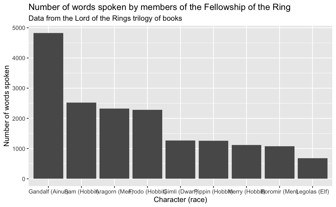
Alas, we encounter a common problem when visualizing categorical data. The labels on the \(x\)-axis are too long and overlap. This makes it difficult to read the chart.
Propose and implement at least 4 different solutions to improve the readability of the chart. For each method, implement the change and describe the advantages and disadvantages of the approach.
Exercise 3
Visualizing cyclical data with polar coordinates. Recall the NYC road traffic accidents chart you generated for homework 02. That chart was somewhat disappointing because it did not clearly show the cyclical nature of the data (e.g. time was shown linearly on the \(x\)-axis even though it is cyclical because 11pm leads into 12am of the following day).
Design and implement a data visualization that depicts the number of road traffic accidents in NYC by time of day using some sort of a polar/radial coordinate system. The chart need not be a direct transformation of your previous chart (in fact, a density plot may not be appropriate for this exercise), but it should clearly show the cyclical nature of the data and allow for meaningful comparisons between weekdays and weekends, as well as distinguishing the levels of severity.
Along with the visualization, provide a written explanation (1-2 paragraphs) of your design choices and how the chart you created helps to better understand the data.
Generative AI (GAI) self-reflection
As stated in the syllabus, include a written reflection for this assignment of how you used GAI tools (e.g. what tools you used, how you used them to assist you with writing code), what skills you believe you acquired, and how you believe you demonstrated mastery of the learning objectives.
Wrap up
Submission
- Go to http://www.gradescope.com and click Log in in the top right corner.
- Click School Credentials \(\rightarrow\) Cornell University NetID and log in using your NetID credentials.
- Click on your INFO 3312 course.
- Click on the assignment, and you’ll be prompted to submit it.
- Mark all the pages associated with exercise. All the pages of homework should be associated with at least one question (i.e., should be “checked”).
Grading
- Exercise 1: 20 points
- Exercise 2: 10 points
- Exercise 3: 20 points
- Total: 50 points
Acknowledgments
- Exercise 1 drawn from Advanced Data Visualization by Mine Çetinkaya-Rundel.
Footnotes
Source: https://lymediseaseassociation.org/resources/2018-reported-lyme-cases-top-15-states↩︎
Gandalf is not a “Wizard”, he’s Ainur.↩︎