HW 02 - Grammar of graphics + layers
This homework is due June 5 at 11:59pm ET.
Learning objectives
- Critique a data visualization using visual design principles
- Define the conceptual grammar of graphics for a statistical chart
- Implement statistical charts using {ggplot2}
Getting started
Go to the info3312-su26 organization on GitHub. Click on the repo with the prefix hw-02.
Clone the repo and start a new workspace in Positron. See the Homework 1 instructions for details on cloning a repo and starting a new R project.
Packages
General guidance
As we’ve discussed in lecture, your plots should include an informative title, axes should be labeled, and careful consideration should be given to aesthetic choices.
Remember that continuing to develop a sound workflow for reproducible data analysis is important as you complete the lab and other assignments in this course. There will be periodic reminders in this assignment to remind you to render, commit, and push your changes to GitHub. You should have at least 3 commits with meaningful commit messages by the end of the assignment.
Make sure to
- Update author name on your document.
- Label all code chunks informatively and concisely.
- Follow the Tidyverse code style guidelines.
- Make at least 3 commits.
- Resize figures where needed, avoid tiny or huge plots.
- Turn in an organized, well formatted document.
Exercises
Exercise 1
Reverse-engineering the grammar of graphics. COVID-19 has been a thing since 2020. Data visualizations have proven extremely valuable for communicating trends regarding the pandemic to the public. For the main plot in this article, write down the components of its grammar of graphic.
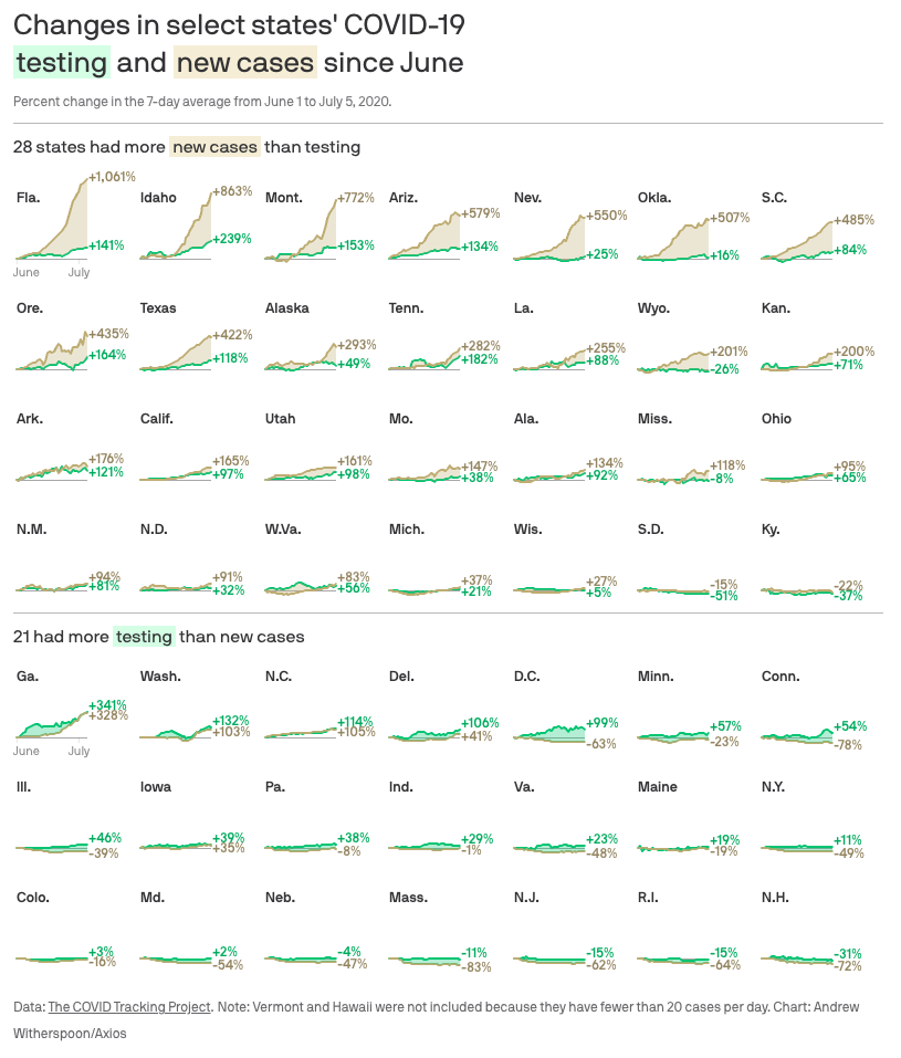
Don’t worry about identifying the correct functions in {ggplot2} used to generate the graph. Instead, focus on recording the key elements of a plot so you could communicate it to someone else.
Exercise 2
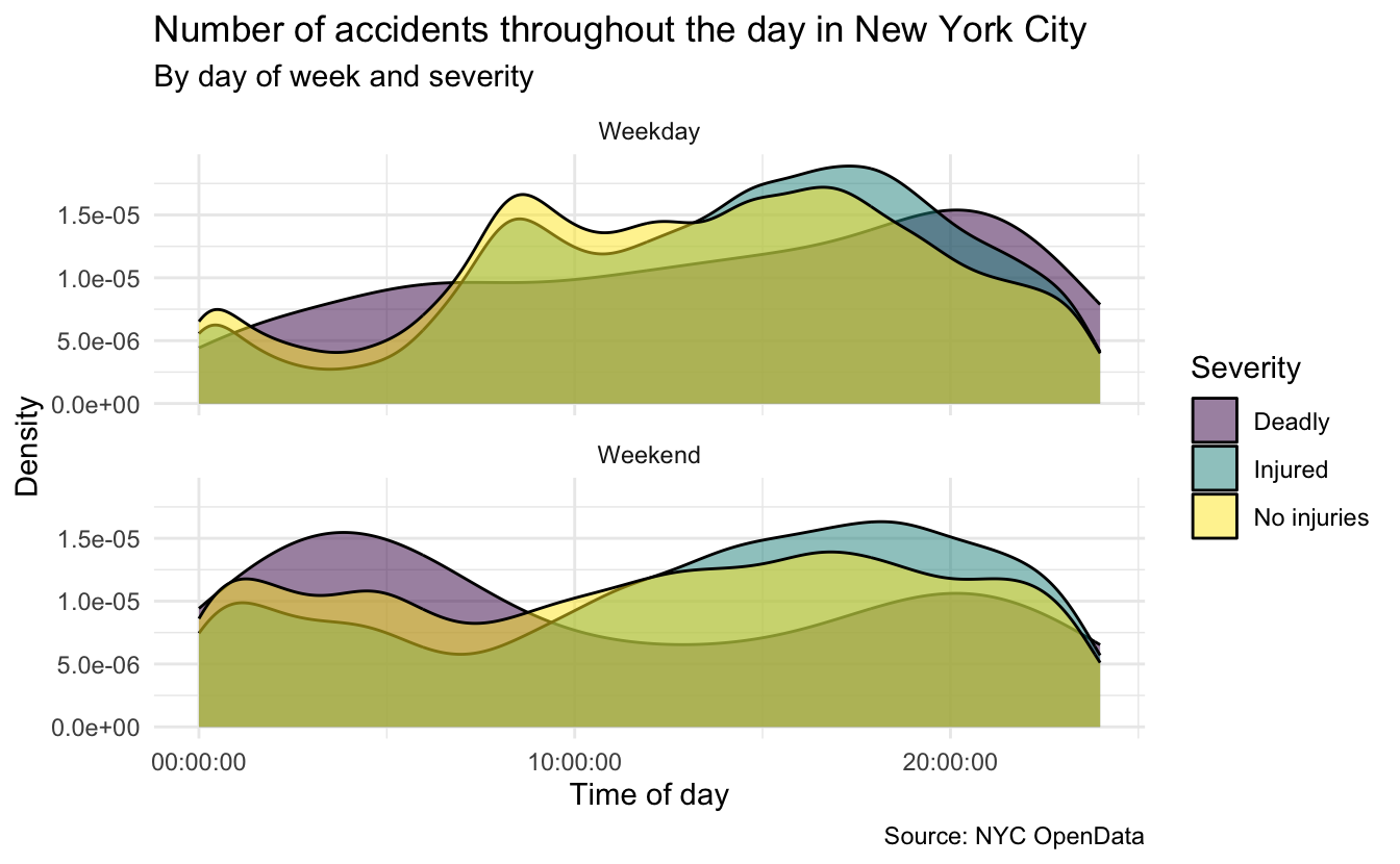
Road traffic accidents in New York City. NYC publishes an open database of all police reported motor vehicle collisions. data/nyc-crashes.csv contains all recorded accidents in 2024.
Recreate the following plot, and interpret in context of the data.
Exercise 3
Critiquing charts using visual design principles. Nathan Yau created a visual timeline of people referenced in Billy Joel’s “We Didn’t Start the Fire”. In 2-3 paragraphs, critique the visualization’s design by drawing on what you have learned about visual design principles. What makes it effective? What problems do you identify with the design and why?
Exercise 4
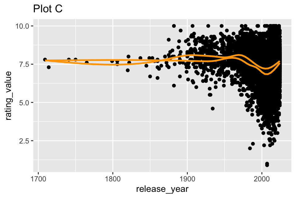
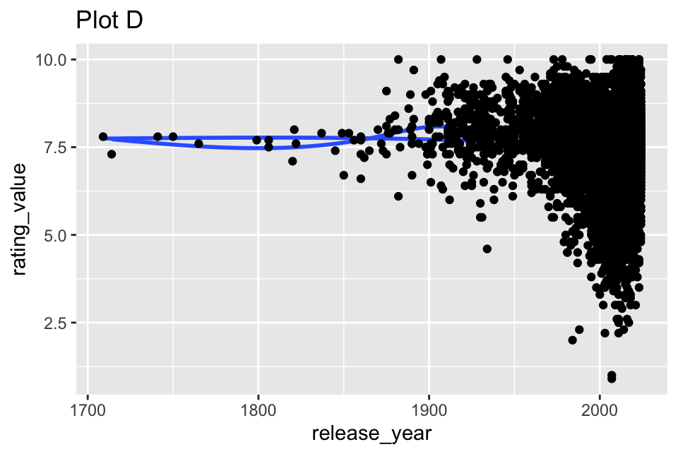
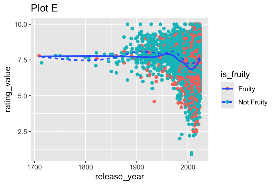
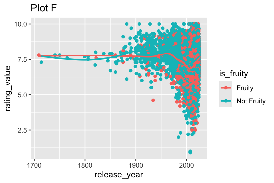
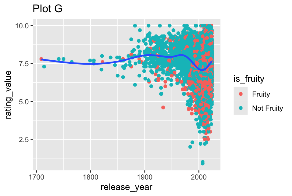
It’s about the layers. Tidy Tuesday published “The Scent of Data”, a dataset of fragrances (perfumes) sourced from Parfumo. A lightly modified version of the dataset is stored in data/perfume.csv. Use the data to generate the graphs below. You will need to create 8 separate plots for this exercise.
Any time a categorical variable is used in a plot, it is is_fruity.

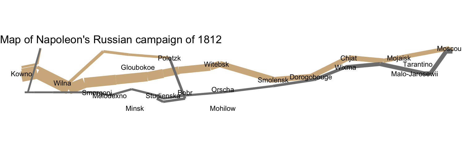
Recreate Minard’s map of Napoleon’s march
You’ve already defined the grammar of graphics for Minard’s map. Now you will use {ggplot2} to recreate the map.
The necessary data sets are stored in data/napoleon.rds. Read in the file using readr::read_rds().The resulting object is a list object with three data frames: cities, temperatures, and troops.
Exercise 5
The point of the exercise is for you to practice translating a grammatical definition of a plot into code using {ggplot2}. Using generative AI to write the code for you defeats the whole purpose of the exercise.
Recreate Minard’s map of Napoleon’s march using your grammatical definition. Using {ggplot2}, recreate Minard’s map of Napoleon’s march on Moscow using the grammar of graphics you defined in the application exercise. You only need to recreate the core plot (the part we defined in the application exercise). You do not need to recreate the title, caption, temperature line graph, or other annotations. It should appear relatively basic, like this:
Exercise 6
Recreate the entire map and make it look fantastic. Now that you have recreated the core plot, extend your code to recreate the entire Minard map as closely as possible. This includes titles, captions, temperature line graph, annotations, and other details.
I am aware there are many tutorials published online that demonstrate how to recreate this visualization.1 Likewise, generative AI can probably produce a decent implementation. You are welcome to use these resources to assist you in recreating the visualization. The key to this exercise is that you must understand and explain how your code works.
- Any resources you use to write the code must be cited. This can be as simple as a code comment in relevant sections of the code chunk, or a written list of resources you utilized as text content in the Quarto document.
- Make sure to extensively document what your code does using your own words. Do not use generative AI to write this documentation - use your brain!
- Beyond the recreation, add at least one original feature to your visualization. Be sure to explicitly tell us what change you made and why.
If you need to install additional packages to recreate Minard’s map, use install.packages().
Generative AI (GAI) self-reflection
As stated in the syllabus, include a written reflection for this assignment of how you used GAI tools (e.g. what tools you used, how you used them to assist you with writing code), what skills you believe you acquired, and how you believe you demonstrated mastery of the learning objectives.
Wrap up
Submission
- Go to http://www.gradescope.com and click Log in in the top right corner.
- Click School Credentials \(\rightarrow\) Cornell University NetID and log in using your NetID credentials.
- Click on your INFO 3312 course.
- Click on the assignment, and you’ll be prompted to submit it.
- Mark all the pages associated with exercise. All the pages of homework should be associated with at least one question (i.e., should be “checked”).
Grading
- Exercise 1: 10 points
- Exercise 2: 10 points
- Exercise 3: 10 points
- Exercise 4: 8 points
- Exercise 5: 6 points
- Exercise 6: 6 points
- Total: 50 points
Footnotes
I did say it was famous.↩︎