Quiz 01
Quiz
Overview
Quiz 01 will be held on October 1st in-class. It will be a 75 minute in-person, timed quiz.
The quiz will cover all material through the end of week 05 (Refine your plots: Color + annotation). It will consist of a series of short answer and free response questions. Questions are designed to evaluate your understanding of concepts and methods. You may be asked to answer conceptual questions, interpret visualizations, apply frameworks for evaluating the effectiveness of visualizations, interpret code and output, and/or create visualizations using sketching, conceptual grammar of graphics, pseudocode, etc.
Students with SDS accommodations
Students who have registered SDS accommodations related to timed assignments are implemented by the SDS Alternative Testing Program. You will receive separate instructions from SDS about how to take the quiz with your accommodations. If you have any questions about your accommodations, please contact SDS directly.
Students with religious or other accommodations
If you require an accommodation for quiz 01 on the basis of religious observances, athletics, military service, or another accommodation listed on the course syllabus, please contact us at soltoffbc@cornell.edu by September 29th. Any accommodation requests received after this date are unlikely to be approved.
Rules & Notes
Academic Integrity
- A student shall in no way misrepresent his or her work.
- A student shall in no way fraudulently or unfairly advance his or her academic position.
- A student shall refuse to be a party to another student’s failure to maintain academic integrity.
- A student shall not in any other manner violate the principle of academic integrity.
- This is an individual assignment. Everything in the quiz is for your eyes only.
- The quiz will be held in-person. All responses will be written by hand and submitted on paper.
- You may not use any electronic devices during the quiz.1 This includes laptops, tablets, phones, smartwatches, smart glasses, etc.
- You may not use any physical materials during the quiz. This includes textbooks, notes, calculators, etc. Any required information will be provided in the quiz.
Submission
- All responses will be submitted on paper using the provided forms. Quizzes will be evaluated and returned to you via Gradescope.
Grading
- Each quiz is weighted equally. There will be two quizzes in total, so each quiz is worth 10% of your final grade.
Practice problems
NoteInstructions
Below are some practice problems you may complete in order to prepare for the quiz. The suggested solution is hidden below each exercise. Try to solve the problem on your own before looking at the solution.
Visualization critique
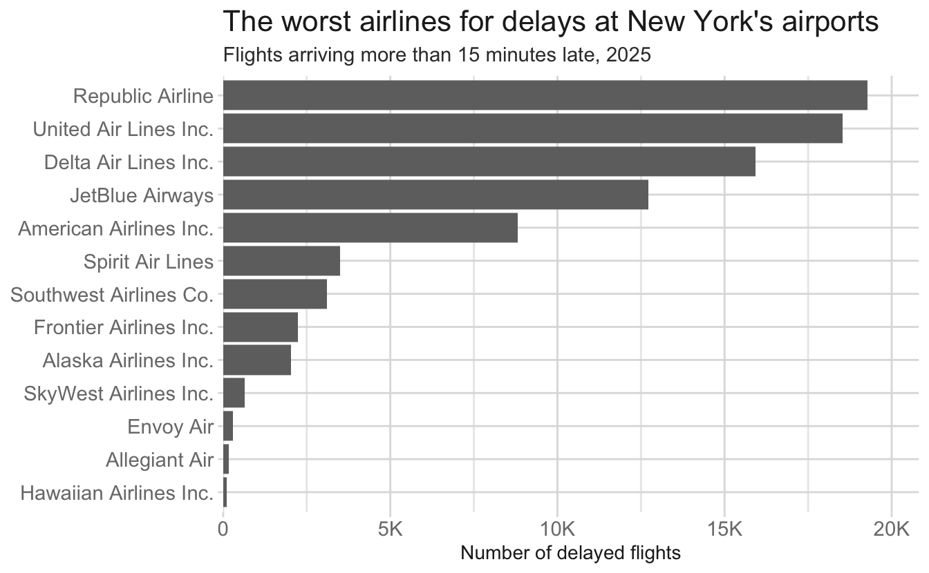
An airline industry blog publishes the chart below under the headline “The worst airlines for delays at New York’s airports.” The chart uses every flight that departed Newark (EWR), John F. Kennedy (JFK), or LaGuardia (LGA) in 2025, and counts the flights that arrived at their destination more than 15 minutes late.
The blog did not publish the table below, but you were able to find it.
| Airline | Total flights from NYC in 2025 |
|---|---|
| Republic Airline | 86,154 |
| United Air Lines Inc. | 74,592 |
| Delta Air Lines Inc. | 64,834 |
| JetBlue Airways | 44,728 |
| American Airlines Inc. | 36,272 |
| Spirit Air Lines | 14,578 |
| Southwest Airlines Co. | 11,408 |
| Alaska Airlines Inc. | 6,769 |
| Frontier Airlines Inc. | 6,648 |
| SkyWest Airlines Inc. | 2,628 |
| Envoy Air | 847 |
| Allegiant Air | 665 |
| Hawaiian Airlines Inc. | 364 |
-
Evaluate this chart using Cairo’s five qualities of a great visualization: truthful, functional, beautiful, insightful, and enlightening.
For each quality, state whether this chart succeeds or fails, and explain why, using specific airlines and numbers from the chart and the table.
NoteSuggested solution- Truthful — fails. The chart ranks carriers by how many delayed flights they had. The headline is about which airline is worst, which means “how likely is my flight to be late?” A raw count mostly measures how many flights a carrier operates. It should be normalized by the total number of flights per carrier. If you compare to the total flights in the table, you can see that the rates are quite different.
- Functional — mostly succeeds. Bars on a common zero baseline, sorted by value, airline names readable. It lets you read the plotted quantity efficiently. The trouble is that it efficiently reads the wrong quantity.
- Beautiful — succeeds? Clean, no chartjunk, no truncated or distorted axis. Not the most inventive or creative, but for a straight-forward chart it does the job.
- Insightful — fails. The only finding on offer is “big airlines have more delayed flights than small ones,” which is nearly a tautology. It hides the real story, which is that the small carriers have the worst rates.
- Enlightening — fails. A traveler acting on this chart would avoid Republic (22.4% late) and book Envoy (35.1% late). That is wrong.
-
State what the chart should show instead, and explain why your version would support the headline’s claim better than the published chart does.
NoteSuggested solutionPlot the percentage of each carrier’s flights that arrived more than 15 minutes late, sorted, with the axis labeled as a percentage. A rate does not move with carrier size, so the comparison isolates performance from market share, and it matches the decision the reader is actually making. This is the same move as adjusting counts for population, or movie grosses for inflation.
Prepping data for visualizing
The billboard data frame (from the {tidyr} package) records the weekly position of every song that entered the Billboard Hot 100 in the year 2000. Here are the first six rows and the first few columns:
| artist | track | date.entered | wk1 | wk2 | wk3 | wk4 | wk5 | wk6 |
|---|---|---|---|---|---|---|---|---|
| 2 Pac | Baby Don’t Cry (Keep… | 2000-02-26 | 87 | 82 | 72 | 77 | 87 | 94 |
| 2Ge+her | The Hardest Part Of … | 2000-09-02 | 91 | 87 | 92 | NA | NA | NA |
| 3 Doors Down | Kryptonite | 2000-04-08 | 81 | 70 | 68 | 67 | 66 | 57 |
| 3 Doors Down | Loser | 2000-10-21 | 76 | 76 | 72 | 69 | 67 | 65 |
| 504 Boyz | Wobble Wobble | 2000-04-15 | 57 | 34 | 25 | 17 | 17 | 31 |
| 98^0 | Give Me Just One Nig… | 2000-08-19 | 51 | 39 | 34 | 26 | 26 | 19 |
The data frame has 317 rows and 79 columns. After date.entered come columns wk1, wk2, wk3, …, all the way through wk76. The value in each wk column is the song’s chart position (1 = best) in that week after it entered the chart. A song that fell off the chart has NA in every later week.
You want to build this chart: for the five songs that spent the most weeks on the chart, a line for each song showing its chart position over time, with the best position (1) at the top of the y-axis.
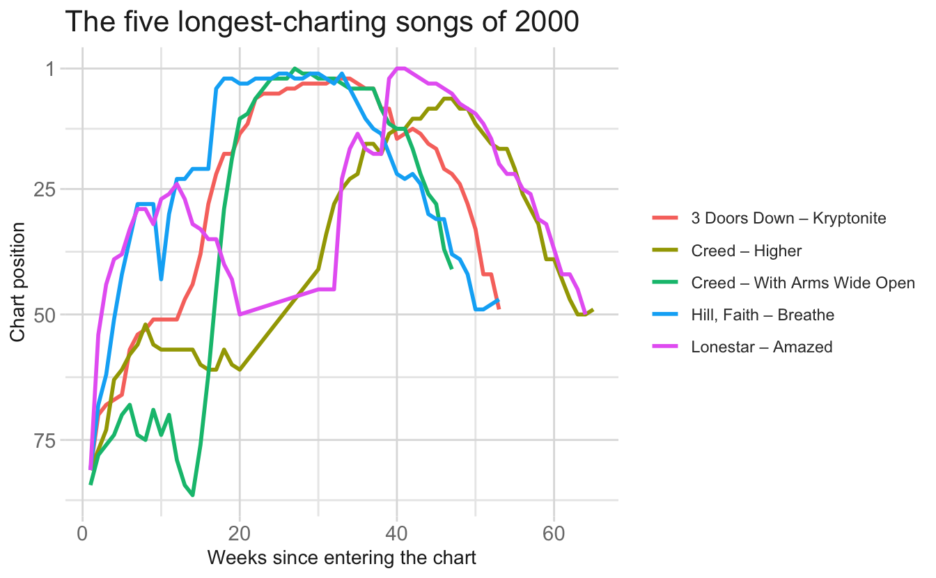
The final ggplot() call is:
ggplot(billboard_plot, aes(x = week, y = rank, color = label)) +
  geom_line() +
  scale_y_reverse()
Describe the sequence of {dplyr} and {tidyr} operations needed to get from the billboard data frame shown above to billboard_plot.
You do not need exact, runnable syntax. You should be able to clearly specify:
- the sequence of operations and the function used at each step,
- the arguments that matter at each step (which columns, which direction, what happens to
NAs), - the shape of the result - state how many rows and which columns
billboard_plothas (approximately, for rows).
NoteSuggested solution
-
Pivot longer. The
wk1–wk76columns are values of a variable, not variables. You need to pivot the data frame to a longer format so one row represents one week for each song. Usepivot_longer()withcols = starts_with("wk"),names_to = "week",values_to = "rank". -
Clean the week variable. It arrives as strings like
"wk1". Strip the prefix and convert to a number. Without this,weekis text and the x-axis putswk10beforewk2. -
Drop the missing weeks. Every song has all 76 columns, so the long data starts at 317 x 76 = 24,092 rows, mostly
NA. Usevalues_drop_na = TRUEorfilter(). After this, each remaining row is one week on the chart. -
Find the five longest-charting songs. Count rows per song and take the top five. The song identifier is
artistandtracktogether;trackalone is not unique. -
Keep only those five. A
semi_join(), afilter(), or a grouped filter. - Build the label column for the color aesthetic, pasting artist and track together.
The final result should be one row per song-week, with columns for artist, track, week, rank, and the label. Five songs charting 45–60 weeks each gives roughly 250 rows.
billboard_long <- billboard |>
  pivot_longer(
    cols = starts_with("wk"),
    names_to = "week",
    names_prefix = "wk",
    names_transform = as.integer,
    values_to = "rank",
    values_drop_na = TRUE
  )

top_five <- billboard_long |>
  count(artist, track, sort = TRUE) |>
  slice_head(n = 5)

billboard_plot <- billboard_long |>
  semi_join(top_five, by = c("artist", "track")) |>
  mutate(label = str_c(artist, " - ", track))
Faceting
flights records every flight that departed one of the three New York City airports (EWR, JFK, LGA) in 2025. Below we summarize mean departure delay, in minutes, by carrier, airport, and month of the year for four carriers that fly out of all three airports.
| Carrier | Mean delay (min) | Lowest month | Highest month |
|---|---|---|---|
| Republic | 9.5 | -0.1 | 21.2 |
| Delta | 18.8 | 6.7 | 57.1 |
| American | 17.4 | 7.3 | 43.2 |
| JetBlue | 18.4 | 4.1 | 42.4 |
Here is the summary plotted without any faceting — one line per carrier–airport combination:
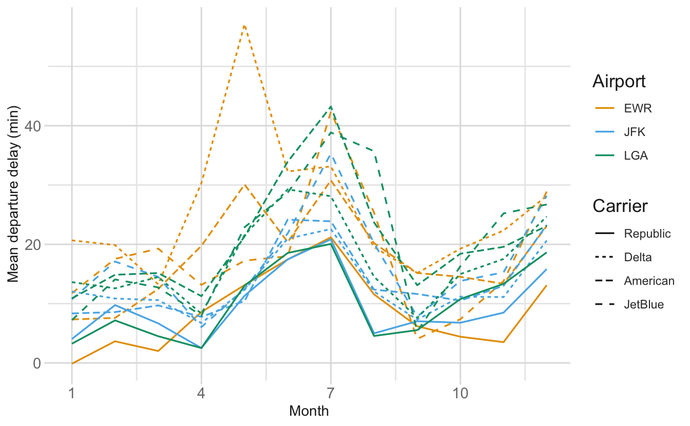
We want to answer the question does the seasonal pattern of departure delays differ across the three NYC airports, and is that pattern the same for every carrier?
-
You will facet this plot. Choose
facet_wrap()orfacet_grid(), write the faceting call you would add, and justify your choice in two or three sentences by reference to the research question and to the structure of the two categorical variables.NoteSuggested solutionfacet_grid()+ facet_grid(rows = vars(carrier), cols = vars(origin))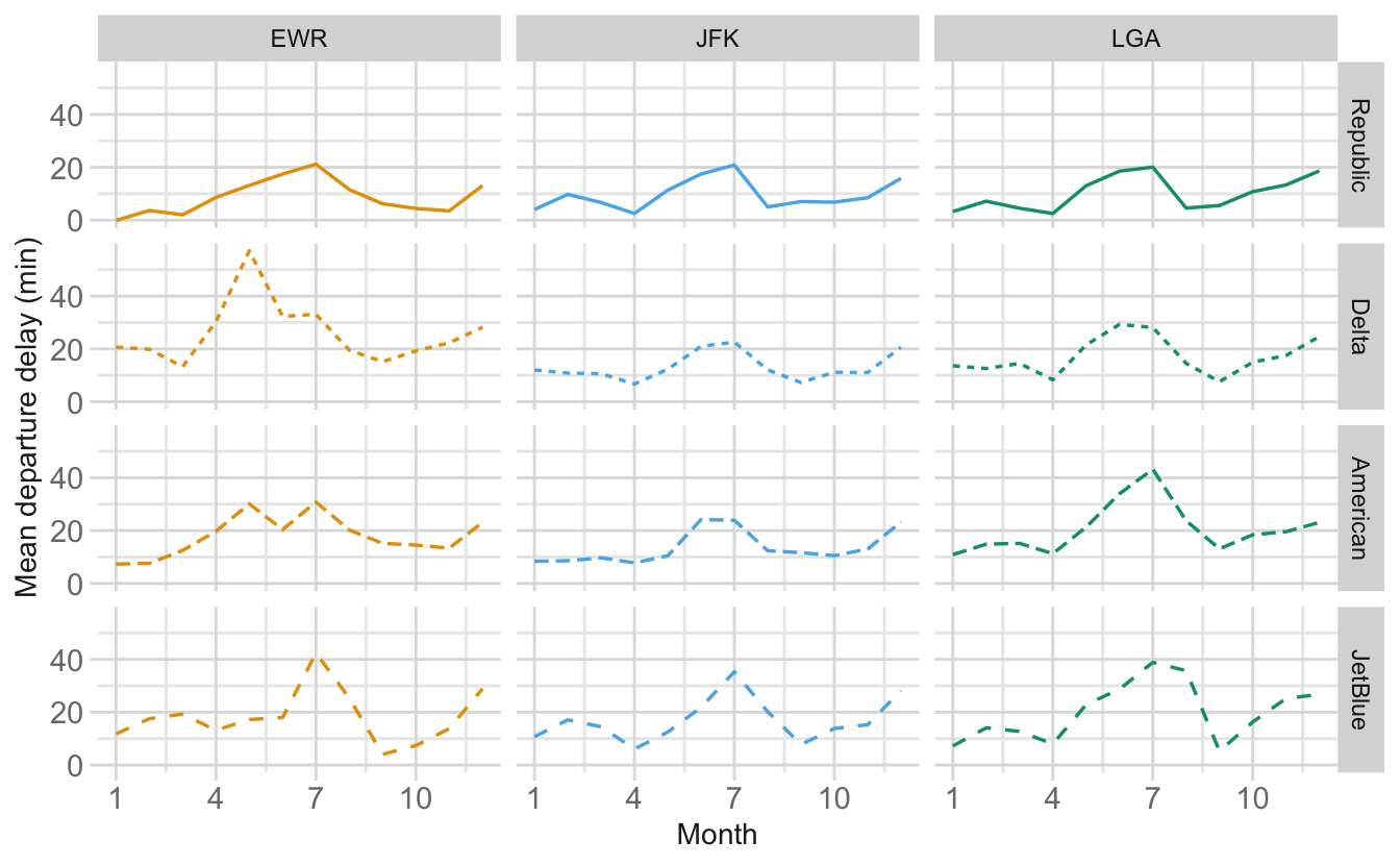
There are two categorical variables, and the research question asks about both at once – does the seasonal pattern differ by airport, and is it the same for every carrier?
facet_grid()lays the two variables out on a grid, so carrier varies down the rows and airport across the columns. That means a reader can scan along a row to compare airports holding carrier fixed, and down a column to compare carriers holding airport fixed.What if you used
facet_wrap()?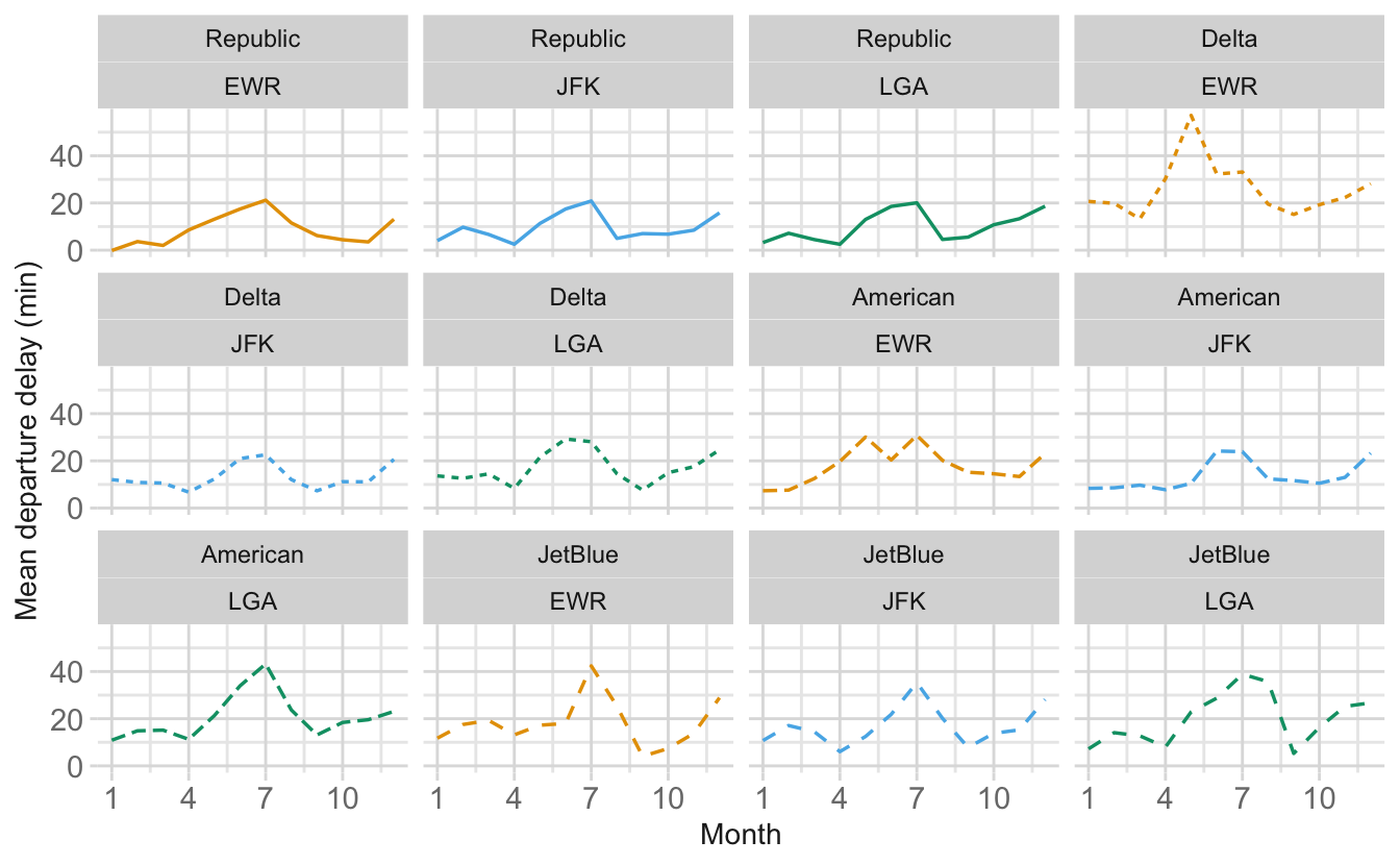
facet_wrap()would flow all 12 combinations into a ribbon of panels with no consistent meaning to row or column position, which throws away exactly the structure the question is about. -
Should the
yscale be fixed across panels or freed (e.g.scales = "free_y")? Justify your answer, and state explicitly what comparison the reader loses if the scales are freed.NoteSuggested solutionKeep the scales fixed. The whole point is to compare delay levels across carriers and airports. Fixed scales put every panel on the same ruler, so a tall line really does mean a longer delay.
Freeing the
yscale rescales each panel to its own range. Republic’s panels (mean 9.5 minutes, never above 21.2) would be stretched to fill the same vertical space as Delta’s (mean 18.8, peaking at 57.1), so the two would look alike.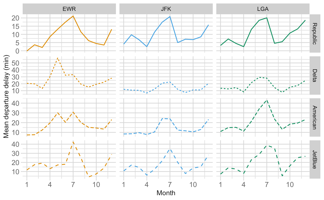
The reader loses the ability to compare magnitudes between panels and keeps only the shape of each panel’s seasonal pattern.
Improving a basic, boring chart
The babynames package contains the number of US babies given each name each year, from Social Security card applications. The chart below shows how many girls were named Hillary each year.
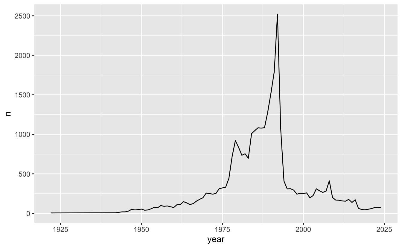
The chart is not wrong (the numbers are accurate) but it is doing almost nothing to communicate what is in the data.
Alberto Cairo’s five qualities of a great visualization are that it should be:
- Truthful
- Functional
- Beautiful
- Insightful
- Enlightening
Propose three concrete improvements to this chart. For each one:
State exactly what you would change. Be specific enough that a classmate could implement it without asking you a question – naming the {ggplot2} function or argument is ideal, but clear prose is acceptable.
Name which of Cairo’s five qualities the change serves, and say in a sentence what the reader gains.
Warning
“Make it prettier,” “add color,” or “improve the labels” are too generic to earn credit. You must be specific about what you would change and why.
TipA helpful hint
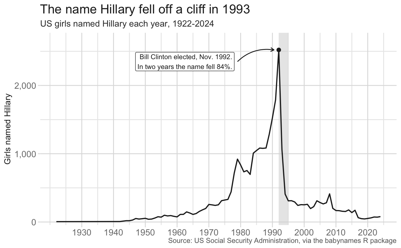
Why did the name Hillary fall in popularity? Probably takes a little history knowledge, but the timing is right after Bill Clinton was elected president in November 1992. “Hillary” was increasing in popularity (maybe in part due to Hillary Clinton, the future first lady and later senator, secretary of state, and presidential candidate), but it appears the name usage plummeted after Bill Clinton’s election. Even if you don’t know this context, you should still be able to note the importance of the cliff and redesign the chart to draw attention to it.
NoteSuggested solution
What is the story? The name Hillary rises through the 1970s and 80s, peaks at 2,521 girls in 1992, then collapses. That is a fall of 84% in two years, and it never recovers. The whole point of this data is a cliff at one specific year, and the default chart neither points at it nor says what happened.
Potential improvements include (but are not limited to):
| # | Change | Quality | What the reader gains |
|---|---|---|---|
| 1 | Annotate the 1993 drop — a labeled annotate(), a dashed geom_vline(), or an arrow pointing at the peak |
Insightful / enlightening | Learns why the line falls, instead of just seeing that it does |
| 2 | A declarative title and subtitle, e.g. “The name Hillary fell off a cliff in 1993” | Enlightening | Gets the conclusion in the two seconds they actually spend looking |
| 3 | Fix the axis labels: y = "Girls named Hillary", x = NULL
|
Functional | Knows what is being counted without a codebook. n is a variable name, not a label |
| 4 | Fix breaks and number formatting: decades on x, comma-formatted counts on y | Functional | Can locate 1992 and read a value off the chart |
| 5 | Add a source caption | Truthful | Can check the claim, and knows this is SSA card applications |
| 6 | Mark and label the peak value directly | Functional / insightful | Sees the actual number instead of estimating from the axis |
| 7 | Plot the proportion of births rather than the raw count, or note the issue | Truthful | Total births change a lot over a century. Here it does not change the story, which is worth saying |
| 8 | Drop theme_gray() for a cleaner theme; remove the gray panel and minor gridlines |
Beautiful / functional | Higher data-to-ink ratio, so the one line dominates the page |
| 9 | Add a comparison name in gray behind Hillary | Insightful | Shows the cliff is specific to this name, not a general trend |
A potential revision could look like this:
Transforming axes
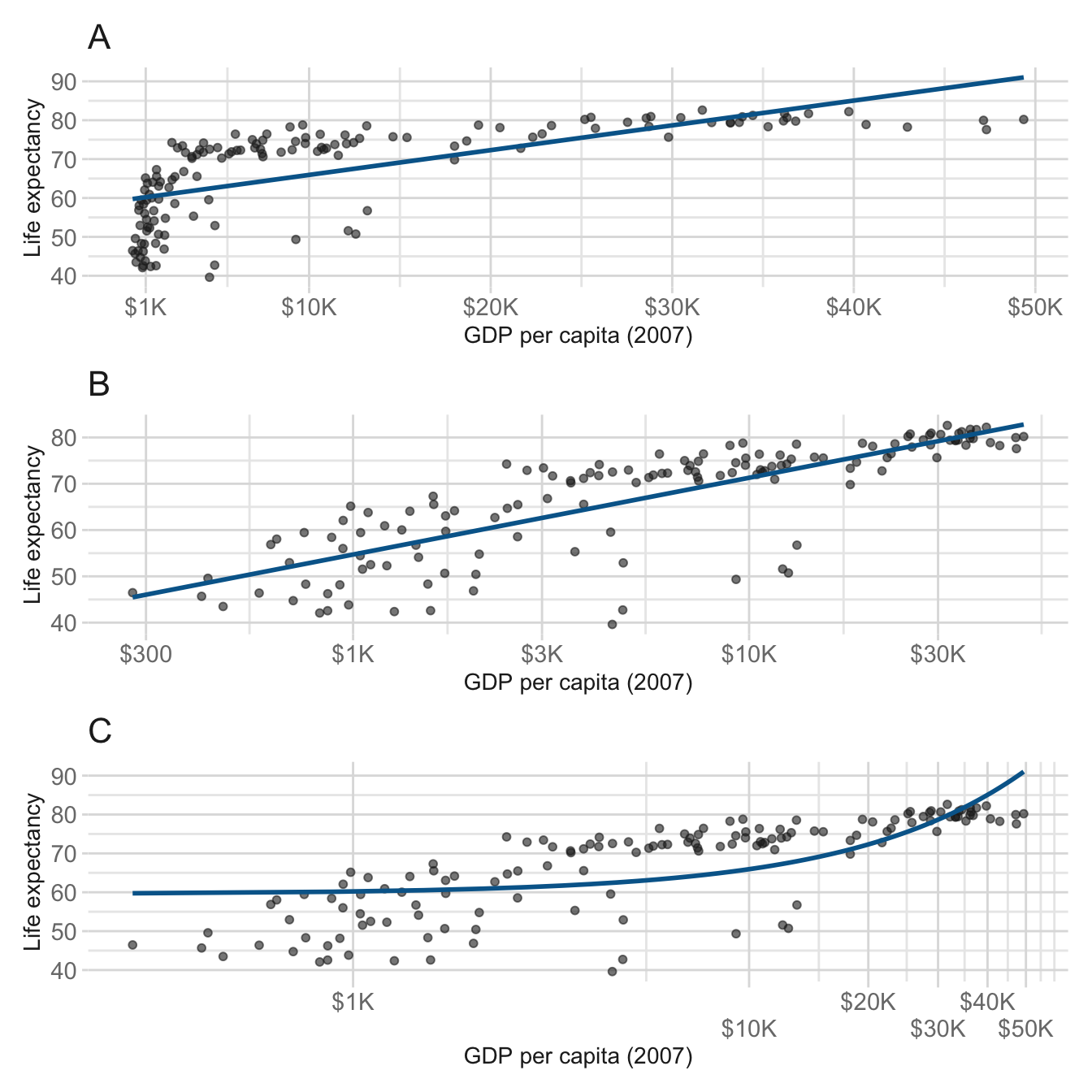
The three panels below all plot the same two variables from the same data: life expectancy against GDP per capita for every country in 2007. Each panel also has a straight-line least-squares fit (geom_smooth(method = "lm", se = FALSE)) added on top of the points.
The panels differ only in how the x-axis is handled. One uses the raw values with no transformation, one uses scale_x_log10(), and one uses coord_transform(x = "log10").
-
Identify which panel is which: raw,
scale_x_log10(), andcoord_transform(x = "log10"). Give the specific visual evidence you used for each.NoteSuggested solution- A is the raw axis. Breaks are evenly spaced ($10K, $20K, $30K…) and the points are crushed against the left edge. The fit is straight.
-
B is
scale_x_log10(). Breaks land on round log values ($300, $1K, $3K, $10K, $30K) and sit at equal distances apart, because the axis itself is in log units. The cloud is spread out and the fit is straight. -
C is
coord_transform(). The cloud is spread out just like B, but the breaks are the raw values from A and they are now unevenly spaced, bunching toward the right. The fit is visibly curved.
-
Explain the key difference between transforming an axis with a
scale_*()function and transforming it withcoord_transform(). Your answer must say when each transformation happens relative to the computation of statistics, and how that difference shows up (i) in the placement of the axis tick marks and (ii) in the fitted line.NoteSuggested solutionA scale transformation happens before the statistics are computed, whereas a coordinate transformation happens after.
{ggplot2} builds a plot in this order:
data → scale transformation → statistics → geoms → coordinate transformation → drawing
scale_x_log10()acts at step 2, so everything downstream sees log dollars and never sees raw dollars.coord_transform()acts at step 5: the statistic is computed on raw dollars, and only the finished shapes get bent onto a log ruler on the way to the page.Tick placement:
scale_x_log10()replaces the variable, so the scale also picks breaks suited to log units — round powers of ten, evenly spaced.coord_transform()leaves the scale alone, so the breaks are still the raw-dollar breaks, and the coordinate system then squeezes them, giving the uneven right-bunched ticks in C.The fitted line: in B, the model is fit to log dollars, and a straight line in log space is drawn straight. In C, the same
geom_smooth()fits raw dollars (producing the identical straight line from panel A) and then the coordinate transformation bends it. That is why C’s fit curves away from the points: it is panel A’s bad fit, redrawn on a stretched axis.
Footnotes
Students with certain SDS accommodations are permitted to use a computer.↩︎