Visualizing spatial data (I)
Notes
NoteLearning objectives
- Introduce the major components of a geospatial visualization
- Identify how to draw raster maps using {ggmap} and
get_stadiamap() - Practice generating raster maps
The anatomy of a geospatial visualization
Data visualization and cartography have been intertwined since at least 1854, when Dr. John Snow mapped cholera deaths in London’s Soho district:
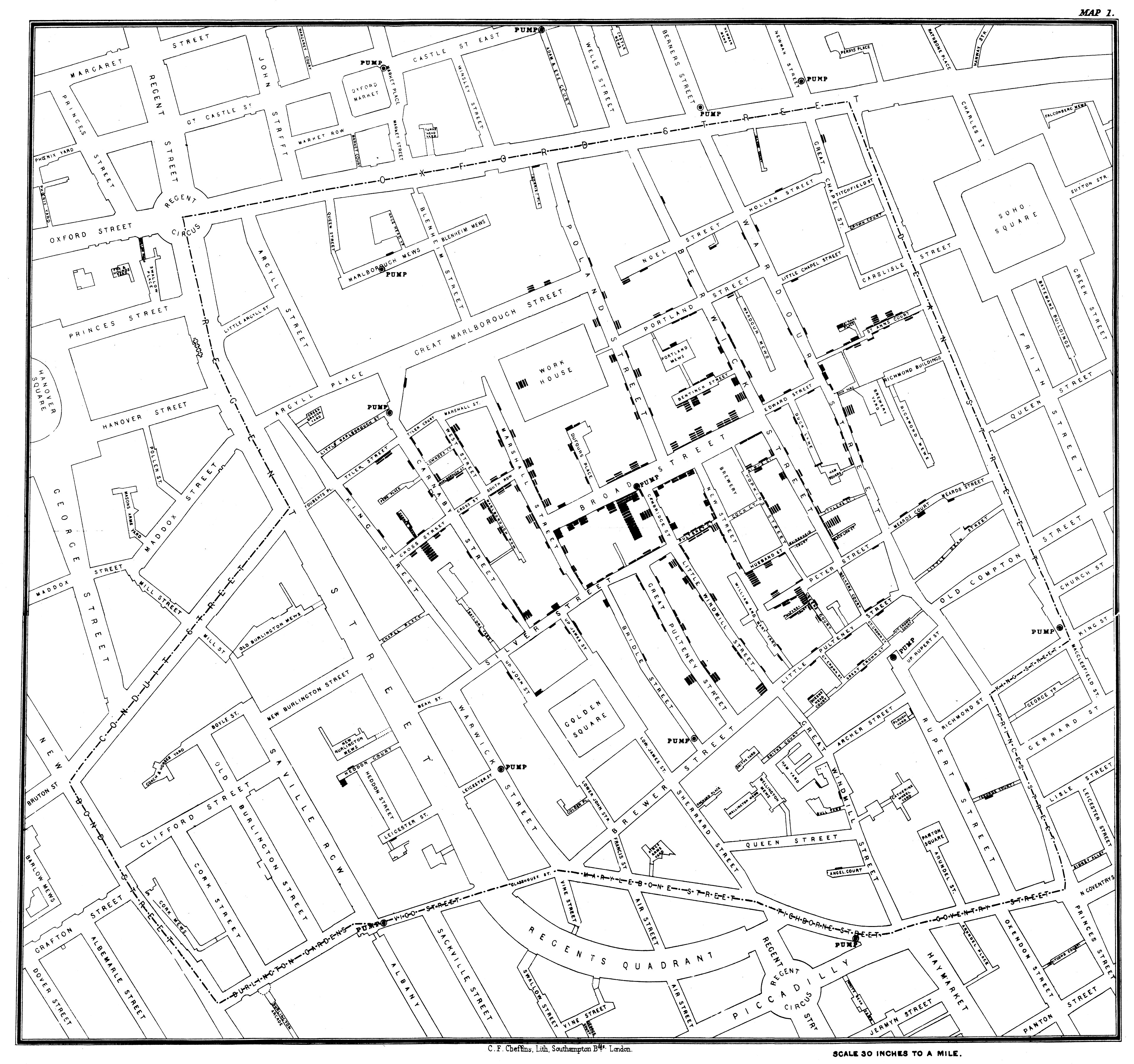
By overlaying deaths on a street grid and marking water pump locations, Snow made the spatial pattern visible: deaths clustered around a single pump on Broad Street. His map demonstrated that spatial visualization could reveal causal structure invisible in tabular data.1
Modern geospatial visualizations follow the same logic but operate at vastly larger scales and with many more data layers.
The three components of a map
Every map involves three fundamental design decisions
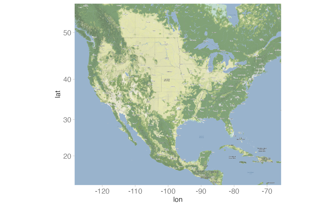
Scale
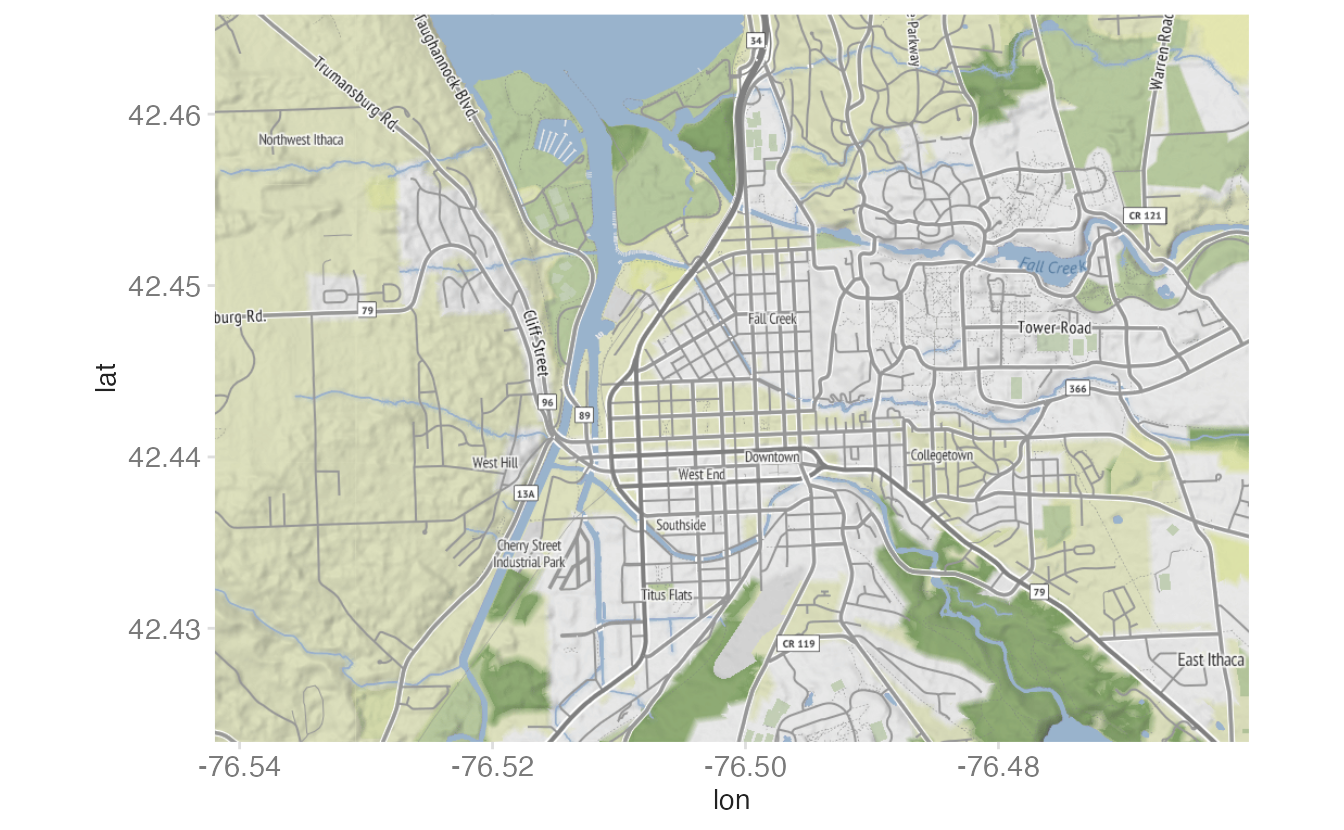
Scale is the ratio between distances on the map and distances on Earth. A large-scale map covers a small area in high detail; a small-scale map covers a large area with less detail.
Projection method
Projection methods define the transformation from the Earth’s three-dimensional surface to a two-dimensional plane. Every projection introduces some distortion in one or more of the following properties:
- Shape
- Area
- Angle
- Distance
- Direction
Consider the examples below:
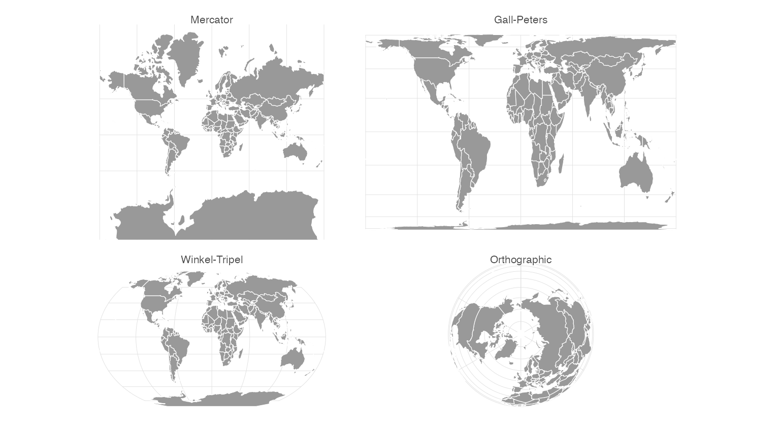
- Conformal (shape-preserving): Mercator. Famously distorts size at high latitudes — Greenland appears as large as Africa.
- Equal-area: Gall-Peters, Mollweide. Correct size relationships, but distort shape.
- Compromise: Winkel-Tripel, Robinson. Minimize overall distortion without perfectly preserving any single property. Used for world maps in major atlases.
- Azimuthal: Orthographic. Shows the globe as seen from space; no distortion at the projection center.
Symbols
Symbols are the marks used to encode data on the map.
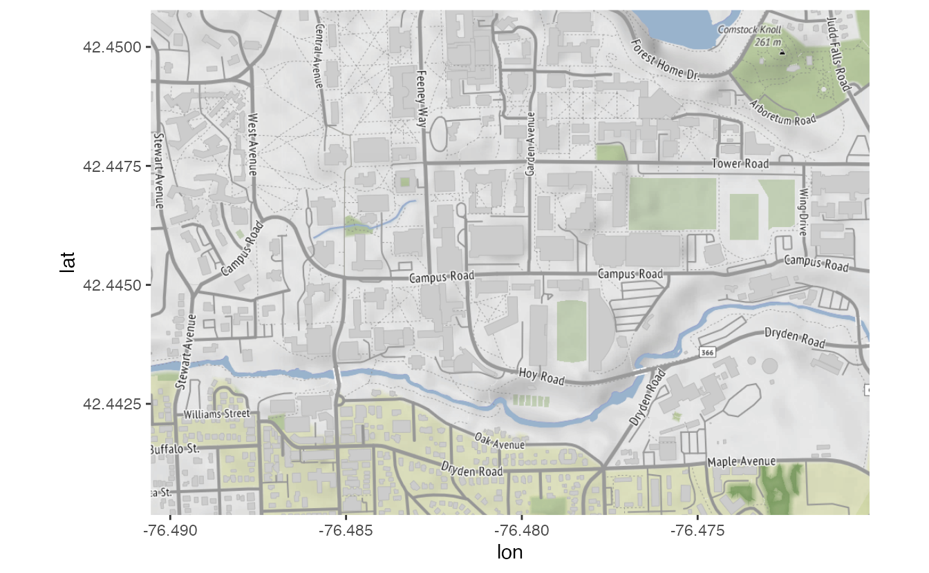
Symbols can be geometric (dots, lines, polygons), pictographic (icons), or statistical (proportional circles, choropleth fills). The choice of symbol type should match the underlying data structure.
- Point data → points
- Areal data → polygons
- Flow data → lines or arrows
Raster maps with {ggmap}
The {ggmap} package downloads pre-rendered map tiles from map tile hosting providers such as Stadia Maps and Google Maps and provides a ggmap() function that renders them as a {ggplot2} base layer. Additional data layers are added on top using standard {ggplot2} syntax.
The main advantage of raster maps is that you do not need to manage geographic boundary files. The main limitation is that you cannot easily change the visual appearance of the underlying map.
Bounding boxes
A bounding box defines the geographic extent of the map as four coordinates: left (minimum longitude), bottom (minimum latitude), right (maximum longitude), and top (maximum latitude).
library(ggmap)
nyc_bb <- c(
left = -74.263045,
bottom = 40.487652,
right = -73.675963,
top = 40.934743
)
nyc_stamen <- get_stadiamap(
bbox = nyc_bb,
zoom = 11
)
ggmap(nyc_stamen)- 1
-
get_stadiamap()fetches map tiles from Stadia Maps for the specified bounding box. The result is a raster image stored in memory. - 2
-
zoom = 11controls the level of detail. Higher values show more street-level detail; lower values show larger areas. - 3
- Initialize a {ggplot2} plot with the map raster as the base layer. The coordinate system is set to match the bounding box, so geographic coordinates will plot correctly on top.
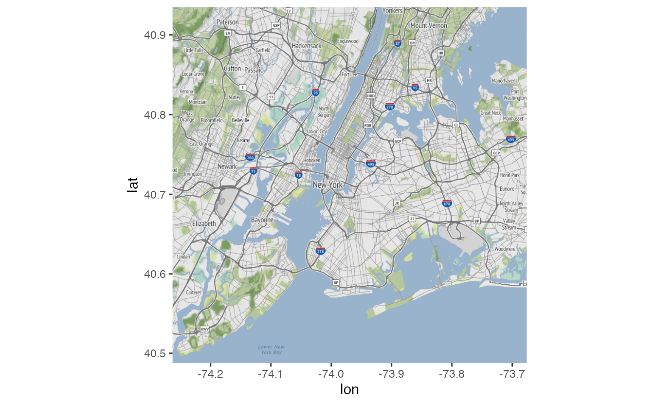
Defining bounding box coordinates
Use online tools such as bboxfinder.com to find coordinates by drawing a rectangle on a map.
Creating a map of crime in New York City
We’ll overlay crime incident data from the New York City open data portal:
crimes <- read_csv("data/nyc-crimes.csv")glimpse(crimes)Rows: 256,797
Columns: 7
$ cmplnt_num <chr> "247350382", "243724728", "246348713", "240025455", "246137143", "2…
$ boro_nm <chr> "BROOKLYN", "QUEENS", "QUEENS", "BROOKLYN", "BRONX", "BROOKLYN", "Q…
$ cmplnt_fr_dt <dttm> 1011-05-18 04:56:02, 1022-04-11 04:56:02, 1022-06-08 04:56:02, 102…
$ law_cat_cd <chr> "MISDEMEANOR", "MISDEMEANOR", "MISDEMEANOR", "FELONY", "FELONY", "F…
$ ofns_desc <chr> "CRIMINAL MISCHIEF & RELATED OF", "PETIT LARCENY", "PETIT LARCENY",…
$ latitude <dbl> 40.66904, 40.77080, 40.68766, 40.65421, 40.83448, 40.69739, 40.7349…
$ longitude <dbl> -73.90619, -73.81115, -73.83406, -73.95957, -73.85637, -73.95129, -…Point overlay with geom_point()
First let’s place points at each crime’s latitude/longitude:
ggmap(nyc_stamen) +
geom_point(
data = crimes,
mapping = aes(x = longitude, y = latitude)
)- 1
-
The
xandyaesthetics map to the geographic coordinates in the data. {ggmap} sets the plot coordinate system to match the tile extent, so longitude and latitude plot correctly.
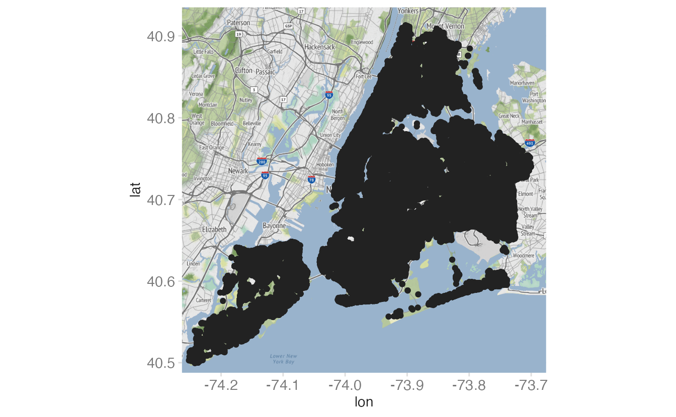
With 100,000+ points, the default size makes the map unreadable. Let’s try to reduce size and alpha:
ggmap(nyc_stamen) +
geom_point(
data = crimes,
mapping = aes(x = longitude, y = latitude),
size = 0.25,
alpha = 0.01
)- 1
-
size = 0.25shrinks each point to a small dot. - 2
-
alpha = 0.01makes each point nearly transparent; overlapping points accumulate to show density.
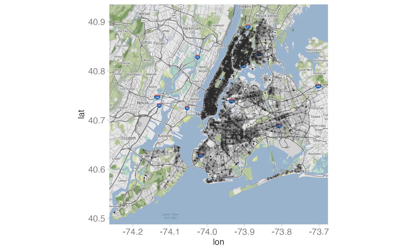
2D density estimation with stat_density_2d()
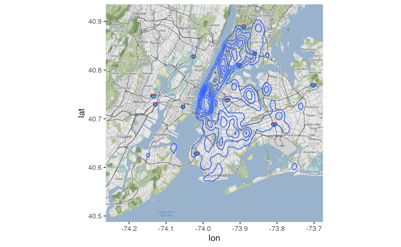
Kernel density estimation (stat_density_2d()) summarizes the point distribution into a continuous density surface:
ggmap(nyc_stamen) +
geom_density_2d(data = crimes, mapping = aes(x = longitude, y = latitude))- 1
-
geom_density_2d()draws contour lines at equal density levels. Areas surrounded by many tight contours are high-density crime locations.
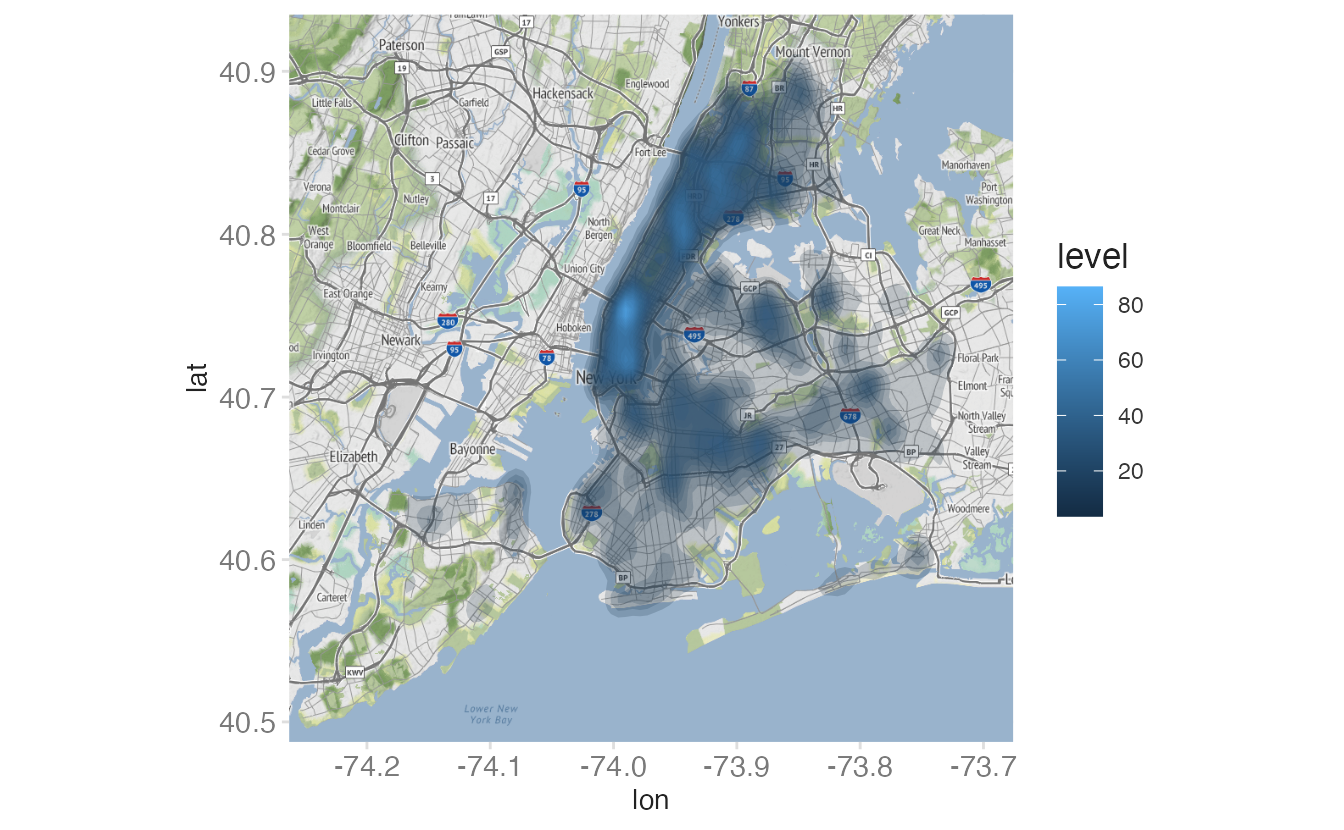
Fill the contours with color using stat_density_2d() with geom = "polygon":
ggmap(nyc_stamen) +
stat_density_2d(
data = crimes,
mapping = aes(
x = longitude,
y = latitude,
fill = after_stat(level)
),
alpha = 0.2,
bins = 25,
geom = "polygon"
)- 1
-
after_stat(level)maps fill color to the computed density level — darker colors indicate higher density. - 2
-
geom = "polygon"fills each density contour band rather than drawing just the contour lines.
Faceting by crime type
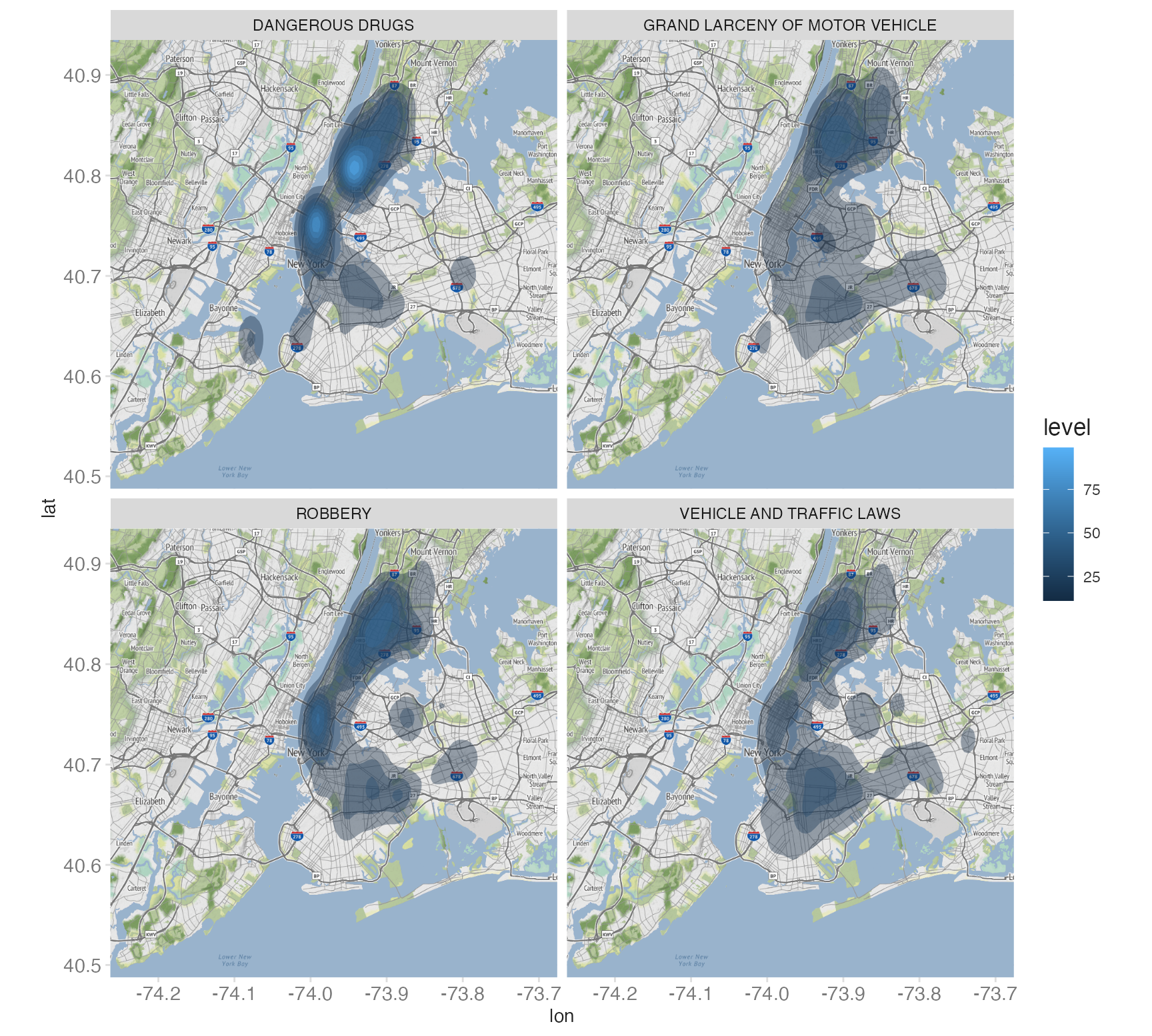
Since the resulting object is a {ggplot2} object, we can do anything to the plot object that we would to a standard ggplot() object. For example, let’s combine it with facet_wrap() to compare spatial patterns across crime categories:
ggmap(nyc_stamen) +
stat_density_2d(
data = crimes |>
filter(
ofns_desc %in%
c(
"DANGEROUS DRUGS",
"GRAND LARCENY OF MOTOR VEHICLE",
"ROBBERY",
"VEHICLE AND TRAFFIC LAWS"
)
),
aes(x = longitude, y = latitude, fill = after_stat(level)),
alpha = 0.4,
bins = 10,
geom = "polygon"
) +
facet_wrap(facets = vars(ofns_desc))- 1
-
facet_wrap(vars(ofns_desc))creates one panel per crime type. Each panel uses the same NYC base map. Drug crimes cluster in Midtown and Harlem; motor vehicle theft is more dispersed.
Geofaceting with {geofacet}
A cartogram is a map that uses geographic position as an organizing principle but replaces standard geographic shapes with chart panels. The {geofacet} package implements this with facet_geo(), a drop-in replacement for facet_wrap() that arranges panels in a grid that approximates the geographic layout of US states.
Data
We’ll use weekly excess death estimates from the CDC, measuring deaths attributable to COVID-19:
excess_deaths <- read_csv("data/Excess_Deaths_Associated_with_COVID-19.csv")excess_deaths <- excess_deaths_raw |>
clean_names() |>
filter(type == "Predicted (weighted)") |>
mutate(outcome = if_else(outcome == "All causes", "all", "no_covid")) |>
select(week_ending_date, state, outcome, percent_excess_estimate) |>
pivot_wider(names_from = outcome, values_from = percent_excess_estimate) |>
mutate(excess_covid = all - no_covid) |>
filter(between(
week_ending_date,
as.Date("2020-01-01"),
as.Date("2022-12-31")
))
glimpse(excess_deaths)Rows: 8,478
Columns: 5
$ week_ending_date <date> 2020-01-04, 2020-01-11, 2020-01-18, 2020-01-25, 2020-02-01, 20…
$ state <chr> "Alabama", "Alabama", "Alabama", "Alabama", "Alabama", "Alabama…
$ all <dbl> 0.0000000, 0.5354003, 0.0000000, 0.0000000, 0.0000000, 0.448622…
$ no_covid <dbl> 0.0000000, 0.5354003, 0.0000000, 0.0000000, 0.0000000, 0.448622…
$ excess_covid <dbl> 0.00000000, 0.00000000, 0.00000000, 0.00000000, 0.00000000, 0.0…Standard facet vs. geofacet
A standard facet_wrap() arranges panels alphabetically:
ggplot(
  data = excess_deaths,
  mapping = aes(x = week_ending_date, y = excess_covid, group = state)
) +
  geom_area() +
  facet_wrap(facets = vars(state))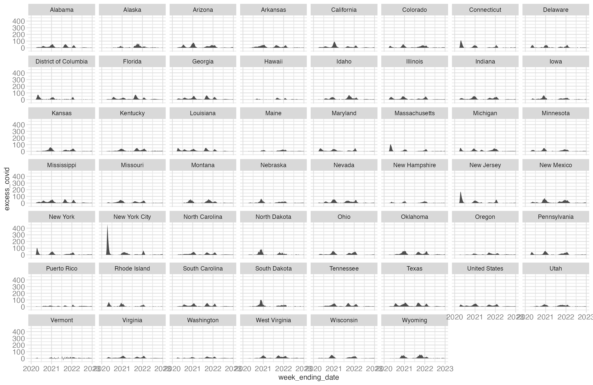
This is not ideal for geographically defined regions such as US states.2 Replacing facet_wrap() with facet_geo() arranges the same panels in a geographic grid:
ggplot(
data = excess_deaths,
mapping = aes(x = week_ending_date, y = excess_covid, group = state)
) +
geom_area() +
facet_geo(facets = vars(state)) +
labs(
x = NULL,
y = NULL,
title = "Excess deaths associated with COVID-19",
subtitle = "Percentage of deaths estimated to be related to COVID-19",
caption = "Source: CDC"
)- 1
-
facet_geo()from {geofacet} uses the same syntax asfacet_wrap(). Thestatecolumn must contain either standard state abbreviations or full state names for the grid to position correctly.
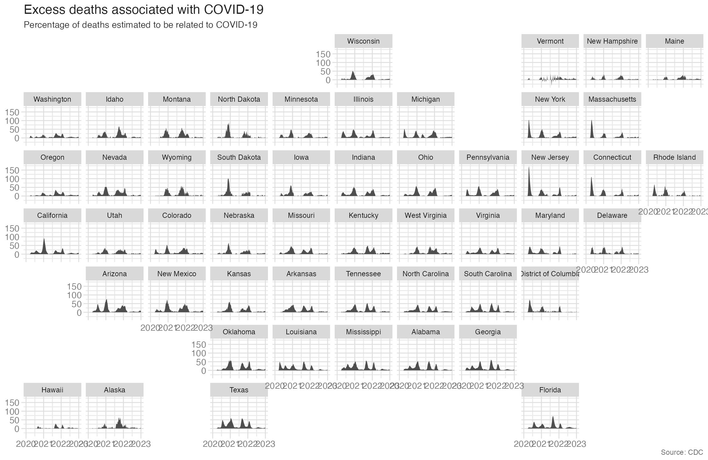
The geographic arrangement makes regional patterns visible that alphabetical ordering obscures — the Southeast shows higher and earlier peaks than the Northeast.
Adding election context
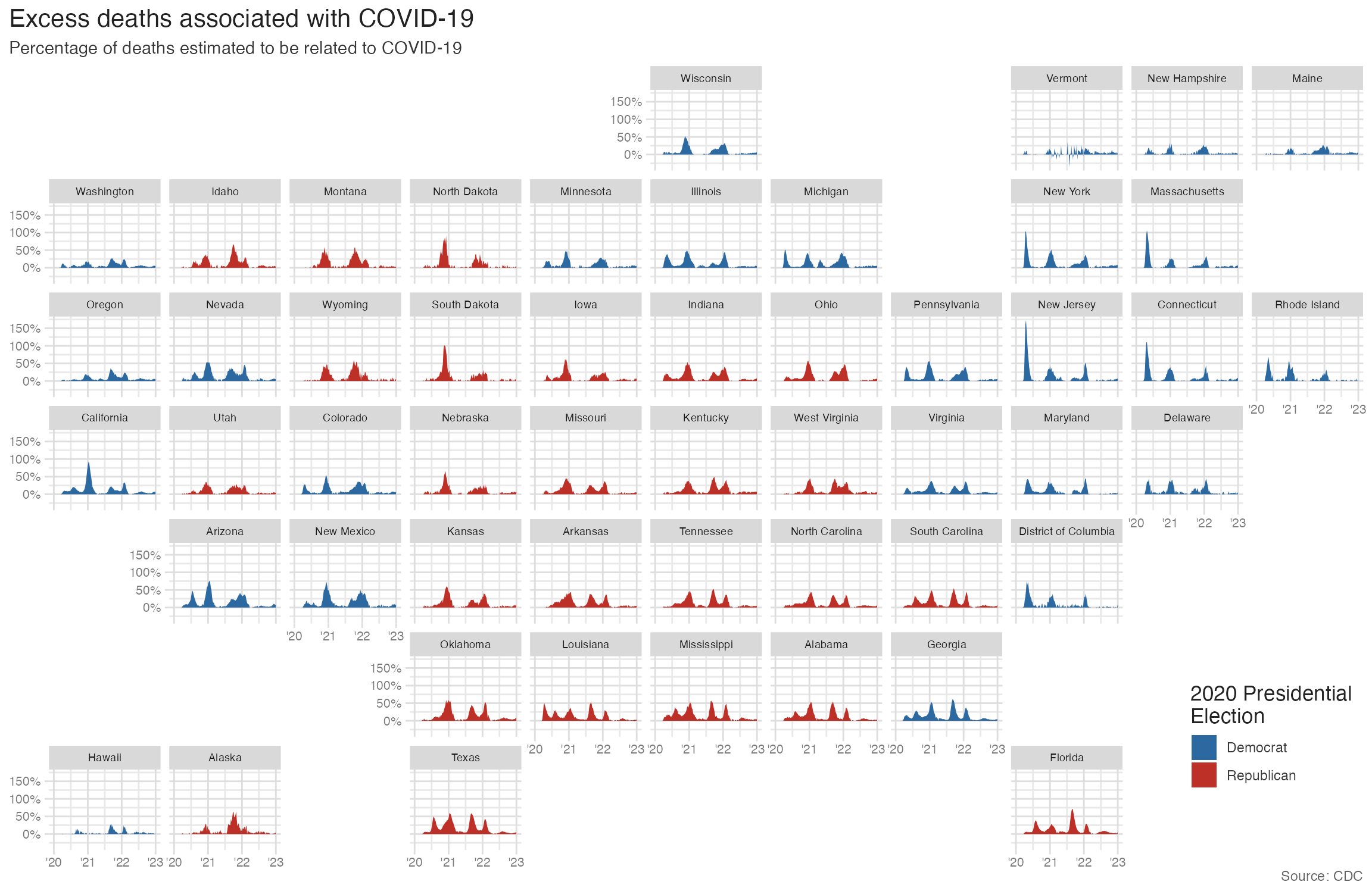
Color the area fills by 2020 presidential election result to add political context:
election_2020 <- read_csv("data/us-election-2020.csv")excess_deaths |>
left_join(y = election_2020) |>
ggplot(mapping = aes(x = week_ending_date, y = excess_covid)) +
geom_area(mapping = aes(fill = win)) +
facet_geo(facets = vars(state)) +
scale_y_continuous(labels = label_percent(scale = 1)) +
scale_x_date(
breaks = as.Date(c("2020-01-01", "2021-01-01", "2022-01-01", "2023-01-01")),
labels = c("'20", "'21", "'22", "'23")
) +
scale_fill_manual(
values = c("#2D69A1", "#BD3028"),
guide = guide_legend(position = "inside")
) +
labs(
x = NULL,
y = NULL,
title = "Excess deaths associated with COVID-19",
subtitle = "Percentage of deaths estimated to be related to COVID-19",
caption = "Source: CDC",
fill = "2020 Presidential\nElection"
) +
theme(
strip.text.x = element_text(size = 7),
axis.text = element_text(size = 8),
plot.title.position = "plot",
legend.position.inside = c(0.93, 0.15)
)- 1
-
left_join(election_2020)adds thewincolumn (the 2020 presidential election winner for each state) to the excess deaths data. - 2
-
Mapping
wintofillcolors each state’s area by election outcome. - 3
- Manual blue/red values match the conventional party colors for US political maps.
Summary
- Geospatial visualizations have three fundamental components: scale, projection, and symbols — each shapes how geographic patterns are perceived
- Every map projection introduces distortion; choose a projection that preserves the property most important for your story (area, shape, or compromise)
- {ggmap} provides raster map tiles via
get_stadiamap(), then standard {ggplot2} layers (points, density) can be added on top - Use
sizeandalphato make large point datasets readable;stat_density_2d()summarizes spatial point density into a continuous surface - {geofacet}’s
facet_geo()arranges small multiples in a geographic grid, preserving spatial structure while enabling comparisons across regions
Acknowledgements
Material derived in part from Data Visualization with R and STA 313: Advanced Data Visualization.
Footnotes
Suggested reading: a great children’s book on the topic↩︎
Also notice that not all the regions in the dataset are actually states - for example, New York City is tracked separately in addition to the state of New York.↩︎