gapminder_2000s <- gapminder |>
  filter(year > 2000)

p <- ggplot(
  data = gapminder_2000s,
  mapping = aes(x = gdpPercap, y = lifeExp, color = continent, size = pop)
) +
  geom_point(alpha = 0.7) +
  scale_x_log10(labels = label_currency(scale_cut = cut_short_scale())) +
  scale_size_continuous(labels = label_comma()) +
  scale_color_discrete_qualitative(palette = "Dark 3") +
  facet_wrap(vars(year)) +
  labs(
    x = "GDP per capita",
    y = "Life expectancy",
    color = "Continent",
    size = "Population",
    title = "Wealth and health across continents",
    subtitle = "2002 and 2007",
    caption = "Source: The Gapminder Project"
)Deep dive: themes
Notes
NoteLearning objectives
- Define {ggplot2} themes and their component elements
- Apply complete and extension themes to plots
- Customize individual theme elements using
element_*()functions - Build a reusable custom theme function
- Configure custom fonts using {ragg} and {systemfonts}
TipSupplemental readings
What is a theme?
A theme is a collection of visual settings that control every non-data element of a plot: text sizes and fonts, background colors, grid line weights, legend positions, axis tick lengths, and more. Themes do not change what data is encoded or how it is mapped to aesthetics — they only change how the plot looks.
{ggplot2} ships with eight complete themes that set all elements at once. You can then layer additional theme() calls on top to tweak individual elements.
Complete themes
Let’s build a base plot to use throughout this section:
The eight built-in complete themes:
p + theme_grey()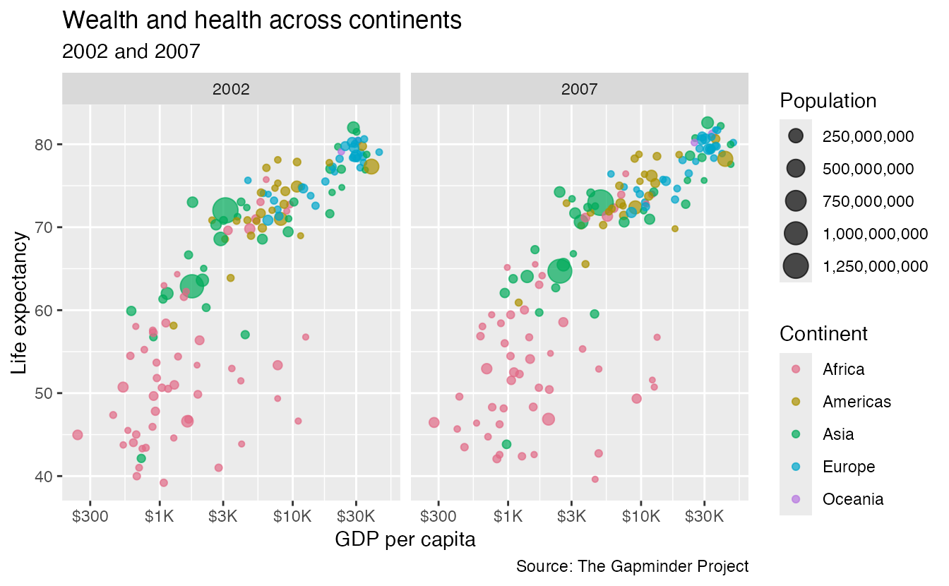
p + theme_bw()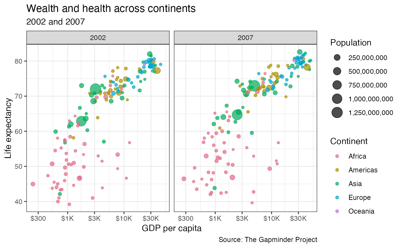
p + theme_linedraw()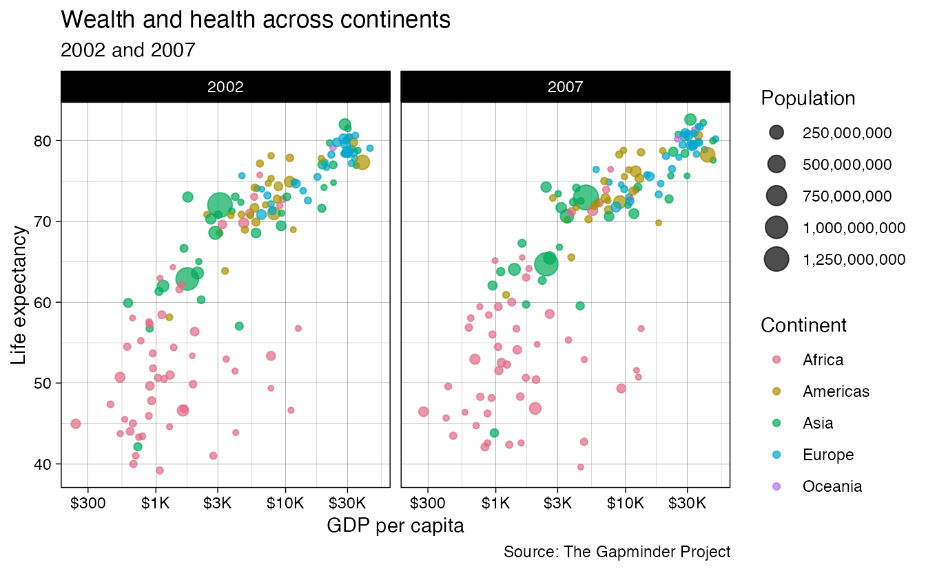
p + theme_light()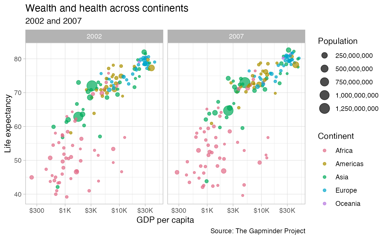
p + theme_dark()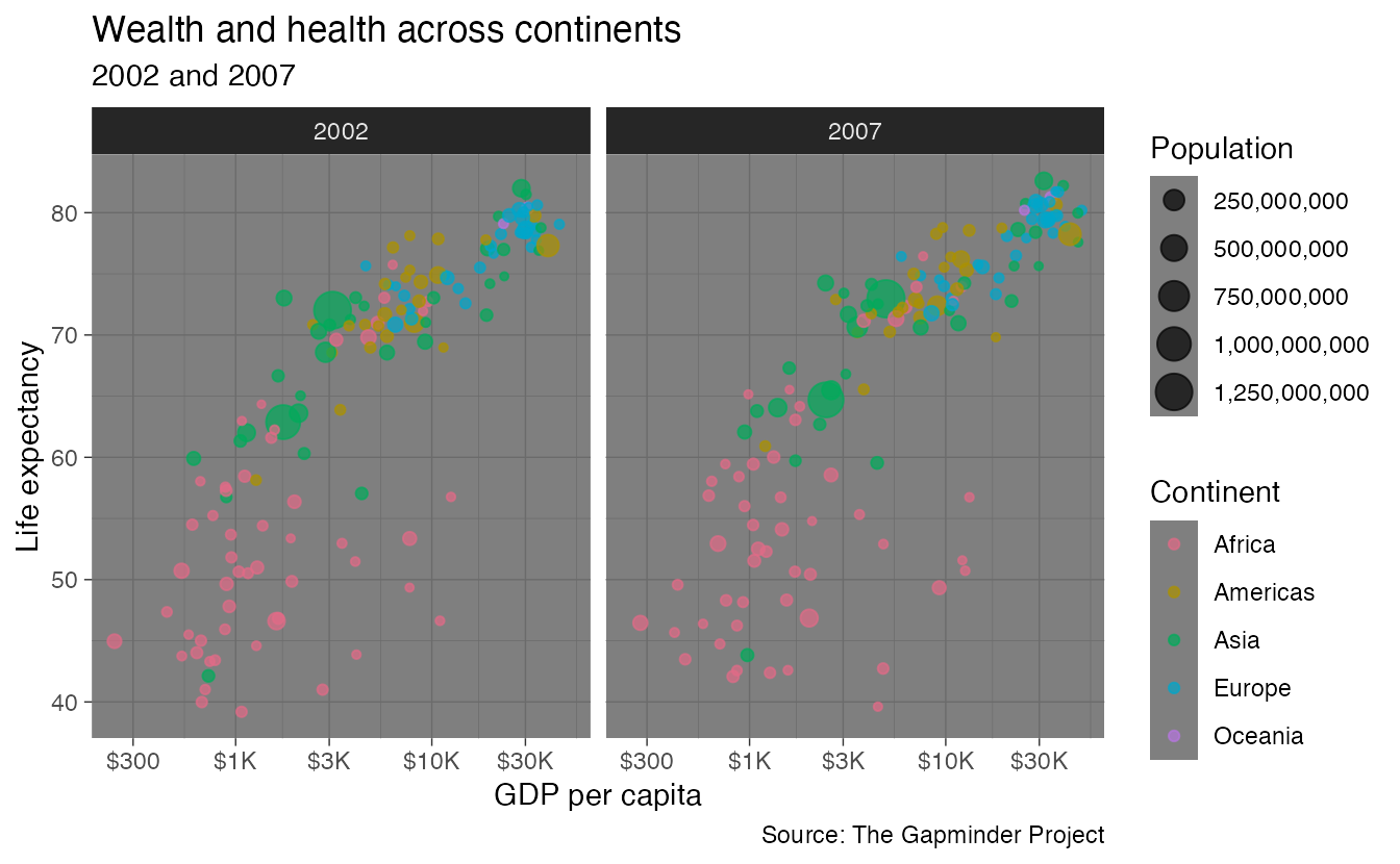
p + theme_minimal()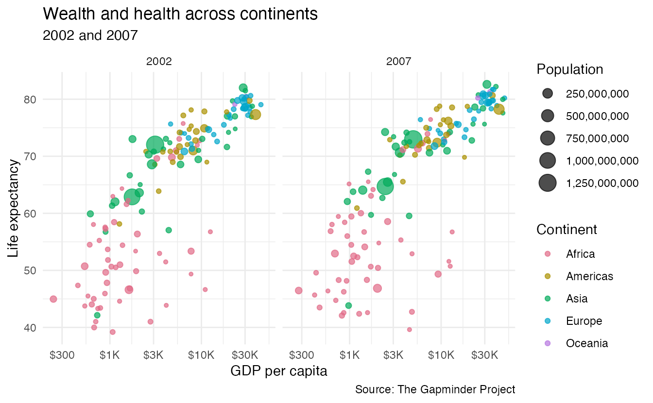
p + theme_classic()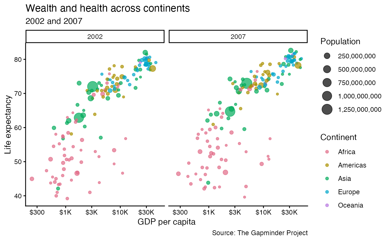
p + theme_void()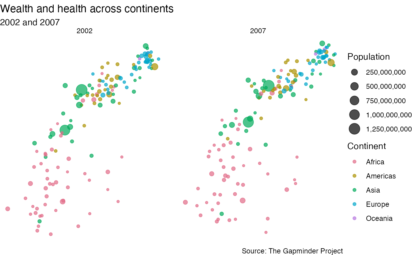
Extension themes
The {ggthemes} package provides themes modeled after specific publication styles:
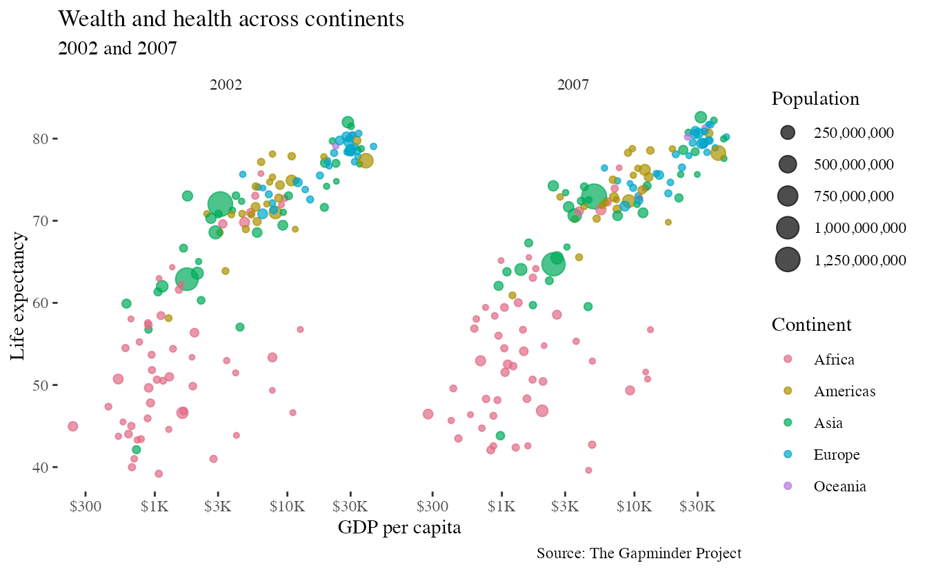
p + theme_tufte()- 1
-
theme_tufte()from {ggthemes} strips all non-data ink. No background, no grid lines — maximizing the data-to-ink ratio in the spirit of Edward Tufte.
p +
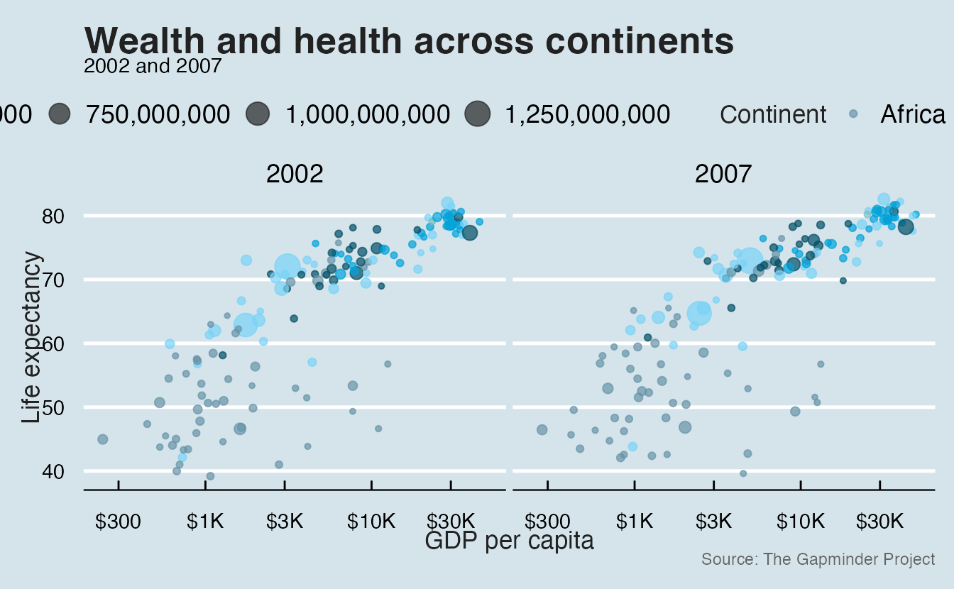
theme_economist() +
scale_color_economist()- 1
-
theme_economist()replicates the visual style of The Economist. - 2
-
scale_color_economist()incorporates a corresponding color scale.
Many other extension theme packages exist for specific aesthetics (e.g. {tvthemes}) or integrate {ggplot2} themes into a larger brand (e.g. {thematic}, {brand.yml}).
Tweaking complete themes
Every complete theme accepts base_size and base_family arguments that scale all text and switch the font uniformly:
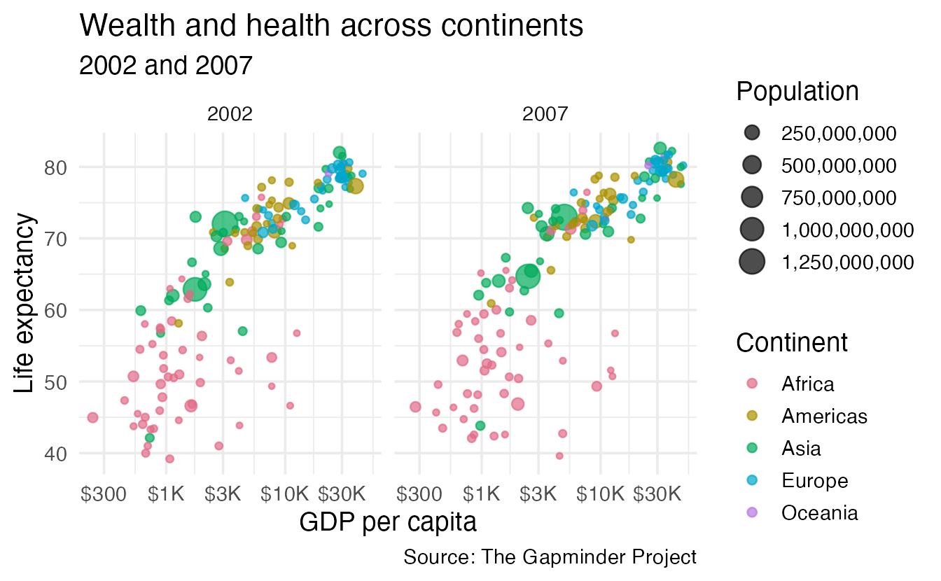
p + theme_minimal(base_size = 14)- 1
-
base_size = 14scales all text elements proportionally. The default is 11. Use larger sizes for presentations, smaller for dense reports.
p +
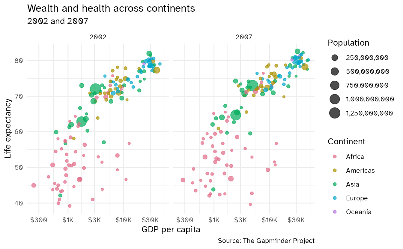
theme_minimal(base_family = "Atkinson Hyperlegible")- 1
-
base_familysets the font for all text. The font must be installed on the system (or downloaded withsystemfonts::require_font()).
Since {ggplot2} 4.0, complete themes also accept ink, paper, and accent arguments to change the color palette of the whole theme in one call:
p +
aes(shape = NULL, color = NULL) +
geom_smooth(method = "lm", se = FALSE) +
theme_bw(
ink = "#BBBBBB",
paper = "#333333",
accent = "#B31B1B"
)- 1
-
inkcontrols text and axis colors. - 2
-
papercontrols background colors. - 3
-
accentcontrols highlight colors like fitted lines.
`geom_smooth()` using formula = 'y ~ x'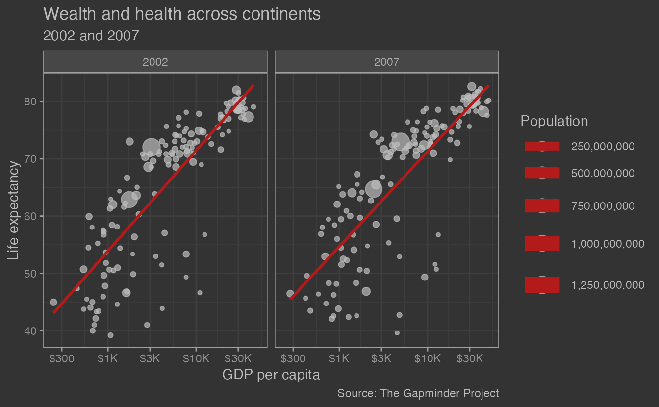
NoteExpressing color values in R
In R, colors can be expressed either by name (e.g., "red", "steelblue") or by hexadecimal code (e.g., "#FF0000" for red). Hex codes are more precise and allow for a wider range of colors, while named colors are more convenient for common hues. You can find many tools online for helping to choose and convert colors.
The anatomy of theme()
The components of the {ggplot2} theme system. Select an element to see its thematic component. Source: {ggplot2 styling}
theme() is the function that lets you modify individual theme elements. It has 147 arguments — one for almost every visual element of the plot. You don’t need to memorize all of them; you learn them as you need them.
The key organization principle: theme elements follow a hierarchy of specificity. More specific names override less specific ones:
axis.text— controls all axis textaxis.text.x— controls x-axis text onlyaxis.text.x.bottom— controls the bottom x-axis text only
Element types
Each theme argument takes one of five special element_*() functions:
| Function | Controls |
|---|---|
element_text() |
Text elements (size, font, color, angle, hjust, vjust, face) |
element_line() |
Line elements (color, linewidth, linetype) |
element_rect() |
Rectangle/background elements (fill, color, linewidth) |
element_geom() |
Default properties of geom layers |
element_blank() |
Removes the element entirely |
Common modifications
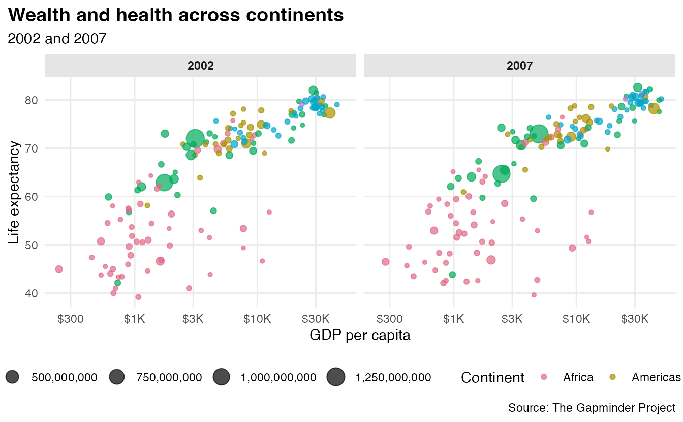
Here is a before/after showing several common tweaks applied at once:
p + theme_minimal()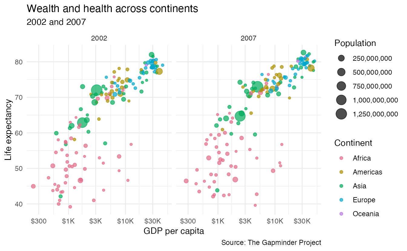
p +
theme_minimal() +
theme(
plot.title = element_text(face = "bold", size = rel(1.3)),
plot.title.position = "plot",
panel.grid.minor = element_blank(),
legend.position = "bottom",
legend.box = "vertical",
strip.background = element_rect(fill = "grey90", color = NA),
strip.text = element_text(face = "bold")
)- 1
- Bold, larger title.
- 2
-
"plot"aligns the title to the full plot width;"panel"(default) aligns to the panel area. - 3
- Remove minor grid lines for a less cluttered background.
- 4
- Move legend to the bottom to free horizontal space.
- 5
- Arrange the two legend guides vertically so they can both be read.
- 6
- Light grey facet label background.
- 7
- Bold facet label text.
Building a custom theme function
When you need the same set of tweaks across many plots, wrap everything in a function. This is how you maintain a consistent “house style” across a report or presentation.
NoteUse
theme_sub_*() functions for organization
theme_sub_*() functions serves as a shortcut for theme() with shorter argument names. Besides the shorter arguments, it also helps in keeping theme declarations more organized.
theme_pretty <- function(
base_family = "Atkinson Hyperlegible",
base_size = 11,
ink = "#222222", # Cornell dark gray
paper = "#FFFFFF",
accent = "#B31B1B", # Carnelian
...
) {
theme_minimal(
base_family = base_family,
base_size = base_size,
ink = ink,
paper = paper,
accent = accent,
...
) +
theme_sub_panel(
grid.minor = element_blank(),
border = element_rect(color = "grey90", fill = NA)
) +
theme_sub_plot(
title = element_text(face = "bold", size = rel(1.3)),
subtitle = element_text(color = "grey50", size = rel(1.1)),
caption = element_text(
face = "italic",
color = "grey60",
size = rel(0.8),
hjust = 0
)
) +
theme_sub_legend(title = element_text(face = "bold")) +
theme_sub_strip(
text = element_text(face = "bold", size = rel(1.05), hjust = 0),
background = element_rect(fill = "grey90", color = NA)
)
}- 1
-
Start from
theme_minimal(), passing through theink/paper/accentpalette arguments. - 2
-
theme_sub_panel()tweaks panel-level elements: remove minor gridlines, add a subtle border around each facet panel. - 3
-
theme_sub_plot()adjusts plot-wide text: larger bold title, muted subtitle, italicized left-aligned caption. - 4
-
theme_sub_legend()makes legend titles bold. - 5
-
theme_sub_strip()styles facet strip labels: bold, left-aligned, grey background.
We can now apply the custom theme to the Gapminder plot:
p + theme_pretty()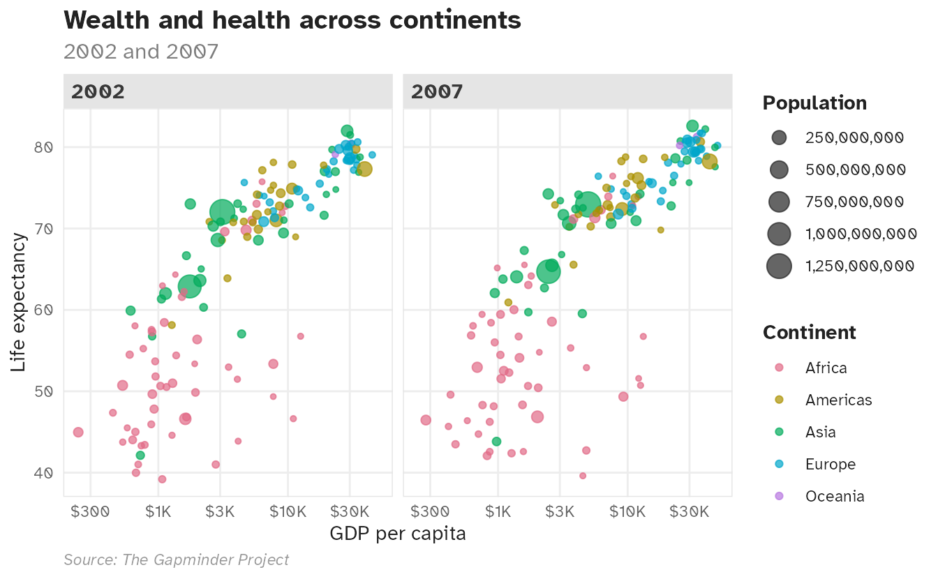
And to a plot for an entirely different dataset — a custom theme should work consistently across different chart types and data:
ggplot(
  data = drop_na(penguins, sex),
  mapping = aes(x = bill_len, y = body_mass, color = str_to_title(sex))
) +
  geom_point(size = 2.5, alpha = 0.6) +
  scale_color_discrete_qualitative(palette = "Dark 3") +
  scale_y_continuous(labels = label_comma()) +
  facet_wrap(vars(species)) +
  labs(
    x = "Bill length (mm)",
    y = "Body mass (g)",
    color = "Sex",
    title = "Gentoo penguins are the largest",
    subtitle = "Females are typically smaller than males",
    caption = "Source: Palmer Station LTER"
  ) +
  theme_pretty()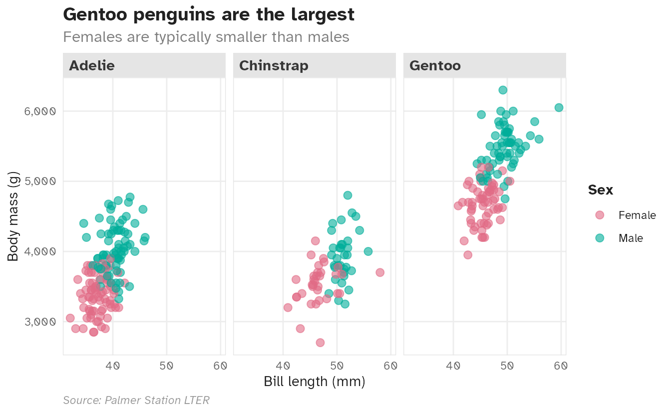
Setting a theme globally
Once you have a custom theme, use theme_set() to apply it to every subsequent plot in the session — no need to add + theme_pretty() to each one:
theme_set(theme_pretty())Custom fonts
Rendering custom fonts has historically been inconsistent in R because it involves four separate systems: R, the operating system, the text rendering engine, and the graphics device. Modern {ggplot2} workflows have simplified this considerably.
{ragg}: a consistent graphics device
The {ragg} package provides a fast, consistent graphics device that handles system fonts reliably. It is used by default in ggsave() as of {ggplot2} 3.3.4.
In Quarto, use {ragg} via the dev chunk option. Add this to your document’s YAML:
knitr:
  opts_chunk:
    dev: ragg_png
Installing fonts
To use a font:
- Install it on your system (download from Google Fonts, etc.)
- {ragg} and {systemfonts} will detect it automatically
If you cannot install fonts directly (e.g., on a shared server), {systemfonts} provides require_font() to download from Google Fonts at render time:
library(systemfonts)
require_font("Roboto Slab")- 1
-
Downloads
Roboto Slabfrom Google Fonts if not already installed, making it available for the current R session.
Summary
- A theme controls all non-data visual elements of a {ggplot2} plot
- {ggplot2} ships with eight complete themes; {ggthemes} and other packages add more
- Adjust all theme text and font at once via
base_size,base_family, and theink/paper/accentarguments to complete themes theme()withelement_text(),element_line(),element_rect(), andelement_blank()targets individual elements- Wrap a set of theme calls into a custom theme function for consistent styling across a project
- Use {ragg} (
dev: ragg_png) as the graphics device to enable reliable custom font rendering
Acknowledgements
- Material derived in part from STA 313: Advanced Data Visualization and Data Visualization with R.
- Font installation and management drawn from An excellent tutorial to get started with {ragg} for custom fonts