Raster maps provide a photographic background but give no access to the underlying geography. For complete control over the geographic elements of your geospatial visualization, you need the geographic boundaries as vector data: a file of coordinates and attributes.
Two formats are common:
Shapefile: A collection of files (.shp, .dbf, .prj) where .shp stores the geometry coordinates, .dbf stores attribute data, and .prj stores the projection. Shapefiles cannot be a single file — they are always a folder.
GeoJSON: A plain-text format using JSON notation. A single .geojson file contains both geometry and attributes. Easier to share and version-control; widely supported. For large or complex geometries, file size may become an issue since you cannot easily compress GeoJSON.
The {sf} package
Simple features
A feature is simply a thing or object that exists in the real world. A simple feature is a standardized way to represent geographic features as geometric shapes (points, lines, polygons) with associated attributes. The simple features standard defines how to encode spatial data in a consistent way across different software and formats.
The {sf} package represents geographic data as simple features in R. Simple features are stored as a data frame with a special geometry list column that holds the spatial coordinates.
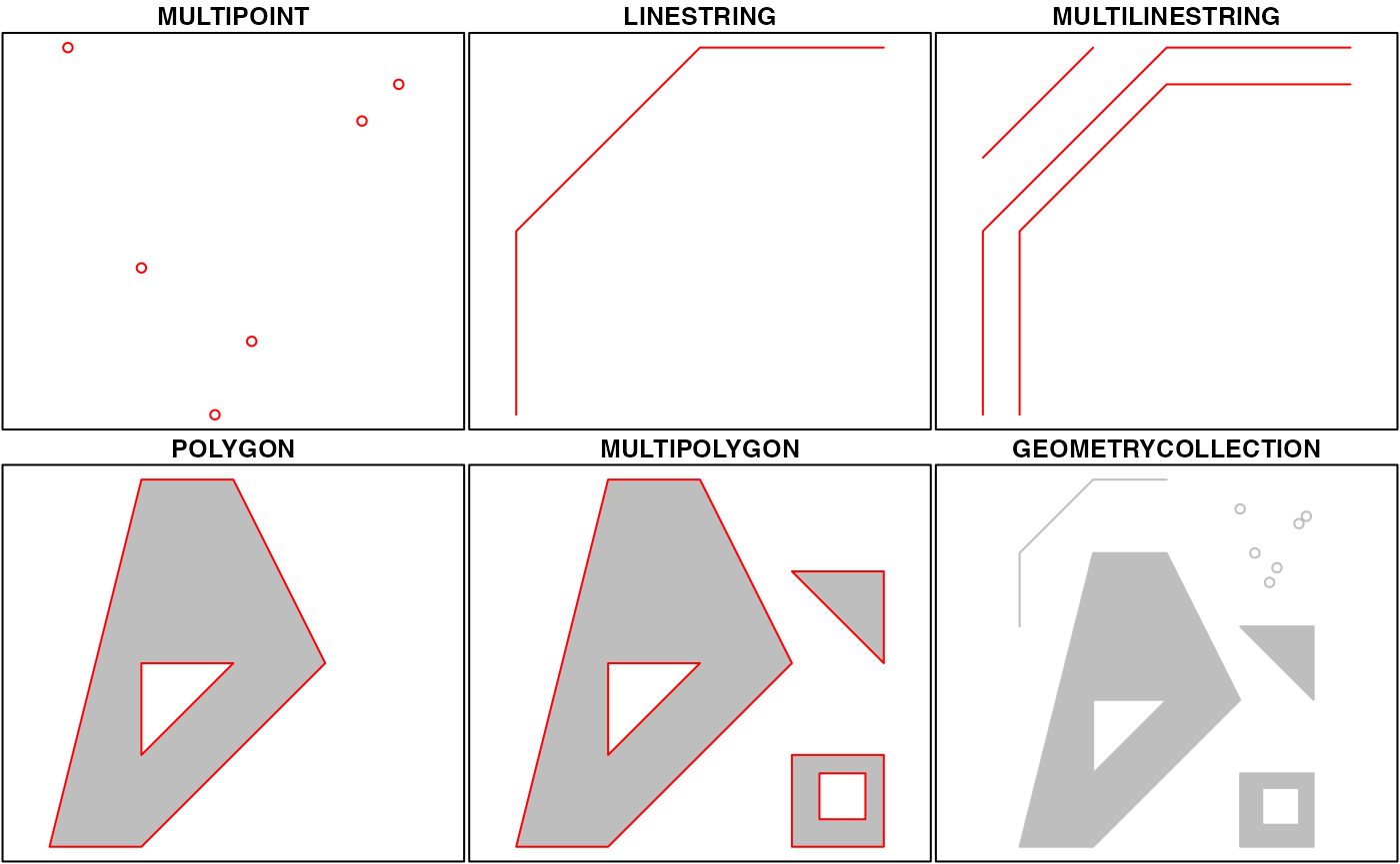
Features can be defined as one of several geometry types. The simplest1 are points, lines, and polygons, but can contain multiple geometries (e.g. a state with multiple islands) or even mixed geometry types in the same object.
The geometry column is sticky: it stays attached to the data frame even when you filter(), mutate(), or select() other columns. Standard {dplyr} verbs work on {sf} objects.
Importing spatial data
st_read() imports shapefiles, GeoJSON, and many other spatial formats:
The sf object prints like a regular data frame, but with a header showing the geometry type, CRS (coordinate reference system), and bounding box.
Visualizing sf objects with geom_sf()
The key function for mapping {sf} objects is geom_sf(). It reads the geometry column automatically — no x or y aesthetic mapping is needed.
US state boundaries from {tigris}
The {tigris} package provides US Census geographic boundaries (states, counties, congressional districts, and more) as {sf} objects:
usa <-states(cb =TRUE)
1
cb = TRUE downloads a more detailed cartographic boundary file. If you get the simplest version, the resulting map will look very blocky.
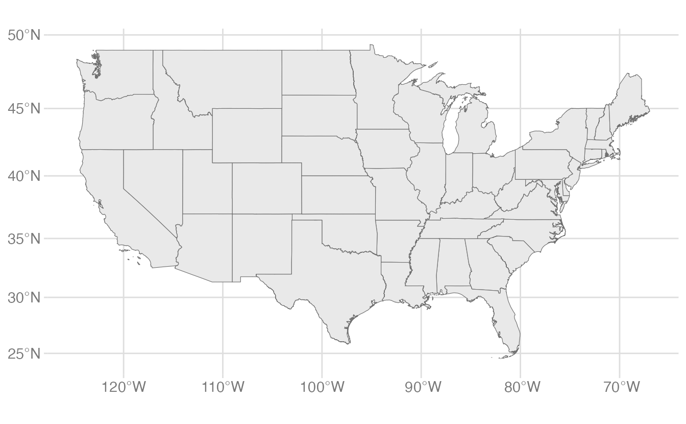
ggplot(data = usa) +geom_sf()
1
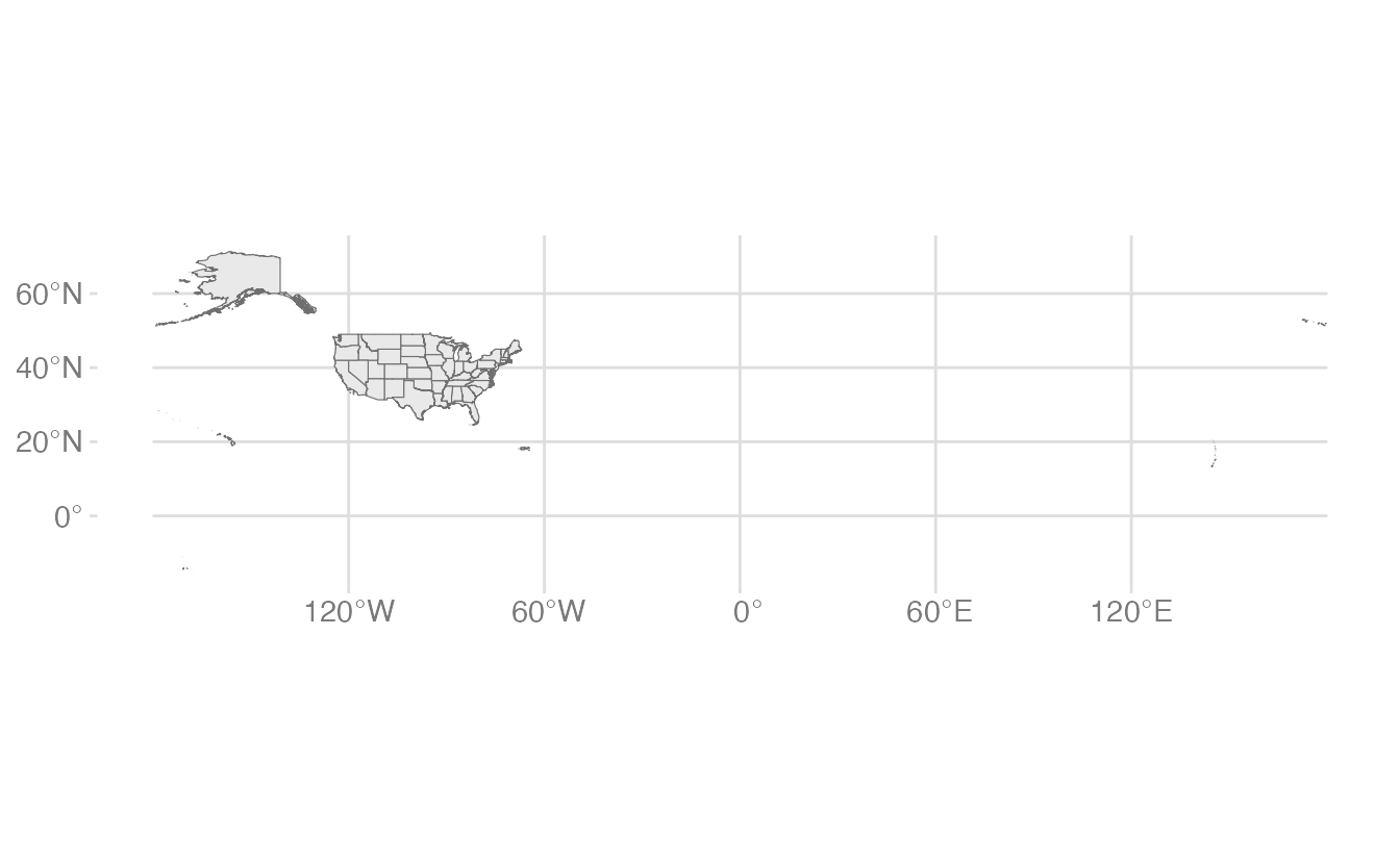
geom_sf() with no aesthetic mappings draws the geometry. For polygon features, it fills with the default gray and draws the boundary with a thin black line.
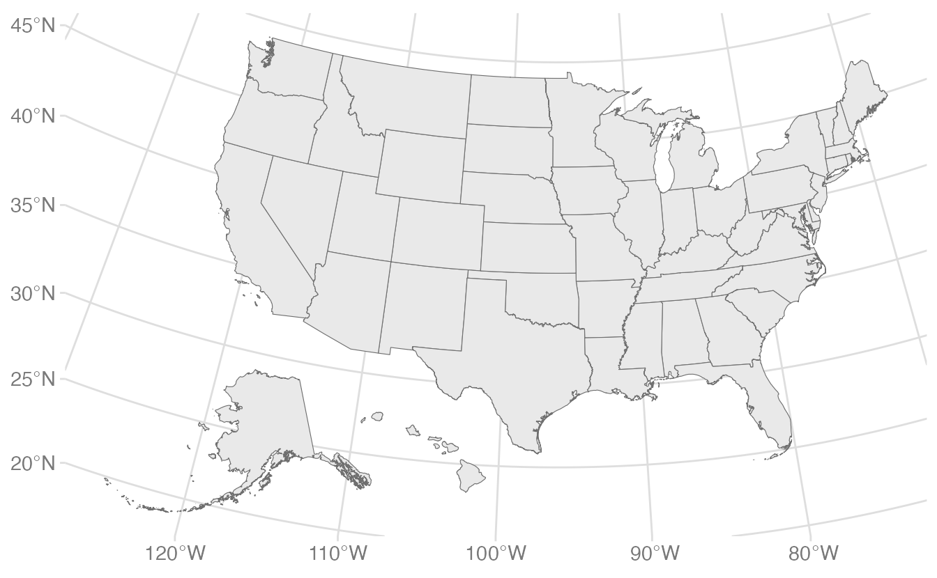
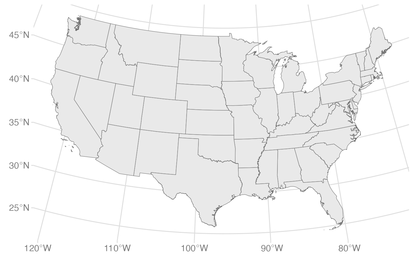
Notice the resulting graph does not look like a typical US map. The default plot extent is the bounding box of all the geometries. This includes Alaska and Hawaii far to the west and south of the contiguous states (in fact, the tail-end of the Aleutian Islands is actually located in the Eastern Hemisphere). It also includes all U.S. territories. This makes the map look stretched out and hard to read.
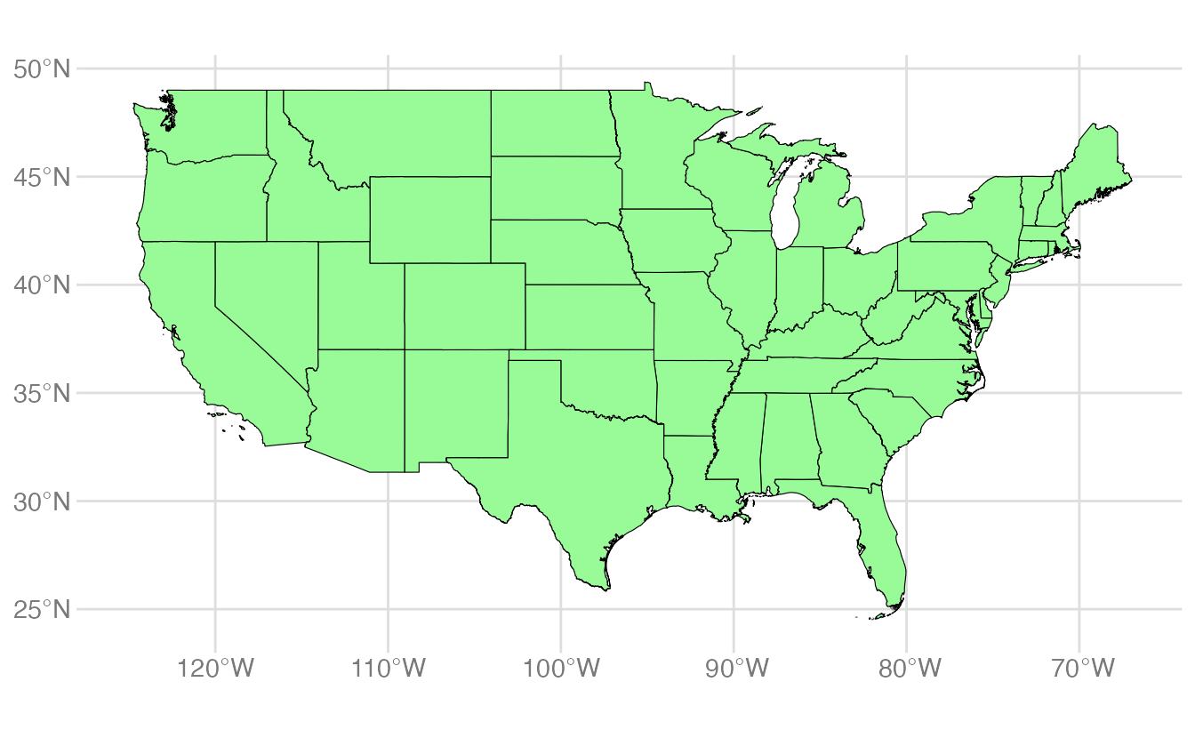
A conventional (albeit overly simplistic) solution is to filter out Alaska and Hawaii along with the U.S. territories and just plot the “lower 48” states:
usa_48 <- usa |>filter(NAME %in% state.name) |>filter(NAME !="Alaska", NAME !="Hawaii")ggplot(data = usa_48) +geom_sf(fill ="palegreen", color ="black")
1
state.name is a built-in R vector of the 50 state names.
2
fill and color set the polygon fill and border colors, just like any other {ggplot2} geom.
Repositioning Alaska and Hawaii with shift_geometry()
A more sophisticated approach is to use {tigris}’s shift_geometry() function, which moves Alaska and Hawaii to standard positions below the lower 48:
shift_geometry() applies an Albers Equal Area projection to the contiguous states, scales Alaska to 50% of its actual size, and repositions both Alaska and Hawaii. This is the standard approach for US national maps.
Retrieving data for the year 2024
ggplot(data = states_sf) +geom_sf()
Overlaying point data
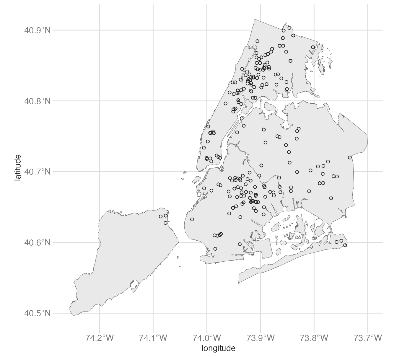
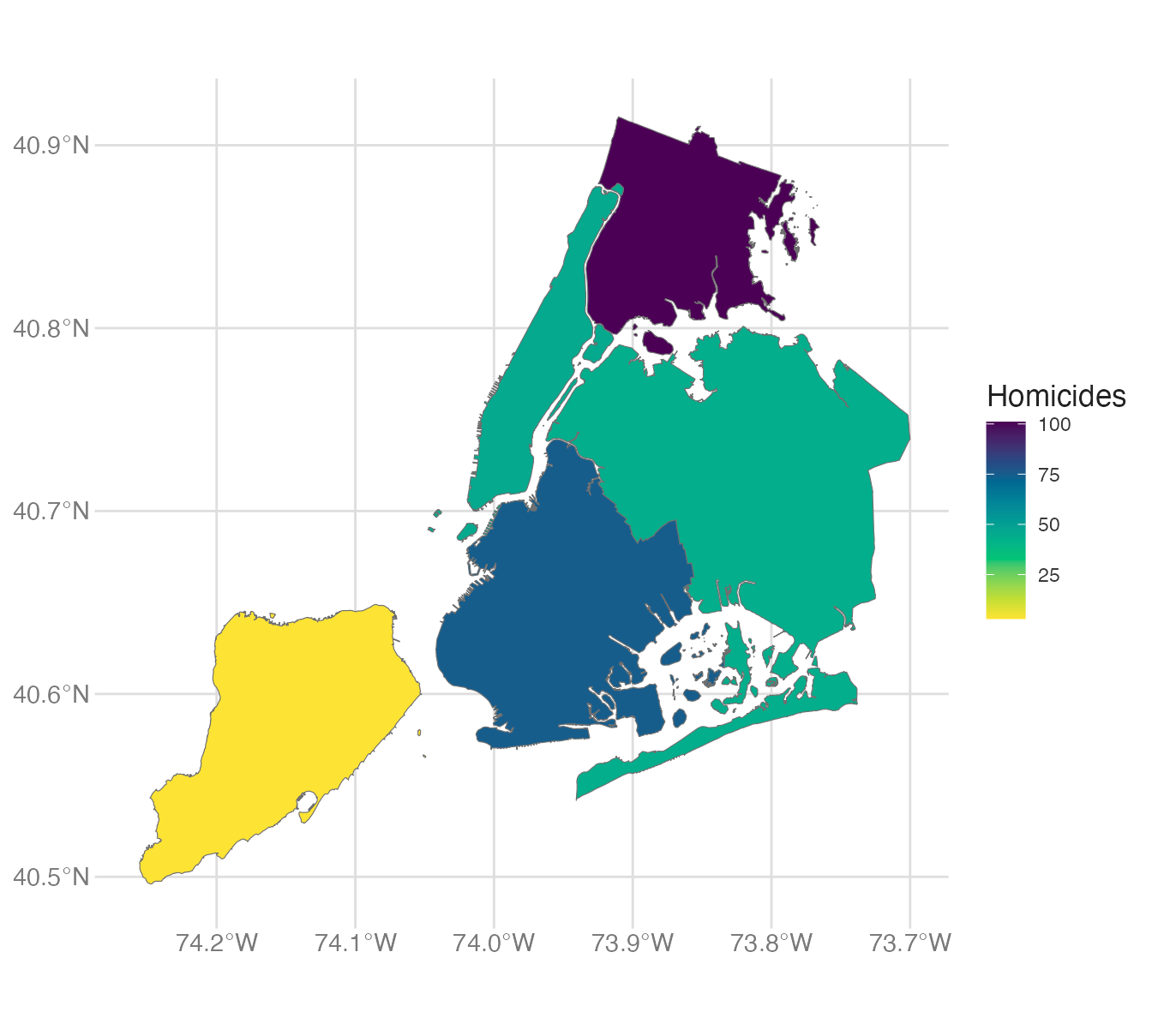
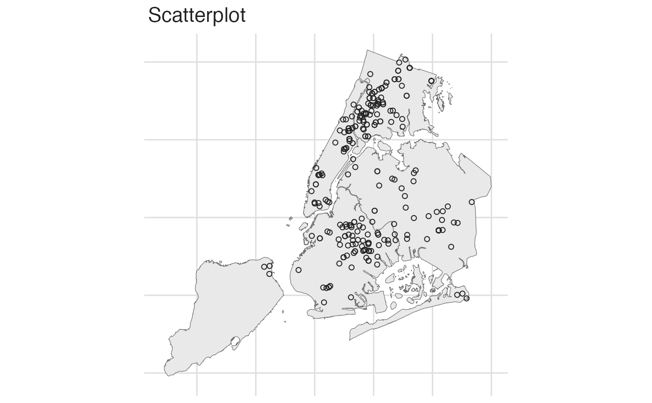
Since this is a {ggplot2} object, we can add additional layers on top using standard {ggplot2} syntax. For example, we can overlay point data with latitude/longitude coordinates using geom_point(). Let’s add the locations of homicides in New York City to a map of the five boroughs.
coords names the columns containing the x (longitude) and y (latitude) coordinates.
2
st_crs() <- 4326 assigns the WGS 84 coordinate reference system (the standard CRS for GPS and most web maps). Without setting the CRS, {sf} cannot spatially align the points with other layers.
Notice geom_sf() automatically detects that the simple features are points and plots them accordingly.
Choropleth maps
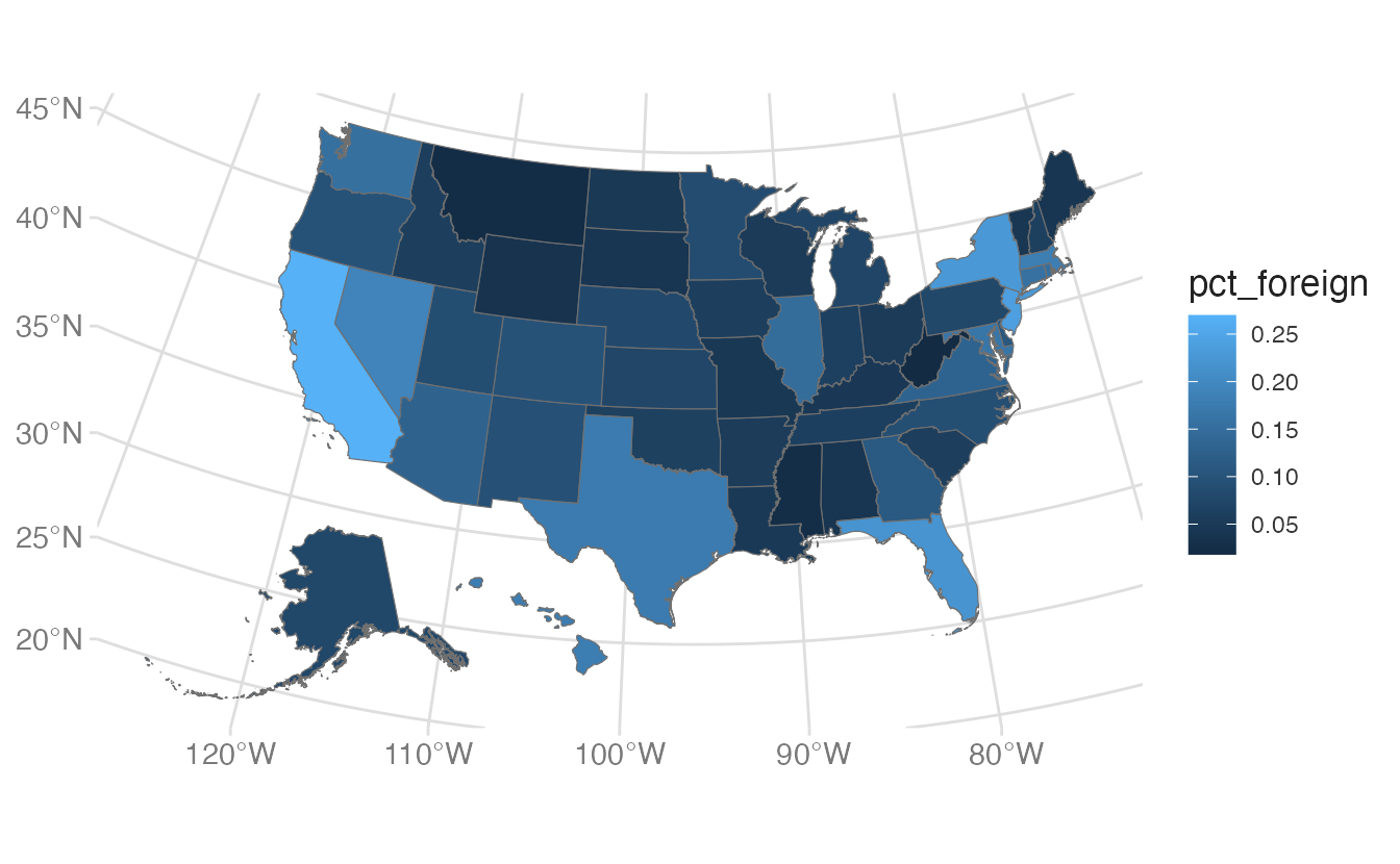
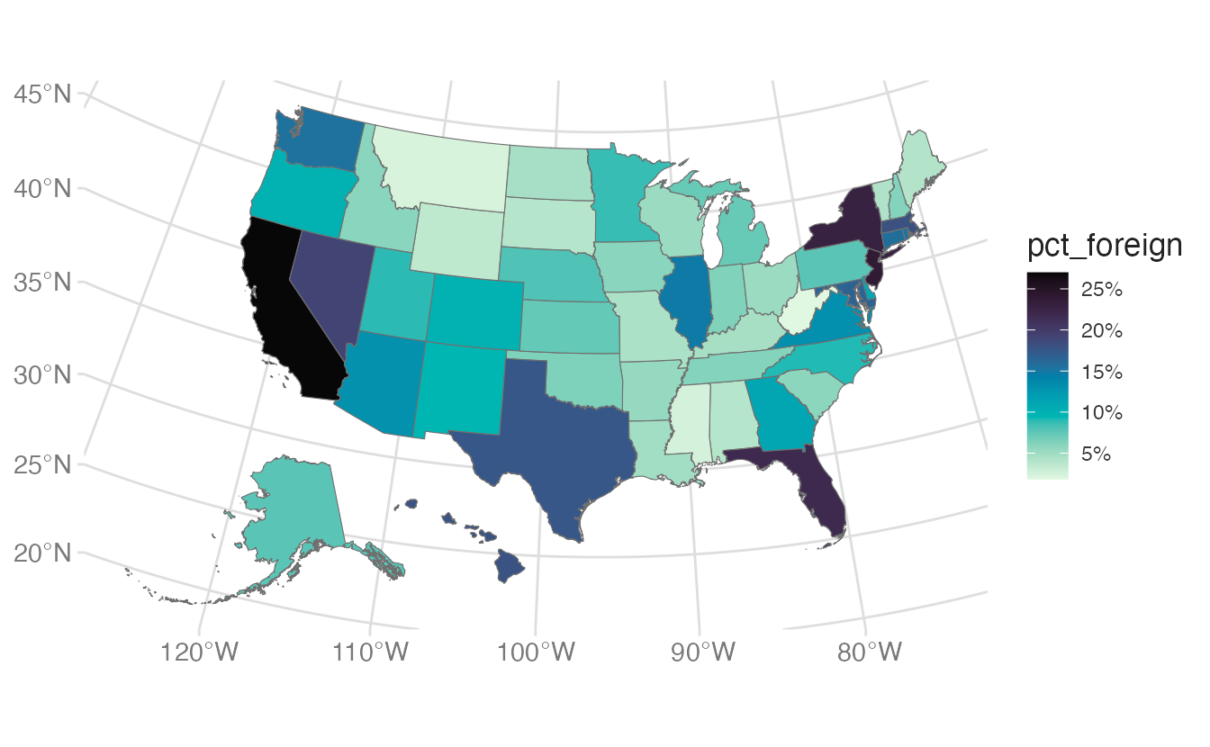
A choropleth encodes a numeric variable through fill color applied to geographic polygons (states, counties, ZIP codes). The key requirement is that the polygon data and the attribute data share a common identifier to join on.
Importing data with {tidycensus}
The {tidycensus} package provides access to US Census and ACS data with geometry attached:
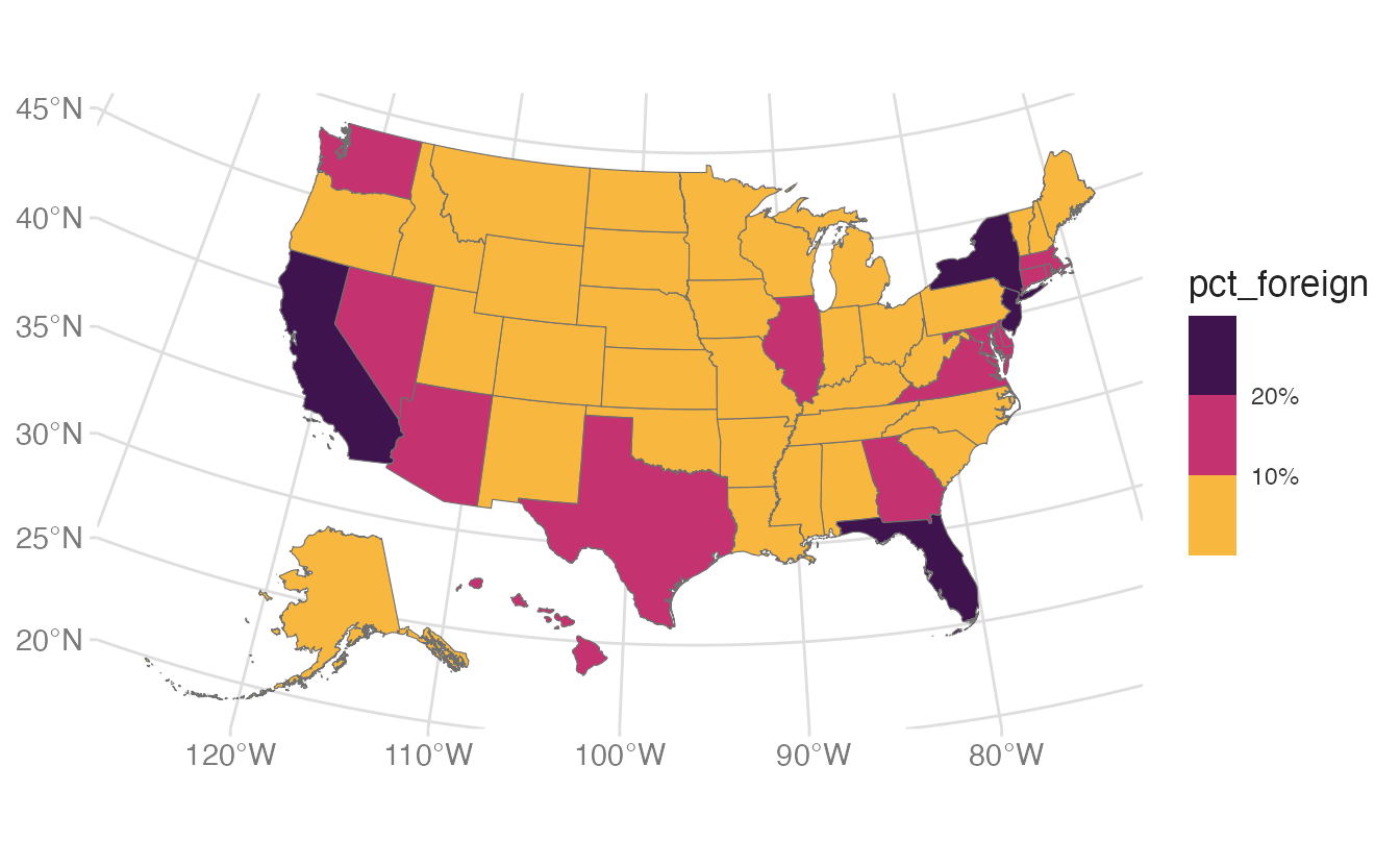
Mapping pct_foreign to fill colors each state by its proportion of foreign-born residents. The default fill scale (blue gradient) is applied automatically.
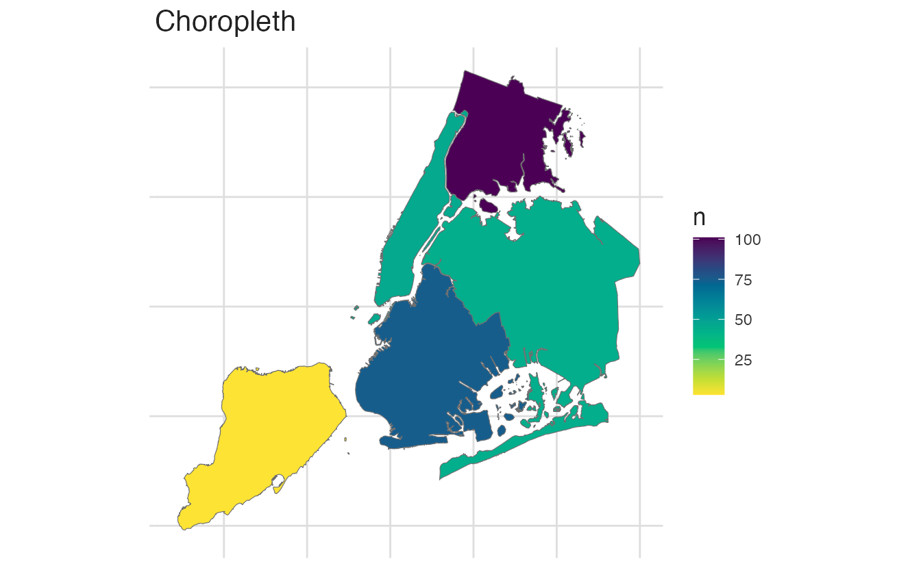
Spatial aggregation counts or summarizes point observations by which polygon they fall in. The st_join() function performs a spatial join: for each point, it identifies the containing polygon and attaches that polygon’s attributes.
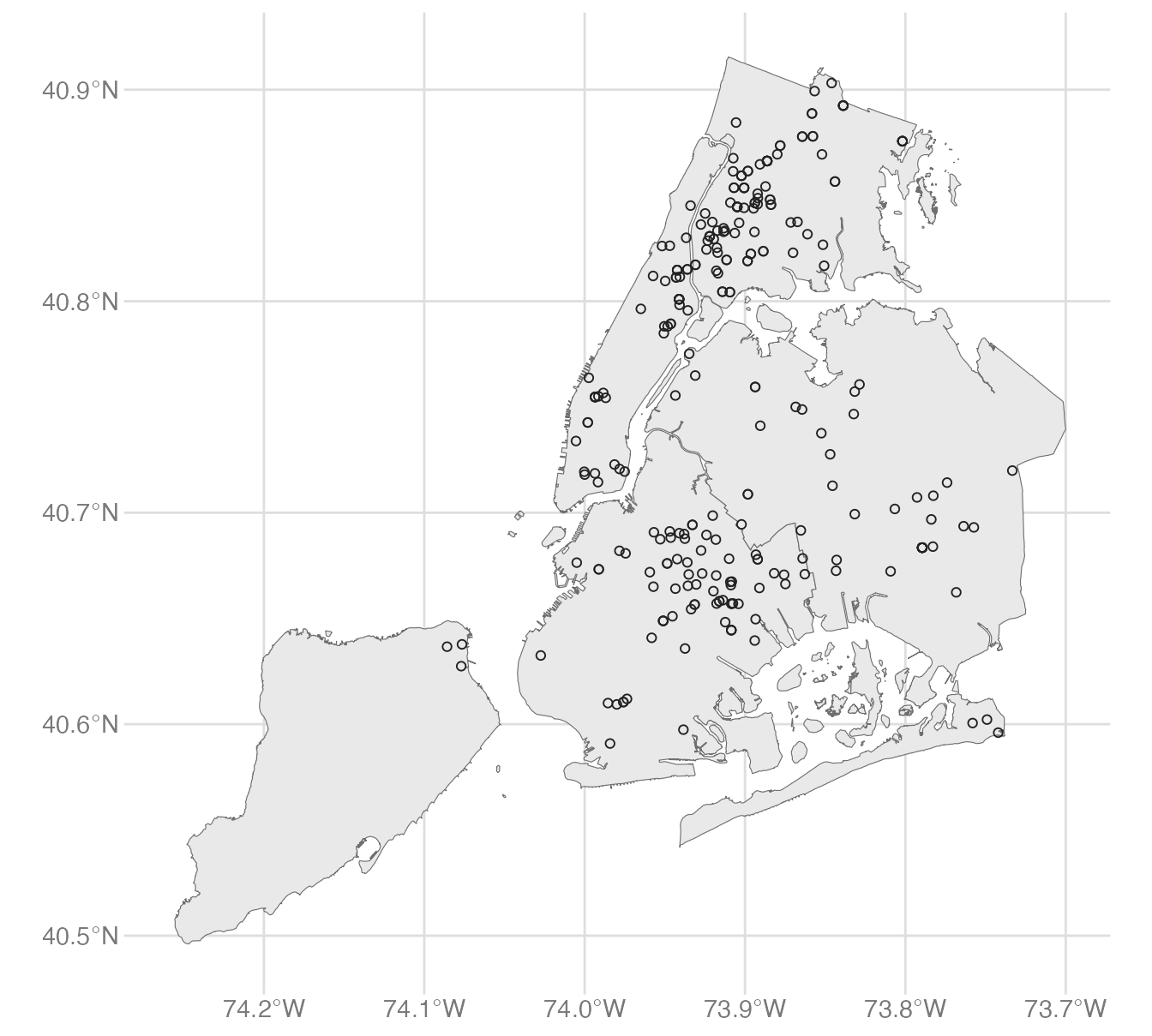
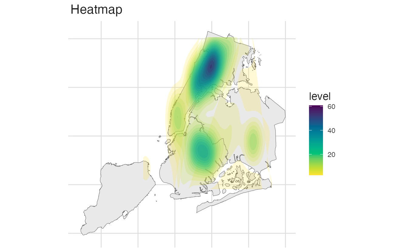
We can visualize the NYC homicide data in three ways:
Comparison of spatial visualization approaches for NYC homicide data
Comparison of spatial visualization approaches for NYC homicide data
Comparison of spatial visualization approaches for NYC homicide data
The choropleth averages over each borough, hiding within-borough variation. The heatmap shows concentration but not exact locations. The scatterplot preserves all information but can be hard to read with many points.
There is no one inherent “correct” way to visualize spatial data. The best approach depends on the specific question, the data, and the intended audience. Always consider the trade-offs of each method and choose the one that best communicates your message.
Binning continuous data
For choropleths, continuous color gradients can be hard to compare across regions because small differences in color are difficult to perceive. Binning collapses the continuous variable into discrete categories:
scale_fill_binned_sequential() from {colorspace} creates a binned sequential scale — the continuous variable is divided into discrete intervals, each assigned a distinct color.
2
n.breaks = 4 attempts to create four breaks (five bins). Fewer breaks make the map easier to read; more breaks preserve more detail.
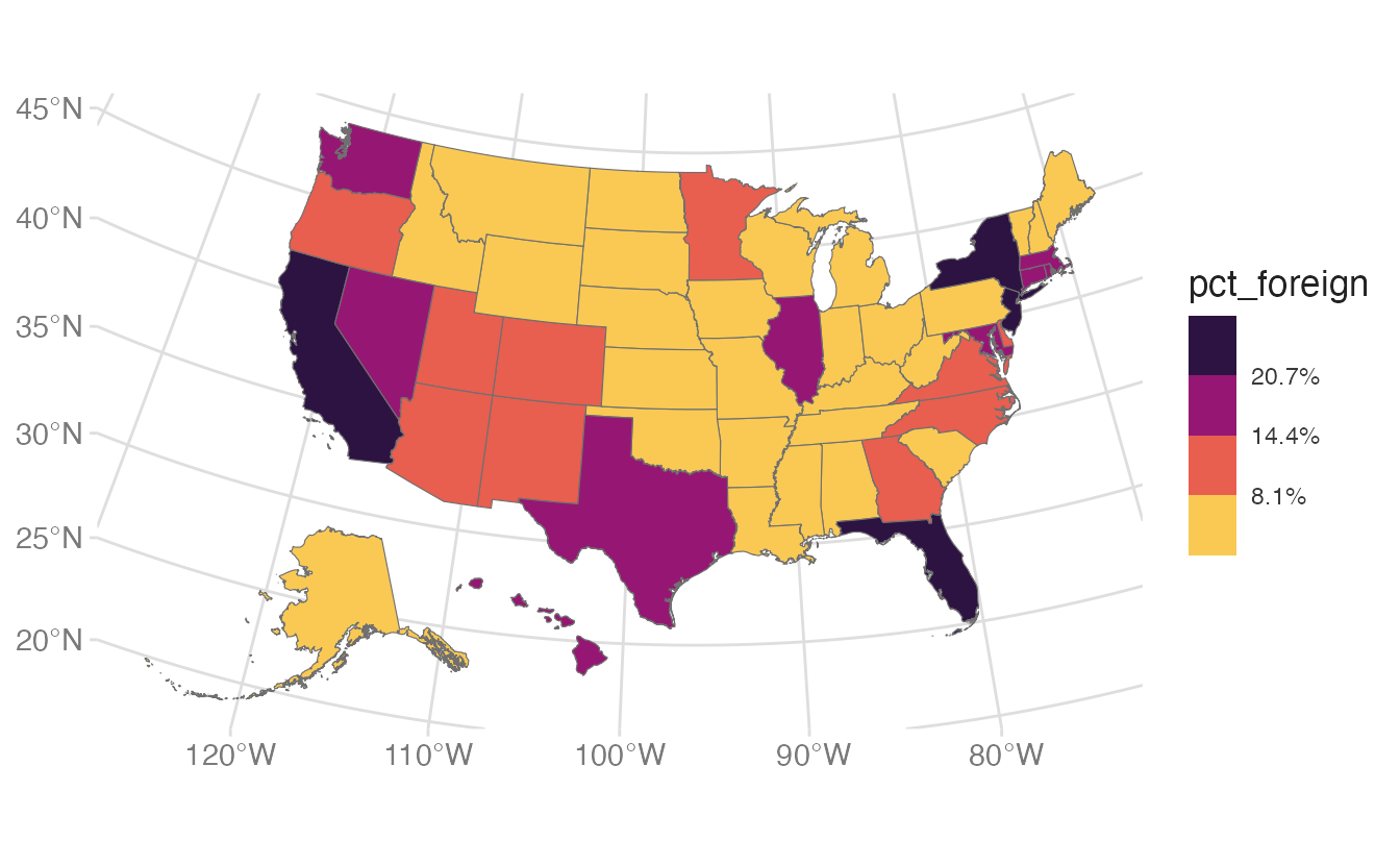
By default, n.breaks chooses “nice” round break values. Set nice.breaks = FALSE to use exact quantiles instead:
nice.breaks = FALSE places breaks exactly at the quartile boundaries rather than rounding to “nice” numbers.
Map projections
A coordinate reference system (CRS) defines how coordinates correspond to locations on the Earth’s surface. We can inherit the CRS defined for the simple features data frame, or manually transform the map to a different CRS using coord_sf(crs = ...).
Setting the CRS with coord_sf()
coord_sf(crs = ...) transforms the map to any CRS:
crs = 5070 is the US National Atlas Equal Area projection — a standard choice for US maps that preserves area relationships.
Albers Equal Area (EPSG:5070)
Finding an appropriate projection with {crsuggest}
The {crsuggest} package suggests appropriate CRS codes for a given {sf} object based on its geographic extent:
suggest_crs(nyc_json)
1
suggest_crs() ranks projected CRS options appropriate for the geographic extent of the input. The top results minimize distortion for the specific region.
# A tibble: 10 × 6
   crs_code crs_name                                  crs_type crs_gcs crs_units crs_proj4
   <chr>    <chr>                                     <chr>      <dbl> <chr>     <chr>
 1 6539     NAD83(2011) / New York Long Island (ftUS) project…    6318 us-ft     +proj=lc…
 2 6538     NAD83(2011) / New York Long Island        project…    6318 m         +proj=lc…
 3 4456     NAD27 / New York Long Island              project…    4267 us-ft     +proj=lc…
 4 3628     NAD83(NSRS2007) / New York Long Island (… project…    4759 us-ft     +proj=lc…
 5 3627     NAD83(NSRS2007) / New York Long Island    project…    4759 m         +proj=lc…
 6 32118    NAD83 / New York Long Island              project…    4269 m         +proj=lc…
 7 2908     NAD83(HARN) / New York Long Island (ftUS) project…    4152 us-ft     +proj=lc…
 8 2831     NAD83(HARN) / New York Long Island        project…    4152 m         +proj=lc…
 9 2263     NAD83 / New York Long Island (ftUS)       project…    4269 us-ft     +proj=lc…
10 3748     NAD83(HARN) / UTM zone 18N                project…    4152 m         +proj=ut…
Bivariate choropleths with {biscale}
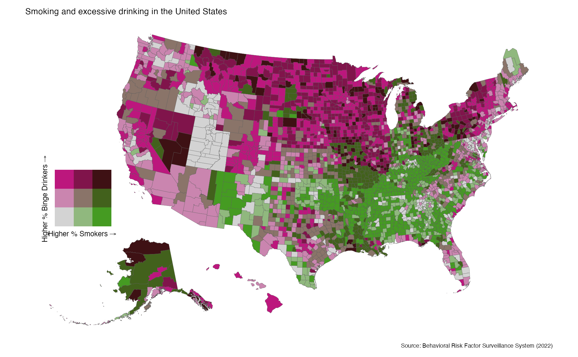
A bivariate choropleth encodes two variables simultaneously using a 2D color palette — each cell in the legend corresponds to a combination of values on both variables. The {biscale} package implements this scale in R.
Consider this example where we visualize simultaneously the percentage of smokers and binge drinkers in US counties:
library(biscale)# Load county health data (smoking + binge drinking rates)county_health <-read_csv("data/PLACES__County_Data__GIS_Friendly_Format___2024_release_20250326.csv") |>select(GEOID = CountyFIPS,drinking = BINGE_AdjPrev,smoking = CSMOKING_AdjPrev )
This is a genuinely ambitious design: encoding two continuous variables into a single map requires the reader to learn the bivariate legend before interpreting any particular county. The tradeoff - complexity in exchange for spatial co-location of two related variables - is worth it when the question is specifically about geographic co-occurrence.
Summary
Vector data stores geographic features (points, lines, polygons) as coordinates with attributes; common formats are shapefiles and GeoJSON
The {sf} package represents vector data as a data frame with a sticky geometry column; st_read() imports it
geom_sf() visualizes {sf} objects in {ggplot2} with no explicit x/y aesthetics required
shift_geometry() from {tigris} repositions Alaska and Hawaii for US national maps
st_as_sf() converts a data frame with coordinate columns to an {sf} object; always set the CRS with st_crs() <- 4326
st_join() performs spatial joins: points are matched to the polygon that contains them
scale_fill_binned_sequential() creates a binned choropleth that is easier to read than a continuous gradient
coord_sf(crs = ...) transforms the map to any CRS; use suggest_crs() to find an appropriate projection for your region