Optimizing color spaces
Notes
NoteLearning objectives
- Identify how color can be effectively used in data visualizations
- Distinguish types of color scales and their appropriate use cases
- Generate color scales using the {colorspace} package
- Implement optimal color palettes
Uses of color
Color in data visualization serves distinct purposes. Using color that matches its intended purpose makes charts easier to read; mismatched color usage introduces confusion.
1. Qualitative: distinguish categories
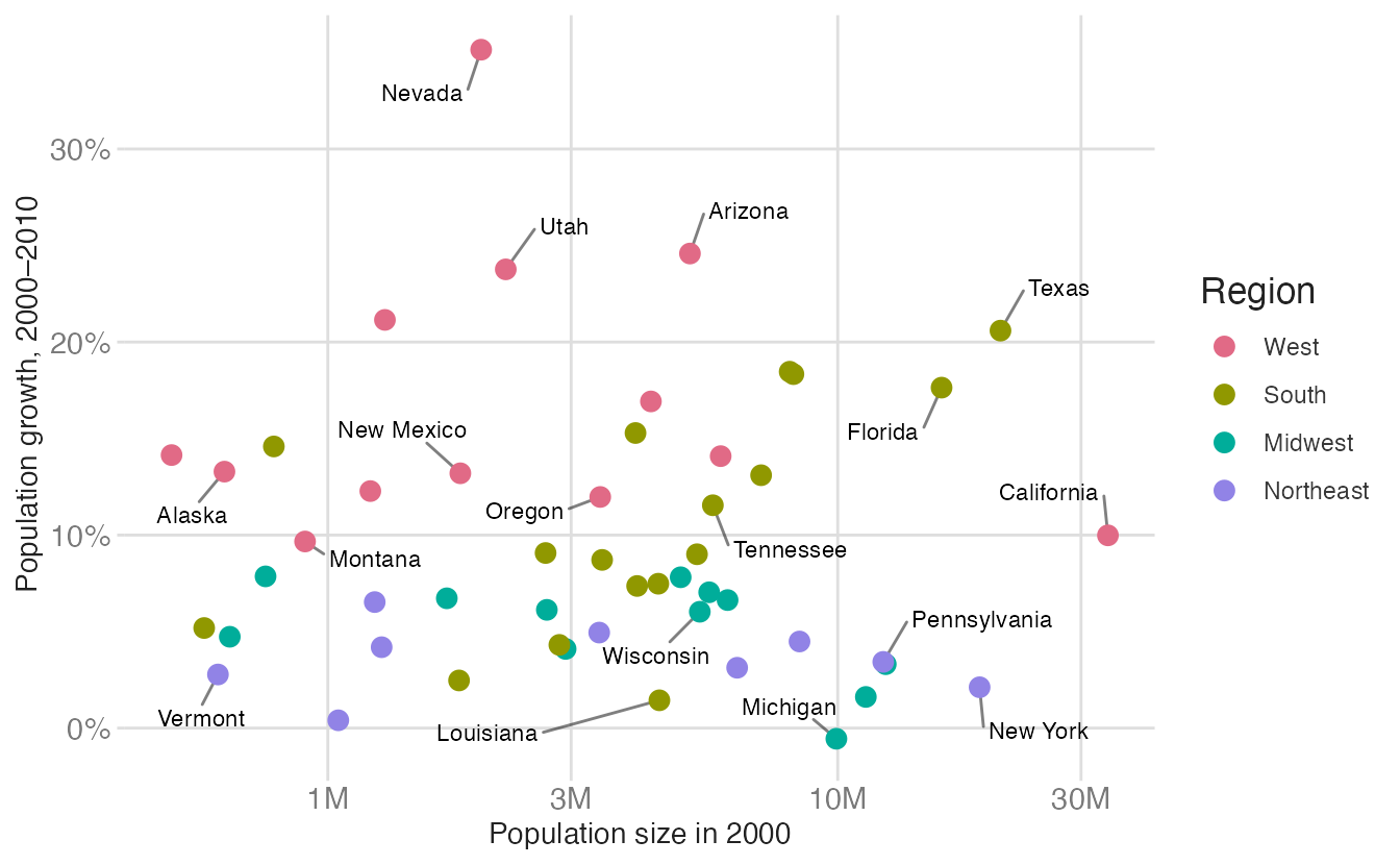
A qualitative (categorical) palette assigns distinct, unordered colors to nominal categories — region, species, country. The colors should be perceptually equidistant: no single color should appear more important than the others.

For example, a scatterplot of US state population growth encodes US region with a qualitative palette.
2. Sequential: represent ordered values
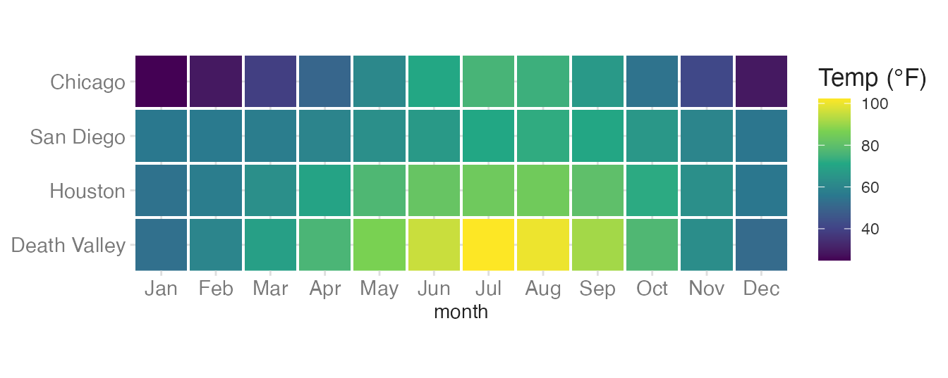
A sequential palette encodes magnitude using a gradient from low to high. It is appropriate for ordered or continuous numeric variables where zero (or the minimum) is a meaningful anchor.

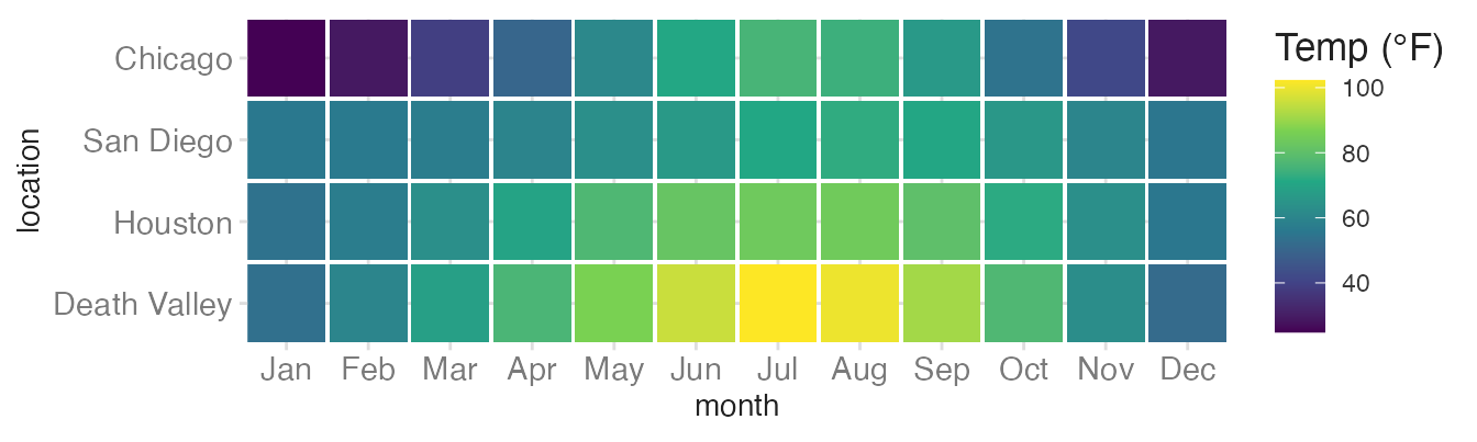
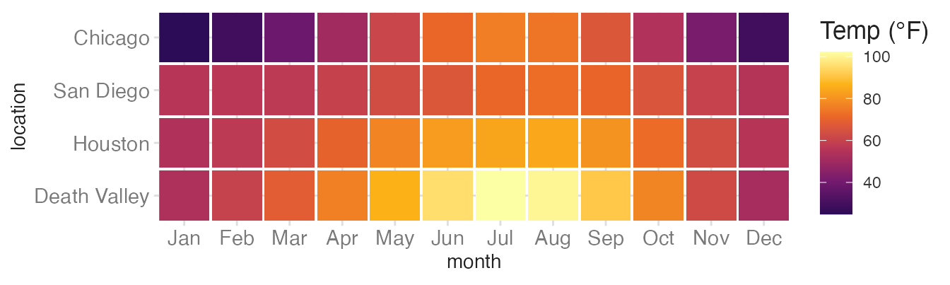
Here we use a tile heatmap to visualize the monthly average temperatures across four locations. Each tile’s fill maps to the mean temperature. Since there is a clear ordering of temperatures from low to high, a sequential palette is appropriate.
3. Diverging: represent centered values
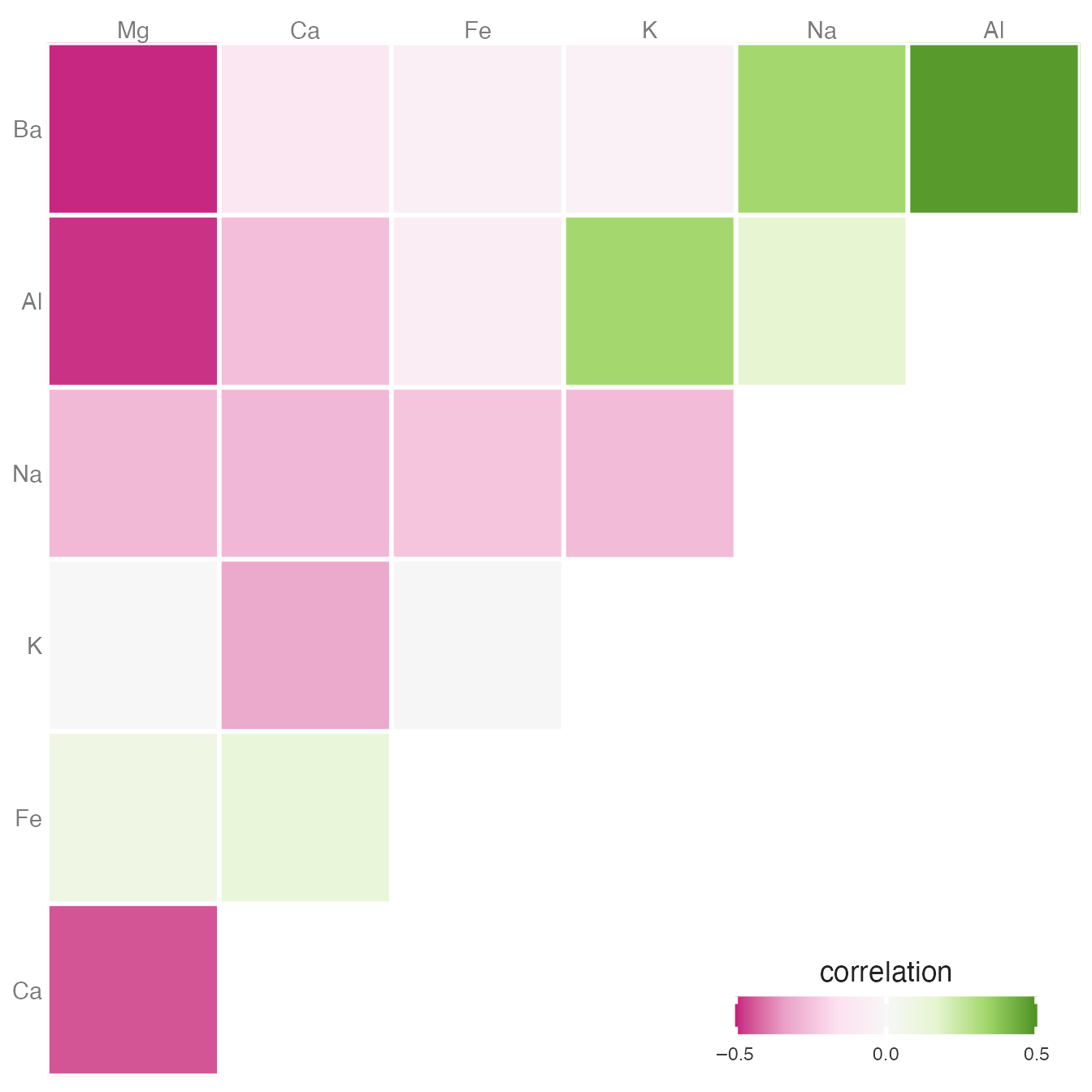
A diverging palette is appropriate when data has a meaningful midpoint — typically zero or the mean — and values on both sides of that midpoint are equally important. The palette should grade from one hue through a neutral midpoint to a contrasting hue.

Correlation matrices are a classic application: positive and negative correlations require equally visible emphasis on both sides of zero.
4. Highlight: draw attention to selected elements
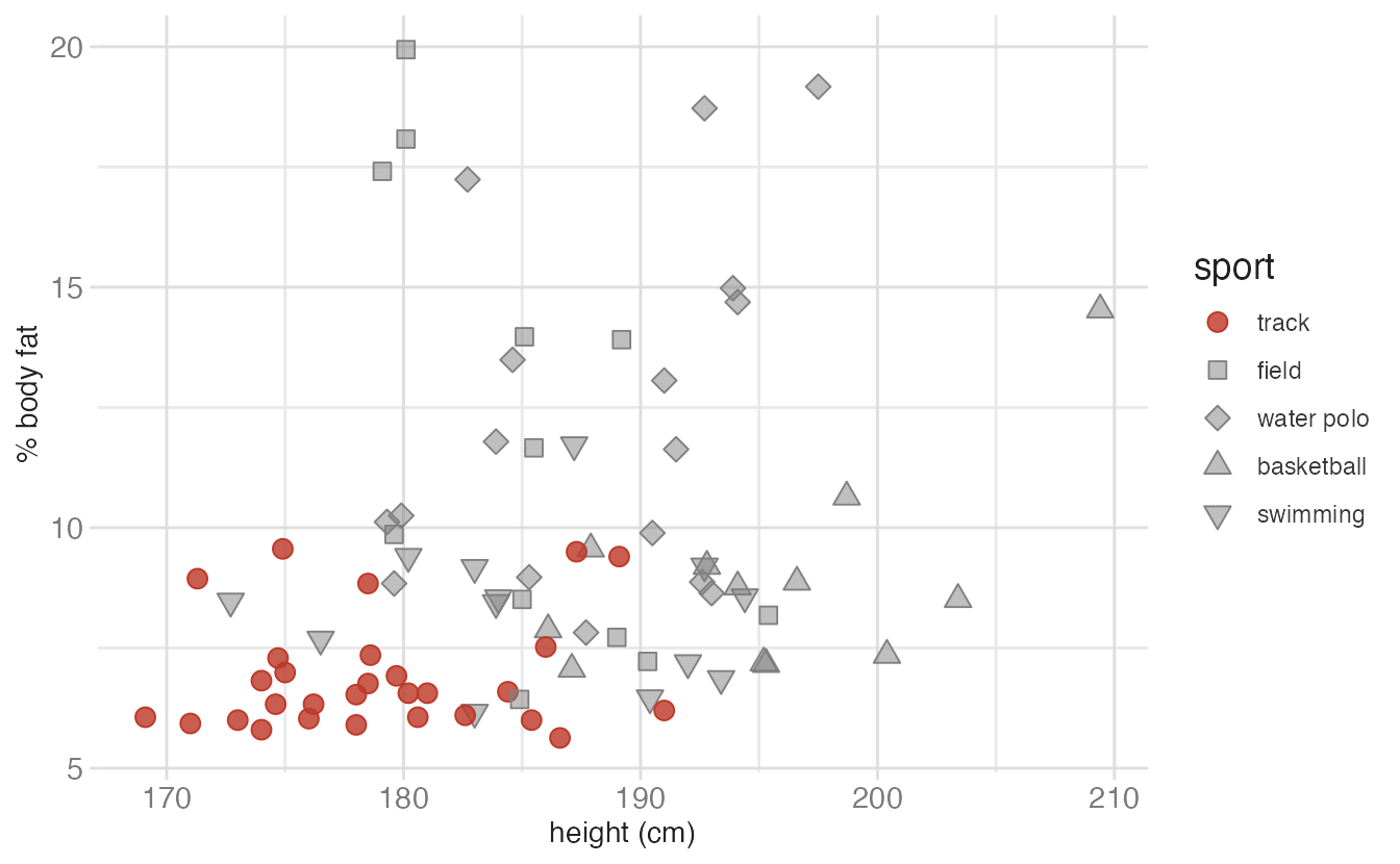
A highlight palette uses one saturated color for the data you want to emphasize and muted grays for everything else. This does not encode a continuous variable — it encodes membership in a meaningful subset.

The athlete example below highlights one sport (track) against four others:
Choosing the right scale type
The most common mistake with color palettes is mismatching the palette type to the variable type. The rule is straightforward:
| Variable type | Palette type | Example |
|---|---|---|
| Nominal (unordered categories) | Qualitative | Region, species, country |
| Ordered / continuous numeric | Sequential | Temperature, income, proportion |
| Diverging numeric (centered) | Diverging | Correlation, gain/loss, z-score |
| Emphasis on a subset | Highlight | One country vs. all others |
Qualitative scale for nominal variables
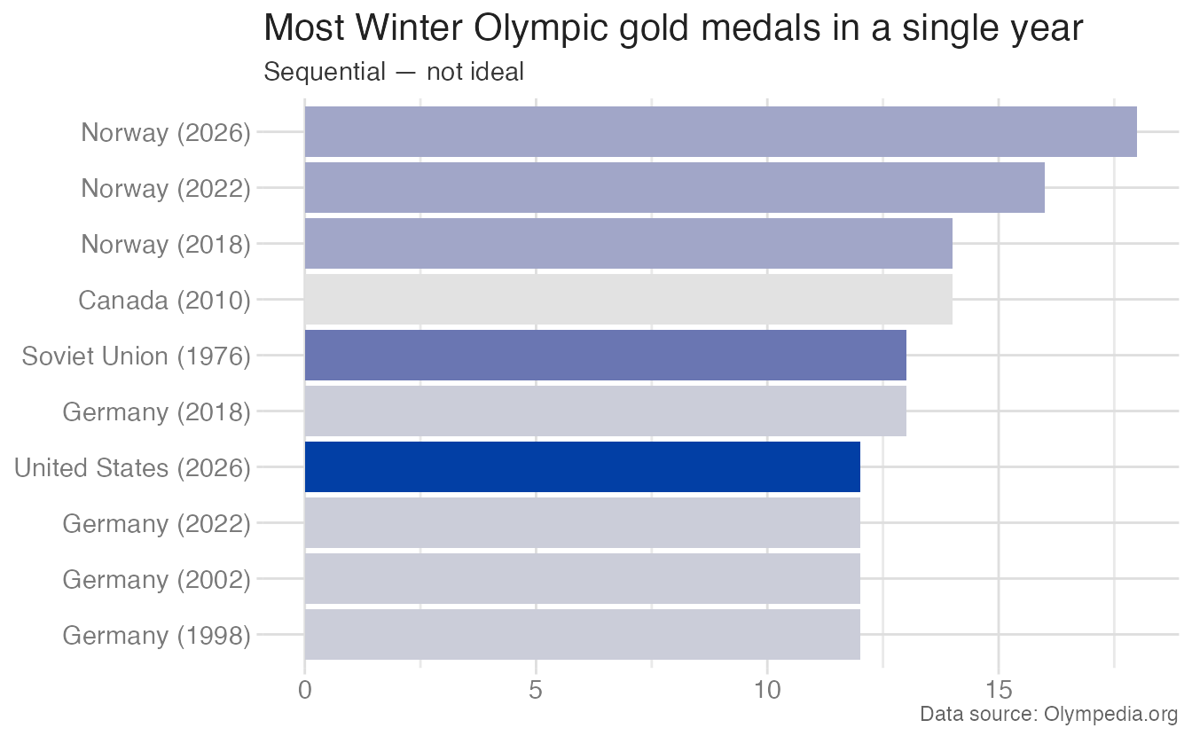
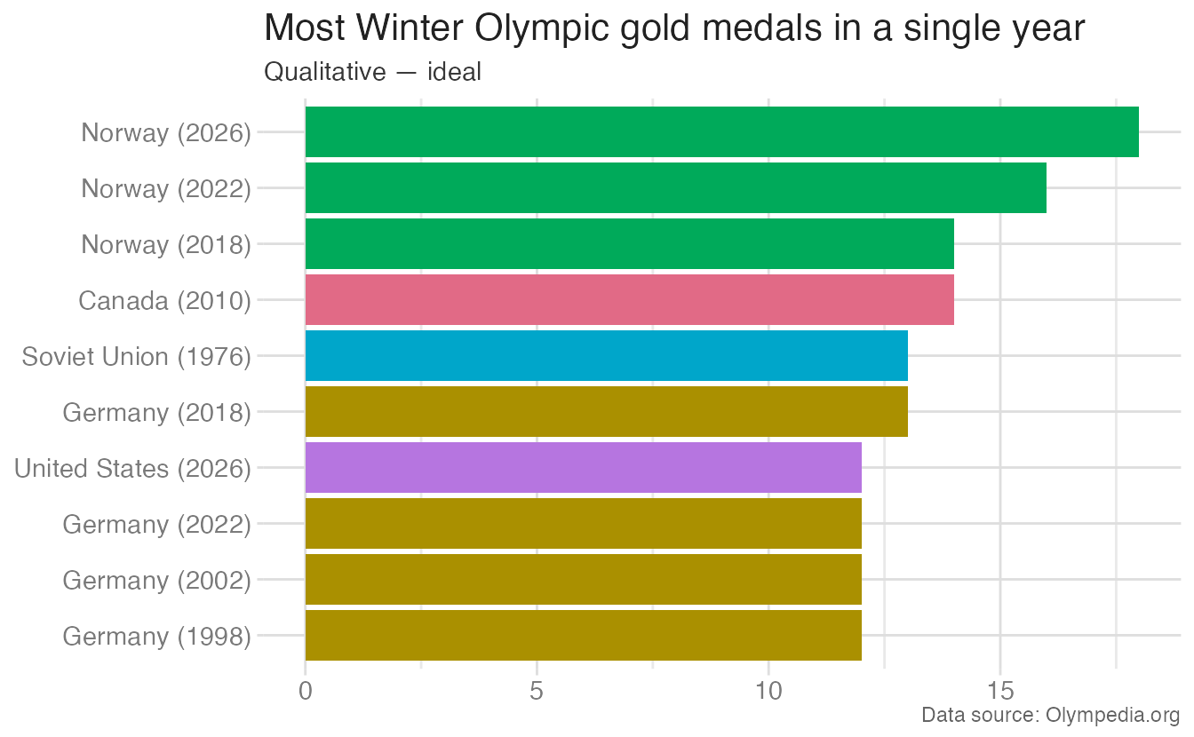
Comparing the same nominal variable — country — with sequential (wrong) vs. qualitative (right) palettes makes the issue concrete:
Sequential scale for ordered variables
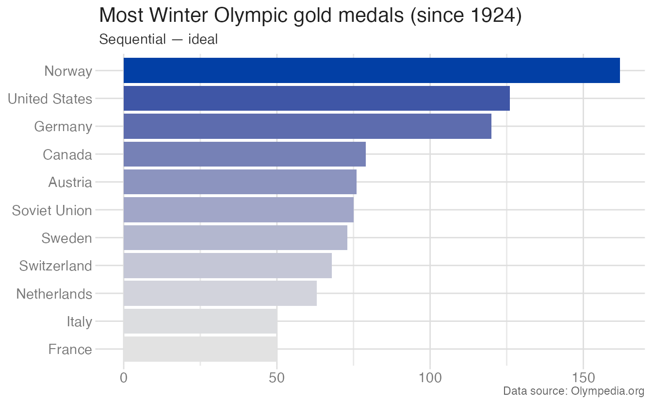
When the same countries are ranked by total golds — an ordered comparison — sequential shading conveys magnitude:

Quantitative \(\neq\) continuous
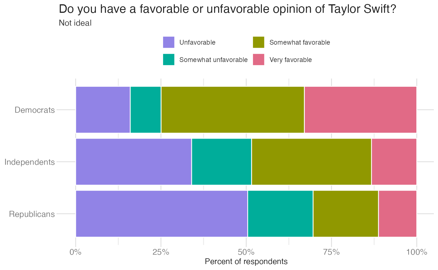
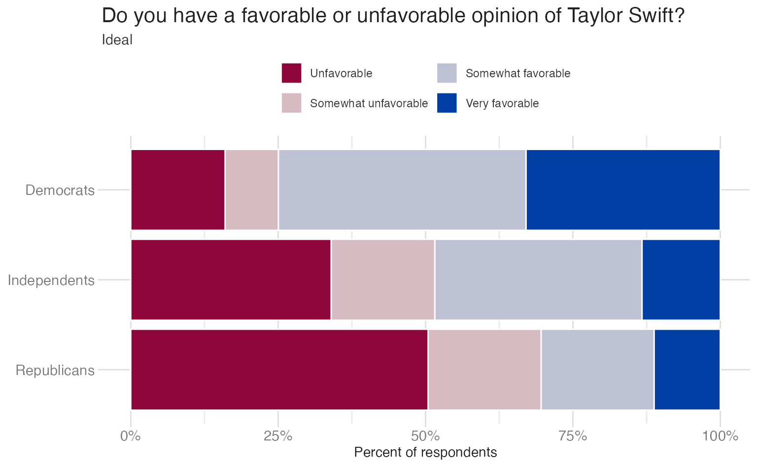
A common misconception is that all numeric variables should be encoded with a sequential palette and categorical variables with a qualitative palette. This is not the case: categorical variables can have a directionality encoded in the responses. Likert survey responses (Strongly agree → Strongly disagree) are a specific case where the variable has directionality and should use some sort of directional palette (sequential or diverging). A qualitative palette treats the responses as unordered; a diverging palette anchors on neutral and shows the opposition between favorable and unfavorable ends:
Sequential for continuous spatial data
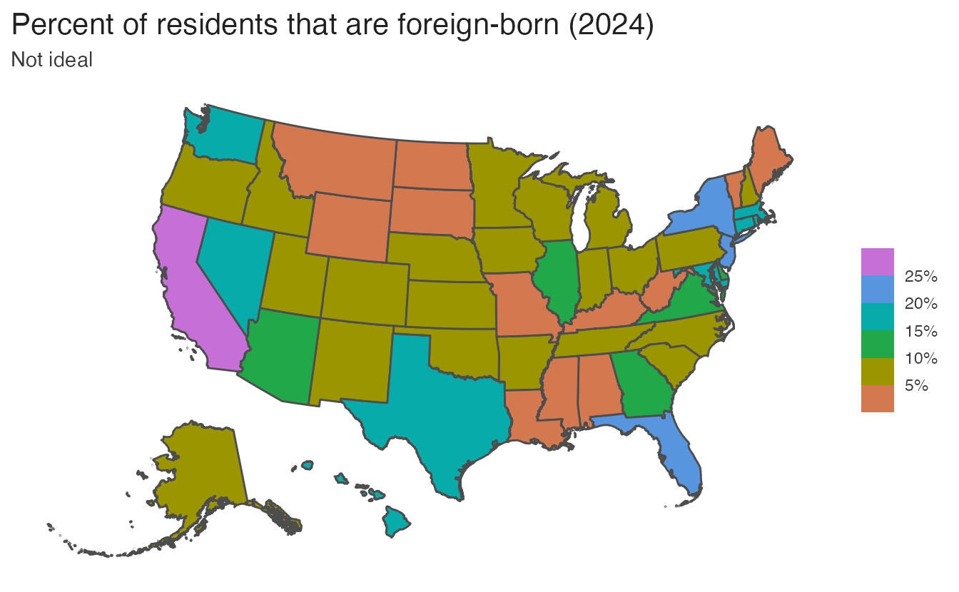
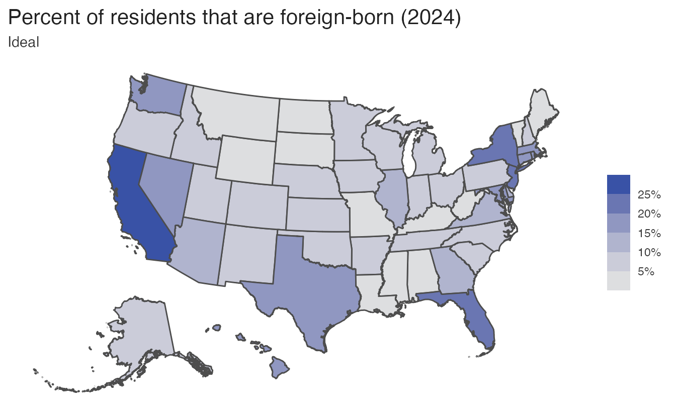
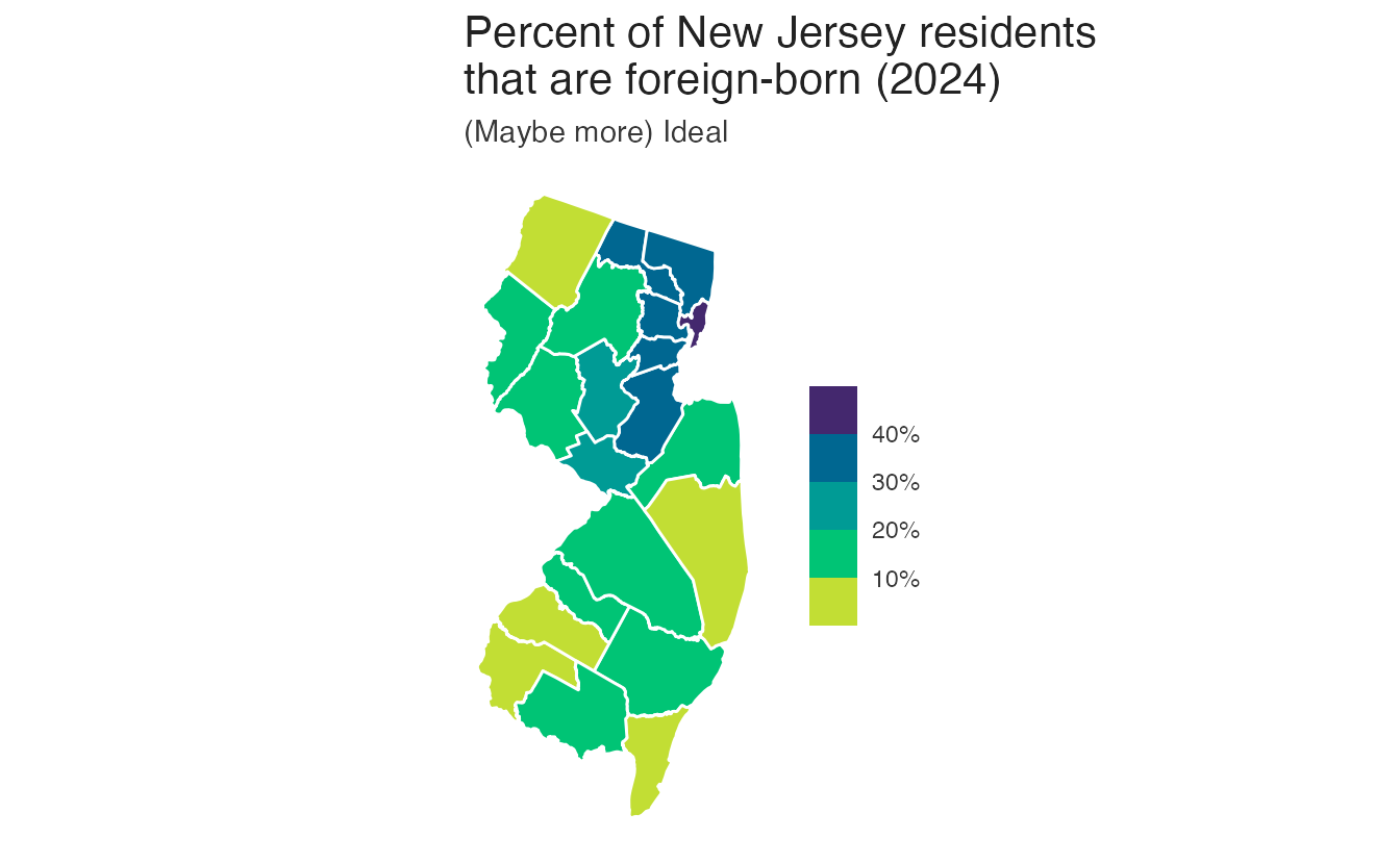
For choropleth maps encoding a continuous proportion (e.g., percent foreign-born), a sequential palette conveys magnitude clearly. Using a qualitative palette on the same data implies the proportions are unordered categories — which they are not:
Binning continuous variables
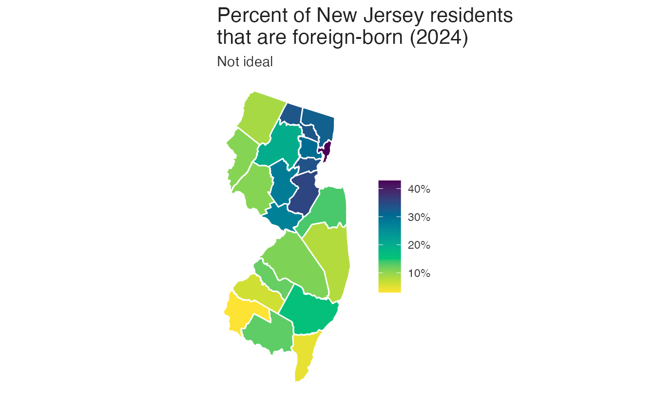
For county-level spatial data, a continuous sequential gradient can be hard to read: adjacent low values appear almost identical. Binning the continuous variable into a small number of discrete steps improves readability:
Scale functions in R
Choosing an optimal color palette is challenging in both the design and implementation. R offers many different methods for generating color scales, but it is difficult to access all these different methods and many palettes may not be optimal.
Built-in {ggplot2} functions
{ggplot2} ships with many scale_* functions for color and fill:
| Function | Aesthetic | Data type | Palette type |
|---|---|---|---|
scale_color_hue() |
color |
discrete | qualitative |
scale_fill_hue() |
fill |
discrete | qualitative |
scale_color_gradient() |
color |
continuous | sequential |
scale_color_gradient2() |
color |
continuous | diverging |
scale_fill_viridis_c() |
fill |
continuous | sequential |
scale_fill_viridis_d() |
fill |
discrete | sequential |
scale_color_brewer() |
color |
discrete | qual / div / seq |
scale_fill_distiller() |
fill |
continuous | qual / div / seq |
The naming is inconsistent: some use color, some use fill; some use c for continuous and d for discrete, others do not; some accept a palette argument and some do not. Furthermore, many of the default palettes produced by {ggplot2} are inaccessible. In practice, it is easy to reach for the wrong function.
{colorspace} for consistent, optimal palettes
The {colorspace} package provides a consistent naming scheme:
scale_<aesthetic>_<datatype>_<colorscale>()<aesthetic>:colororfill<datatype>:discrete,continuous, orbinned<colorscale>:qualitative,sequential,diverging, ordivergingx
| Function | Aesthetic | Data type | Palette type |
|---|---|---|---|
scale_color_discrete_qualitative() |
color |
discrete | qualitative |
scale_fill_continuous_sequential() |
fill |
continuous | sequential |
scale_fill_binned_sequential() |
fill |
binned | sequential |
scale_fill_binned_diverging() |
fill |
binned | diverging |
scale_color_continuous_divergingx() |
color |
continuous | diverging extended |
The naming is predictable: once you know the aesthetic, data type, and palette type you need, the function name follows directly. Additionally, most of the palettes available in the package are optimized for perceptual uniformity and accessibility, and the package provides a large library of palettes to choose from.
Temperature heatmap examples
The temperature tile chart makes scale progression easy to compare:
Code
ggplot(temps_months, aes(x = month, y = location, fill = mean)) +
  geom_tile(width = 0.95, height = 0.95) +
  coord_cartesian(ratio = 1, expand = FALSE) +
  labs(fill = "Temp (°F)")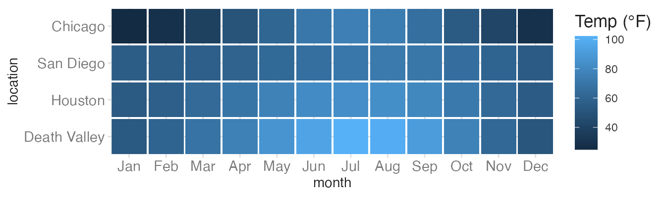
Default fill — arbitrary blue gradient that does not encode temperature intuition.
Code
ggplot(temps_months, aes(x = month, y = location, fill = mean)) +
geom_tile(width = 0.95, height = 0.95) +
coord_cartesian(ratio = 1, expand = FALSE) +
scale_fill_viridis_c() +
labs(fill = "Temp (°F)")- 1
-
scale_fill_viridis_c()uses a perceptually uniform sequential palette that reads well in grayscale.
Code
ggplot(temps_months, aes(x = month, y = location, fill = mean)) +
geom_tile(width = 0.95, height = 0.95) +
coord_cartesian(ratio = 1, expand = FALSE) +
scale_fill_viridis_c(option = "B", begin = 0.15) +
labs(fill = "Temp (°F)")- 1
-
option = "B"selects the Inferno palette.begin = 0.15avoids the very dark end, which can be hard to distinguish from black.
Code
ggplot(temps_months, aes(x = month, y = location, fill = mean)) +
geom_tile(width = 0.95, height = 0.95) +
coord_cartesian(ratio = 1, expand = FALSE) +
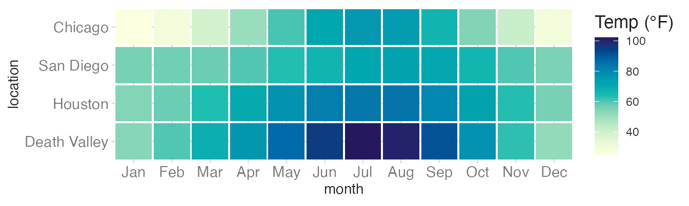
scale_fill_continuous_sequential(palette = "YlGnBu") +
labs(fill = "Temp (°F)")- 1
-
scale_fill_continuous_sequential()from {colorspace} gives access to a much larger palette library."YlGnBu"is a Yellow-Green-Blue gradient from ColorBrewer.
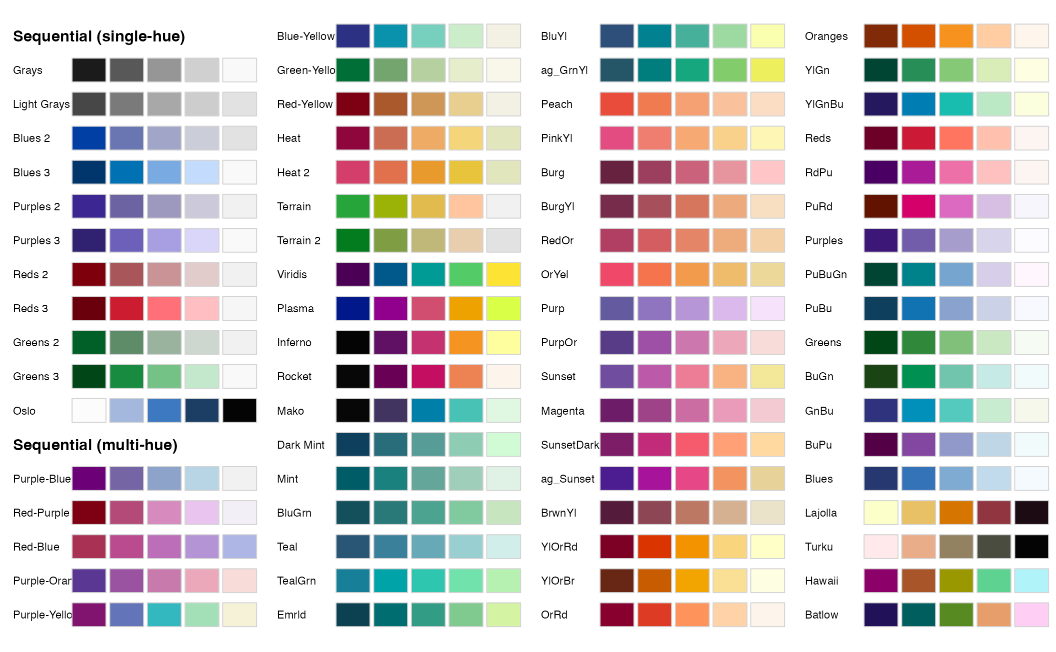
Browsing available palettes
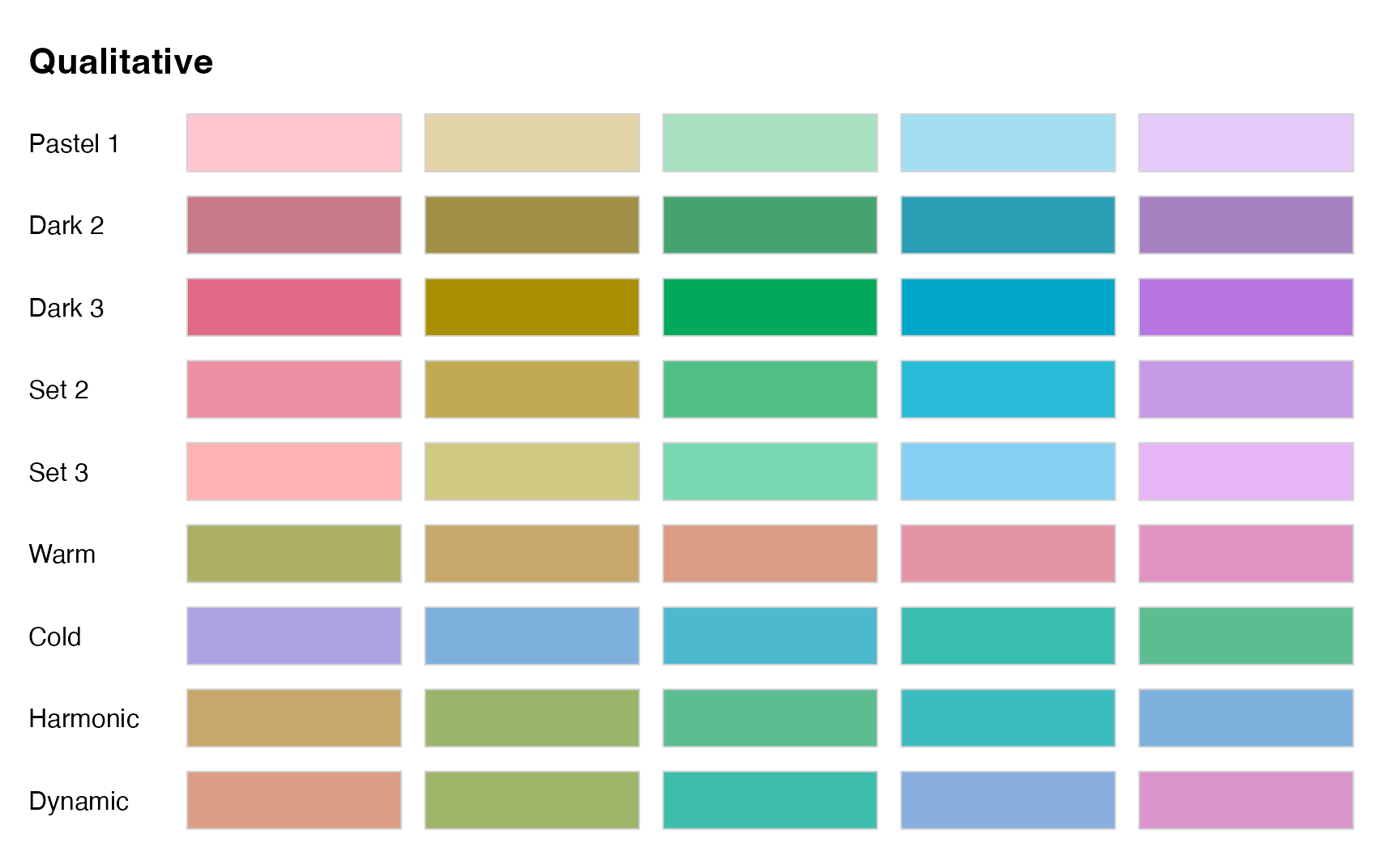
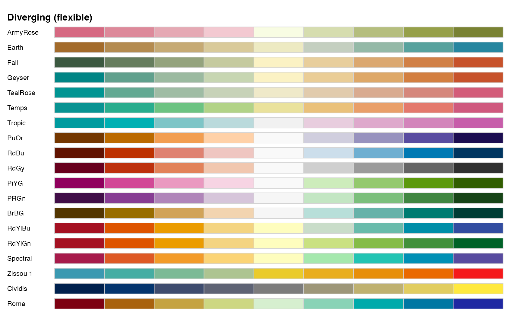
{colorspace} provides hcl_palettes() to browse all available palettes by type. Calling it with plot = TRUE renders a visual overview.
TipUse the interactive palette viewer
You can also use the interactive palette viewer at http://hclwizard.org:3000/hclwizard/ to explore palettes for use in R.
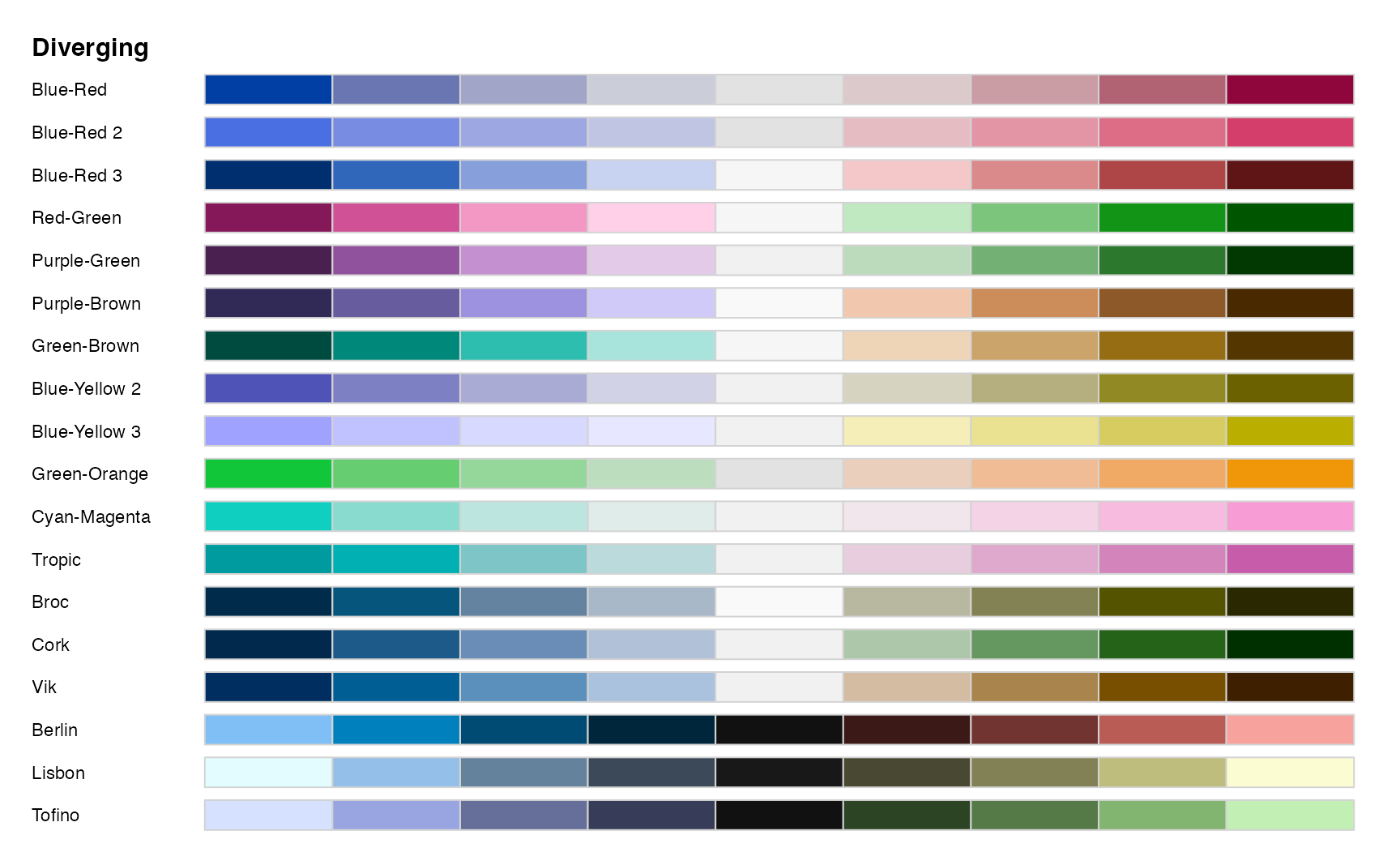
For extended diverging palettes (useful when the scale does not have a symmetric range around zero):
When to not use {colorspace}
There are a few situations when you probably do not want to use {colorspace} to set your palette.
Highlighting
Highlighting a single category against a muted background is not a built-in palette type in {colorspace}. Instead, you can use scale_color_manual() or scale_fill_manual() to set one color to a saturated hue and the rest to muted grays.
Consider the track and field athletes example again:
colors <- c("#BD3828", rep("#808080", 4))
fills <- c(alpha(colors[1], .815), alpha(colors[2:5], .5))
ggplot(
data = male_Aus,
mapping = aes(
x = height,
y = pcBfat,
shape = sport,
color = sport,
fill = sport
)
) +
geom_point(size = 3) +
scale_shape_manual(values = 21:25) +
labs(
x = "height (cm)",
y = "% body fat"
) +
scale_color_manual(values = colors) +
scale_fill_manual(values = fills)- 1
- Define a vector of colors: one saturated red and four muted grays.
- 2
-
Use
scales::alpha()increase the color transparancy without using a separatealphachannel in the plot - the highlight color is more opaque than the muted colors. - 3
-
Use
scale_shape_manual()to set the shapes for all categories. Note these values allow separate colors for the outline (color) and fill (fill) aesthetics. - 4
-
Use
scale_color_manual()andscale_fill_manual()to apply the custom colors.
Okabe-Ito colorblind-friendly palette
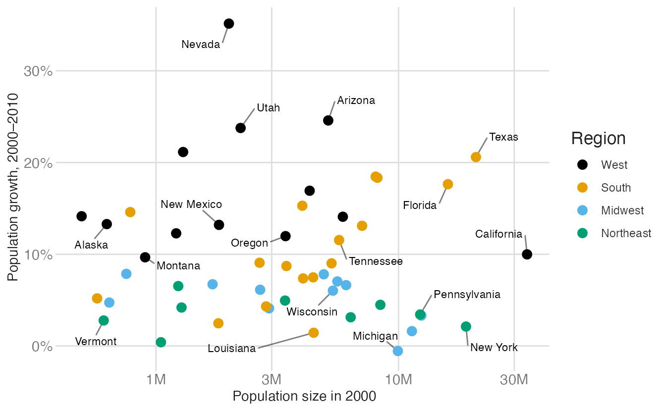
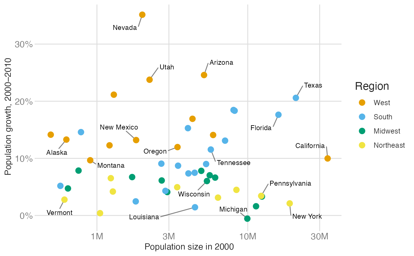
The Okabe-Ito palette is designed for colorblindness and is widely used in accessibility-conscious data visualization. However, it is not available in {colorspace} — you must use scale_color_manual() or scale_fill_manual() with the hex codes directly.
| Color name | Hex code | R, G, B (0-255) |
|---|---|---|
| Black | #000000 | 0, 0, 0 |
| Orange | #E69F00 | 230, 159, 0 |
| Sky Blue | #56B4E9 | 86, 180, 233 |
| Bluish Green | #009E73 | 0, 158, 115 |
| Yellow | #F0E442 | 240, 228, 66 |
| Blue | #0072B2 | 0, 114, 178 |
| Vermilion | #D55E00 | 213, 94, 0 |
| Reddish Purple | #CC79A7 | 204, 121, 167 |
# use scale_color_colorblind()
p_pop +
scale_color_colorblind()- 1
-
scale_color_manual()gives full control. Here I avoid using the first color (black) since it draws more attention than the others, when I want to treat all regions equally.
# use scale_color_manual() with Okabe-Ito hex codes
p_pop +
scale_color_manual(
values = c(
West = "#E69F00",
South = "#56B4E9",
Midwest = "#009E73",
Northeast = "#F0E442"
)
)
Summary
- Color serves four purposes: qualitative (distinguish categories), sequential (encode magnitude), diverging (encode deviation from a midpoint), and highlight (draw attention to a subset)
- Match the palette type to the variable type
- The {colorspace}
scale_<aesthetic>_<datatype>_<colorscale>()naming convention makes the right function easy to find - Consider binning over continuous fills when the number of distinct values matters for comparison
Acknowledgements
Material derived in part from Fundamentals of Data Visualization by Claus O. Wilke and STA 313: Advanced Data Visualization.