Implementing accessibility

Notes
Modified

May 20, 2026

NoteLearning objectives
  • Design accessible data visualizations
  • Identify why accessibility is important to data communication
  • Write alternative text for charts
  • Implement optimized color palettes

Why accessibility matters

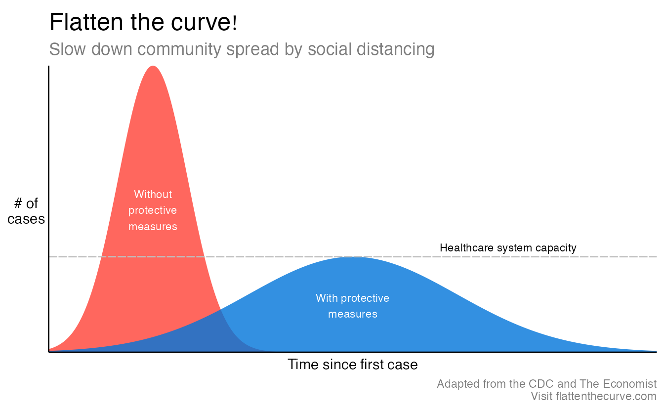
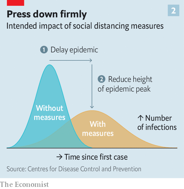
In early 2020, “flatten the curve” became one of the most widely shared data visualizations in history.

First instance of the chart. Originally published in The Economist

First instance of the chart. Originally published in The Economist

Adapted in The New York Times

Adapted in The New York Times
Code
high_mean <- 12
high_sd <- 4
flat_mean <- 35
flat_sd <- 12

ggplot(tibble(x = c(0, 70)), aes(x = x)) +
  stat_function(
    geom = "area",
    fun = dnorm,
    n = 1000,
    args = list(mean = high_mean, sd = high_sd),
    fill = "#FF4136",
    alpha = 0.8
  ) +
  stat_function(
    geom = "area",
    fun = dnorm,
    n = 1000,
    args = list(mean = flat_mean, sd = flat_sd),
    fill = "#0074D9",
    alpha = 0.8
  ) +
  geom_hline(
    yintercept = dnorm(flat_mean, flat_mean, flat_sd),
    linetype = "61",
    color = "grey75"
  ) +
  annotate(
    geom = "text",
    x = qnorm(0.5, high_mean, high_sd),
    y = dnorm(qnorm(0.5, high_mean, high_sd), high_mean, high_sd) / 2,
    label = "Without\nprotective\nmeasures",
    color = "white",
    size = 3,
    family = "Fira Sans Condensed",
    fontface = "bold"
  ) +
  annotate(
    geom = "text",
    x = qnorm(0.5, flat_mean, sd = flat_sd),
    y = dnorm(qnorm(0.5, flat_mean, sd = flat_sd), flat_mean, sd = flat_sd) / 2,
    label = "With protective\nmeasures",
    color = "white",
    size = 3,
    family = "Fira Sans Condensed",
    fontface = "bold"
  ) +
  annotate(
    geom = "text",
    x = 45,
    y = dnorm(flat_mean, flat_mean, sd = flat_sd),
    label = "Healthcare system capacity",
    vjust = -0.5,
    hjust = 0,
    size = 3,
    family = "Fira Sans Condensed",
    fontface = "bold"
  ) +
  labs(
    x = "Time since first case",
    y = "# of\ncases",
    title = "Flatten the curve!",
    subtitle = "Slow down community spread by social distancing",
    caption = "Adapted from the CDC and The Economist\nVisit flattenthecurve.com"
  ) +
  scale_x_continuous(expand = c(0, 0)) +
  scale_y_continuous(expand = c(0, 0)) +
  theme_minimal(base_family = "Fira Sans Condensed Light") +
  theme(
    panel.grid = element_blank(),
    axis.line = element_line(color = "black"),
    axis.text = element_blank(),
    axis.title = element_text(family = "Fira Sans Condensed", face = "bold"),
    axis.title.y = element_text(angle = 0, vjust = 0.5),
    plot.title = element_text(
      family = "Fira Sans Condensed",
      face = "bold",
      size = rel(1.7)
    ),
    plot.subtitle = element_text(size = rel(1.2), color = "grey50"),
    plot.caption = element_text(color = "grey50")
  )

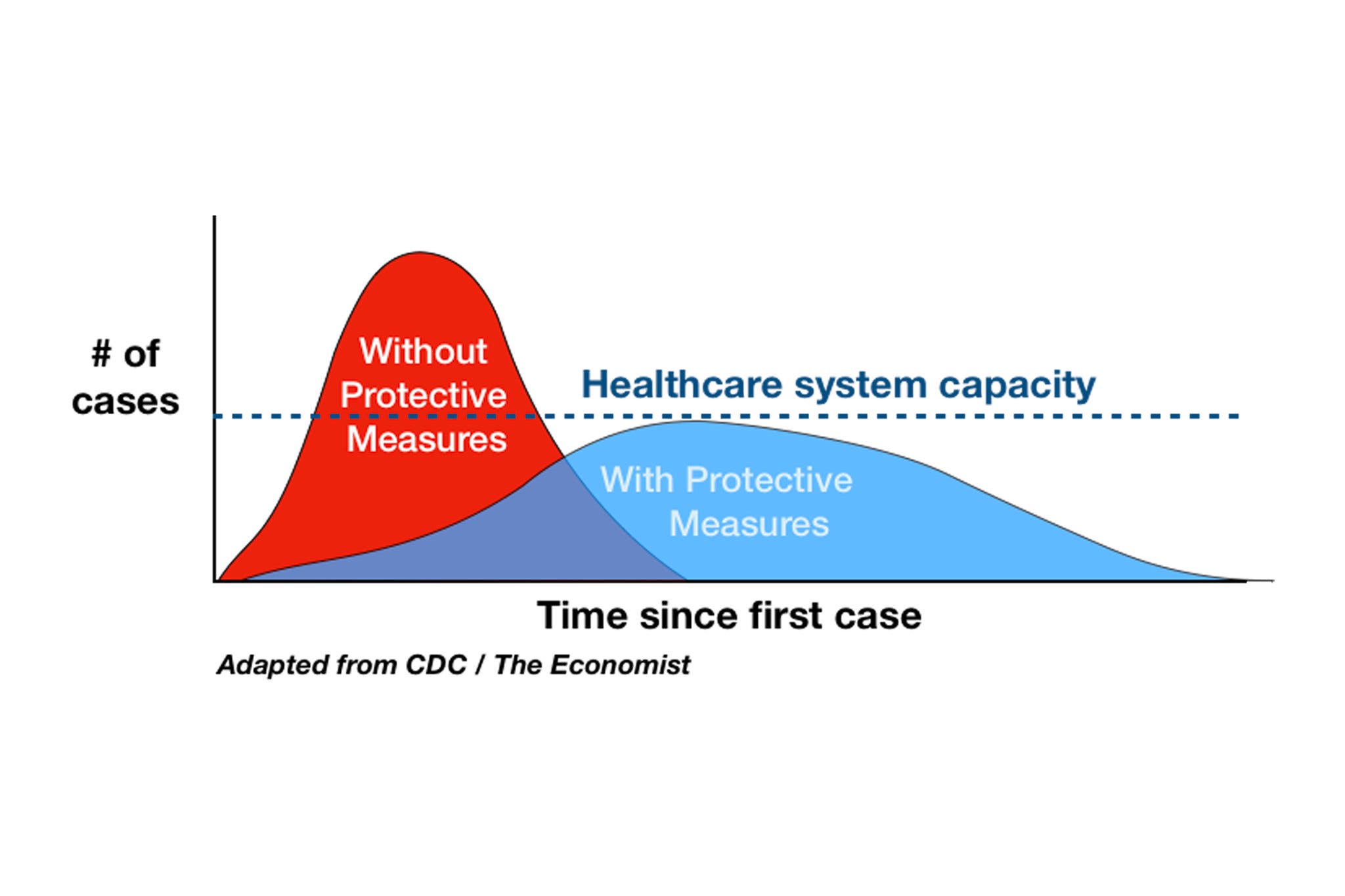
Reproducible version generated using R and {ggplot2}

Reproducible version generated using R and {ggplot2}

A simple area chart showing how non-pharmaceutical interventions (e.g. masking, social distancing) could reduce the peak burden on healthcare systems was reproduced in newspapers, on social media, and in government briefings. Its accessibility — it was intuitive to read, color was not the only encoding, and the message was captured in the title — contributed directly to its impact.

Accessibility is not a feature you add at the end. It shapes every design decision: color choice, font size, label placement, and whether the data structure is communicated through alt text. When you design for accessibility, you benefit everyone — readers with color vision deficiencies, those using screen readers, and those viewing your chart in print or low-light conditions.

In this article, we will cover three key elements of accessible data visualization design:

  1. Alternative text: Write descriptive alt text for every chart, following a structured framework.
  2. Color and contrast: Use colorblind-friendly palettes, check color contrast ratios, and apply redundant encoding to ensure charts are interpretable without color.
  3. Whitespace, patterns, and fonts: Use whitespace and pattern fills to differentiate chart elements, and choose accessible fonts with sufficient

Data

We’ll use data on registered nurses by US state and year, including salary and employment figures.1

nurses <- read_csv("data/nurses.csv") |> janitor::clean_names()
glimpse(nurses)
Rows: 1,242
Columns: 22
$ state                                        <chr> "Alabama", "Alaska", "Arizona", "Ar…
$ year                                         <dbl> 2020, 2020, 2020, 2020, 2020, 2020,…
$ total_employed_rn                            <dbl> 48850, 6240, 55520, 25300, 307060, …
$ employed_standard_error_percent              <dbl> 2.9, 13.0, 3.7, 4.2, 2.0, 2.8, 6.5,…
$ hourly_wage_avg                              <dbl> 28.96, 45.81, 38.64, 30.60, 57.96, …
$ hourly_wage_median                           <dbl> 28.19, 45.23, 37.98, 29.97, 56.93, …
$ annual_salary_avg                            <dbl> 60230, 95270, 80380, 63640, 120560,…
$ annual_salary_median                         <dbl> 58630, 94070, 79010, 62330, 118410,…
$ wage_salary_standard_error_percent           <dbl> 0.8, 1.4, 0.9, 1.4, 1.0, 0.7, 1.0, …
$ hourly_10th_percentile                       <dbl> 20.75, 31.50, 27.66, 21.47, 36.62, …
$ hourly_25th_percentile                       <dbl> 23.73, 36.94, 32.58, 25.71, 45.18, …
$ hourly_75th_percentile                       <dbl> 33.15, 53.31, 44.67, 35.40, 71.07, …
$ hourly_90th_percentile                       <dbl> 38.67, 60.70, 50.14, 39.65, 83.35, …
$ annual_10th_percentile                       <dbl> 43150, 65530, 57530, 44660, 76180, …
$ annual_25th_percentile                       <dbl> 49360, 76830, 67760, 53490, 93970, …
$ annual_75th_percentile                       <dbl> 68960, 110890, 92920, 73630, 147830…
$ annual_90th_percentile                       <dbl> 80420, 126260, 104290, 82480, 17337…
$ location_quotient                            <dbl> 1.20, 0.98, 0.91, 1.00, 0.87, 0.95,…
$ total_employed_national_aggregate            <dbl> 140019790, 140019790, 140019790, 14…
$ total_employed_healthcare_national_aggregate <dbl> 8632190, 8632190, 8632190, 8632190,…
$ total_employed_healthcare_state_aggregate    <dbl> 128600, 17730, 171010, 80410, 84474…
$ yearly_total_employed_state_aggregate        <dbl> 1903210, 296300, 2835110, 1177860, …
Throughout this article we’ll focus on three states:

nurses_subset <- nurses |>
  filter(state %in% c("California", "New York", "North Carolina"))

Alternative text

What is alt text?

Alternative text (alt text) is a written description attached to an image. Screen readers read it aloud for users with visual impairments. Browsers display it when an image fails to load. Search engines use it for indexing.

For data visualizations, alt text serves a specific purpose: it communicates the content and meaning of the chart to someone who cannot see it.

The framework

Creating high-quality alt text is challenging. Amy Cesal developed a useful template for chart alt text designed to include the most important information in a concise format. The framework is:

"CHART TYPE of TYPE OF DATA where REASON FOR INCLUDING CHART"
  • CHART TYPE: Telling readers the chart type gives context before they encounter the data. A reader with partial vision can orient themselves before processing specifics.
  • TYPE OF DATA: What variables are plotted? The axis labels often answer this directly.
  • REASON FOR INCLUDING CHART: Every chart should have a point. State it. What pattern or finding motivated including this visualization?

The alt text should also include a link to the underlying data source somewhere nearby, though not embedded in the alt text itself.

Alt text in the wild

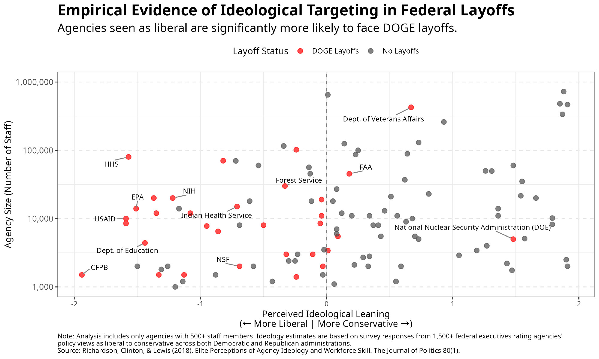
Good alt text is visible in practice when you look for it. Here is an example from Bluesky:

Source: Adam Bonica via Bluesky. If you go to the post and click the image, you’ll see the alt text at the bottom of the screen.

Source: Adam Bonica via Bluesky. If you go to the post and click the image, you’ll see the alt text at the bottom of the screen.

Adding alt text in Quarto

Alt text needs to be embedding in the HTML source code so that screen readers can access it. When you render a plot in a Quarto document, the image file is generated and the alt text is added as an attribute to the <img> tag in the HTML.

To ensure the alt text is included in the HTML, use the fig-alt chunk option.

For short alt text that fits on one line:

```{r}
#| fig-alt: Alt text goes here.

# code for plot goes here
```

Longer alt text using YAML block literal syntax:

```{r}
#| fig-alt: |
#|   Longer alt text goes here. Make sure to add line breaks roughly
#|   80 characters wide for readability in the source file.

# code for plot goes here
```

Developing the alt text: an example

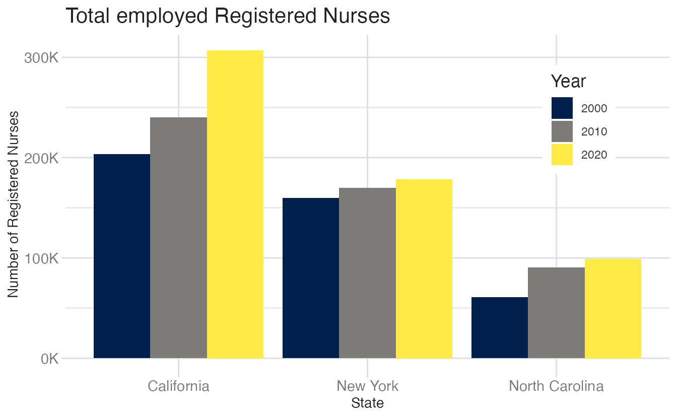
Here is a bar chart of total employed registered nurses in three states across three years. A range of alt text versions, from minimal to complete, illustrates how the framework applies.

The figure is a bar chart titled 'Total employed Registered Nurses' that displays the numbers of registered nurses in three states (California, New York, and North Carolina) over a 20 year period, with data recorded in three time points (2000, 2010, and 2020). In each state, the numbers of registered nurses increase over time. The following numbers are all approximate. California started off with 200K registered nurses in 2000, 240K in 2010, and 300K in 2020. New York had 150K in 2000, 160K in 2010, and 170K in 2020. Finally North Carolina had 60K in 2000, 90K in 2010, and 100K in 2020.

Here is how the alt text develops in stages.

First attempt

Total employed registered nurses in three states over time.

This is too brief and does not give sufficient context.

Second attempt

Total employed registered nurses in California, New York, and North Carolina, in 2000, 2010, and 2020.

This is better since it names the variables, but it still lacks the key trend and the chart type.

Third attempt

A bar chart of total employed registered nurses in California, New York, and North Carolina, in 2000, 2010, and 2020, showing increasing numbers of nurses over time.

This is good; it includes the chart type and the key trend. However, it still lacks specific numbers that may be important to a reader, especially since the trends differ across states.

Final attempt

The figure is a bar chart titled ‘Total employed Registered Nurses’ that displays the numbers of registered nurses in three states (California, New York, and North Carolina) over a 20 year period, with data recorded in three time points (2000, 2010, and 2020). In each state, the numbers of registered nurses increase over time. The following numbers are all approximate. California started off with 200K registered nurses in 2000, 240K in 2010, and 300K in 2020. New York had 150K in 2000, 160K in 2010, and 170K in 2020. Finally North Carolina had 60K in 2000, 90K in 2010, and 100K in 2020.

This is complete; it includes all details and the key trend. A reader using a screen reader would have a clear understanding of the chart’s content and message.

LLM assistance for alt text

Large language models can generate a reasonable first draft of alt text when given a chart image. Pass the rendered plot to a model with a system prompt specifying the accessibility framework, and use the output as a starting point. The model will typically capture the chart type and axis variables but may miss subtle patterns or require editing for accuracy. Use LLM-generated alt text as a first draft, not a final product.

An example using Claude Sonnet:

Grouped bar chart titled “Total Employed Registered Nurses,” showing the number of registered nurses across three states — California, New York, and North Carolina — for three years: 2000, 2010, and 2020. The x-axis represents the state and the y-axis represents the number of registered nurses, ranging from 0 to over 300,000.

Key data points:

  • California had the highest totals across all years, growing from approximately 205,000 in 2000 to 245,000 in 2010, and reaching approximately 310,000 in 2020.
  • New York showed moderate and steady growth, from approximately 158,000 in 2000 to 165,000 in 2010, and approximately 178,000 in 2020.
  • North Carolina had the lowest totals but showed notable growth, rising from approximately 55,000 in 2000 to 90,000 in 2010, and approximately 100,000 in 2020.

Overall, all three states experienced consistent increases in employed registered nurses over the two-decade period, with California showing the most substantial growth in absolute numbers.

Accessible tables as an alternative

For some charts, an accessible data table is a better complement to alt text than a detailed description. A reader using a screen reader can navigate a table row by row. Here is a {gt} table version of the nurses bar chart data:

Code
nurses_subset |>
  filter(year %in% c(2000, 2010, 2020)) |>
  arrange(year) |>
  select(state, year, total_employed_rn) |>
  pivot_wider(
    names_from = year,
    values_from = total_employed_rn
  ) |>
  gt() |>
  fmt_number(
    columns = -state,
    decimals = 0
  ) |>
  cols_label(state = "State") |>
  tab_spanner(
    label = "Total employed registered nurses",
    columns = everything()
  ) |>
  tab_style(
    style = cell_text(weight = "bold"),
    locations = cells_column_spanners()
  )
Total employed registered nurses
State 2000 2010 2020
California 203,390 240,030 307,060
New York 159,670 169,710 178,550
North Carolina 60,940 90,730 99,110

Colors and colorblindness

The problem with default colors

The default {ggplot2} color scale uses evenly spaced hues around the color wheel. These colors are distinguishable to people with typical color vision, but many of them are not distinguishable to people with color vision deficiencies.

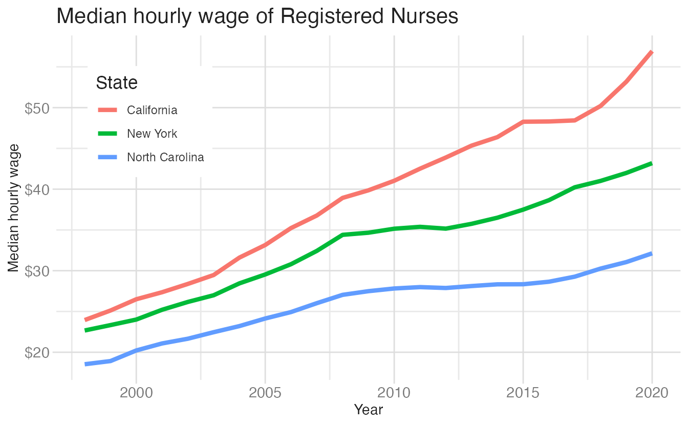
Here is a line chart of median hourly wages with the default palette:

The colorblindr::cvd_grid() function simulates how the chart appears under six different color vision deficiency conditions:

cvd_grid(nurses_wages)

The simulations reveal that the default red-green-blue palette fails for several common colorblindness types. The red and green lines become nearly indistinguishable.

Colorblind-friendly palettes

A better choice is to use palettes designed for colorblind accessibility.2 Two good options include:

Okabe-Ito (scale_color_colorblind() from {ggthemes}) - a qualitative palette designed to be distinguishable for people with deuteranopia, protanopia, and tritanopia.

Okabe-Ito colorblind-friendly palette
Color name Hex code R, G, B (0-255)
Black #000000 0, 0, 0
Orange #E69F00 230, 159, 0
Sky Blue #56B4E9 86, 180, 233
Bluish Green #009E73 0, 158, 115
Yellow #F0E442 240, 228, 66
Blue #0072B2 0, 114, 178
Vermilion #D55E00 213, 94, 0
Reddish Purple #CC79A7 204, 121, 167

Viridis (scale_color_viridis_d() from {ggplot2}) - a sequential palette that is perceptually uniform and distinguishable in grayscale. Better suited for ordered data.

Source: [{viridis}(https://cran.r-project.org/web/packages/viridis/vignettes/intro-to-viridis.html)]

Source: [{viridis}(https://cran.r-project.org/web/packages/viridis/vignettes/intro-to-viridis.html)]
Code
nurses_wages_oi <- nurses_subset |>
  ggplot(aes(x = year, y = hourly_wage_median, color = state)) +
  geom_line(linewidth = 1.5) +
  scale_color_colorblind() +
  scale_y_continuous(labels = label_currency()) +
  labs(
    x = "Year",
    y = "Median hourly wage",
    color = "State",
    title = "Median hourly wage of Registered Nurses"
  ) +
  theme(
    legend.position = c(0.15, 0.75),
    legend.background = element_rect(fill = "white", color = "white")
  )
nurses_wages_oi
1
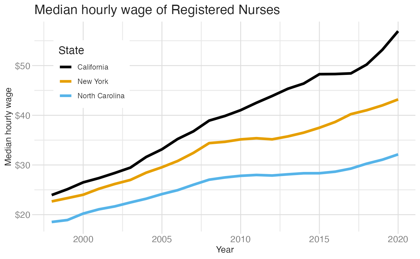
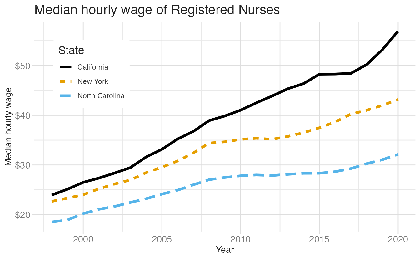
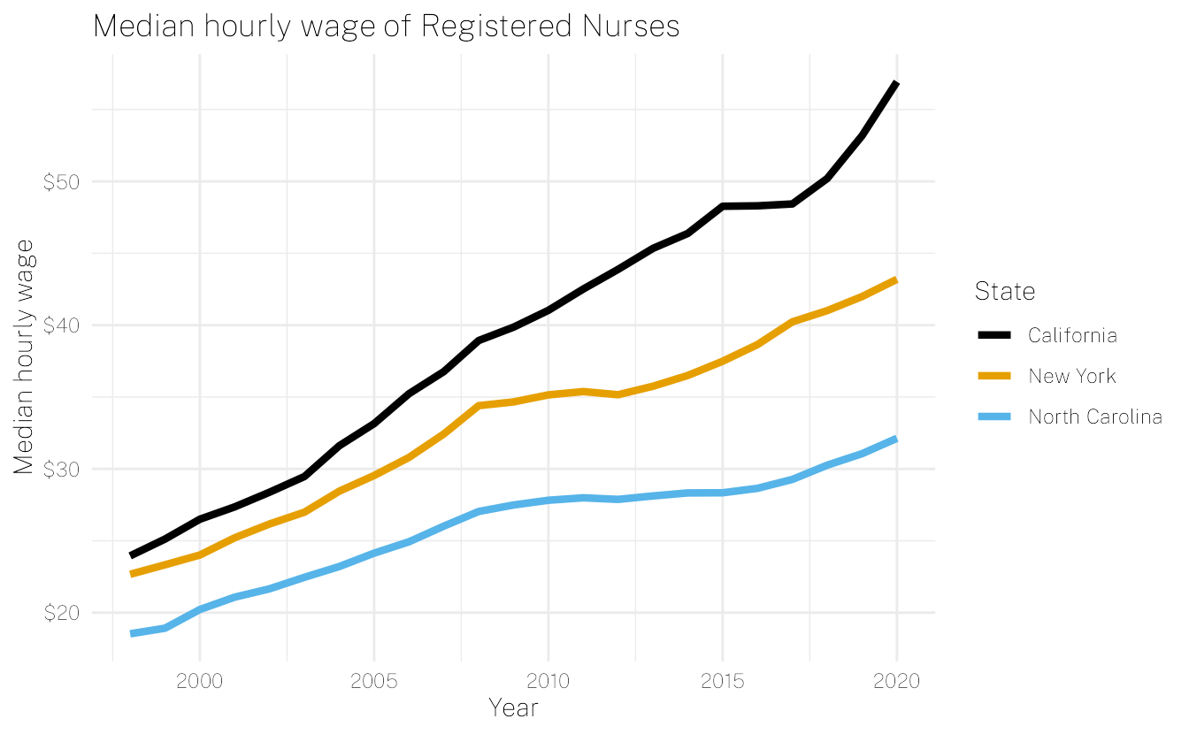
scale_color_colorblind() from {ggthemes} applies the Okabe-Ito palette, designed specifically for colorblind accessibility.

Line chart of median hourly wages using the Okabe-Ito palette.

Line chart of median hourly wages using the Okabe-Ito palette.

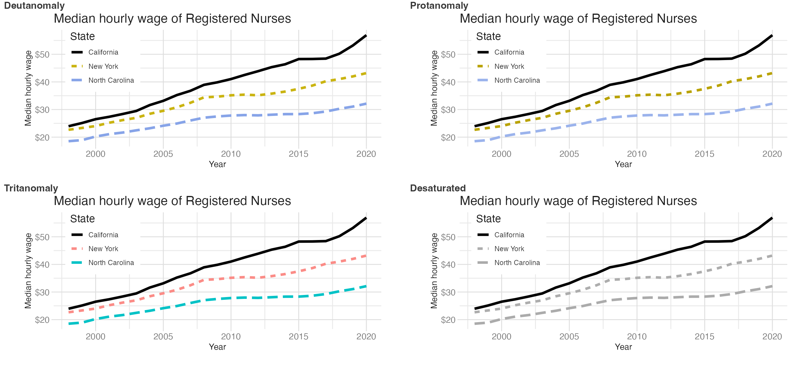
We can re-run cvd_grid() to verify the improvement:

cvd_grid(nurses_wages_oi)

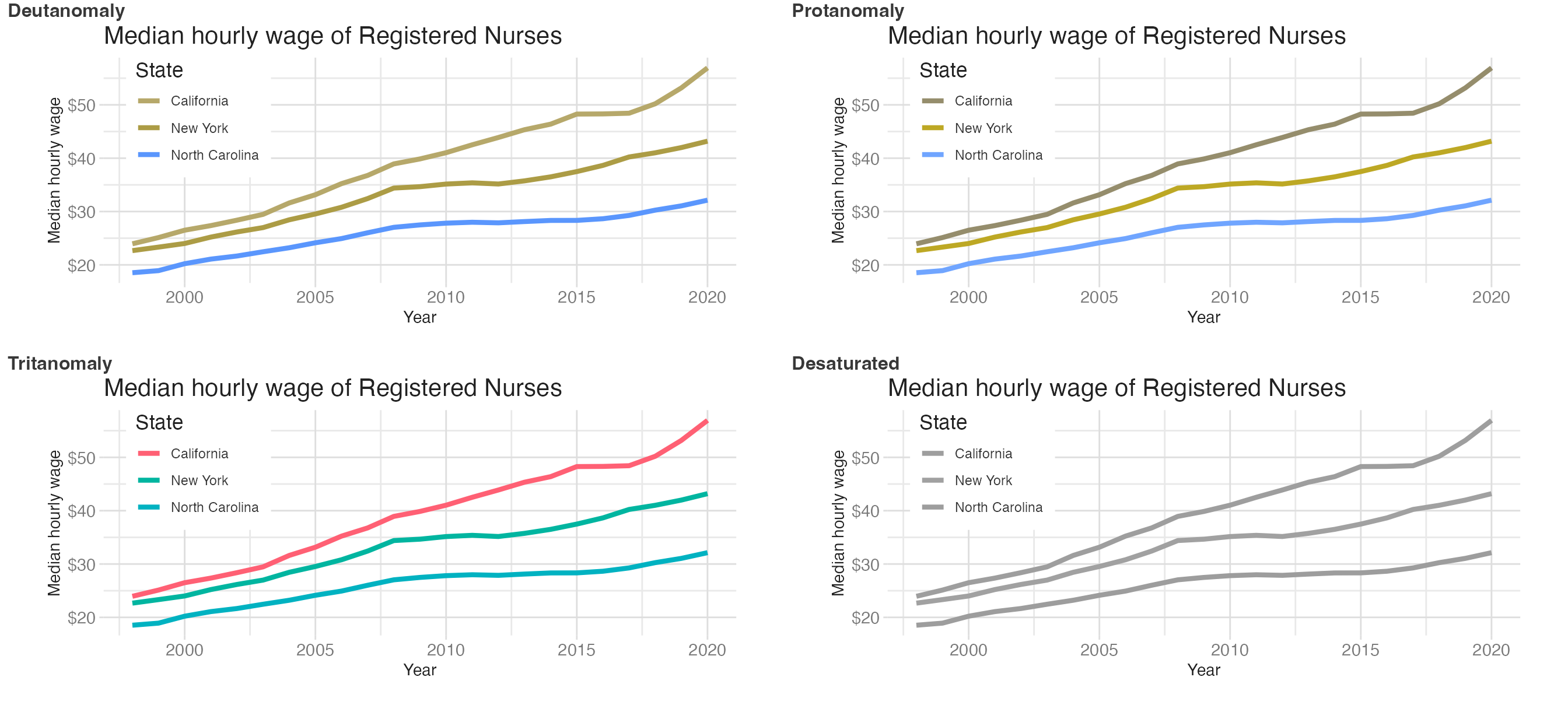
The three states remain distinguishable across most simulated conditions, although the greyscale simulation still shows some challenges.

Color contrast

For text and annotation, background and foreground colors need sufficient contrast to be legible. The WCAG guidelines require a contrast ratio of at least 4.5:1 for normal text. The savonliquide::check_contrast() function checks this.

White on black

check_contrast("#000000", "#FFFFFF")

* The Contrast Ratio is 21

* The result for the AA check is : PASS

* The result for the AALarge check is : PASS

* The result for the AAA check is : PASS

* The result for the AAALarge check is : PASS

Grey on black

check_contrast("#000000", "#424242")

* The Contrast Ratio is 2.08

* The result for the AA check is : FAIL

* The result for the AALarge check is : FAIL

* The result for the AAA check is : FAIL

* The result for the AAALarge check is : FAIL

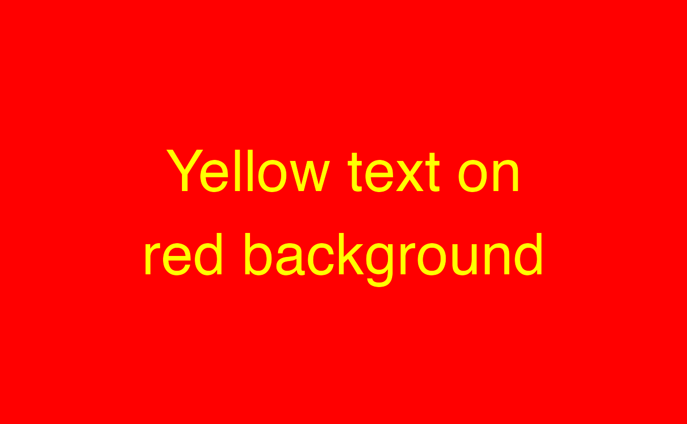
Yellow on red

check_contrast("#ff0000", "#ffff00")

* The Contrast Ratio is 3.72

* The result for the AA check is : FAIL

* The result for the AALarge check is : PASS

* The result for the AAA check is : FAIL

* The result for the AAALarge check is : FAIL

Redundant encoding

Double encoding: color and linetype

Color alone is a fragile encoding. Combining color with a second channel — linetype, shape, or size — ensures that the chart remains interpretable even when color fails. This is called redundant encoding.

For line charts, map the same categorical variable to both color and linetype:

cvd_grid(nurses_double)

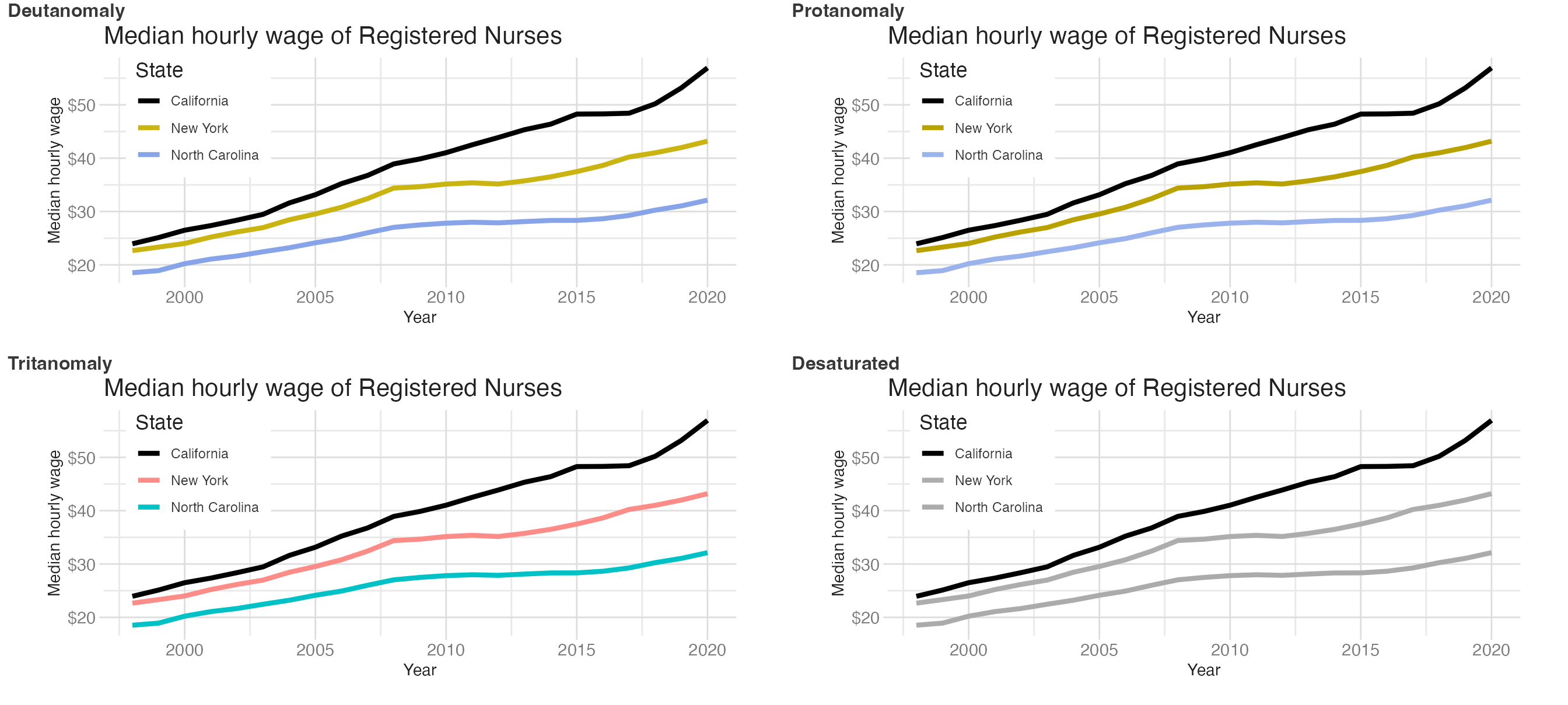
Even in the most challenging colorblindness simulations, the three lines remain distinguishable by pattern.

Direct labeling

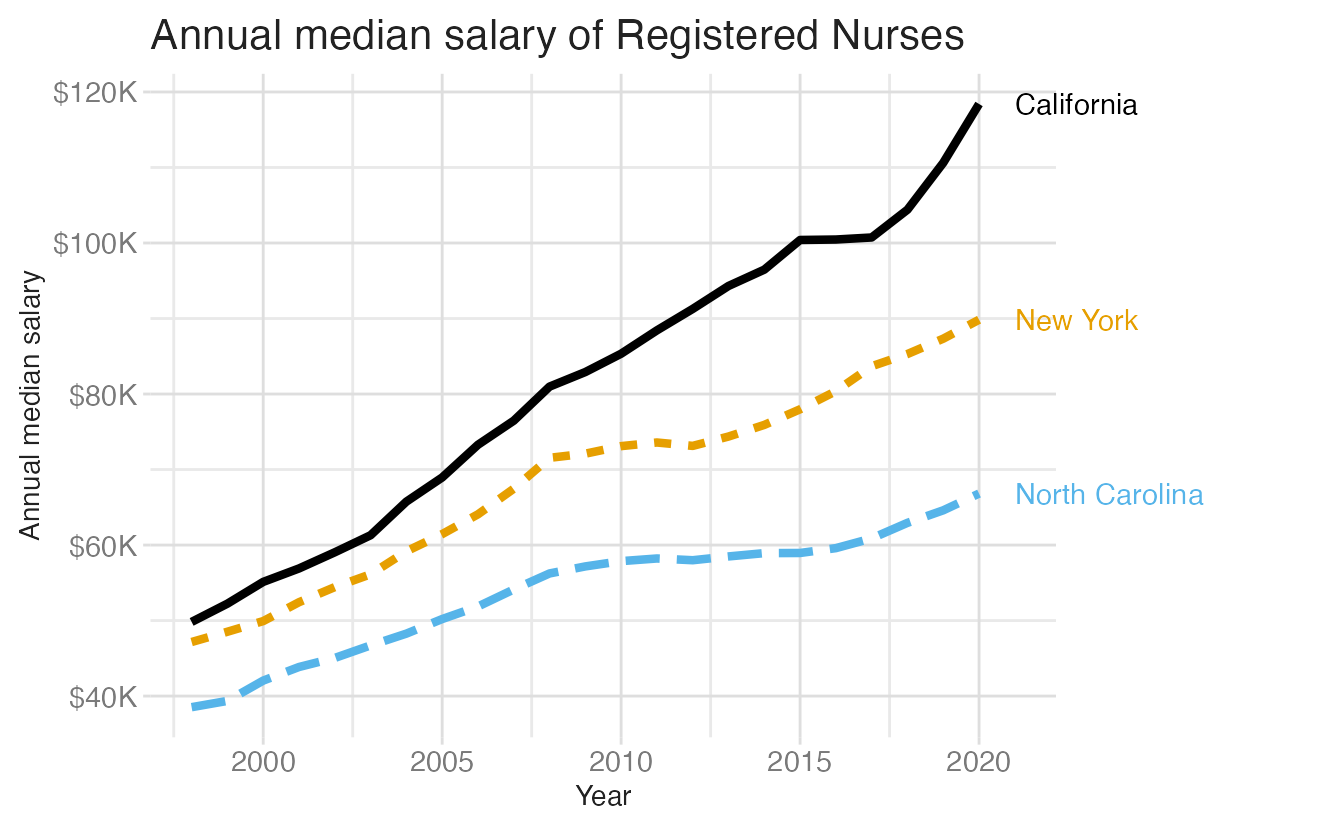
Legends require the reader to look away from the data to decode the mapping. Direct labeling — placing labels directly on the chart elements — removes that friction and eliminates the reliance on color for identification.

Code
nurses_subset |>
  ggplot(aes(
    x = year,
    y = annual_salary_median,
    color = state,
    linetype = state
  )) +
  geom_line(linewidth = 1.5, show.legend = FALSE) +
  geom_text(
    data = nurses_subset |> filter(year == max(year)),
    aes(label = state),
    hjust = 0,
    nudge_x = 1,
    show.legend = FALSE
  ) +
  scale_color_colorblind() +
  scale_y_continuous(labels = label_currency(scale = 1 / 1000, suffix = "K")) +
  coord_cartesian(clip = "off") +
  labs(
    x = "Year",
    y = "Annual median salary",
    title = "Annual median salary of Registered Nurses"
  ) +
  theme(plot.margin = margin(0.1, 1.5, 0.1, 0.1, "in"))
1
Filter to only the final year of data so each label appears once at the end of its line.
2
clip = "off" allows the labels to render outside the plot panel boundaries, preventing them from being clipped.
3
The right plot margin is expanded to provide room for the labels.

Whitespace and patterns

Whitespace

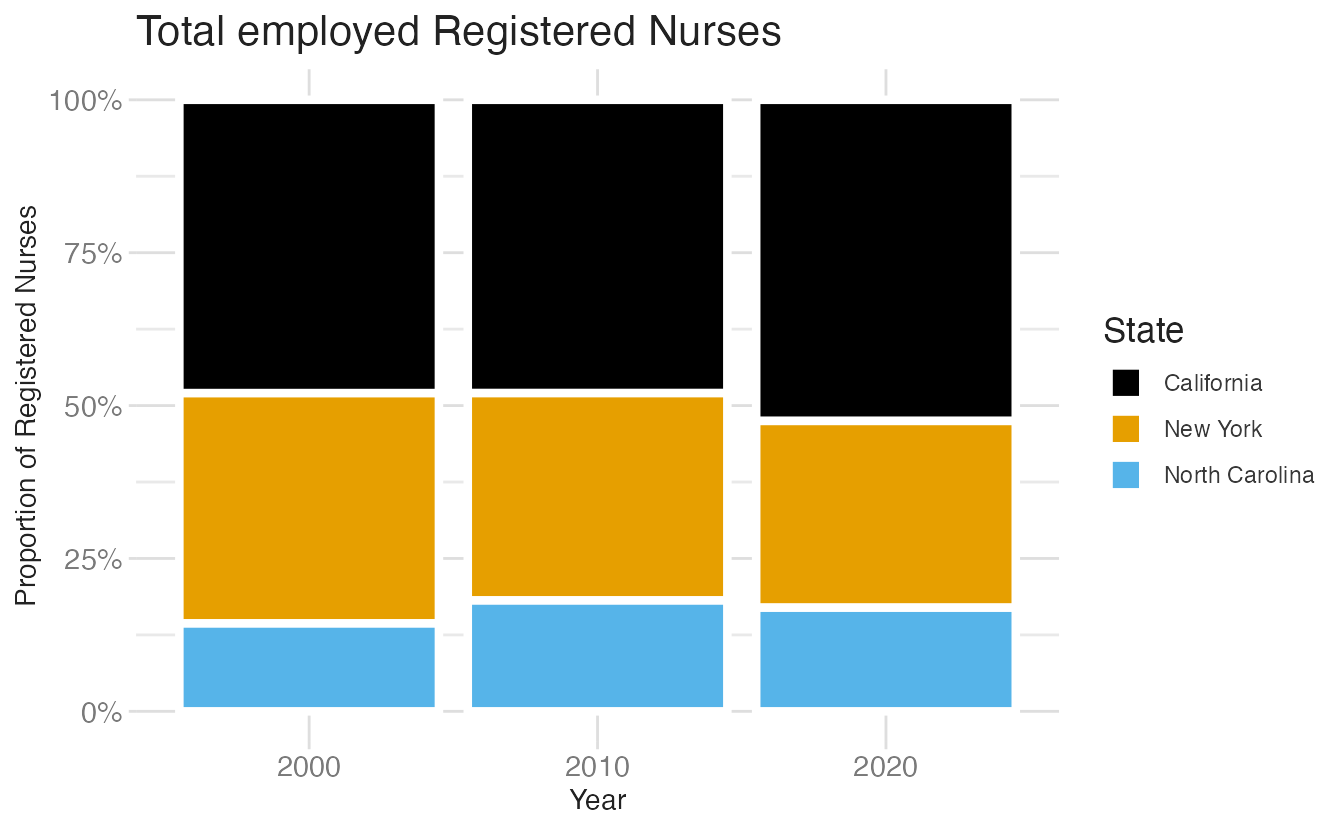
For stacked bar charts, adding whitespace between segments with a white border makes segments distinguishable without relying on color contrast alone:

Code
nurses_subset |>
  filter(year %in% c(2000, 2010, 2020)) |>
  ggplot(aes(x = factor(year), y = total_employed_rn, fill = state)) +
  geom_col(position = "fill") +
  scale_y_continuous(labels = label_percent()) +
  scale_fill_colorblind() +
  labs(
    x = "Year",
    y = "Proportion of Registered Nurses",
    fill = "State",
    title = "Total employed Registered Nurses"
  )
1
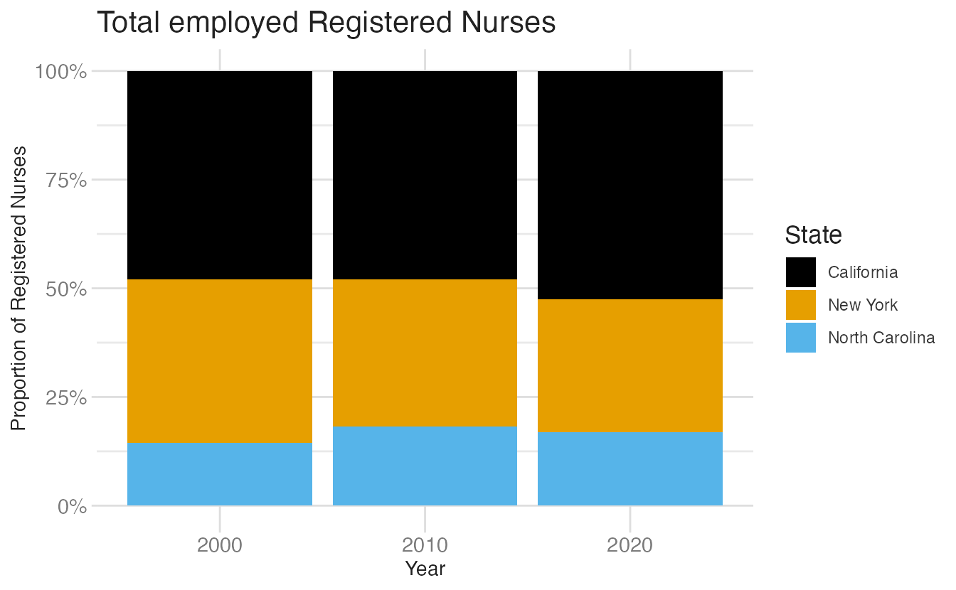
position = "fill" stacks bars to 100%, showing the proportional breakdown. Without whitespace, adjacent segments of similar color are hard to distinguish.

Stacked bar chart without whitespace between segments. Adjacent segments of similar color are hard to distinguish.

Stacked bar chart without whitespace between segments. Adjacent segments of similar color are hard to distinguish.
Code
nurses_subset |>
  filter(year %in% c(2000, 2010, 2020)) |>
  ggplot(aes(x = factor(year), y = total_employed_rn, fill = state)) +
  geom_col(position = "fill", color = "white", linewidth = 1.5) +
  scale_y_continuous(labels = label_percent()) +
  scale_fill_colorblind() +
  labs(
    x = "Year",
    y = "Proportion of Registered Nurses",
    fill = "State",
    title = "Total employed Registered Nurses"
  )
1
color = "white" draws a white border around each bar segment, creating visual separation that does not rely on color contrast.

Stacked bar chart with whitespace between segments. The white borders create visual separation that does not rely on color contrast.

Stacked bar chart with whitespace between segments. The white borders create visual separation that does not rely on color contrast.

Pattern fills with {ggpattern}

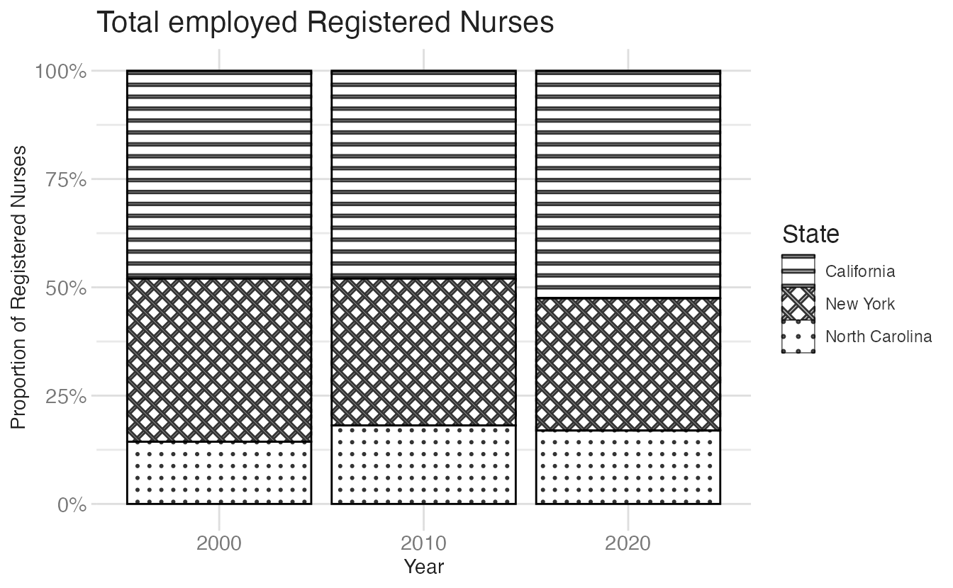
The {ggpattern} package extends {ggplot2} with pattern-filled geoms. geom_col_pattern() replaces geom_col() and maps patterns to variables just like color:

Code
nurses_subset |>
  filter(year %in% c(2000, 2010, 2020)) |>
  ggplot(aes(x = factor(year), y = total_employed_rn)) +
  geom_col_pattern(
    aes(
      pattern = state,
      pattern_angle = state
    ),
    fill = "white",
    colour = "black",
    pattern_spacing = 0.025,
    position = "fill"
  ) +
  scale_y_continuous(labels = label_percent()) +
  labs(
    x = "Year",
    y = "Proportion of Registered Nurses",
    pattern = "State",
    pattern_angle = "State",
    title = "Total employed Registered Nurses"
  )
1
pattern maps a geometric fill pattern (stripes, dots, crosshatch, etc.) to the state variable.
2
pattern_angle varies the angle of the stripes, creating additional differentiation.

Pattern fills work entirely without color, making the chart readable in grayscale and for readers with any type of color vision deficiency (though the aesthetic taste is questionable).

Accessible fonts

Font choice affects legibility for readers with dyslexia, low vision, and other reading differences. Several fonts have been tested specifically for accessibility:

  • Atkinson Hyperlegible — designed by the Braille Institute for readers with low vision. Distinguishes easily confused characters (I, l, 1; O, 0).
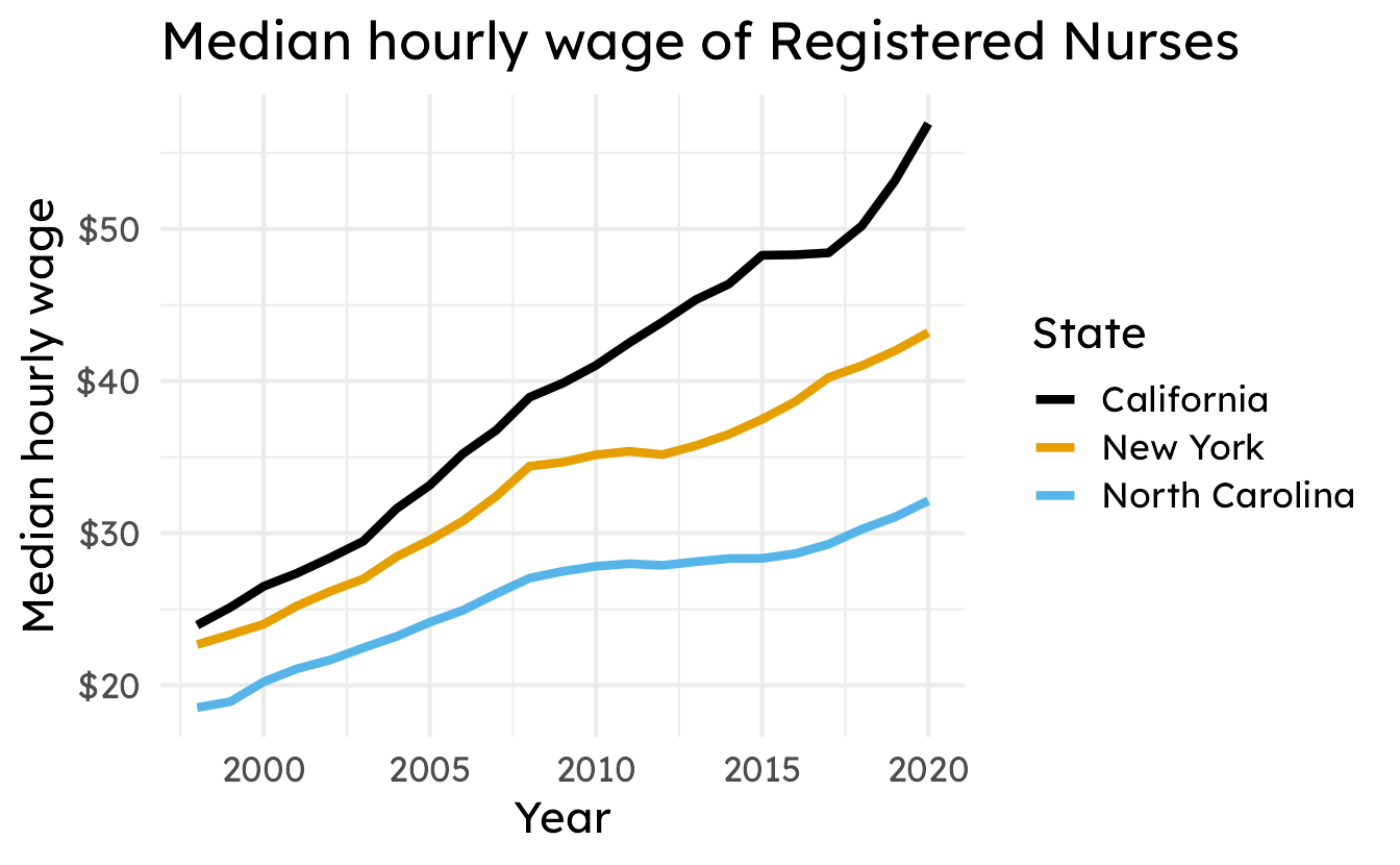
  • Lexend — designed to improve reading fluency; reduces cognitive load from character similarity.
  • Public Sans — open-source US government font with high legibility at small sizes.

Use base_family to apply an accessible font, and ensure base_size is large enough to be legible:

nurses_font <- nurses_subset |>
  ggplot(aes(x = year, y = hourly_wage_median, color = state)) +
  geom_line(linewidth = 1.5) +
  scale_color_colorblind() +
  scale_y_continuous(labels = label_currency()) +
  labs(
    x = "Year",
    y = "Median hourly wage",
    color = "State",
    title = "Median hourly wage of Registered Nurses"
  )
Code
nurses_font +
  theme_minimal(
    base_size = 16,
    base_family = "Atkinson Hyperlegible"
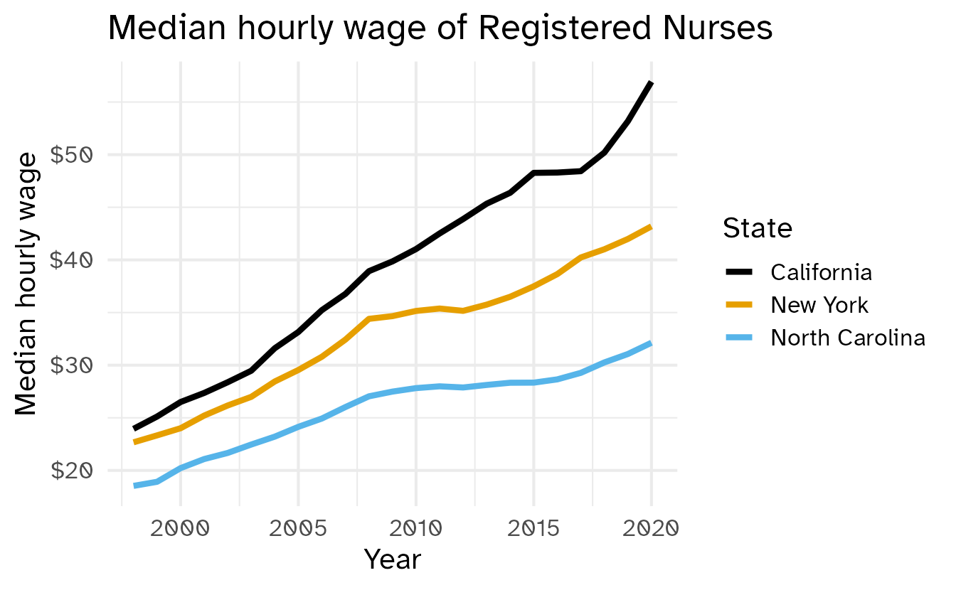
  )
1
base_size = 16 sets a larger base text size. Smaller sizes reduce legibility, especially at typical screen resolutions.
2
base_family = "Atkinson Hyperlegible" applies the accessible font. The font must be installed on your system or downloaded via systemfonts::require_font().

Code
nurses_font +
  theme_minimal(
    base_size = 16,
    base_family = "Lexend"
  )

Code
nurses_font +
  theme_minimal(
    base_size = 11,
    base_family = "Public Sans"
  )

Summary

  • Write alt text for every chart; use the framework “CHART TYPE of TYPE OF DATA where REASON FOR INCLUDING CHART”
  • Add alt text in Quarto with the fig-alt chunk option
  • Use colorblind-friendly palettes such as Okabe-Ito or Viridis
  • Test your palette before publishing
  • Check text/background color contrast
  • Apply redundant encoding
  • Use direct labeling to eliminate reliance on legends and color
  • Add whitespace to separate adjacent elements that may be hard to distinguish by color alone
  • Use pattern fills for charts that must be readable in grayscale
  • Choose accessible fonts and set base_size large enough to be legible

Acknowledgements

Material derived in part from STA 313: Advanced Data Visualization.

Footnotes

  1. Source: TidyTuesday, 2021-10-05↩︎

  2. We will discuss the importance of selecting optimal color palettes later in the course.↩︎