library(tidyverse)The grammar of graphics
Notes
NoteLearning objectives
- Describe the grammar of graphics framework and its components
- Map variables in a dataset to visual aesthetics
- Distinguish between mapping and setting aesthetic properties
- Create small-multiples plots using faceting
TipSupplemental readings
- This page is a summary of A Layered Grammar of Graphics by Hadley Wickham. I strongly encourage you to read the original article in conjunction with this summary.
- ggplot2 - ch 13 (Mastery)
The grammar of graphics is a formal framework for describing statistical visualizations, originated by Leland Wilkinson in 20011 and extended by Hadley Wickham in his {ggplot2} package.2 The name is a deliberate analogy: just as the grammar of a language describes how words combine into meaningful sentences, the grammar of graphics describes how data, aesthetics, and geometric objects combine into meaningful charts.
Every {ggplot2} chart is built from the same layered structure:
ggplot(data = [dataset],
       mapping = aes(x = [x-variable], y = [y-variable])) +
   geom_[chart-type]() +
   other options
This uniformity means the same mental model applies whether you are drawing a scatter plot, a bar chart, a map, or an animated bubble chart.
Components of the layered grammar of graphics
- Layer
- Data
- Mapping
- Statistical transformation (stat)
- Geometric object (geom)
- Position adjustment (position)
- Scale
- Coordinate system (coord)
- Faceting (facet)
- Defaults
- Data
- Mapping
Layer
Layers are used to create the objects on a plot. They are defined by five basic parts:
- Data
- Mapping
- Statistical transformation (stat)
- Geometric object (geom)
- Position adjustment (position)
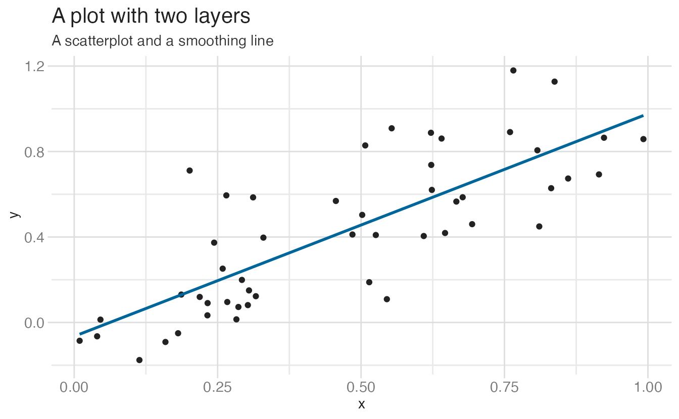
Layers are typically related to one another and share many common features. For instance, multiple layers can be built using the same underlying data. An example would be a scatterplot overlayed with a smoothed regression line to summarize the relationship between two variables:
Data and mapping
Data defines the source of the information to be visualized, but is independent from the other elements. So a layered graphic can be built which utilizes different data sources while keeping the other components the same.
We’ll use the penguins dataset throughout this article. It contains measurements on 333 penguins across three species (Adelie, Chinstrap, Gentoo) on three islands in the Palmer Archipelago, Antarctica.
| species | island | bill_len | bill_dep | flipper_len | body_mass | sex | year |
|---|---|---|---|---|---|---|---|
| Adelie | Torgersen | 39.1 | 18.7 | 181 | 3750 | male | 2007 |
| Adelie | Torgersen | 39.5 | 17.4 | 186 | 3800 | female | 2007 |
| Adelie | Torgersen | 40.3 | 18.0 | 195 | 3250 | female | 2007 |
| Adelie | Torgersen | 36.7 | 19.3 | 193 | 3450 | female | 2007 |
| Adelie | Torgersen | 39.3 | 20.6 | 190 | 3650 | male | 2007 |
| Adelie | Torgersen | 38.9 | 17.8 | 181 | 3625 | female | 2007 |
Mapping defines how the variables are applied to the plot. So if we were graphing information from penguins, we might map a penguin’s flipper length to the \(x\) position and body mass to the \(y\) position.
penguins |>
  select(flipper_len, body_mass) |>
  rename(
    x = flipper_len,
    y = body_mass
  )
# A tibble: 333 × 2
x y
<int> <int>
1 181 3750
2 186 3800
3 195 3250
4 193 3450
5 190 3650
6 181 3625
7 195 4675
8 182 3200
9 191 3800
10 198 4400
# ℹ 323 more rowsStatistical transformation
A statistical transformation (stat) transforms the data, generally by summarizing the information. For instance, in a bar graph you typically are not trying to graph the raw data because this doesn’t make any inherent sense. Instead, you might summarize the data by graphing the total number of observations within a set of categories. Or if you have a dataset with many observations, you might transform the data into a smoothing line which summarizes the overall pattern of the relationship between variables by calculating the mean of \(y\) conditional on \(x\).
A stat is a function that takes in a dataset as the input and returns a dataset as the output; a stat can add new variables to the original dataset, or create an entirely new dataset. So instead of graphing this data in its raw form:
penguins |>
  select(island)
# A tibble: 333 × 1
island
<fct>
1 Torgersen
2 Torgersen
3 Torgersen
4 Torgersen
5 Torgersen
6 Torgersen
7 Torgersen
8 Torgersen
9 Torgersen
10 Torgersen
# ℹ 323 more rowsYou would transform it to:
penguins |>
  count(island)
# A tibble: 3 × 2
island n
<fct> <int>
1 Biscoe 163
2 Dream 123
3 Torgersen 47
Note
Sometimes you don’t need to make a statistical transformation. For example, in a scatterplot you use the raw values for the \(x\) and \(y\) variables to map onto the graph. In these situations, the statistical transformation is an identity transformation - the stat simply passes in the original dataset and exports the exact same dataset.
Geometric objects
Geometric objects (geoms) control the type of plot you create. Geoms are classified by their dimensionality:
- 0 dimensions - point, text
- 1 dimension - path, line
- 2 dimensions - polygon, interval
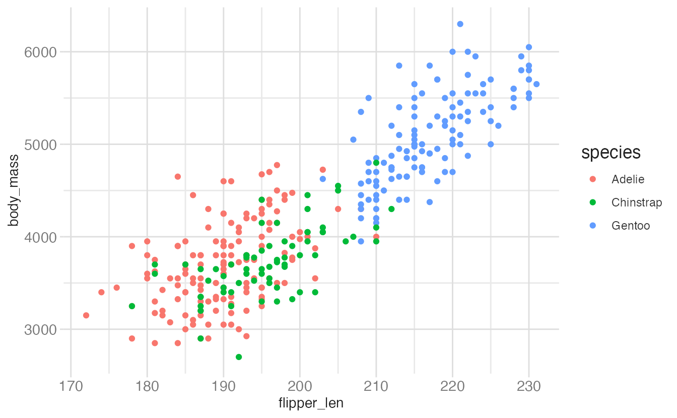
Each geom can only display certain aesthetics or visual attributes of the geom. For example, a point geom has position, color, shape, and size aesthetics.
# a point geom with position and color aesthetics
ggplot(
data = penguins,
mapping = aes(
x = flipper_len,
y = body_mass,
color = species
)
) +
geom_point()- 1
- Position defines where each point is drawn on the plot
- 2
- Color defines the color of each point. Here the color is determined by the species of the car (observation)
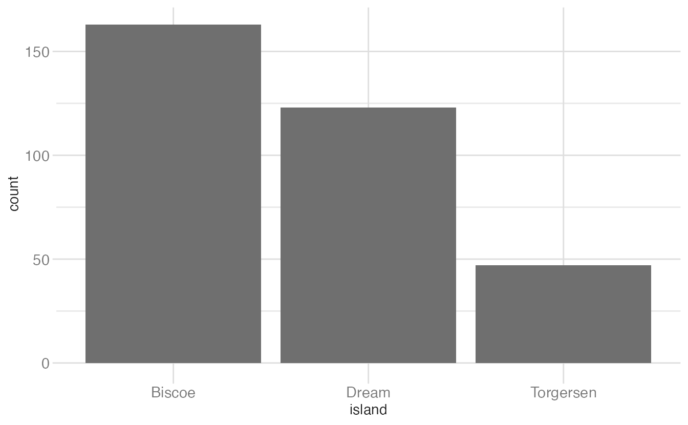
Whereas a bar geom has position, height, width, and fill color.
# a bar geom with position and height aesthetics
ggplot(data = penguins, aes(x = island)) +
geom_bar()- 1
- Position determines the starting location (origin) of each bar
- 2
- Height determines how tall to draw the bar. Here the height is based on the number of observations in the dataset for each island.
Position adjustment
Sometimes with dense data we need to adjust the position of elements on the plot, otherwise data points might obscure one another. Bar plots frequently stack or dodge the bars to avoid overlap:
# stacked bar chart
count(x = penguins, species, island) |>
  ggplot(mapping = aes(x = island, y = n, fill = species)) +
  geom_col()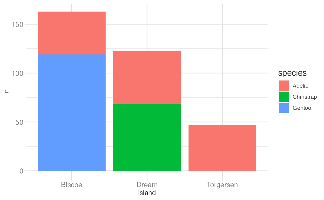
# dodged bar chart
count(x = penguins, species, island) |>
  ggplot(mapping = aes(x = island, y = n, fill = species)) +
  geom_col(position = "dodge")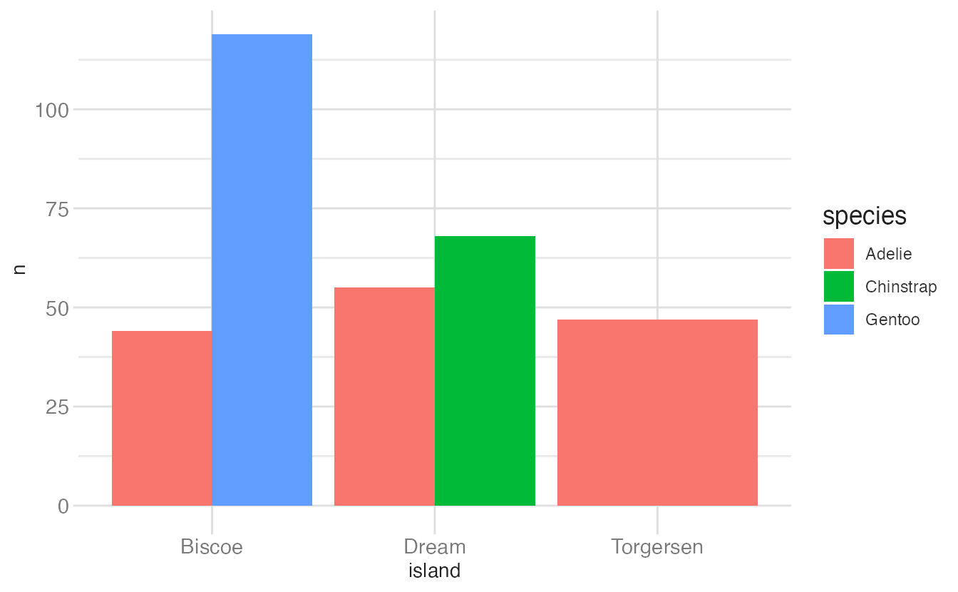
Sometimes scatterplots with few unique \(x\) and \(y\) values are jittered (random noise is added) to reduce overplotting.
# point geom with obscured data points
ggplot(data = penguins, mapping = aes(x = island, y = body_mass)) +
  geom_point()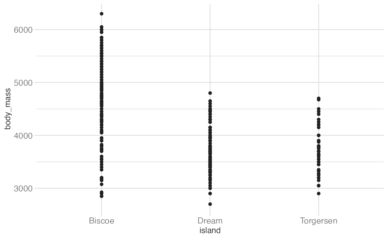
# point geom with jittered data points
ggplot(data = penguins, mapping = aes(x = island, y = body_mass)) +
  geom_jitter()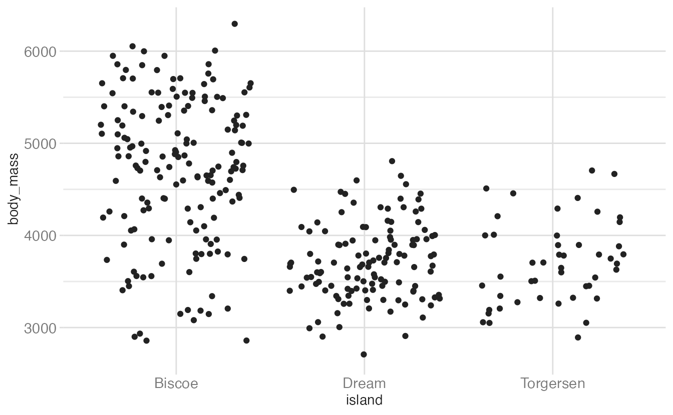
Scale
A scale controls how data is mapped to aesthetic attributes, so we need one scale for every aesthetic property employed in a layer. For example, this graph defines a scale for color:
ggplot(
  data = penguins,
  mapping = aes(
    x = flipper_len,
    y = body_mass,
    color = species
  )
) +
  geom_point()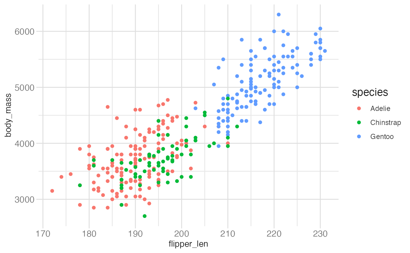
Note that the scale is consistent - every point for an Adèlie penguin is drawn in red, whereas Chinstrap penguins are drawn in green. The scale can be changed to use a different color palette:
ggplot(
  data = penguins,
  mapping = aes(
    x = flipper_len,
    y = body_mass,
    color = species
  )
) +
  geom_point() +
  scale_color_brewer(palette = "Dark2")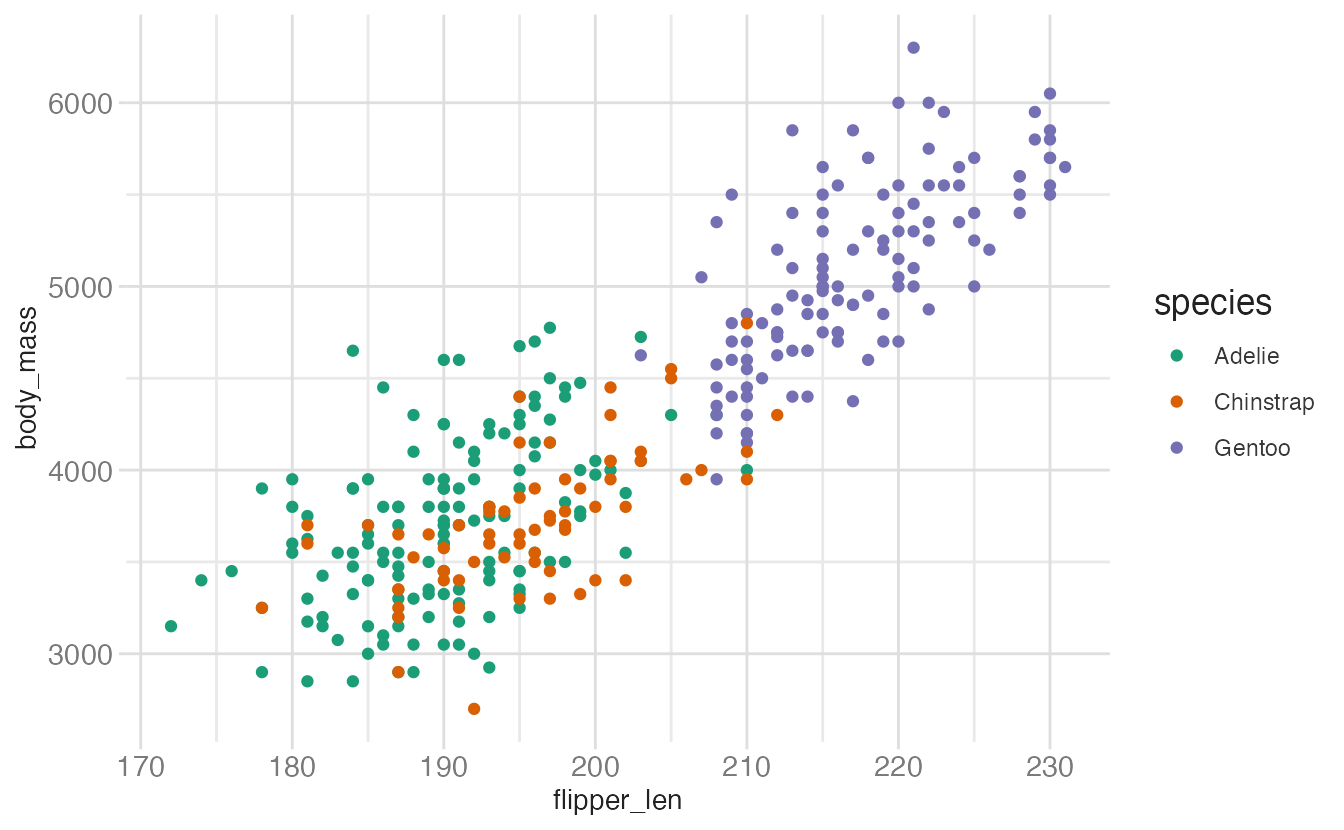
Now we are using a different palette, but the scale is still consistent: all Adèlie penguins utilize the same color, whereas Chinstrap penguins use a new color but each Chinstrap penguin still uses the same, consistent color.
Coordinate system
A coordinate system (coord) maps the position of objects onto the plane of the plot, and controls how the axes and grid lines are drawn. Plots typically use two coordinates (\(x, y\)), but could use any number of coordinates. Most plots are drawn using the Cartesian coordinate system:
# create simulated dataset
p <- tibble(
  x = c(1, 10),
  y = c(1, 5)
) |>
  # draw a basic chart with no geom
  ggplot(mapping = aes(x = x, y = y))

# cartesian coordinate system
p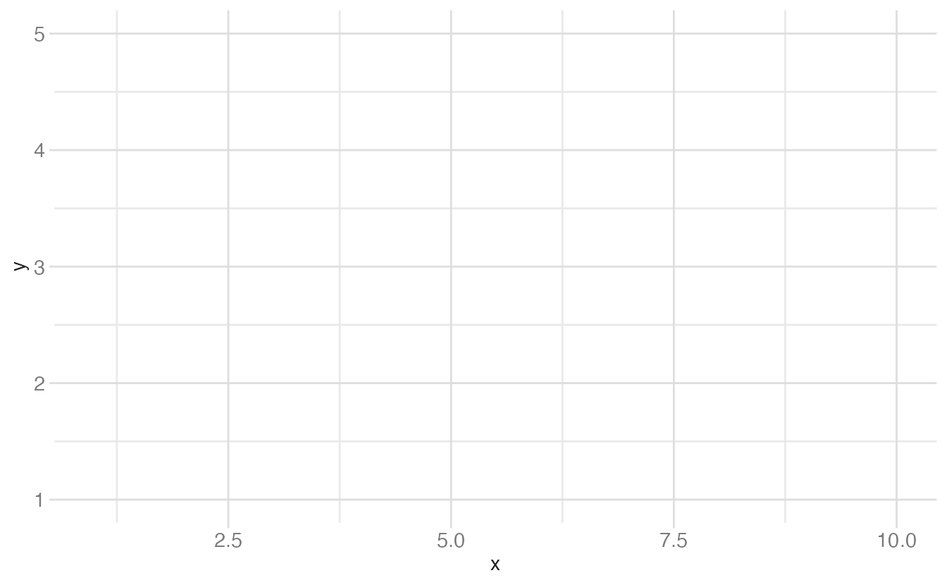
This system requires a fixed and equal spacing between values on the axes. That is, the graph draws the same distance between 1 and 2 as it does between 5 and 6. The graph could be drawn using a semi-log coordinate system which logarithmically compresses the distance on an axis:
# semi-log coordinate system
p +
  coord_transform(y = "log10")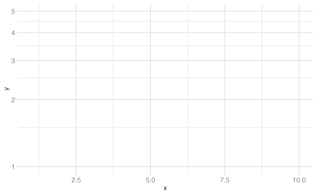
Or could even be drawn using polar coordinates:
# polar coordinate system
p +
  coord_radial()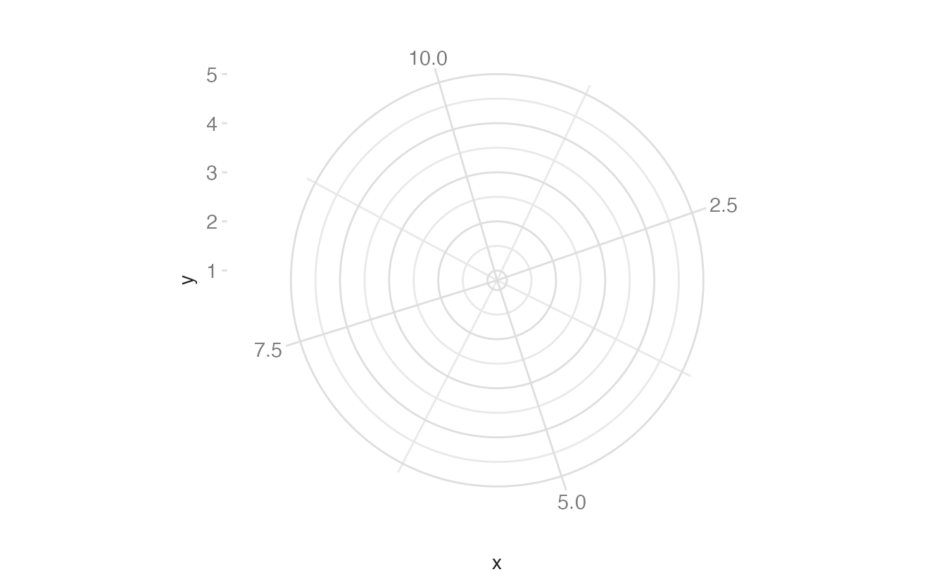
Faceting
Faceting can be used to split the data up into subsets of the entire dataset. This is a powerful tool when investigating whether patterns are the same or different across conditions, and allows the subsets to be visualized on the same plot (known as conditioned or trellis plots). The faceting specification describes which variables should be used to split up the data, and how they should be arranged.
ggplot(data = penguins, mapping = aes(x = flipper_len, y = body_mass)) +
  geom_point() +
  facet_wrap(facets = vars(species))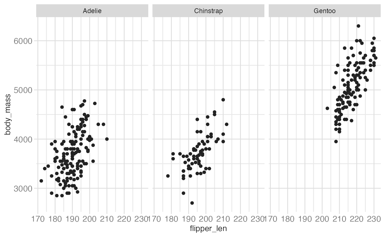
facet_grid()
facet_grid() produces a two-dimensional grid defined by row and column variables:
ggplot(data = penguins, mapping = aes(x = bill_dep, y = bill_len)) +
  geom_point() +
  facet_grid(rows = vars(species), cols = vars(island))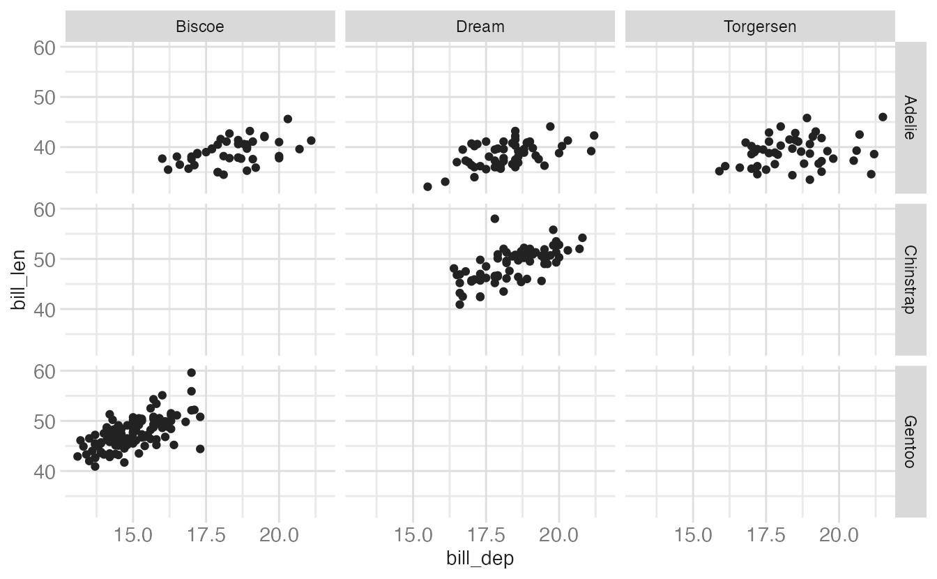
Swapping the row and column variables is a simple but meaningful decision — it changes which comparisons are visually easier to make. Panels in the same column share an x-axis, and panels in the same row share a y-axis, making within-row or within-column comparisons easier:
ggplot(data = penguins, mapping = aes(x = bill_dep, y = bill_len)) +
  geom_point() +
  facet_grid(rows = vars(sex), cols = vars(species))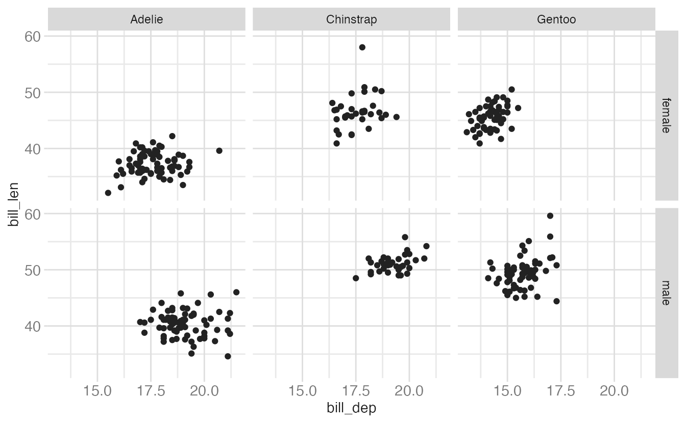
facet_wrap()
facet_wrap() lays out panels in a one-dimensional ribbon that wraps to fill the available space. It’s most useful when you have a single faceting variable and want control over the number of columns:
ggplot(data = penguins, mapping = aes(x = bill_dep, y = bill_len)) +
  geom_point() +
  facet_wrap(facets = vars(species))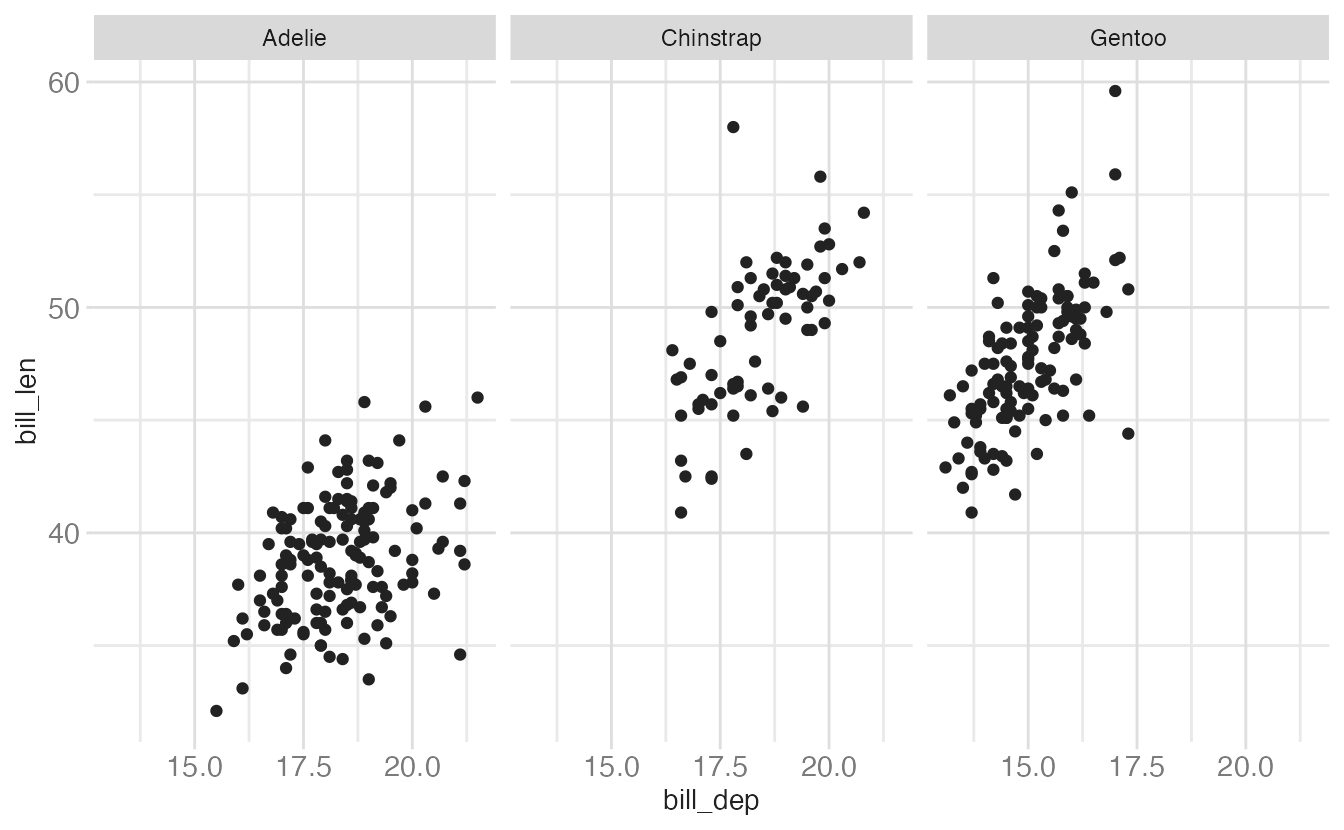
To control the layout explicitly, use ncol or nrow:
ggplot(data = penguins, mapping = aes(x = bill_dep, y = bill_len)) +
  geom_point() +
  facet_wrap(facets = vars(species), ncol = 2)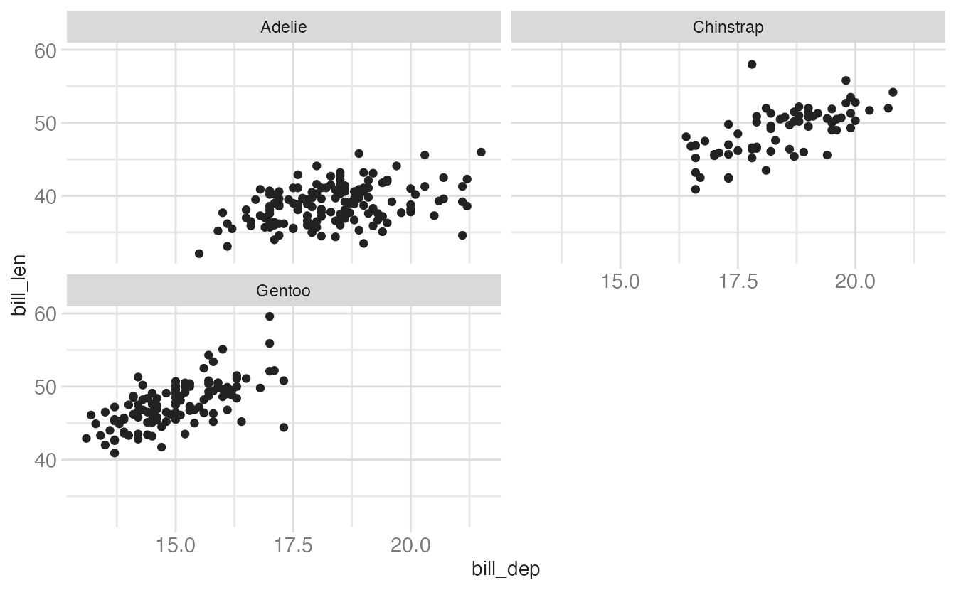
Combining facets and color
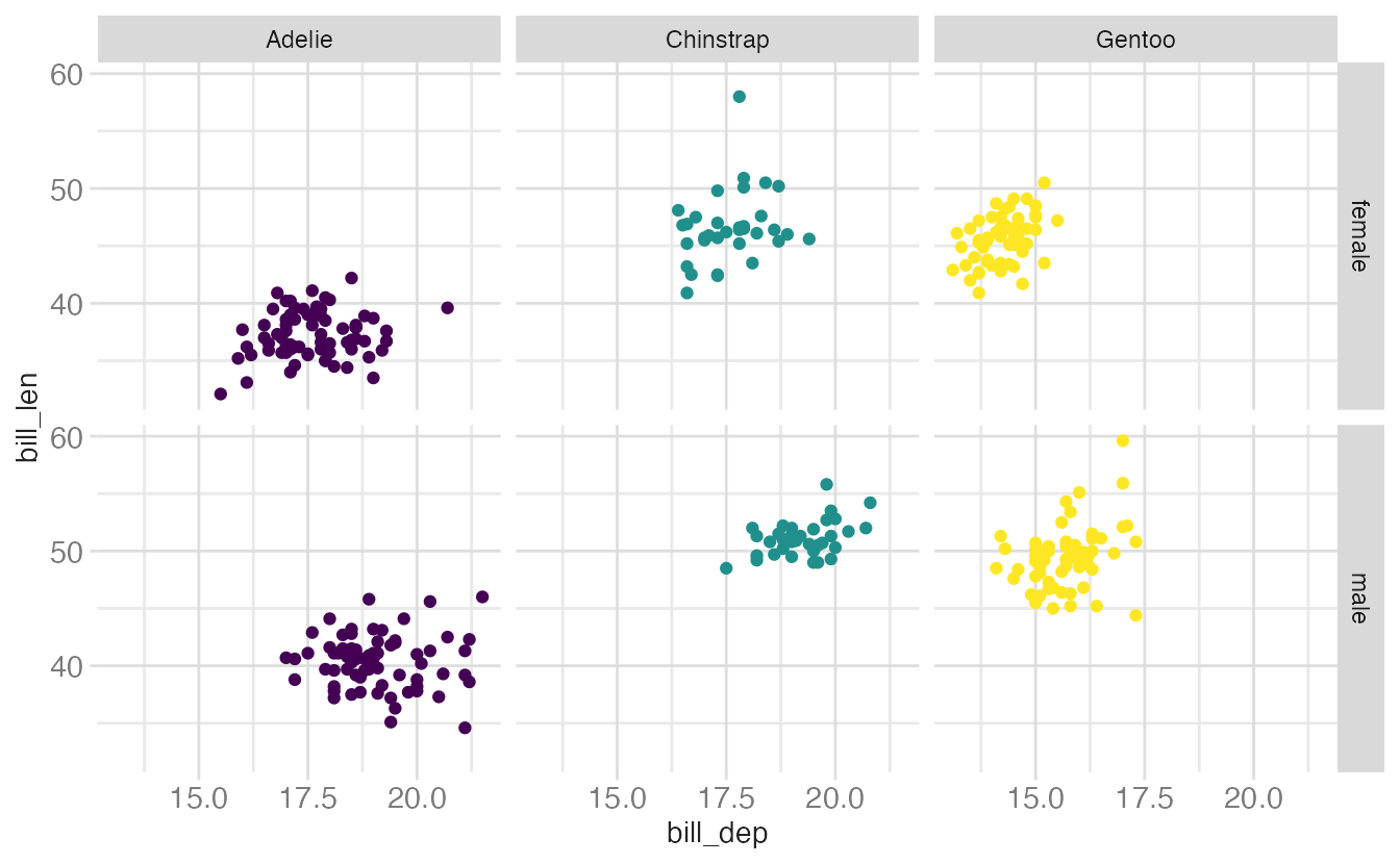
Faceting and color aesthetics can be combined for maximum information density. When the faceting variable and the color variable are the same, the legend becomes redundant and can be suppressed:
ggplot(
  data = penguins,
  mapping = aes(
    x = bill_dep,
    y = bill_len,
    color = species
  )
) +
  geom_point() +
  facet_grid(rows = vars(sex), cols = vars(species)) +
  scale_color_viridis_d()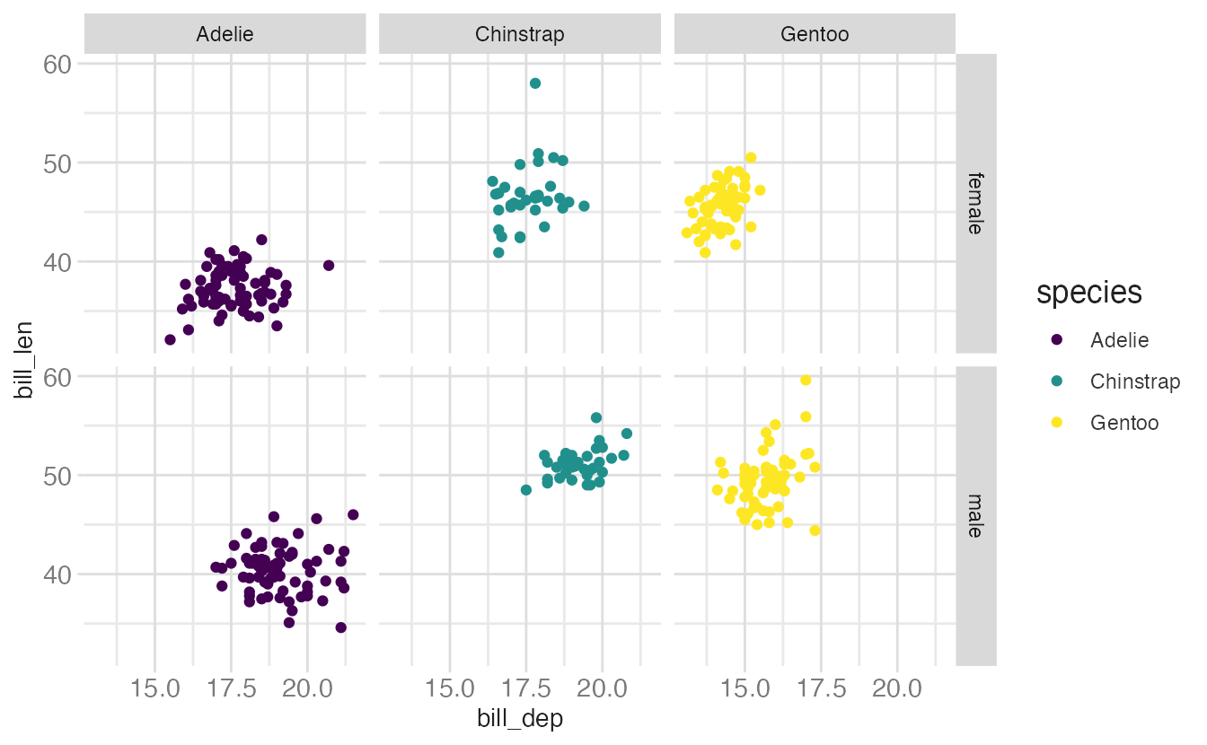
ggplot(
data = penguins,
mapping = aes(
x = bill_dep,
y = bill_len,
color = species
)
) +
geom_point() +
facet_grid(rows = vars(sex), cols = vars(species)) +
scale_color_viridis_d(guide = "none")- 1
-
guide = "none"suppresses the legend for the color aesthetic.
Defaults
Rather than explicitly declaring each component of a layered graphic (which will use more code and introduces opportunities for errors), we can establish intelligent defaults for specific geoms and scales. For instance, whenever we want to use a bar geom, we can default to using a stat that counts the number of observations in each group of our variable in the \(x\) position.
Consider the following scenario: you wish to generate a scatterplot visualizing the relationship between flipper length and body mass. With no defaults, the code to generate this graph is:
ggplot() +
  layer(
    data = penguins,
    mapping = aes(x = flipper_len, y = body_mass),
    geom = "point",
    stat = "identity",
    position = "identity"
  ) +
  scale_x_continuous() +
  scale_y_continuous() +
  coord_cartesian()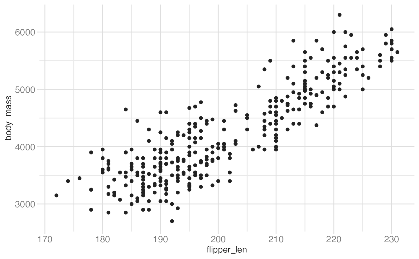
The above code:
- Creates a new plot object (
ggplot) - Adds a layer (
layer)- Specifies the data (
penguins) - Maps flipper length to the \(x\) position and body mass to the \(y\) position (
mapping) - Uses the point geometric transformation (
geom = "point") - Implements an identity transformation and position (
stat = "identity"andposition = "identity")
- Specifies the data (
- Establishes two continuous position scales (
scale_x_continuousandscale_y_continuous) - Declares a cartesian coordinate system (
coord_cartesian)
How can we simplify this using intelligent defaults?
- We only need to specify one geom and stat, since each geom has a default stat.
- Cartesian coordinate systems are most commonly used, so it should be the default.
- Default scales can be added based on the aesthetic and type of variables.
- Continuous values are transformed with a linear scaling.
- Discrete values are mapped to integers.
- Scales for aesthetics such as color, fill, and size can also be intelligently defaulted.
Using these defaults, we can rewrite the above code as:
ggplot() +
  geom_point(data = penguins, mapping = aes(x = flipper_len, y = body_mass))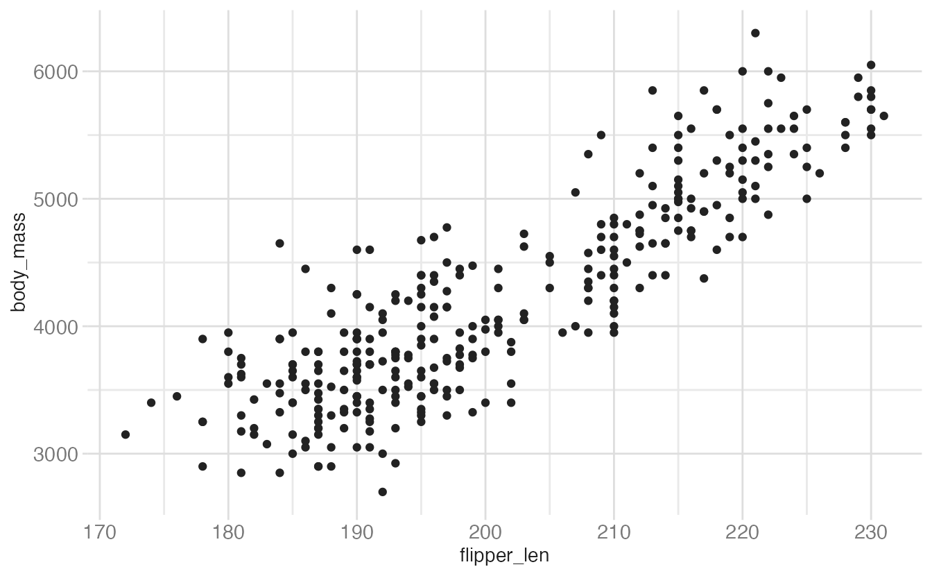
This generates the exact same plot, but uses fewer lines of code. Because multiple layers can use the same components (data, mapping, etc.), we can also specify that information in the ggplot() function rather than in the geom_*() function:
ggplot(data = penguins, mapping = aes(x = flipper_len, y = body_mass)) +
  geom_point()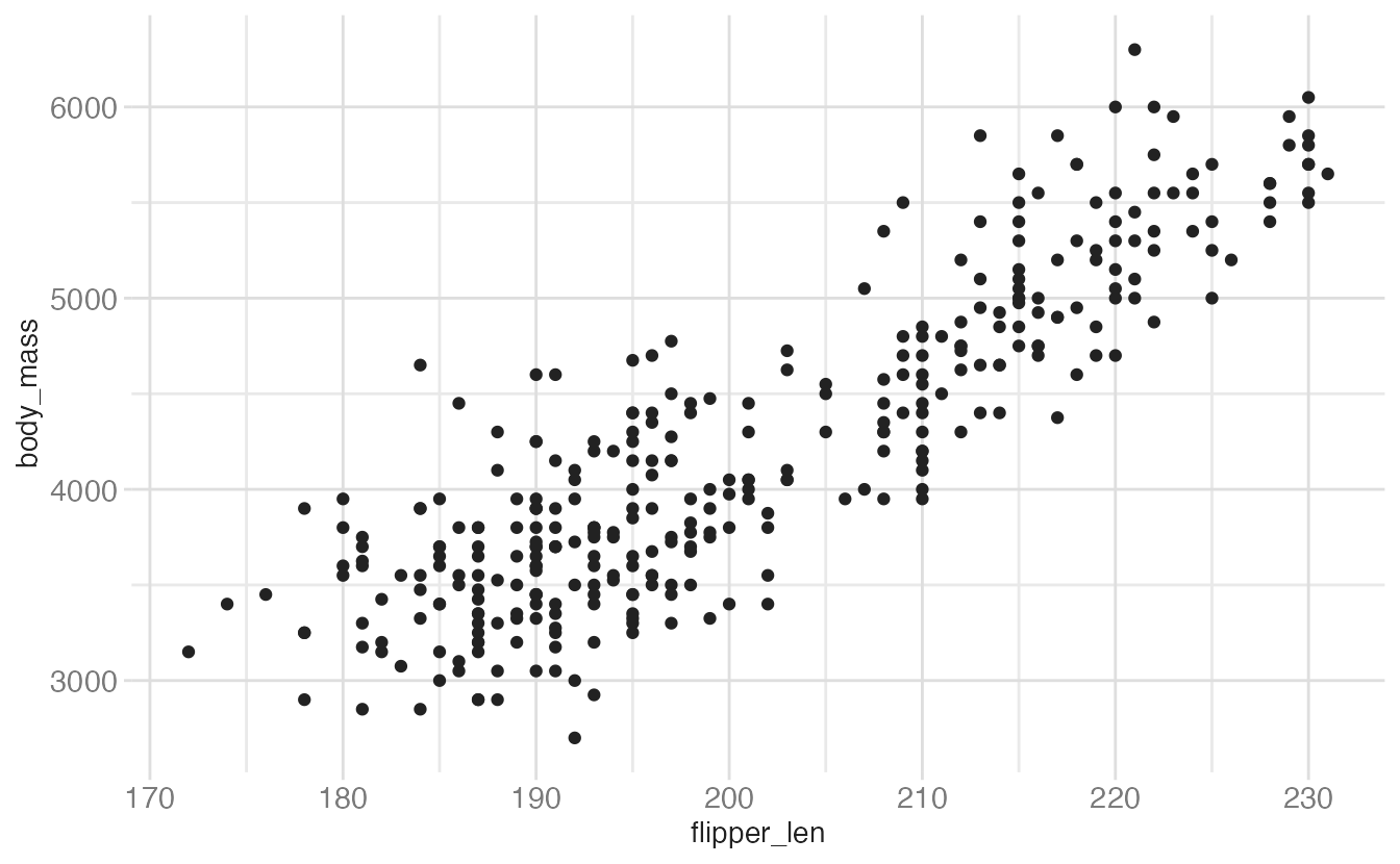
And as we will learn, function arguments in R use specific ordering, so we can omit the explicit call to data and mapping:
ggplot(penguins, aes(flipper_len, body_mass)) +
  geom_point()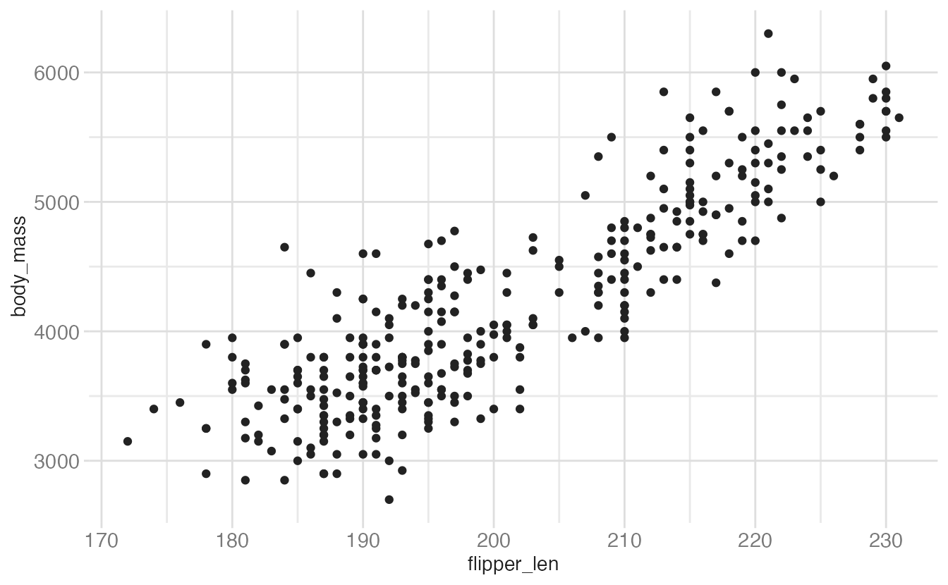
With this specification, it is easy to build the graphic up with additional layers, without modifying the original code:
ggplot(penguins, aes(flipper_len, body_mass)) +
  geom_point() +
  geom_smooth()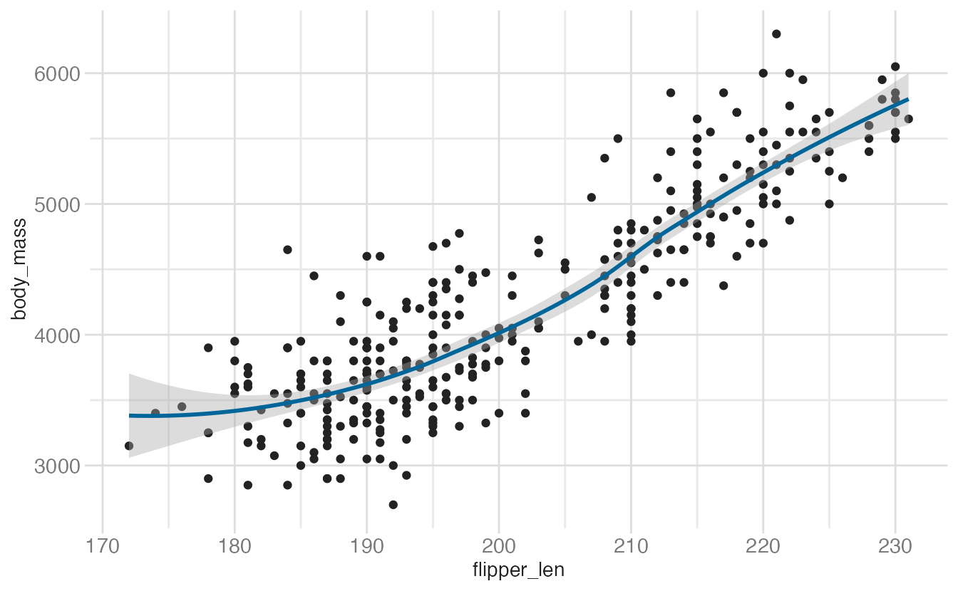
Because we called aes(flipper_len, body_mass) within the ggplot() function, it is automatically passed along to both geom_point() and geom_smooth(). If we fail to do this, we get an error:
ggplot(penguins) +
  geom_point(aes(flipper_len, body_mass)) +
  geom_smooth()
Error in `geom_smooth()`:
! Problem while computing stat.
ℹ Error occurred in the 2nd layer.
Caused by error in `compute_layer()`:
! `stat_smooth()` requires the following missing aesthetics: x and y.More on aesthetics
Mapping variables to aesthetics
Start with color — map species to the color of each point:
ggplot(
  data = penguins,
  mapping = aes(
    x = bill_dep,
    y = bill_len,
    color = species
  )
) +
  geom_point()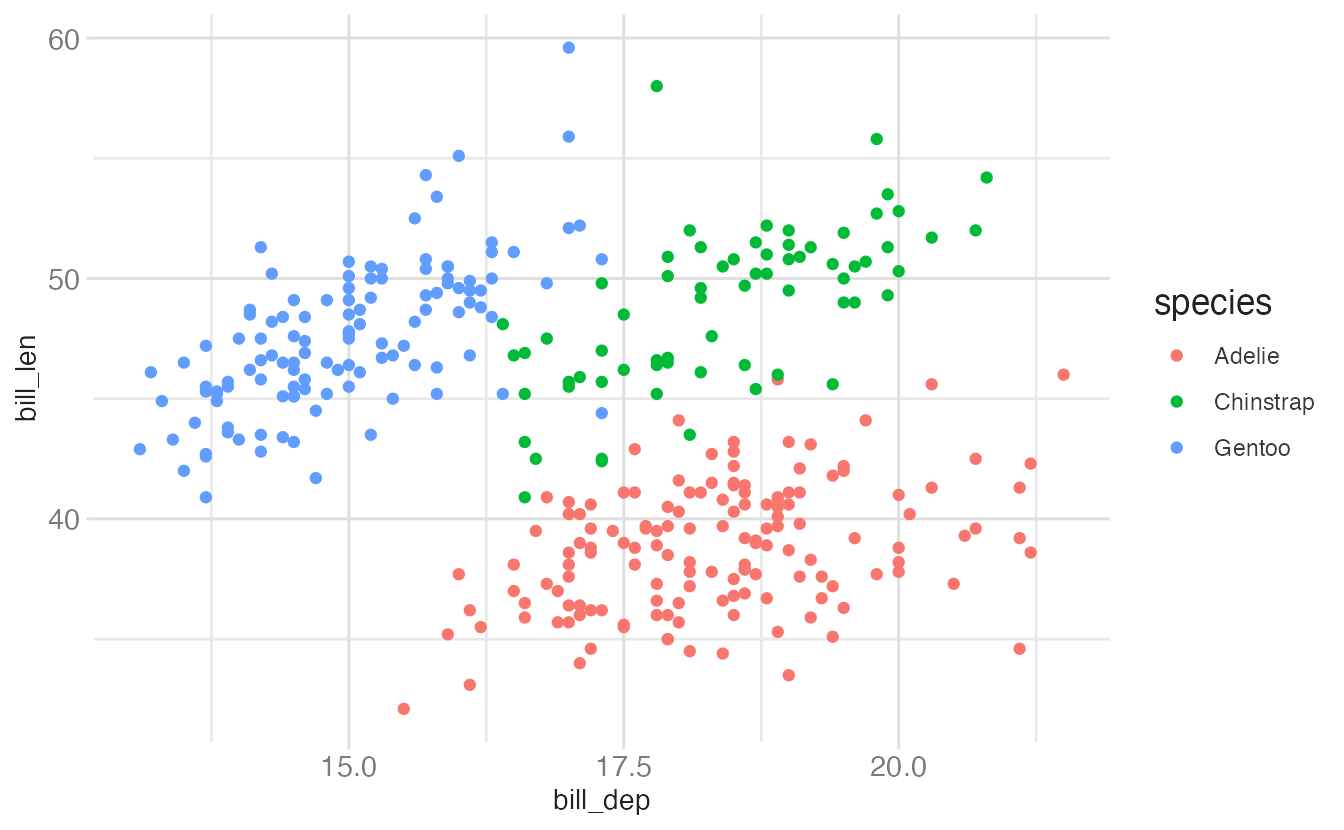
Now add shape. Mapping shape to the same variable as color creates double-encoding — each species is distinguishable by both color and shape, which improves accessibility and legibility in black-and-white:
ggplot(
  data = penguins,
  mapping = aes(
    x = bill_dep,
    y = bill_len,
    color = species,
    shape = species
  )
) +
  geom_point()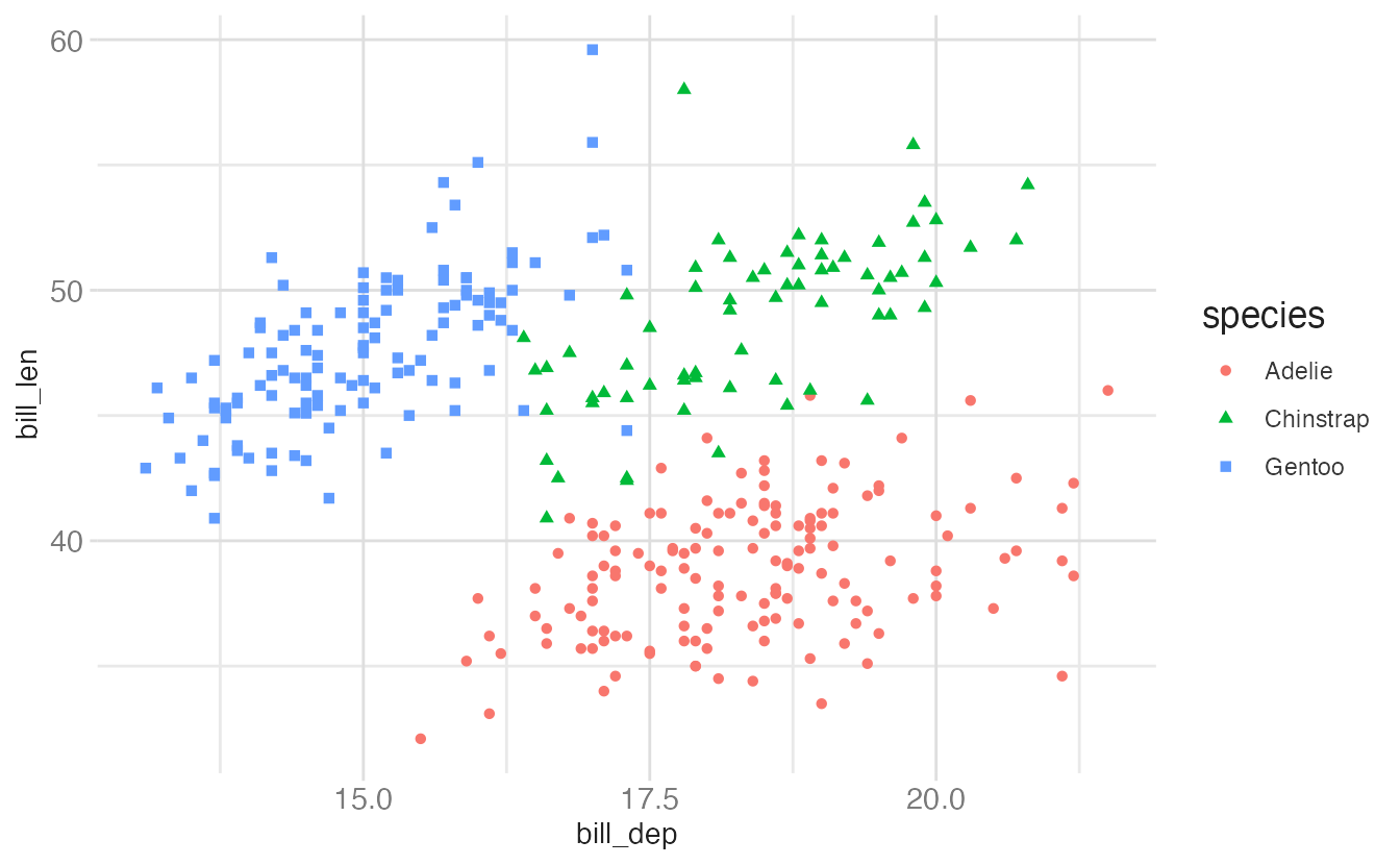
You can also map shape to a different variable than color, effectively encoding a third dimension:
ggplot(
  data = penguins,
  mapping = aes(
    x = bill_dep,
    y = bill_len,
    color = species,
    shape = island
  )
) +
  geom_point()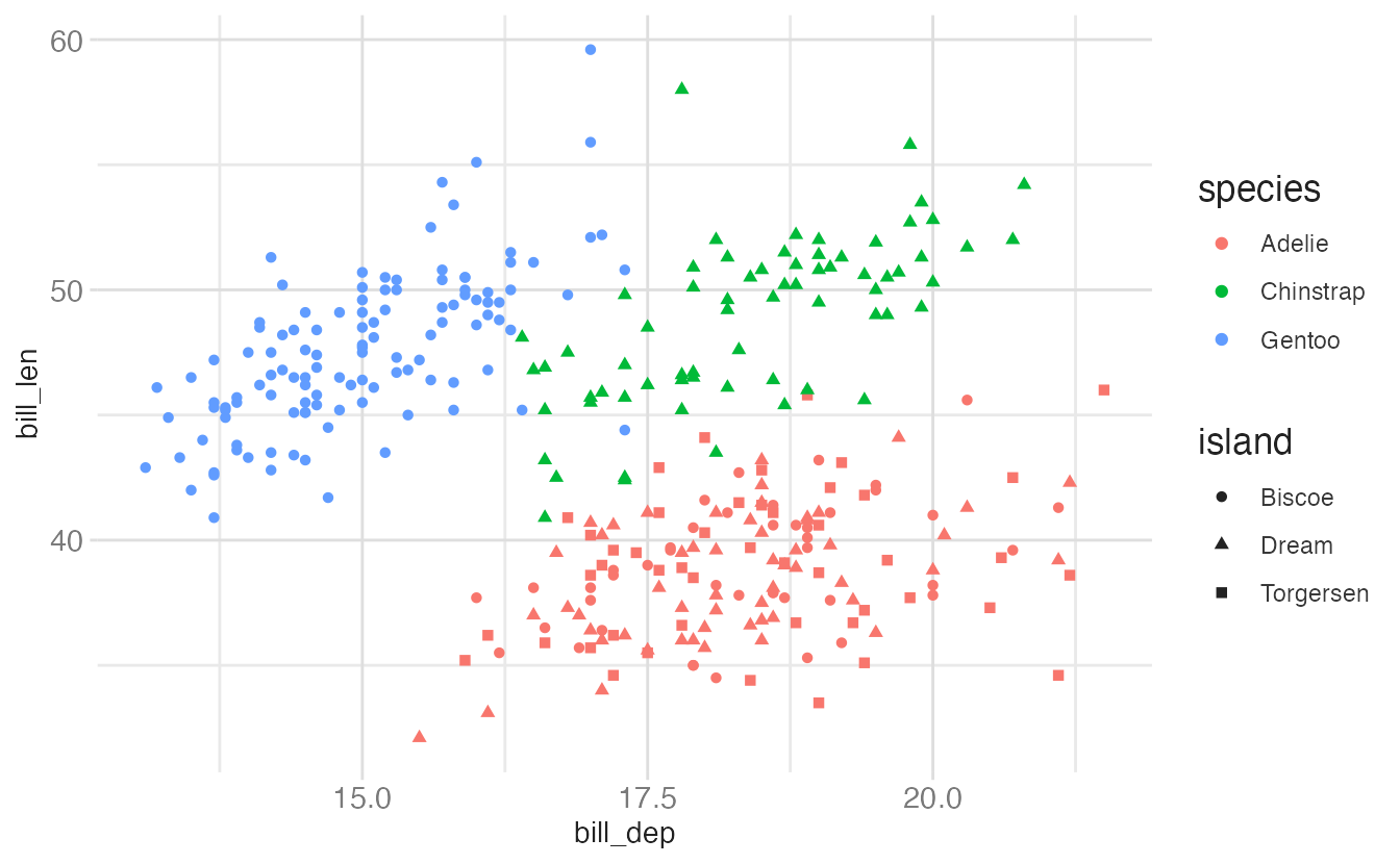
Adding size and alpha (transparency) maps two more continuous variables. The plot below uses all four aesthetics simultaneously:
ggplot(
  data = penguins,
  mapping = aes(
    x = bill_dep,
    y = bill_len,
    color = species,
    shape = species,
    size = body_mass,
    alpha = flipper_len
  )
) +
  geom_point()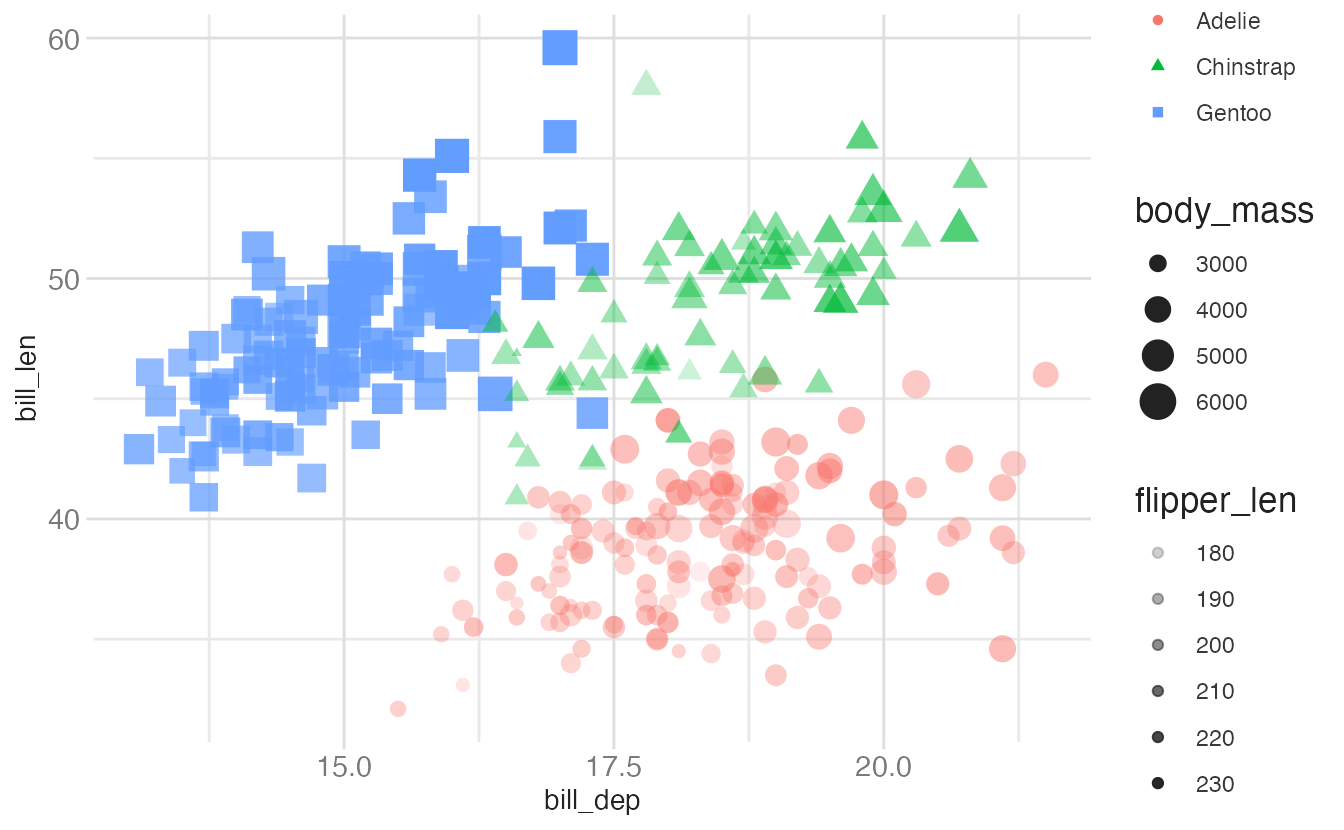
The result is harder to read than the earlier plots — encoding too many variables degrades clarity. Good visualization design means choosing which dimensions to encode and which to drop.
Mapping vs. setting
There is a critical distinction in {ggplot2} between mapping an aesthetic to a variable and setting it to a fixed value:
- Mapping goes inside
aes()and connects a visual property to data - Setting goes inside
geom_*()and applies the same value to all observations
ggplot(
  data = penguins,
  mapping = aes(
    x = bill_dep,
    y = bill_len,
    size = body_mass,
    alpha = flipper_len
  )
) +
  geom_point()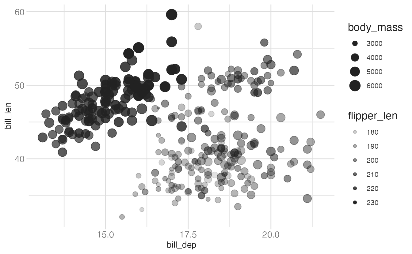
ggplot(
  data = penguins,
  mapping = aes(
    x = bill_dep,
    y = bill_len
  )
) +
  geom_point(size = 2, alpha = 0.5)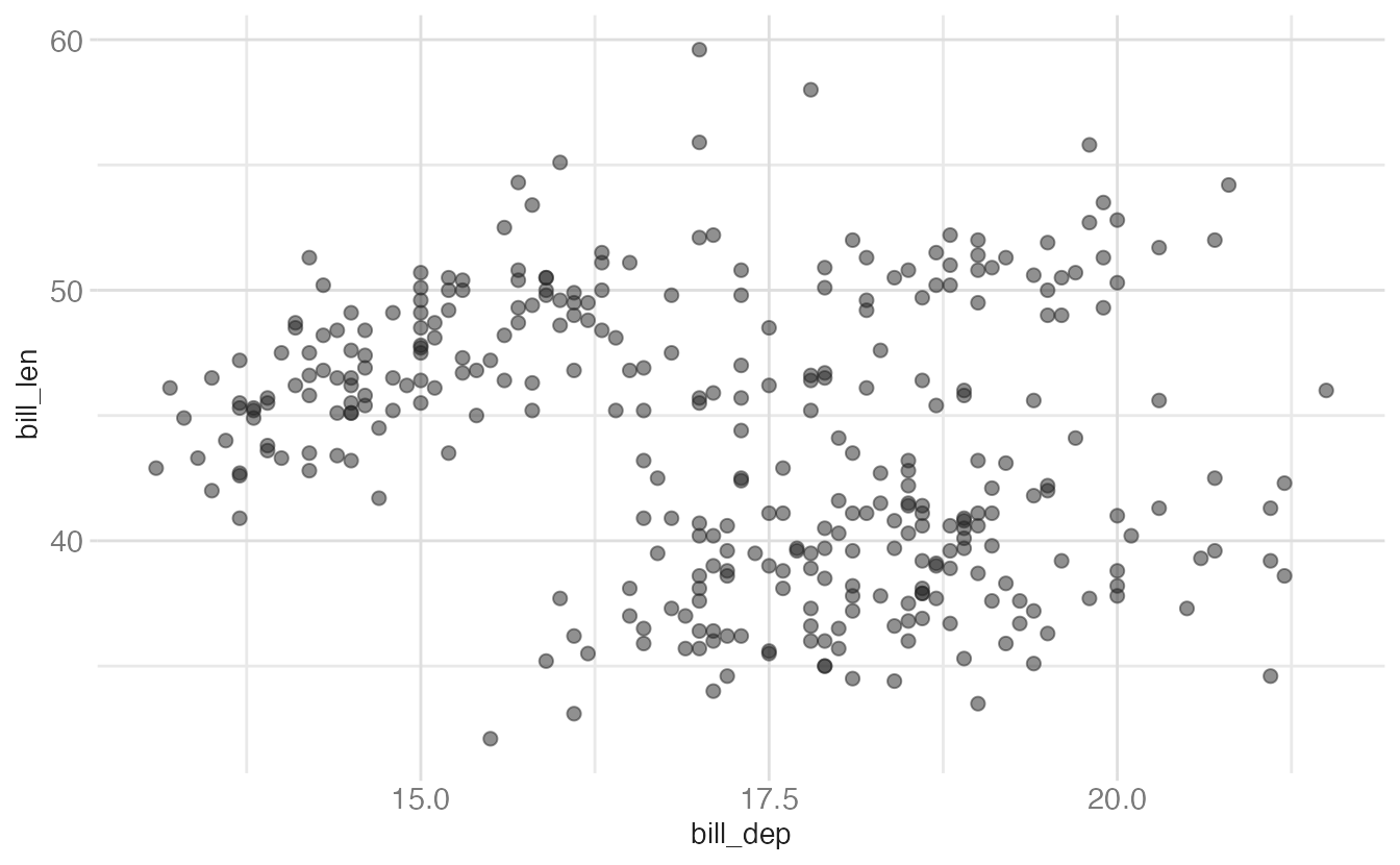
A common mistake is placing a constant inside aes():
aes(color = "blue")  # wrong — maps the string "blue" to color, producing a legend
geom_point(color = "blue")  # correct — sets all points to blue
Summary
- {ggplot2} implements the grammar of graphics: plots are built by mapping data variables to visual aesthetics using a consistent, composable syntax
- Initialize every plot with
ggplot(), specify data and aesthetic mappings withaes() - Add geometric objects with
geom_*()functions - Mapping (inside
aes()) connects a visual property to a data variable; setting (insidegeom_*()) applies a fixed value to all observations facet_grid()creates a two-dimensional panel grid;facet_wrap()lays out panels in a wrapped ribbon- Redundant encoding (mapping the same variable to multiple aesthetics) improves accessibility without adding clutter
Acknowledgements
Material derived in part from Data Science in a Box.