ggplot(gapminder_europe, aes(x = gdpPercap, y = lifeExp)) +
geom_point() +
geom_text(aes(label = country))- 1
-
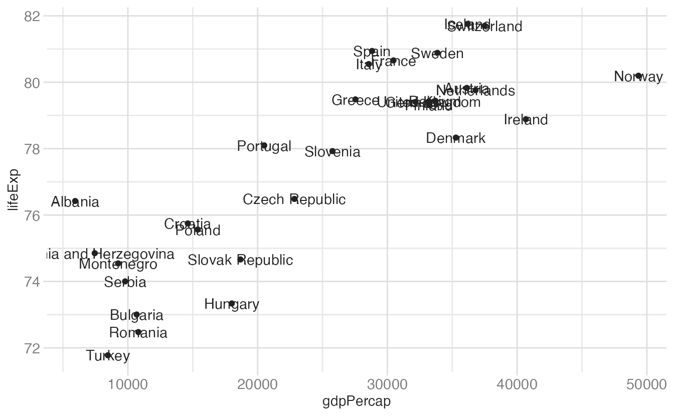
geom_text()places the country name at each point’s (x, y) coordinate. The result is unreadable — every label overlaps.
geom_text(), geom_label(), and {ggrepel}annotate()There are two distinct strategies for placing text on a chart:
x, y) position of an observationgeom_text() and geom_label() both place text at each observation’s coordinates:
ggplot(gapminder_europe, aes(x = gdpPercap, y = lifeExp)) +
geom_point() +
geom_text(aes(label = country))geom_text() places the country name at each point’s (x, y) coordinate. The result is unreadable — every label overlaps.
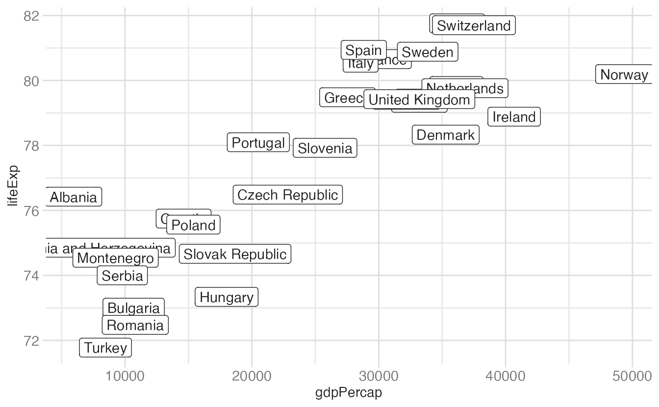
geom_label() draws a background rectangle behind each label, which helps readability slightly but does not solve the overlap:
ggplot(gapminder_europe, aes(x = gdpPercap, y = lifeExp)) +
geom_point() +
geom_label(mapping = aes(label = country))geom_label() draws a white background box behind each label. It is more readable than geom_text() but still overlaps severely.
The {ggrepel} package provides geom_text_repel() and geom_label_repel(), which automatically nudge labels to avoid overlap while drawing a connecting line back to the original point:
ggplot(gapminder_europe, aes(x = gdpPercap, y = lifeExp)) +
geom_point() +
geom_text_repel(mapping = aes(label = country))geom_text_repel() uses a force-directed algorithm to push labels apart while keeping them as close as possible to their data points. The thin lines connect displaced labels back to their points.
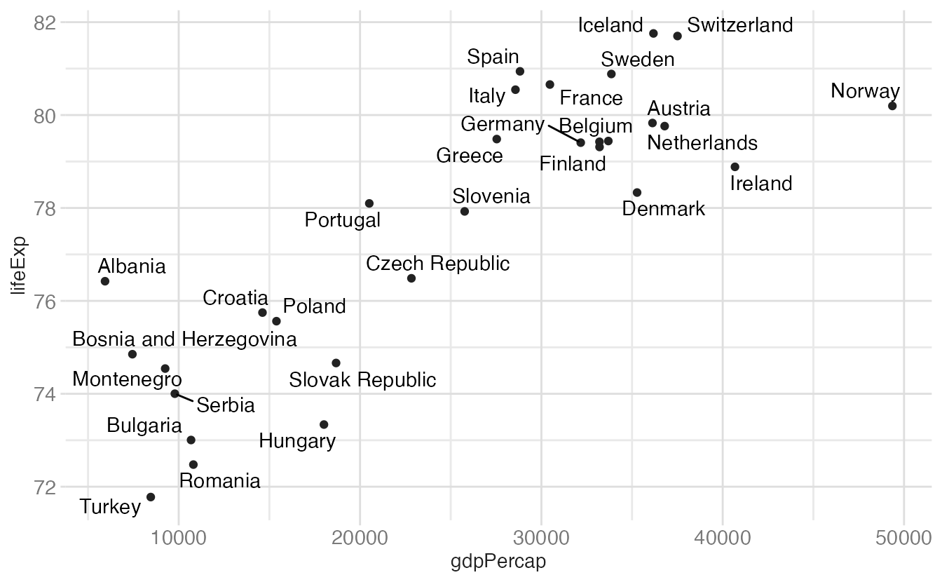
Even with repelling, 30+ labels is too many for most charts. The better solution is to label selectively — only the points that matter for the story:
gapminder_europe <- gapminder_europe |>
mutate(
highlight = country %in% c("Albania", "Norway", "Hungary")
)
ggplot(gapminder_europe, aes(x = gdpPercap, y = lifeExp)) +
geom_point(aes(color = highlight)) +
geom_label_repel(
data = filter(gapminder_europe, highlight),
mapping = aes(label = country, fill = highlight),
color = "white"
) +
scale_color_manual(values = c("grey70", "#B31B1B")) +
scale_fill_manual(values = "#B31B1B") +
guides(color = "none", fill = "none") +
labs(x = "GDP per capita", y = "Life expectancy")geom_label_repel(). The other points are still plotted but unlabeled.
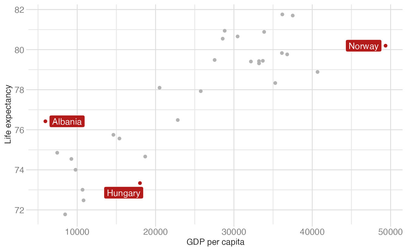
This combination — gray non-highlighted points, colored highlighted points with labels — is a versatile design pattern for drawing attention to specific observations without removing context.
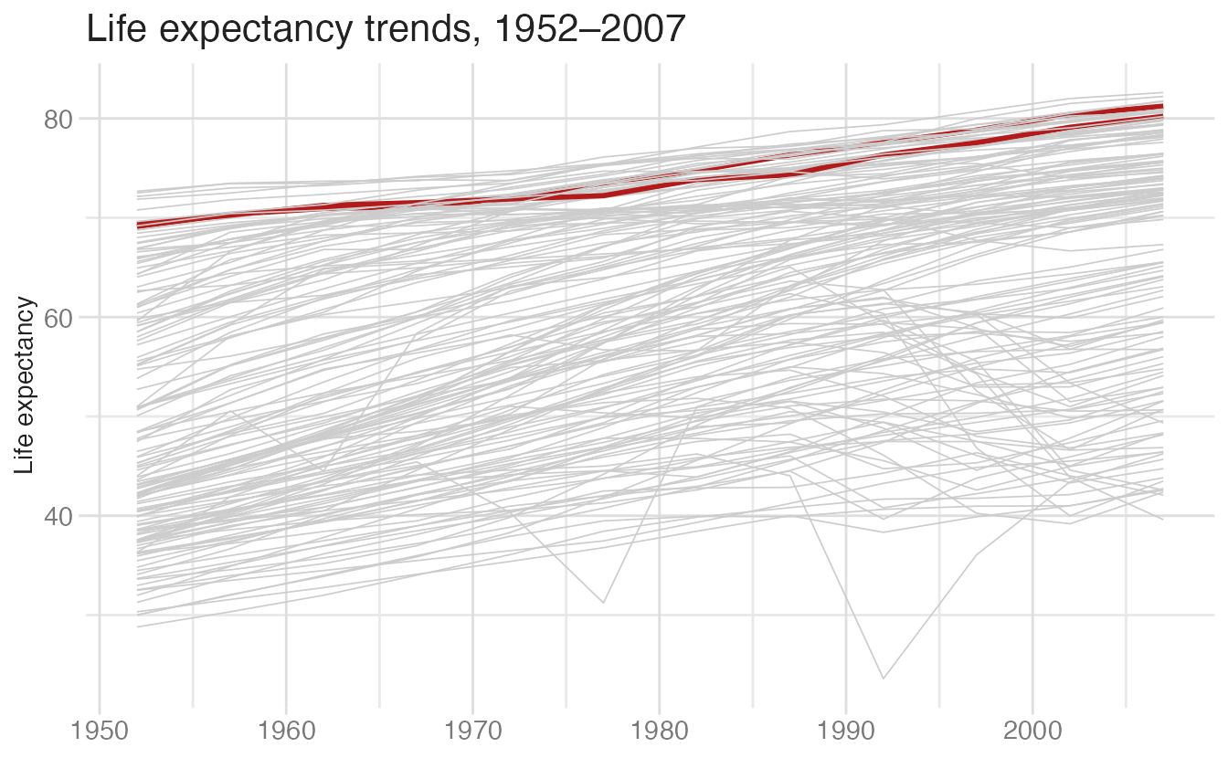
The same highlighting pattern applies to line charts:
gapminder |>
mutate(is_oceania = continent == "Oceania") |>
ggplot(aes(
x = year,
y = lifeExp,
group = country,
color = is_oceania,
linewidth = is_oceania
)) +
geom_line() +
scale_color_manual(values = c("grey80", "#B31B1B")) +
scale_linewidth_manual(values = c(0.3, 1)) +
guides(color = "none", linewidth = "none") +
labs(
title = "Life expectancy trends, 1952–2007",
x = NULL,
y = "Life expectancy"
)scale_linewidth_manual() makes the highlighted lines thicker and the background lines thin, reinforcing the contrast.
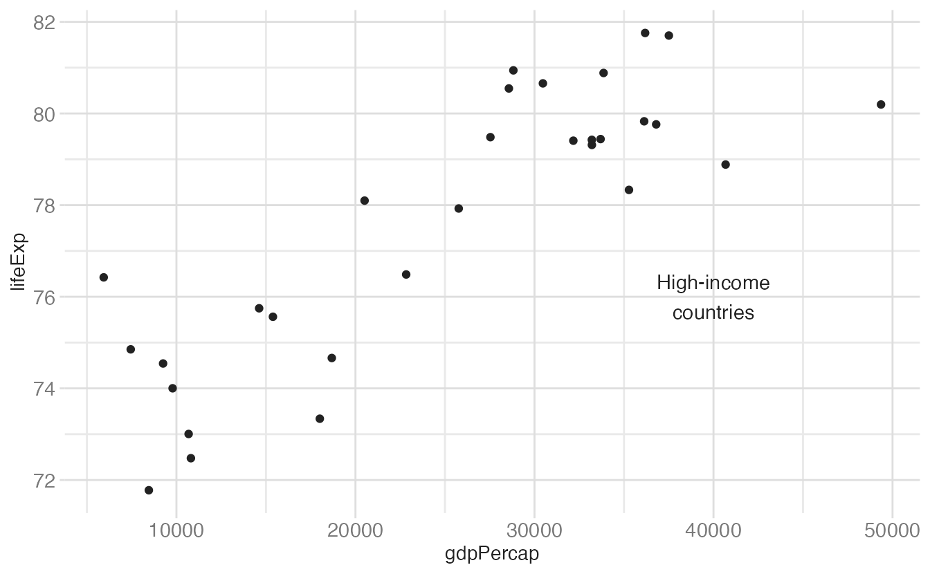
annotate()annotate() places a single geom at a specific location you specify — independent of any data. Use it to add callout text, highlight a region, or draw a reference line at a meaningful value.
ggplot(gapminder_europe, aes(x = gdpPercap, y = lifeExp)) +
geom_point() +
annotate(
geom = "text",
x = 40000,
y = 76,
label = "High-income\ncountries"
)geom = "text" places a text string at (40000, 76). Any geom name works here.
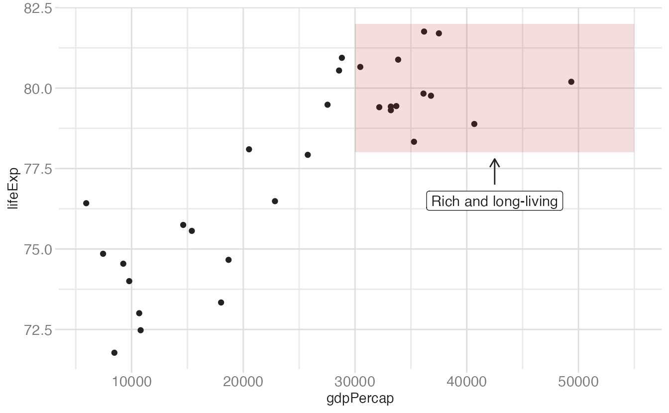
Use "rect" to shade a region:
ggplot(gapminder_europe, aes(x = gdpPercap, y = lifeExp)) +
geom_point() +
annotate(
geom = "rect",
xmin = 30000,
xmax = 55000,
ymin = 78,
ymax = 82,
fill = "#B31B1B",
alpha = 0.15
) +
annotate(
geom = "label",
x = 42500,
y = 76.5,
label = "Rich and long-living"
) +
annotate(
geom = "segment",
x = 42500,
xend = 42500,
y = 77.0,
yend = 77.8,
arrow = arrow(length = unit(0.1, "in"))
)arrow() adds an arrowhead at (xend, yend).
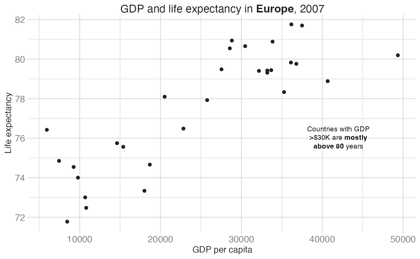
{ggtext} extends annotations with Markdown and HTML rendering. Use element_markdown() in theme() for title/subtitle text, and geom = "richtext" in annotate() for inline formatted annotations:
ggplot(gapminder_europe, aes(x = gdpPercap, y = lifeExp)) +
geom_point() +
annotate(
geom = "richtext",
x = 42000,
y = 76,
label = "Countries with GDP<br>>$30K are **mostly<br>above 80** years",
fill = NA,
label.color = NA,
hjust = 0.5,
size = 3
) +
labs(
title = "GDP and life expectancy in **Europe**, 2007",
x = "GDP per capita",
y = "Life expectancy"
) +
theme(plot.title = element_markdown())geom = "richtext" renders Markdown/HTML inside the annotation box. fill = NA and label.color = NA remove the box background and border.
**bold** in the title requires element_markdown() to render.
geom_text() / geom_label() place text at data coordinates; geom_text_repel() (from {ggrepel}) avoids overlap automaticallyannotate() places a single geom at an arbitrary location; use it for callouts, shaded regions, and reference linesMaterial derived in part from Data Visualization with R and Fundamentals of Data Visualization.