Deep dive: coordinates + facets
Notes
NoteLearning objectives
- Define coordinate systems and distinguish linear from non-linear systems
- Understand the difference between scale limits and coordinate limits
- Utilize
scalesandspacearguments infacet_*()for flexible panel layouts - Highlight data across facets using a data-removal trick
TipSupplemental readings
Coordinate systems
A coordinate system combines the x and y position aesthetics to produce a two-dimensional location on the plot. It also determines how axes and panel backgrounds are drawn. The coordinate system is specified with a coord_*() function.
Linear coordinate systems
Linear coordinate systems preserve the shape of geoms — straight lines remain straight.
coord_cartesian()— the default; standard horizontal/vertical axescoord_flip()xandyinaes()insteadcoord_fixed()coord_cartesian(ratio = X)instead
Non-linear coordinate systems
Non-linear systems can change the shape of geoms — a straight line in data space may curve on the plot.
coord_transform()— applies transformations to x and y after the stat has processed the data (compare toscale_*_log10(), which transforms before the stat)coord_radial()— polar coordinates; used for pie charts, circular bar chartscoord_sf()— map projections
Setting axis limits: scales vs. coordinates
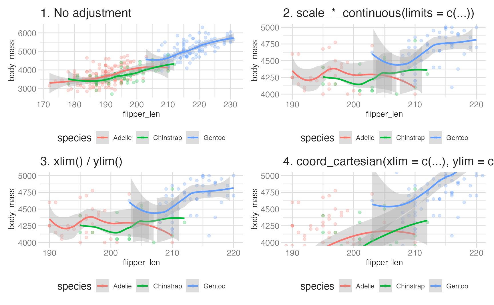
There are two distinct ways to restrict the visible range of a plot, and they behave very differently:
Plots 2 and 3 use scale limits — any observation outside the range is discarded before the stat runs. You will see warnings like “Removed N rows containing non-finite outside the scale range.” The smooth line in those plots is fit only to the data within the window, so it looks different from Plot 1.
Plot 4 uses coordinate limits — all data is retained and the stat runs on the full dataset. The plot is then zoomed to the window. The smooth line in Plot 4 is identical to Plot 1’s, just cropped.
base_plot +
scale_x_continuous(limits = c(190, 220)) +
scale_y_continuous(limits = c(4000, 5000))
base_plot +
coord_cartesian(
xlim = c(190, 220),
ylim = c(4000, 5000)
)- 1
- Scale limits drop data outside the range before the stat runs, changing the statistical summary and potentially the visual pattern.
- 2
- Coordinate limits zoom in on the specified range after the stat runs, preserving the statistical summary and visual pattern within the window.
The rule: use coord_cartesian() when you want to zoom in without changing the statistical summary; use scale limits only when you genuinely want to exclude data.
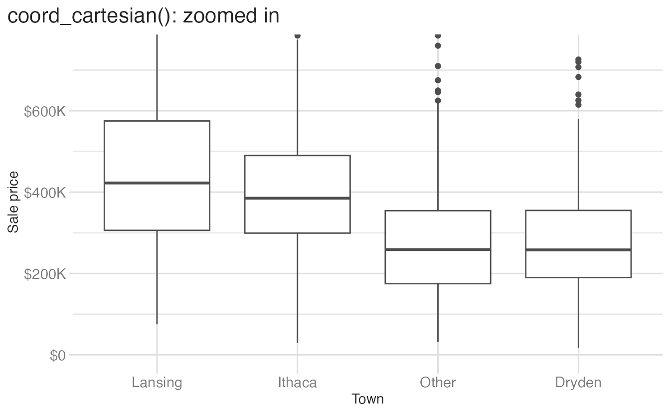
The same principle applies to box plots. Cropping with scale limits drops outlier data before the boxplot stat runs, changing the whisker lengths:
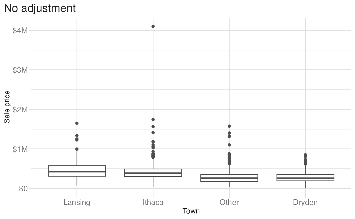
Warning: Removed 58 rows containing non-finite outside the scale range
(`stat_boxplot()`).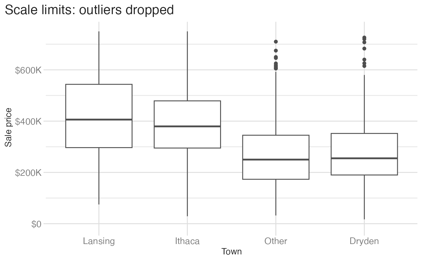
Fixed aspect ratios
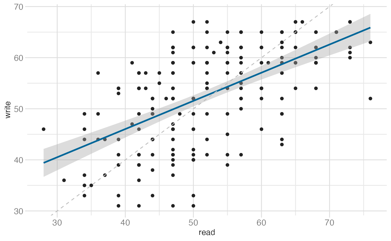
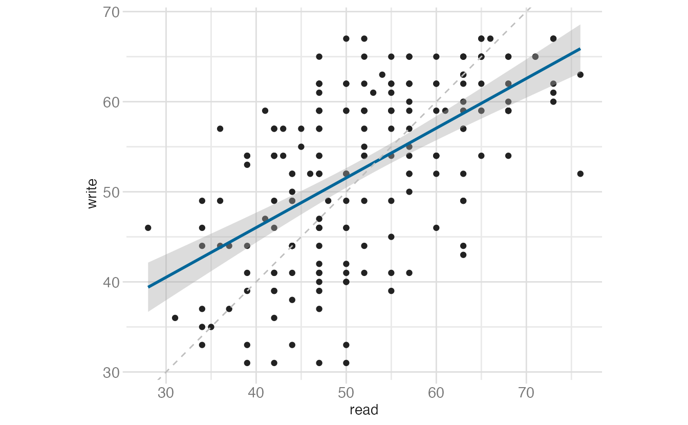
When two variables are measured on the same scale, a fixed aspect ratio makes slopes visually meaningful.
Transforming coordinate space
There are four ways to apply a log transformation, each with different behavior:
ggplot(data = penguins, mapping = aes(x = bill_dep, y = body_mass)) +
  geom_point() +
  geom_smooth(method = "lm")
`geom_smooth()` using formula = 'y ~ x'Warning: Removed 2 rows containing non-finite outside the scale range (`stat_smooth()`).Warning: Removed 2 rows containing missing values or values outside the scale range
(`geom_point()`).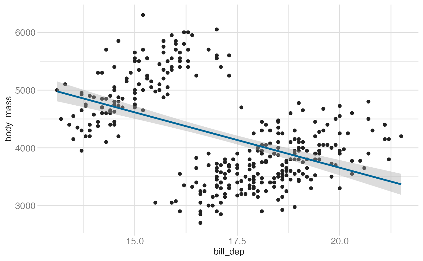
ggplot(
data = penguins,
mapping = aes(x = log10(bill_dep), y = log10(body_mass))
) +
geom_point() +
geom_smooth(method = "lm")- 1
-
Transforming inside
aes()changes the axis labels to log-scale values. The smooth is fit on the transformed data. Note we uselog10()to match the behavior ofscale_*_log10(); usinglog()would produce a natural log scale, which is less common for visualization.
`geom_smooth()` using formula = 'y ~ x'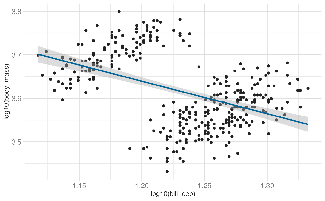
ggplot(data = penguins, mapping = aes(x = bill_dep, y = body_mass)) +
geom_point() +
geom_smooth(method = "lm") +
scale_x_log10() +
scale_y_log10()- 1
-
Axis labels show original values; internally data is log-transformed before the stat runs. The smooth is fit on the log-transformed data (same as the
log()version).
`geom_smooth()` using formula = 'y ~ x'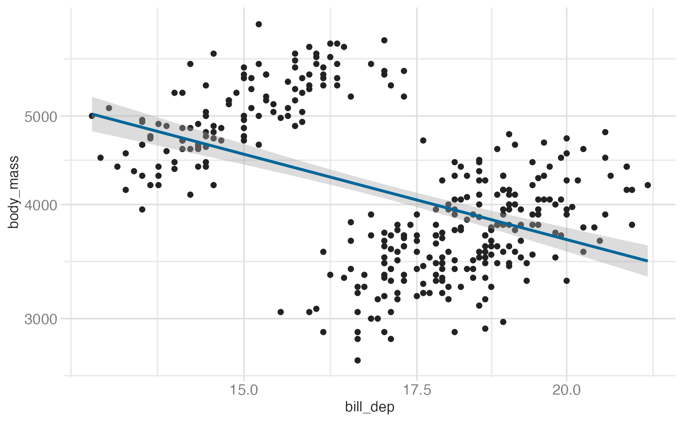
ggplot(data = penguins, mapping = aes(x = bill_dep, y = body_mass)) +
geom_point() +
geom_smooth(method = "lm") +
coord_transform(x = "log10", y = "log10")- 1
-
coord_transform()applies the transformation after the stat runs. The smooth is fit on the original linear data and then its points are transformed — this produces a curve, unlike thescale_*version.
`geom_smooth()` using formula = 'y ~ x'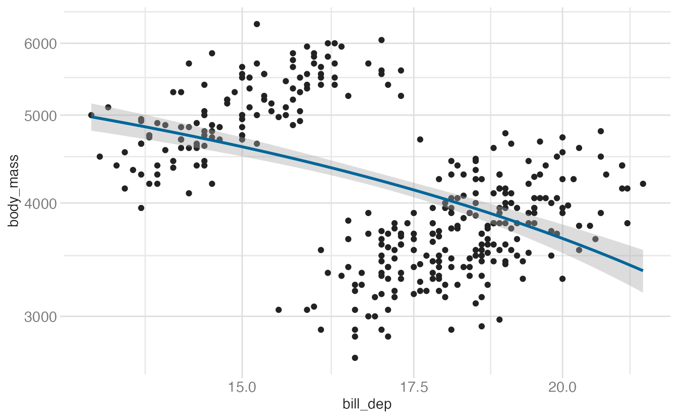
The practical rule: use scale_*_log10() (or scale_*_continuous(transform = "log10")) in almost all cases. Only use coord_transform() if you specifically need the stat to run on untransformed data.
Polar coordinates and radial charts
coord_radial() maps the x or y aesthetic to an angle, producing circular charts. It is the modern replacement for the old coord_polar().
Common radial charts
There are three common types of radial charts:
- Pie charts use a circular layout to show proportions of a whole as slices of the circle
- Donut charts are a variation of pie charts with a hollow center
- Bullseye charts are sometimes used to construct diagrams of hierarchical priorities, or to literally represent a target1
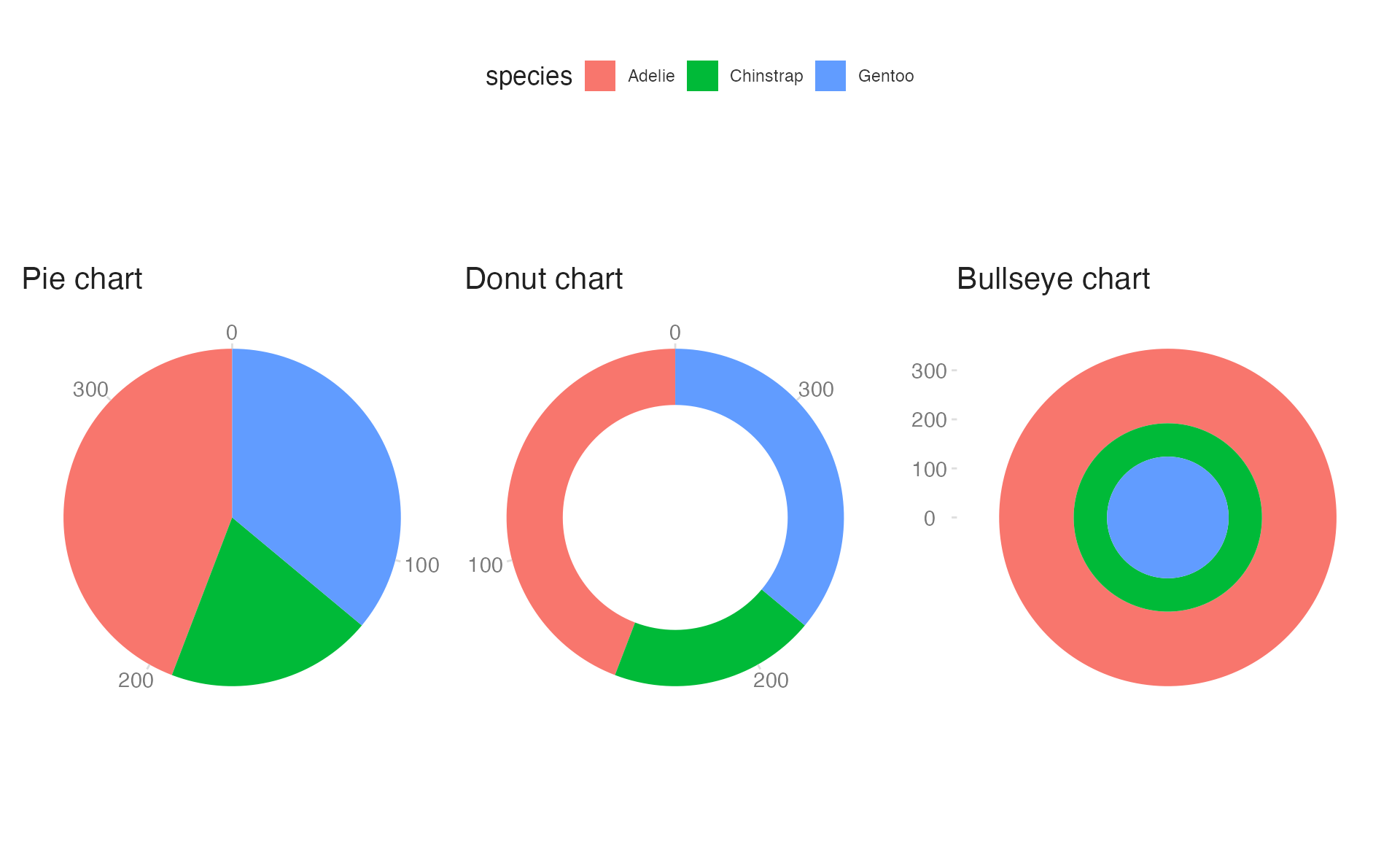
All three are generated with coord_radial(), differing only in which aesthetic is mapped to the angle (theta), the axis limits, and direction.
Circular bar charts
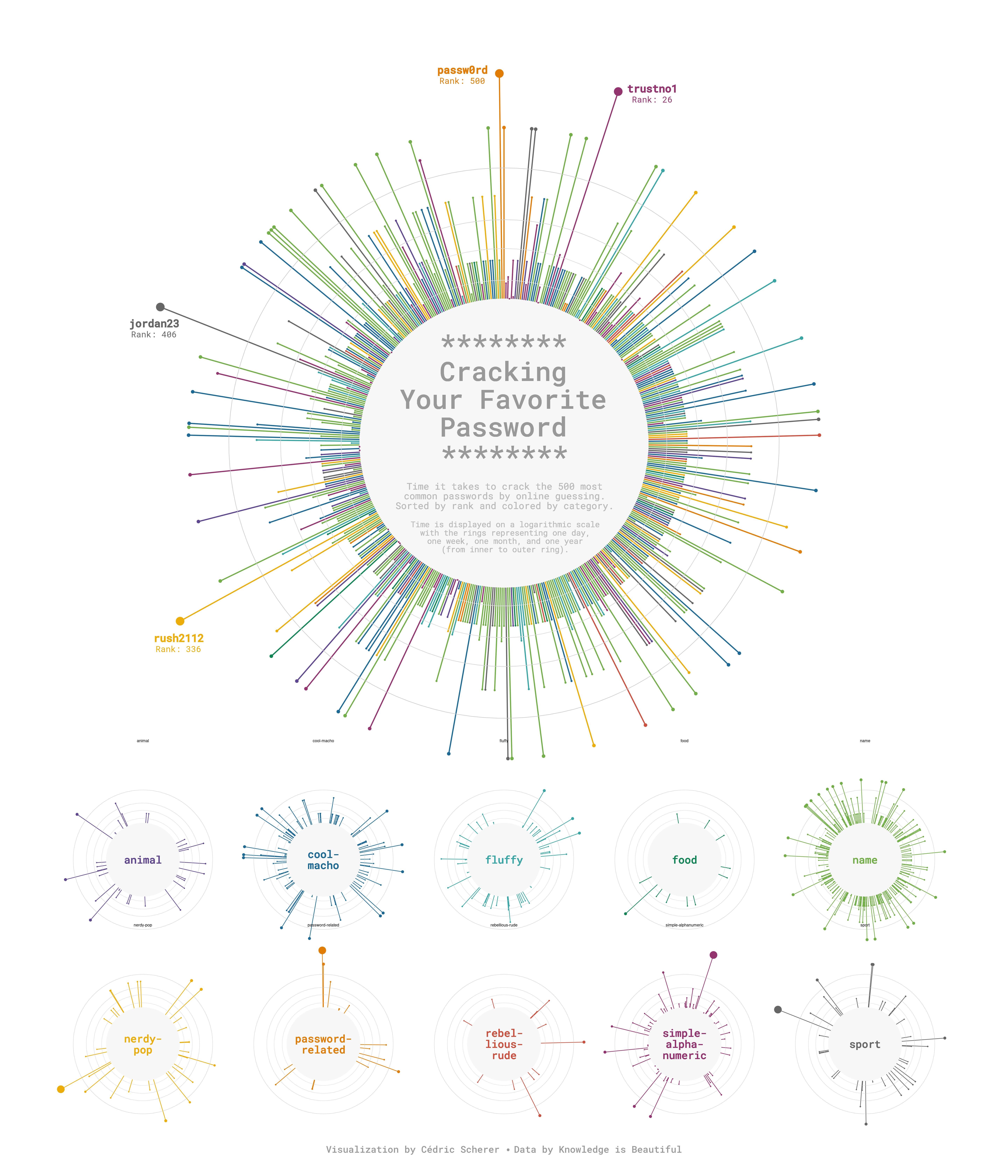
Circular bar charts combine geom_col() with coord_radial(). They work well when the x variable is cyclic (hours of the day, months of the year) because the circular layout reinforces the cyclical structure of the data.2
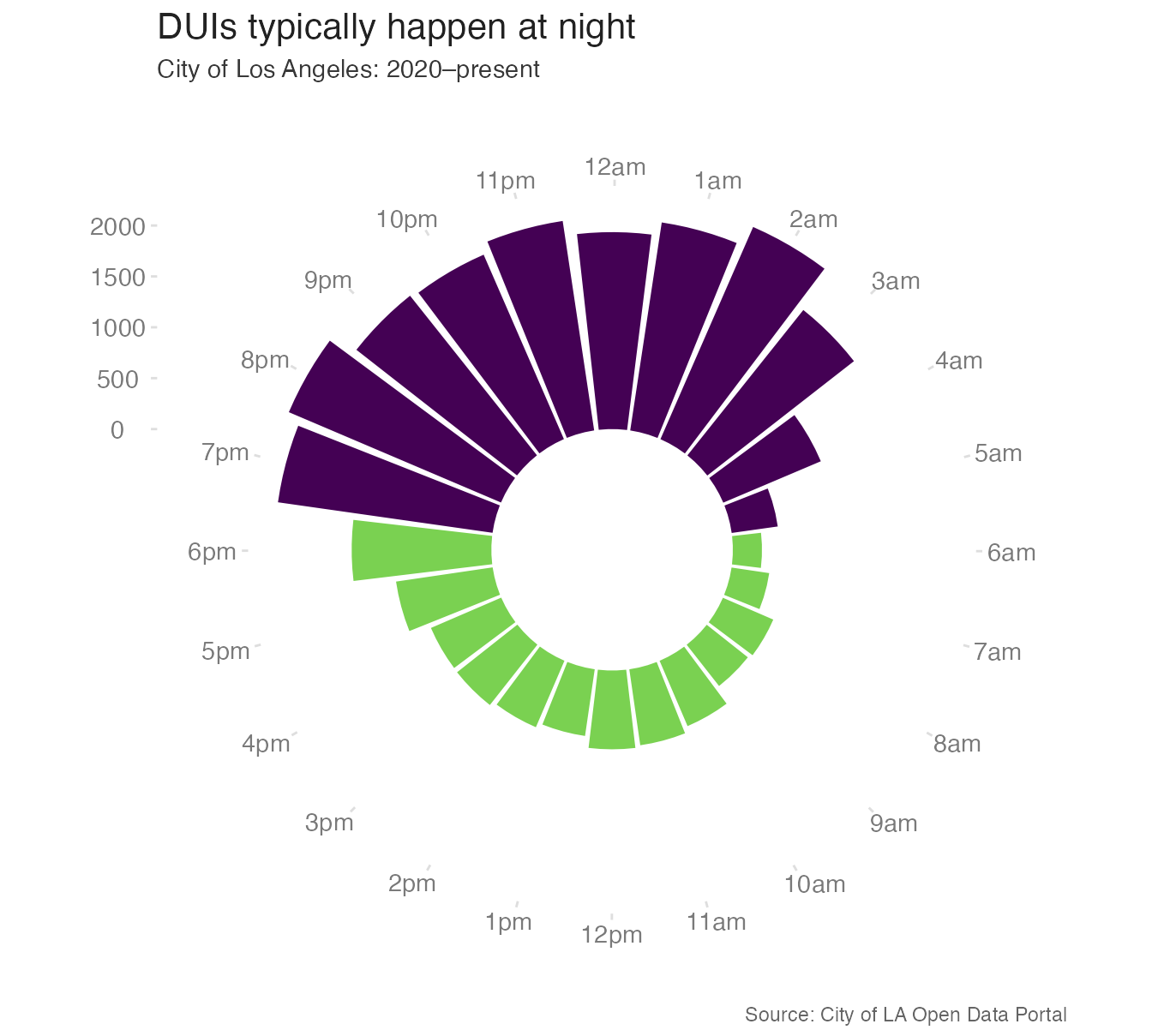
Alternatively, you can use a circular layout to make a lollipop chart for a more avant-garde style:
Facets
The faceting functions were introduced alongside the grammar of graphics, but a few important behaviors are worth a deeper look here.
Freeing scales
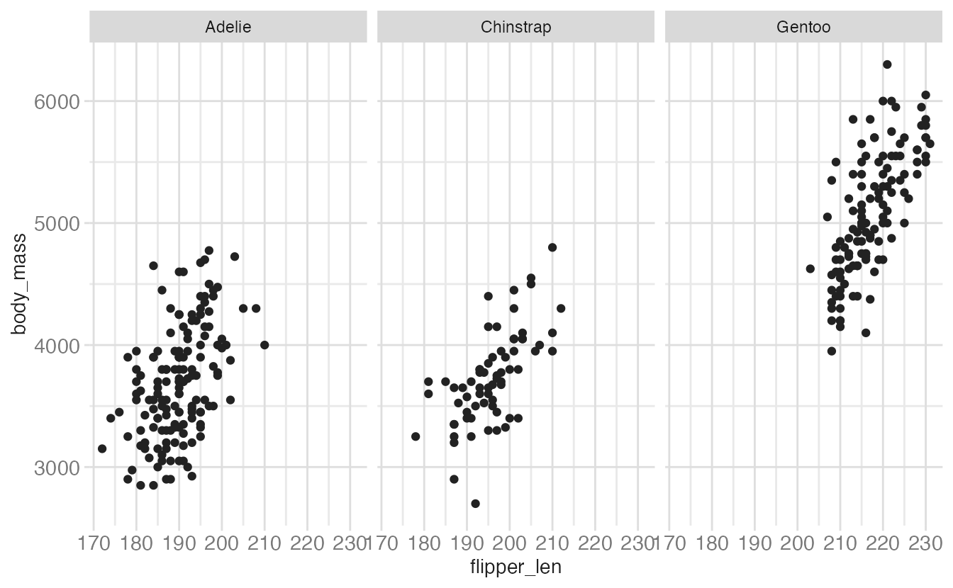
By default, all facets in a facet_wrap() or facet_grid() share the same axis scales. The scales argument can free one or both:
p <- ggplot(
  data = penguins,
  mapping = aes(
    x = flipper_len,
    y = body_mass
  )
) +
  geom_point()

p +
facet_wrap(facets = vars(species))- 1
-
scales = "free"frees both axes independently per panel."free_x"and"free_y"free only one axis.
p +
facet_wrap(
facets = vars(species),
scales = "free"
)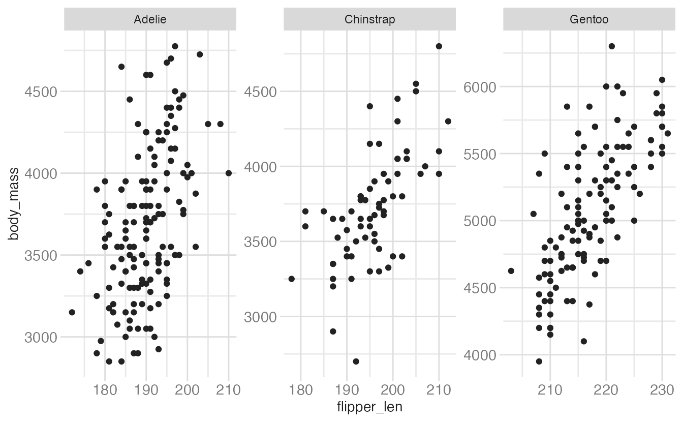
Freeing scales makes within-panel patterns easier to see but makes cross-panel comparisons harder — the reader can no longer directly compare values across panels. Use free scales deliberately.
Freeing space in facet_grid()
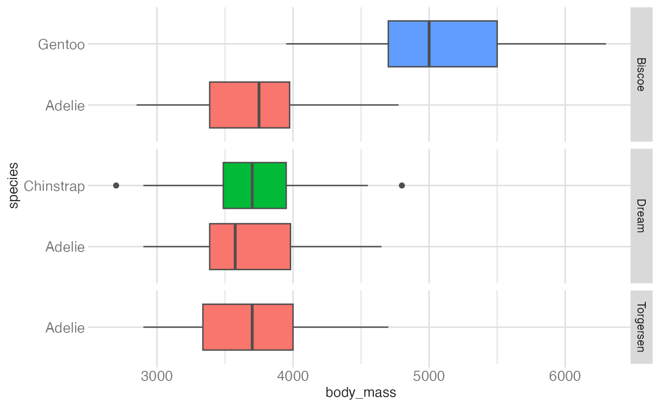
With facet_grid(), even after freeing the scale, panels still take equal space in the grid. When the number of categories differs across rows or columns, this wastes space and distorts proportions. The space argument fixes this:
ggplot(penguins, aes(y = species, x = body_mass, fill = species)) +
  geom_boxplot(show.legend = FALSE) +
  facet_grid(rows = vars(island))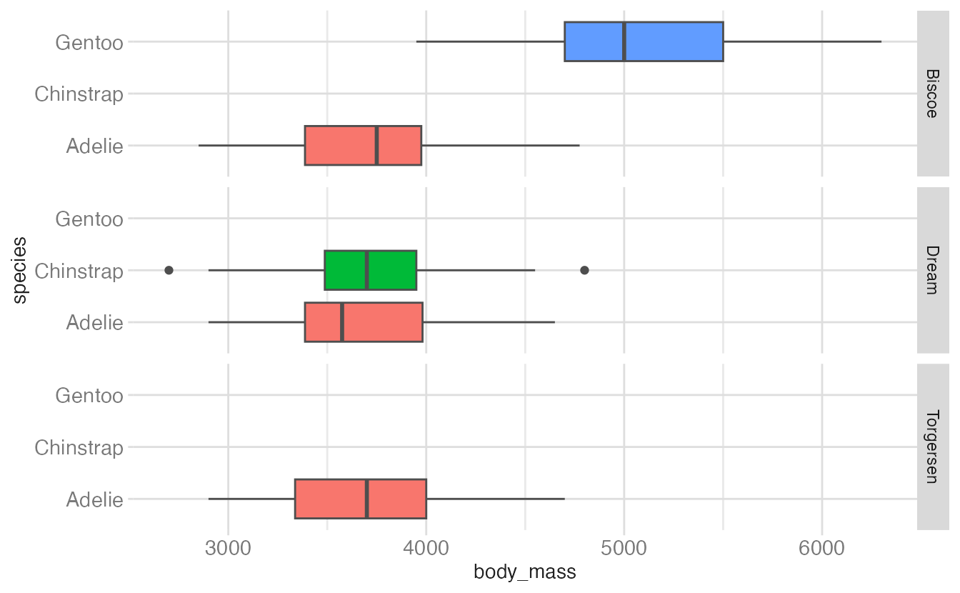
ggplot(penguins, aes(y = species, x = body_mass, fill = species)) +
geom_boxplot(show.legend = FALSE) +
facet_grid(rows = vars(island), scales = "free_y")- 1
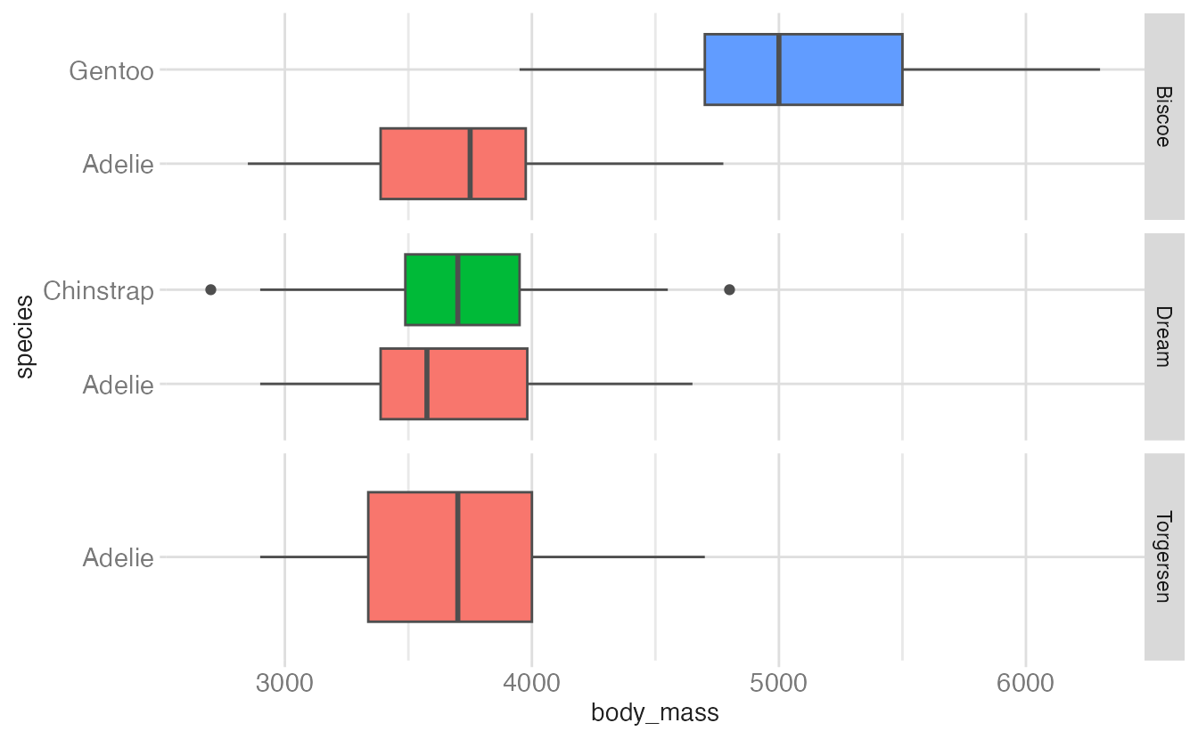
- The y scale is freed so each island only shows the species present there. But the row heights are still equal — some rows have one species, others have two, creating unequal whitespace.
ggplot(penguins, aes(y = species, x = body_mass, fill = species)) +
geom_boxplot(show.legend = FALSE) +
facet_grid(rows = vars(island), scales = "free_y", space = "free")- 1
-
space = "free"allocates row height proportional to the number of categories in each row. Now rows with one species are shorter than rows with two.
Highlighting across facets
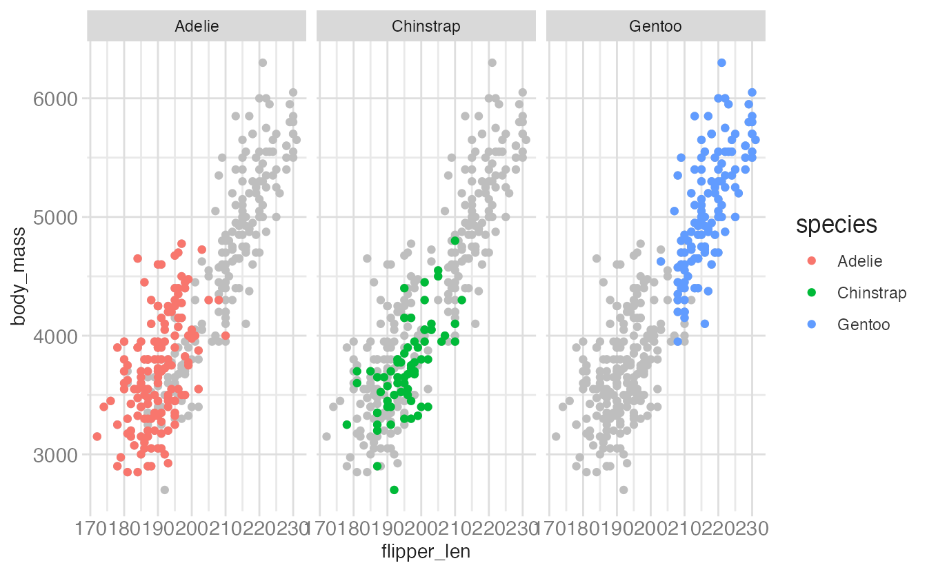
A powerful technique for emphasizing one group at a time: create a copy of the data with the faceting variable removed, then layer the full data (in gray) under the faceted data (in color):
penguins_sans_species <- penguins |>
select(-species)
ggplot(data = penguins, mapping = aes(x = flipper_len, y = body_mass)) +
geom_point(data = penguins_sans_species, color = "gray") +
geom_point(mapping = aes(color = species)) +
facet_wrap(facets = vars(species))- 1
-
Remove the faceting variable. Without
species, this data frame has no facet grouping. - 2
-
The gray layer uses the stripped data — it appears in every facet because
speciesis absent, so there is nothing to split on. - 3
-
The colored layer uses the full data with
species, so it is correctly distributed across facets.
Themes
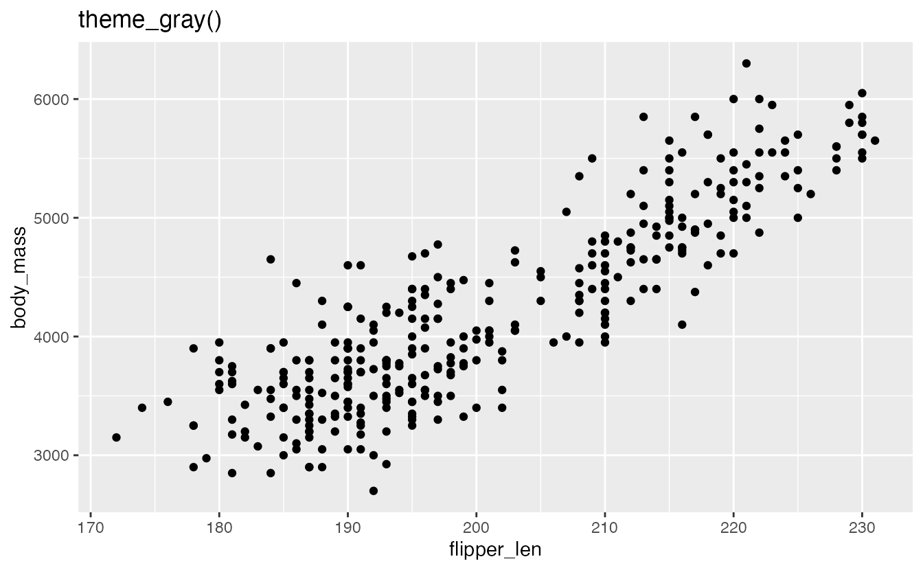
Themes control every non-data visual element — text, backgrounds, grid lines, tick marks, borders. {ggplot2} ships with eight complete themes. Examples include:
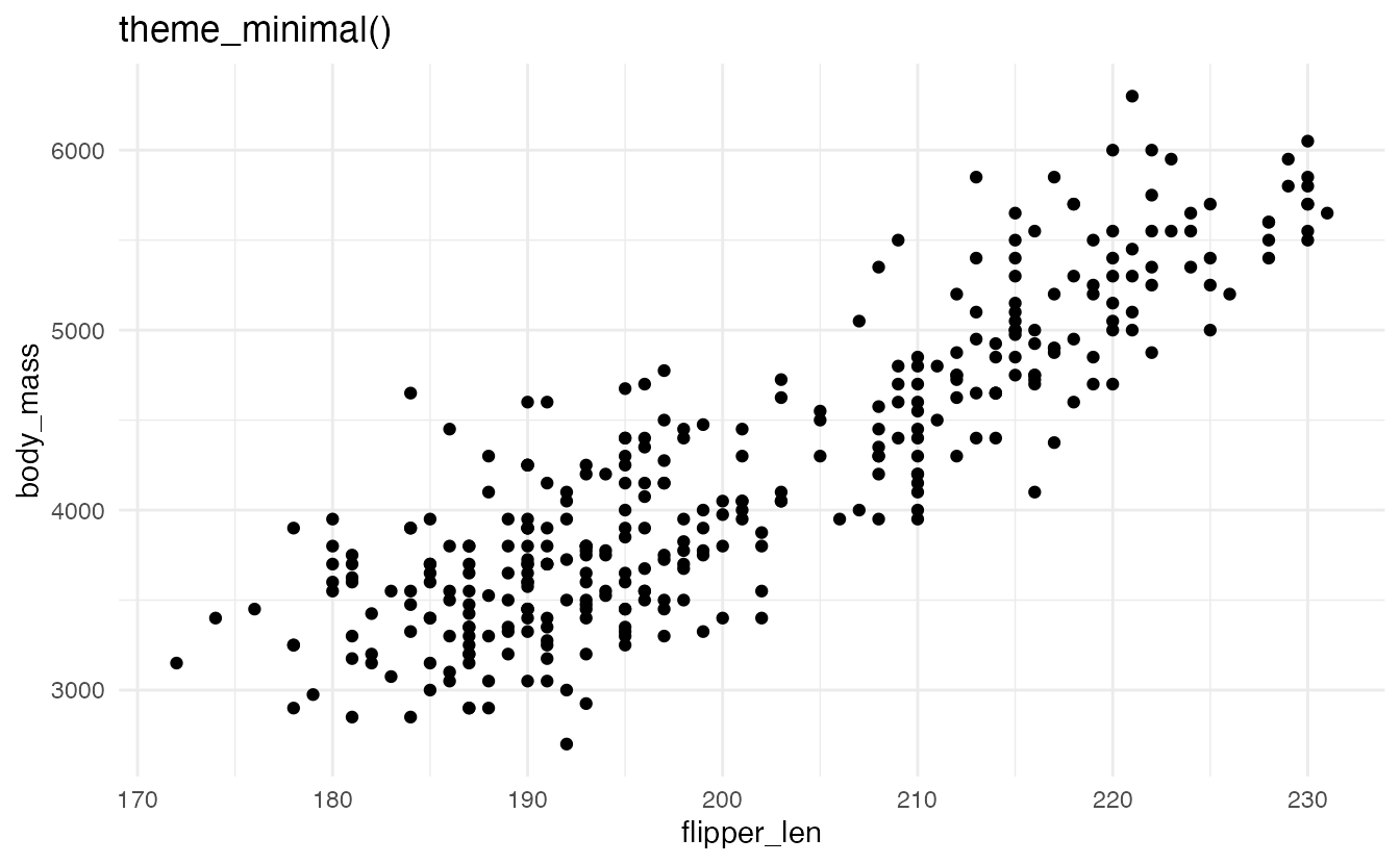
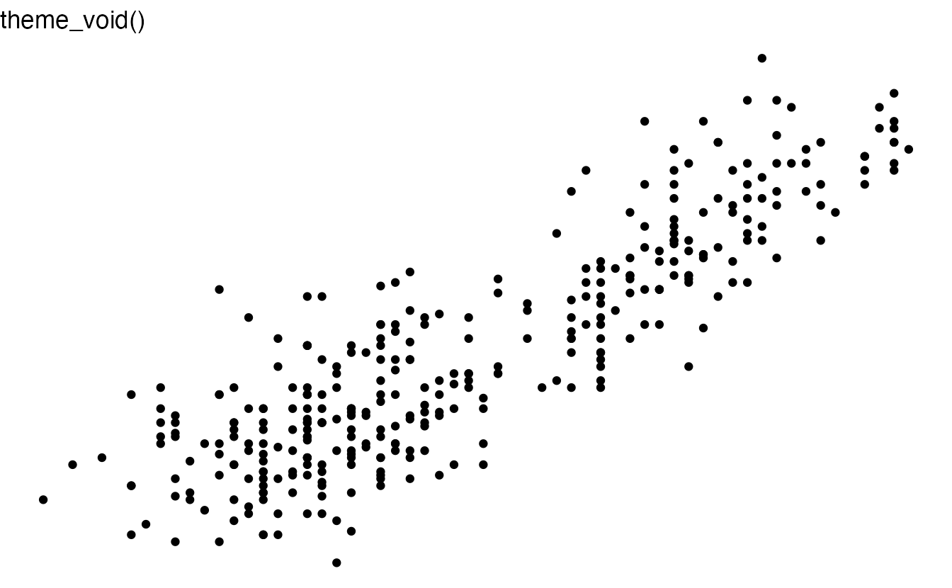
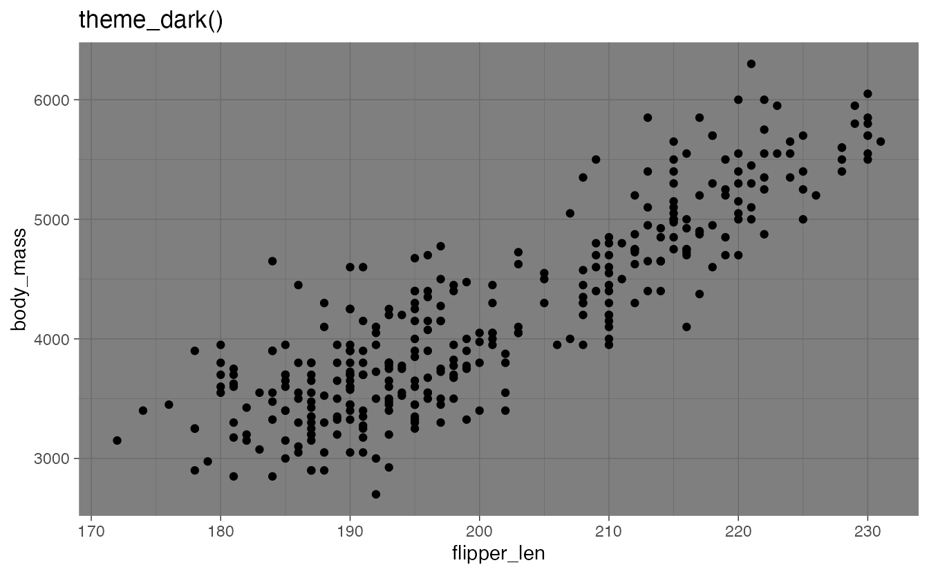
The theme system is covered in depth in the themes reading.
Summary
- Coordinate systems combine position aesthetics into a 2D location;
coord_cartesian()is the default,coord_radial()produces circular charts - Scale limits (
scale_*_continuous(limits = ...),xlim(),ylim()) drop out-of-range data before the stat runs; coordinate limits (coord_cartesian(xlim = ..., ylim = ...)) zoom in without dropping data - Pie charts work for very few categories with simple proportions; bar charts are more readable in general; waffle charts are an accessible middle ground
- Facet scales can be fixed (default), free on both axes, or free on one axis;
space = "free"infacet_grid()adjusts panel sizes proportionally - The data-removal highlight technique — duplicating data without the faceting variable — shows all points as gray context in every panel
Acknowledgements
Material derived in part from STA 313: Advanced Data Visualization.
Footnotes
Don’t use this chart, even though it is technically feasible with {ggplot2}↩︎
More examples: R Graph Gallery↩︎