world_bank <- read_rds("data/wb-indicators.rds")
glimpse(world_bank)Deep dive: stats + scales + guides
Notes
NoteLearning objectives
- Define the statistical transformation and scales components of the grammar of graphics
- Demonstrate how to use
stat_*()functions from {ggplot2} - Implement scale transformations for \(x\) and \(y\) axes
- Modify guides to change the visual appearance of scales on plots
TipSupplemental readings
Data: World economic measures
The World Bank publishes a rich and detailed set of socioeconomic indicators spanning several decades and dozens of topics. Here we focus on a few key indicators for the year 2021.
gdp_per_cap- GDP per capita (current USD)pop- Total populationlife_exp- Life expectancy at birth, total (years)female_labor_pct- Labor force, female (% of total labor force)income_level- Classification of economies based on national income levels
Rows: 174
Columns: 8
$ iso2c            <chr> "AF", "AO", "AL", "AE", "AR", "AM", "AU", "AT", "AZ", "BI", "BE…
$ country          <chr> "Afghanistan", "Angola", "Albania", "United Arab Emirates", "Ar…
$ year             <dbl> 2023, 2023, 2023, 2023, 2023, 2023, 2023, 2023, 2023, 2023, 202…
$ gdp_per_cap      <dbl> 413.7579, 2916.1366, 9730.8692, 49850.6872, 14261.8466, 8159.08…
$ female_labor_pct <dbl> 6.848413, 49.398305, 46.369111, 22.302110, 43.248796, 47.193740…
$ life_exp         <dbl> 66.03500, 64.61700, 79.60200, 82.90900, 77.39500, 77.46585, 83.…
$ pop              <dbl> 41454761, 36749906, 2414095, 10483751, 45538401, 2964300, 26659…
$ income_level     <fct> Low income, Lower middle income, Upper middle income, High inco…
Statistical transformations
Stats and geoms
Every geom_*() in {ggplot2} has an associated stat — a statistical transformation that processes the raw data before it is drawn. Most of the time the transformation is invisible, but many geoms perform meaningful transformations behind the scenes.
stat |
geom that uses it |
|---|---|
stat_bin() |
geom_bar(), geom_freqpoly(), geom_histogram() |
stat_bin2d() |
geom_bin2d() |
stat_bindot() |
geom_dotplot() |
stat_binhex() |
geom_hex() |
stat_boxplot() |
geom_boxplot() |
stat_contour() |
geom_contour() |
stat_quantile() |
geom_quantile() |
stat_smooth() |
geom_smooth() |
stat_sum() |
geom_count() |
Understanding this relationship matters when you need to override the default statistical transformation or add a summary statistic as an additional layer — for example, overlaying a group median on a strip plot.
Layering with stats
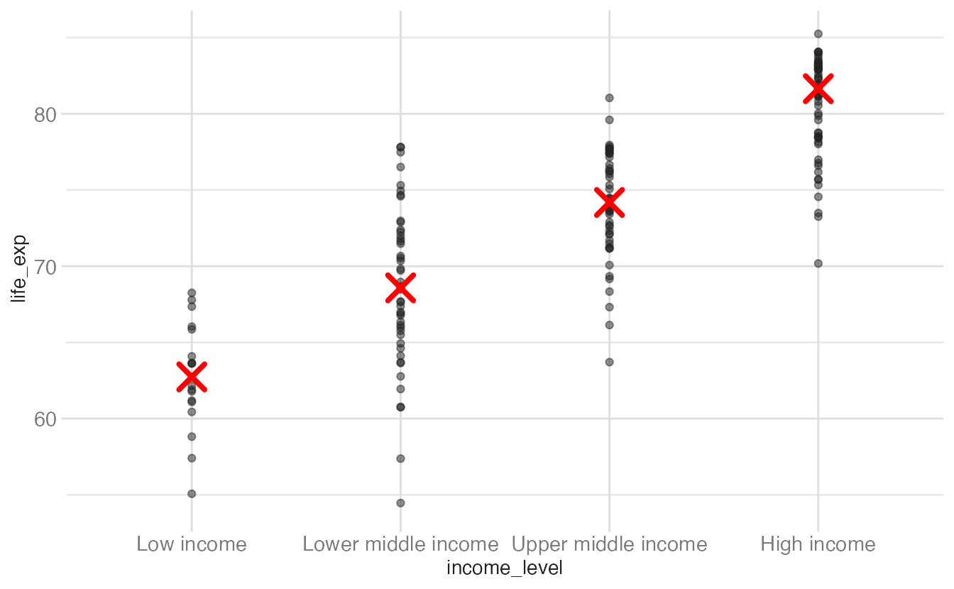
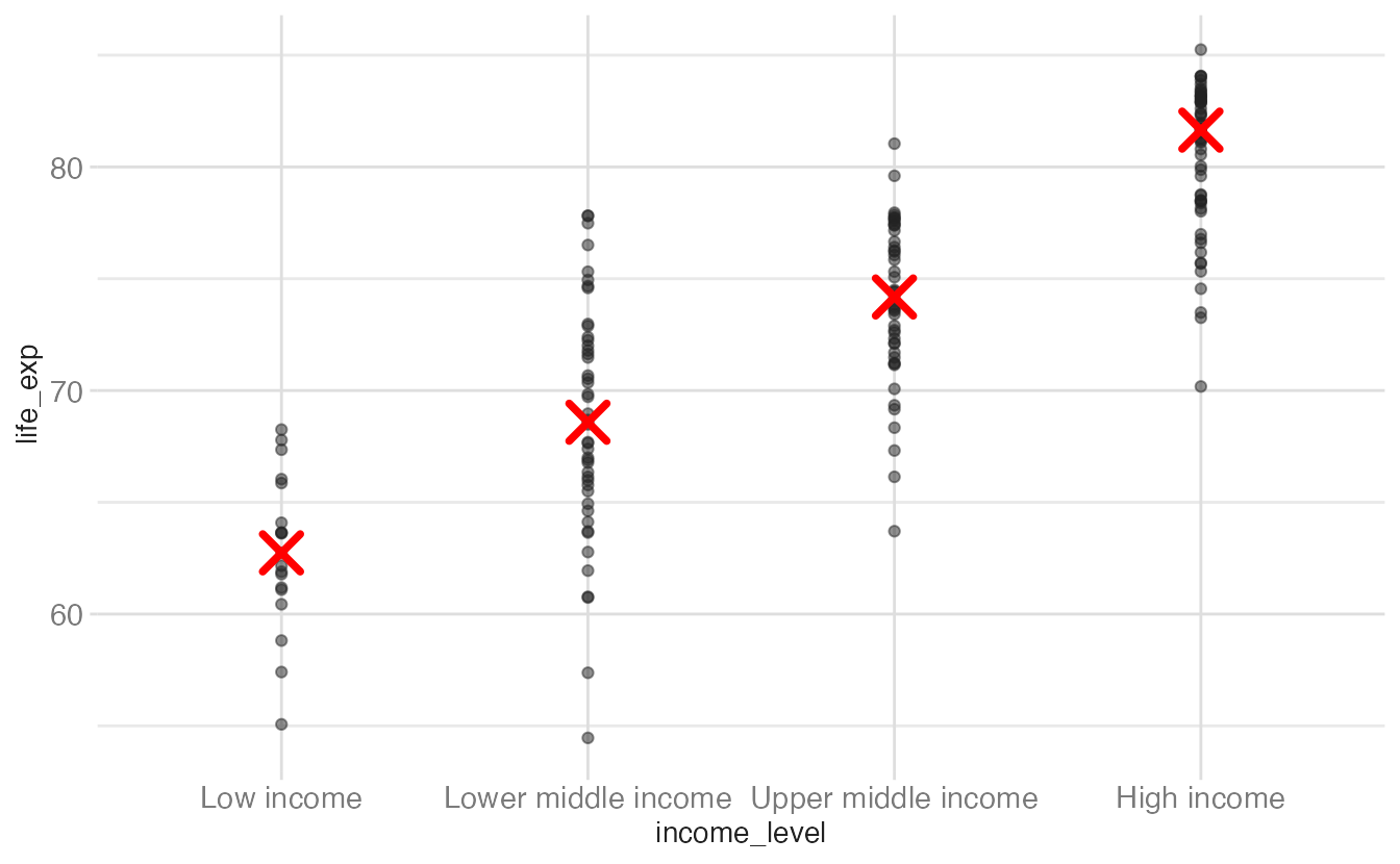
Suppose we want to show all individual data points and then highlight the median for each income group with a distinct marker. There are three equivalent ways to do this.
ggplot(world_bank, aes(x = income_level, y = life_exp)) +
geom_point(alpha = 0.5) +
stat_summary(
geom = "point",
fun = "median",
color = "red",
size = 5,
pch = 4,
stroke = 2
)- 1
-
stat_summary()computesfun(here,median) for eachxgroup and draws the result using the specifiedgeom.pch = 4draws an × symbol;strokecontrols its line width.
ggplot(world_bank, aes(x = income_level, y = life_exp)) +
geom_point(alpha = 0.5) +
geom_point(
stat = "summary",
fun = "median",
color = "red",
size = 5,
pch = 4,
stroke = 2
)- 1
-
Any geom can be given a custom
statargument. This is syntactically equivalent tostat_summary(geom = "point", ...).
world_bank |>
group_by(income_level) |>
summarize(median_life_exp = median(life_exp)) |>
ggplot(mapping = aes(x = income_level)) +
geom_point(data = world_bank, mapping = aes(y = life_exp), alpha = 0.5) +
geom_point(
mapping = aes(y = median_life_exp),
color = "red",
size = 5,
pch = 4,
stroke = 2
)- 1
- Compute median life expectancy per group before plotting.
- 2
-
The raw data layer uses
data = world_bank, overriding the piped-in summary data for this layer only. - 3
- The summary layer uses the piped-in data, which contains only the group medians.
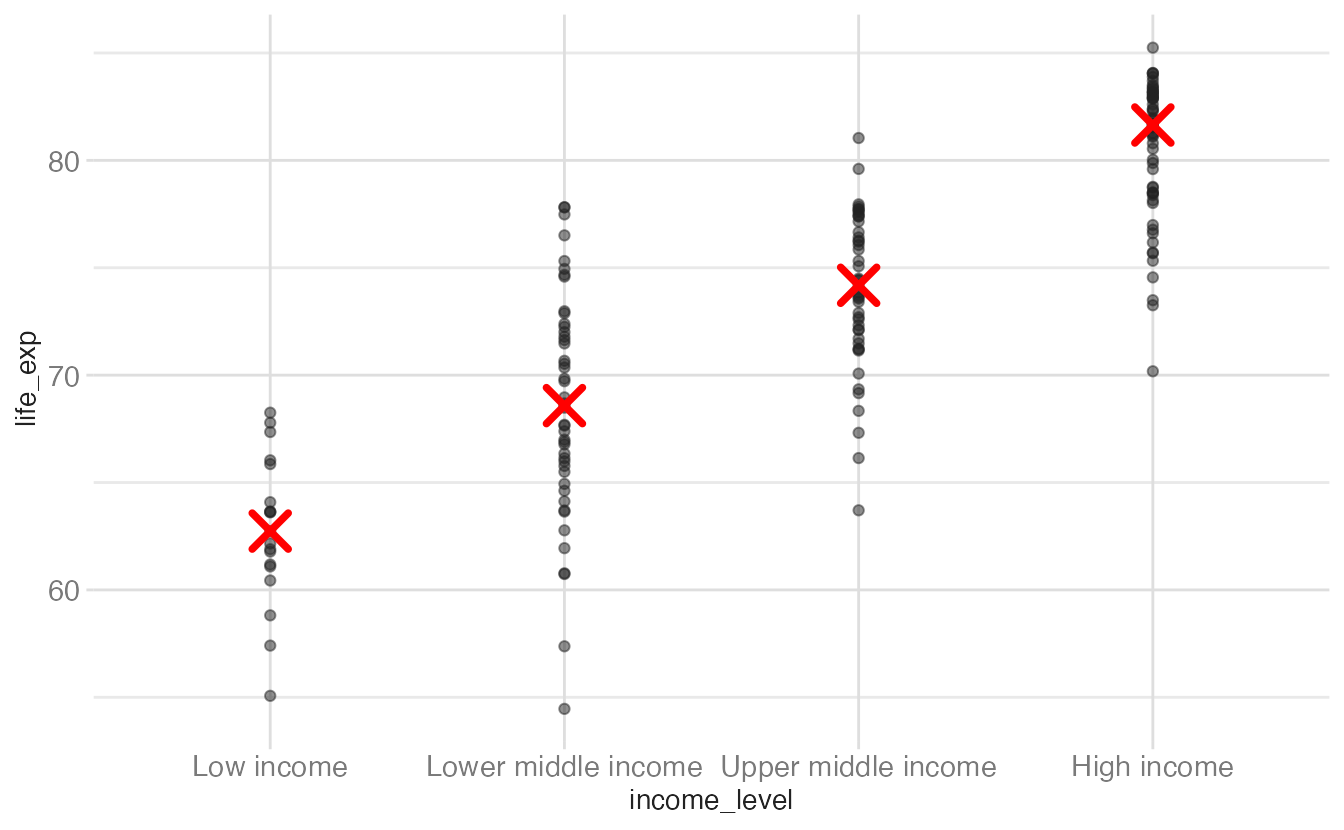
Option 3 is more verbose but gives you full control over the summary computation and is easier to debug — you can inspect the summarized data frame before plotting it.
Scales
What is a scale?
A scale is a function that maps from data space to aesthetic space — it translates a range of data values (the domain) into a range of visual properties (the range). The axis or legend, called a guide, is the inverse: it lets the reader translate visual properties back into data values.
Every aesthetic in a {ggplot2} plot is associated with exactly one scale. When you write:
ggplot(
  world_bank,
  aes(x = female_labor_pct, y = life_exp, color = income_level)
) +
  geom_point(alpha = 0.8)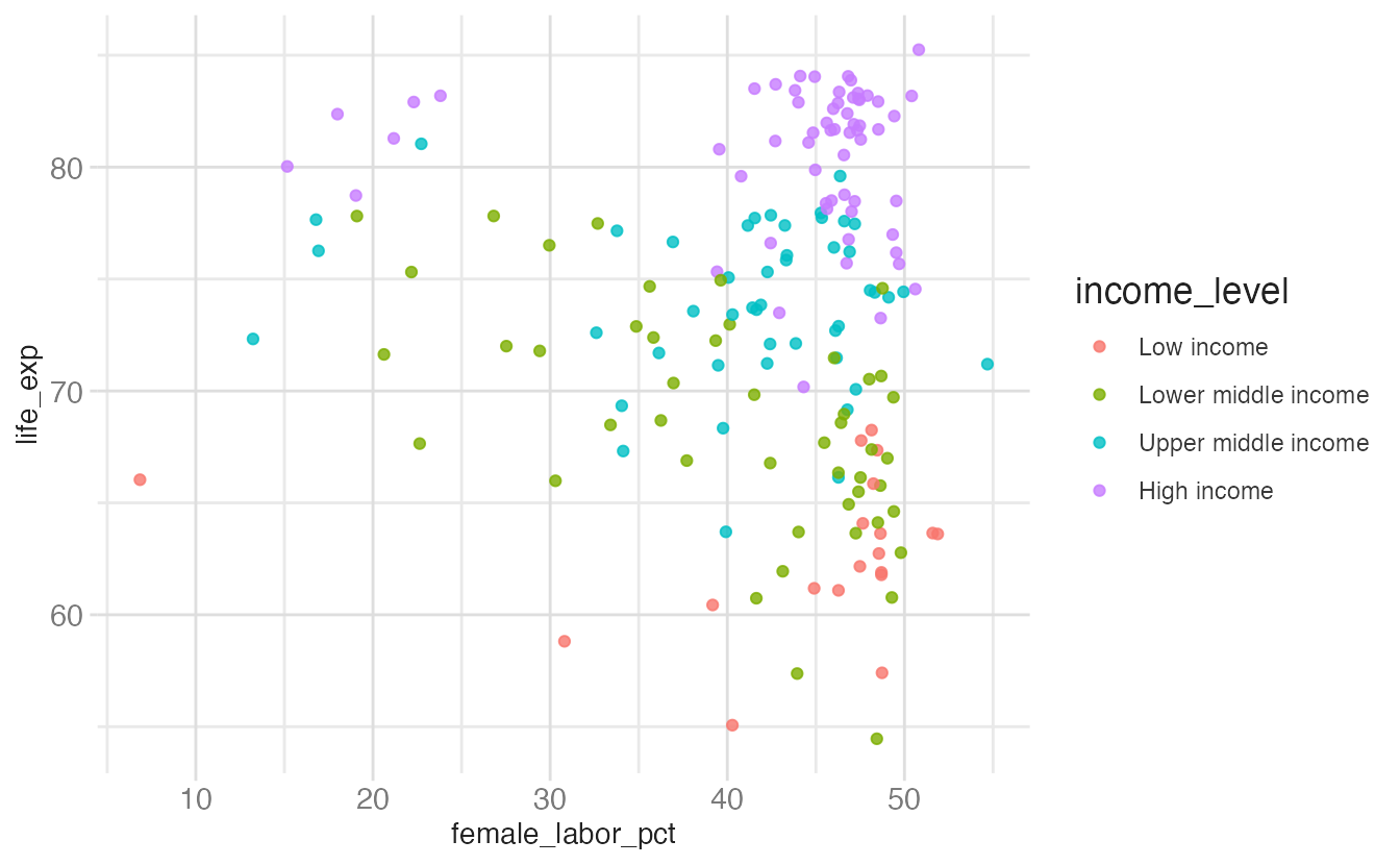
{ggplot2} automatically adds scale_x_continuous(), scale_y_continuous(), and scale_color_discrete(). The explicit version produces the same output.
ggplot(
  data = world_bank,
  mapping = aes(x = female_labor_pct, y = life_exp, color = income_level)
) +
  geom_point(alpha = 0.8) +
  scale_x_continuous() +
  scale_y_continuous() +
  scale_color_discrete()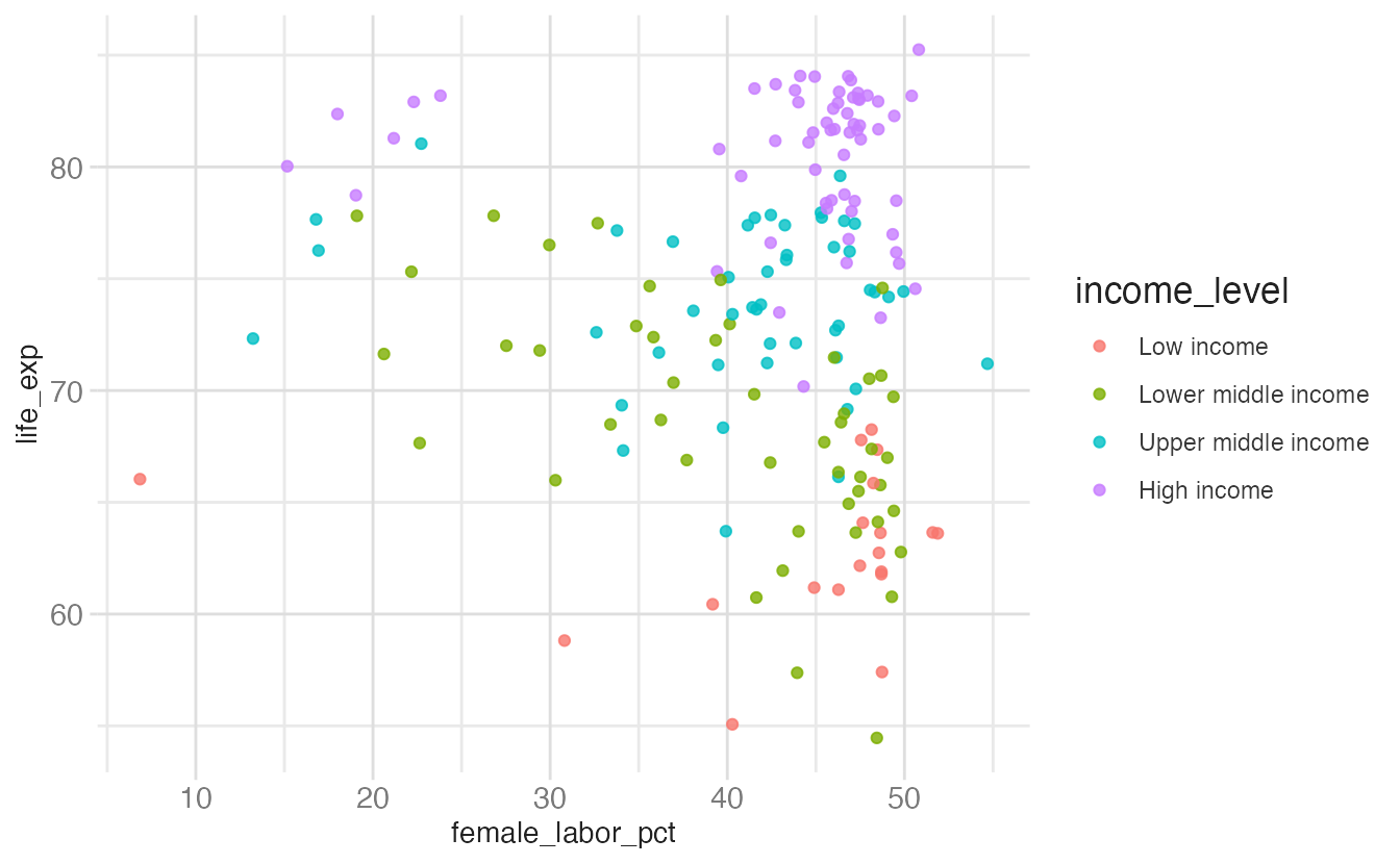
Anatomy of a scale function
Scale functions follow the pattern scale_<aes>_<type>():
scale— always the prefix<aes>— the aesthetic being scaled:x,y,color,fill,shape,size, etc.<type>— the type of scale:continuous,discrete,log10,brewer,viridis, etc.
Some scale functions add a fourth component indicating how a palette is applied:
scale_color_viridis_b()
scale_color_viridis_c()
scale_color_viridis_d()- 1
- binned — maps continuous data into discrete bins
- 2
- continuous — maps continuous data to a color gradient
- 3
- discrete — maps categorical data to distinct colors
Specifying scales more than once
Each aesthetic can only have one active scale. If you specify the same scale twice, the second call wins and {ggplot2} issues a message:
ggplot(
data = world_bank,
mapping = aes(x = female_labor_pct, y = life_exp, color = income_level)
) +
geom_point(alpha = 0.8) +
scale_x_continuous(name = "female_labor_pct") +
scale_x_continuous(name = "Female labor (% of workforce)")- 1
- This scale is overridden — {ggplot2} will warn you.
- 2
-
The second
scale_x_continuous()wins; this is the label that appears on the axis.
Scale for x is already present.
Adding another scale for x, which will replace the existing scale.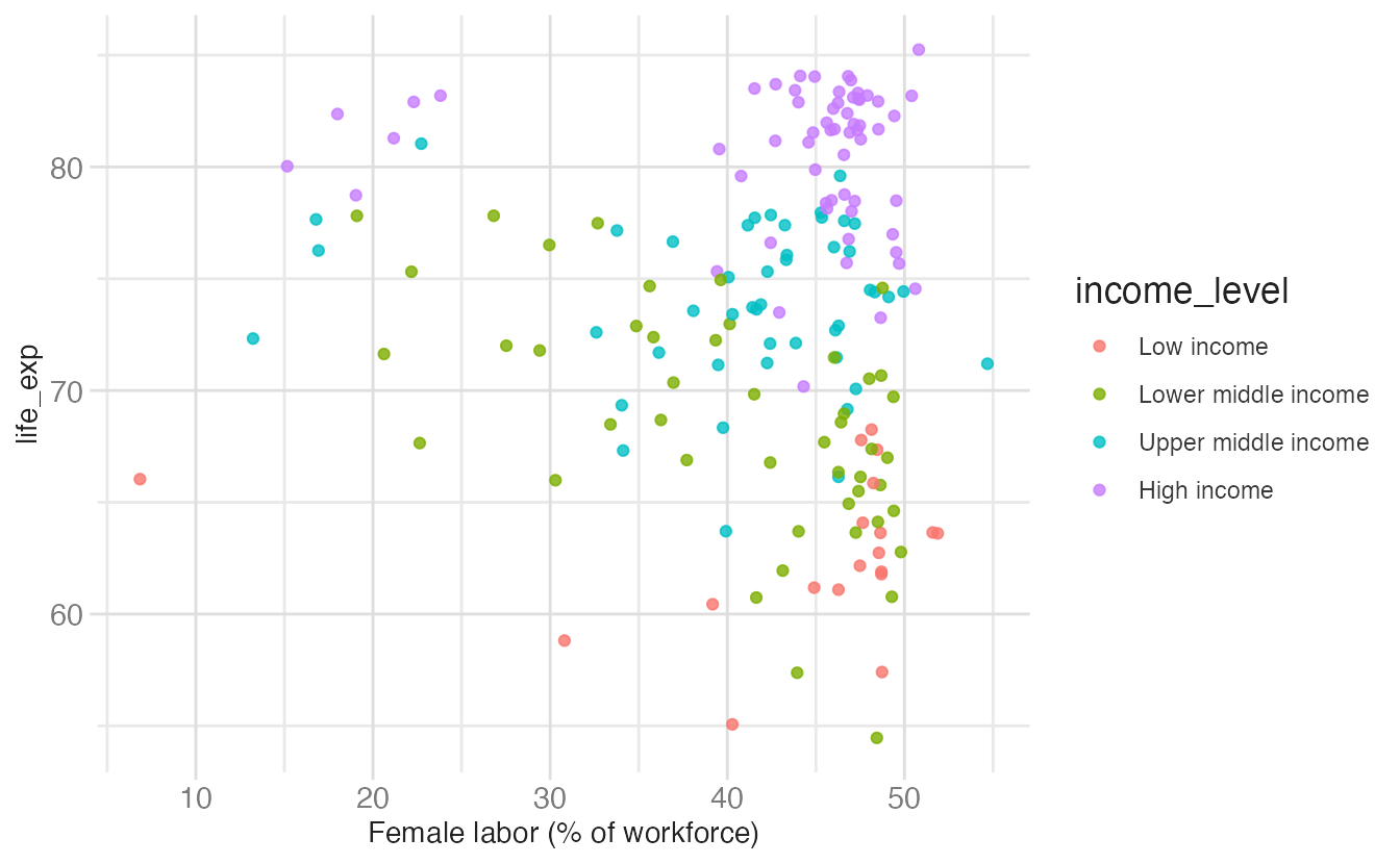
This is a common source of confusion when building up a plot incrementally. If you see “Scale for x is already present. Adding another scale for x, which will replace the existing scale”, you have a duplicate scale somewhere.
Incorrect scale pairings
Scale type must match the variable type. Applying a continuous scale to a discrete variable (or vice versa) produces errors or unexpected behavior:
ggplot(
data = world_bank,
mapping = aes(x = income_level, y = life_exp)
) +
geom_point(alpha = 0.5) +
scale_x_continuous()- 1
-
income_levelis a categorical variable;scale_x_continuous()expects a numeric one. This produces an error.
Error in `scale_x_continuous()`:
! Discrete value supplied to a continuous scale.
ℹ Example values: Low income, Lower middle income, Upper middle income, and High income.ggplot(
data = world_bank,
mapping = aes(x = income_level, y = life_exp)
) +
geom_point(alpha = 0.5) +
scale_y_discrete()- 1
-
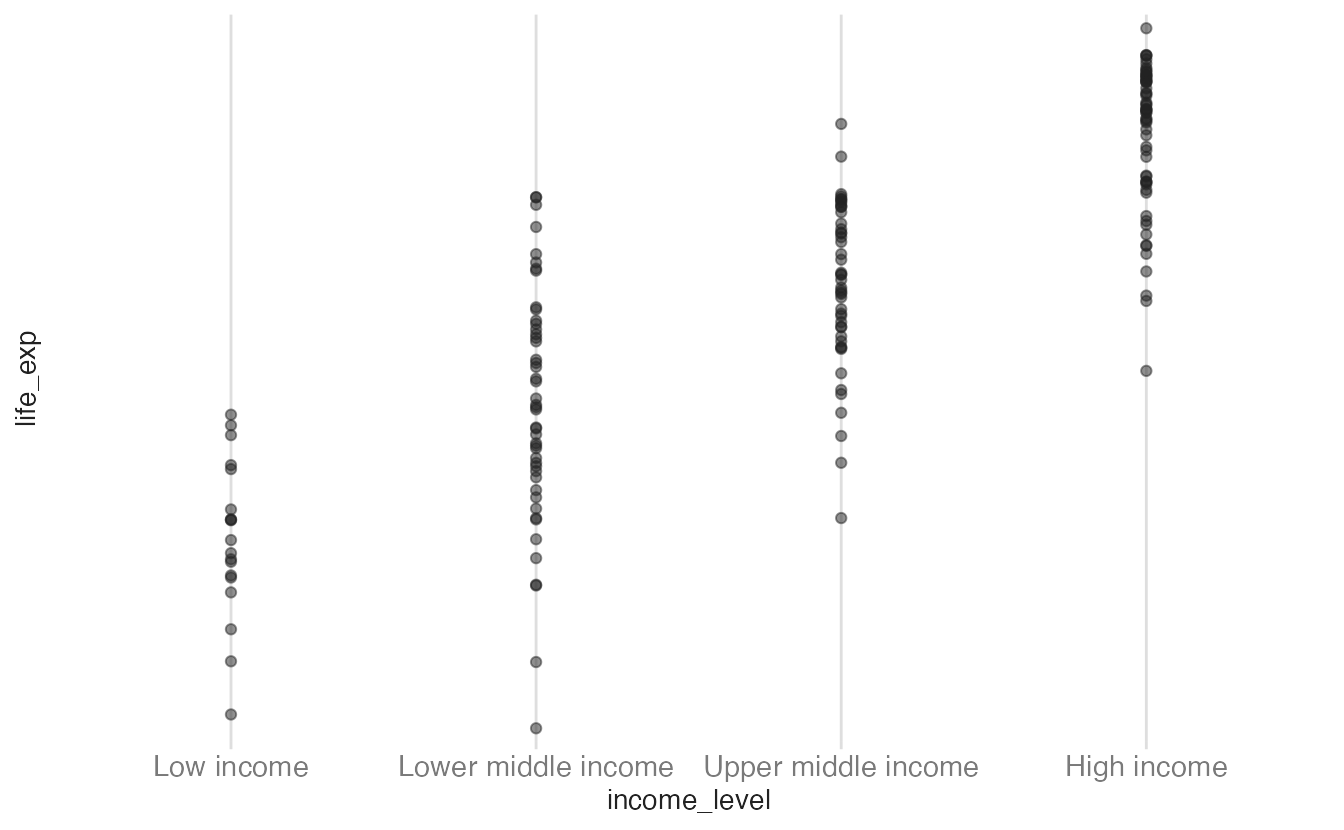
life_expis continuous;scale_y_discrete()will coerce it in unexpected ways. No error is thrown, but the axis is wrong.
Scale transformations
By default, continuous scales map data linearly to aesthetic space. The transform argument applies a mathematical transformation before mapping — useful when data is highly skewed.
ggplot(
  data = world_bank,
  mapping = aes(x = female_labor_pct, y = gdp_per_cap)
) +
  geom_point(alpha = 0.5)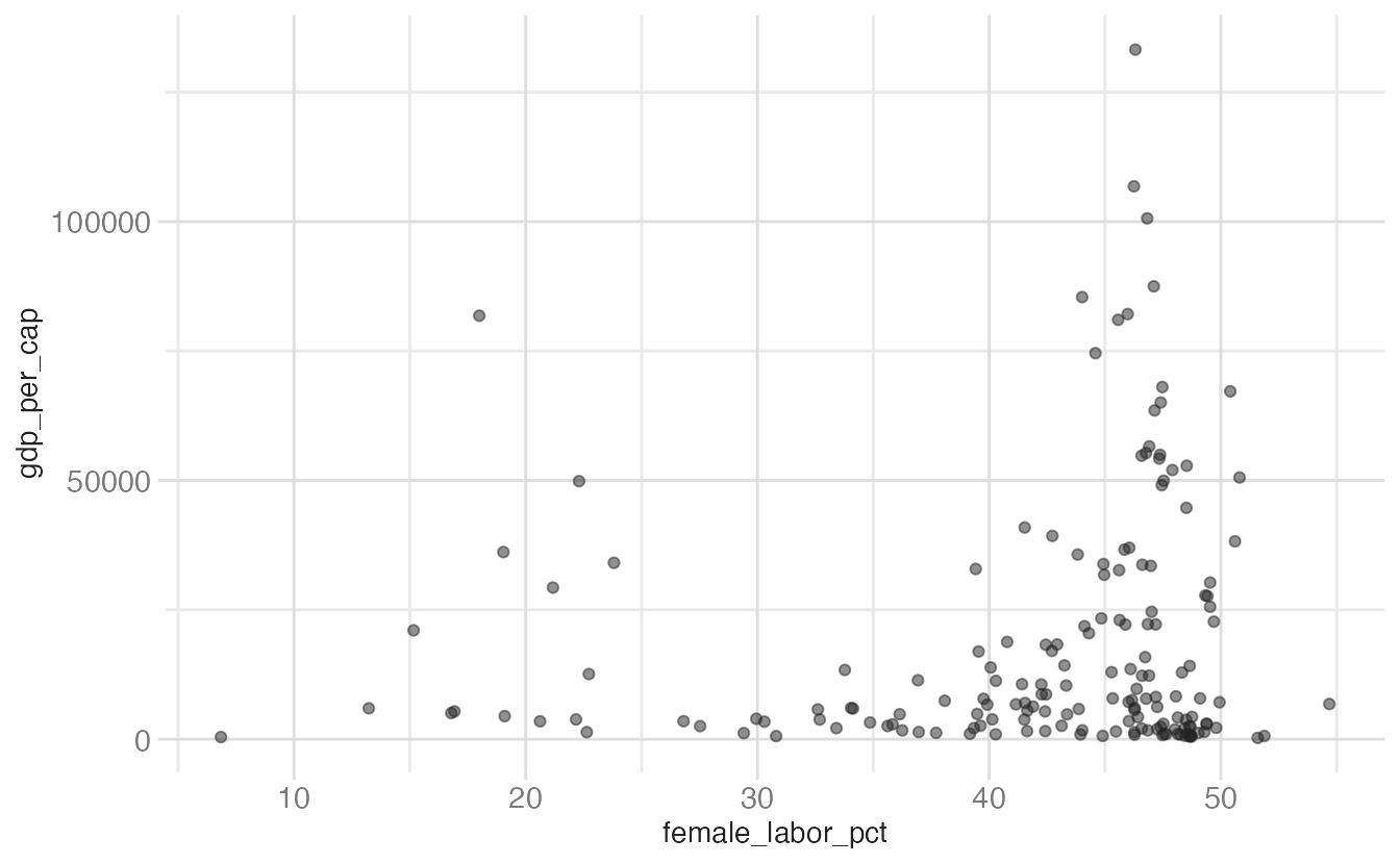
ggplot(
data = world_bank,
mapping = aes(x = female_labor_pct, y = gdp_per_cap)
) +
geom_point(alpha = 0.5) +
scale_y_continuous(transform = "log10")- 1
-
transform = "log10"applies a log₁₀ transformation to the y-axis. Axis labels still show the original data values; only the spacing changes.
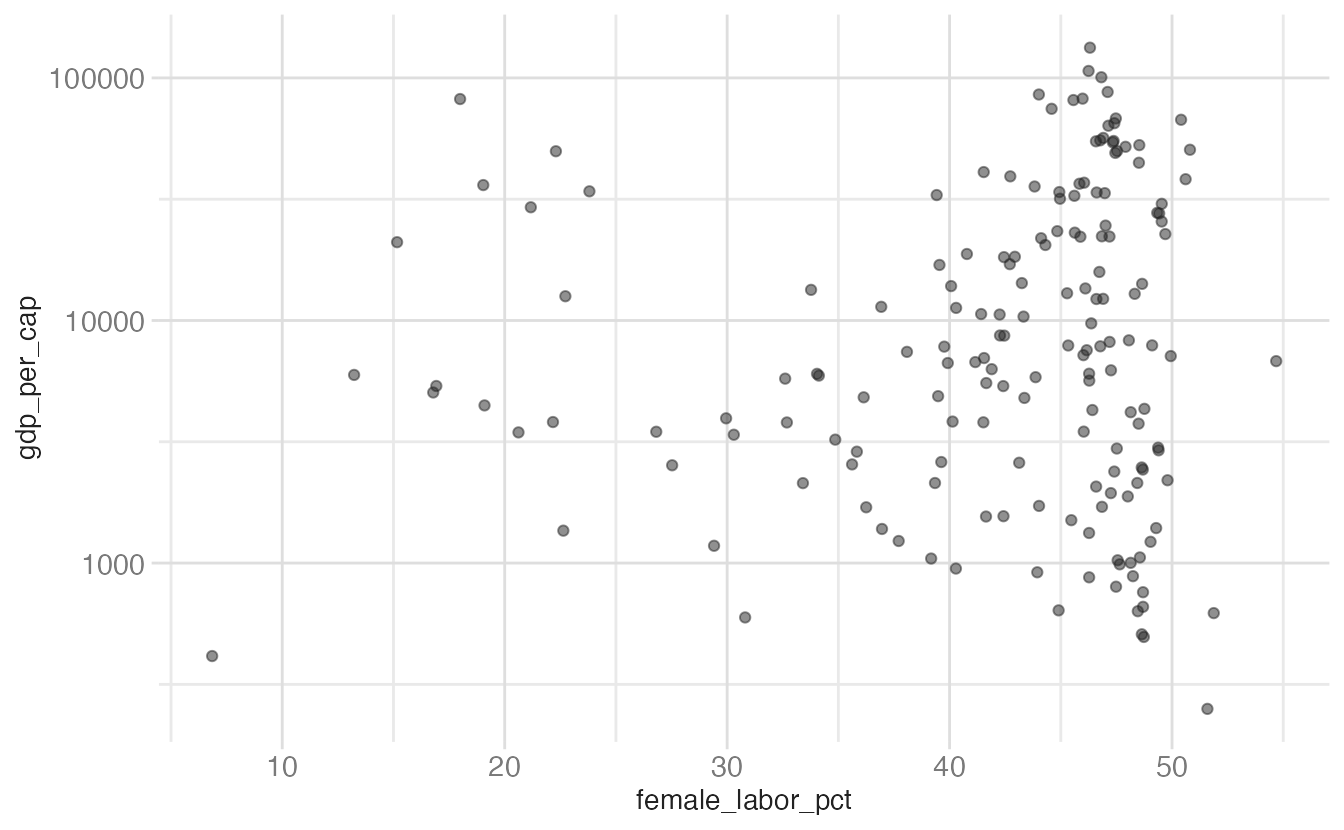
The log transformation reveals structure in the right tail of the GDP distribution that is invisible on the linear scale.
| Name | Function \(f(x)\) |
|---|---|
"log" |
\(\log(x)\) |
"log10" |
\(\log_{10}(x)\) |
"log2" |
\(\log_2(x)\) |
"sqrt" |
\(\sqrt{x}\) |
"reverse" |
\(-x\) |
"exp" |
\(e^x\) |
For the most common transformations, {ggplot2} provides convenience scale functions that are equivalent:
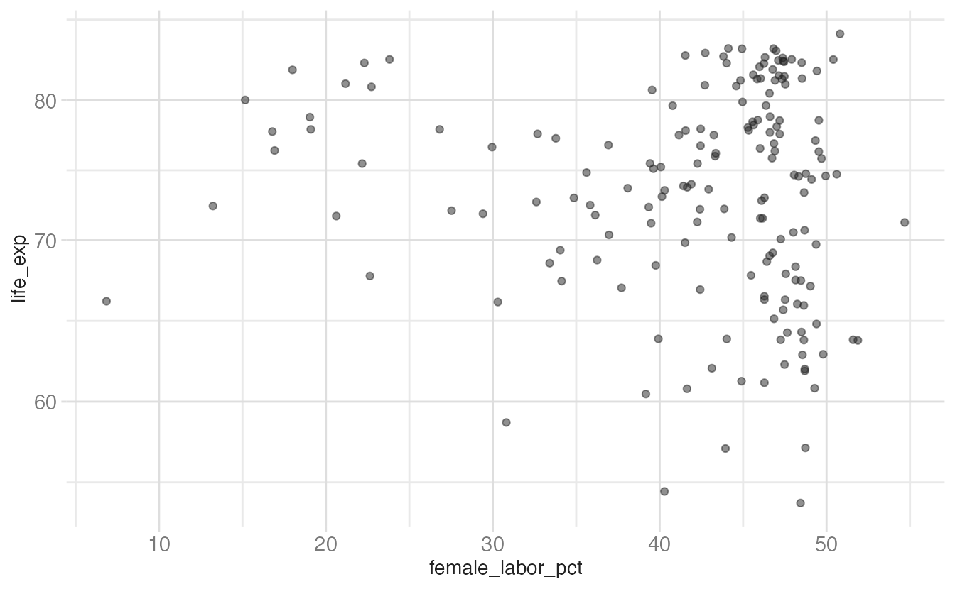
ggplot(data = world_bank, mapping = aes(x = female_labor_pct, y = life_exp)) +
geom_point(alpha = 0.5) +
scale_y_log10()- 1
-
scale_y_log10()is shorthand forscale_y_continuous(transform = "log10"). The convenience functions (scale_y_log10(),scale_y_sqrt(),scale_x_reverse()) are less typing and slightly more readable.
Guides
What are guides?
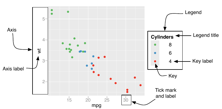
Guides are the visual elements that help readers decode a scale — axes for position aesthetics, and legends for color, shape, size, and other aesthetics.
Customizing axes with scale_*()
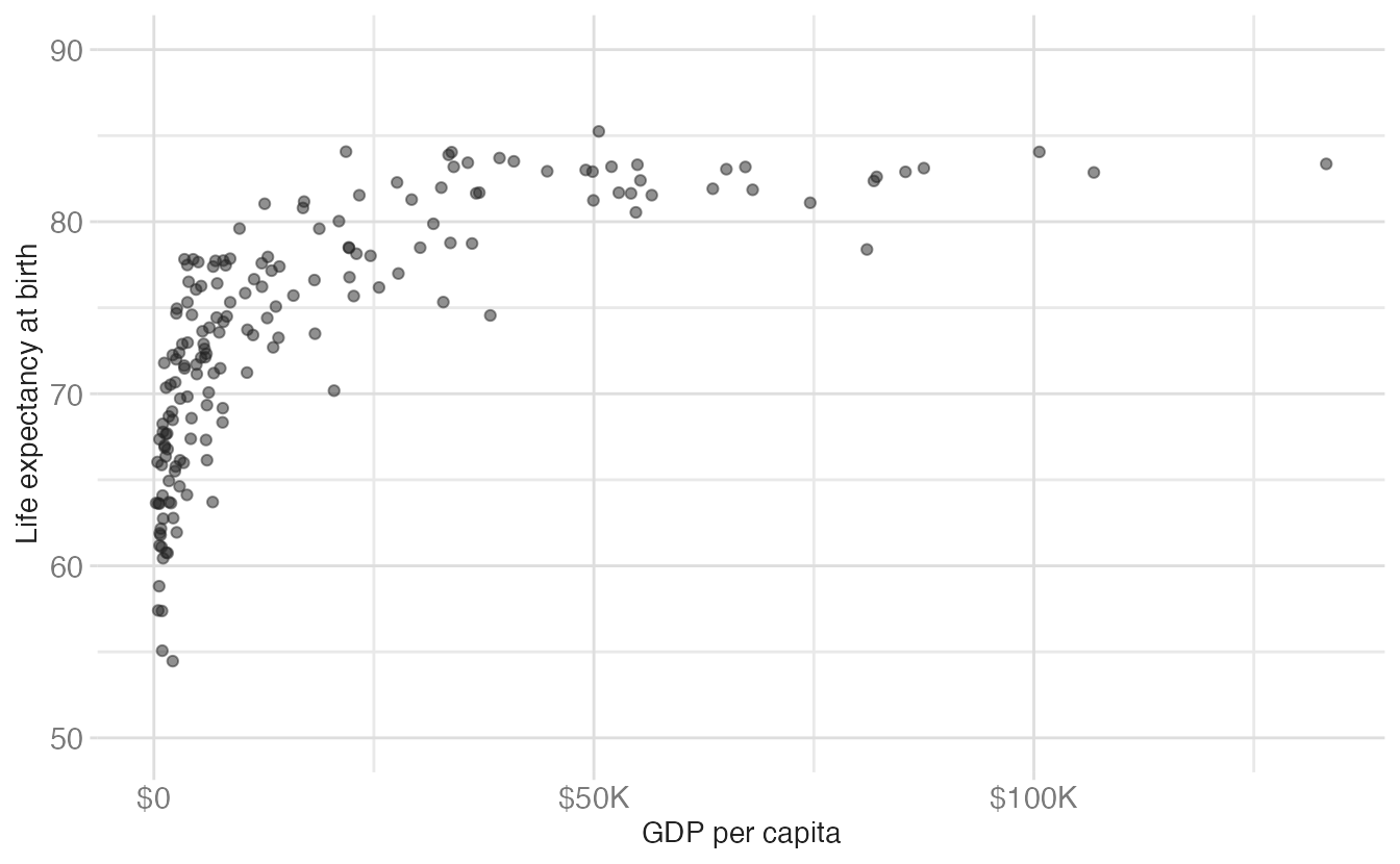
Axis labels, breaks, and limits are all controlled through the relevant scale_*() function. Here is a fully customized scatterplot built up argument by argument:
ggplot(data = world_bank, mapping = aes(x = gdp_per_cap, y = life_exp)) +
geom_point(alpha = 0.5) +
scale_y_continuous(
name = "Life expectancy at birth",
breaks = seq(from = 50, to = 90, by = 10),
limits = c(50, 90)
) +
scale_x_continuous(
name = "GDP per capita",
labels = label_currency(scale_cut = cut_short_scale())
)- 1
-
namesets the axis title. This is equivalent to usinglabs(y = ...). - 2
-
breaksspecifies where tick marks and gridlines appear. Values outside the data range appear only if they’re withinlimits. - 3
-
limitssets the visible range. Observations outside this range are dropped (with a warning) rather than plotted off-scale. - 4
-
label_currency(scale_cut = cut_short_scale())from {scales} formats values as “$50K”, “$100K” etc. — much more readable than scientific notation or raw numbers.
Customizing legends with guides()
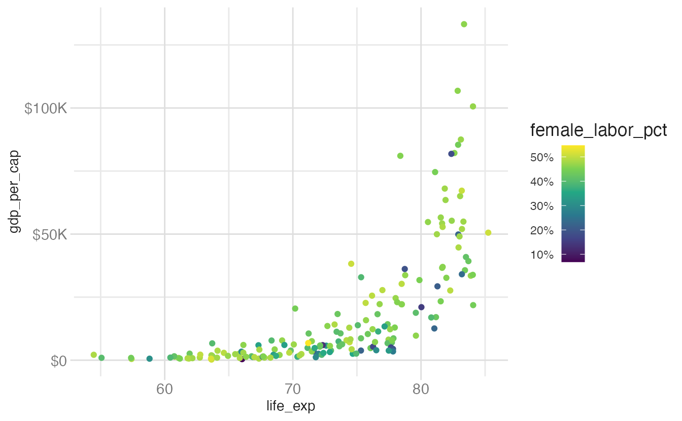
For color and other non-position aesthetics, the guides() function controls the guide type and its appearance. Let us build a base plot to illustrate:
base_plot <- ggplot(
  data = world_bank,
  mapping = aes(x = life_exp, y = gdp_per_cap, color = female_labor_pct)
) +
  geom_point() +
  scale_y_continuous(labels = label_currency(scale_cut = cut_short_scale())) +
  scale_color_viridis_c(labels = label_percent(scale = 1))
base_plot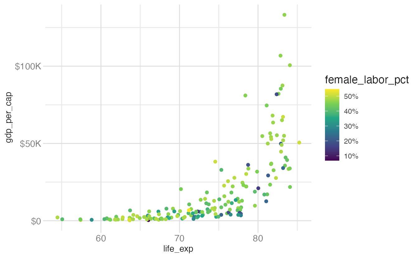
The default colorbar guide has several customizable properties. Examples of common modifications are shown below.
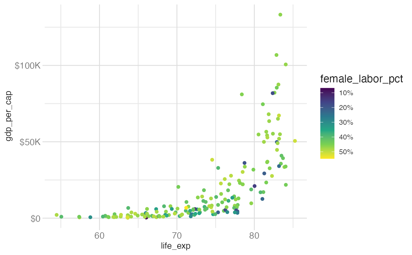
base_plot +
guides(color = guide_colorbar(reverse = TRUE))- 1
-
reverse = TRUEflips the colorbar so the highest values appear at the bottom. Useful when your data narrative naturally reads top-to-bottom.
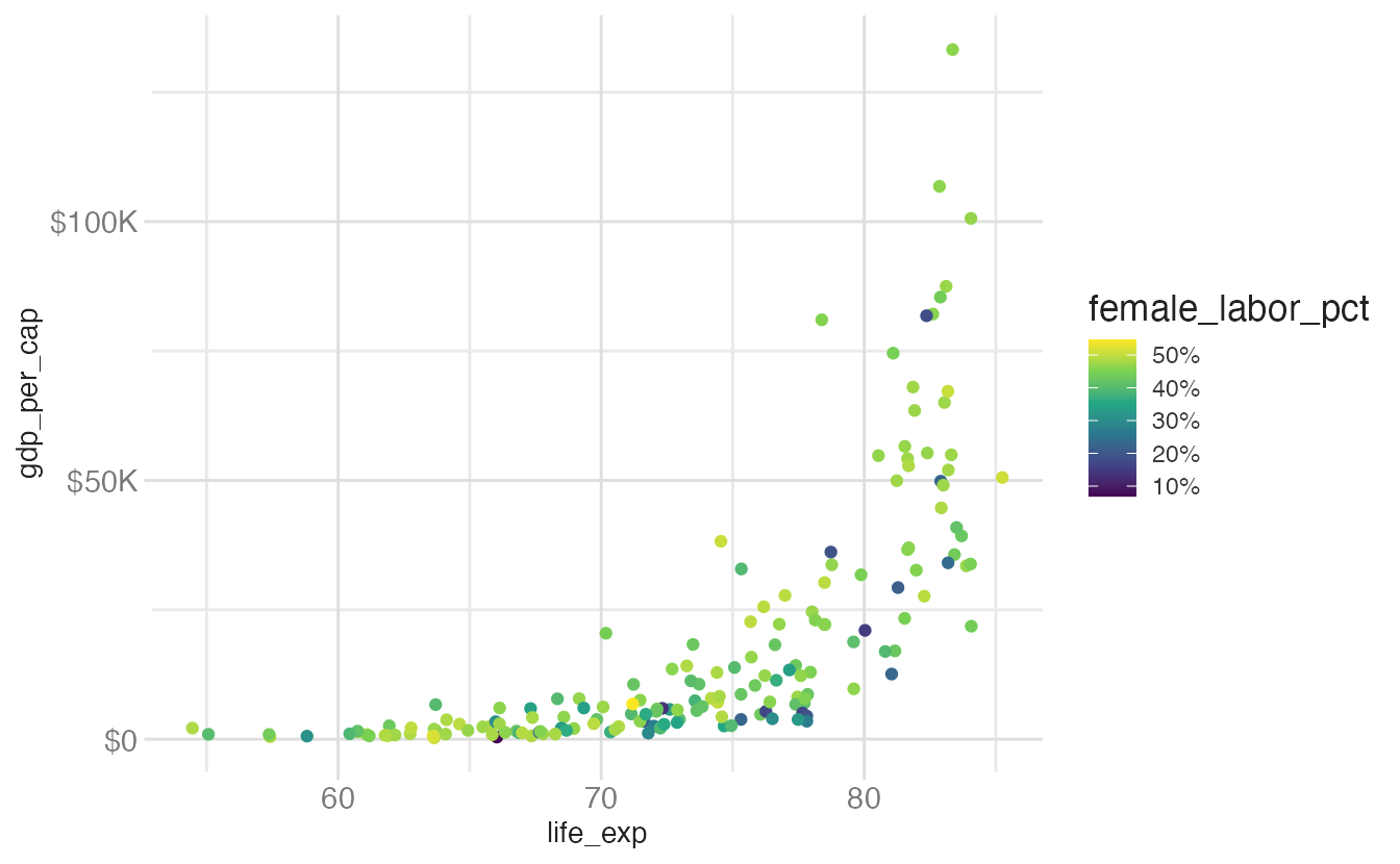
base_plot +
guides(
color = guide_colorbar(
theme = theme(legend.key.height = unit(4, "cm"))
)
)- 1
-
legend.key.heightcontrols the height of the colorbar. Increasing it makes the gradient easier to read.
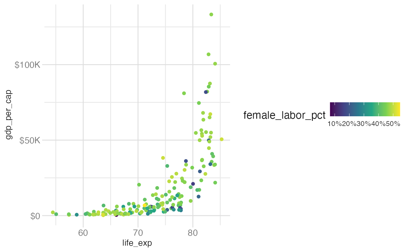
base_plot +
guides(
color = guide_colorbar(
theme = theme(legend.direction = "horizontal")
)
)- 1
-
legend.direction = "horizontal"rotates the colorbar. Horizontal bars work well at the bottom of a plot.
base_plot +
guides(
color = guide_colorbar(
theme = theme(legend.text.position = "left")
)
)- 1
-
legend.text.positioncontrols which side of the bar the tick labels appear on.
| Scale type | Default guide | Function |
|---|---|---|
| Continuous color/fill | colorbar | guide_colorbar() |
| Binned color/fill | colorsteps | guide_colorsteps() |
| Position scales | axis | guide_axis() |
| Discrete scales (except position) | legend | guide_legend() |
| Binned scales (except position/color/fill) | bins | guide_bins() |
Summary
- Statistical transformations (stats) process raw data before it is drawn; most geoms apply a stat automatically
- Every aesthetic is associated with a scale function (
scale_<aes>_<type>()); {ggplot2} adds default scales automatically - Scale type must match variable type — mixing continuous and discrete produces errors
- Use
transform(or convenience functions likescale_y_log10()) to apply axis transformations for skewed data - Guides (axes and legends) are the inverse of scales; customize them via
scale_*()arguments orguides() - The {scales} package provides formatting functions (
label_currency(),label_percent(), etc.) for readable axis labels
Acknowledgements
Material derived in part from STA 313: Advanced Data Visualization.