tompkins <- read_csv("data/tompkins-home-sales.csv") |>
  mutate(decade_built = (year_built %/% 10) * 10) |>
  mutate(
    decade_built_cat = case_when(
      decade_built <= 1940 ~ "1940 or before",
      decade_built >= 1990 ~ "1990 or after",
      .default = as.character(decade_built)
    )
  )

mean_price_decade <- tompkins |>
  group_by(decade_built_cat) |>
summarize(mean_price = mean(price))Deep dive: layers (II)
Notes
NoteLearning objectives
- Identify common geom types for single and multiple variable charts
- Generate charts using the same variables and different geoms
- Utilize position adjustments
- Evaluate the effectiveness of geom type choice for specific combinations of variables
Setup
We’ll continue using the Tompkins County home sales data from the previous lesson. Here is the full data preparation pipeline in a single pipeline:
Rows: 1270 Columns: 12
── Column specification ──────────────────────────────────────────────────────────────────
Delimiter: ","
chr  (2): town, municipality
dbl  (9): price, beds, baths, area, lot_size, year_built, hoa_month, long, lat
date (1): sold_date

ℹ Use `spec()` to retrieve the full column specification for this data.
ℹ Specify the column types or set `show_col_types = FALSE` to quiet this message.
Geoms
A geom is the geometric object used to represent observations in a plot. Choosing the right geom is one of the most consequential visualization decisions you’ll make — the same data can tell very different stories depending on how it is drawn.
{ggplot2} provides a geom_*() function for every major chart type. The right choice depends primarily on two things: how many variables you’re showing and what types they are (continuous vs. discrete).
One variable
Discrete variables
For a single discrete (categorical) variable, geom_bar() is the default: it counts how many observations fall in each category and renders a bar for each.
Continuous variables
For a single continuous variable, you have several options depending on what you want to emphasize:
geom_histogram()— bin and count into bars; good for seeing the shape of the distributiongeom_density()— smoothed kernel density estimate; good for comparing shapes across groupsgeom_freqpoly()— like a histogram but drawn as a line; makes multi-group comparisons easiergeom_dotplot()— stack individual points; good for small datasets
When comparing distributions across groups, the choice between these matters. A stacked or overlapping histogram can be hard to read:
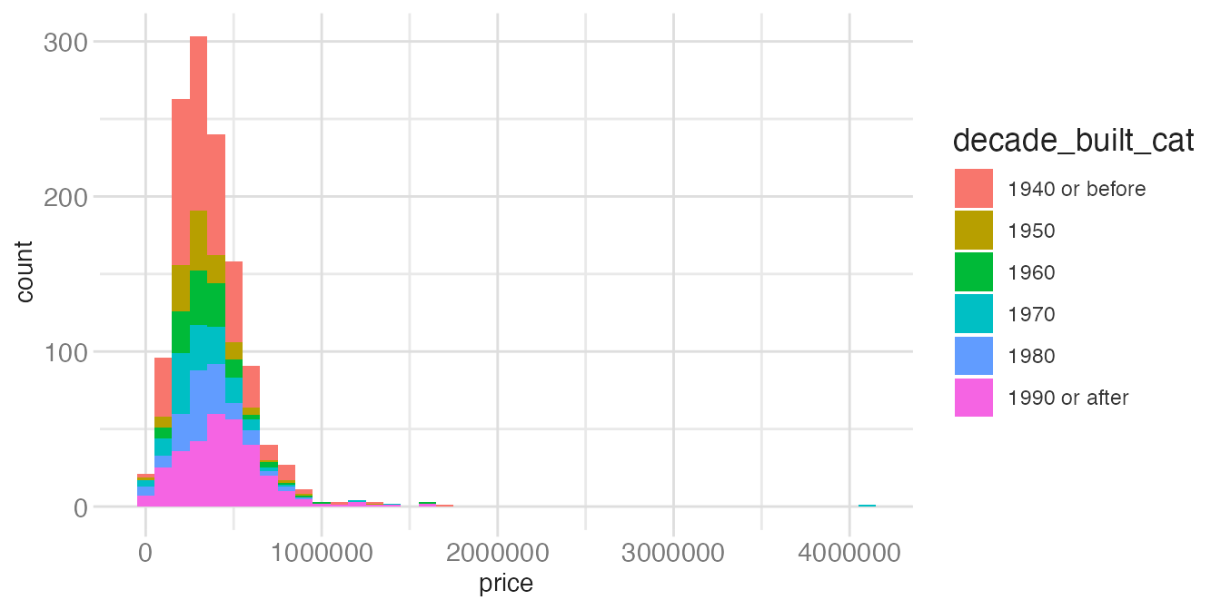
ggplot(tompkins, aes(x = price, fill = decade_built_cat)) +
geom_histogram(binwidth = 100000)- 1
- Stacked histograms make it hard to compare the heights of bars across groups — only the bottom group has a stable baseline at zero.
ggplot(tompkins, aes(x = price, color = decade_built_cat)) +
geom_freqpoly(binwidth = 100000, linewidth = 1)- 1
-
geom_freqpoly()draws the same information as a histogram but as lines, making multi-group comparison straightforward since lines don’t occlude each other.
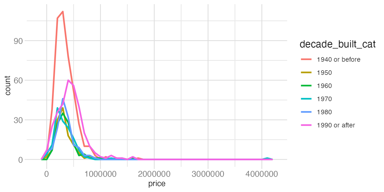
The frequency polygon is easier to compare across groups because all lines share a common baseline and don’t overlap in the way bars do.
Two variables
Both continuous
For two continuous variables the standard options are:
geom_point()— scatterplot; the go-to for exploring relationshipsgeom_smooth()— fitted curve with optional confidence bandgeom_quantile()— quantile regression linesgeom_rug()— marginal tick marks along each axis showing the marginal distributiongeom_text()orgeom_label()— text labels at each (x, y) position
Showing density for large datasets
When there are many observations, individual points overlap and a scatterplot becomes an unreadable mass of ink. Density geoms bin the 2D space and count points within each bin:
geom_bin2d()— rectangular binsgeom_hex()— hexagonal bins (less visual artifact from rectangles)geom_density2d()— contour lines of a smoothed 2D density
geom_hex() illustrates how the appropriate geom scales with dataset size:
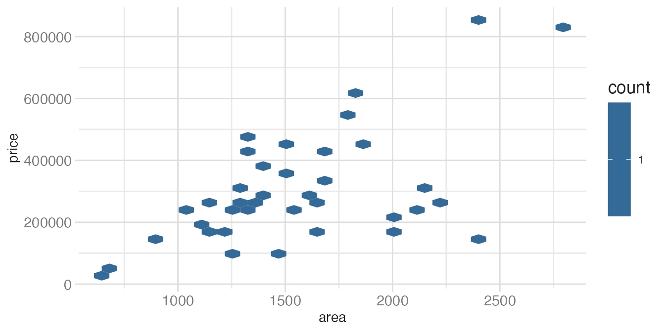
tompkins |>
filter(decade_built == 1940) |>
ggplot(aes(x = area, y = price)) +
geom_hex()- 1
-
With only 38 observations, most hex cells contain just one point. The binning adds no value —
geom_point()would be clearer.
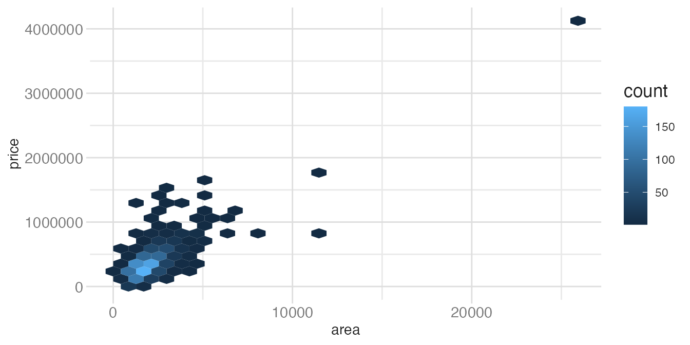
ggplot(tompkins, aes(x = area, y = price)) +
geom_hex()- 1
-
With 1270 observations there is some overplotting, and
geom_hex()starts to reveal density patterns.
ggplot(diamonds, aes(x = carat, y = price)) +
geom_hex()- 1
- With 53940 observations, hexagonal binning is clearly the right choice — a scatterplot would be an unreadable blob.
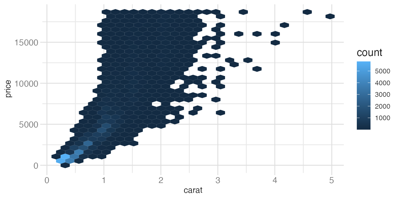
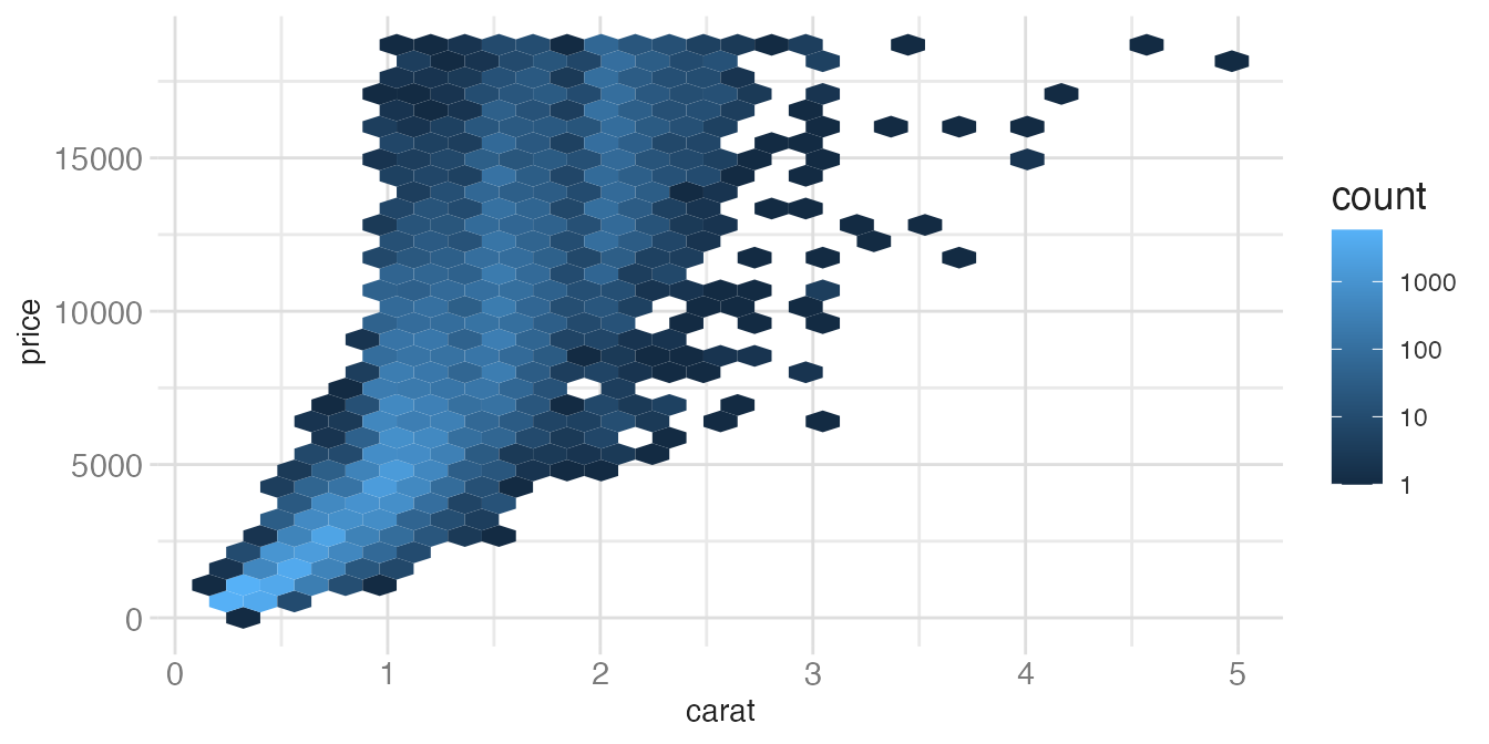
The fill scale in geom_hex() defaults to a linear count. For highly skewed data, a log-transformed fill scale reveals structure across orders of magnitude:
ggplot(diamonds, aes(x = carat, y = price)) +
geom_hex() +
scale_fill_gradient(transform = "log10")- 1
-
transform = "log10"applies a log scale to the fill color mapping. This prevents the one or two highest-density cells from dominating the color scale and washing out all other variation.
One continuous, one discrete
When one variable is discrete, you’re usually comparing a distribution or summary across groups:
geom_boxplot()— five-number summary per groupgeom_violin()— full density estimate per groupgeom_col()— bar chart of pre-computed summary valuesgeom_count()— scale point size by count at each location
Handling overplotting with geom_jitter()
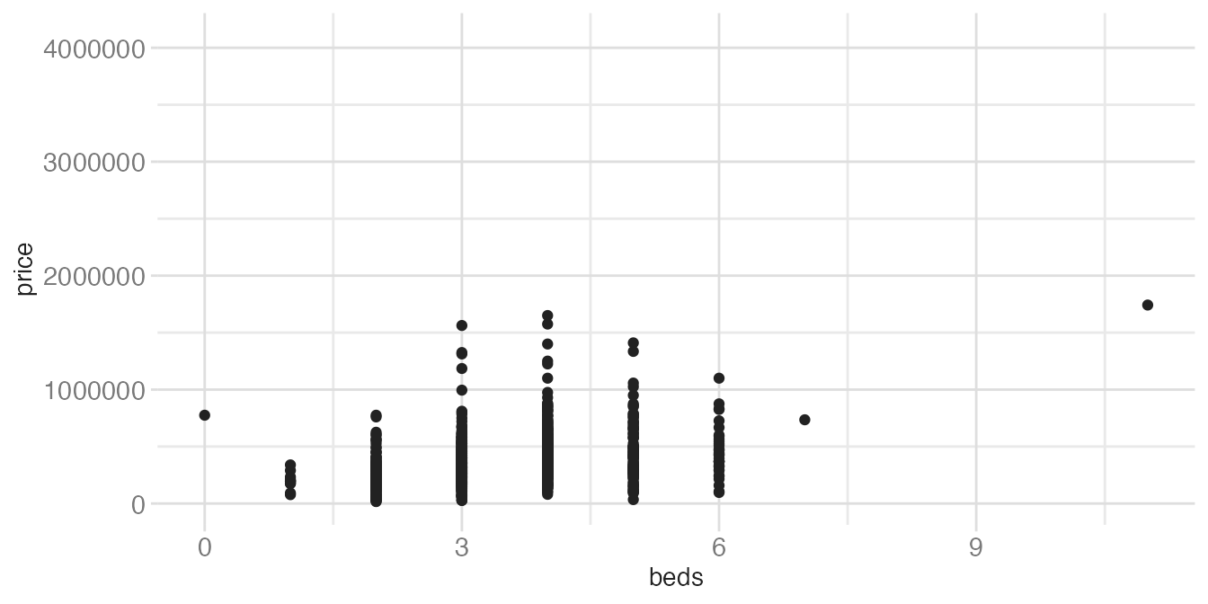
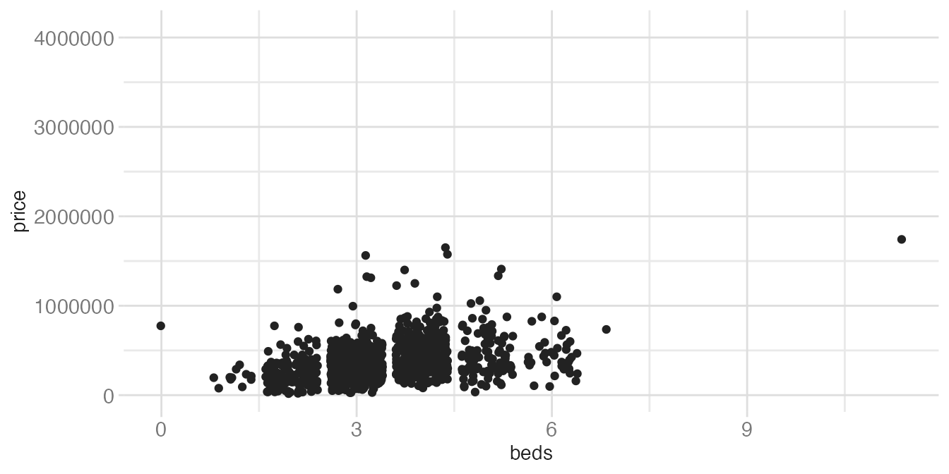
When one variable is discrete and the other is continuous, geom_point() stacks all points for a given category into a vertical line — overplotting obscures how many points are there. geom_jitter() adds a small random horizontal nudge to each point to reveal the density:
ggplot(tompkins, aes(x = beds, y = price)) +
geom_point()- 1
- Points are stacked directly on top of each other at each integer bed count, making it impossible to see how many observations are in each column.
ggplot(tompkins, aes(x = beds, y = price)) +
geom_jitter()- 1
- Each point is nudged by a small random amount. The spread is random, so the result looks slightly different every time the code runs.
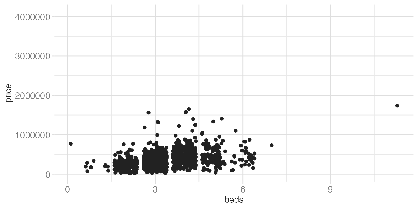
That randomness matters when results need to be reproducible. set.seed() pins the random number generator so the same jitter positions are produced on every render:
ggplot(tompkins, aes(x = beds, y = price)) +
  geom_jitter() # point positions change every render
Warning: Removed 42 rows containing missing values or values outside the scale range
(`geom_point()`).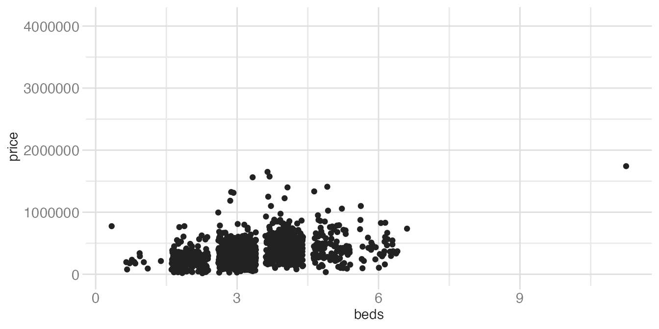
set.seed(531)
ggplot(tompkins, aes(x = beds, y = price)) +
geom_jitter()- 1
-
set.seed(531)before the plot ensures the same random positions are generated each time. Use any integer — what matters is consistency.
One continuous, one time variable
For time series data you have several geom choices:
geom_line()— connect points in time order; the standard for time seriesgeom_area()— likegeom_line()but fills the area below the line to zerogeom_step()— staircase-style; good for data that changes discretely rather than continuously
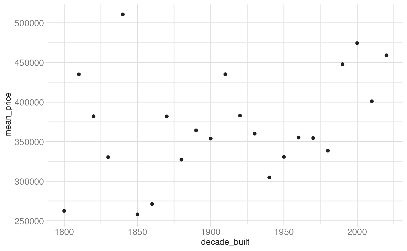
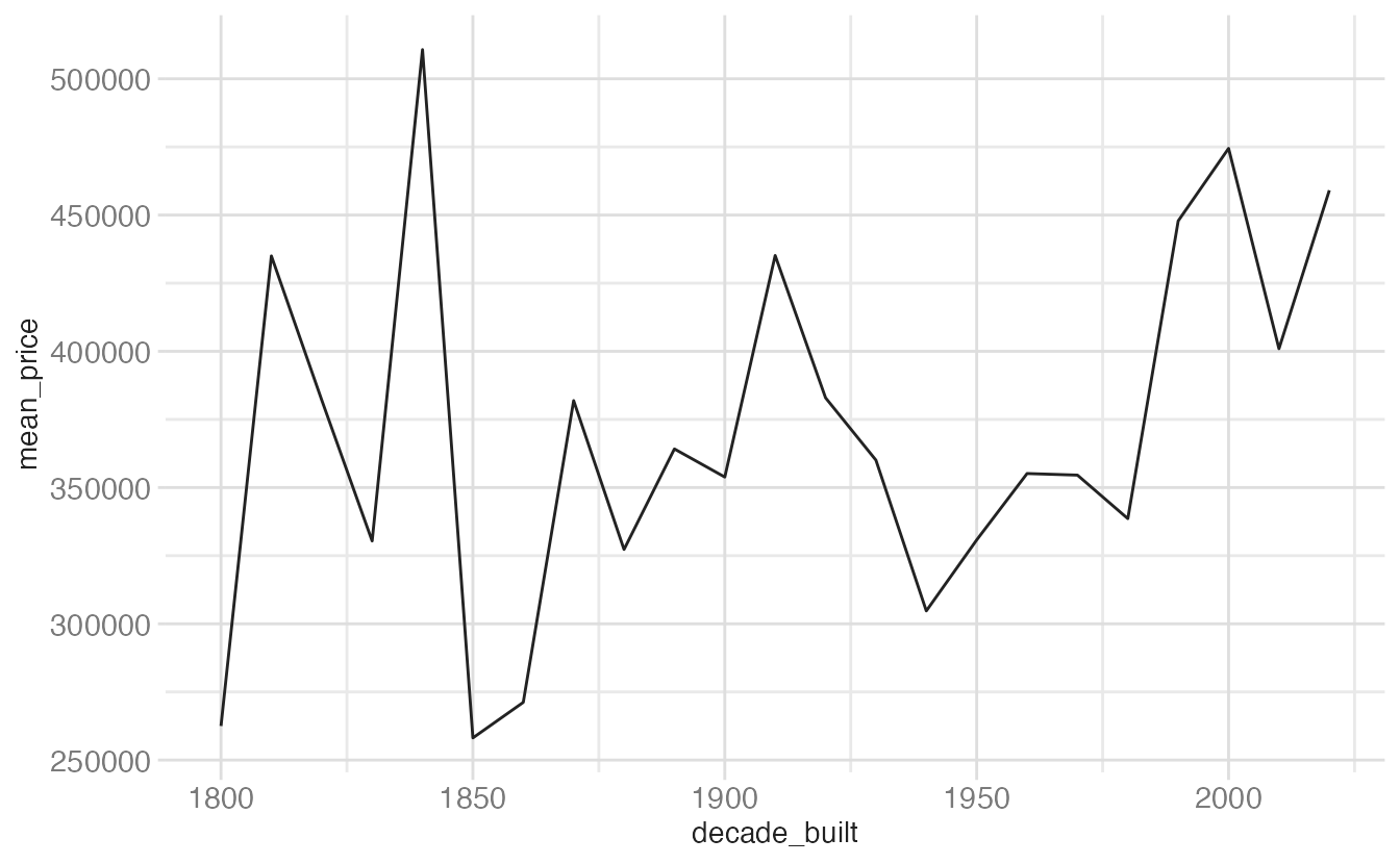
The four geoms behave quite differently on the same mean price by decade data:
ggplot(mean_price_year, aes(x = decade_built, y = mean_price)) +
geom_point()- 1
-
geom_point()shows each decade’s mean without implying continuity between them. Appropriate if you want to treat decades as unordered categories rather than a time axis.
ggplot(mean_price_year, aes(x = decade_built, y = mean_price)) +
geom_line()- 1
-
geom_line()connects the dots in order ofx, implying a continuous trend over time. The standard choice for time series.
ggplot(mean_price_year, aes(x = decade_built, y = mean_price)) +
geom_area()- 1
-
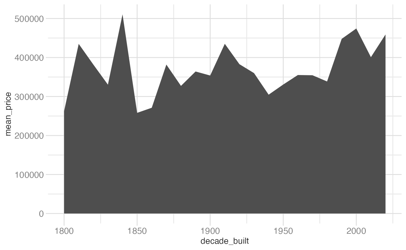
geom_area()fills the region under the line to zero. This emphasizes the absolute magnitude at each point rather than just the shape of the trend — useful when “how much total” matters, but it can be misleading when the baseline (zero) is far from the data range.
ggplot(mean_price_year, aes(x = decade_built, y = mean_price)) +
geom_step()- 1
-
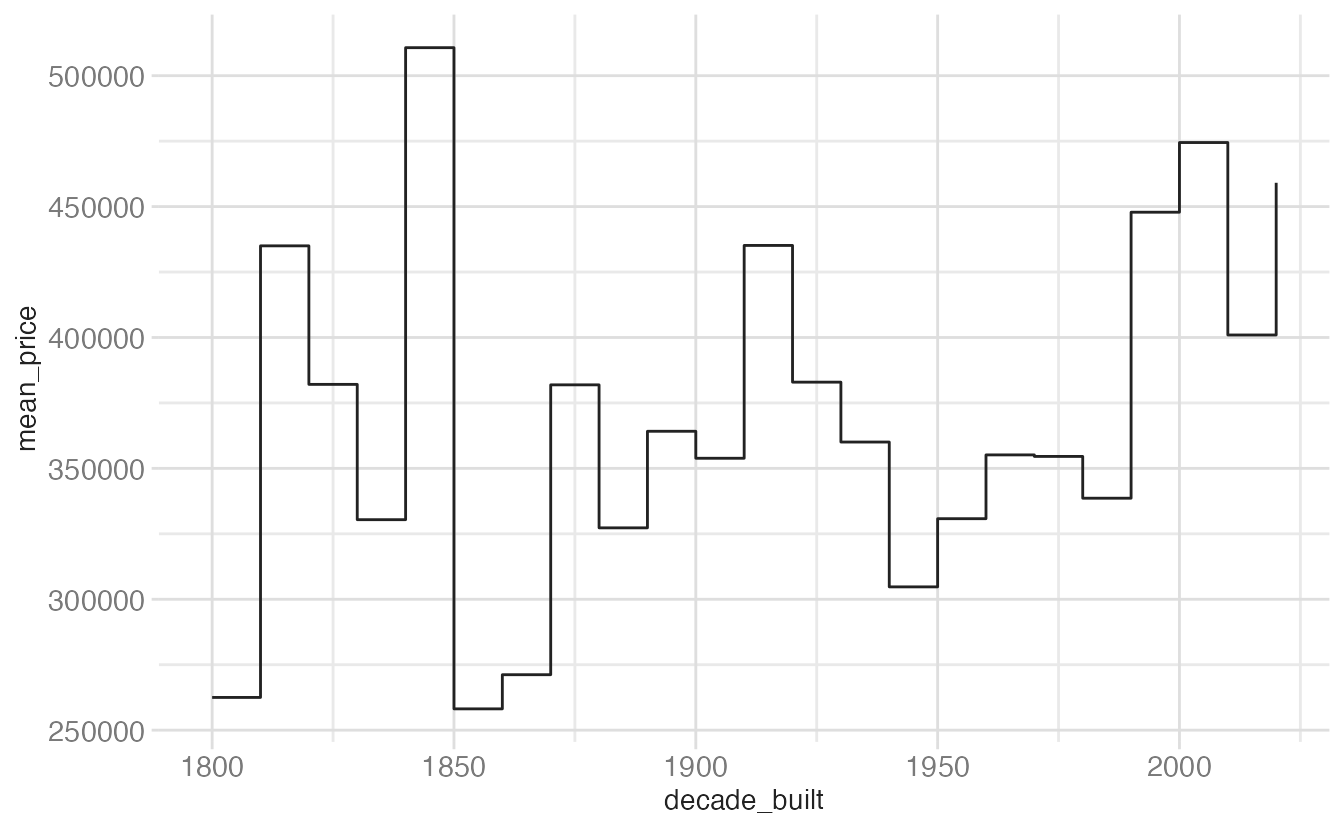
geom_step()draws horizontal segments that jump at each x value. It explicitly conveys that the value is constant within each period and only changes at the boundary — well-suited for data that is genuinely step-wise (e.g., interest rate history, bin counts).
Displaying uncertainty
When showing summary statistics, it is good practice to convey the uncertainty around each estimate:
geom_errorbar()— vertical bars spanning a confidence or standard deviation intervalgeom_linerange()— like an error bar without the end capsgeom_pointrange()— a point at the center with a line spanning the intervalgeom_crossbar()— a box (like a boxplot middle) with a center line
Putting it together
Here is the full scatterplot from earlier, polished with proper axis labels and a color choice:
ggplot(tompkins, aes(x = area, y = price)) +
geom_point(alpha = 0.2, size = 2, color = "#B31B1B") +
scale_x_continuous(labels = label_comma()) +
scale_y_continuous(
labels = label_currency(scale_cut = cut_short_scale())
) +
labs(
x = "Area (square feet)",
y = "Sale price (USD)",
title = "Sale prices of homes in Tompkins County, NY",
subtitle = "2022–24",
caption = "Source: Redfin.com"
)- 1
-
label_comma()formats the x-axis numbers with commas (e.g., 2,000 instead of 2000). - 2
-
label_currency(scale_cut = cut_short_scale())formats y-axis labels as currency with SI suffixes (e.g., $300K instead of $300,000).

Summary
- {ggplot2} provides
geom_*()functions for every major chart type; the right choice depends on the number and types of variables - For a single continuous variable:
geom_histogram()orgeom_density()for distributions;geom_freqpoly()for multi-group comparisons - For two continuous variables:
geom_point()for exploration;geom_hex()orgeom_bin2d()when overplotting is severe - For a discrete + continuous combination:
geom_boxplot(),geom_violin(), orgeom_jitter() - For time series:
geom_line()is standard;geom_area()emphasizes magnitude;geom_step()emphasizes discrete change - Use
set.seed()beforegeom_jitter()(or any geom using randomness) to ensure reproducible output
Acknowledgements
Material derived in part from STA 313: Advanced Data Visualization.