tompkins <- read_csv("data/tompkins-home-sales.csv")
glimpse(tompkins)Deep dive: layers (I)
Notes
NoteLearning objectives
- Identify reasons for what makes bad figures look “bad”
- Introduce principles of visual perception
- Assess competing graphs for their adherence to principles of visual perception
- Create a lollipop chart using {ggplot2}
Data: Sale prices of houses in Tompkins County
Throughout this lesson we’ll use data on houses sold in Tompkins County, NY from 2022–24, scraped from Redfin.
Rows: 1270 Columns: 12
── Column specification ──────────────────────────────────────────────────────────────────
Delimiter: ","
chr  (2): town, municipality
dbl  (9): price, beds, baths, area, lot_size, year_built, hoa_month, long, lat
date (1): sold_date

ℹ Use `spec()` to retrieve the full column specification for this data.
ℹ Specify the column types or set `show_col_types = FALSE` to quiet this message.
Rows: 1,270
Columns: 12
$ sold_date <date> 2022-09-12, 2022-09-12, 2022-09-12, 2022-09-13, 2022-07-22, 2022-0…
$ price <dbl> 340000, 390000, 625500, 246600, 172000, 205000, 230000, 246000, 350…
$ beds <dbl> 2, 4, 2, 2, NA, 2, 5, 5, 3, 5, 3, 2, 2, 4, 3, 5, 4, 3, 4, 3, 3, 3, …
$ baths <dbl> 3.0, 3.0, 3.0, 1.5, NA, 1.0, 2.0, 2.0, 2.5, 4.0, 1.0, 1.5, 2.0, 2.5…
$ area <dbl> 1864, 3252, 1704, 1264, 2644, 820, 2900, 2364, 2016, 2882, 1246, 11…
$ lot_size <dbl> 4.50000000, 0.33999082, 65.00000000, 0.21000918, 0.13000459, 0.2399…
$ year_built <dbl> 1999, 1988, 1988, 1953, 1870, 1932, 1850, 1985, 1984, 2002, 1961, 2…
$ hoa_month <dbl> NA, NA, NA, NA, NA, NA, NA, NA, NA, NA, NA, NA, NA, NA, NA, NA, NA,…
$ town <chr> "Newfield", "Ithaca", "Dryden", "Ithaca", "Dryden", "Ithaca", "Lans…
$ municipality <chr> "Unincorporated", "Unincorporated", "Unincorporated", "Ithaca city"…
$ long <dbl> -76.59488, -76.45546, -76.35953, -76.52435, -76.29872, -76.48761, -…
$ lat <dbl> 42.38609, 42.47046, 42.43971, 42.45208, 42.49046, 42.42739, 42.6182…A basic scatterplot with a linear trend line gives us an overview of the relationship between house area and sale price:
ggplot(data = tompkins, mapping = aes(x = area, y = price)) +
  geom_point(alpha = 0.7, size = 2) +
  geom_smooth(method = "lm", se = FALSE, linewidth = 0.7) +
  labs(
    x = "Area (square feet)",
    y = "Sale price (USD)",
    title = "Price and area of houses in Tompkins County"
  )
`geom_smooth()` using formula = 'y ~ x'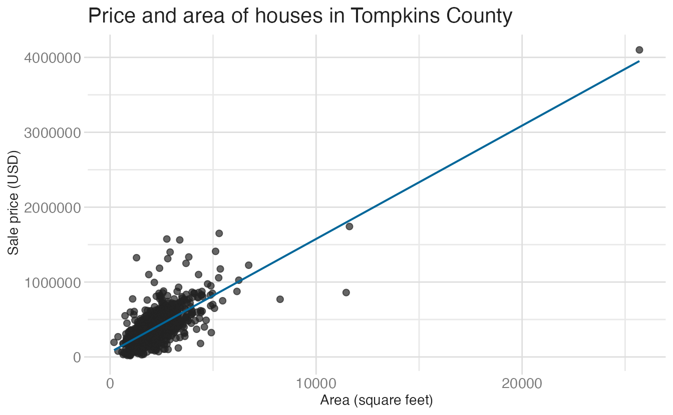
We can add more structure to this by grouping houses by the decade they were built. The %/% operator performs integer division — dividing by 10 and multiplying back gives us the decade floor for any year:
tompkins <- tompkins |>
mutate(decade_built = (year_built %/% 10) * 10)
tompkins |>
select(year_built, decade_built)- 1
-
%/%is integer (floor) division.1987 %/% 10gives198; multiplying by 10 gives1980.
# A tibble: 1,270 × 2
   year_built decade_built
        <dbl>        <dbl>
 1       1999         1990
 2       1988         1980
 3       1988         1980
 4       1953         1950
 5       1870         1870
 6       1932         1930
 7       1850         1850
 8       1985         1980
 9       1984         1980
10       2002         2000
# ℹ 1,260 more rows
To keep the chart readable, we collapse the earliest and most recent decades into aggregate categories using case_when():
tompkins <- tompkins |>
mutate(
decade_built_cat = case_when(
decade_built <= 1940 ~ "1940 or before",
decade_built >= 1990 ~ "1990 or after",
.default = as.character(decade_built)
)
)
tompkins |>
count(decade_built_cat)- 1
- Edge decades are collapsed into “before” and “after” buckets to avoid tiny categories.
- 2
-
.defaulthandles all remaining decades, converting the numeric decade to a string label.
# A tibble: 6 × 2
  decade_built_cat     n
  <chr>            <int>
1 1940 or before     443
2 1950               117
3 1960               120
4 1970               136
5 1980               143
6 1990 or after      311
With this variable we can facet the scatterplot by decade:
ggplot(
  data = tompkins,
  mapping = aes(x = area, y = price, color = decade_built_cat)
) +
  geom_point(alpha = 0.7, show.legend = FALSE) +
  geom_smooth(method = "lm", se = FALSE, linewidth = 0.5, show.legend = FALSE) +
  scale_x_continuous(labels = label_number(scale_cut = cut_short_scale())) +
  scale_y_continuous(labels = label_currency(scale_cut = cut_short_scale())) +
  facet_wrap(facets = vars(decade_built_cat)) +
  labs(
    x = "Area (square feet)",
    y = "Sale price (USD)",
    title = "Price and area of houses in Tompkins County"
  )
`geom_smooth()` using formula = 'y ~ x'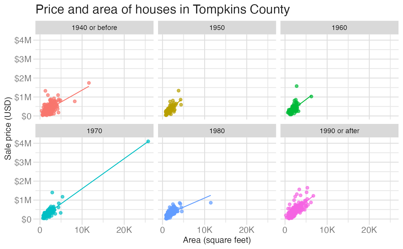
What makes a visualization bad?
Visualizations can fail for three distinct reasons: bad taste, bad data, and bad perception. It is worth distinguishing these because their remedies are different.
Aesthetic choices and bad taste
Consider two versions of the same faceted scatterplot. Both show identical data:
`geom_smooth()` using formula = 'y ~ x'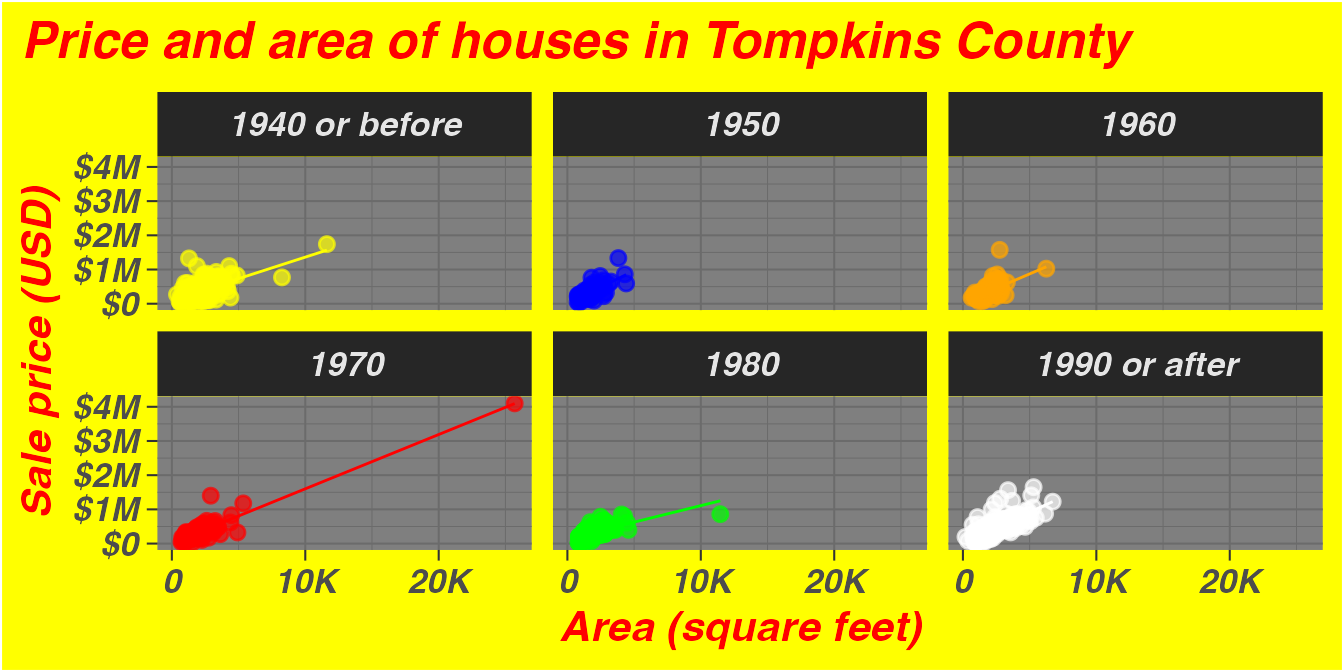
`geom_smooth()` using formula = 'y ~ x'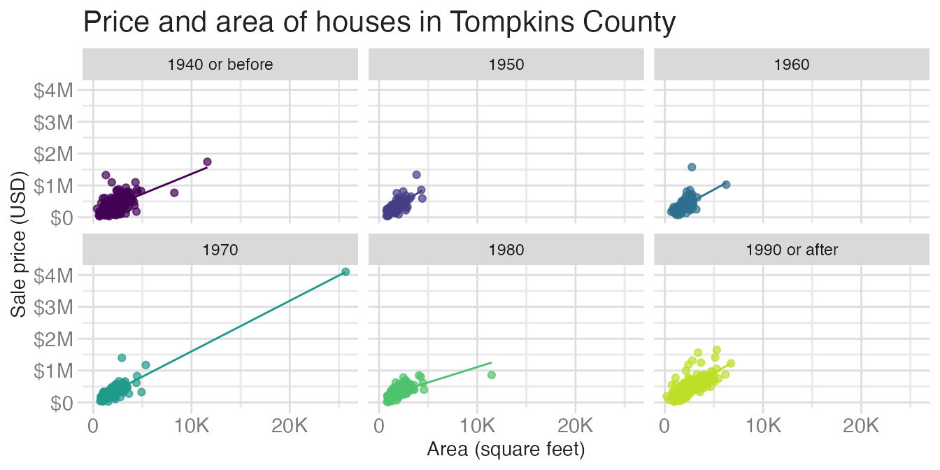
Plot A is genuinely difficult to read. The yellow background, red bold-italic text, and clashing manual colors all add noise without adding information. This is bad taste — aesthetic choices that work against the reader. Plot B uses a clean theme and a perceptually uniform color palette. Neither plot changes the data; the difference is entirely in design choices.
The data-to-ink ratio
Edward Tufte coined the term data-to-ink ratio to describe how much of the ink on the page is actually encoding data versus decorating it:
Graphical excellence is the well-designed presentation of interesting data — a matter of substance, of statistics, and of design… It consists of complex ideas communicated with clarity, precision, and efficiency… It is that which gives to the viewer the greatest number of ideas in the shortest time with the least ink in the smallest space.1
High data-to-ink ratio means most ink is carrying information. Low ratio means a lot of ink is decoration. Compare these two charts showing the same mean sale prices by decade:
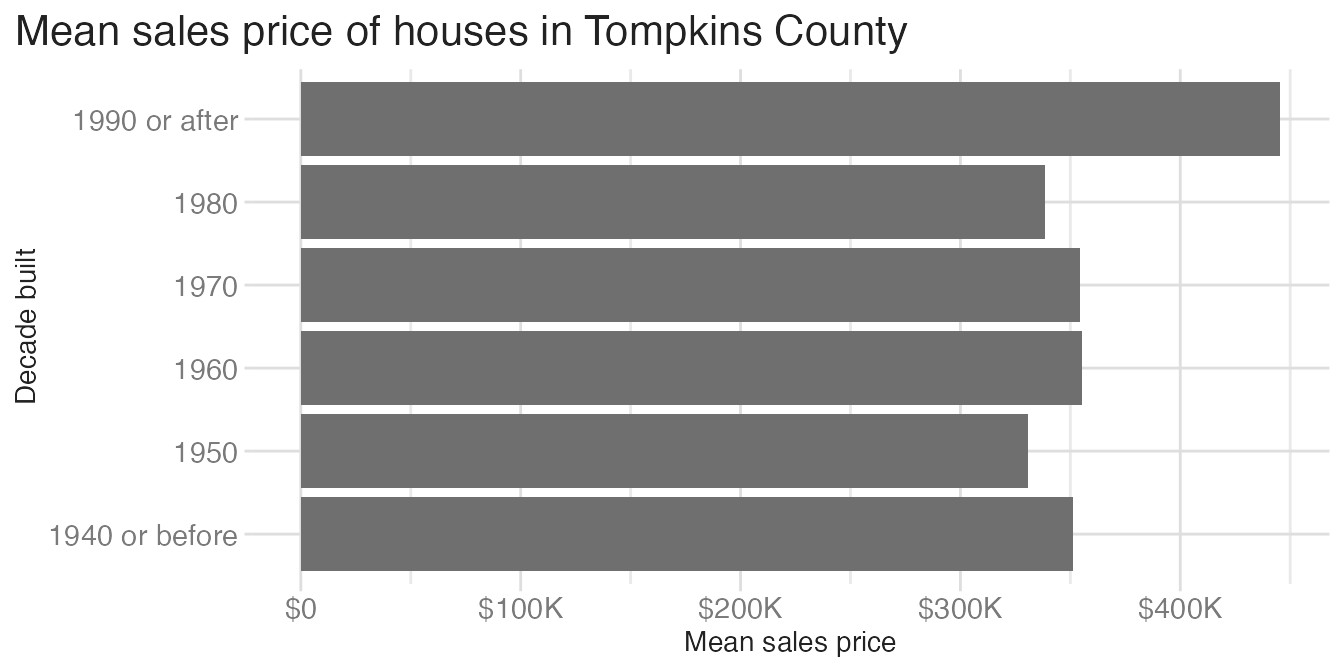
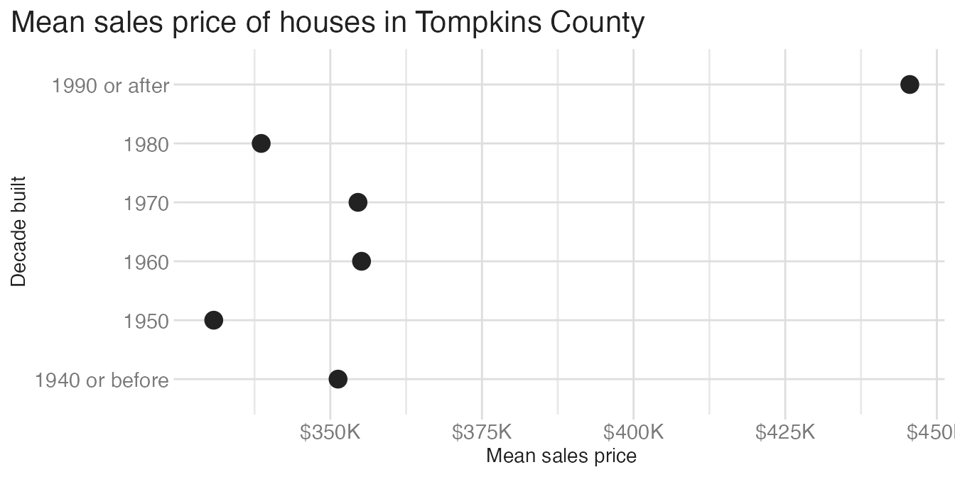
The bar chart uses a lot of ink to fill in bars that extend from zero — but the meaningful information is only at the tip of each bar. The dot plot conveys the same information with a single point per category. All that filled area is low-information ink. The dot plot has a higher data-to-ink ratio.
Bad data
Even a well-designed chart can mislead if the underlying data are incorrectly represented. The following two versions of the same chart show this vividly:2
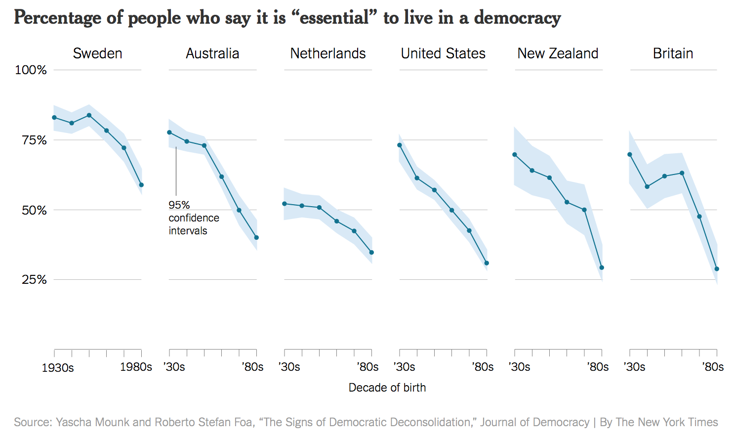
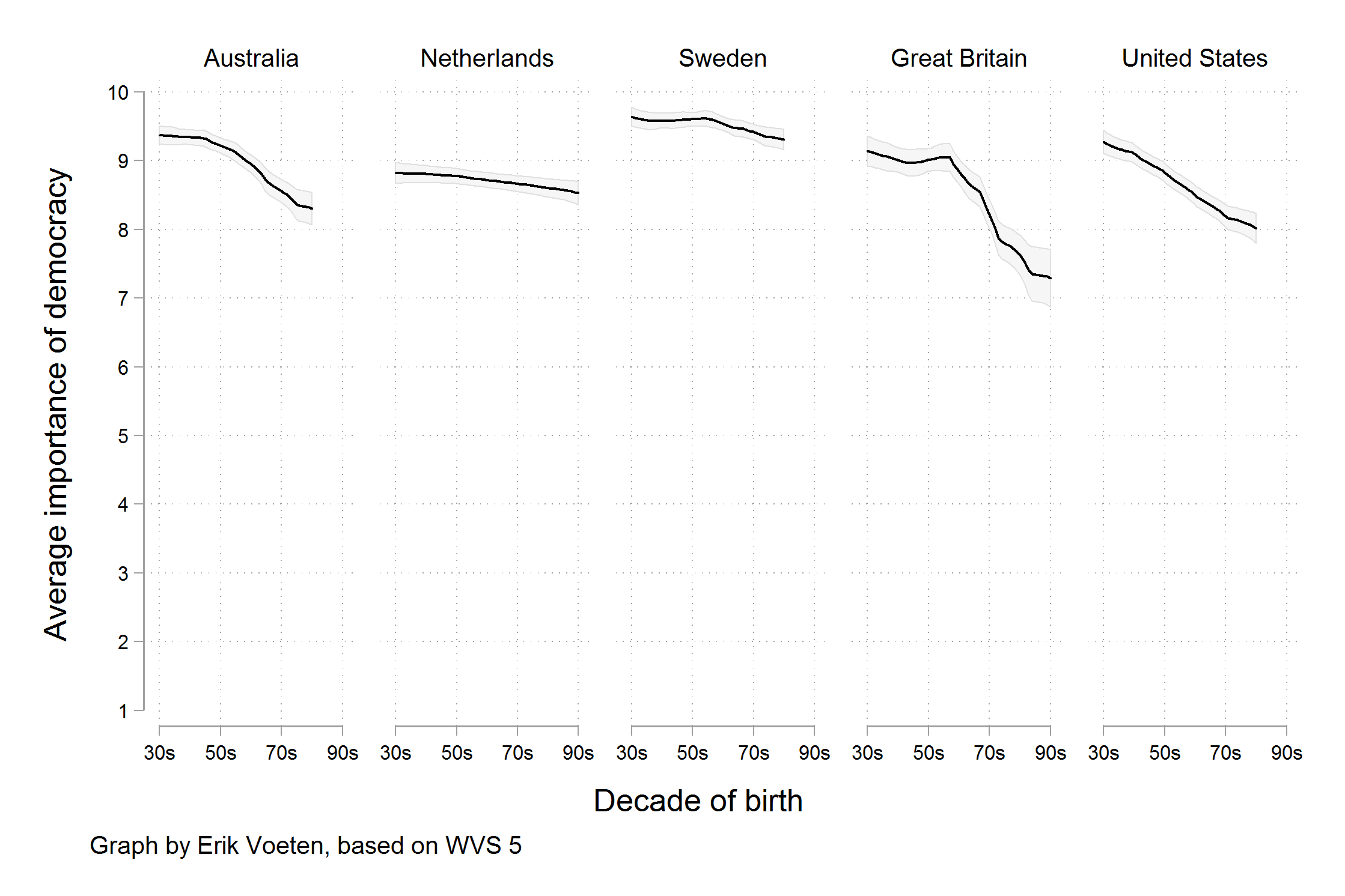
The original chart truncates the y-axis and uses a subset of survey waves in a way that dramatically exaggerates an apparent trend. The improved version uses all available data and a full y-axis, revealing the “trend” as far more modest. The design is nearly the same; the data representation is completely different.
Bad perception
Even accurate data, displayed with good taste, can be misread if the chart exploits known weaknesses in human visual perception. Aspect ratio is one example: the same rate of change looks steeper or flatter depending on how wide or tall you make the plot.3
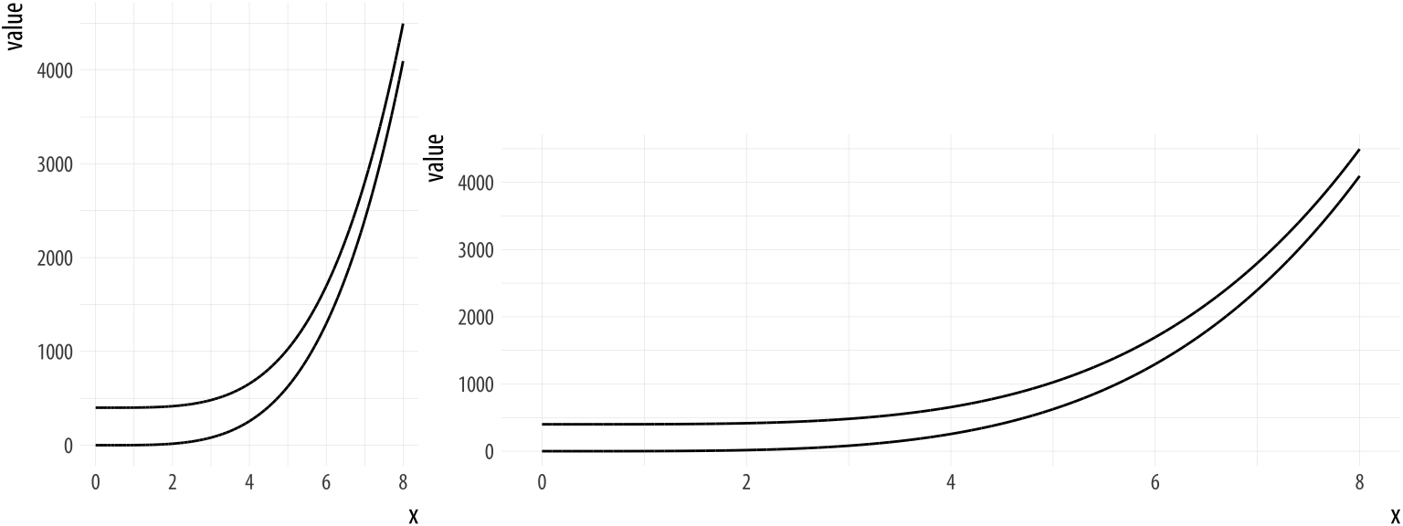
The curves in both panels encode the same data. Our perception of the slope — and therefore our impression of how fast something is changing — depends almost entirely on the aspect ratio chosen. This is not a problem with the data or with bad taste; it is a perceptual artifact.
Constructing a lollipop chart
Bar, dot, or lollipop?
The dot plot above is better than the bar chart for a dataset with a few categories. But a dot floating in space gives no visual anchor to the axis — it can be harder to trace the value back to zero or to compare distances across categories. A lollipop chart splits the difference: it keeps the minimal ink of a dot but adds a thin line connecting each point back to the axis.
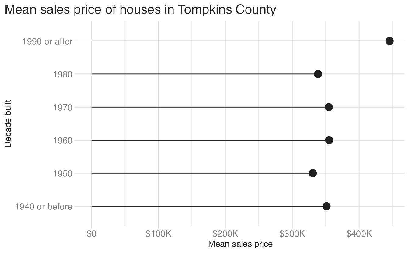
📝 Make a lollipop chart
Your turn: Define the conceptual grammar of graphics for a lollipop chart to visualize the average sales price by decade built. Focus specifically on the layer(s) needed to create the “lollipop” effect, the geometric object(s), and the mapping aesthetics required.
TipChoosing appropriate geom(s)
Try to construct the chart without using geom_col(). You would have to spend more time tweaking some of the function’s parameters so it looks appropriate.
There is another geom_*() that works pretty well here.
TipSuggested answer
The grammar of graphics for a lollipop chart includes:
- Layer 1 (the “stick”)
- Data:
mean_price_decade - Geometric object:
geom_segment() - Mapping aesthetics:
x: 0xend:mean_pricey:decade_built_catyend:decade_built_cat
- Data:
- Layer 2 (the “candy”)
- Data:
mean_price_decade - Geometric object:
geom_point() - Mapping aesthetics:
x:mean_pricey:decade_built_cat
- Data:
Your turn: Now implement your lollipop chart using ggplot().
NoteHint
Use two layers: geom_segment() for the stick (with x = 0 and xend = mean_price) and geom_point() for the candy.
TipSuggested solution
ggplot(
  data = mean_price_decade,
  mapping = aes(x = mean_price, y = decade_built_cat)
) +
  geom_point(size = 4) +
  geom_segment(
    mapping = aes(
      x = 0,
      xend = mean_price,
      y = decade_built_cat,
      yend = decade_built_cat
    )
  ) +
  labs(
    x = "Mean sales price",
    y = "Decade built",
    title = "Mean sales price of houses in Tompkins County, by decade built"
  )
You can also reuse the global y aesthetic in geom_segment() to reduce repetition:
ggplot(
  data = mean_price_decade,
  mapping = aes(x = mean_price, y = decade_built_cat)
) +
  geom_point(size = 4) +
  geom_segment(
    mapping = aes(
      xend = 0,
      yend = decade_built_cat
    )
  ) +
  labs(
    x = "Mean sales price",
    y = "Decade built",
    title = "Mean sales price of houses in Tompkins County, by decade built"
  )
This reduces the data-ink ratio compared to the bar chart, while still communicating the same information.
Global vs. layer-specific aesthetics
{ggplot2} lets you specify aesthetic mappings in three places: in the initial ggplot() call (global), in individual geom_*() calls (layer-specific), or both. When you have multiple layers, the distinction matters.
The lollipop above specifies y = decade_built_cat and x = mean_price globally, and then geom_segment() adds its own x = 0 and xend = mean_price on top. Here is an equivalent version where geom_segment() inherits less from the global mapping:
ggplot(
data = mean_price_decade,
mapping = aes(y = decade_built_cat, x = mean_price)
) +
geom_point(size = 4) +
geom_segment(
mapping = aes(
xend = 0,
yend = decade_built_cat
)
) +
scale_x_continuous(labels = label_currency(scale_cut = cut_short_scale())) +
labs(
x = "Mean sales price",
y = "Decade built",
title = "Mean sales price of houses in Tompkins County"
) +
theme(plot.title.position = "plot")- 1
-
x = mean_priceandy = decade_built_catare inherited by all layers. - 2
-
In
geom_segment(),xis inherited (the starting point), and onlyxendandyendare specified explicitly. The result is identical — but this version relies more heavily on aesthetic inheritance.
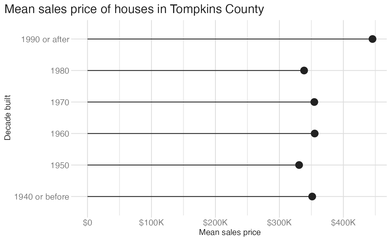
The key rule: each layer inherits the global aesthetics and can add, override, or remove them. If you only have one layer, it doesn’t matter where you put the aesthetic mapping. Once you add a second layer, you need to be deliberate.
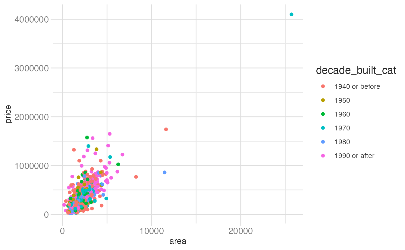
To make the distinction concrete, examine these three plots:
# Plot A — color is mapped to a variable
ggplot(data = tompkins, mapping = aes(x = area, y = price)) +
geom_point(mapping = aes(color = decade_built_cat))- 1
-
color = decade_built_catis insideaes()— it maps the variable to color, producing a legend.
# Plot B — color is set to a named color string
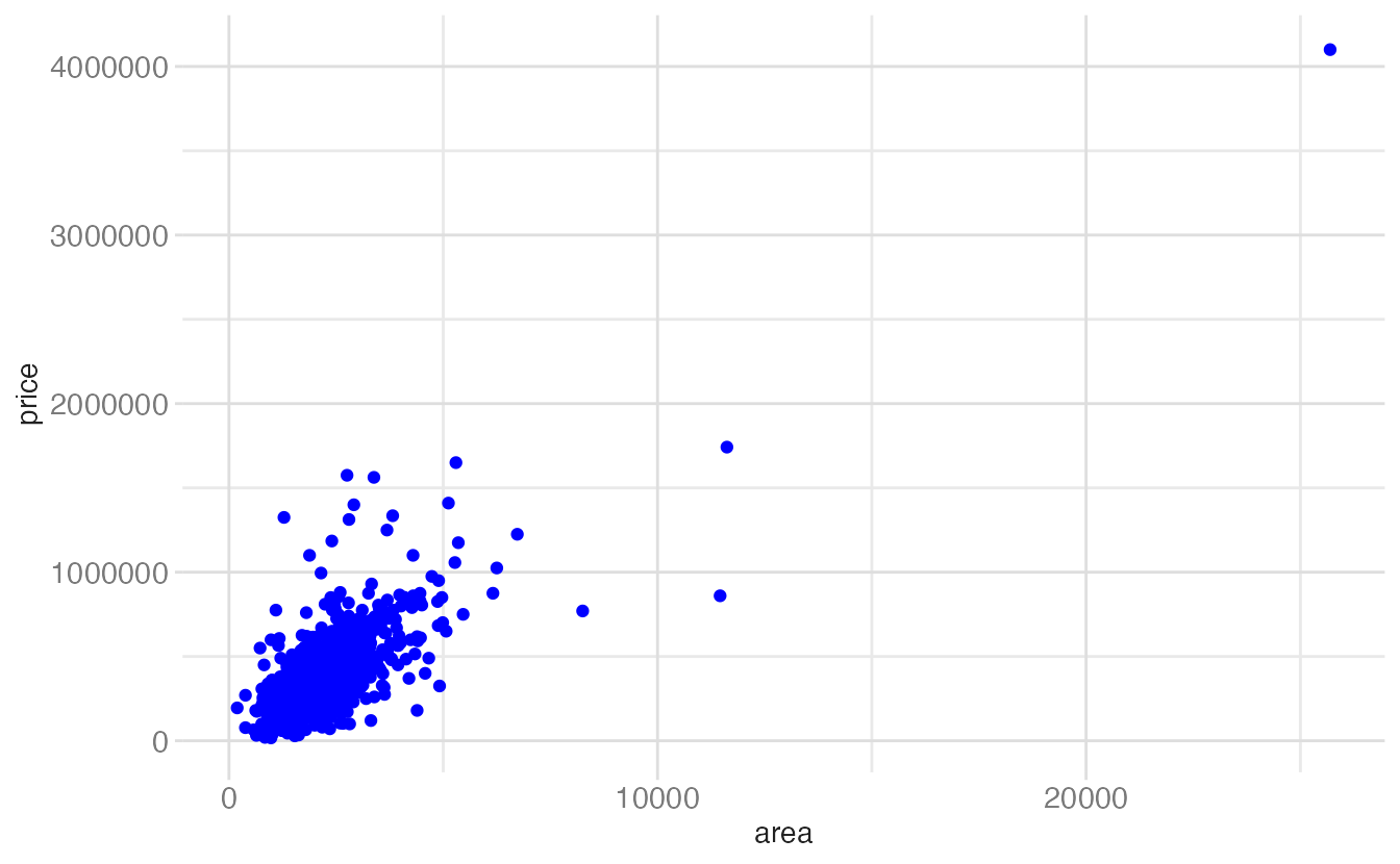
ggplot(data = tompkins, mapping = aes(x = area, y = price)) +
geom_point(color = "blue")- 1
-
color = "blue"is outsideaes()— it sets every point to blue. No legend is produced.
# Plot C — color is set to a hex code
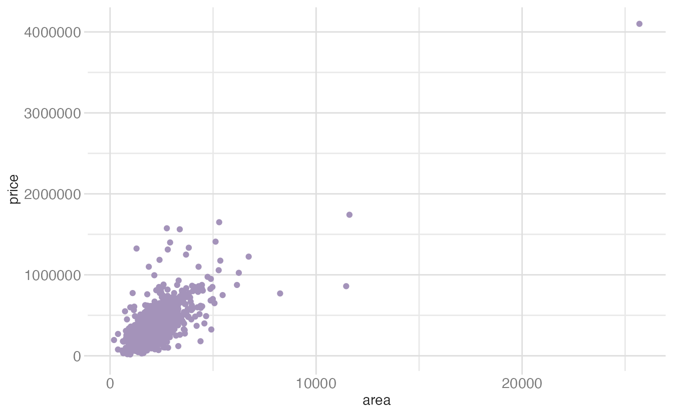
ggplot(data = tompkins, mapping = aes(x = area, y = price)) +
geom_point(color = "#A493BA")- 1
-
color = "#A493BA"works the same as Plot B — a fixed color applied uniformly. Named colors and hex codes are interchangeable.
Summary
- Visualizations can fail due to bad taste (poor aesthetic choices), bad data (misleading representation), or bad perception (exploiting visual system weaknesses)
- Maximizing the data-to-ink ratio (Tufte) means using ink purposefully — each mark should carry information
- {ggplot2} charts are built from layers —
geom_point(),geom_segment(), and other geoms can be stacked on the same coordinate system - Aesthetic mappings can be specified globally in
ggplot()or locally in individual geoms; layers inherit global mappings and can override them
Acknowledgements
Material derived in part from STA 313: Advanced Data Visualization.
Footnotes
Tufte, E. (1983). The Visual Display of Quantitative Information, p. 51.↩︎
Source: socviz Chapter 1, Figures 1.8 and 1.9.↩︎
Source: socviz Chapter 1, Figure 1.12.↩︎