Take a sad plot, and make it better
This application exercise is designed to be run in your web browser using the {webr} framework. Simply work through the exercises and use the provided code cells to execute live R code in your browser.
Take a sad plot, and make it better
The American Association of University Professors (AAUP) is a nonprofit membership association of faculty and other academic professionals. This report by the AAUP shows trends in instructional staff employees between 1975 and 2011, and contains an image very similar to the one given below.
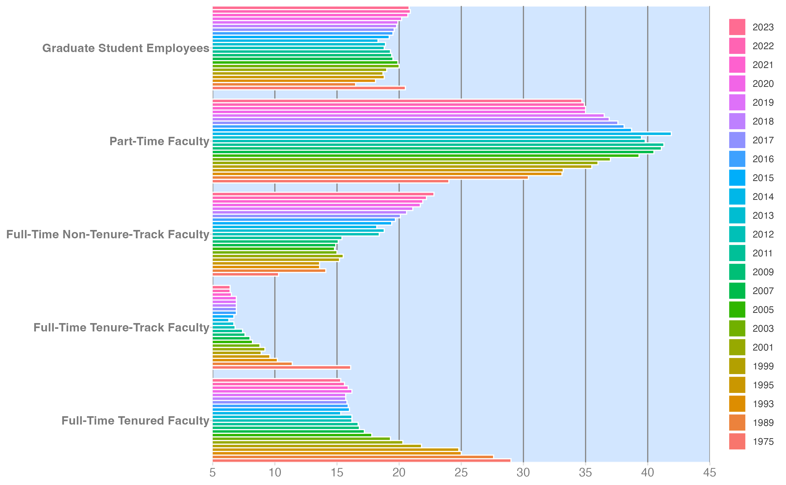
The data series has been extended through 2021.1
Each row in this dataset represents a faculty type, and the columns are the years for which we have data. The values are percentage of hires of that type of faculty for each year.
staff <- read_csv("data/instructional-staff.csv")
staff# A tibble: 5 × 17
faculty_type `1975` `1989` `1993` `1995` `1999` `2001` `2003` `2005` `2007`
<chr> <dbl> <dbl> <dbl> <dbl> <dbl> <dbl> <dbl> <dbl> <dbl>
1 Full-Time Tenu… 29 27.6 25 24.8 21.8 20.3 19.3 17.8 17.2
2 Full-Time Tenu… 16.1 11.4 10.2 9.6 8.9 9.2 8.8 8.2 8
3 Full-Time Non-… 10.3 14.1 13.6 13.6 15.2 15.5 15 14.8 14.9
4 Part-Time Facu… 24 30.4 33.1 33.2 35.5 36 37 39.3 40.5
5 Graduate Stude… 20.5 16.5 18.1 18.8 18.7 19 20 19.9 19.5
# ℹ 7 more variables: `2009` <dbl>, `2011` <dbl>, `2013` <dbl>, `2015` <dbl>,
# `2018` <dbl>, `2020` <dbl>, `2021` <dbl>
Recreate the visualization
In order to recreate this visualization we need to first reshape the data to have one variable for faculty type and one variable for year. In other words, we will convert the data from the wide format to long format.
Your turn: Reshape the data so we have one row per faculty type and year, and the percentage of hires as a single column.
staff_long <- staff |>
pivot_longer(
cols = -faculty_type,
names_to = "year",
values_to = "percentage"
)
staff_longYour turn: Attempt to recreate the original bar chart as best as you can. Don’t worry about theming or color palettes right now. The most important aspects to incorporate:
- Faculty type on the \(y\)-axis with bar segments color-coded based on the year of the survey
- Percentage of instructional staff employees on the \(x\)-axis
- Begin the \(x\)-axis at 5%
- Label the \(x\)-axis at 5% increments
- Match the order of the legend
{forcats} contains many functions for defining and adjusting the order of levels for factor variables. Factors are often used to enforce specific ordering of categorical variables in charts.
staff_long |>
mutate(
faculty_type = fct_relevel(
.f = faculty_type,
"Full-Time Tenured Faculty",
"Full-Time Tenure-Track Faculty",
"Full-Time Non-Tenure-Track Faculty",
"Part-Time Faculty",
"Graduate Student Employees"
)
) |>
ggplot(mapping = aes(x = percentage, y = faculty_type, fill = year)) +
geom_col(position = "dodge", color = "white") +
scale_x_continuous(
breaks = seq(from = 5, to = 45, by = 5),
labels = label_percent(scale = 1)
) +
guides(fill = guide_legend(reverse = TRUE)) +
labs(x = NULL, y = NULL, fill = NULL) +
coord_cartesian(xlim = c(5, 45), expand = FALSE) +
theme_minimal() +
theme(panel.grid.minor = element_blank())Let’s make it better
Colleges and universities have come to rely more heavily on non-tenure track faculty members over time, in particular part-time faculty (e.g. contingent faculty, adjuncts). We want to show academia’s reliance on part-time faculty.
Your turn: Sketch/design a chart that highlights the trend for part-time faculty. What type of geom would you use? What elements would you include? What would you remove?
A line chart works better here because:
- Year is a continuous temporal variable that should be spaced proportionally on the \(x\)-axis
- Lines connect data points over time and make trends easy to see
- We can highlight Part-Time Faculty with a distinct color and mute the other faculty types
Key design choices: encode each faculty type with color, use geom_line() + geom_point(), convert year to numeric via names_transform = parse_number in pivot_longer(), and order legend entries by the final percentage value using fct_reorder2().
Your turn: Create the chart you designed above using {ggplot2}.
# ensure year is numeric in pivot_longer
staff_long <- staff |>
pivot_longer(
cols = -faculty_type,
names_to = "year",
values_to = "percentage",
names_transform = ______
)
staff_long |>
mutate(
part_time = if_else(
faculty_type == "______",
"Part-Time Faculty",
"Other Faculty"
)
) |>
ggplot(
mapping = aes(
x = year,
y = percentage,
group = faculty_type,
color = part_time
)
) +
geom______() +
geom______() +
scale_color_manual(
values = c("gray", "red"),
guide = guide_legend(reverse = TRUE)
) +
scale_y_continuous(labels = label_percent(scale = 1, accuracy = 1)) +
theme_minimal() +
labs(
title = ______,
subtitle = "As a percentage of all instructional staff employees",
x = NULL,
y = NULL,
color = NULL,
caption = "Source: AAUP"
) +
theme(legend.position = "bottom")staff_long <- staff |>
pivot_longer(
cols = -faculty_type,
names_to = "year",
values_to = "percentage",
names_transform = parse_number
)
staff_long |>
mutate(
part_time = if_else(
faculty_type == "Part-Time Faculty",
"Part-Time Faculty",
"Other Faculty"
)
) |>
ggplot(
mapping = aes(
x = year,
y = percentage,
group = faculty_type,
color = part_time
)
) +
geom_line() +
geom_point() +
scale_color_manual(
values = c("gray", "red"),
guide = guide_legend(reverse = TRUE)
) +
scale_y_continuous(labels = label_percent(scale = 1, accuracy = 1)) +
theme_minimal() +
labs(
title = "Academia is increasingly relying on part-time faculty",
subtitle = "As a percentage of all instructional staff employees",
x = NULL,
y = NULL,
color = NULL,
caption = "Source: AAUP"
) +
theme(legend.position = "bottom")Acknowledgments
- Exercise derived from Data Science in a Box and licensed under CC BY-SA 4.0.
sessioninfo::session_info()─ Session info ───────────────────────────────────────────────────────────────
setting value
version R version 4.5.2 (2025-10-31)
os macOS Tahoe 26.5
system aarch64, darwin20
ui X11
language (EN)
collate en_US.UTF-8
ctype en_US.UTF-8
tz America/New_York
date 2026-05-24
pandoc 3.8.3 @ /Applications/Positron.app/Contents/Resources/app/quarto/bin/tools/aarch64/ (via rmarkdown)
quarto 1.10.3 @ /Applications/quarto/bin/quarto
─ Packages ───────────────────────────────────────────────────────────────────
! package * version date (UTC) lib source
P bit 4.6.0 2025-03-06 [?] RSPM (R 4.5.0)
P bit64 4.8.0 2026-04-21 [?] RSPM
P cli 3.6.6 2026-04-09 [?] RSPM
P crayon 1.5.3 2024-06-20 [?] RSPM (R 4.5.0)
P digest 0.6.39 2025-11-19 [?] RSPM (R 4.5.0)
P dplyr * 1.2.1 2026-04-03 [?] RSPM
P evaluate 1.0.5 2025-08-27 [?] RSPM (R 4.5.0)
P farver 2.1.2 2024-05-13 [?] RSPM (R 4.5.0)
P fastmap 1.2.0 2024-05-15 [?] RSPM (R 4.5.0)
P forcats * 1.0.1 2025-09-25 [?] RSPM (R 4.5.0)
P generics 0.1.4 2025-05-09 [?] RSPM (R 4.5.0)
P ggplot2 * 4.0.3 2026-04-22 [?] RSPM
P glue 1.8.1 2026-04-17 [?] RSPM
P gtable 0.3.6 2024-10-25 [?] RSPM (R 4.5.0)
P here 1.0.2 2025-09-15 [?] CRAN (R 4.5.0)
P hms 1.1.4 2025-10-17 [?] RSPM (R 4.5.0)
P htmltools 0.5.9 2025-12-04 [?] RSPM (R 4.5.0)
P htmlwidgets 1.6.4 2023-12-06 [?] RSPM (R 4.5.0)
P jsonlite 2.0.0 2025-03-27 [?] RSPM (R 4.5.0)
P knitr 1.51 2025-12-20 [?] RSPM (R 4.5.0)
P lifecycle 1.0.5 2026-01-08 [?] RSPM (R 4.5.0)
P lubridate * 1.9.5 2026-02-04 [?] RSPM
P magrittr 2.0.5 2026-04-04 [?] RSPM
P otel 0.2.0 2025-08-29 [?] RSPM (R 4.5.0)
P pillar 1.11.1 2025-09-17 [?] RSPM (R 4.5.0)
P pkgconfig 2.0.3 2019-09-22 [?] RSPM (R 4.5.0)
P purrr * 1.2.2 2026-04-10 [?] RSPM
P R6 2.6.1 2025-02-15 [?] RSPM (R 4.5.0)
P RColorBrewer 1.1-3 2022-04-03 [?] RSPM (R 4.5.0)
P readr * 2.2.0 2026-02-19 [?] RSPM
P renv 1.2.3 2026-05-16 [?] RSPM
P rlang 1.2.0 2026-04-06 [?] RSPM
P rmarkdown 2.31 2026-03-26 [?] RSPM
P rprojroot 2.1.1 2025-08-26 [?] RSPM (R 4.5.0)
P S7 0.2.2 2026-04-22 [?] RSPM
P scales * 1.4.0 2025-04-24 [?] RSPM (R 4.5.0)
P sessioninfo 1.2.3 2025-02-05 [?] RSPM (R 4.5.0)
P stringi 1.8.7 2025-03-27 [?] RSPM (R 4.5.0)
P stringr * 1.6.0 2025-11-04 [?] RSPM (R 4.5.0)
P tibble * 3.3.1 2026-01-11 [?] RSPM (R 4.5.0)
P tidyr * 1.3.2 2025-12-19 [?] RSPM (R 4.5.0)
P tidyselect 1.2.1 2024-03-11 [?] RSPM (R 4.5.0)
P tidyverse * 2.0.0 2023-02-22 [?] RSPM (R 4.5.0)
P timechange 0.4.0 2026-01-29 [?] RSPM
P tzdb 0.5.0 2025-03-15 [?] RSPM (R 4.5.0)
P utf8 1.2.6 2025-06-08 [?] RSPM (R 4.5.0)
P vctrs 0.7.3 2026-04-11 [?] RSPM
P vroom 1.7.1 2026-03-31 [?] RSPM
P withr 3.0.2 2024-10-28 [?] RSPM (R 4.5.0)
P xfun 0.57 2026-03-20 [?] RSPM
P yaml 2.3.12 2025-12-10 [?] RSPM (R 4.5.0)
[1] /Users/bcs88/Projects/info-3312/course-site/renv/library/macos/R-4.5/aarch64-apple-darwin20
[2] /Users/bcs88/Library/Caches/org.R-project.R/R/renv/sandbox/macos/R-4.5/aarch64-apple-darwin20/4cd76b74
* ── Packages attached to the search path.
P ── Loaded and on-disk path mismatch.
──────────────────────────────────────────────────────────────────────────────
Footnotes
Data sources: IPEDS and Digest of Education Statistics. Downloaded February 10, 2025.↩︎
