library(tidyverse)
library(scales)
Take a sad plot, and make it better
Suggested answers
Application exercise
Answers
Important
These are suggested answers. This document should be used as reference only, it’s not designed to be an exhaustive key.
Take a sad plot, and make it better
The American Association of University Professors (AAUP) is a nonprofit membership association of faculty and other academic professionals. This report by the AAUP shows trends in instructional staff employees between 1975 and 2011, and contains an image very similar to the one given below.
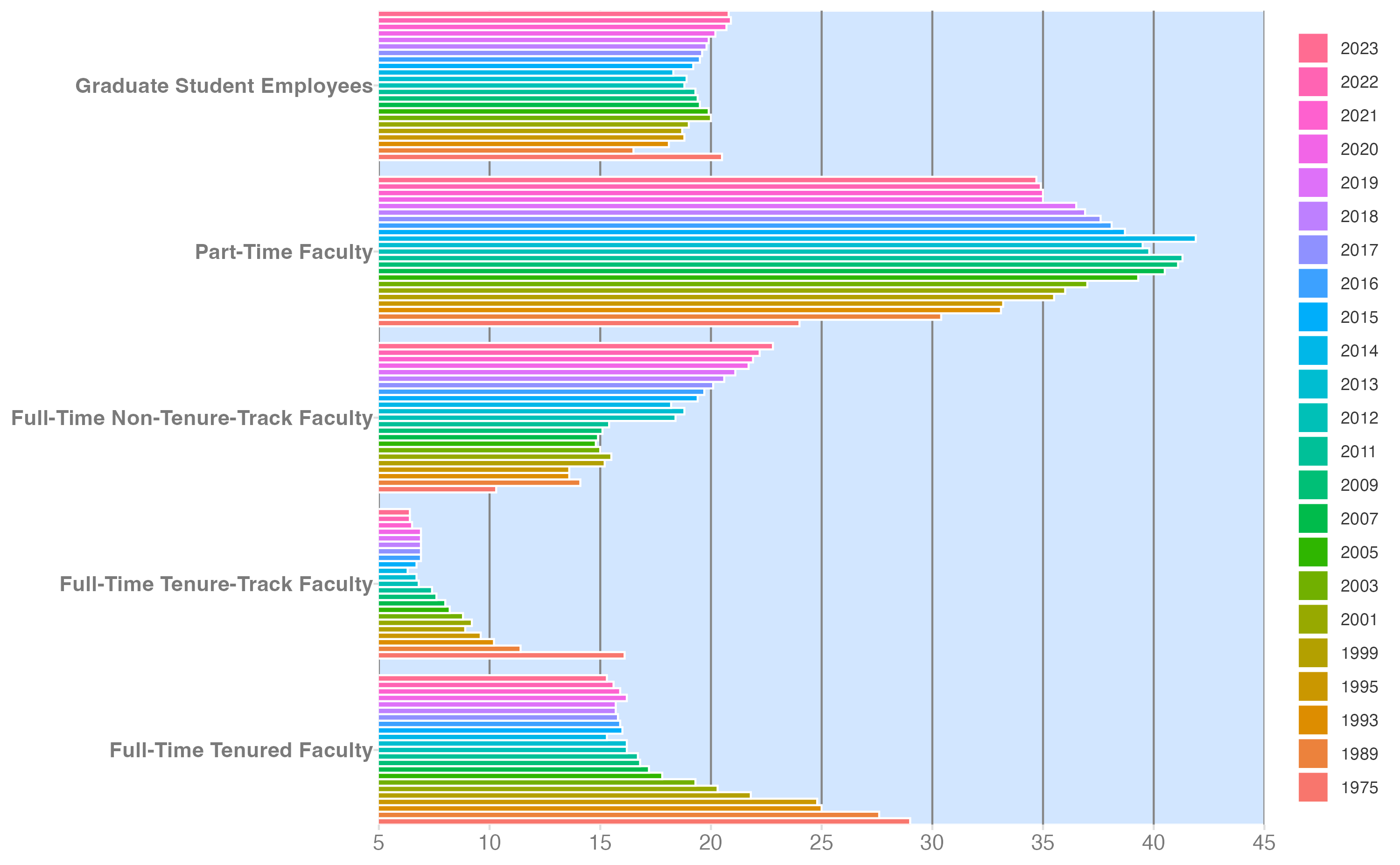
The data series has been extended through 2023.1
Each row in this dataset represents a faculty type, and the columns are the years for which we have data. The values are percentage of hires of that type of faculty for each year.
staff <- read_csv("data/instructional-staff-extended.csv")
staff
# A tibble: 5 × 24
faculty_type `1975` `1989` `1993` `1995` `1999` `2001` `2003` `2005` `2007`
<chr> <dbl> <dbl> <dbl> <dbl> <dbl> <dbl> <dbl> <dbl> <dbl>
1 Full-Time Tenu… 29 27.6 25 24.8 21.8 20.3 19.3 17.8 17.2
2 Full-Time Tenu… 16.1 11.4 10.2 9.6 8.9 9.2 8.8 8.2 8
3 Full-Time Non-… 10.3 14.1 13.6 13.6 15.2 15.5 15 14.8 14.9
4 Part-Time Facu… 24 30.4 33.1 33.2 35.5 36 37 39.3 40.5
5 Graduate Stude… 20.5 16.5 18.1 18.8 18.7 19 20 19.9 19.5
# ℹ 14 more variables: `2009` <dbl>, `2011` <dbl>, `2012` <dbl>, `2013` <dbl>,
# `2014` <dbl>, `2015` <dbl>, `2016` <dbl>, `2017` <dbl>, `2018` <dbl>,
# `2019` <dbl>, `2020` <dbl>, `2021` <dbl>, `2022` <dbl>, `2023` <dbl>Let’s make it better
Colleges and universities have come to rely more heavily on non-tenure track faculty members over time. Prior to the early 2010s, this was driven heavily by an increase in part-time faculty (e.g. contingent faculty, adjuncts). More recently, there has been a shift towards full-time non-tenure track faculty (e.g. lecturers, instructors, teaching professors). The original plot does not make it easy to see these trends.
Your turn: Sketch a chart that highlights the decline in tenure-track faculty.
- What type of geom would you use?
- Scales? Guides?
- Labels?
Include sufficient level of detail to communicate your design choices for implementation.
Your turn: Swap with a peer and critique their design choices. Apply at least two of Cairo’s qualities of great visualizations.
- Truthful
- Functional
- Beautiful
- Insightful
- Enlightening
Your turn: Sketch a revised version of your chart based on the feedback you received. Have you changed the geom(s)? Modified your scales/guides? Added improved labels or colors?
Additionally, define the chart’s core grammar of graphics. What are the variables and aesthetic mappings? What geoms would you use? What scales and guides would you include?
Your turn: Finally, implement your design in R using {ggplot2}. Pay careful attention to any data tidying/wrangling necessary to implement your design.
TipData set structure
Remember you can only map a single column to an aesthetic channel for a given geom. So your data must be structured such that each variable is in its own column. This is often referred to as tidy data.
If the source data is not tidy, then reshape it before creating your chart.
Tip
{forcats} contains many functions for defining and adjusting the order of levels for factor variables. Factors are often used to enforce specific ordering of categorical variables in charts.
First attempt
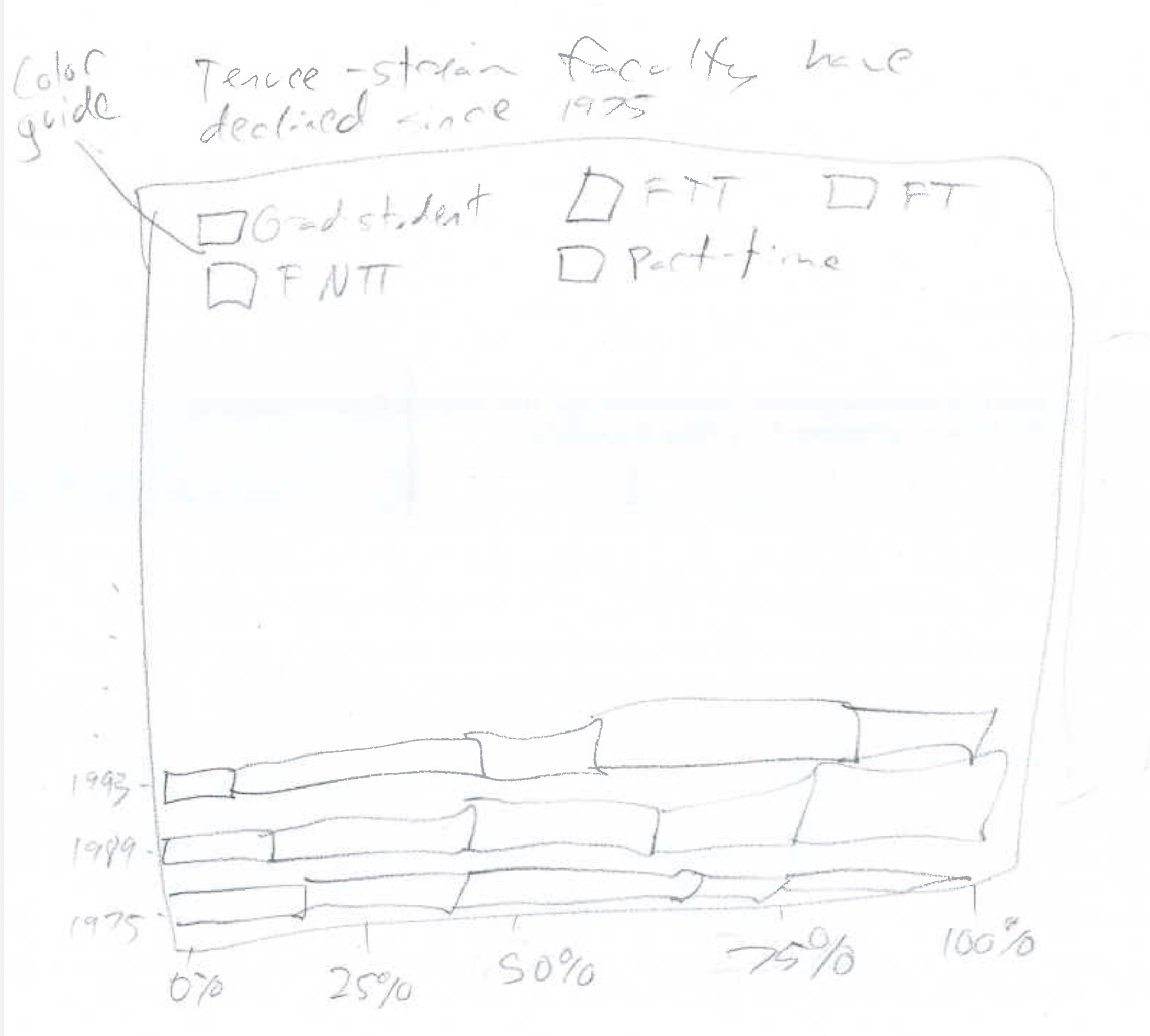
NoteGrammar of graphics
- Layer
- Data -
staff - Mapping
x=percentagey=yearfill=faculty_type
- Geom - bar chart
- Position adjustment - fill
- Data -
- Scales
x- continuous, percentage formattingy- discretefill- some sort of discrete palette, TBD
The original plot is not very informative. It’s hard to compare the trends for across each faculty type. I improved the chart by using a relative frequency bar chart with year on the \(y\)-axis and faculty type encoded using color.
In order to create this visualization we need to first reshape the data to have one variable for faculty type and one variable for year. In other words, we will convert the data from the wide format to long format.
staff_long <- staff |>
  pivot_longer(
    cols = -faculty_type,
    names_to = "year",
    values_to = "percentage"
  )
staff_long
# A tibble: 115 × 3
faculty_type year percentage
<chr> <chr> <dbl>
1 Full-Time Tenured Faculty 1975 29
2 Full-Time Tenured Faculty 1989 27.6
3 Full-Time Tenured Faculty 1993 25
4 Full-Time Tenured Faculty 1995 24.8
5 Full-Time Tenured Faculty 1999 21.8
6 Full-Time Tenured Faculty 2001 20.3
7 Full-Time Tenured Faculty 2003 19.3
8 Full-Time Tenured Faculty 2005 17.8
9 Full-Time Tenured Faculty 2007 17.2
10 Full-Time Tenured Faculty 2009 16.8
# ℹ 105 more rowsstaff_long |>
mutate(
faculty_type = fct_relevel(
.f = faculty_type,
"Full-Time Tenured Faculty",
"Full-Time Tenure-Track Faculty",
"Full-Time Non-Tenure-Track Faculty",
"Part-Time Faculty",
"Graduate Student Employees"
)
) |>
ggplot(mapping = aes(x = percentage, y = year, fill = faculty_type)) +
geom_col(position = "fill") +
scale_x_continuous(labels = label_percent()) +
scale_fill_discrete(guide = guide_legend(nrow = 2)) +
labs(
x = NULL,
y = NULL,
fill = NULL
) +
theme_minimal() +
theme(legend.position = "top")- 1
-
Use
fct_relevel()to enforce a specific order for the levels of thefaculty_typevariable. This ensures that the legend and the stacked bars are ordered in a meaningful way. - 2
- Position the legend on the top of the plot with two rows to fit all the text on the plot.
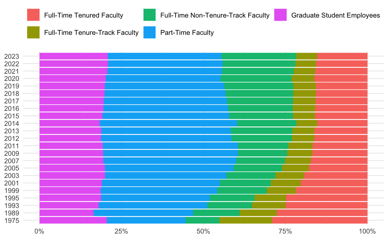
This allows for better comparison in the composition of college faculty over time, but it still has some issues. This distorts the intervals for the year variable. It makes it appear as if the survey was conducted at regular intervals, which is not the case.
Second attempt
Note
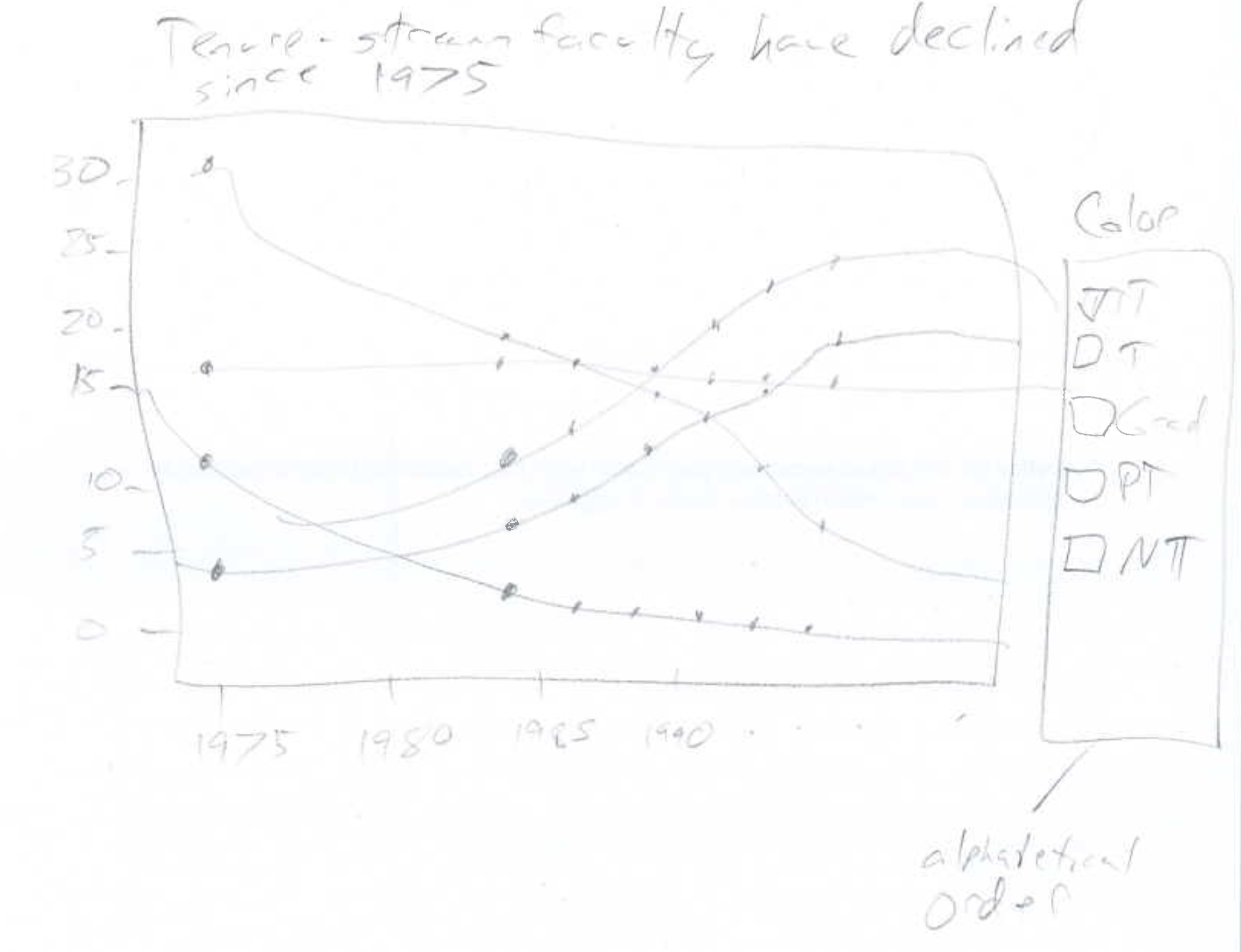
Grammar of graphics
- Layer
- Data -
staff - Mapping
x=yeary=percentagecolor=color
- Geom - line chart
- Data -
- Layer
- Data -
staff - Mapping
x=yeary=percentagecolor=color
- Geom - point
- Data -
- Scales
x- continuousy- continuous, percentage formattingcolor- some sort of discrete palette, TBD
To correct for this, I next utilized a line chart. Graph the data with year on the \(x\)-axis and percentage of employees on the \(y\)-axis. Distinguish each faculty type using an appropriate aesthetic mapping. I also added points to the line chart to make it easier to read the values for each year, also indicating the gaps between survey years.
staff_long |>
  ggplot(
    mapping = aes(
      x = year,
      y = percentage,
      group = faculty_type,
      color = faculty_type
    )
  ) +
  geom_line() +
  geom_point() +
  theme_minimal()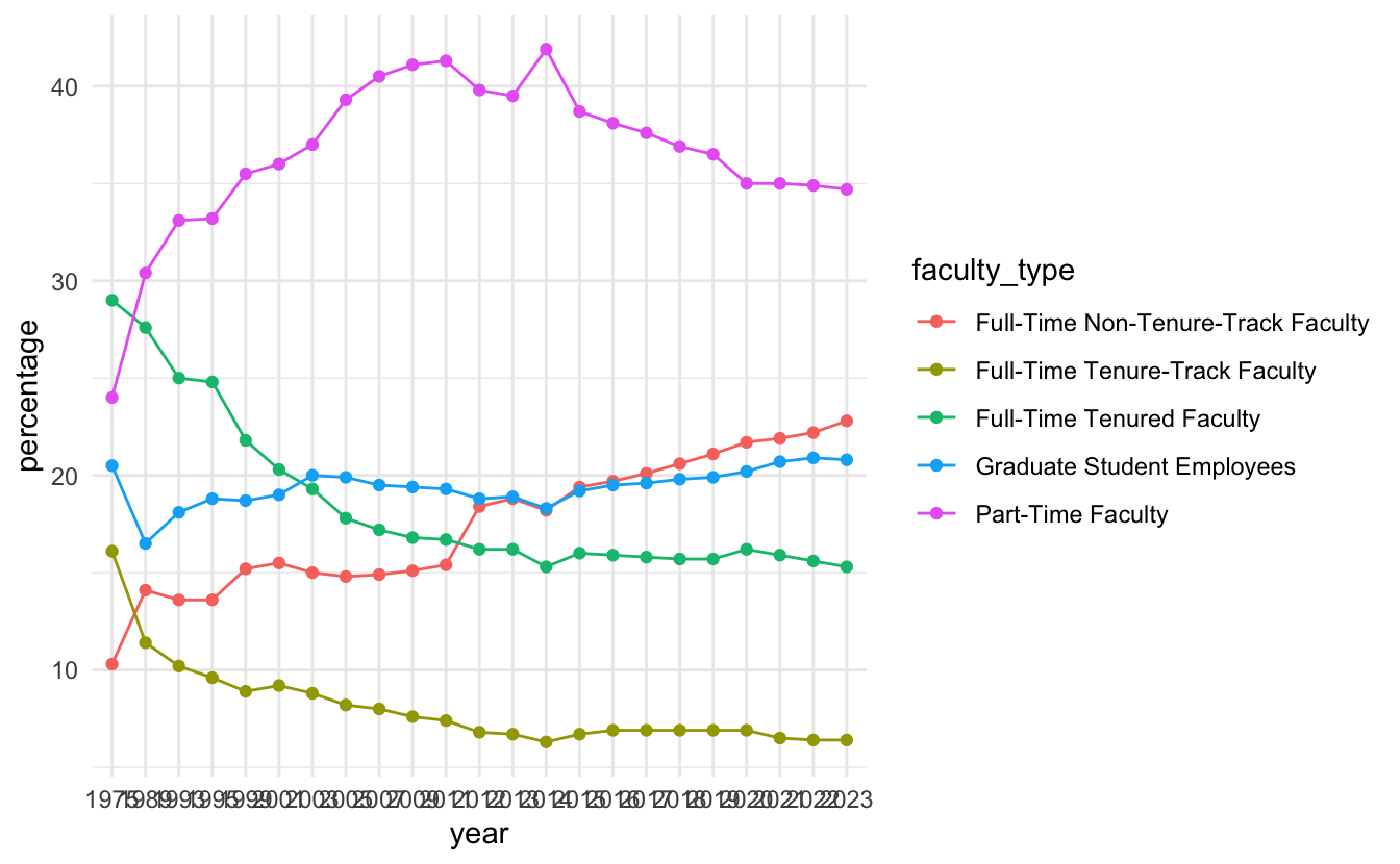
Ooops, it still is equal intervals because I never ensured year was converted to a numeric variable after pivoting it. Let’s fix that.
staff_long <- staff |>
  pivot_longer(
    cols = -faculty_type,
    names_to = "year",
    values_to = "percentage",
    names_transform = parse_number
  )

staff_long |>
  ggplot(
    mapping = aes(
      x = year,
      y = percentage,
      color = faculty_type
    )
  ) +
  geom_line() +
  geom_point() +
  theme_minimal()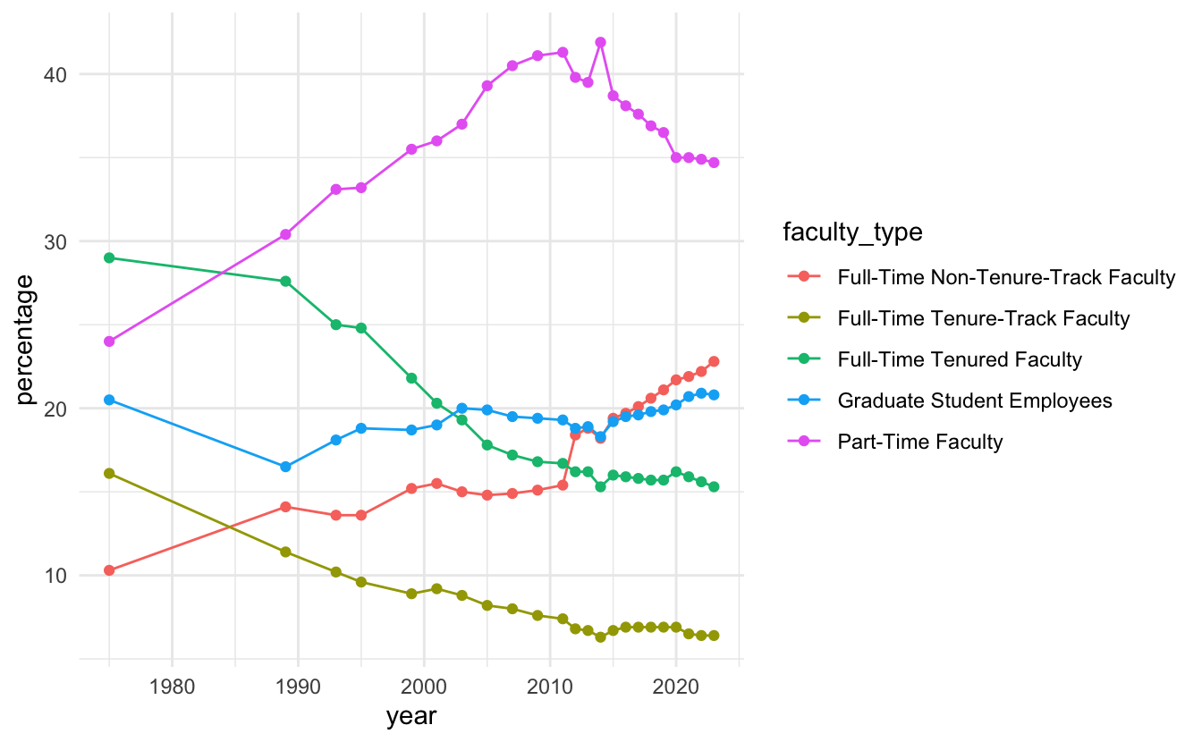
Now I attempt to clean it up a bit more by:
- Add a proper title and labelling to the chart
- Use an optimized color palette2
- Order the legend values by the final value of the
percentagevariable
staff_long |>
  mutate(
    faculty_type = fct_reorder2(
      .f = faculty_type,
      .x = year,
      .y = percentage
    )
  ) |>
  ggplot(
    mapping = aes(
      x = year,
      y = percentage,
      color = faculty_type
    )
  ) +
  geom_line() +
  geom_point() +
  scale_y_continuous(labels = label_percent(scale = 1)) +
  scale_color_viridis_d(end = 0.9) +
  labs(
    title = "Instructional staff employment trends",
    x = NULL,
    y = NULL,
    color = NULL,
    caption = "Source: AAUP"
  ) +
  theme_minimal()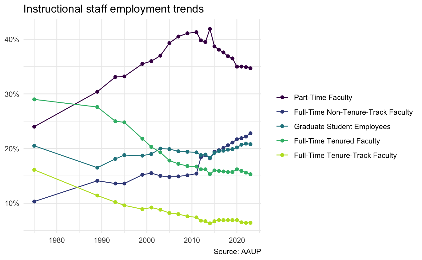
Final attempt
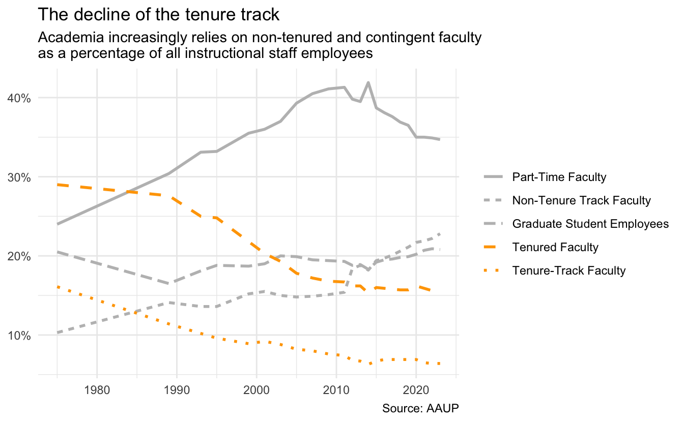
I like the line chart approach but I still want to emphasize decline in tenure-track faculty. Based on my work thus far, I will highlight the tenure-track lines (Full-Time Tenured Faculty and Full-Time Tenure-Track Faculty) using color. I’ll further distinguish between each faculty type using linetype, remove the points from the chart to reduce visual clutter,3 and write a more focused title and subtitle.
staff_long |>
  mutate(
    faculty_type = replace_values(
      x = faculty_type,
      "Full-Time Tenured Faculty" ~ "Tenured Faculty",
      "Full-Time Tenure-Track Faculty" ~ "Tenure-Track Faculty",
      "Full-Time Non-Tenure-Track Faculty" ~ "Non-Tenure Track Faculty"
    ),
    non_tt = faculty_type %in%
      c(
        "Part-Time Faculty",
        "Graduate Student Employees",
        "Non-Tenure Track Faculty"
      )
  ) |>
  # reorder legend entries meaningfully
  mutate(
    faculty_type = fct_reorder2(
      .f = faculty_type,
      .x = year,
      .y = percentage
    )
  ) |>
  ggplot(
    mapping = aes(
      x = year,
      y = percentage,
      linetype = faculty_type,
      color = faculty_type
    )
  ) +
  geom_line(linewidth = 1) +
  scale_y_continuous(labels = label_percent(scale = 1, accuracy = 1)) +
  scale_color_manual(
    values = c(
      "Part-Time Faculty" = "gray",
      "Graduate Student Employees" = "gray",
      "Non-Tenure Track Faculty" = "gray",
      "Tenured Faculty" = "orange",
      "Tenure-Track Faculty" = "orange"
    )
  ) +
  theme_minimal() +
  labs(
    title = "The decline of the tenure track",
    subtitle = "Academia increasingly relies on non-tenured and contingent faculty\nas a percentage of all instructional staff employees",
    x = NULL,
    y = NULL,
    color = NULL,
    linetype = NULL,
    caption = "Source: AAUP"
  )
Acknowledgments
- Exercise derived from Data Science in a Box and licensed under CC BY-SA 4.0.
NoteSession information
sessioninfo::session_info()─ Session info ───────────────────────────────────────────────────────────────
setting value
version R version 4.6.1 (2026-06-24)
os macOS Golden Gate 27.0
system aarch64, darwin23
ui X11
language (EN)
collate en_US.UTF-8
ctype en_US.UTF-8
tz America/New_York
date 2026-09-18
pandoc 3.10 @ /Applications/Positron.app/Contents/Resources/app/quarto/bin/tools/aarch64/ (via rmarkdown)
quarto 1.10.18 @ /Applications/quarto/bin/quarto
─ Packages ───────────────────────────────────────────────────────────────────
! package * version date (UTC) lib source
P bit 4.6.0 2025-03-06 [?] RSPM
P bit64 4.8.2 2026-05-19 [?] RSPM
P cli 3.6.6 2026-04-09 [?] RSPM
P crayon 1.5.3 2024-06-20 [?] RSPM
P digest 0.6.39 2025-11-19 [?] RSPM
P dplyr * 1.2.1 2026-04-03 [?] RSPM
P evaluate 1.0.5 2025-08-27 [?] RSPM
P farver 2.1.2 2024-05-13 [?] RSPM
P fastmap 1.2.0 2024-05-15 [?] RSPM
P forcats * 1.0.1 2025-09-25 [?] RSPM
P generics 0.1.4 2025-05-09 [?] RSPM
P ggplot2 * 4.0.3 2026-04-22 [?] RSPM
P glue 1.8.1 2026-04-17 [?] RSPM
P gtable 0.3.6 2024-10-25 [?] RSPM
P here 1.0.2 2025-09-15 [?] RSPM
P hms 1.1.4 2025-10-17 [?] RSPM
P htmltools 0.5.9 2025-12-04 [?] RSPM
P htmlwidgets 1.6.4 2023-12-06 [?] RSPM
P jsonlite 2.0.0 2025-03-27 [?] RSPM
P knitr 1.51 2025-12-20 [?] RSPM
P labeling 0.4.3 2023-08-29 [?] RSPM
P lifecycle 1.0.5 2026-01-08 [?] RSPM
P lubridate * 1.9.5 2026-02-04 [?] RSPM
P magrittr 2.0.5 2026-04-04 [?] RSPM
P otel 0.2.0 2025-08-29 [?] RSPM
P pillar 1.11.1 2025-09-17 [?] RSPM
P pkgconfig 2.0.3 2019-09-22 [?] RSPM
P purrr * 1.2.2 2026-04-10 [?] RSPM
P R6 2.6.1 2025-02-15 [?] RSPM
P ragg 1.5.2 2026-03-23 [?] RSPM
P RColorBrewer 1.1-3 2022-04-03 [?] RSPM
P readr * 2.2.0 2026-02-19 [?] RSPM
P renv 1.2.2 2026-04-16 [?] RSPM
P rlang 1.3.0 2026-07-05 [?] RSPM
P rmarkdown 2.31 2026-03-26 [?] RSPM
P rprojroot 2.1.1 2025-08-26 [?] RSPM
P S7 0.2.2 2026-04-22 [?] RSPM
P scales * 1.4.0 2025-04-24 [?] RSPM
P sessioninfo 1.2.4 2026-06-04 [?] RSPM
P stringi 1.8.9 2026-08-04 [?] RSPM
P stringr * 1.6.0 2025-11-04 [?] RSPM
P systemfonts 1.3.2 2026-03-05 [?] RSPM
P textshaping 1.0.5 2026-03-06 [?] RSPM
P tibble * 3.3.1 2026-01-11 [?] RSPM
P tidyr * 1.3.2 2025-12-19 [?] RSPM
P tidyselect 1.2.1 2024-03-11 [?] RSPM
P tidyverse * 2.0.0 2023-02-22 [?] RSPM
P timechange 0.4.0 2026-01-29 [?] RSPM
P tzdb 0.5.0 2025-03-15 [?] RSPM
P utf8 1.2.6 2025-06-08 [?] RSPM
P vctrs 0.7.3 2026-04-11 [?] RSPM
P viridisLite 0.4.3 2026-02-04 [?] RSPM
P vroom 1.7.1 2026-03-31 [?] RSPM
P withr 3.0.3 2026-06-19 [?] RSPM
P xfun 0.60 2026-07-09 [?] RSPM
P yaml 2.3.12 2025-12-10 [?] RSPM
[1] /Users/bcs88/Projects/info-3312/course-site/renv/library/macos/R-4.6/aarch64-apple-darwin23
[2] /Users/bcs88/Library/Caches/org.R-project.R/R/renv/sandbox/macos/R-4.6/aarch64-apple-darwin23/46003b10
* ── Packages attached to the search path.
P ── Loaded and on-disk path mismatch.
──────────────────────────────────────────────────────────────────────────────Footnotes
Data sources: IPEDS and Digest of Education Statistics. Downloaded February 10, 2025.↩︎
{viridis} is often a good choice, but you can find others.↩︎
Personally I think it gets too busy once we shift to annual measures, though I realize reduces the ability to discern the large time gap between the first two surveys. Life is full of trade-offs.↩︎