# A tibble: 51 × 5
long lat survivors direction group
<dbl> <dbl> <dbl> <chr> <dbl>
1 24 54.9 340000 A 1
2 24.5 55 340000 A 1
3 25.5 54.5 340000 A 1
4 26 54.7 320000 A 1
5 27 54.8 300000 A 1
6 28 54.9 280000 A 1
7 28.5 55 240000 A 1
8 29 55.1 210000 A 1
9 30 55.2 180000 A 1
10 30.3 55.3 175000 A 1
# ℹ 41 more rows
Building a complicated, layered graphic using the grammar of graphics
Carte figurative des pertes successives en hommes de l’Armée Française dans la campagne de Russie 1812–1813
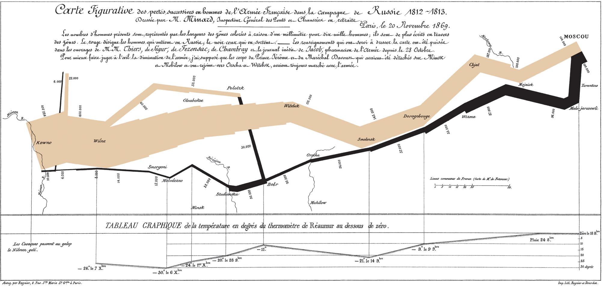
This cartograph is identified in Edward Tufte’s The Visual Display of Quantitative Information as one of “the best statistical drawings ever created”. It also demonstrates a very important rule of warfare: never invade Russia in the winter.
In 1812, Napoleon ruled most of Europe. He wanted to seize control of the British islands, but could not overcome the UK defenses. He decided to impose an embargo to weaken the nation in preparation for invasion, but Russia refused to participate. Angered at this decision, Napoleon launched an invasion of Russia with over 400,000 troops in the summer of 1812. Russia was unable to defeat Napoleon in battle, but instead waged a war of attrition. The Russian army was in near constant retreat, burning or destroying anything of value along the way to deny France usable resources. While Napoleon’s army maintained the military advantage, his lack of food and the emerging European winter decimated his forces. He left France with an army of approximately 422,000 soldiers; he returned to France with just 10,000.
Charles Minard’s map is a stunning achievement for his era. It incorporates data across six dimensions to tell the story of Napoleon’s failure. The graph depicts:
- Size of the army
- Location in two physical dimensions (latitude and longitude)
- Direction of the army’s movement
- Temperature on dates during Napoleon’s retreat
What makes this such an effective visualization?1
- Forces visual comparisons (colored bands for advancing and retreating)
- Shows causality (temperature chart)
- Captures multivariate complexity
- Integrates text and graphic into a coherent whole (perhaps the first infographic, and done well!)
- Illustrates high quality content (based on reliable data)
- Places comparisons adjacent to each other (all on the same page, no jumping back and forth between pages)
Building Minard’s map in R
We can reconstruct this map using the grammar of graphics.2 Here we will focus just on the upper portion including the map depicting the troop movements.
troops
cities
# A tibble: 20 × 3
long lat city
<dbl> <dbl> <chr>
1 24 55 Kowno
2 25.3 54.7 Wilna
3 26.4 54.4 Smorgoni
4 26.8 54.3 Moiodexno
5 27.7 55.2 Gloubokoe
6 27.6 53.9 Minsk
7 28.5 54.3 Studienska
8 28.7 55.5 Polotzk
9 29.2 54.4 Bobr
10 30.2 55.3 Witebsk
11 30.4 54.5 Orscha
12 30.4 53.9 Mohilow
13 32 54.8 Smolensk
14 33.2 54.9 Dorogobouge
15 34.3 55.2 Wixma
16 34.4 55.5 Chjat
17 36 55.5 Mojaisk
18 37.6 55.8 Moscou
19 36.6 55.3 Tarantino
20 36.5 55 Malo-Jarosewii
Define the grammar of graphics for this graph
Recall the major elements of the grammar of graphics:
- Layer
- Data
- Mapping
- Statistical transformation (stat)
- Geometric object (geom)
- Position adjustment (position)
- Scale
- Coordinate system
- Faceting
And here we have two data frames containing the following variables:
- Troops
- Latitude
- Longitude
- Survivors
- Advance/retreat
- Cities
- Latitude
- Longitude
- City name
Your turn: Use this information to define the grammar of graphics to recreate Minard’s map.3 Share your grammar of graphics on the discussion board.
- The graph is best defined as a layered graph with two layers, one for the troop movements and one for the city labels.
- Remember that all components of the grammar of graphics must be defined, even if it’s just the default. For example, if you want to use the raw data for the statistical transformation, you should specify an identity transformation. If you want to use the default position adjustment, you should specify an identity position adjustment. This is important because it ensures that your graph is fully defined and that there are no hidden assumptions about how the data will be transformed or positioned.
This graph is best defined as a layered graph with two layers, one for the troop movements and one for the city labels. The troop movement layer is a path graph where the width of the path indicates the number of survivors and the color indicates whether the troops are advancing or retreating. The city layer is a text graph where the position of the text indicates the location of the city and the label is the name of the city.
Layer 1: Troop movements
- Data -
troops - Mapping
-
\(x\) and \(y\) - troop position (
latandlong) - Linewidth -
survivors - Color -
direction
-
\(x\) and \(y\) - troop position (
- Statistical transformation (stat) -
identity. We want the raw data to be plotted, so we use the identity statistical transformation. Remember that every component of the grammar of graphics must be defined, even if it’s just the default. - Geometric object (geom) -
path. We want to connect the points in the order they appear in the data frame, so we use the path geometric object. This is not the same as a line graph, which connects points in order of the \(x\) variable. The path graph connects points in the order they appear in the data frame, regardless of the \(x\) variable. - Position adjustment (position) -
identity
Layer 2: City labels
- Data -
cities - Mapping
-
\(x\) and \(y\) - city position (
latandlong) - Label -
city
-
\(x\) and \(y\) - city position (
- Statistical transformation (stat) -
identity - Geometric object (geom) -
text. We want to add text labels to the graph, so we use the text geometric object. This encodes the city names as text on the graph, instead of using a symbol such as with a scatterplot. - Position adjustment (position) -
identity
Global elements
- Scale
-
Linewidth - range of widths for troop
path - Color - colors to indicate advancing or retreating troops
-
Linewidth - range of widths for troop
- Coordinate system - since the graph depicts physical locations, we should use a coordinate system designed for map projections as opposed to a standard Cartesian coordinate system. This could be something like a Mercator or Gall-Peters projection method.
- Faceting - null or none. We want all of the data to be plotted on the same panel, so we do not use faceting.
─ Session info ───────────────────────────────────────────────────────────────
setting value
version R version 4.5.2 (2025-10-31)
os macOS Tahoe 26.5
system aarch64, darwin20
ui X11
language (EN)
collate en_US.UTF-8
ctype en_US.UTF-8
tz America/New_York
date 2026-05-24
pandoc 3.8.3 @ /Applications/Positron.app/Contents/Resources/app/quarto/bin/tools/aarch64/ (via rmarkdown)
quarto 1.10.3 @ /Applications/quarto/bin/quarto
─ Packages ───────────────────────────────────────────────────────────────────
! package * version date (UTC) lib source
P cli 3.6.6 2026-04-09 [?] RSPM
P crayon 1.5.3 2024-06-20 [?] RSPM (R 4.5.0)
P digest 0.6.39 2025-11-19 [?] RSPM (R 4.5.0)
P dplyr * 1.2.1 2026-04-03 [?] RSPM
P evaluate 1.0.5 2025-08-27 [?] RSPM (R 4.5.0)
P farver 2.1.2 2024-05-13 [?] RSPM (R 4.5.0)
P fastmap 1.2.0 2024-05-15 [?] RSPM (R 4.5.0)
P forcats * 1.0.1 2025-09-25 [?] RSPM (R 4.5.0)
P generics 0.1.4 2025-05-09 [?] RSPM (R 4.5.0)
P ggplot2 * 4.0.3 2026-04-22 [?] RSPM
P glue 1.8.1 2026-04-17 [?] RSPM
P gtable 0.3.6 2024-10-25 [?] RSPM (R 4.5.0)
P here 1.0.2 2025-09-15 [?] CRAN (R 4.5.0)
P hms 1.1.4 2025-10-17 [?] RSPM (R 4.5.0)
P htmltools 0.5.9 2025-12-04 [?] RSPM (R 4.5.0)
P htmlwidgets 1.6.4 2023-12-06 [?] RSPM (R 4.5.0)
P jsonlite 2.0.0 2025-03-27 [?] RSPM (R 4.5.0)
P knitr 1.51 2025-12-20 [?] RSPM (R 4.5.0)
P lifecycle 1.0.5 2026-01-08 [?] RSPM (R 4.5.0)
P lubridate * 1.9.5 2026-02-04 [?] RSPM
P magrittr 2.0.5 2026-04-04 [?] RSPM
P otel 0.2.0 2025-08-29 [?] RSPM (R 4.5.0)
P pillar 1.11.1 2025-09-17 [?] RSPM (R 4.5.0)
P pkgconfig 2.0.3 2019-09-22 [?] RSPM (R 4.5.0)
P purrr * 1.2.2 2026-04-10 [?] RSPM
P R6 2.6.1 2025-02-15 [?] RSPM (R 4.5.0)
P RColorBrewer 1.1-3 2022-04-03 [?] RSPM (R 4.5.0)
P readr * 2.2.0 2026-02-19 [?] RSPM
P renv 1.2.3 2026-05-16 [?] RSPM
P rlang 1.2.0 2026-04-06 [?] RSPM
P rmarkdown 2.31 2026-03-26 [?] RSPM
P rprojroot 2.1.1 2025-08-26 [?] RSPM (R 4.5.0)
P S7 0.2.2 2026-04-22 [?] RSPM
P scales 1.4.0 2025-04-24 [?] RSPM (R 4.5.0)
P sessioninfo 1.2.3 2025-02-05 [?] RSPM (R 4.5.0)
P stringi 1.8.7 2025-03-27 [?] RSPM (R 4.5.0)
P stringr * 1.6.0 2025-11-04 [?] RSPM (R 4.5.0)
P tibble * 3.3.1 2026-01-11 [?] RSPM (R 4.5.0)
P tidyr * 1.3.2 2025-12-19 [?] RSPM (R 4.5.0)
P tidyselect 1.2.1 2024-03-11 [?] RSPM (R 4.5.0)
P tidyverse * 2.0.0 2023-02-22 [?] RSPM (R 4.5.0)
P timechange 0.4.0 2026-01-29 [?] RSPM
P tzdb 0.5.0 2025-03-15 [?] RSPM (R 4.5.0)
P utf8 1.2.6 2025-06-08 [?] RSPM (R 4.5.0)
P vctrs 0.7.3 2026-04-11 [?] RSPM
P withr 3.0.2 2024-10-28 [?] RSPM (R 4.5.0)
P xfun 0.57 2026-03-20 [?] RSPM
P yaml 2.3.12 2025-12-10 [?] RSPM (R 4.5.0)
[1] /Users/bcs88/Projects/info-3312/course-site/renv/library/macos/R-4.5/aarch64-apple-darwin20
[2] /Users/bcs88/Library/Caches/org.R-project.R/R/renv/sandbox/macos/R-4.5/aarch64-apple-darwin20/4cd76b74
* ── Packages attached to the search path.
P ── Loaded and on-disk path mismatch.
──────────────────────────────────────────────────────────────────────────────
Footnotes
Source: Dataviz History: Charles Minard’s Flow Map of Napoleon’s Russian Campaign of 1812.↩︎
This exercise is drawn from Wickham, Hadley. (2010) “A Layered Grammar of Graphics”. Journal of Computational and Graphical Statistics, 19(1).↩︎
Ignore the temperature line graph, just focus on the map portion.↩︎

