Telling the story with data
Notes
NoteLearning objectives
- Explain how data visualizations function as storytelling tools
- Apply principles of simplicity, ordering, and emphasis to chart design
- Handle missing data clearly in visualizations
- Untangle a spaghetti line chart using highlighting and small multiples
TipSupplemental readings
Telling a story
Data communication is not just about presenting facts. It is about telling a story — a sequence of observations presented in an order that creates understanding and, often, an emotional reaction.
A story is a set of observations, facts, or events, true or invented, that are presented in a specific order such that they create an emotional reaction in the audience.
Common narrative structures:
- Sequential: motivation first, then resolution — build to a conclusion
- Single plot: show the resolution immediately, and embed the motivation within it
- Three-act: setup → confrontation → resolution
Simplicity vs. complexity
When you’re trying to show too much data at once, you may end up not showing anything.
Never assume your audience can rapidly process complex visual displays. Practical rules:
- Don’t add variables to your plot that are tangential to your story
- Don’t jump straight to a highly complex figure; first show an easily digestible subset
- Aim for memorable, but clear
Consistency vs. repetitiveness
Be consistent, but don’t be repetitive.
- Use consistent features across plots — the same color should represent the same group on every chart in a report
- Use different chart types for different analyses — if every chart is a bar chart, readers stop looking
Designing effective visualizations
Keep it simple
A classic bad example: the 3D pie chart.
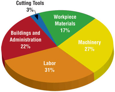
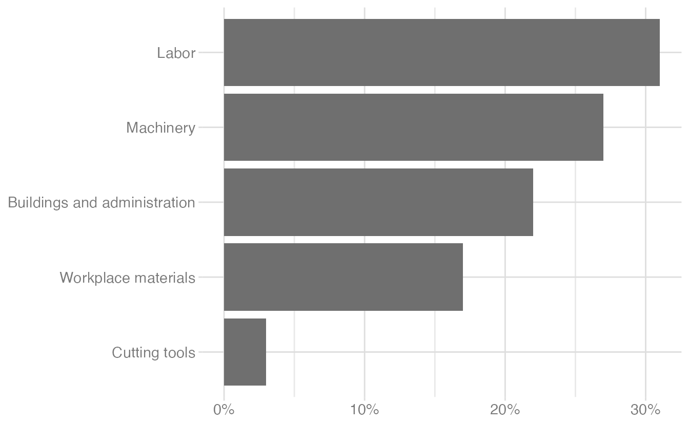
The 3D perspective distorts the areas so that slices of equal size appear different. A horizontal bar chart — sorted by value — conveys the same information with no distortion and much less visual noise:
Use color to draw attention
Color is most effective when it encodes meaning, not decoration. Compare three approaches to the same bar chart:
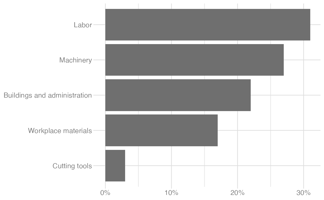
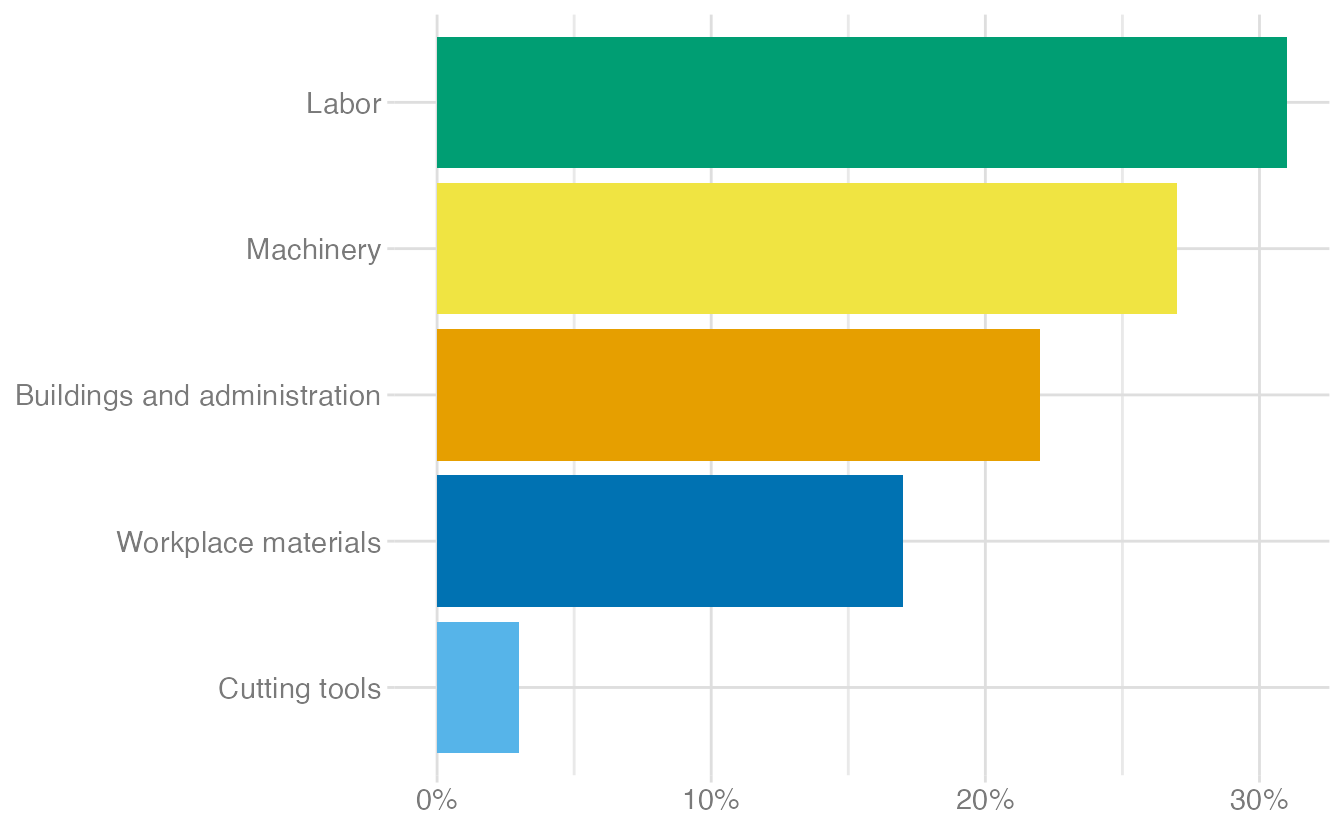
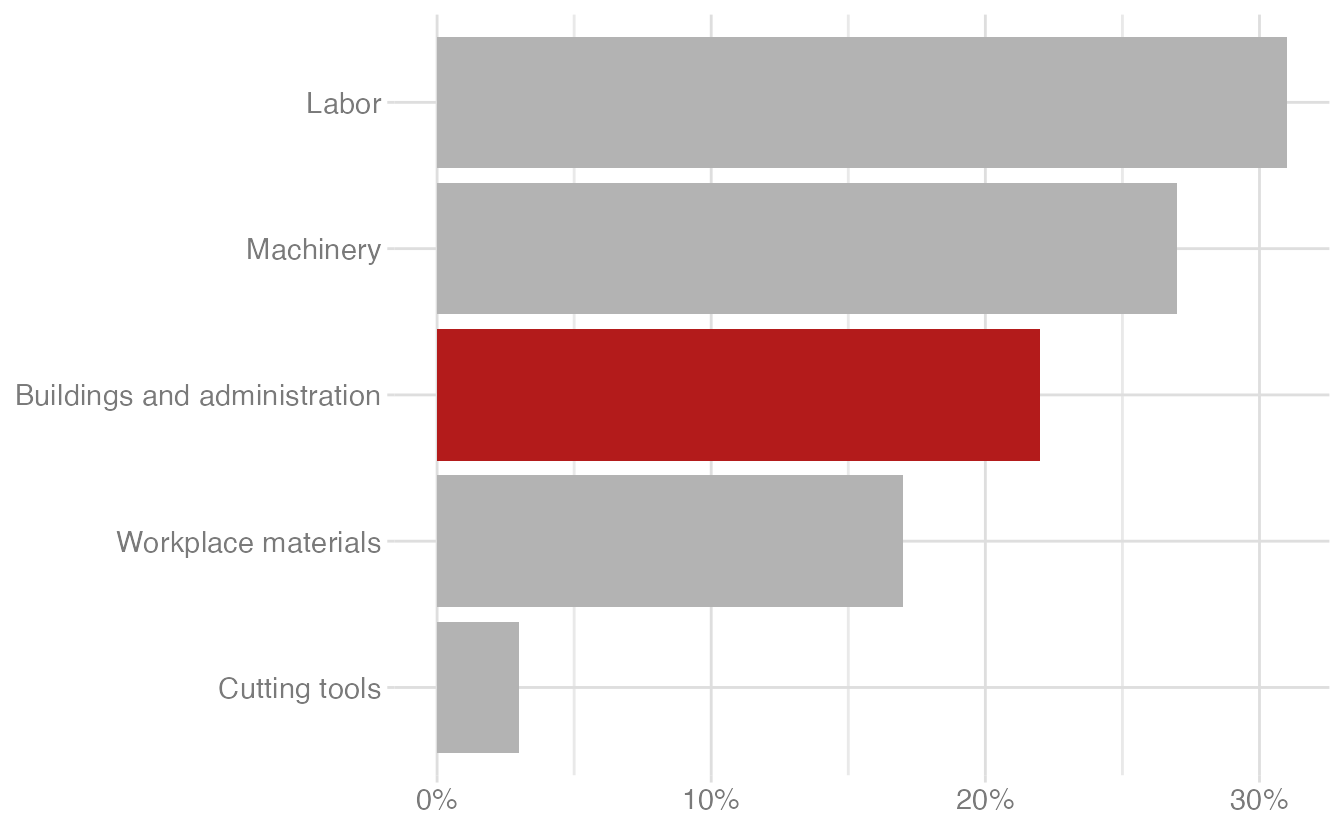
The last version is the most effective: the color is doing work — it draws the reader’s eye to the category being discussed. Each category a different color gives no guidance on where to look.
Order matters
Categories in a chart should be ordered to serve the story. Alphabetical order is usually not the right choice.
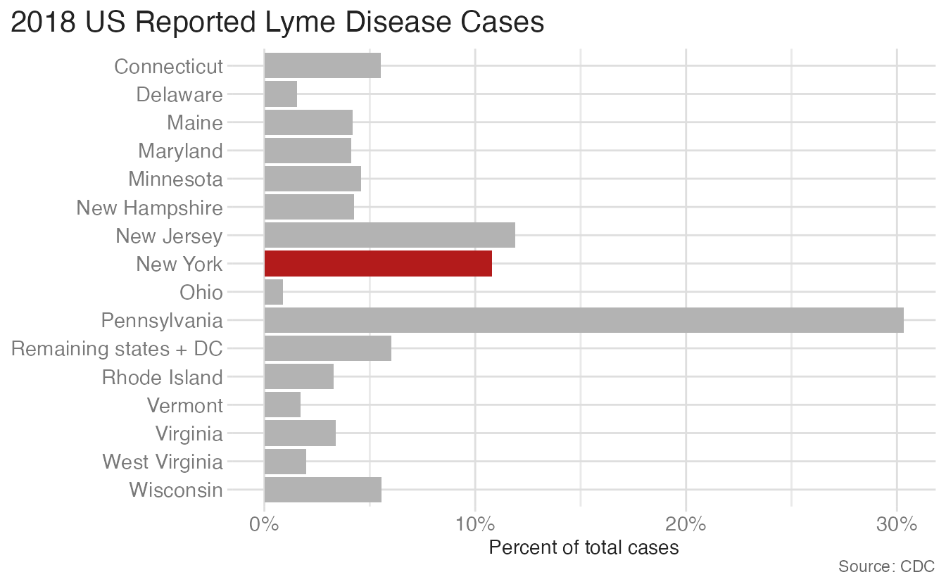
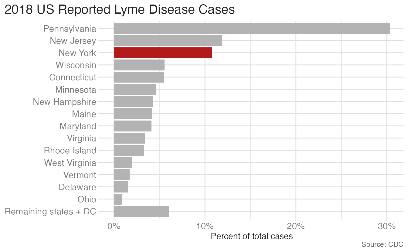
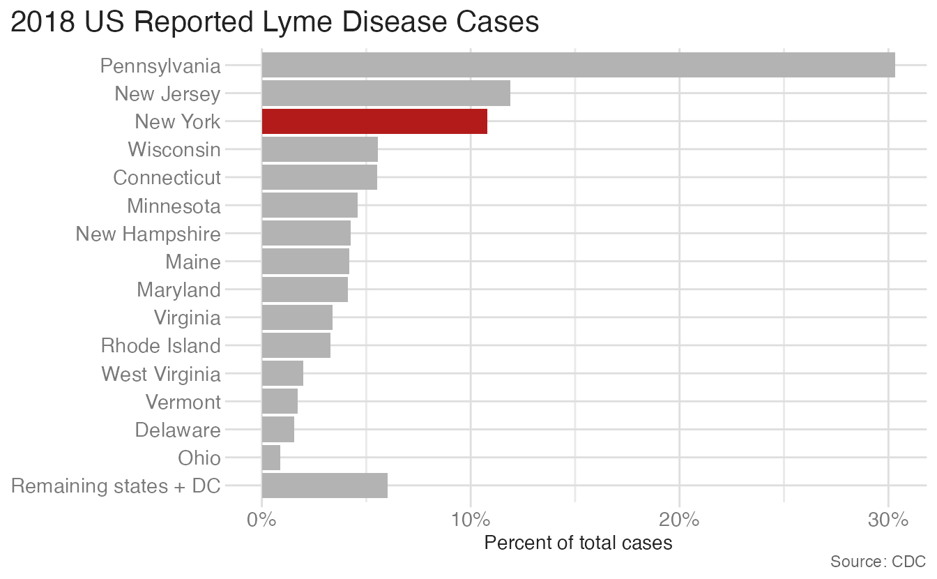
Ordering by value makes comparisons between states immediate. The eye immediately identifies the outliers — Pennsylvania with over 30% of all cases. Alphabetical order buries this information.
Reduce cognitive load
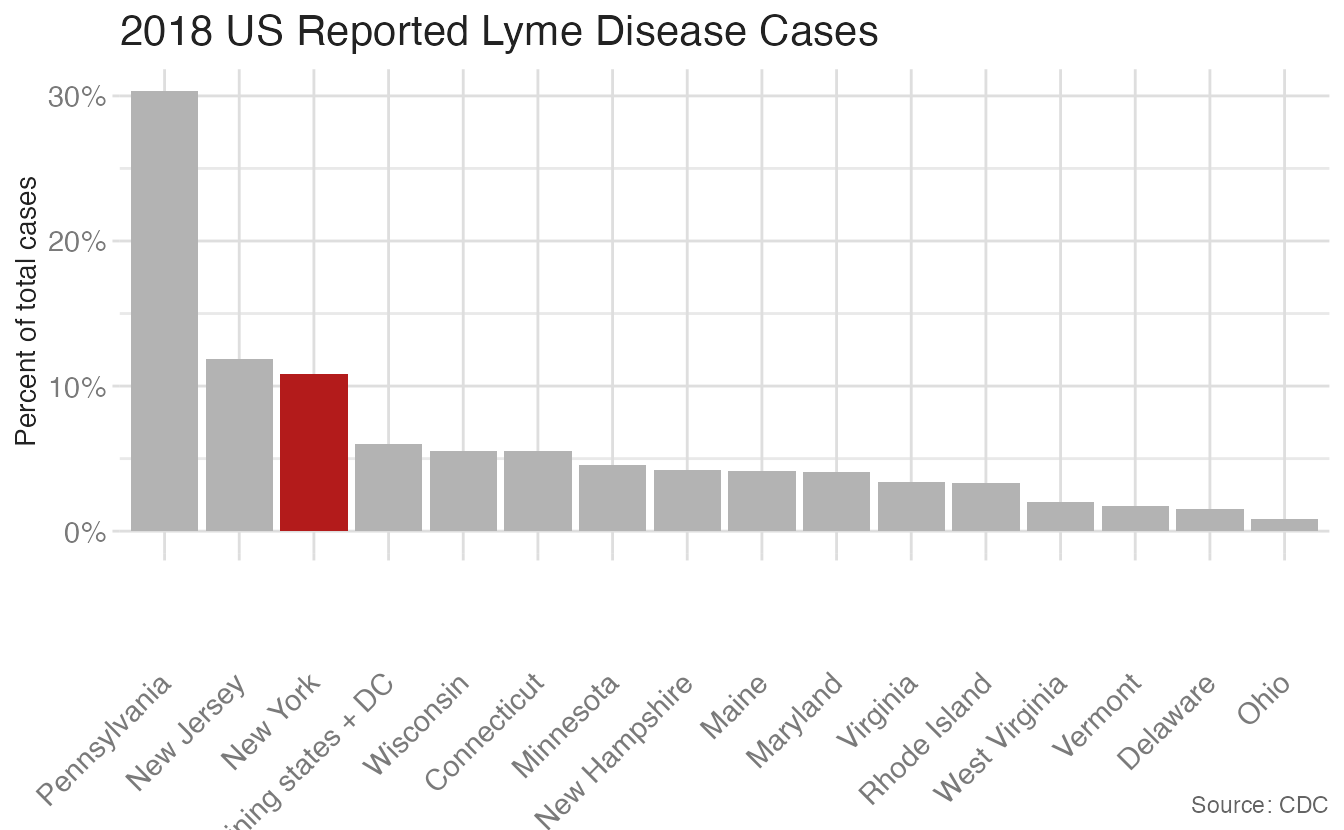
Rotate labels, don’t rotate the chart. When category labels are long, a vertical bar chart forces angled text that slows reading. Horizontal bars let labels read naturally:
Clearly indicate missing data
How you represent a missing data point tells the reader something about why it is missing. The six strategies below use health insurance data with 2020 deliberately removed:
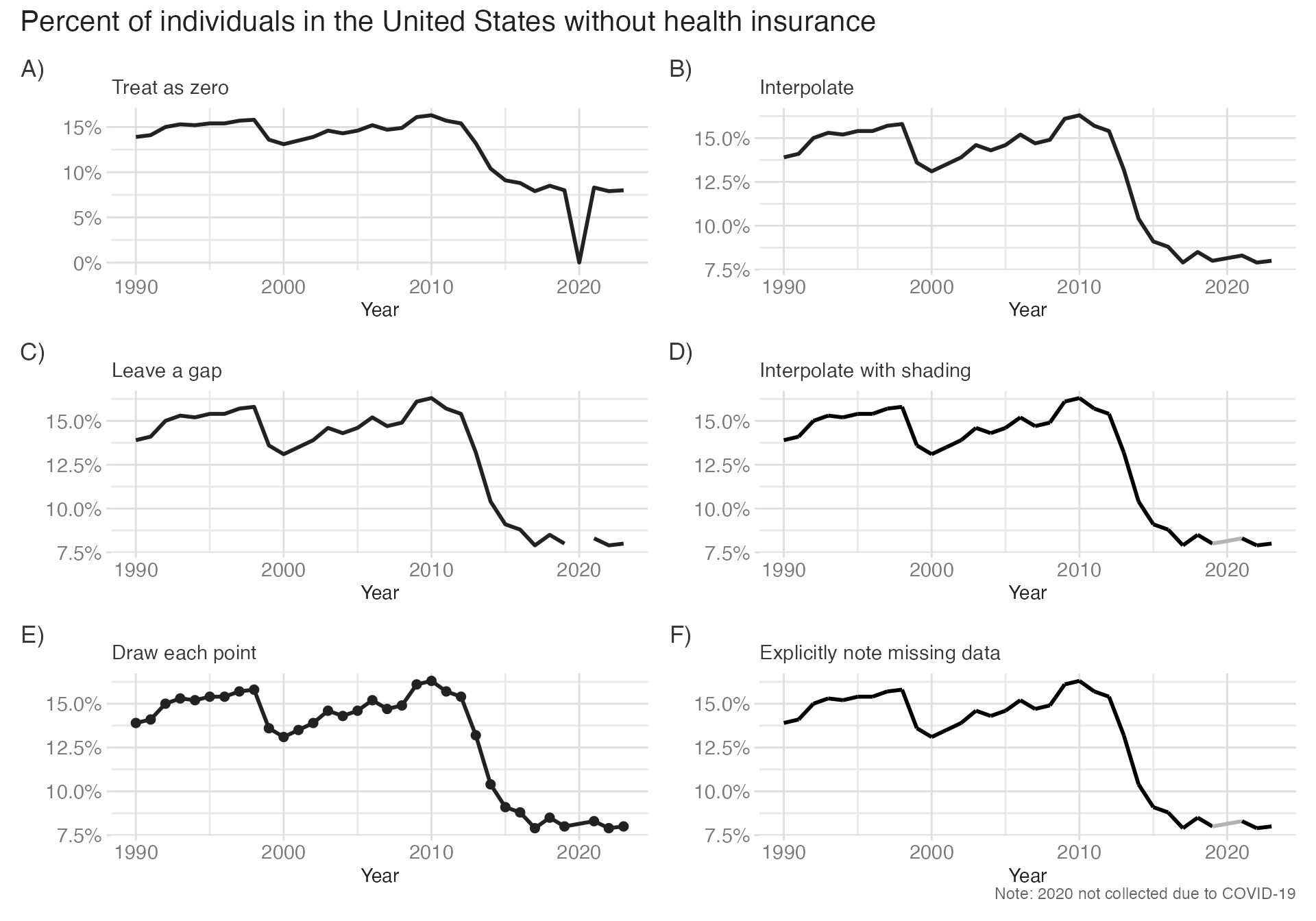
Option A (treat as zero) is almost always wrong — it creates a false data point. Option B (interpolate silently) is also problematic — it implies data that was never collected. Leaving a gap (Option C) or muting the interpolated segment (Option D) is a good approach, but should also be paired with a caption explaining the gap. Option F is an optimal approach: interpolate for visual continuity, but make the gap visible and explain it in a caption.
Use descriptive titles
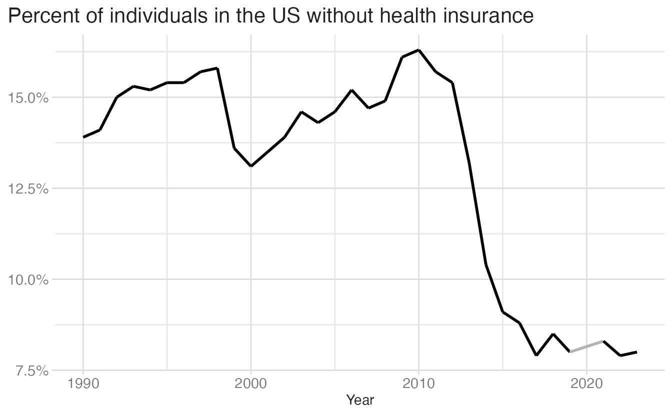
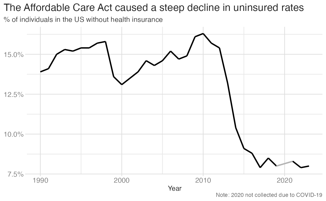
The title is prime real estate. A title that describes the pattern — not just the variable — tells the reader where to look and what to conclude.
Untangling a spaghetti chart
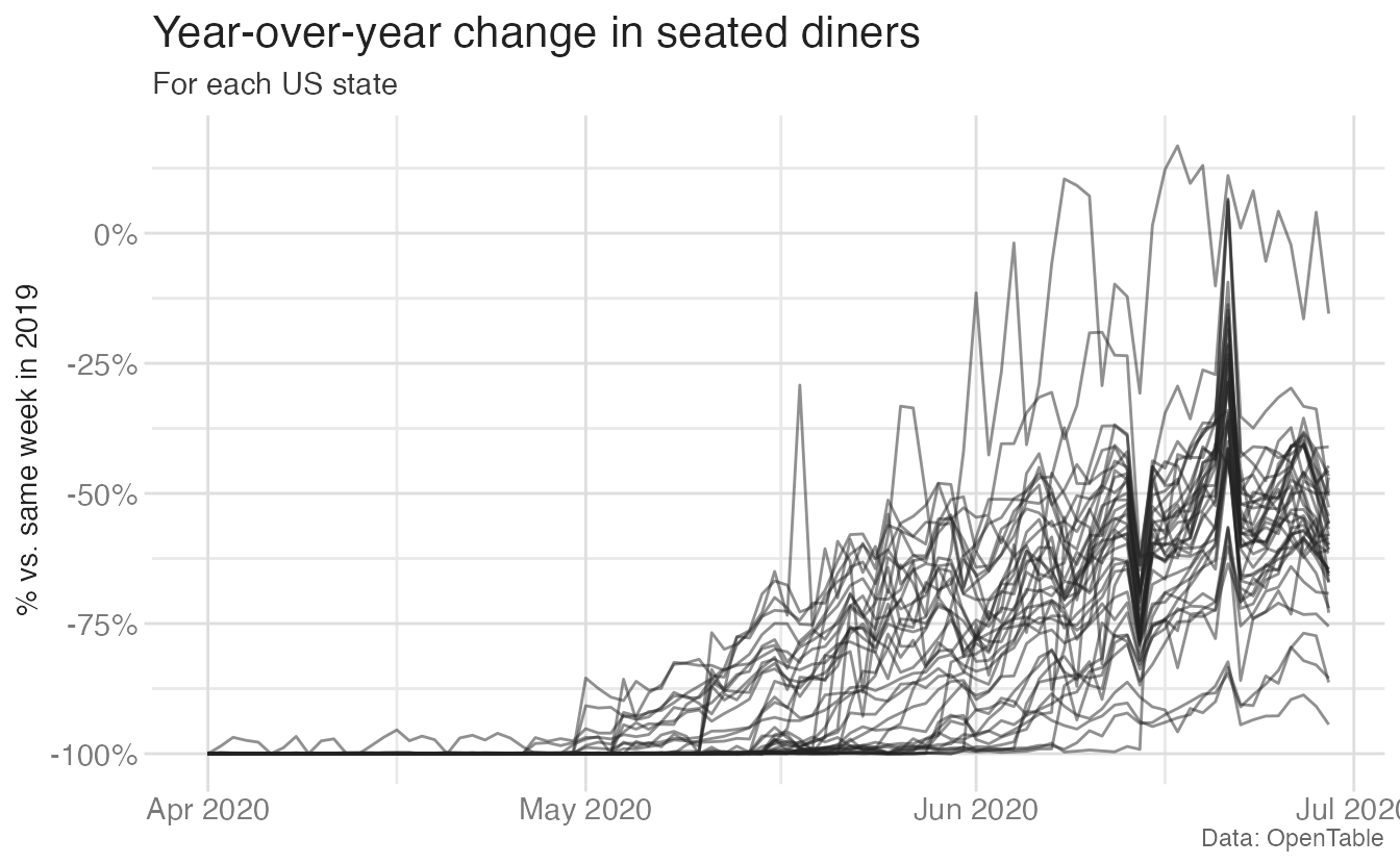
When you have many time series on the same plot, it often becomes unreadable — a “spaghetti chart.” The solution is usually one of three approaches: highlight a single series, use small multiples, or show a cross-sectional snapshot.
The spaghetti problem
OpenTable data shows year-over-year change in seated diners for every US state during 2020. With 50+ series, the chart is unreadable:
Approach 1: Highlight one series
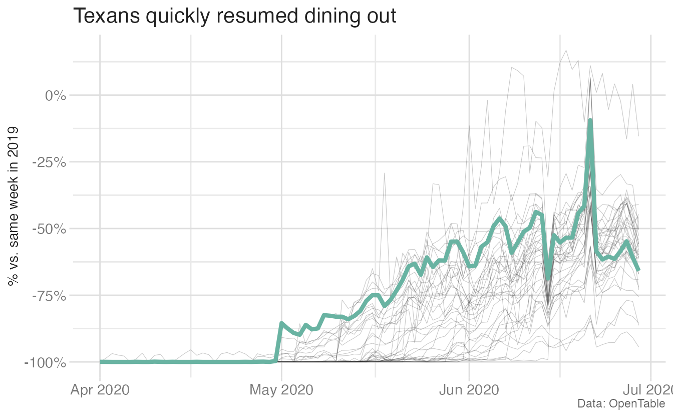
Gray thin lines provide the population context; the highlighted state is visually dominant.
Approach 2: Small multiples
We can do something similar without focusing on just a single state by creating a faceted highlighted chart:
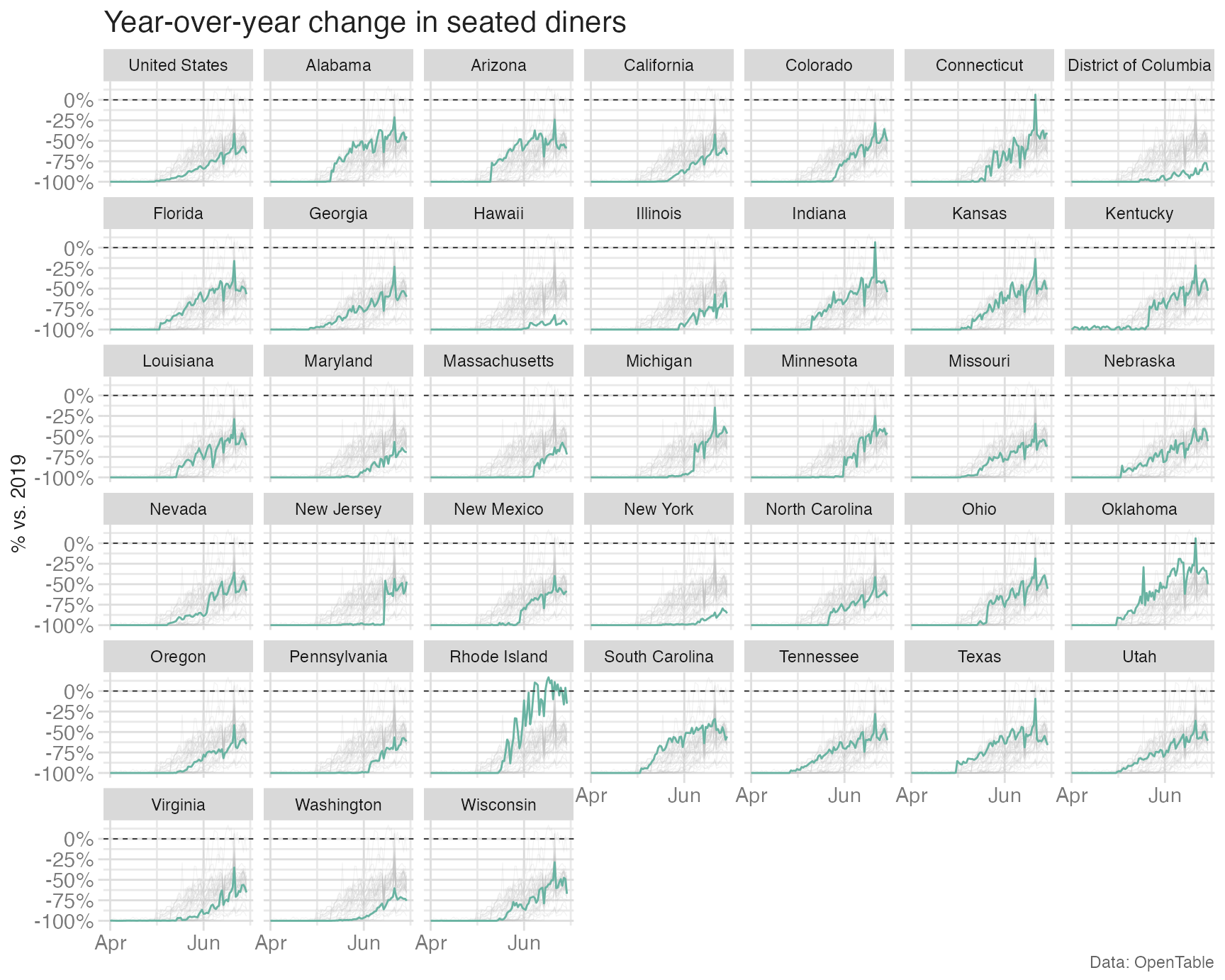
Each small multiple highlights one state against the full distribution, making state-by-state comparisons possible while preserving national context.
Approach 3: Snapshot in time
A completely different approach — instead of showing all the trends, pick a single date and compare states at that point:
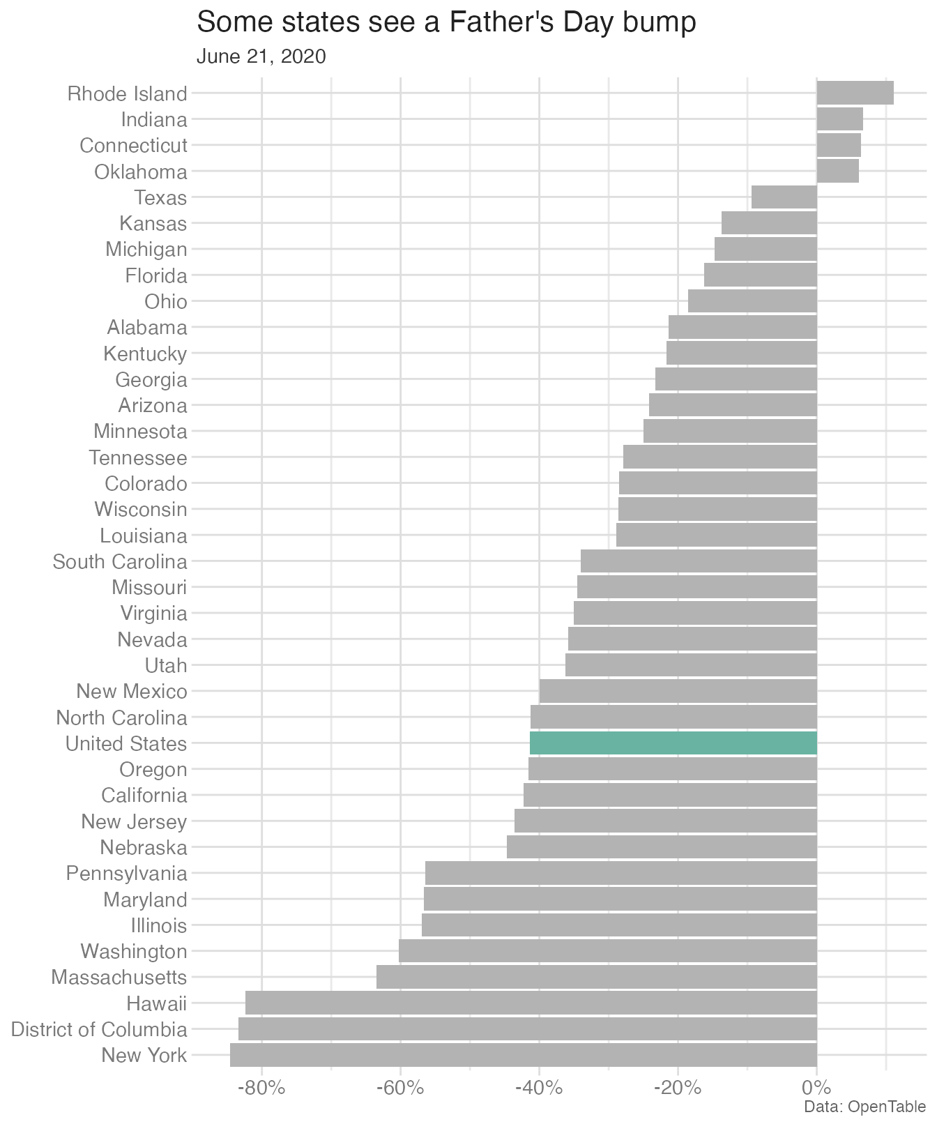
This chart tells a different but equally valid story — not how recovery happened, but where things stood at a specific moment. The choice of approach depends on the story you want to tell.
Summary
- Effective data communication requires choosing the right narrative structure — sequential or single-plot — for your story
- Simplicity: remove variables not central to the story; never assume rapid processing of complex visuals
- Order by value, not alphabetically — unless alphabetical order is meaningful for your audience
- Horizontal bars reduce cognitive load when category labels are long
- Missing data should be visually distinguishable and explained in a caption; never treat it as zero
- Descriptive titles state the conclusion; the chart provides the evidence
- Spaghetti charts can be untangled by highlighting, small multiples, or snapshot comparisons
- Consistent color mapping across multiple plots reduces cognitive load for readers
Acknowledgements
Material derived in part from STA 313: Advanced Data Visualization and Flowing Data.