Introduce forms of interactivity for data visualizations
Identify core interactivity techniques
Critique interactivity in data visualizations
Implement interactive charts using {ggiraph}
When to go interactive
The foundational principle of interactive data visualization comes from Ben Shneiderman’s 1996 paper “The eyes have it”:
Overview first, zoom and filter, then details on demand.
Static charts present the most important patterns to the audience. Interactivity goes further — it allows readers to dig into the information, explore on their own terms, and surface stories that the designer did not anticipate. The two forms of communication serve different purposes: static charts communicate a predetermined message; interactive charts invite participation.
Forms of interactivity
Storytelling form
Interactive data experiences take two narrative forms:
Linear: The reader progresses through content in a fixed order. Scrollytelling (where effects are triggered by scrolling) is the most common linear form.
Nonlinear: The reader controls the order of exploration. Dashboards and interactive applications are the primary nonlinear forms.
Interaction techniques
Common interaction techniques include:
Scroll and pan — navigate along a single axis
Zoom — adjust the level of detail
Open and close — expand or collapse sections of content
Sort and rearrange — change the ordering of elements
Search and filter — show only data meeting specific criteria
Real interactive graphics often combine several of these techniques. For example, the New York Times “You Draw It” series asks readers to predict a trend before revealing the actual data — combining user drawing (open/close) with reveal (zoom and filter). The Pixar Cry Chart uses hover and filter to let readers explore emotional moments across Pixar films.
Approaches to interactive data communication
There are four general approaches to interactive data communication, ordered roughly by complexity:
Interactive charts — Single charts with hover, click, or filter behavior. The easiest to build and the most common form. Tools: {ggiraph}, {plotly}.
Scrollytelling — Longform stories where audio, video, and animation effects are triggered by scrolling. Maintains a linear narrative while making the experience feel dynamic. Common in data journalism.
Dashboards — Nonlinear layouts that present related variables and allow client-side filtering and exploration. The reader controls which slices of the data to view, but all data is loaded upfront. Tools: {flexdashboard}, Quarto dashboards.
Interactive web applications — Nonlinear format with server-side computation: the server re-runs R code in response to reader input, so the full dataset need not be loaded into the browser. More powerful but more complex. Tool: Shiny.
The rest of this note focuses on interactive charts, which have the lowest barrier to entry and can be embedded in any HTML document.
Interactive charts with {ggiraph}
{ggiraph} makes {ggplot2} graphics interactive by replacing standard geoms with _interactive variants. It keeps the familiar {ggplot2} structure while adding hover labels and click behavior. The output is an {htmlwidgets} widget — it renders correctly in any HTML document, including Quarto notes and RMarkdown reports.
Basic example
The pattern is:
Replace a geom (e.g., geom_point()) with its interactive version (geom_point_interactive())
Add tooltip and/or data_id aesthetics
Wrap the plot in girafe() instead of printing it directly
gapminder_2007 <-filter(gapminder, year ==2007)my_plot <-ggplot(data = gapminder_2007,mapping =aes(x = gdpPercap, y = lifeExp, color = continent)) +geom_point_interactive(mapping =aes(tooltip = country, data_id = country) ) +scale_x_log10() +theme_minimal()girafe(ggobj = my_plot)
1
geom_point_interactive() replaces geom_point() and adds interactivity support.
2
tooltip = country displays the country name on hover; data_id = country links hover highlighting to the same identifier.
3
girafe() renders the {ggplot2} object as an interactive SVG widget.
Hover over any point to see the country name. Points with the same data_id are highlighted together — useful when the same entity appears in multiple places.
Custom hover text
The tooltip aesthetic accepts HTML strings, which enables rich multi-line tooltips with formatted values:
str_glue() builds the tooltip string by interpolating data values. <br> is HTML for a line break.
2
opts_tooltip() controls tooltip appearance — background color, text color, padding, and border.
Works with many geoms
Most standard geoms have an interactive variant. For example, replace geom_histogram() with geom_histogram_interactive() to display bin counts on hover:
after_stat(count) accesses the computed bin count as the tooltip value.
2
after_stat(x) uses the bin center as the unique identifier for hover behavior.
Three interactivity aesthetics
All _interactive geoms support three aesthetics:
tooltip — HTML string displayed when the mouse hovers over the element
data_id — a unique identifier that links elements: when one element is hovered, all elements with the same data_id are highlighted together
onclick — a JavaScript expression executed when the element is clicked (less commonly used in R workflows)
A complete example: partisan baby names
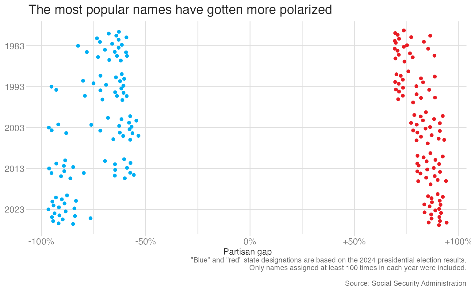
The partisan names dataset contains the SSA-reported popularity of US baby names by year and state, augmented with the 2024 presidential election result for each state. The variable part_diff measures the partisan gap: the percentage-point difference in how common a name is in states won by Trump vs. states won by Harris.
A beeswarm plot (via geom_quasirandom() from {ggbeeswarm}) distributes points to avoid overplotting while preserving the per-year grouping:
static_plot <-ggplot(data = partisan_names,mapping =aes(x = part_diff,y =fct_rev(year),color = outcome )) +geom_quasirandom() +scale_x_continuous(labels =label_percent(style_positive ="plus")) +scale_color_manual(values =c(dem, rep), guide ="none") +labs(title ="The most popular names have gotten more polarized",x ="Partisan gap",y =NULL,caption ='"Blue" and "red" state designations are based on the 2024 presidential election results.\nOnly names assigned at least 100 times in each year were included.\n\nSource: Social Security Administration' )static_plot
The distribution is clear — names are more polarized in recent years — but individual points are unidentifiable. Interactivity solves this.
Making it interactive
Replace geom_quasirandom() with geom_quasirandom_interactive() and add tooltip and data_id:
interactive_plot <-ggplot(data = partisan_names,mapping =aes(x = part_diff,y =fct_rev(year),color = outcome )) +geom_quasirandom_interactive(mapping =aes(tooltip = name, data_id = name) ) +scale_x_continuous(labels =label_percent(style_positive ="plus")) +scale_color_manual(values =c(dem, rep), guide ="none") +labs(title ="The most popular names have gotten more polarized",x ="Partisan gap",y =NULL,caption ='"Blue" and "red" state designations are based on the 2024 presidential election results.\nOnly names assigned at least 100 times in each year were included.\n\nSource: Social Security Administration' )girafe(ggobj = interactive_plot)
1
data_id = name means that hovering over a name highlights that same name across all years — you can track “Emma” or “James” up and down the chart.
Adding a rich tooltip
A richer tooltip that includes the year, direction, and formatted percentage makes the hover experience more informative. Build the tooltip string as a new column with mutate():
Shorten “Trump”/“Harris” to “R”/“D” for compact display.
2
str_glue() combines the year, name, formatted percentage, and party abbreviation into a single HTML string.
# A tibble: 200 × 5
   year  name     part_diff outcome_short fancy_label
   <fct> <chr>        <dbl> <chr>         <glue>
 1 1983  Kendrick     0.884 R             1983: Kendrick<br>+88% R
 2 1983  Trey         0.864 R             1983: Trey<br>+86% R
 3 1983  Rodrick      0.854 R             1983: Rodrick<br>+85% R
 4 1983  Ashlea       0.833 R             1983: Ashlea<br>+83% R
 5 1983  Tosha        0.780 R             1983: Tosha<br>+78% R
 6 1983  Misti        0.773 R             1983: Misti<br>+77% R
 7 1983  Latoria      0.767 R             1983: Latoria<br>+77% R
 8 1983  Jackie       0.753 R             1983: Jackie<br>+75% R
 9 1983  Demarcus     0.740 R             1983: Demarcus<br>+74% R
10 1983  Angelia      0.737 R             1983: Angelia<br>+74% R
# ℹ 190 more rows
Interactivity shifts the reader from passive viewer to active explorer — use it when your audience benefits from being able to investigate details on demand
The core principle: overview first, zoom and filter, then details on demand
{ggiraph} converts {ggplot2} plots to interactive SVG widgets by replacing standard geoms with _interactive variants and wrapping in girafe()
The three key aesthetics are tooltip (hover text, accepts HTML), data_id (links related elements for coordinated highlighting), and onclick (JavaScript behavior on click)
Use str_glue() with HTML tags to build rich, multi-line tooltip strings from data values