From static to motion: Animated charts
Notes
NoteLearning objectives
- Identify the rationale for animated data visualizations
- Define the grammar of animation
- Review the major components of the grammar of animation
- Implement animated charts using {gganimate}
Animation adds a temporal or sequential dimension to a chart. The core question is whether that dimension carries meaningful information that a static chart cannot show.
Animation works well when:
- Data has a natural time axis and change over time is the story
- Multiple states of the same data need to be compared (e.g., filtered subsets)
- A sequential process should be made explicit — such as layers accumulating or a line being drawn
Animation works poorly when:
- The audience needs to make precise comparisons across time points
- The transitions between states are not meaningful
- The chart will be printed or viewed in a context where it cannot be replayed
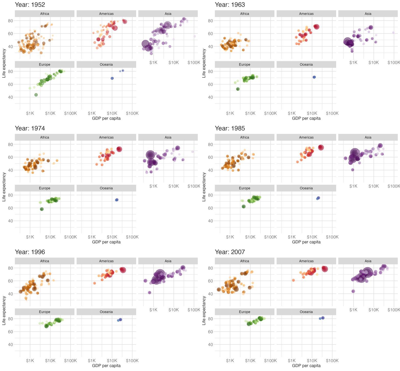
The Gapminder dataset — GDP per capita vs. life expectancy from 1952 to 2007 — is a canonical example where animation pays off: the global story of development is most powerful when you can watch it unfold year by year.
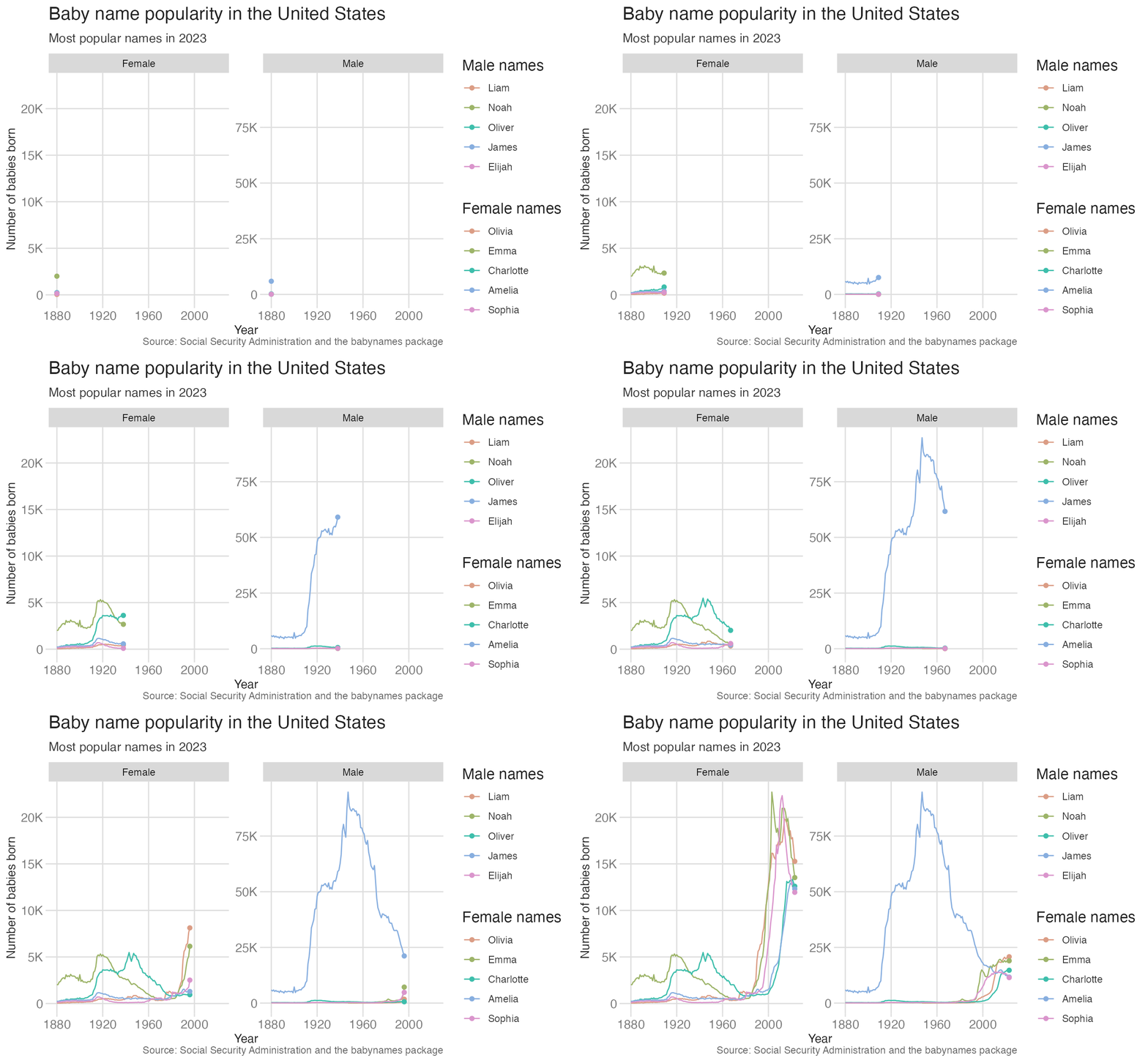
Compare this to an animated line chart showing the popularity of the top 5 baby names in the US over time. The story here is not the overall trend in baby name popularity, but the individual trajectories of specific names. It’s not clear that animation adds value here — the same information could be conveyed with a static line chart.
Getting started with {gganimate}
{gganimate} extends the grammar of graphics as implemented by {ggplot2} to include the description of animation. It provides a range of new grammar classes that can be added to the plot object in order to customize how it should change with time.
The basic workflow is:
- Build a static {ggplot2} plot
- Add one or more {gganimate} grammar classes
- Render by printing the plot object (or explicitly with
animate())
Building up to animation
The cleanest way to understand the {gganimate} API is to start with a static plot and add animation in a single step. The {babynames} package provides Social Security Administration records of US baby name popularity by year and sex.
p <- ggplot(
data = babynames |> filter(name == "Benjamin", sex == "M"),
mapping = aes(x = year, y = n)
) +
geom_line() +
labs(
x = "Year",
y = "Number of births",
title = "Popularity of 'Benjamin' over time"
)
# static plot
p
# animated plot
p +
transition_reveal(year)- 1
-
Filter the
babynamesdataset to male babies named Benjamin. - 2
-
Map
yearto x and birth count to y. - 3
- Draw a line connecting yearly counts.
- 4
-
transition_reveal(year)incrementally uncovers the line along theyearaxis — each animation frame shows data up to a given year, so the line appears to be drawn from left to right.
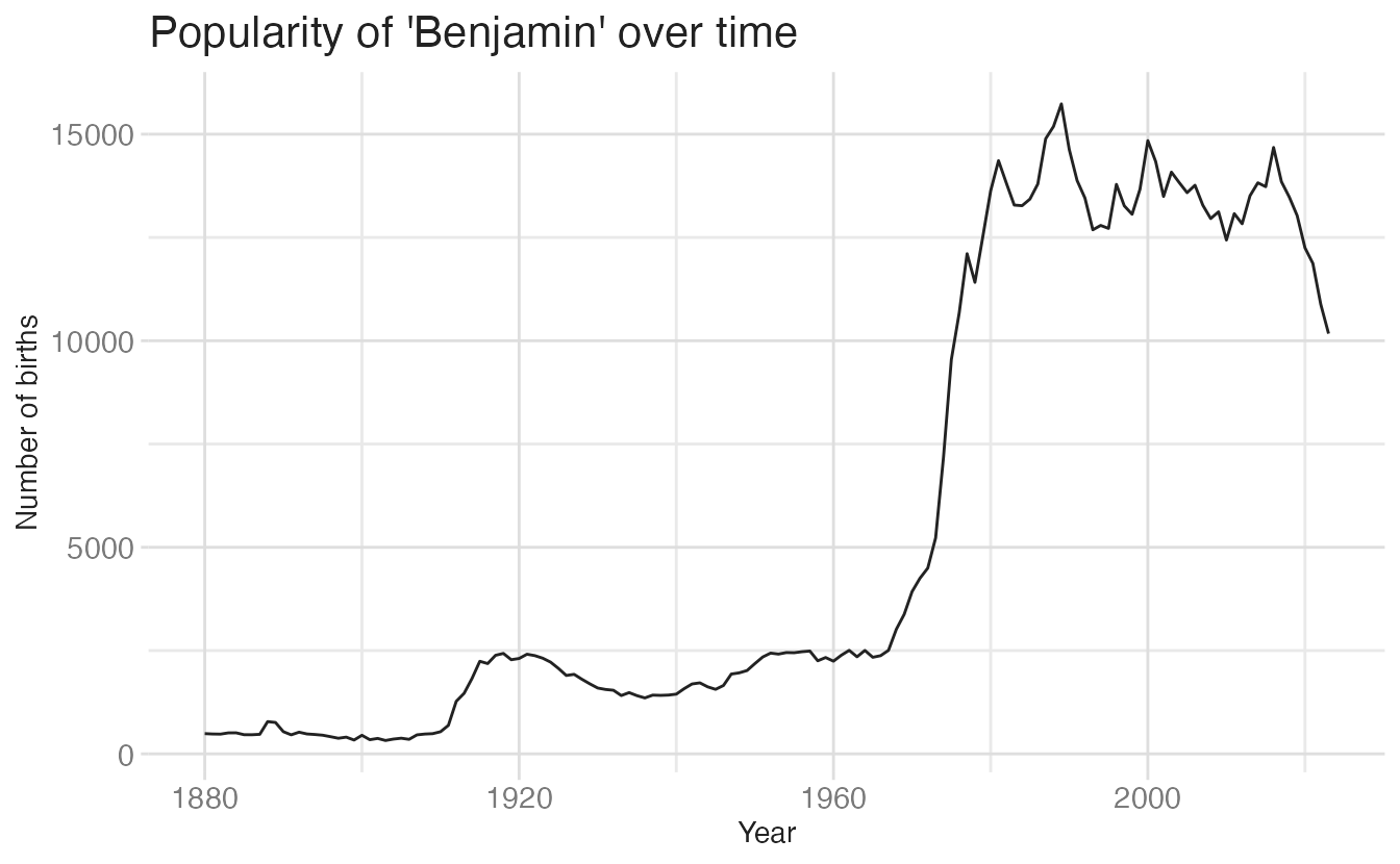
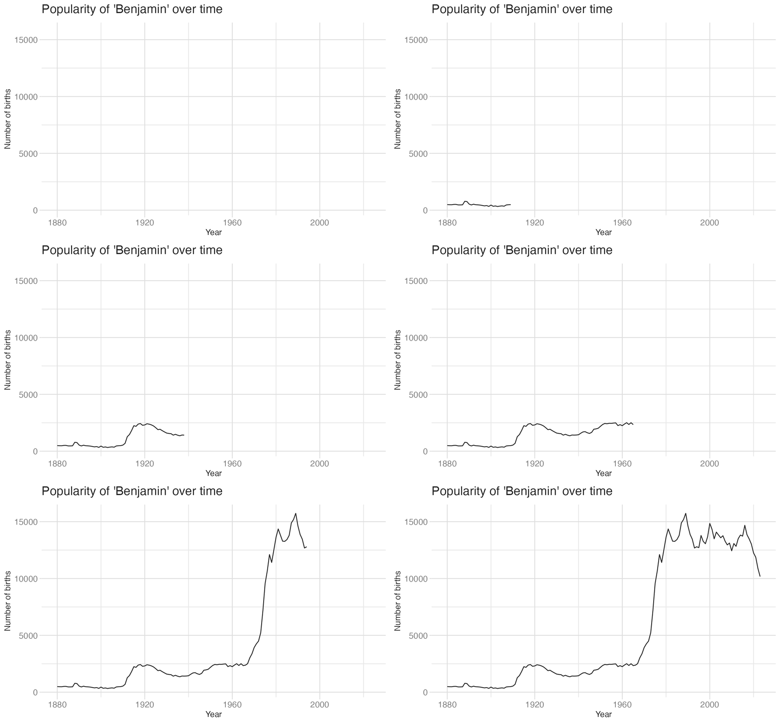
Without transition_reveal(), this is a standard line chart. Adding the transition converts it into an animation where time is made explicit through motion.
Grammar of animation
Just as {ggplot2} has a grammar built from layers, scales, and coordinates, {gganimate} has a grammar of animation built from five component types:
- Transitions: How the data changes across frames
- Views: How the plot window (axes) changes across frames
- Shadows: Whether — and how — data from previous frames persists
- Entrances/Exits: How elements appear and disappear
- Easing: How aesthetic values interpolate between states
Transitions
Transitions are the core of any animation. They define how data is spread across frames.
| Function | Description |
|---|---|
transition_manual() |
Build an animation frame by frame (no tweening applied). |
transition_states() |
Transition between frames of a plot (like moving between facets). |
transition_time() |
Like `transition_states()`, except animation pacing respects time. |
transition_components() |
Independent animation of plot elements (by group). |
transition_reveal() |
Gradually extends the data used to reveal more information. |
transition_layers() |
Animate the addition of layers to the plot. Can also remove layers. |
transition_filter() |
Transition between a collection of subsets from the data. |
transition_events() |
Define entrance and exit times of each visual element (row of data). |
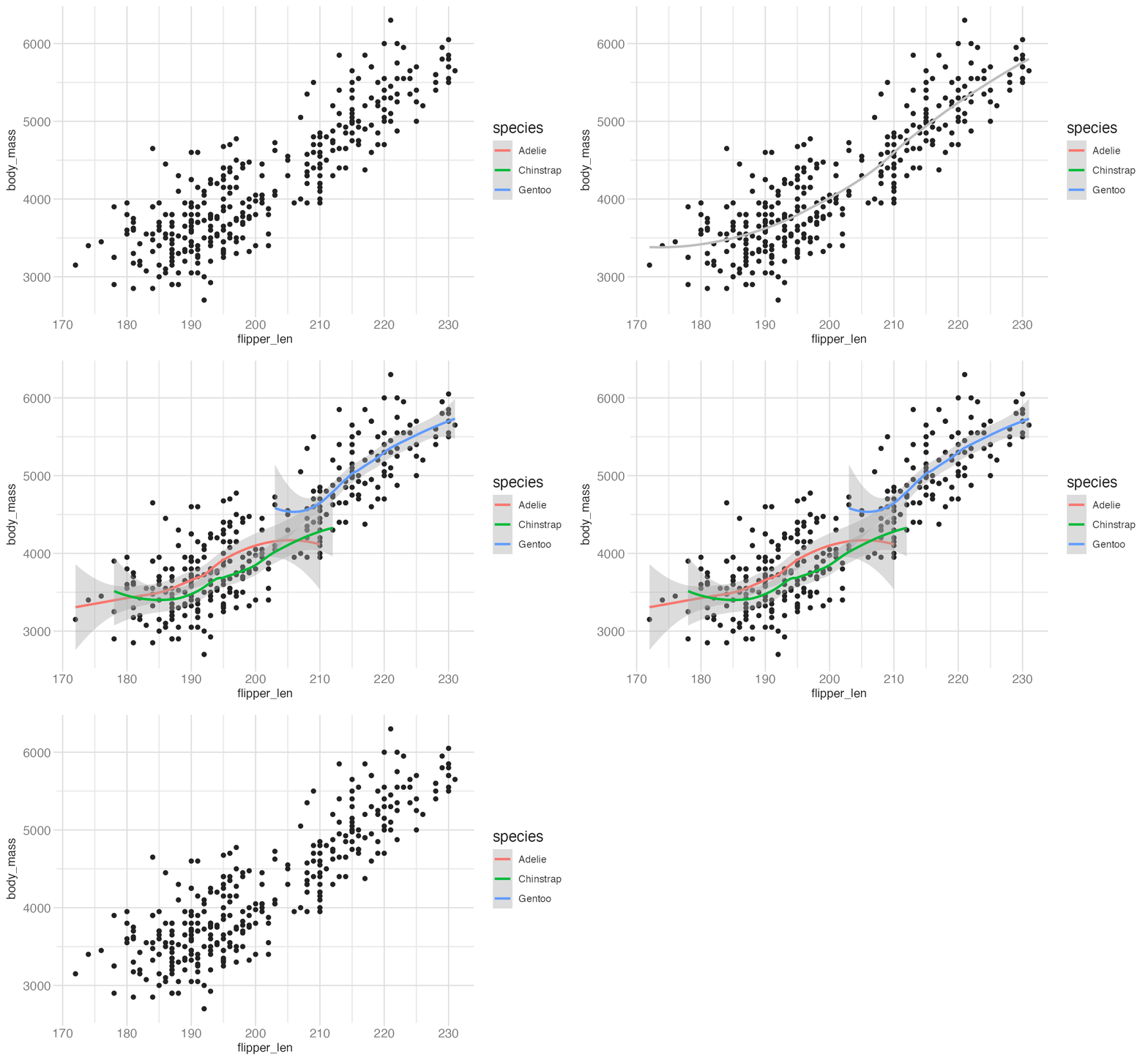
transition_layers() adds (and optionally removes) geom layers one at a time:
penguins |>
drop_na() |>
ggplot(aes(x = flipper_len, y = body_mass)) +
geom_point() +
geom_smooth(color = "grey", se = FALSE, method = "loess", formula = y ~ x) +
geom_smooth(aes(color = species)) +
transition_layers(
layer_length = 1,
transition_length = 2,
from_blank = FALSE,
keep_layers = c(Inf, 0, 0)
)- 1
-
keep_layerscontrols how long each layer persists.Infkeeps the base point layer indefinitely;0means each smooth is removed before the next one appears.
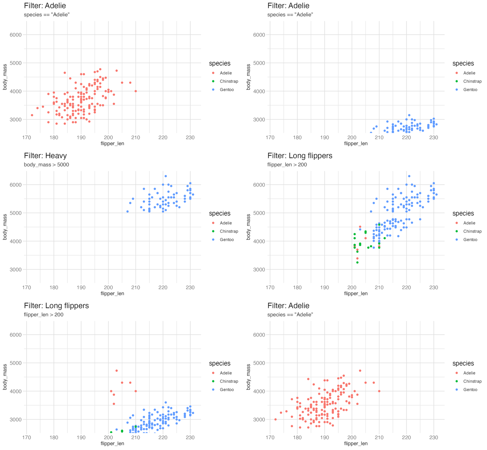
transition_filter() cycles through different subsets of the data:
penguins |>
drop_na() |>
ggplot(aes(x = flipper_len, y = body_mass, color = species)) +
geom_point() +
transition_filter(
transition_length = 2,
filter_length = 1,
Adelie = species == "Adelie",
Heavy = body_mass > 5000,
`Long flippers` = flipper_len > 200,
keep = TRUE
) +
ggtitle(
"Filter: {closest_filter}",
subtitle = "{closest_expression}"
) +
enter_fade() +
exit_fly(y_loc = 0)- 1
- Each named argument defines a filter condition; the animation cycles through them.
- 2
-
{closest_filter}and{closest_expression}are {gganimate} label variables — they display the name and expression of the current filter condition.
Views
Views control how the plot axes change during the animation. Without a view function, the axes are fixed at their initial range for the full animation.
| Function | Description |
|---|---|
view_follow() |
Change the view to follow the range of current data. |
view_step() |
Similar to view_follow(), except the view is static between transitions. |
view_step_manual() |
Same as view_step(), except view ranges are manually defined. |
view_zoom() |
Similar to view_step(), but appears smoother by zooming out then in. |
view_zoom_manual() |
Same as view_zoom(), except view ranges are manually defined. |
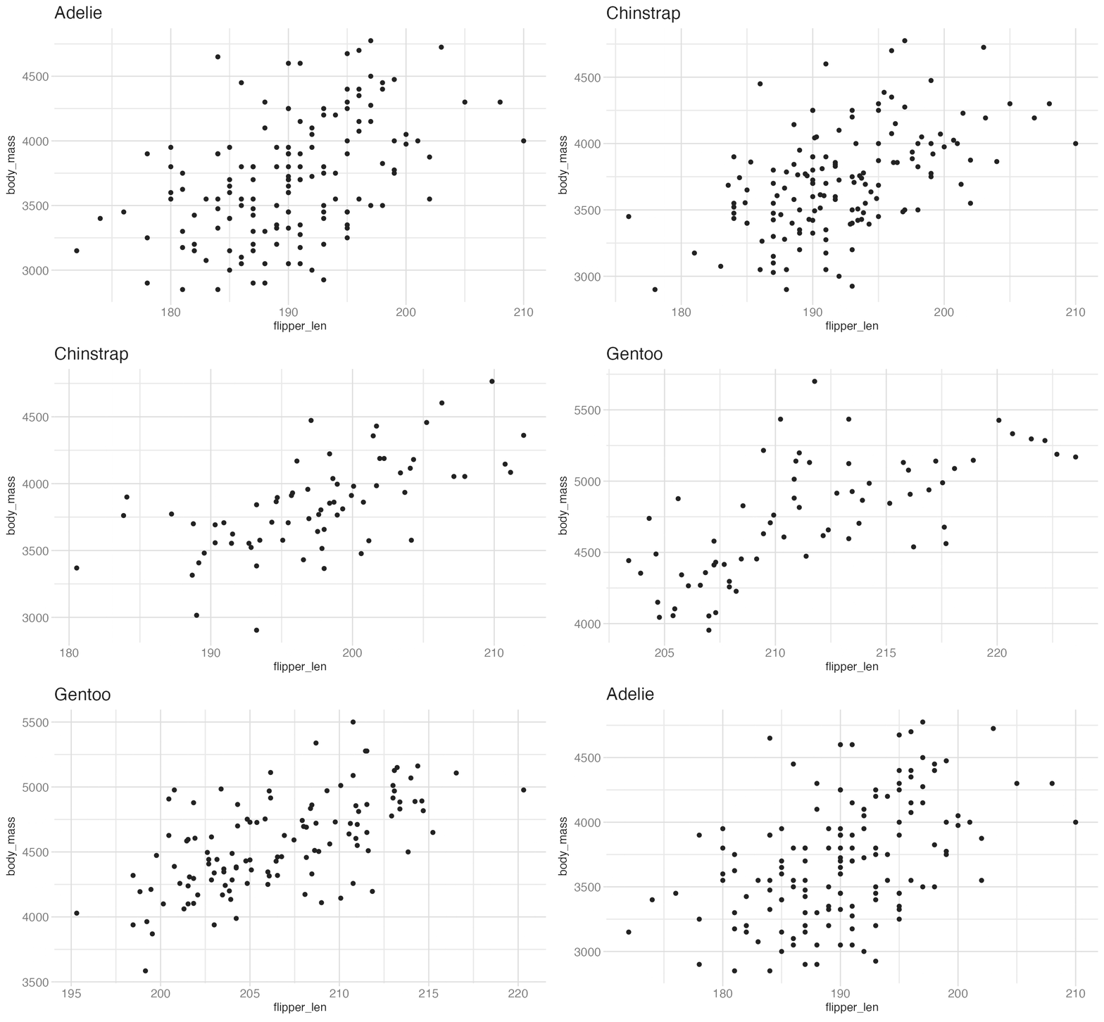
view_follow() rescales the axes to track the current data range:
penguins |>
drop_na() |>
ggplot(aes(x = flipper_len, y = body_mass)) +
geom_point() +
labs(title = "{closest_state}") +
transition_states(
species,
transition_length = 4,
state_length = 2
) +
view_follow()- 1
-
view_follow()zooms the axes to the range of the currently displayed data — useful when different states have meaningfully different scales.
Shadows
Shadows determine whether data from previous frames persists as a ghost or trail behind the current frame.
| Function | Description |
|---|---|
shadow_mark() |
Previous (and/or future) frames leave permanent background marks. |
shadow_trail() |
Similar to shadow_mark(), except marks are from tweened data. |
shadow_wake() |
Shows a shadow which diminishes in size and/or opacity over time. |
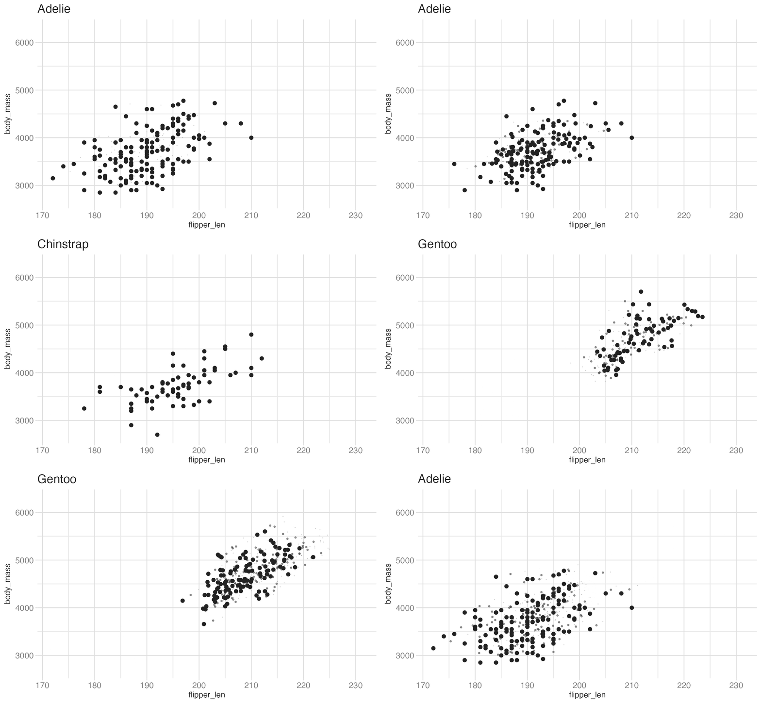
shadow_wake() leaves a fading trail behind moving points:
penguins |>
drop_na() |>
ggplot(aes(x = flipper_len, y = body_mass)) +
geom_point(size = 2) +
labs(title = "{closest_state}") +
transition_states(
species,
transition_length = 4,
state_length = 1
) +
shadow_wake(wake_length = 0.1)- 1
-
wake_length = 0.1means the trail spans 10% of the animation duration. Points near the head are full size; they shrink toward zero at the tail.
shadow_mark() leaves permanent marks from each previous frame — useful for showing cumulative change:
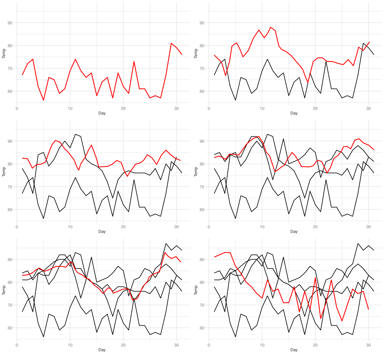
ggplot(airquality, aes(Day, Temp)) +
geom_line(color = "red", linewidth = 1) +
transition_time(Month) +
shadow_mark(color = "black", linewidth = 0.75)- 1
- The current month’s temperature profile is drawn in red.
- 2
-
shadow_mark()renders each previous month’s line in black, accumulating across the animation.
Entrances and exits
Entrance and exit functions control how new data elements appear and how old elements disappear during transitions.
| Function | Description |
|---|---|
enter_appear()/exit_disappear() |
Instantly appears or disappears. |
enter_fade()/exit_fade() |
Opacity fades in or out. |
enter_grow()/exit_shrink() |
Element size grows from or shrinks to zero. |
enter_recolor()/exit_recolor() |
Element color blends in from or out to the background. |
enter_fly()/exit_fly() |
Elements move from/to a specific x,y position. |
enter_drift()/exit_drift() |
Elements shift relative from/to their x,y position. |
enter_reset()/exit_reset() |
Clear all previously added entrances/exits. |
Easing
Easing controls how aesthetic values interpolate between keyframes. Without easing, all transitions are linear. With easing, transitions can accelerate, decelerate, or overshoot.
p + ease_aes({aesthetic} = {ease})
p + ease_aes(x = "cubic")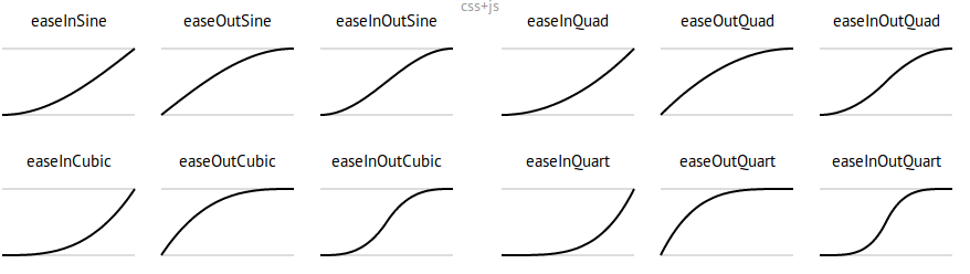
The default is "linear". Common alternatives: "cubic-in-out" for smooth deceleration, "bounce-out" for bouncy arrivals.
Deeper dive: the datasaurus dozen
The datasaurus dozen is a collection of 13 datasets with nearly identical summary statistics (mean, standard deviation, correlation) but very different shapes when plotted. It was designed to demonstrate why summary statistics alone are insufficient — you must always visualize your data.
Animation is particularly effective here: rather than 13 facet panels, a single animated plot cycles through all 13 shapes, letting the viewer appreciate both the visual diversity and the statistical sameness.
Start by plotting all datasets as a plain scatter:
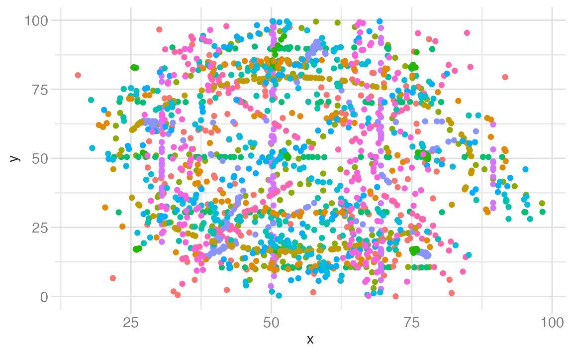
ggplot(datasaurus_dozen, aes(x, y, color = dataset)) +
geom_point() +
guides(color = "none")- 1
- All 13 datasets overlap in a single panel. The individual shapes are invisible.
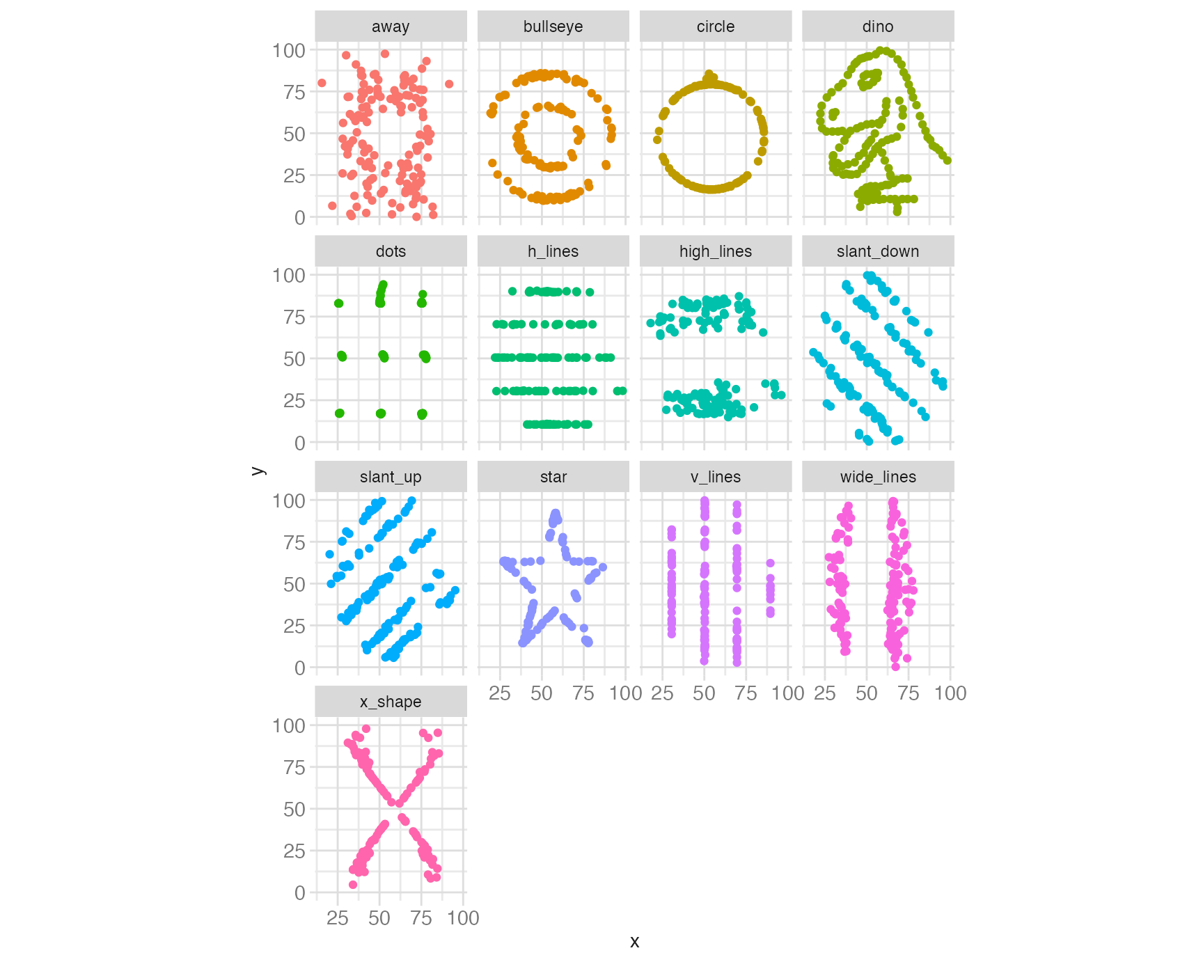
Use facet_wrap() to reveal each shape:
ggplot(datasaurus_dozen, aes(x, y, color = dataset)) +
geom_point() +
facet_wrap(facets = vars(dataset)) +
coord_cartesian(ratio = 1) +
guides(color = "none")- 1
- Each dataset gets its own panel. The dinosaur, star, and circle shapes are now visible — all with x mean ≈ 54.3, y mean ≈ 47.8, and correlation ≈ −0.06.
Replace the facets with animation to experience each shape sequentially:
ggplot(datasaurus_dozen, aes(x, y)) +
geom_point() +
coord_cartesian(ratio = 1) +
transition_states(dataset, 3, 1) +
labs(title = "Dataset: {closest_state}")- 1
-
transition_states(dataset, 3, 1)cycles through each unique value ofdataset.3is the transition length (frames spent morphing between states);1is the state length (frames spent paused on each state). - 2
-
{closest_state}is a {gganimate} label variable that displays the name of the current state.
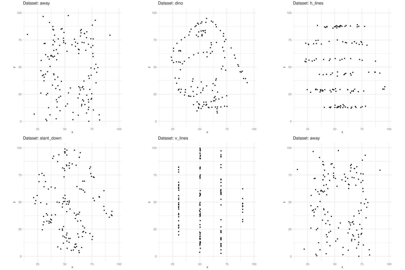
The animation makes a point the facets cannot: you watch the same point cloud morph between radically different shapes while the underlying statistics remain fixed.
Animation controls
By default, animate() renders 100 frames at 10 frames per second. Adjust via the gganimate chunk option in Quarto:
```{r}
#| gganimate: !expr list(nframes = 50, fps = 20)
# animation code here
```
Key parameters:
nframes: total frames to render (default 100)fps: playback speed in frames per second (default 10)duration: length of the animation in seconds (overridesnframes/fpsif set)end_pause: extra frames to hold on the final state before looping
To save an animation to disk:
anim <- my_plot + transition_reveal(year)
animate(anim, nframes = 200, fps = 25, end_pause = 30)
anim_save("output.gif")
See the full reference at https://gganimate.com/reference/animate.html.
Considerations for effective animation
Pace — Animation speed determines whether the viewer can absorb each frame. Fast animations lose detail; slow animations become tedious. A good starting point is 10 fps with enough frames that each state is held for at least 0.5–1 second.
Perplexity — How much is changing at once? If multiple dimensions change simultaneously, it is difficult to know where to look. When complexity is unavoidable, consider breaking one complex animation into several simpler ones shown side by side.
Purpose — Does animation add value? If the insight is visible in a static chart, animation adds cognitive load without payoff. Animation earns its complexity when the temporal or sequential dimension is itself the story — not when it is used as decoration.
Summary
- Animation adds a temporal dimension to {ggplot2} plots without changing the underlying grammar — add one {gganimate} class to an existing static plot
- The grammar of animation has five components: transitions, views, shadows, entrances/exits, and easing
transition_reveal()progressively uncovers data along an axis;transition_states()cycles through categorical states;transition_time()animates along a continuous time variable- Evaluate animations on pace, perplexity, and purpose — use motion when it earns its complexity, not as decoration
Acknowledgements
Material derived in part from Advanced Data Visualization.
Footnotes
Source: easings.net↩︎