Adjusting scales for World Bank indicators
This application exercise is completed in class and submitted via a worksheet.
Data: World economic measures
The World Bank publishes a rich and detailed set of socioeconomic indicators spanning several decades and dozens of topics. Here we focus on a few key indicators for the year 2024.
-
gdp_per_cap- GDP per capita (current USD) -
pop- Total population -
life_exp- Life expectancy at birth, total (years) -
female_labor_pct- Labor force, female (% of total labor force) -
income_level- Classification of economies based on national income levels
The data is stored in wb-indicators.rds. To import the data, use the read_rds() function.
world_bank <- read_rds("data/wb-indicators.rds")Customize scales
Let’s consider the relationship between female labor participation and per capita GDP. We’ll use the income_level variable to color the points and provide context on the overall wealth of the countries.1
Let’s generate a color-coded scatterplot with a single smoothing line.
ggplot(
  data = world_bank,
  mapping = aes(x = female_labor_pct, y = gdp_per_cap)
) +
  geom_point(mapping = aes(color = income_level)) +
  geom_smooth(se = FALSE)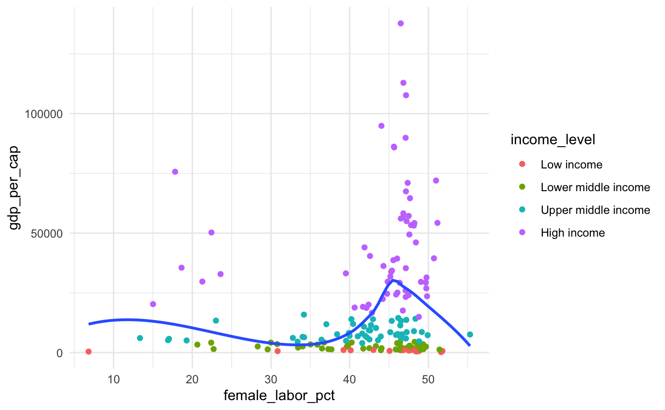
This is a good starting point, but to improve the interpretability of the chart we need to clean up the scales and guides.
Your turn: Identify any interpretability issues with the plot above. Propose at least five adjustments to the scales and/or guides that would improve the plot.
Footnotes
Note that the income level is based on the GNI per capita, which is strongly correlated with GDP per capita, but not exactly the same.↩︎