Critique a visualization
Application exercise
Critique a data visualization using Alberto Cairo’s five qualities of great visualizations and propose design improvements.
Note
This application exercise is completed in class and submitted via a worksheet.
The five qualities of great visualizations
Alberto Cairo, in his book The Truthful Art, outlines five qualities of great visualizations:
- Truthful: The visualization should not distort the data.
- Functional: The visualization should be easy to read and interpret.
- Beautiful: The visualization should be aesthetically pleasing.
- Insightful: The visualization should help the viewer understand the data.
- Enlightening: The visualization should help the viewer see the data in a new way.
Instructions
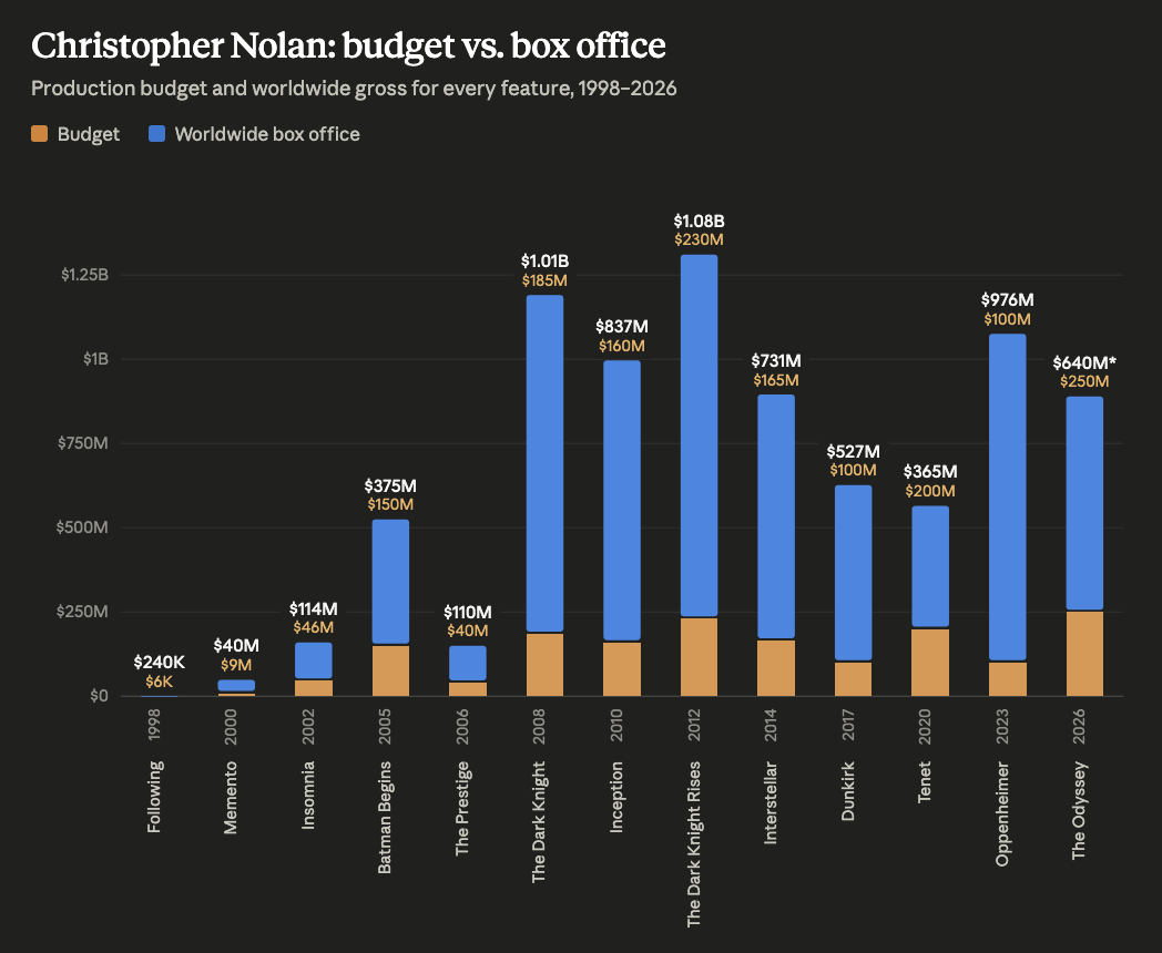
For one of the visualizations below, critique the visualization using Cairo’s qualities. What is effective about the chart? What could be improved?
Identify at least three design choices that could be implemented to improve the visualization. Be detailed. Possible approaches could include:
- Different chart type
- Additional layers
- New color palette
- Annotations (text, arrows, highlighting, etc.)
- Different theming
Visualizations
Group A
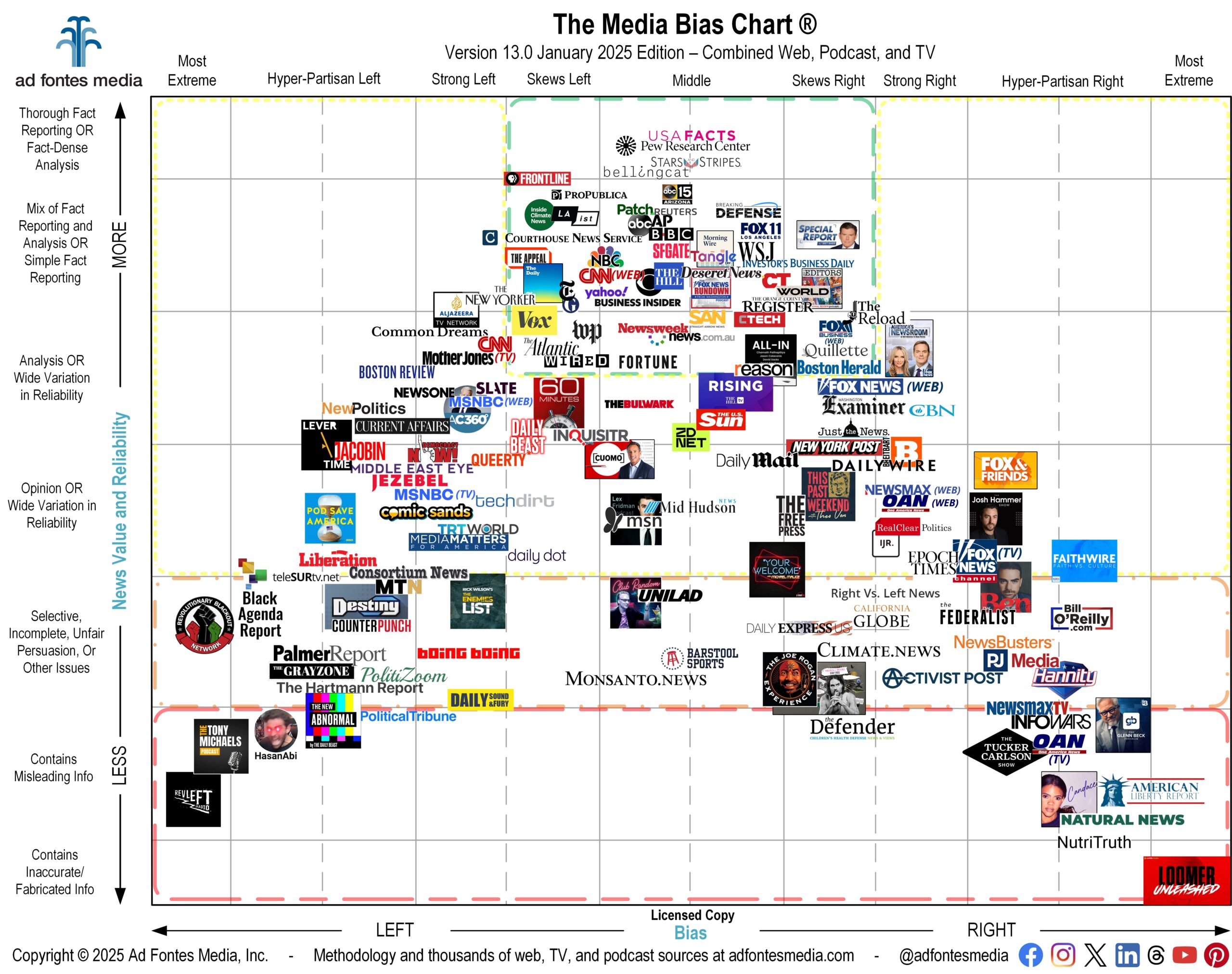
Group B
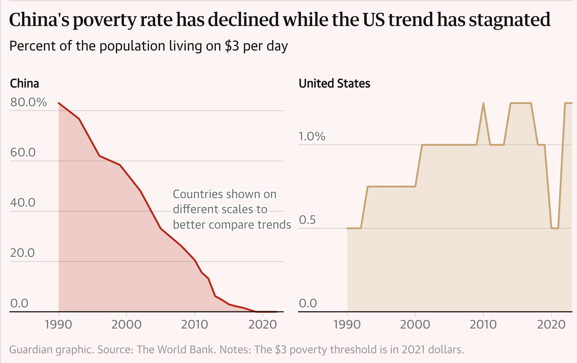
Group C