Adjusting scales for World Bank indicators
This application exercise is designed to be run in your web browser using the {webr} framework. Simply work through the exercises and use the provided code cells to execute live R code in your browser.
Data: World economic measures
The World Bank publishes a rich and detailed set of socioeconomic indicators spanning several decades and dozens of topics. Here we focus on a few key indicators for the year 2021.
-
gdp_per_cap- GDP per capita (current USD) -
pop- Total population -
life_exp- Life expectancy at birth, total (years) -
female_labor_pct- Labor force, female (% of total labor force) -
income_level- Classification of economies based on national income levels
The data is stored in wb-indicators.rds. To import the data, use the read_rds() function.
world_bank <- read_rds("data/wb-indicators.rds")Part 1: Transforming axes
Is there a relationship between a country’s per capita GDP and life expectancy? Let’s explore this relationship using a scatterplot.
ggplot(data = world_bank, mapping = aes(x = gdp_per_cap, y = life_exp)) +
  geom_point() +
  labs(
    title = "Countries with higher GDP tend to have higher life expectancy",
    x = "GDP per capita (current USD)",
    y = "Life expectancy at birth (years)"
  )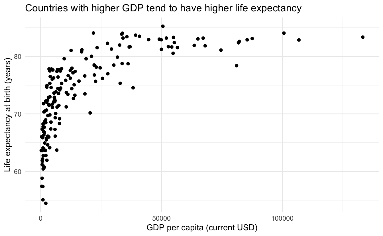
Seems like there is an association, but the relationship is not linear. Let’s try a log transformation on the \(x\)-axis to see if that helps.
Your turn: Log-transform the \(x\)-axis by mutating the original column prior to graphing.
Your turn: Now log-transform the \(x\)-axis by using the original per capita GDP measure and an appropriate scale_x_*() function.
ggplot(data = world_bank, mapping = aes(x = gdp_per_cap, y = life_exp)) +
  geom_point() +
  scale_x_log10() +
  labs(
    title = "Countries with higher GDP tend to have higher life expectancy",
    x = "GDP per capita (current USD, log10 scale)",
    y = "Life expectancy at birth"
  )
Your turn: Which is more interpretable, and why?
Log-transforming the column first results in a plot with non-sensical labels on the \(x\)-axis — people do not intuitively understand log scales and have to exponentiate out of them to read the values. This is especially problematic with natural logarithms.
Using scale_x_log10() keeps the original values as labels on a log-scaled axis, making them directly human-readable.
Part 2: Customize scales
Let’s consider the relationship between female labor participation and per capita GDP. We’ll use the income_level variable to color the points and provide context on the overall wealth of the countries.1
Step 1: Base plot
First, let’s generate a color-coded scatterplot with a single smoothing line.
ggplot(
  data = world_bank,
  mapping = aes(x = female_labor_pct, y = gdp_per_cap)
) +
  geom_point(mapping = aes(color = income_level)) +
  geom_smooth(se = FALSE)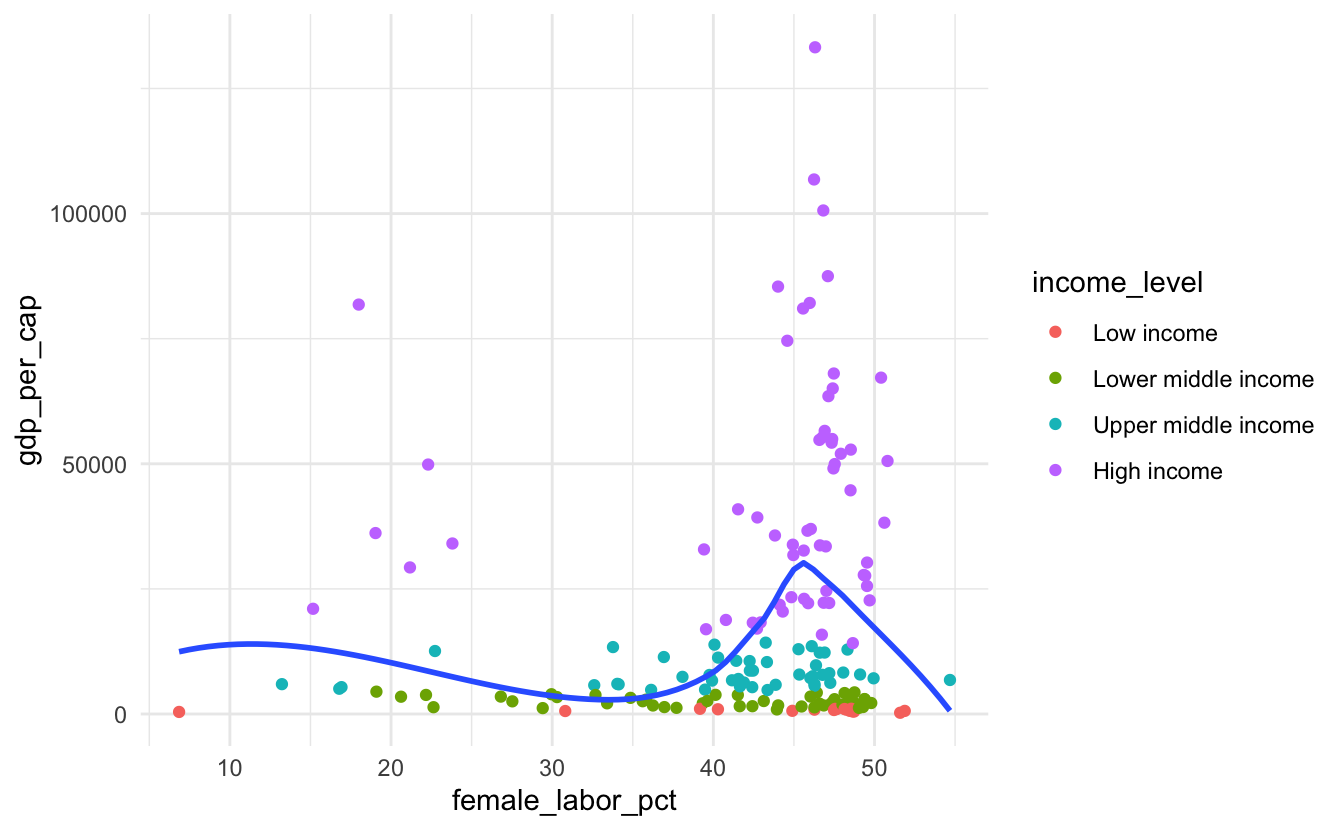
Step 2: Your turn
Now, let’s modify the scales to make the chart more readable. Log-transform the \(y\)-axis and format the labels so they are explicitly identified as percentages and currency.
ggplot(
  data = world_bank,
  mapping = aes(x = female_labor_pct, y = gdp_per_cap)
) +
  geom_point(mapping = aes(color = income_level)) +
  geom_smooth(se = FALSE) +
  scale_x_continuous(labels = label_percent(scale = 1)) +
  scale_y_log10(labels = label_currency(scale_cut = cut_short_scale()))
Step 3: Your turn
Add human-readable labels for the title, axes, and legend.
ggplot(
  data = world_bank,
  mapping = aes(x = female_labor_pct, y = gdp_per_cap)
) +
  geom_point(mapping = aes(color = income_level)) +
  geom_smooth(se = FALSE) +
  scale_x_continuous(labels = label_percent(scale = 1)) +
  scale_y_log10(labels = label_currency(scale_cut = cut_short_scale())) +
  labs(
    title = "Female labor participation is weakly correlated with per capita GDP",
    x = "Female labor (percentage of total workforce)",
    y = "GDP per capita (current USD)",
    color = "Level of income"
  )
Step 4: Your turn
Use the {viridis} color palette for income_level.
The bright yellow at the end of the palette is hard on the eyes. You can condense the hue at which the color map ends using the end argument to the appropriate scale_color_*() function.
ggplot(
  data = world_bank,
  mapping = aes(x = female_labor_pct, y = gdp_per_cap)
) +
  geom_point(mapping = aes(color = income_level)) +
  geom_smooth(se = FALSE) +
  scale_x_continuous(labels = label_percent(scale = 1)) +
  scale_y_log10(labels = label_currency(scale_cut = cut_short_scale())) +
  scale_color_viridis_d(end = 0.8) +
  labs(
    title = "Female labor participation is weakly correlated with per capita GDP",
    x = "Female labor (percentage of total workforce)",
    y = "GDP per capita (current USD)",
    color = "Level of income"
  )
Step 5: Your turn
Double-encode the income_level variable by using both color and shape to represent the same variable. Condense the guides so you use a single legend.
When both color and shape have the same label, ggplot2 automatically merges them into a single legend.
ggplot(
  data = world_bank,
  mapping = aes(x = female_labor_pct, y = gdp_per_cap)
) +
  geom_point(mapping = aes(color = income_level, shape = income_level)) +
  geom_smooth(se = FALSE) +
  scale_x_continuous(labels = label_percent(scale = 1)) +
  scale_y_log10(labels = label_currency(scale_cut = cut_short_scale())) +
  scale_color_viridis_d(end = 0.8) +
  labs(
    title = "Female labor participation is weakly correlated with per capita GDP",
    x = "Female labor (percentage of total workforce)",
    y = "GDP per capita (current USD)",
    color = "Level of income",
    shape = "Level of income"
  )
Step 6: Your turn
It’s annoying that the order of the values in the legend are opposite from how the income levels are ordered in the chart. Reverse the order of the values in the legend so they correspond to the ordering on the \(y\)-axis.
ggplot(
  data = world_bank,
  mapping = aes(x = female_labor_pct, y = gdp_per_cap)
) +
  geom_point(mapping = aes(color = income_level, shape = income_level)) +
  geom_smooth(se = FALSE) +
  scale_x_continuous(labels = label_percent(scale = 1)) +
  scale_y_log10(labels = label_currency(scale_cut = cut_short_scale())) +
  scale_color_viridis_d(end = 0.8, guide = guide_legend(reverse = TRUE)) +
  scale_shape_discrete(guide = guide_legend(reverse = TRUE)) +
  labs(
    title = "Female labor participation is weakly correlated with per capita GDP",
    x = "Female labor (percentage of total workforce)",
    y = "GDP per capita (current USD)",
    color = "Level of income",
    shape = "Level of income"
)sessioninfo::session_info()─ Session info ───────────────────────────────────────────────────────────────
setting value
version R version 4.5.2 (2025-10-31)
os macOS Tahoe 26.5
system aarch64, darwin20
ui X11
language (EN)
collate en_US.UTF-8
ctype en_US.UTF-8
tz America/New_York
date 2026-05-24
pandoc 3.8.3 @ /Applications/Positron.app/Contents/Resources/app/quarto/bin/tools/aarch64/ (via rmarkdown)
quarto 1.10.3 @ /Applications/quarto/bin/quarto
─ Packages ───────────────────────────────────────────────────────────────────
! package * version date (UTC) lib source
P cli 3.6.6 2026-04-09 [?] RSPM
P digest 0.6.39 2025-11-19 [?] RSPM (R 4.5.0)
P dplyr * 1.2.1 2026-04-03 [?] RSPM
P evaluate 1.0.5 2025-08-27 [?] RSPM (R 4.5.0)
P farver 2.1.2 2024-05-13 [?] RSPM (R 4.5.0)
P fastmap 1.2.0 2024-05-15 [?] RSPM (R 4.5.0)
P forcats * 1.0.1 2025-09-25 [?] RSPM (R 4.5.0)
P generics 0.1.4 2025-05-09 [?] RSPM (R 4.5.0)
P ggplot2 * 4.0.3 2026-04-22 [?] RSPM
P glue 1.8.1 2026-04-17 [?] RSPM
P gridExtra 2.3 2017-09-09 [?] RSPM (R 4.5.0)
P gtable 0.3.6 2024-10-25 [?] RSPM (R 4.5.0)
P here 1.0.2 2025-09-15 [?] CRAN (R 4.5.0)
P hms 1.1.4 2025-10-17 [?] RSPM (R 4.5.0)
P htmltools 0.5.9 2025-12-04 [?] RSPM (R 4.5.0)
P htmlwidgets 1.6.4 2023-12-06 [?] RSPM (R 4.5.0)
P jsonlite 2.0.0 2025-03-27 [?] RSPM (R 4.5.0)
P knitr 1.51 2025-12-20 [?] RSPM (R 4.5.0)
P labeling 0.4.3 2023-08-29 [?] RSPM (R 4.5.0)
P lattice 0.22-7 2025-04-02 [?] CRAN (R 4.5.2)
P lifecycle 1.0.5 2026-01-08 [?] RSPM (R 4.5.0)
P lubridate * 1.9.5 2026-02-04 [?] RSPM
P magrittr 2.0.5 2026-04-04 [?] RSPM
P Matrix 1.7-4 2025-08-28 [?] CRAN (R 4.5.2)
P mgcv 1.9-3 2025-04-04 [?] CRAN (R 4.5.2)
P nlme 3.1-168 2025-03-31 [?] CRAN (R 4.5.2)
P otel 0.2.0 2025-08-29 [?] RSPM (R 4.5.0)
P pillar 1.11.1 2025-09-17 [?] RSPM (R 4.5.0)
P pkgconfig 2.0.3 2019-09-22 [?] RSPM (R 4.5.0)
P purrr * 1.2.2 2026-04-10 [?] RSPM
P R6 2.6.1 2025-02-15 [?] RSPM (R 4.5.0)
P RColorBrewer 1.1-3 2022-04-03 [?] RSPM (R 4.5.0)
P readr * 2.2.0 2026-02-19 [?] RSPM
P renv 1.2.3 2026-05-16 [?] RSPM
P rlang 1.2.0 2026-04-06 [?] RSPM
P rmarkdown 2.31 2026-03-26 [?] RSPM
P rprojroot 2.1.1 2025-08-26 [?] RSPM (R 4.5.0)
P S7 0.2.2 2026-04-22 [?] RSPM
P scales * 1.4.0 2025-04-24 [?] RSPM (R 4.5.0)
P sessioninfo 1.2.3 2025-02-05 [?] RSPM (R 4.5.0)
P stringi 1.8.7 2025-03-27 [?] RSPM (R 4.5.0)
P stringr * 1.6.0 2025-11-04 [?] RSPM (R 4.5.0)
P tibble * 3.3.1 2026-01-11 [?] RSPM (R 4.5.0)
P tidyr * 1.3.2 2025-12-19 [?] RSPM (R 4.5.0)
P tidyselect 1.2.1 2024-03-11 [?] RSPM (R 4.5.0)
P tidyverse * 2.0.0 2023-02-22 [?] RSPM (R 4.5.0)
P timechange 0.4.0 2026-01-29 [?] RSPM
P tzdb 0.5.0 2025-03-15 [?] RSPM (R 4.5.0)
P vctrs 0.7.3 2026-04-11 [?] RSPM
P viridis * 0.6.5 2024-01-29 [?] RSPM (R 4.5.0)
P viridisLite * 0.4.3 2026-02-04 [?] CRAN (R 4.5.2)
P withr 3.0.2 2024-10-28 [?] RSPM (R 4.5.0)
P xfun 0.57 2026-03-20 [?] RSPM
P yaml 2.3.12 2025-12-10 [?] RSPM (R 4.5.0)
[1] /Users/bcs88/Projects/info-3312/course-site/renv/library/macos/R-4.5/aarch64-apple-darwin20
[2] /Users/bcs88/Library/Caches/org.R-project.R/R/renv/sandbox/macos/R-4.5/aarch64-apple-darwin20/4cd76b74
* ── Packages attached to the search path.
P ── Loaded and on-disk path mismatch.
──────────────────────────────────────────────────────────────────────────────Footnotes
Note that the income level is based on the GNI per capita, which is strongly correlated with GDP per capita, but not exactly the same.↩︎