Show the code
library(tidyverse)
library(scales)
library(colorspace)

theme_set(
  brand.yml::theme_brand_ggplot2() +
    theme(plot.caption = element_text(hjust = 1))
)This application exercise is completed in class and submitted via a worksheet.
This application exercise is designed to be run in your web browser using the {webr} framework. Simply work through the exercises and use the provided code cells to execute live R code in your browser.
library(tidyverse)
library(scales)
library(colorspace)
theme_set(
brand.yml::theme_brand_ggplot2() +
theme(plot.caption = element_text(hjust = 1))
)Since 2021, Fox News polls have asked registered voters, “How much of a problem are current gas prices for you and your family?”
# Fox News poll results among registered voters
# "(Don't know)" responses are omitted (1% or less in every poll)
fox_poll <- tribble(
  ~date        , ~major , ~minor , ~not_problem , ~wording             ,
  "2021-10-19" ,     50 ,     34 ,           15 , "Rising gas prices"  ,
  "2022-03-21" ,     52 ,     36 ,           12 , "Rising gas prices"  ,
  "2022-06-13" ,     67 ,     23 ,            9 , "Current gas prices" ,
  "2023-08-14" ,     49 ,     36 ,           14 , "Current gas prices" ,
  "2024-05-13" ,     49 ,     35 ,           16 , "Current gas prices" ,
  "2024-09-16" ,     48 ,     36 ,           15 , "Current gas prices" ,
  "2025-09-09" ,     33 ,     43 ,           24 , "Current gas prices" ,
  "2026-04-20" ,     60 ,     29 ,           11 , "Current gas prices" ,
  "2026-09-14" ,     61 ,     29 ,           10 , "Current gas prices"
) |>
  mutate(date = ymd(date))

fox_poll |>
  pivot_longer(
    cols = c(major, minor, not_problem),
    names_to = "response",
    values_to = "pct"
  ) |>
  mutate(
    response = factor(
      response,
      levels = c("major", "minor", "not_problem"),
      labels = c("Major problem", "Minor problem", "Not a problem")
    )
  ) |>
  ggplot(mapping = aes(x = date, y = pct / 100, color = response)) +
  geom_line() +
  geom_point() +
  scale_y_continuous(labels = label_percent(), limits = c(0, NA)) +
  scale_color_viridis_d(end = 0.8) +
  labs(
    title = "Gas prices as a problem for families, 2021-2026",
    subtitle = "\"How much of a problem are current gas prices for you and your family?\"",
    x = NULL,
    y = "Percent of registered voters",
    color = NULL,
    caption = "Source: Fox News polls.\nOctober 2021 and March 2022 polls asked about \"rising gas prices.\""
  )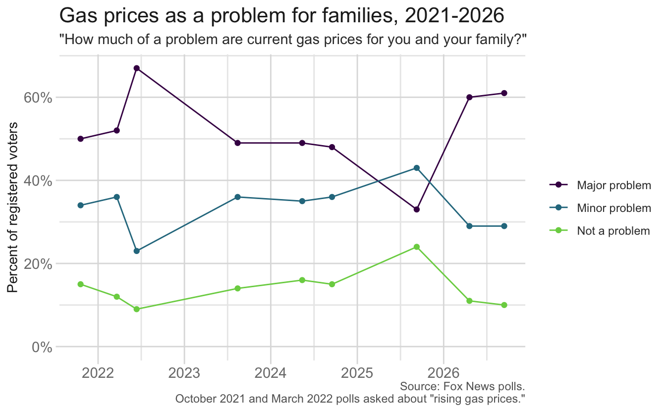
In recent months Americans have expressed increasing concerns about gas prices at the pump. Gas prices are one of the most visible prices in the economy. They are posted in large numbers on nearly every street corner, and most households pay them every week.
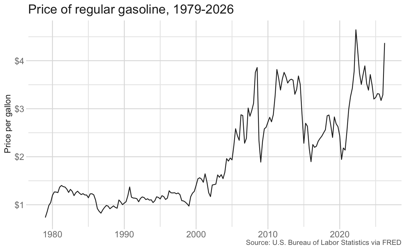
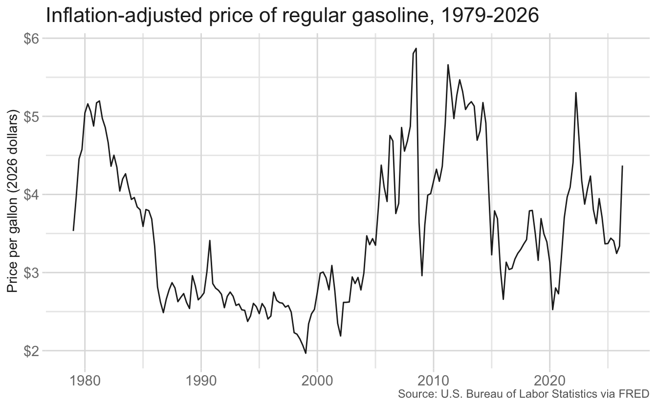
Our story starts with a simple question: how have gas prices changed over time?
Your turn: Before looking at any data, discuss with your group:
For each way of measuring gas prices your group comes up with, identify at least one strength and one weakness. Record your discussion on the worksheet.
Recall the four components of a story: Opening, Challenge, Action, and Resolution. We will start with the first two.
Your group will finish the story by identifying the Action and Resolution.
The dataset contains quarterly measures of gas prices and wages in the United States from 1979 through the second quarter of 2026. All series were obtained from FRED, the Federal Reserve Bank of St. Louis’s economic data portal.
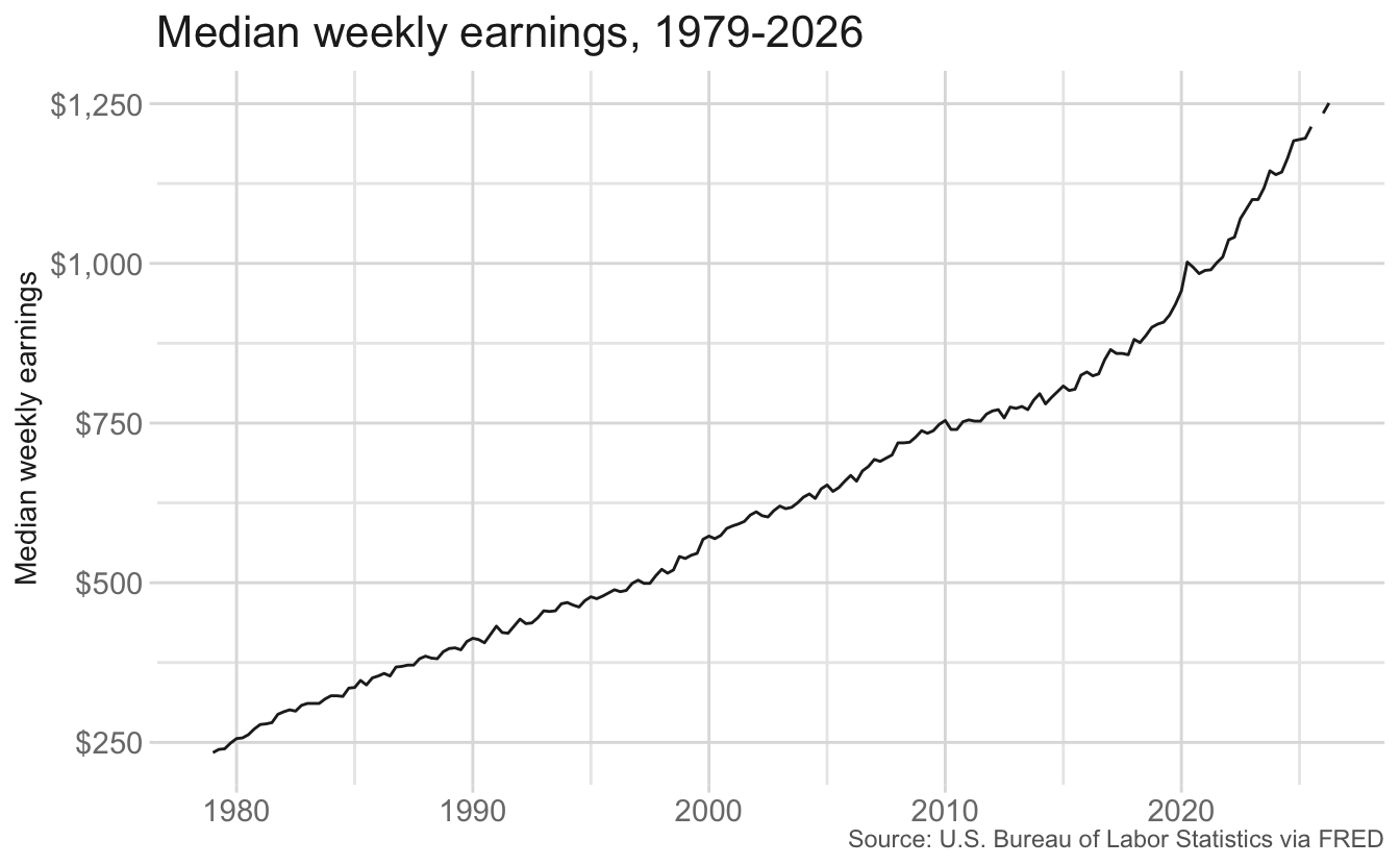
APU000074714).LEU0252881500Q).CPIAUCSL).Wage data is not available for the fourth quarter of 2025.
gas_wage <- read_csv("data/gas-wages.csv")
gas_wage
# A tibble: 190 × 14
date gas_price_nominal median_wage_nominal gas_price_real
<date> <dbl> <dbl> <dbl>
1 1979-01-01 0.734 234 3.53
2 1979-04-01 0.849 239 3.96
3 1979-07-01 0.986 240 4.45
4 1979-10-01 1.04 249 4.58
5 1980-01-01 1.20 256 5.04
6 1980-04-01 1.27 257 5.16
7 1980-07-01 1.26 262 5.06
8 1980-10-01 1.25 271 4.88
9 1981-01-01 1.37 278 5.17
10 1981-04-01 1.40 279 5.20
# ℹ 180 more rows
# ℹ 10 more variables: median_wage_real <dbl>,
# median_wage_per_hour_nominal <dbl>, median_wage_per_hour_real <dbl>,
# gallons_per_hour <dbl>, minutes_per_gallon <dbl>, below_mean <lgl>,
# gas_price_nominal_index <dbl>, gas_price_real_index <dbl>,
# median_wage_nominal_index <dbl>, median_wage_real_index <dbl>| Variable | Description |
|---|---|
date |
First day of the quarter |
gas_price_nominal |
Average price per gallon of regular gasoline (dollars) |
median_wage_nominal |
Median weekly earnings (dollars) |
gas_price_real |
Average price per gallon of regular gasoline (2026 Q2 dollars) |
median_wage_real |
Median weekly earnings (2026 Q2 dollars) |
median_wage_per_hour_nominal |
Median hourly earnings, assuming a 40-hour work week (dollars) |
median_wage_per_hour_real |
Median hourly earnings, assuming a 40-hour work week (2026 Q2 dollars) |
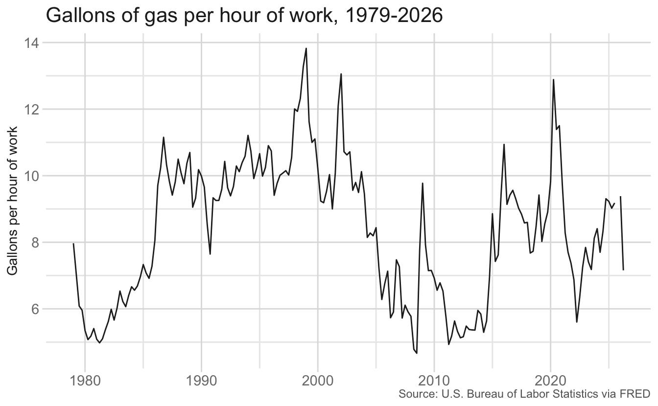
gallons_per_hour |
Gallons of gas that one hour of work at the median wage can purchase |
minutes_per_gallon |
Minutes of work at the median wage needed to purchase one gallon of gas |
below_mean |
Is gallons_per_hour below its average over the full time period? |
gas_price_nominal_index |
Nominal gas price, indexed so 1979 Q1 = 100 |
gas_price_real_index |
Inflation-adjusted gas price, indexed so 1979 Q1 = 100 |
median_wage_nominal_index |
Nominal median weekly earnings, indexed so 1979 Q1 = 100 |
median_wage_real_index |
Inflation-adjusted median weekly earnings, indexed so 1979 Q1 = 100 |
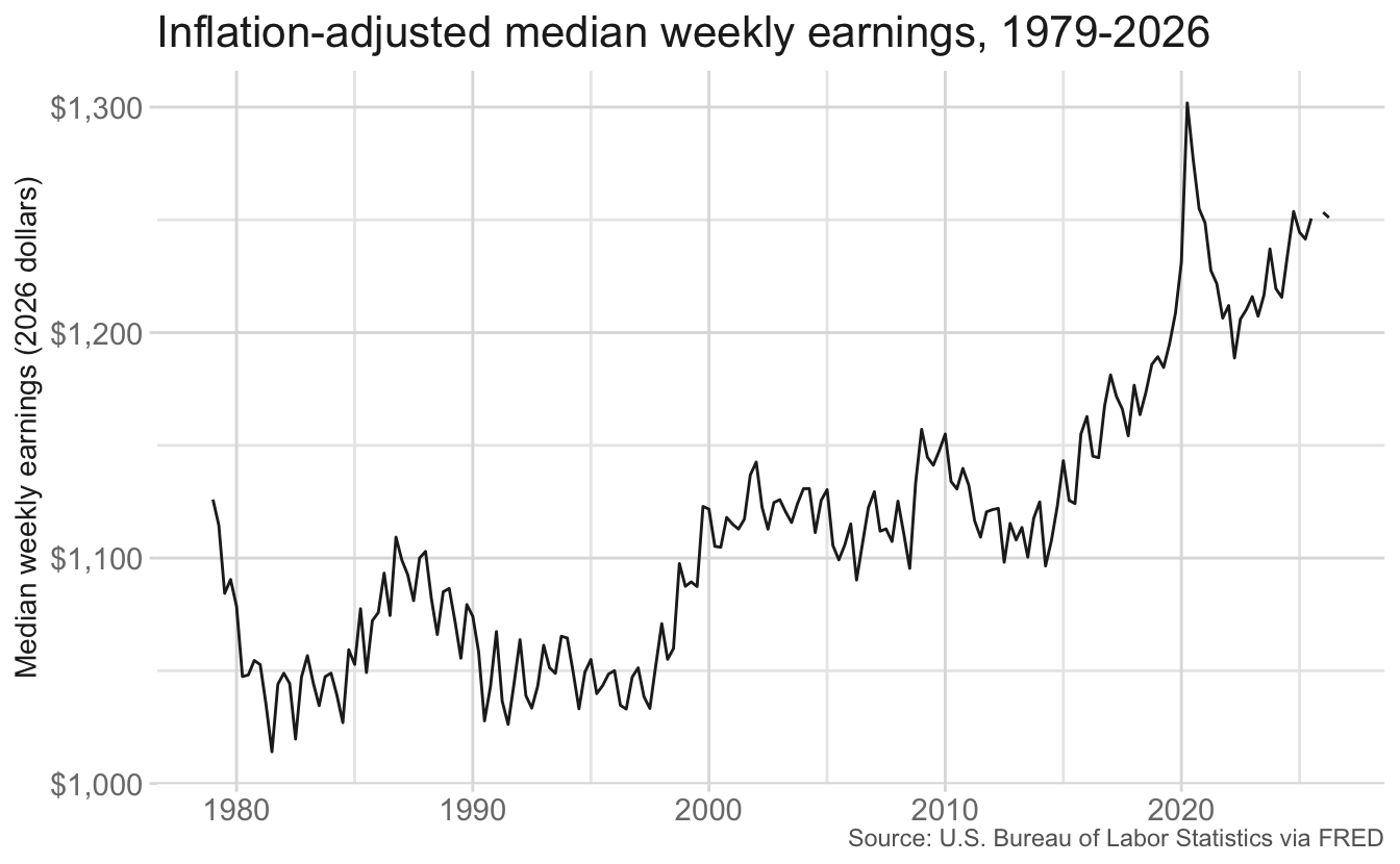
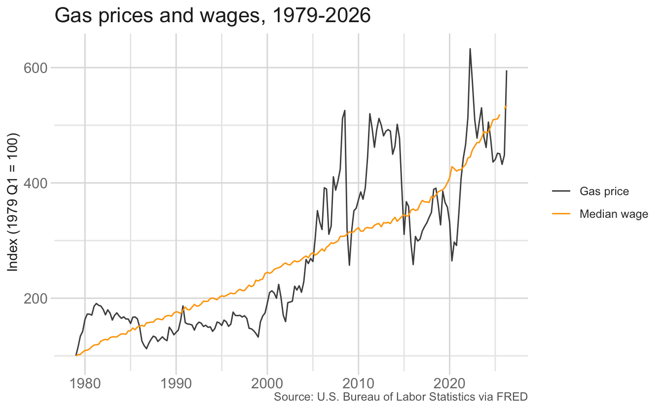
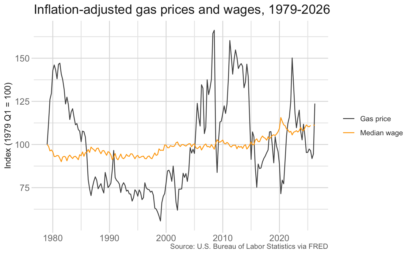
The charts below are a starting point for your analysis. They are intentionally plain. Use them to decide which measures best answer the challenge and what your story should be, not as models for your final design.
ggplot(data = gas_wage, mapping = aes(x = date, y = gas_price_nominal)) +
  geom_line() +
  scale_y_continuous(labels = label_currency()) +
  labs(
    title = "Price of regular gasoline, 1979-2026",
    x = NULL,
    y = "Price per gallon",
    caption = "Source: U.S. Bureau of Labor Statistics via FRED"
  )
ggplot(data = gas_wage, mapping = aes(x = date, y = gas_price_real)) +
  geom_line() +
  scale_y_continuous(labels = label_currency()) +
  labs(
    title = "Inflation-adjusted price of regular gasoline, 1979-2026",
    x = NULL,
    y = "Price per gallon (2026 dollars)",
    caption = "Source: U.S. Bureau of Labor Statistics via FRED"
  )
ggplot(data = gas_wage, mapping = aes(x = date, y = median_wage_nominal)) +
  geom_line() +
  scale_y_continuous(labels = label_currency()) +
  labs(
    title = "Median weekly earnings, 1979-2026",
    x = NULL,
    y = "Median weekly earnings",
    caption = "Source: U.S. Bureau of Labor Statistics via FRED"
  )
ggplot(data = gas_wage, mapping = aes(x = date, y = median_wage_real)) +
  geom_line() +
  scale_y_continuous(labels = label_currency()) +
  labs(
    title = "Inflation-adjusted median weekly earnings, 1979-2026",
    x = NULL,
    y = "Median weekly earnings (2026 dollars)",
    caption = "Source: U.S. Bureau of Labor Statistics via FRED"
  )
ggplot(data = gas_wage, mapping = aes(x = date)) +
  geom_line(mapping = aes(y = gas_price_nominal_index, color = "Gas price")) +
  geom_line(
    mapping = aes(y = median_wage_nominal_index, color = "Median wage")
  ) +
  scale_color_manual(values = c("grey30", "orange")) +
  labs(
    title = "Gas prices and wages, 1979-2026",
    x = NULL,
    y = "Index (1979 Q1 = 100)",
    color = NULL,
    caption = "Source: U.S. Bureau of Labor Statistics via FRED"
  )
ggplot(data = gas_wage, mapping = aes(x = date)) +
  geom_line(mapping = aes(y = gas_price_real_index, color = "Gas price")) +
  geom_line(mapping = aes(y = median_wage_real_index, color = "Median wage")) +
  scale_color_manual(values = c("grey30", "orange")) +
  labs(
    title = "Inflation-adjusted gas prices and wages, 1979-2026",
    x = NULL,
    y = "Index (1979 Q1 = 100)",
    color = NULL,
    caption = "Source: U.S. Bureau of Labor Statistics via FRED"
  )
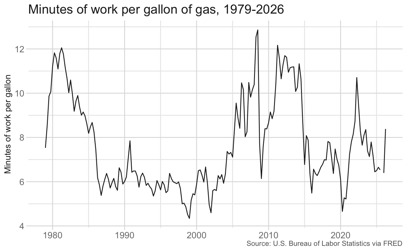
# interpolate a series onto a fine grid so the shading changes color exactly
# where the line crosses the average for the full time period
interpolate_vs_mean <- function(data, var) {
  data <- drop_na(data, {{ var }})
  values <- pull(data, {{ var }})

  approx(x = as.numeric(data$date), y = values, n = 2000) |>
    as_tibble() |>
    transmute(
      date = as.Date(x),
      value = y,
      avg = mean(values),
      position = if_else(value < avg, "Below average", "Above average"),
      # separate ribbon per contiguous run so groups don't bridge gaps
      run = consecutive_id(position)
    )
}gph_fine <- interpolate_vs_mean(gas_wage, gallons_per_hour)
gph_plot <- ggplot(data = gph_fine, mapping = aes(x = date)) +
geom_ribbon(
mapping = aes(
ymin = pmin(value, avg),
ymax = pmax(value, avg),
fill = position,
group = run
)
) +
geom_line(data = gas_wage, mapping = aes(y = gallons_per_hour)) +
geom_hline(
yintercept = gph_fine$avg[[1]],
color = "grey50",
linetype = "dashed"
) +
labs(
title = "Gallons of gas per hour of work, 1979-2026",
subtitle = "Compared to the average for the full period",
x = NULL,
y = "Gallons per hour of work",
fill = NULL,
caption = "Source: U.S. Bureau of Labor Statistics via FRED"
)gph_plot +
scale_fill_manual(values = c("grey70", "orange"))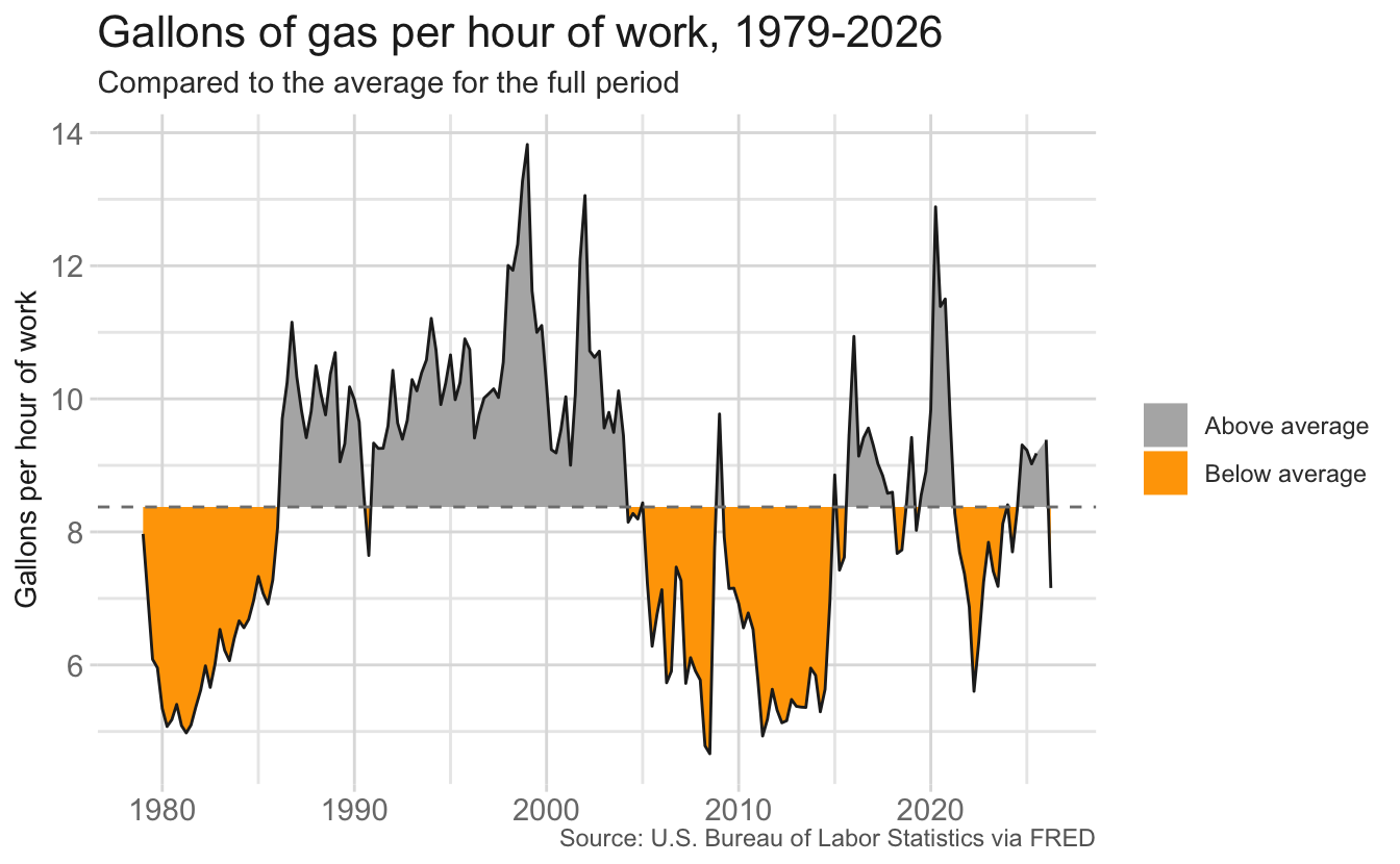
gph_plot +
  scale_fill_manual(values = c("orange", "grey70"))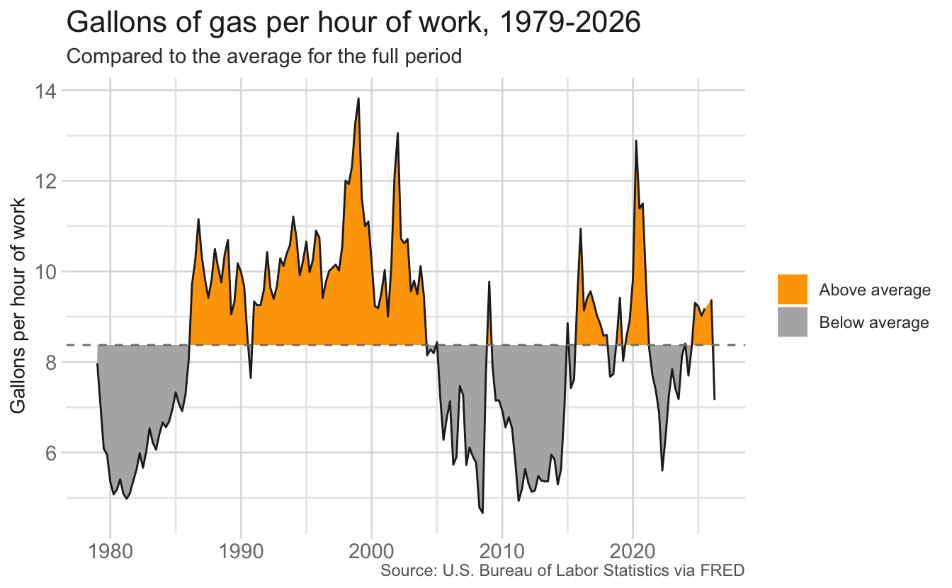
mpg_fine <- interpolate_vs_mean(gas_wage, minutes_per_gallon)

mpg_plot <- ggplot(data = mpg_fine, mapping = aes(x = date)) +
  geom_ribbon(
    mapping = aes(
      ymin = pmin(value, avg),
      ymax = pmax(value, avg),
      fill = position,
      group = run
    )
  ) +
  geom_line(data = gas_wage, mapping = aes(y = minutes_per_gallon)) +
  geom_hline(
    yintercept = mpg_fine$avg[[1]],
    color = "grey50",
    linetype = "dashed"
  ) +
  labs(
    title = "Minutes of work per gallon of gas, 1979-2026",
    subtitle = "Compared to the average for the full period",
    x = NULL,
    y = "Minutes of work per gallon",
    fill = NULL,
    caption = "Source: U.S. Bureau of Labor Statistics via FRED"
)mpg_plot +
scale_fill_manual(values = c("grey70", "orange"))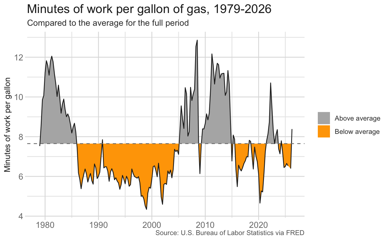
mpg_plot +
  scale_fill_manual(values = c("orange", "grey70"))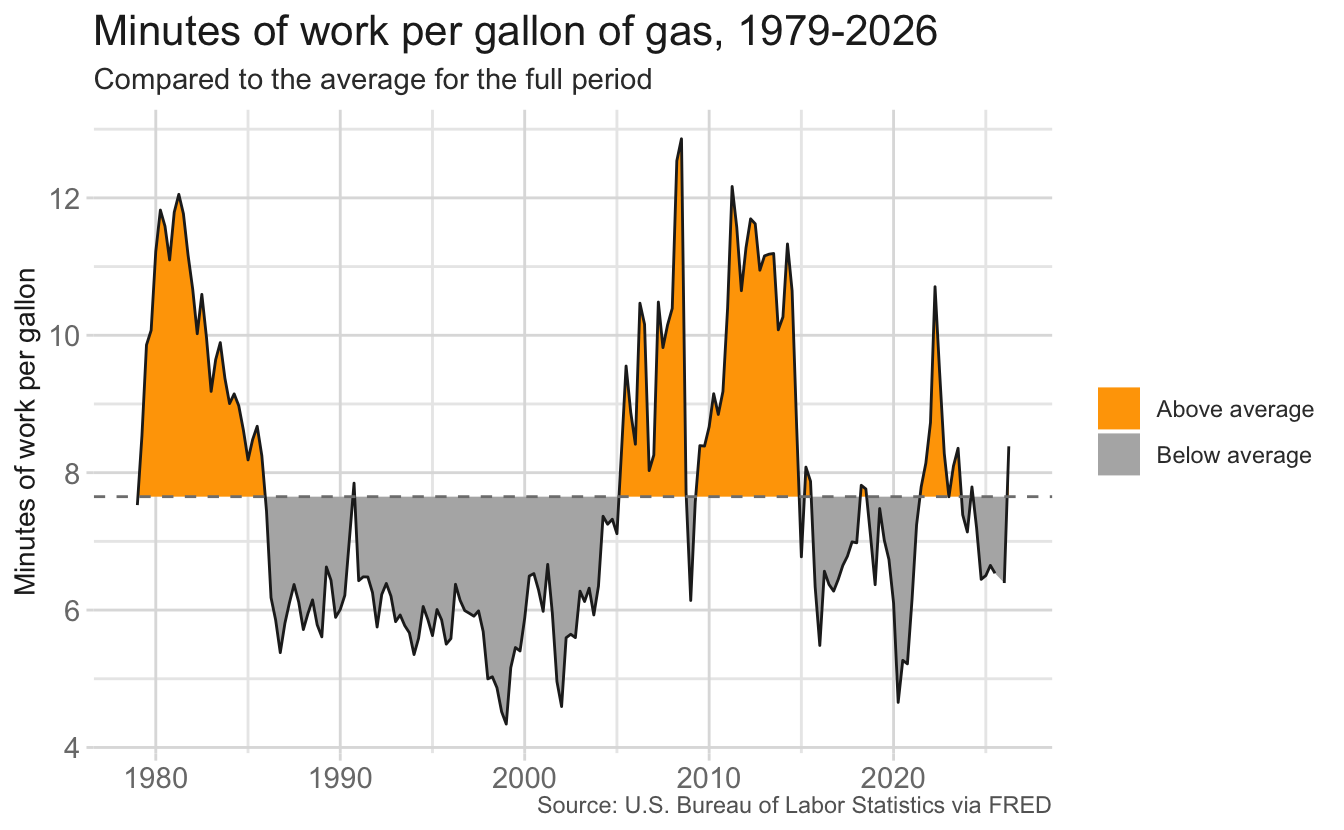
Your turn: With your group, use the sample charts to finish the story.
Record the action and resolution on the worksheet.
Your turn: Sketch two charts that, shown in order, carry your audience from the challenge to the resolution. The first chart should set up the problem, and the second should deliver the action or resolution. For each chart, write the title you would use. Titles should communicate the takeaway of the chart, not just describe its contents.
Once you have a sketch, implement your charts using the code cells below. The data is loaded as gas_wage, and {tidyverse}, {scales}, {ggrepel}, and {ggtext} are available.