Optimizing color palettes for births
This application exercise is designed to be run in your web browser using the {webr} framework. Simply work through the exercises and use the provided code cells to execute live R code in your browser.
Import birth data
The Social Security Administration keeps detailed records on births and deaths in the United States. For our analysis, we will use a dataset of the number of births daily in the United States from 1994-2014.1
births <- read_rds("data/births.Rds")
births
# A tibble: 7,670 × 7
year month date_of_month day_of_week births date_of_month_catego…¹ weekend
<dbl> <ord> <dbl> <ord> <dbl> <fct> <lgl>
1 1994 January 1 Saturday 8096 1 TRUE
2 1994 January 2 Sunday 7772 2 TRUE
3 1994 January 3 Monday 10142 3 FALSE
4 1994 January 4 Tuesday 11248 4 FALSE
5 1994 January 5 Wednesday 11053 5 FALSE
6 1994 January 6 Thursday 11406 6 FALSE
7 1994 January 7 Friday 11251 7 FALSE
8 1994 January 8 Saturday 8653 8 TRUE
9 1994 January 9 Sunday 7910 9 TRUE
10 1994 January 10 Monday 10498 10 FALSE
# ℹ 7,660 more rows
# ℹ abbreviated name: ¹date_of_month_categoricalThe Friday the 13th effect
Friday the 13th is considered an unlucky day in Western superstition. Let’s see if fewer babies are born on the 13th of each month if it falls on a Friday compared to another week day. Specifically, we will compare the average number of births on the 13th of the month to the average number of births on the 6th and 20th of the month.
friday_13_births <- births |>
  filter(date_of_month %in% c(6, 13, 20)) |>
  mutate(not_13 = date_of_month == 13) |>
  summarize(
    avg_births = mean(births),
    .by = c(day_of_week, not_13)
  ) |>
  pivot_wider(
    names_from = not_13,
    values_from = avg_births
  ) |>
  mutate(pct_diff = (`TRUE` - `FALSE`) / `FALSE`) |>
  arrange(day_of_week)

friday_13_births
# A tibble: 7 × 4
day_of_week `FALSE` `TRUE` pct_diff
<ord> <dbl> <dbl> <dbl>
1 Monday 11658. 11431. -0.0194
2 Tuesday 12900. 12630. -0.0210
3 Wednesday 12794. 12425. -0.0288
4 Thursday 12735. 12310. -0.0334
5 Friday 12545. 11744. -0.0638
6 Saturday 8651. 8593. -0.00671
7 Sunday 7634. 7558. -0.0101 Your turn: Visualize the results using a bar chart. Emphasize the difference on Fridays compared to other weekdays.2
Two approaches work well: highlighting with fill color, or de-emphasizing with alpha transparency.
# option 1: highlight Friday with a contrasting fill color
friday_13_births |>
  ggplot(mapping = aes(
    x = day_of_week,
    y = pct_diff,
    fill = day_of_week == "Friday"
  )) +
  geom_col() +
  scale_y_continuous(labels = label_percent()) +
  scale_fill_manual(values = c("grey50", "orange"), guide = "none") +
  labs(
    x = NULL,
    y = NULL,
    title = "The Friday the 13th effect",
    subtitle = "Difference in the share of U.S. births on the 13th of each month\nfrom the average of births on the 6th and the 20th, 1994-2014"
  )

# option 2: mute other days with lower alpha
friday_13_births |>
  ggplot(mapping = aes(
    x = day_of_week,
    y = pct_diff,
    alpha = day_of_week == "Friday"
  )) +
  geom_col(fill = "orange") +
  scale_y_continuous(labels = label_percent()) +
  scale_alpha_manual(values = c(0.4, 1), guide = "none") +
  labs(
    x = NULL,
    y = NULL,
    title = "The Friday the 13th effect",
    subtitle = "Difference in the share of U.S. births on the 13th of each month\nfrom the average of births on the 6th and the 20th, 1994-2014"
  )
Create a heatmap showing average number of births by day of year
Let’s explore the relative popularity of each calendar day for births. We will create a heatmap showing the relative ratio of births for each day of the year compared to the annual average.
avg_births_month_day <- births |>
  group_by(month, date_of_month_categorical) |>
  summarize(avg_births = mean(births), .groups = "drop") |>
  mutate(avg_births_ratio = avg_births / mean(births$births))

birth_days_plot <- ggplot(
  data = avg_births_month_day,
  mapping = aes(
    x = date_of_month_categorical,
    y = fct_rev(month),
    fill = avg_births_ratio
  )
) +
  geom_tile() +
  labs(
    x = "Day of the month",
    y = NULL,
    title = "Average births per day",
    subtitle = "1994-2014",
    fill = "Ratio of births\nrelative to average"
  ) +
  coord_cartesian(ratio = 1)
birth_days_plot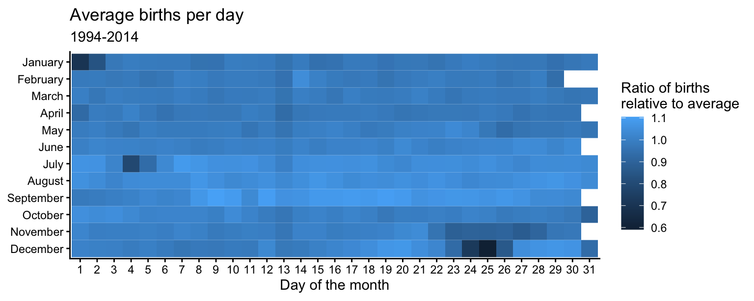
Your turn: Modify the plot to use an appropriate color palette. What days have an unusually high or low number of births? Why?
In order to select an appropriate color palette, remember to consider these questions:
- What type of variable are you plotting? Is it discrete or continuous? If it is continuous, should be it be drawn using a continuous gradient or would it be better to bin it into discrete categories?
- What type of color scale do you need? Do you need a qualitative color scale? Sequential? Diverging?
- Use this interactive tool to explore the different color scales available in the {colorspace} package
avg_births_ratio is continuous and centered around 1 (the annual average). A diverging palette with mid = 1 makes days above and below average immediately distinguishable. A binned variant trades some nuance for easier category comparisons.
# continuous diverging — sets midpoint at 1
birth_days_plot +
  scale_fill_continuous_diverging(palette = "Blue-Red 3", mid = 1)

# binned diverging — easier to count discrete levels
birth_days_plot +
  scale_fill_binned_diverging(palette = "Blue-Red 3", mid = 1)
Your turn: What days have an unusually high or low number of births? Why?
Major U.S. holidays with fixed dates tend to have fewer births relative to the average. Christmas Day has the fewest births (along with Christmas Eve and Boxing Day). New Year’s Day, Independence Day (July 4th), and Halloween (October 31st) also have substantially fewer births than average. Thanksgiving Day always falls between November 22 and 28, which have lower-than-average birth ratios. February 14th (Valentine’s Day) has a slightly higher ratio than surrounding days, likely due to some individuals choosing to induce labor on that date.
The ratio is higher from mid-June through late August, consistent with peak conception periods in the fall.
Overall, diverging color scales are more effective here since they clearly distinguish days with higher-than-average births from days with lower-than-average births — something sequential scales make harder to read.
sessioninfo::session_info()─ Session info ───────────────────────────────────────────────────────────────
setting value
version R version 4.5.2 (2025-10-31)
os macOS Tahoe 26.5.1
system aarch64, darwin20
ui X11
language (EN)
collate en_US.UTF-8
ctype en_US.UTF-8
tz America/New_York
date 2026-06-08
pandoc 3.8.3 @ /Applications/Positron.app/Contents/Resources/app/quarto/bin/tools/aarch64/ (via rmarkdown)
quarto 1.10.7 @ /Applications/quarto/bin/quarto
─ Packages ───────────────────────────────────────────────────────────────────
package * version date (UTC) lib source
cli 3.6.6 2026-04-09 [1] RSPM
colorspace * 2.1-2 2025-09-22 [1] RSPM
digest 0.6.39 2025-11-19 [1] RSPM (R 4.5.0)
dplyr * 1.2.1 2026-04-03 [1] RSPM
evaluate 1.0.5 2025-08-27 [1] RSPM (R 4.5.0)
farver 2.1.2 2024-05-13 [2] CRAN (R 4.5.0)
fastmap 1.2.0 2024-05-15 [2] CRAN (R 4.5.0)
forcats * 1.0.1 2025-09-25 [1] RSPM (R 4.5.0)
generics 0.1.4 2025-05-09 [2] CRAN (R 4.5.0)
ggplot2 * 4.0.3 2026-04-22 [1] RSPM
ggthemes * 5.2.0 2025-11-30 [1] CRAN (R 4.5.2)
glue 1.8.1 2026-04-17 [1] RSPM
gtable 0.3.6 2024-10-25 [2] CRAN (R 4.5.0)
here 1.0.2 2025-09-15 [1] CRAN (R 4.5.0)
hms 1.1.4 2025-10-17 [1] RSPM (R 4.5.0)
htmltools 0.5.9 2025-12-04 [1] RSPM (R 4.5.0)
htmlwidgets 1.6.4 2023-12-06 [2] CRAN (R 4.5.0)
jsonlite 2.0.0 2025-03-27 [2] CRAN (R 4.5.0)
knitr 1.51 2025-12-20 [1] RSPM (R 4.5.0)
labeling 0.4.3 2023-08-29 [2] CRAN (R 4.5.0)
lifecycle 1.0.5 2026-01-08 [1] RSPM (R 4.5.0)
lubridate * 1.9.5 2026-02-04 [1] RSPM
magrittr 2.0.5 2026-04-04 [1] RSPM
otel 0.2.0 2025-08-29 [1] RSPM (R 4.5.0)
pillar 1.11.1 2025-09-17 [1] RSPM (R 4.5.0)
pkgconfig 2.0.3 2019-09-22 [2] CRAN (R 4.5.0)
purrr * 1.2.2 2026-04-10 [1] RSPM
R6 2.6.1 2025-02-15 [2] CRAN (R 4.5.0)
RColorBrewer 1.1-3 2022-04-03 [2] CRAN (R 4.5.0)
readr * 2.2.0 2026-02-19 [1] RSPM
rlang 1.2.0 2026-04-06 [1] RSPM
rmarkdown 2.31 2026-03-26 [1] RSPM
rprojroot 2.1.1 2025-08-26 [1] RSPM (R 4.5.0)
S7 0.2.2 2026-04-22 [1] RSPM
scales * 1.4.0 2025-04-24 [1] RSPM (R 4.5.0)
sessioninfo 1.2.3 2025-02-05 [2] CRAN (R 4.5.0)
stringi 1.8.7 2025-03-27 [2] CRAN (R 4.5.0)
stringr * 1.6.0 2025-11-04 [1] RSPM
tibble * 3.3.1 2026-01-11 [1] RSPM (R 4.5.0)
tidyr * 1.3.2 2025-12-19 [1] RSPM (R 4.5.0)
tidyselect 1.2.1 2024-03-11 [2] CRAN (R 4.5.0)
tidyverse * 2.0.0 2023-02-22 [1] RSPM (R 4.5.0)
timechange 0.4.0 2026-01-29 [1] RSPM
tzdb 0.5.0 2025-03-15 [2] CRAN (R 4.5.0)
utf8 1.2.6 2025-06-08 [2] CRAN (R 4.5.0)
vctrs 0.7.3 2026-04-11 [1] RSPM
withr 3.0.2 2024-10-28 [2] CRAN (R 4.5.0)
xfun 0.57 2026-03-20 [1] RSPM
yaml 2.3.12 2025-12-10 [1] RSPM (R 4.5.0)
[1] /Users/bcs88/Library/R/arm64/4.5/library
[2] /Library/Frameworks/R.framework/Versions/4.5-arm64/Resources/library
* ── Packages attached to the search path.
──────────────────────────────────────────────────────────────────────────────Footnotes
Collected by FiveThirtyEight.↩︎
Essentially a replication of Carl Bialik’s original chart.↩︎