Telling a story of CO₂ emissions over time
This application exercise is completed in class and submitted via a worksheet.
This application exercise is designed to be run in your web browser using the {webr} framework. Simply work through the exercises and use the provided code cells to execute live R code in your browser.
Data
The dataset comes from the World Bank and contains information on CO₂ emissions, GDP per capita, and population for 215 countries from 1995 to 2022. The data is available in the file wdi_co2.csv. We will import the data and perform some basic cleaning tasks.
# import raw data obtained using WDI API
wdi_co2_raw <- read_csv("data/wdi_co2.csv")

# clean the data
wdi_clean <- wdi_co2_raw |>
  # remove observations that are not actually countries
  filter(region != "Aggregates") |>
  # select relevant columns and rename to make it easier
  select(
    iso2c,
    iso3c,
    country,
    year,
    population = SP.POP.TOTL,
    co2_emissions = EN.GHG.CO2.PC.CE.AR5,
    gdp_per_cap = NY.GDP.PCAP.KD,
    region,
    income
  )

wdi_clean
# A tibble: 6,727 × 9
iso2c iso3c country year population co2_emissions gdp_per_cap region income
<chr> <chr> <chr> <dbl> <dbl> <dbl> <dbl> <chr> <chr>
1 AF AFG Afghani… 2019 37856121 0.320 558. Middl… Low i…
2 AF AFG Afghani… 2018 36743039 0.321 553. Middl… Low i…
3 AF AFG Afghani… 2014 32792523 0.243 575. Middl… Low i…
4 AF AFG Afghani… 2008 26482622 0.147 418. Middl… Low i…
5 AF AFG Afghani… 2017 35688935 0.291 563. Middl… Low i…
6 AF AFG Afghani… 2003 22733049 0.0447 346. Middl… Low i…
7 AF AFG Afghani… 2015 33831764 0.249 566. Middl… Low i…
8 AF AFG Afghani… 2016 34700612 0.219 564. Middl… Low i…
9 AF AFG Afghani… 2007 25909852 0.0797 411. Middl… Low i…
10 AF AFG Afghani… 2009 27466101 0.224 489. Middl… Low i…
# ℹ 6,717 more rowsNext we rank countries based on their CO₂ emissions in 1995 and 2020, and then calculate the difference in rankings. We also create a variable that indicates if the rank changed by a lot (more than 30 positions). This requires substantial data cleaning and wrangling.
co2_rankings <- wdi_clean |>
  # Get rid of smaller countries
  filter(population > 200000) |>
  # Only look at two years
  filter(year %in% c(1995, 2020)) |>
  # Get rid of all the rows that have missing values in co2_emissions
  drop_na(co2_emissions) |>
  # Look at each year individually and rank countries based on their emissions that year
  mutate(
    ranking = rank(co2_emissions),
    .by = year
  ) |>
  # Only select required columns
  select(iso3c, country, year, region, income, ranking) |>
  # pivot long
  pivot_wider(
    names_from = year,
    names_prefix = "rank_",
    values_from = ranking
  ) |>
  # Find the difference in ranking between 2020 and 1995
  mutate(rank_diff = rank_2020 - rank_1995) |>
  # Remove all rows where there's a missing value in the rank_diff column
  drop_na(rank_diff) |>
  # Make an indicator variable that is true of the absolute value of the
  # difference in rankings is greater than 30
  mutate(big_change = if_else(abs(rank_diff) >= 30, TRUE, FALSE)) |>
  # Make another indicator variable that indicates if the rank improved by a
  # lot, worsened by a lot, or didn't change much.
  mutate(
    better_big_change = case_when(
      rank_diff <= -30 ~ "Rank improved",
      rank_diff >= 30 ~ "Rank worsened",
      .default = "Rank changed a little"
    )
  ) |>
  # arrange rows by rank_diff for printing
  arrange(rank_diff)
Here is what the data looked like originally:
slice_head(wdi_clean, n = 5)# A tibble: 5 × 9
iso2c iso3c country year population co2_emissions gdp_per_cap region income
<chr> <chr> <chr> <dbl> <dbl> <dbl> <dbl> <chr> <chr>
1 AF AFG Afghanis… 2019 37856121 0.320 558. Middl… Low i…
2 AF AFG Afghanis… 2018 36743039 0.321 553. Middl… Low i…
3 AF AFG Afghanis… 2014 32792523 0.243 575. Middl… Low i…
4 AF AFG Afghanis… 2008 26482622 0.147 418. Middl… Low i…
5 AF AFG Afghanis… 2017 35688935 0.291 563. Middl… Low i…And here is what it looks like after cleaning:
slice_head(co2_rankings, n = 5)# A tibble: 5 × 9
iso3c country region income rank_2020 rank_1995 rank_diff big_change
<chr> <chr> <chr> <chr> <dbl> <dbl> <dbl> <lgl>
1 ZWE Zimbabwe Sub-Saharan… Lower… 38 76 -38 TRUE
2 DJI Djibouti Middle East… Lower… 44 81 -37 TRUE
3 DNK Denmark Europe & Ce… High … 127 159 -32 TRUE
4 GAB Gabon Sub-Saharan… Upper… 86 118 -32 TRUE
5 YEM Yemen, Rep. Middle East… Low i… 23 53 -30 TRUE
# ℹ 1 more variable: better_big_change <chr>Basic plot
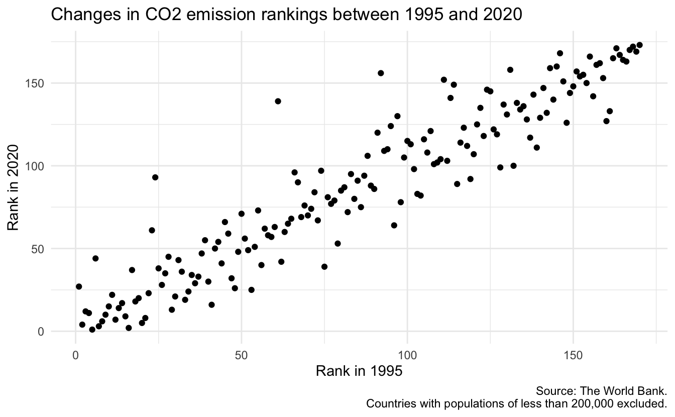
Let’s create a basic plot that visualizes the changes in CO₂ emission rankings between 1995 and 2020.
Brainstorm improvements
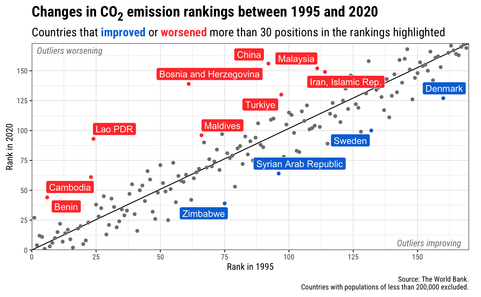
Your turn: Brainstorm methods to improve the readability and interpretability of the chart through annotations.
- What is a “good” rank? What is a “bad” rank? Keep in mind that 1 is the country with the lowest carbon emissions per capita, and 170 is the country with the highest carbon emissions per capita.
- What are the countries that have significantly improved or worsened their rank?
- What other aspects do you feel should be emphasized?
- Text labels
- Arrows/lines
- Rectangles
- Colors/fills
Implement your annotations
Now try implementing your proposed annotations in the code cell below. The basic plot code is provided as a starting point. The {ggrepel} and {ggtext} packages are available if you want to use them.
library(ggrepel)
library(ggtext)

ggplot(
  data = co2_rankings,
  mapping = aes(x = rank_1995, y = rank_2020)
) +
  # Add a reference line that goes from the bottom corner to the top corner
  annotate(
    geom = "segment",
    x = 0,
    xend = max(co2_rankings$rank_1995),
    y = 0,
    yend = max(co2_rankings$rank_2020)
  ) +
  # Add points and color them by the type of change in rankings
  geom_point(aes(color = better_big_change)) +
  # Add repelled labels. Only use data where big_change is TRUE. Fill them by
  # the type of change (so they match the color in geom_point() above) and use
  # white text
  geom_label_repel(
    data = filter(co2_rankings, big_change == TRUE),
    aes(label = country, fill = better_big_change),
    color = "white",
    seed = 895
  ) +
  # Add notes about what the outliers mean in the bottom left and top right
  # corners. These are italicized and light grey. The text in the bottom corner
  # is justified to the right with hjust = 1, and the text in the top corner is
  # justified to the left with hjust = 0
  annotate(
    geom = "text",
    x = 167,
    y = 6,
    label = "Outliers improving",
    fontface = "italic",
    hjust = 1,
    color = "grey50"
  ) +
  annotate(
    geom = "text",
    x = 2,
    y = 167,
    label = "Outliers worsening",
    fontface = "italic",
    hjust = 0,
    color = "grey50"
  ) +
  # Use three different colors for the points
  scale_color_manual(values = c("grey50", "#0074D9", "#FF4136")) +
  # Use two different colors for the filled labels.
  # There are no grey labels, so we don't need that color
  scale_fill_manual(values = c("#0074D9", "#FF4136")) +
  # Make the x and y axes expand all the way to the edges of the plot area and
  # add breaks every 25 units from 0 to 175
  scale_x_continuous(expand = c(0, 0), breaks = seq(0, 175, 25)) +
  scale_y_continuous(expand = c(0, 0), breaks = seq(0, 175, 25)) +
  # Add labels! There are a couple fancy things here.
  # 1. In the title we wrap the 2 of CO2 in the HTML <sub></sub> tag so that the
  #    number gets subscripted. The only way this will actually get parsed as
  #    HTML is if we tell the plot.title to use element_markdown() in the
  #    theme() function, and element_markdown() comes from the ggtext package.
  # 2. In the subtitle we bold the two words **improved** and **worsened** using
  #    Markdown asterisks. We also wrap these words with HTML span tags with
  #    inline CSS to specify the color of the text. Like the title, this will
  #    only be processed and parsed as HTML and Markdown if we tell the
  #    plot.subtitle to use element_markdown() in the theme() function.
  labs(
    x = "Rank in 1995",
    y = "Rank in 2020",
    title = "Changes in CO<sub>2</sub> emission rankings between 1995 and 2020",
    subtitle = "Countries that <span style='color: #0074D9'>**improved**</span> or <span style='color: #FF4136'>**worsened**</span> more than 30 positions in the rankings highlighted",
    caption = "Source: The World Bank.\nCountries with populations of less than 200,000 excluded."
  ) +
  # Turn off the legends for color and fill, since the subtitle includes that
  guides(color = "none", fill = "none") +
  # Use theme_bw() with Roboto Condensed
  theme_bw(base_family = "Roboto Condensed") +
  # Tell the title and subtitle to be treated as Markdown/HTML, make the title
  # 1.6x the size of the base font, and make the subtitle 1.3x the size of the
  # base font. Also add a little larger margin on the right of the plot so that
  # the 175 doesn't get cut off.
  theme(
    plot.title = element_markdown(face = "bold", size = rel(1.6)),
    plot.subtitle = element_markdown(size = rel(1.3)),
    plot.margin = unit(c(0.5, 1, 0.5, 0.5), units = "lines")
  )
Acknowledgments
- Exercise drawn from Data Visualization with R by Andrew Heiss and licensed under CC BY-NC 4.0.