Waffle charts for visualizing proportions
Waffle charts
{waffle} provides a {ggplot2} implementation of waffle plots. The typical workflow consists of preparing the data by tabulating in advance and then plotting it with {ggplot2} and geom_waffle().
You will estimate the same three proportions twice – once from a pie chart, once from a waffle chart – before computing the true values. Do not compute the answer early, and do not revise an earlier estimate after seeing a later chart. Wrong guesses are the point; they are your data.
Round 1: estimate from a pie chart
Demonstration: Run the chunk below to draw a pie chart of penguins by species.
penguins |>
  count(species) |>
  ggplot(mapping = aes(x = "", y = n, fill = species)) +
  geom_col(color = "white") +
  coord_radial(
    theta = "y",
    reverse = "theta",
    expand = FALSE
  ) +
  scale_fill_viridis_d(end = 0.8) +
  labs(
    title = "Penguins by species",
    x = NULL,
    y = NULL,
    fill = NULL
  ) +
  theme_void() +
  theme(legend.position = "top")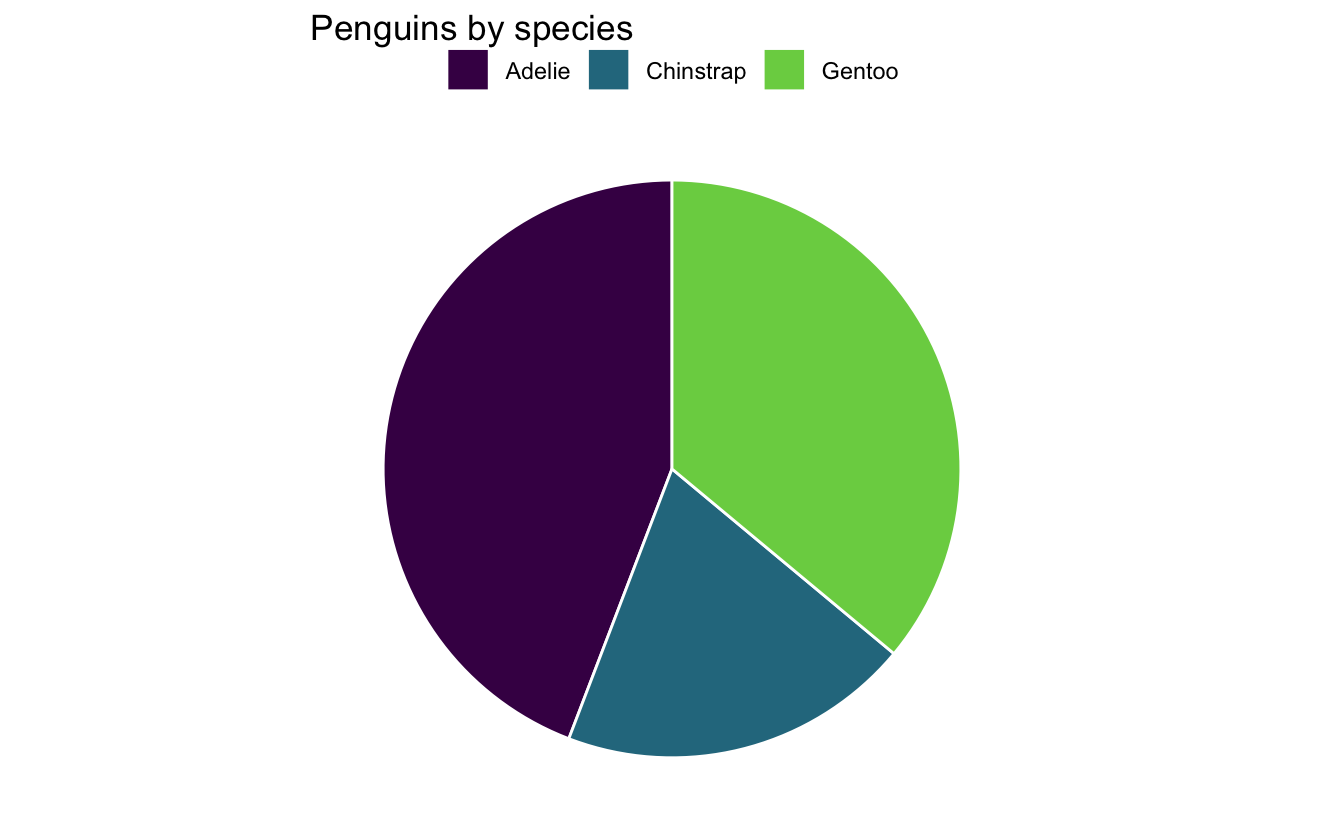
Your turn: Looking only at the pie chart, estimate what percentage of the penguins belong to each species. Do not count anything and do not write any code – just read the chart. Your three estimates should sum to about 100%.
| Species | Estimate from the pie chart |
|---|---|
| Adelie | % |
| Chinstrap | % |
| Gentoo | % |
Basic waffle chart
Demonstration: Prepare the penguins data frame to visualize the number of penguins by species.
# add code hereDemonstration: Use the prepared data to draw a basic color-coded waffle chart
# add code hereImprove the waffle chart
Your turn: Adjust the waffle chart to use a fixed aspect ratio so the symbols are squares. Rotate the chart so the squares are stacked vertically.
# add code hereDemonstration: {waffle} will draw all observations on the chart. For larger datasets, this is problematic. Instead, we might want to visualize the proportion of observations in each category. Use geom_waffle() to represent the data as proportions instead.
# add code hereYour turn: Adjust the waffle chart to use a better color palette and move the legend to the top.
# add code hereRound 2: estimate from your waffle chart
Your turn: Now read the same three proportions off the waffle chart you just built. Again, do not count the squares one by one and do not write any code – read the chart the way a reader would.
| Species | Estimate from the waffle chart |
|---|---|
| Adelie | % |
| Chinstrap | % |
| Gentoo | % |
Round 3: compute the true proportions
Your turn: Now compute the actual percentage of penguins in each species. Use count() to tabulate and mutate() to convert the counts into percentages.
Compare
Your turn: Fill in the table using your two sets of estimates and the values you just computed. Error is your estimate minus the truth, so a positive number means you overestimated.
| Species | Pie estimate | Waffle estimate | True % | Pie error | Waffle error |
|---|---|---|---|---|---|
| Adelie | |||||
| Chinstrap | |||||
| Gentoo |
Your turn: Which chart produced smaller errors for you? Was the gap the same for all three species, or larger for some than others?
Add response here.
Your turn: In lecture we ranked perceptual tasks by how accurately people read them: position on a common scale is most accurate, then length, then angle, then area. A pie chart asks you to judge angle; a waffle chart asks you to judge counts of discrete squares. Do your errors line up with that ranking? If they do not, what else about these charts might explain it?
Add response here.
Your turn: Compare your results with the person next to you. Where your errors disagree, what about how each of you read the chart might account for the difference?
Add response here.
One more comparison: donut charts
Demonstration: A donut chart is a pie chart with the center removed.
penguins |>
  count(species) |>
  ggplot(mapping = aes(x = 2, y = n, fill = species)) +
  geom_col(color = "white") +
  coord_radial(theta = "y", reverse = "theta", expand = FALSE) +
  xlim(0.5, 2.5) +
  scale_fill_viridis_d(end = 0.8) +
  labs(
    title = "Penguins by species",
    x = NULL,
    y = NULL,
    fill = NULL
  ) +
  theme_void() +
  theme(legend.position = "top")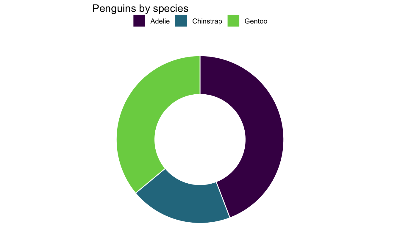
Your turn: Removing the center removes the vertex of every angle. Based on what you measured above, would you expect estimates from the donut chart to be better or worse than from the pie chart? Explain your reasoning.
Add response here.