| Chart | Encoding | Orange | Blue | Smaller | True % |
|---|---|---|---|---|---|
| 1 | Length, same bar | 40 | 14 | blue | 35.0 |
| 2 | Position, common scale (adjacent) | 22 | 45 | orange | 48.9 |
| 3 | Length, different bars | 48 | 36 | blue | 75.0 |
| 4 | Rectangular area | 54 | 44 | blue | 81.5 |
| 5 | Position, common scale (separated) | 39 | 16 | blue | 41.0 |
| 6 | Circular area | 38 | 22 | blue | 57.9 |
| 7 | Angle | 29 | 44 | orange | 65.9 |
| 8 | Rectangular area (treemap) | 41 | 11 | blue | 26.8 |
| 9 | Position, non-aligned scales | 41 | 8 | blue | 19.5 |
Graphical perception
Suggested answers
Application exercise
Answers
Graphical perception
In 1984, William Cleveland and Robert McGill ran an experiment to answer a question that sounds simple but had never been tested: when a chart encodes a quantity as a position, a length, an angle, or an area, how accurately can people actually read it back out? They asked subjects to compare two marked values on a chart and estimate how much smaller one was than the other, then ranked the encodings by how much error each produced. Jeffrey Heer and Michael Bostock replicated the study on Mechanical Turk in 2010 and extended it to areas – bubble charts and treemaps.
Answer key
Each chart marks two values, one orange and one blue. Students identified the smaller and estimated what percentage it is of the larger.
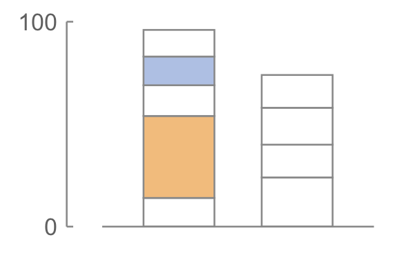
Smaller: blue, and it is 35% of the larger.
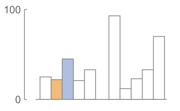
Smaller: orange, and it is 48.9% of the larger.
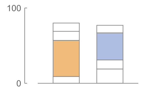
Smaller: blue, and it is 75% of the larger.
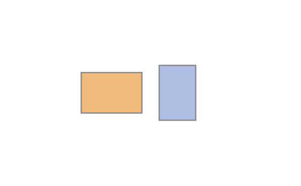
Smaller: blue, and it is 81.5% of the larger.
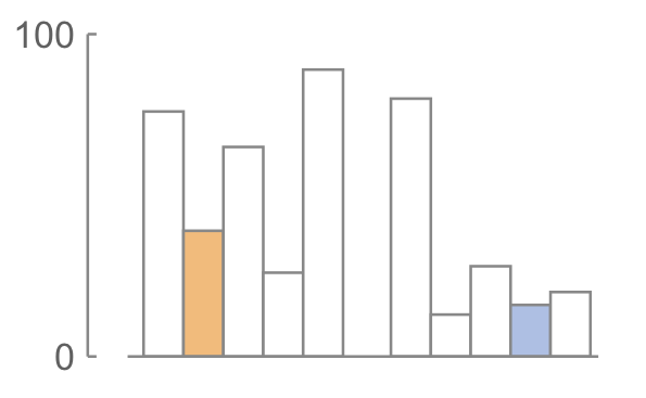
Smaller: blue, and it is 41% of the larger.
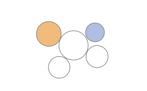
Smaller: blue, and it is 57.9% of the larger.
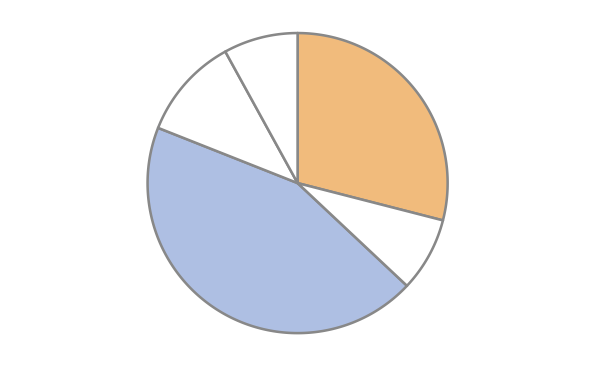
Smaller: orange, and it is 65.9% of the larger.
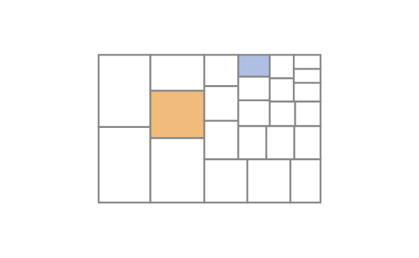
Smaller: blue, and it is 26.8% of the larger.
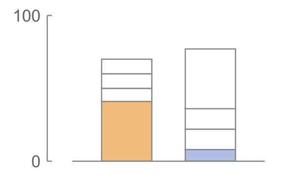
Smaller: blue, and it is 19.5% of the larger.
The conceptual tasks
The charts are not nine arbitrary designs. They are the nine stimuli from Experiment 1 of Heer and Bostock (2010), which recreate Cleveland and McGill’s (1984) position-length experiment and extend it to areas. Each one isolates a single elementary perceptual task – the visual operation a reader has to perform to recover the number.
| Task | Encoding | What the reader has to do |
|---|---|---|
| T1 | Position, common scale (adjacent) | Compare two bars sharing a baseline, side by side |
| T2 | Position, non-aligned scales | Compare two segments that each start at their own bar’s zero |
| T3 | Position, common scale (separated) | Same as T1, but the bars are far apart |
| T4 | Length, different bars | Compare two floating segments in two different bars |
| T5 | Length, same bar | Compare two floating segments in one bar |
| T6 | Angle | Compare two pie wedges |
| T7 | Circular area | Compare two circles |
| T8 | Rectangular area | Compare two rectangles |
| T9 | Rectangular area (treemap) | Compare two rectangles embedded in a treemap |
References
- Cleveland, William S., and Robert McGill. 1984. “Graphical Perception: Theory, Experimentation, and Application to the Development of Graphical Methods.” Journal of the American Statistical Association 79: 531–554.
- Cleveland, William S., and Robert McGill. 1987. “Graphical Perception: The Visual Decoding of Quantitative Information on Graphical Displays of Data.” Journal of the Royal Statistical Society Series A 150: 192–229.
- Heer, Jeffrey, and Michael Bostock. 2010. “Crowdsourcing Graphical Perception: Using Mechanical Turk to Assess Visualization Design.” Proceedings of the SIGCHI Conference on Human Factors in Computing Systems, 203–212. https://doi.org/10.1145/1753326.1753357