AE 13: Revise a boxplot using Tufte’s principles
Application exercise
Note
This application exercise is completed in class and submitted via a worksheet.
Tufte’s principles for graphical excellence
Above all else show the data.
- Show the data
- Induce the viewer to think about the substance rather than about methodology, graphic design, the technology of graphic production, or something else
- Avoid distorting what the data have to say
- Present many numbers in a small space
- Make large data sets coherent
- Encourage the eye to compare different pieces of data
- Reveal the data at several levels of detail, from a broad overview to the fine structure
- Serve a reasonably clear purpose: description, exploration, tabulation, or decoration
- Be closely integrated with the statistical and verbal descriptions of a data set
Remember that his goal is to maximize the data-ink ratio
\[\text{Data-ink ratio} = \frac{\text{data-ink}}{\text{total ink used to print the graphic}}\]
or the proportion of a graphic’s ink devoted to the non-redundant display of data-information.
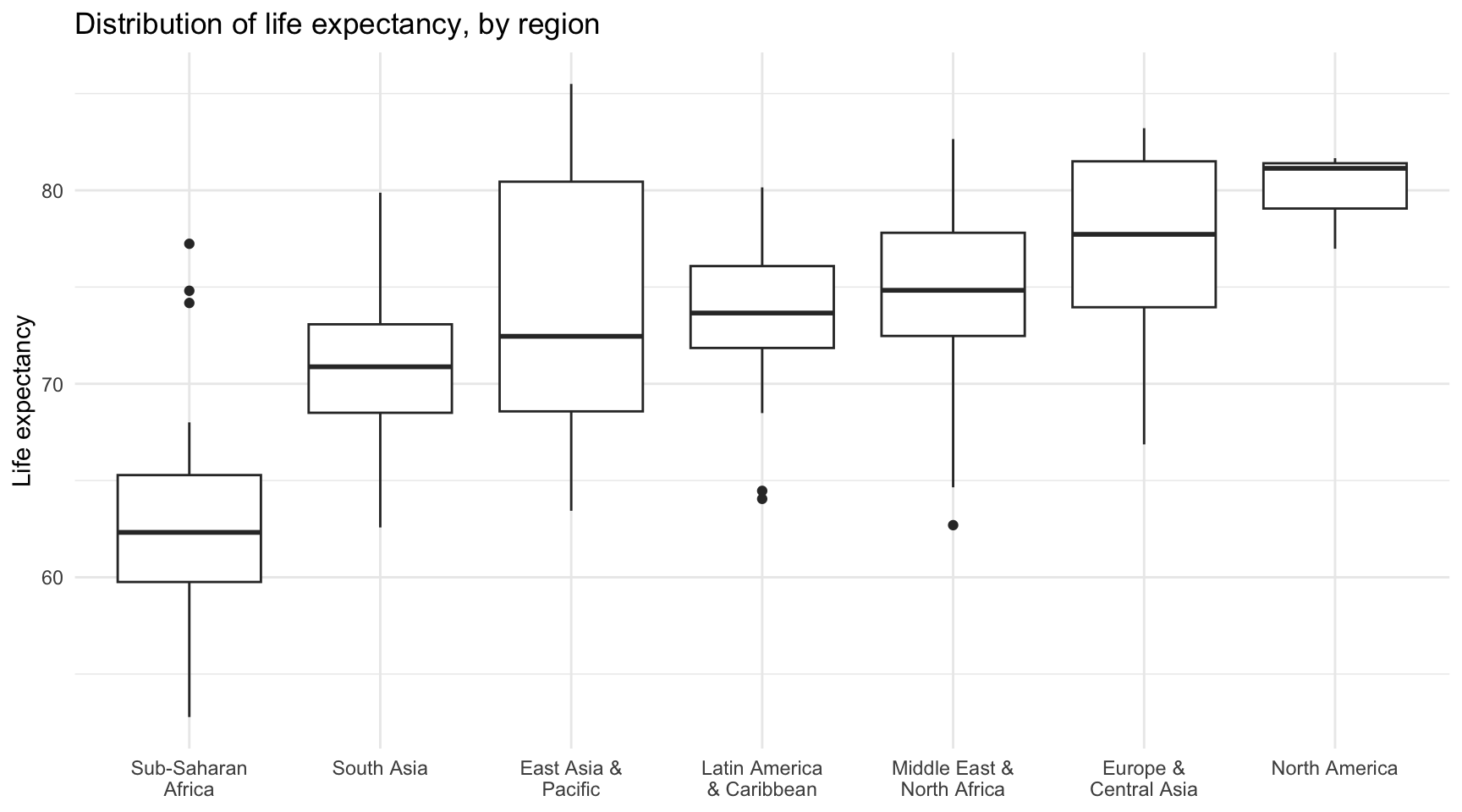
Redesign a boxplot
Your turn: Redesign the boxplot below to maximize the data-ink ratio and minimize the amount of redundant ink.
What is the purpose of a boxplot?
Keep in mind that a boxplot compactly displays the distribution of a continuous variable. It visualizes five summary statistics (the median, two hinges defined by the interquartile range (IQR), and two whiskers), and all “outlying” points individually. What could be stripped out or removed from the boxplot to maximize the data-ink ratio and remove any redundant ink?