AE 13: Accessible data visualizations
Suggested answers
Application exercise
Answers
Import nursing data
nurses <- read_csv("data/nurses.csv") |> janitor::clean_names()Rows: 1242 Columns: 22
── Column specification ────────────────────────────────────────────────────────
Delimiter: ","
chr (1): State
dbl (21): Year, Total Employed RN, Employed Standard Error (%), Hourly Wage ...
ℹ Use `spec()` to retrieve the full column specification for this data.
ℹ Specify the column types or set `show_col_types = FALSE` to quiet this message.# subset to three states
nurses_subset <- nurses |>
filter(state %in% c("California", "New York", "North Carolina"))
# unemployment data
unemp_state <- read_excel(
path = "data/emp-unemployment.xls",
sheet = "States",
skip = 5
) |>
pivot_longer(
cols = -c(Fips, Area),
names_to = "Year",
values_to = "unemp"
) |>
rename(state = Area, year = Year) |>
mutate(year = parse_number(year)) |>
filter(state != "United States") |>
# calculate mean unemp rate per state and year
group_by(state, year) |>
summarize(unemp_rate = mean(unemp, na.rm = TRUE))`summarise()` has regrouped the output.
ℹ Summaries were computed grouped by state and year.
ℹ Output is grouped by state.
ℹ Use `summarise(.groups = "drop_last")` to silence this message.
ℹ Use `summarise(.by = c(state, year))` for per-operation grouping
(`?dplyr::dplyr_by`) instead.Developing alternative text
Bar chart
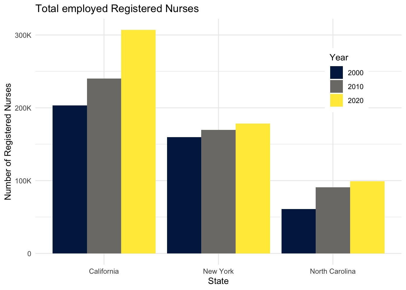
Demonstration: The following code chunk demonstrates how to add alternative text to a bar chart. The alternative text is added to the chunk header using the fig-alt chunk option. The text is written in Markdown and can be as long as needed. Note that fig-cap is not the same as fig-alt.
```{r}
#| label: nurses-bar
#| fig-cap: "Total employed Registered Nurses"
#| fig-alt: |
#|   The figure is a bar chart titled 'Total employed Registered
#|   Nurses' that displays the numbers of registered nurses in three states
#|   (California, New York, and North Carolina) over a 20 year period, with data
#|   recorded in three time points (2000, 2010, and 2020). In each state, the
#|   numbers of registered nurses increase over time. The following numbers are
#|   all approximate. California started off with 200K registered nurses in 2000,
#|   240K in 2010, and 300K in 2020. New York had 150K in 2000, 160K in 2010, and
#|   170K in 2020. Finally North Carolina had 60K in 2000, 90K in 2010, and 100K
#|   in 2020.

nurses_subset |>
  filter(year %in% c(2000, 2010, 2020)) |>
  ggplot(aes(x = state, y = total_employed_rn, fill = factor(year))) +
  geom_col(position = "dodge") +
  scale_fill_viridis_d(
    option = "E",
    guide = guide_legend(position = "inside")
  ) +
  scale_y_continuous(labels = label_number(scale_cut = cut_short_scale())) +
  labs(
    x = "State",
    y = "Number of Registered Nurses",
    fill = "Year",
    title = "Total employed Registered Nurses"
  ) +
  theme(
    legend.background = element_rect(fill = "white", color = "white"),
    legend.position.inside = c(0.85, 0.75)
  )
```
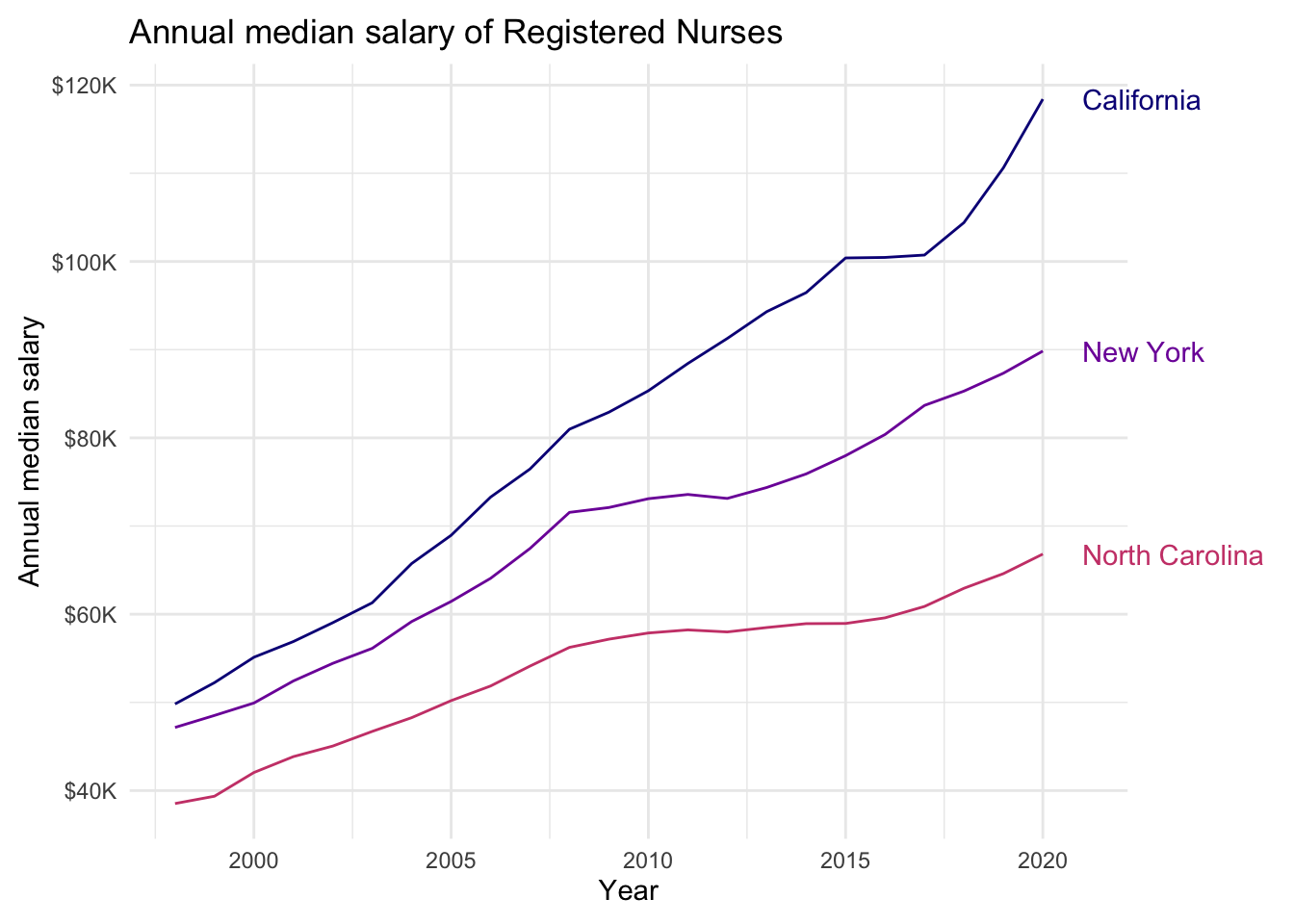
Line chart
Your turn: Add alternative text to the following line chart.
Tip
Remember the major components of alt text:
-
CHART TYPE: It’s helpful for people with partial sight to know what chart type it is and gives context for understanding the rest of the visual. -
TYPE OF DATA: What data is included in the chart? The x and y axis labels may help you figure this out. -
REASON FOR INCLUDING CHART: Think about why you’re including this visual. What does it show that’s meaningful. There should be a point to every visual and you should tell people what to look for. -
Link to data source: Don’t include this in your alt text, but it should be included somewhere in the surrounding text.
TipUsing generative AI to write alt text
After attempting to write the alt text yourself, try using altR to help you write the alt text. You will need to manually save the plot as an image and upload it to altR. Compare the alt text generated by altR to the one you wrote yourself. Which one do you think is better? Why?
```{r}
#| label: nurses-line
#| fig-alt: |
#|   The figure is titled "Annual median salary of Registered Nurses".
#|   There are three lines on the plot: the top labelled California, the middle
#|   New York, the bottom North Carolina. The vertical axis is labelled "Annual
#|   median salary", beginning with $40K, up to $120K. The horizontal axis is
#|   labelled "Year", beginning with couple years before 2000 up to 2020. The
#|   following numbers are all approximate. In the graph, the California line
#|   begins around $50K in 1998 and goes up to  $120K in 2020. The increase is
#|   steady, except for stalling for about couple years between 2015 to 2017.
#|   The New York line also starts around $50K, just below where the California
#|   line starts, and steadily goes up to $90K. And the North Carolina line starts
#|   around $40K and steadily goes up to $70K.

nurses_subset |>
  ggplot(aes(x = year, y = annual_salary_median, color = state)) +
  geom_line(show.legend = FALSE) +
  geom_text(
    data = nurses_subset |> filter(year == max(year)),
    aes(label = state),
    hjust = 0,
    nudge_x = 1,
    show.legend = FALSE
  ) +
  scale_color_viridis_d(option = "C", end = 0.5) +
  scale_y_continuous(labels = label_currency(scale_cut = cut_short_scale())) +
  labs(
    x = "Year",
    y = "Annual median salary",
    color = "State",
    title = "Annual median salary of Registered Nurses"
  ) +
  coord_cartesian(clip = "off") +
  theme(
    plot.margin = margin(0.1, 0.9, 0.1, 0.1, "in")
  )
```
Scatterplot
Your turn: Add alternative text to the following scatterplot.
```{r}
#| label: nurses-scatter
#| fig-alt: |
#|   The figure is titled "Median hourly wage of Registered Nurses".
#|   It is a scatter plot with points for each of the 50 U.S. states from 1998
#|   to 2008. The horizontal axis is labeled "Unemployment rate", beginning
#|   around 2% up to 14%. The horizontal axis is labelled "Median hourly wage",
#|   beginning with amounts under $20 up to approximately $50. The pattern is
#|   hard to discern but appears to show a positive correlation between the
#|   variables. As unemployment rate increases the median hourly wage also
#|   slightly increases. There is more variability in median hourly wage for
#|   unemployment rates below 7%.

nurses |>
  left_join(unemp_state) |>
  drop_na(unemp_rate) |>
  ggplot(aes(x = unemp_rate, y = hourly_wage_median)) +
  geom_point(size = 2, alpha = .5) +
  scale_x_continuous(labels = label_percent(scale = 1)) +
  scale_y_continuous(labels = label_currency()) +
  labs(
    x = "Unemployment rate",
    y = "Median hourly wage",
    title = "Median hourly wage of Registered Nurses (1998-2018)",
    subtitle = "By state"
  )
```
Joining with `by = join_by(state, year)`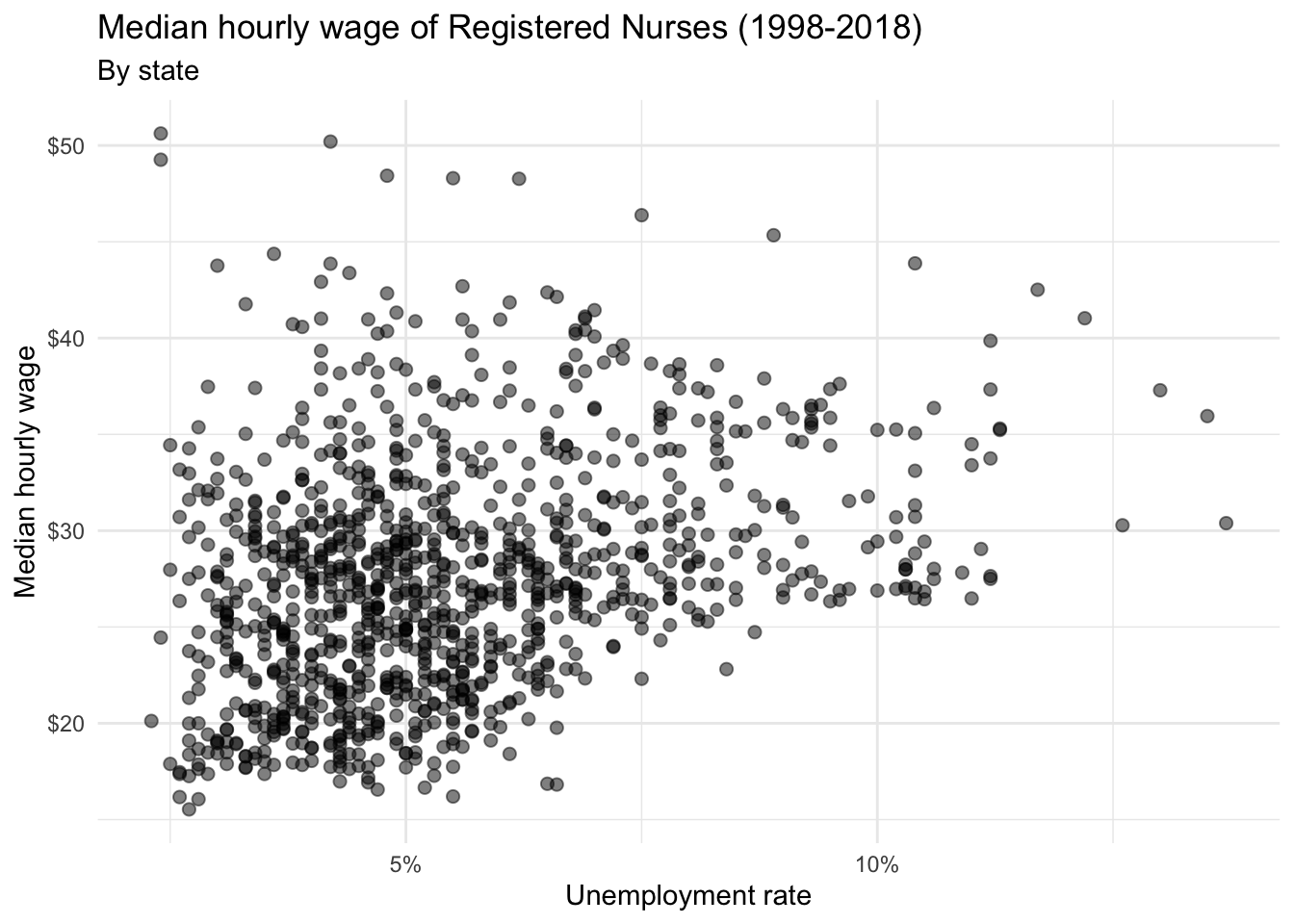
Acknowledgments
- Exercise drawn from STA 313: Advanced Data Visualization
NoteSession information
sessioninfo::session_info()─ Session info ───────────────────────────────────────────────────────────────
setting value
version R version 4.5.2 (2025-10-31)
os macOS Tahoe 26.3.1
system aarch64, darwin20
ui X11
language (EN)
collate en_US.UTF-8
ctype en_US.UTF-8
tz America/New_York
date 2026-03-13
pandoc 3.4 @ /usr/local/bin/ (via rmarkdown)
quarto 1.9.31 @ /usr/local/bin/quarto
─ Packages ───────────────────────────────────────────────────────────────────
! package * version date (UTC) lib source
P bit 4.6.0 2025-03-06 [?] RSPM (R 4.5.0)
P bit64 4.6.0-1 2025-01-16 [?] RSPM (R 4.5.0)
P cellranger 1.1.0 2016-07-27 [?] RSPM (R 4.5.0)
P cli 3.6.5 2025-04-23 [?] RSPM (R 4.5.0)
P crayon 1.5.3 2024-06-20 [?] RSPM (R 4.5.0)
P digest 0.6.39 2025-11-19 [?] RSPM (R 4.5.0)
P dplyr * 1.2.0 2026-02-03 [?] RSPM
P evaluate 1.0.5 2025-08-27 [?] RSPM (R 4.5.0)
P farver 2.1.2 2024-05-13 [?] RSPM (R 4.5.0)
P fastmap 1.2.0 2024-05-15 [?] RSPM (R 4.5.0)
P forcats * 1.0.1 2025-09-25 [?] RSPM (R 4.5.0)
P generics 0.1.4 2025-05-09 [?] RSPM (R 4.5.0)
P ggplot2 * 4.0.1 2025-11-14 [?] RSPM (R 4.5.0)
P glue 1.8.0 2024-09-30 [?] RSPM (R 4.5.0)
P gtable 0.3.6 2024-10-25 [?] RSPM (R 4.5.0)
P here 1.0.2 2025-09-15 [?] CRAN (R 4.5.0)
P hms 1.1.4 2025-10-17 [?] RSPM (R 4.5.0)
P htmltools 0.5.9 2025-12-04 [?] RSPM (R 4.5.0)
P htmlwidgets 1.6.4 2023-12-06 [?] RSPM (R 4.5.0)
P janitor 2.2.1 2024-12-22 [?] RSPM (R 4.5.0)
P jsonlite 2.0.0 2025-03-27 [?] RSPM (R 4.5.0)
P knitr 1.51 2025-12-20 [?] RSPM (R 4.5.0)
P labeling 0.4.3 2023-08-29 [?] RSPM (R 4.5.0)
P lifecycle 1.0.5 2026-01-08 [?] RSPM (R 4.5.0)
P lubridate * 1.9.4 2024-12-08 [?] RSPM (R 4.5.0)
P magrittr 2.0.4 2025-09-12 [?] RSPM (R 4.5.0)
P otel 0.2.0 2025-08-29 [?] RSPM (R 4.5.0)
P pillar 1.11.1 2025-09-17 [?] RSPM (R 4.5.0)
P pkgconfig 2.0.3 2019-09-22 [?] RSPM (R 4.5.0)
P purrr * 1.2.0 2025-11-04 [?] CRAN (R 4.5.0)
P R6 2.6.1 2025-02-15 [?] RSPM (R 4.5.0)
P RColorBrewer 1.1-3 2022-04-03 [?] RSPM (R 4.5.0)
P readr * 2.1.6 2025-11-14 [?] RSPM (R 4.5.0)
P readxl * 1.4.5 2025-03-07 [?] RSPM (R 4.5.0)
P renv 1.1.7 2026-01-27 [?] RSPM
P rlang 1.1.7 2026-01-09 [?] RSPM (R 4.5.0)
P rmarkdown 2.30 2025-09-28 [?] RSPM (R 4.5.0)
P rprojroot 2.1.1 2025-08-26 [?] RSPM (R 4.5.0)
P S7 0.2.1 2025-11-14 [?] RSPM (R 4.5.0)
P scales * 1.4.0 2025-04-24 [?] RSPM (R 4.5.0)
P sessioninfo 1.2.3 2025-02-05 [?] RSPM (R 4.5.0)
P snakecase 0.11.1 2023-08-27 [?] RSPM (R 4.5.0)
P stringi 1.8.7 2025-03-27 [?] RSPM (R 4.5.0)
P stringr * 1.6.0 2025-11-04 [?] RSPM (R 4.5.0)
P tibble * 3.3.0 2025-06-08 [?] RSPM (R 4.5.0)
P tidyr * 1.3.2 2025-12-19 [?] RSPM (R 4.5.0)
P tidyselect 1.2.1 2024-03-11 [?] RSPM (R 4.5.0)
P tidyverse * 2.0.0 2023-02-22 [?] RSPM (R 4.5.0)
P timechange 0.3.0 2024-01-18 [?] RSPM (R 4.5.0)
P tzdb 0.5.0 2025-03-15 [?] RSPM (R 4.5.0)
P vctrs 0.7.1 2026-01-23 [?] RSPM
P viridisLite 0.4.2 2023-05-02 [?] RSPM (R 4.5.0)
P vroom 1.6.7 2025-11-28 [?] RSPM (R 4.5.0)
P withr 3.0.2 2024-10-28 [?] RSPM (R 4.5.0)
P xfun 0.55 2025-12-16 [?] CRAN (R 4.5.2)
P yaml 2.3.12 2025-12-10 [?] RSPM (R 4.5.0)
[1] /Users/bcs88/Projects/info-3312/course-site/renv/library/macos/R-4.5/aarch64-apple-darwin20
[2] /Users/bcs88/Library/Caches/org.R-project.R/R/renv/sandbox/macos/R-4.5/aarch64-apple-darwin20/4cd76b74
* ── Packages attached to the search path.
P ── Loaded and on-disk path mismatch.
──────────────────────────────────────────────────────────────────────────────