AE 12: Critique great visualizations
Suggested answers
The five qualities of great visualizations
Alberto Cairo, in his book The Truthful Art, outlines five qualities of great visualizations:
- Truthful: The visualization should not distort the data.
- Functional: The visualization should be easy to read and interpret.
- Beautiful: The visualization should be aesthetically pleasing.
- Insightful: The visualization should help the viewer understand the data.
- Enlightening: The visualization should help the viewer see the data in a new way.
Visualizing attitudes on social issues
Nationscape is a major public opinion survey project that has collected data on a wide range of topics, including attitudes on social issues, the economy, and immigration. In 2024, Jan Zilinsky shared a visualization of some of the Nationscape data on X, replicated below:
nationscape |>
  mutate(label = fct_rev(f = label)) |>
  ggplot(mapping = aes(x = mean_response, y = label, fill = gender)) +
  geom_col(position = position_dodge(width = 0.6), col = "black") +
  scale_x_continuous(labels = label_percent()) +
  scale_fill_manual(values = c("#3182ff", "#d52033")) +
  facet_wrap(facets = vars(age), nrow = 1) +
  labs(
    title = "Views on social issues, the economy, and immigration",
    subtitle = "Nationscape surveys, 2019-21",
    x = "% Agreement",
    y = NULL,
    fill = NULL,
    caption = "Chart & calculations replicated from: @janzilinsky"
  ) +
  theme_minimal()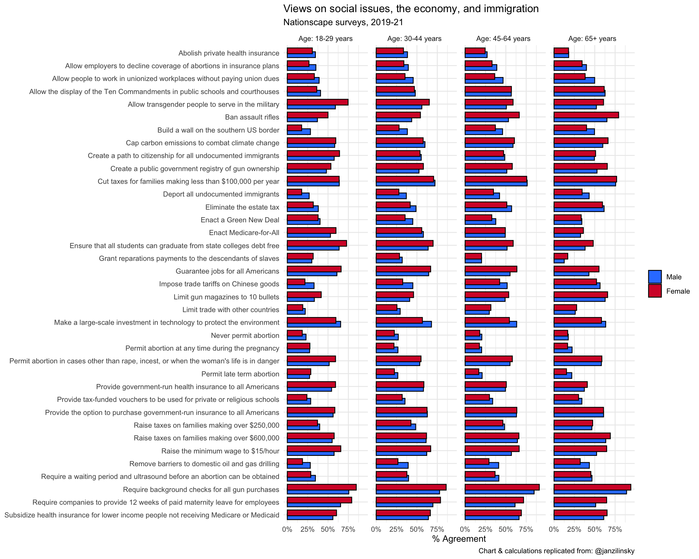
Your turn: Critique the visualization using Cairo’s five qualities. For each quality identify at least one strength and one weakness of the visualization.
Responses vary.
Improving the visualization
Your turn: Identify at least three design choices that could be implemented to improve the visualization. Be detailed. Possible approaches could include:
- Different chart type
- Additional layers
- Employ faceting (or not)
- New color palette
- Annotations (text, arrows, highlighting, etc.)
- Different graphical
theme()
Below is a curated selection of approaches that different students took to improve the visualization. Note that there are many ways to improve a visualization, and the approaches below are not necessarily “better” than one another.
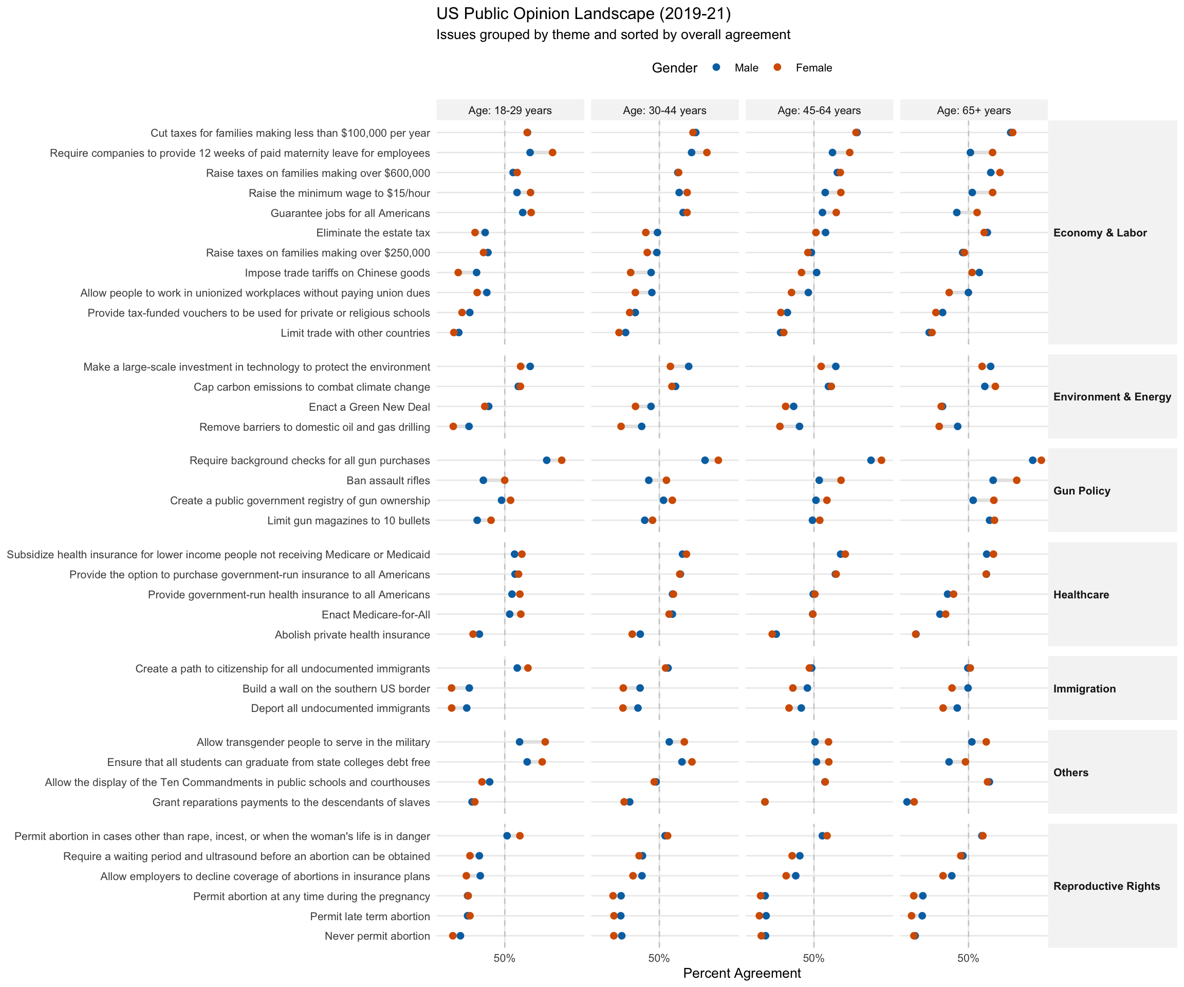
Kevin
- Switch to a Cleveland Dot Plot (Lollipop Chart): Replacing thick bars with dots connected by a line (a “dumbbell” or “DNA” plot) reduces visual clutter. This emphasizes the gap between male and female responses—which is often the most interesting part of gender-based data—rather than just the raw magnitude of each.
- Reorder by Magnitude (Effect Size): The current alphabetical sorting is the “death of insight.” Sorting the issues by the overall mean agreement (or by the size of the gender gap) allows the viewer to instantly see which issues have the most consensus (e.g., background checks) versus which are the most niche (e.g., never permit abortion).
-
Refine Typography and Color Contrast: Removing the heavy black outlines on the bars and using a more muted, professional color palette (like
viridisor high-contrast custom hex codes) improves legibility. Adding a dashed vertical line at the 50% mark provides a constant “majority” reference point across all facets.
# 1. Categorize labels into logical themes
nationscape_themed <- nationscape |>
  mutate(
    theme = case_when(
      str_detect(label, "abortion|Abortion|ultrasound") ~ "Reproductive Rights",
      str_detect(label, "gun|bullets|registry|rifles") ~ "Gun Policy",
      str_detect(label, "immigrants|border|citizenship|Deport") ~ "Immigration",
      str_detect(
        label,
        "tax|wage|maternity|jobs|tariffs|estate tax|trade|union"
      ) ~ "Economy & Labor",
      str_detect(
        label,
        "environment|climate|oil|Green New Deal"
      ) ~ "Environment & Energy",
      str_detect(
        label,
        "insurance|Medicare|Medicare-for-All|health"
      ) ~ "Healthcare",
      TRUE ~ "Others"
    )
  ) |>
  # Reorder labels by agreement within their respective themes
  mutate(label = fct_reorder(label, mean_response, .fun = mean))

# 2. Create the themed visualization
ggplot(nationscape_themed, aes(x = mean_response, y = label)) +
  # 50% Reference Line
  geom_vline(xintercept = 0.5, linetype = "dashed", color = "gray80") +
  # Dumbbell Lines
  geom_line(aes(group = label), color = "gray90", linewidth = 1.2) +
  # Points
  geom_point(aes(color = gender), size = 2) +
  # Facet by Theme (Y) and Age (X)
  facet_grid(theme ~ age, scales = "free_y", space = "free_y") +
  # Styling
  scale_x_continuous(labels = label_percent(), breaks = c(0, .5, 1)) +
  scale_color_manual(values = c("Male" = "#0072B2", "Female" = "#D55E00")) +
  labs(
    title = "US Public Opinion Landscape (2019-21)",
    subtitle = "Issues grouped by theme and sorted by overall agreement",
    x = "Percent Agreement",
    y = NULL,
    color = "Gender"
  ) +
  theme_minimal(base_size = 10) +
  theme(
    strip.text.y = element_text(angle = 0, face = "bold", hjust = 0), # Horizontal theme labels
    strip.background = element_rect(fill = "gray96", color = NA),
    panel.spacing.y = unit(0.5, "lines"),
    legend.position = "top",
    panel.grid.minor = element_blank()
  )
Sam
Show the gender gap instead of two bars. Replace the dodged bars with a single value: male % minus female % (or vice versa). This halves the number of bars and makes the gender comparison the direct focus, rather than requiring the reader to subtract mentally.
Remove age faceting. Drop the four age panels and show only the overall (all-ages) averages. This reduces the chart from ~120 bars to ~15 and makes patterns immediately visible. Age differences could be explored in a separate, dedicated chart.
Switch to a lollipop chart. Replace bars with points and thin lines. Less ink, less visual weight, and easier to read when many categories are stacked vertically.
Replace the blue/red palette with politically neutral colors. Use a different color scheme to avoid the Democrat/Republican association and focus attention on the actual gender gap.
nationscape |>
  summarize(mean_response = mean(mean_response), .by = c(label, gender)) |>
  pivot_wider(names_from = gender, values_from = mean_response) |>
  mutate(
    gap = Male - Female,
    label = fct_reorder(label, -gap),
    direction = if_else(gap > 0, "Men higher", "Women higher")
  ) |>
  ggplot(aes(x = gap, y = label, color = direction)) +
  geom_vline(xintercept = 0, linewidth = 0.5, color = "gray60") +
  geom_segment(aes(xend = 0, yend = label), linewidth = 0.8) +
  geom_point(size = 3) +
  scale_x_continuous(labels = label_percent()) +
  scale_color_manual(
    values = c("Men higher" = "#1b7837", "Women higher" = "#762a83")
  ) +
  labs(
    title = "Gender gap in views on social issues, the economy, and immigration",
    subtitle = "Nationscape surveys, 2019–21 (men's agreement minus women's agreement)",
    x = "Gender gap (percentage points)",
    y = NULL,
    color = NULL,
    caption = "Chart & calculations replicated from: @janzilinsky"
  ) +
  theme_minimal() +
  theme(legend.position = "bottom")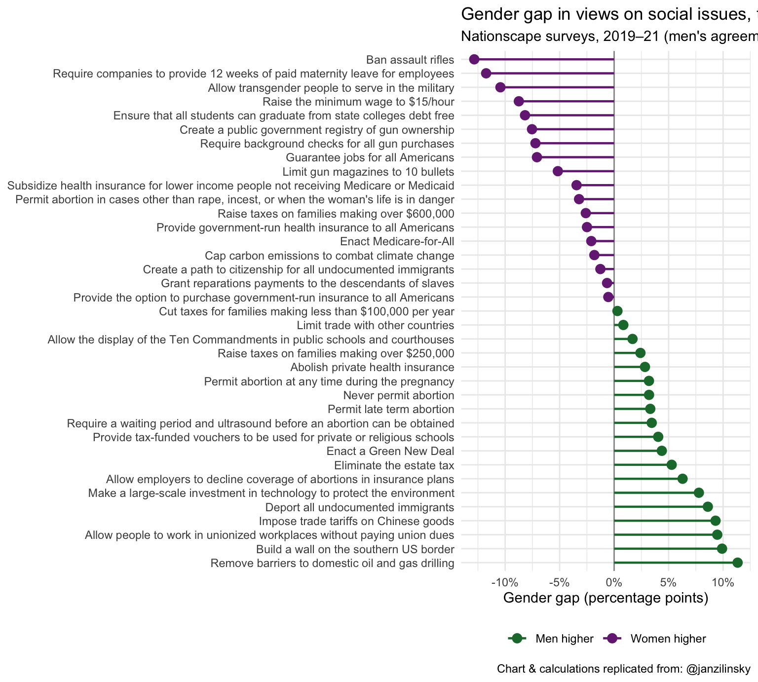
nationscape |>
  summarize(mean_response = mean(mean_response), .by = c(label, age)) |>
  mutate(
    label = fct_reorder(label, mean_response, .fun = function(x) {
      diff(range(x))
    }),
    age = str_remove_all(age, "Age: | years")
  ) |>
  ggplot(aes(x = mean_response, y = label, color = age)) +
  geom_line(aes(group = label), color = "gray70", linewidth = 0.8) +
  geom_point(size = 3) +
  scale_x_continuous(labels = label_percent()) +
  scale_color_viridis_d(option = "plasma", end = 0.85) +
  labs(
    title = "Views on social issues, the economy, and immigration by age group",
    subtitle = "Nationscape surveys, 2019–21 (averaged across genders)",
    x = "% Agreement",
    y = NULL,
    color = NULL,
    caption = "Chart & calculations replicated from: @janzilinsky"
  ) +
  theme_minimal() +
  theme(legend.position = "bottom")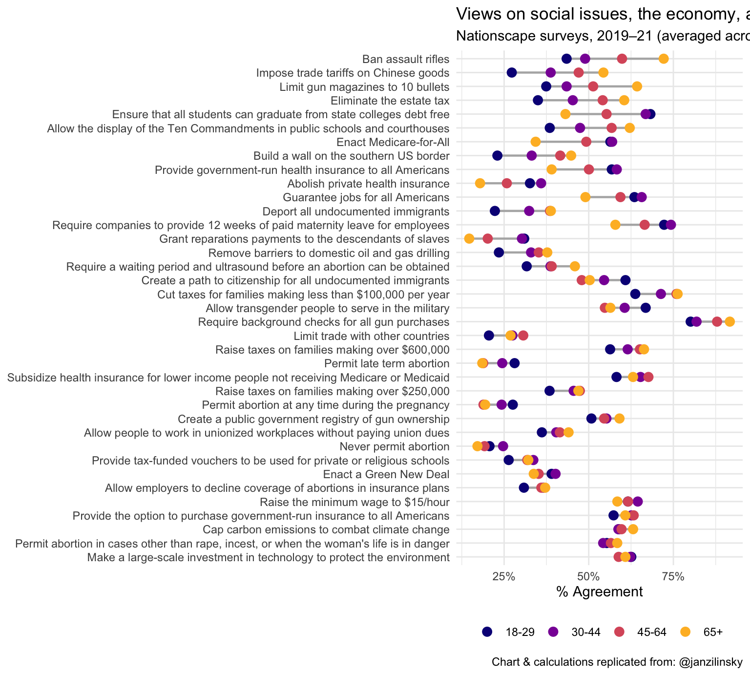
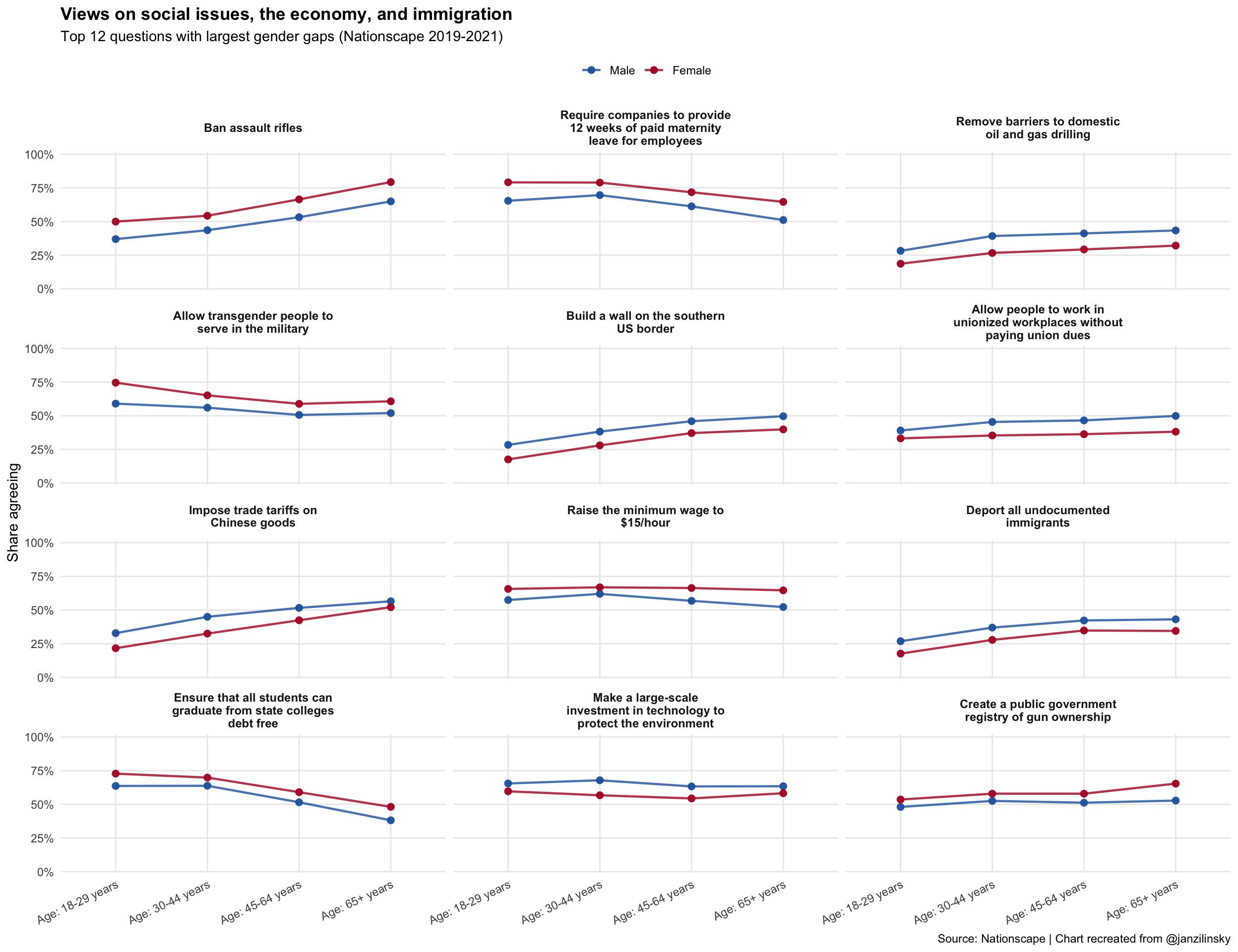
Karam
Use lines and points instead of overlapping bars
This keeps comparisons clear and avoids the heavy stacked look.Focus on a smaller set of questions
Show the 12 questions with the largest gender gaps, so the chart is readable without cramming labels.Use small multiples by question
Each question gets its own panel, which removes the overloaded left-side text and improves spacing.
nationscape_gaps <- nationscape |>
  group_by(label, gender) |>
  summarize(avg_agree = mean(mean_response), .groups = "drop") |>
  pivot_wider(names_from = gender, values_from = avg_agree) |>
  mutate(abs_gender_gap = abs(Female - Male)) |>
  arrange(desc(abs_gender_gap))

top_labels <- nationscape_gaps |>
  slice_head(n = 12) |>
  pull(label)

nationscape_improved <- nationscape |>
  filter(label %in% top_labels) |>
  mutate(
    label_wrap = str_wrap(label, width = 28),
    age = factor(
      age,
      levels = c(
        "Age: 18-29 years",
        "Age: 30-44 years",
        "Age: 45-64 years",
        "Age: 65+ years"
      )
    )
  ) |>
  mutate(
    label_wrap = factor(label_wrap, levels = str_wrap(top_labels, width = 28))
  )

ggplot(
  nationscape_improved,
  aes(x = age, y = mean_response, color = gender, group = gender)
) +
  geom_line(linewidth = 0.8, alpha = 0.8) +
  geom_point(
    size = 2.1,
    alpha = 0.95
  ) +
  facet_wrap(vars(label_wrap), ncol = 3) +
  scale_y_continuous(
    labels = label_percent(accuracy = 1),
    limits = c(0, 1),
    breaks = seq(0, 1, by = 0.25),
    expand = expansion(mult = c(0.01, 0.02))
  ) +
  scale_color_manual(values = c("Male" = "#2166ac", "Female" = "#b2182b")) +
  labs(
    title = "Views on social issues, the economy, and immigration",
    subtitle = "Top 12 questions with largest gender gaps (Nationscape 2019-2021)",
    x = NULL,
    y = "Share agreeing",
    color = NULL,
    caption = "Source: Nationscape | Chart recreated from @janzilinsky"
  ) +
  theme_minimal(base_size = 11) +
  theme(
    panel.grid.minor = element_blank(),
    axis.text.x = element_text(angle = 25, hjust = 1),
    legend.position = "top",
    strip.text = element_text(face = "bold", size = 9),
    plot.title = element_text(face = "bold")
  )
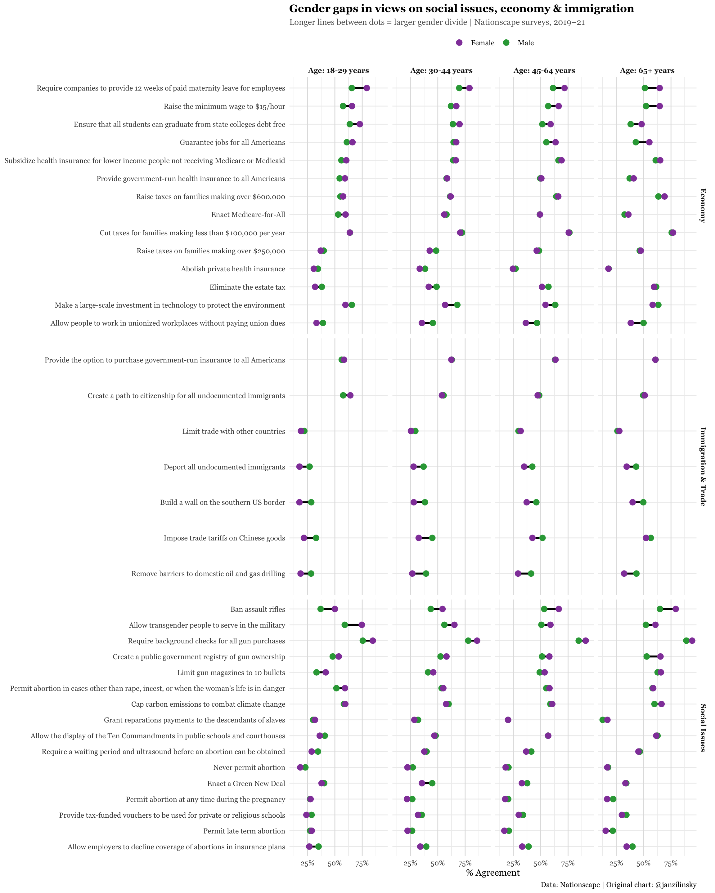
Tiffany
- Facet by topic/social issue category rather than age
- Highlight the largest gender gaps
- Reduce clutter with a dot/lollipop plot so that the graph is less crowded with bars
# add code here
nationscape |>
  mutate(
    category = case_when(
      label %in%
        c(
          "Ban assault rifles",
          "Require background checks for all gun purchases",
          "Create a public government registry of gun ownership",
          "Limit gun magazines to 10 bullets",
          "Permit abortion in cases other than rape, incest, or when the woman's life is in danger",
          "Require a waiting period and ultrasound before an abortion can be obtained",
          "Never permit abortion",
          "Permit abortion at any time during the pregnancy",
          "Permit late term abortion",
          "Allow employers to decline coverage of abortions in insurance plans",
          "Allow transgender people to serve in the military",
          "Enact a Green New Deal",
          "Cap carbon emissions to combat climate change",
          "Grant reparations payments to the descendants of slaves",
          "Allow the display of the Ten Commandments in public schools and courthouses",
          "Provide tax-funded vouchers to be used for private or religious schools"
        ) ~ "Social Issues",
      label %in%
        c(
          "Raise the minimum wage to $15/hour",
          "Ensure that all students can graduate from state colleges debt free",
          "Guarantee jobs for all Americans",
          "Subsidize health insurance for lower income people not receiving Medicare or Medicaid",
          "Provide government-run health insurance to all Americans",
          "Raise taxes on families making over $600,000",
          "Enact Medicare-for-All",
          "Abolish private health insurance",
          "Raise taxes on families making over $250,000",
          "Cut taxes for families making less than $100,000 per year",
          "Eliminate the estate tax",
          "Make a large-scale investment in technology to protect the environment",
          "Allow people to work in unionized workplaces without paying union dues",
          "Require companies to provide 12 weeks of paid maternity leave for employees"
        ) ~ "Economy",
      label %in%
        c(
          "Create a path to citizenship for all undocumented immigrants",
          "Deport all undocumented immigrants",
          "Build a wall on the southern US border",
          "Limit trade with other countries",
          "Impose trade tariffs on Chinese goods",
          "Remove barriers to domestic oil and gas drilling",
          "Provide the option to purchase government-run insurance to all Americans"
        ) ~ "Immigration & Trade",
      TRUE ~ "Other"
    )
  ) |>
  pivot_wider(names_from = gender, values_from = mean_response) |>
  mutate(
    gender_gap = Female - Male,
    label = fct_reorder(label, gender_gap)
  ) |>
  pivot_longer(
    cols = c(Male, Female),
    names_to = "gender",
    values_to = "mean_response"
  ) |>
  ggplot(aes(x = mean_response, y = label)) +
  geom_line(aes(group = label), color = "black", linewidth = 1.1) +
  geom_point(aes(color = gender), size = 3) +
  facet_grid(rows = vars(category), cols = vars(age), scales = "free_y") +
  scale_x_continuous(
    labels = label_percent(),
    breaks = c(0, 0.25, 0.5, 0.75, 1.0)
  ) +
  scale_color_manual(values = c("Male" = "#2fa545ff", "Female" = "#9245a9ff")) +
  labs(
    title = "Gender gaps in views on social issues, economy & immigration",
    subtitle = "Longer lines between dots = larger gender divide | Nationscape surveys, 2019–21",
    x = "% Agreement",
    y = NULL,
    color = NULL,
    caption = "Data: Nationscape | Original chart: @janzilinsky"
  ) +
  theme_minimal(base_size = 11) +
  theme(
    legend.position = "top",
    strip.text = element_text(face = "bold"),
    panel.grid.major.y = element_line(color = "gray93"),
    panel.grid.major.x = element_line(color = "gray88"),
    plot.title = element_text(face = "bold", size = 13, family = "Georgia"),
    plot.subtitle = element_text(
      color = "gray40",
      size = 10,
      family = "Georgia"
    ),
    axis.text = element_text(family = "Georgia"),
    text = element_text(family = "Georgia")
  )