AE 09: Telling a story of CO₂ emissions over time
This application exercise is completed in class and submitted via a worksheet.
Data
The dataset comes from the World Bank and contains information on CO₂ emissions, GDP per capita, and population for 215 countries from 1995 to 2022. The data is available in the file wdi_co2.csv. We will import the data and perform some basic cleaning tasks.
# import raw data obtained using WDI API
wdi_co2_raw <- read_csv("data/wdi_co2.csv")

# clean the data
wdi_clean <- wdi_co2_raw |>
  # remove observations that are not actually countries
  filter(region != "Aggregates") |>
  # select relevant columns and rename to make it easier
  select(
    iso2c,
    iso3c,
    country,
    year,
    population = SP.POP.TOTL,
    co2_emissions = EN.ATM.CO2E.PC,
    gdp_per_cap = NY.GDP.PCAP.KD,
    region,
    income
  )

wdi_clean
# A tibble: 6,020 × 9
iso2c iso3c country year population co2_emissions gdp_per_cap region income
<chr> <chr> <chr> <dbl> <dbl> <dbl> <dbl> <chr> <chr>
1 AF AFG Afghani… 2001 19688632 0.0553 NA South… Low i…
2 AF AFG Afghani… 1998 18493132 0.0713 NA South… Low i…
3 AF AFG Afghani… 2009 27385307 0.240 490. South… Low i…
4 AF AFG Afghani… 2000 19542982 0.0552 NA South… Low i…
5 AF AFG Afghani… 2012 30466479 0.335 571. South… Low i…
6 AF AFG Afghani… 1996 17106595 0.0823 NA South… Low i…
7 AF AFG Afghani… 1999 19262847 0.0582 NA South… Low i…
8 AF AFG Afghani… 2002 21000256 0.0668 344. South… Low i…
9 AF AFG Afghani… 2003 22645130 0.0730 347. South… Low i…
10 AF AFG Afghani… 2004 23553551 0.0549 339. South… Low i…
# ℹ 6,010 more rowsNext we rank countries based on their CO₂ emissions in 1995 and 2020, and then calculate the difference in rankings. We also create a variable that indicates if the rank changed by a lot (more than 30 positions). This requires substantial data cleaning and wrangling.
co2_rankings <- wdi_clean |>
  # Get rid of smaller countries
  filter(population > 200000) |>
  # Only look at two years
  filter(year %in% c(1995, 2020)) |>
  # Get rid of all the rows that have missing values in co2_emissions
  drop_na(co2_emissions) |>
  # Look at each year individually and rank countries based on their emissions that year
  mutate(
    ranking = rank(co2_emissions),
    .by = year
  ) |>
  # Only select required columns
  select(iso3c, country, year, region, income, ranking) |>
  # pivot long
  pivot_wider(
    names_from = year,
    names_prefix = "rank_",
    values_from = ranking
  ) |>
  # Find the difference in ranking between 2020 and 1995
  mutate(rank_diff = rank_2020 - rank_1995) |>
  # Remove all rows where there's a missing value in the rank_diff column
  drop_na(rank_diff) |>
  # Make an indicator variable that is true of the absolute value of the
  # difference in rankings is greater than 30
  mutate(big_change = if_else(abs(rank_diff) >= 30, TRUE, FALSE)) |>
  # Make another indicator variable that indicates if the rank improved by a
  # lot, worsened by a lot, or didn't change much.
  mutate(
    better_big_change = case_when(
      rank_diff <= -30 ~ "Rank improved",
      rank_diff >= 30 ~ "Rank worsened",
      .default = "Rank changed a little"
    )
  ) |>
  # arrange rows by rank_diff for printing
  arrange(rank_diff)
Here is what the data looked like originally:
slice_head(wdi_clean, n = 5)# A tibble: 5 × 9
iso2c iso3c country year population co2_emissions gdp_per_cap region income
<chr> <chr> <chr> <dbl> <dbl> <dbl> <dbl> <chr> <chr>
1 AF AFG Afghanis… 2001 19688632 0.0553 NA South… Low i…
2 AF AFG Afghanis… 1998 18493132 0.0713 NA South… Low i…
3 AF AFG Afghanis… 2009 27385307 0.240 490. South… Low i…
4 AF AFG Afghanis… 2000 19542982 0.0552 NA South… Low i…
5 AF AFG Afghanis… 2012 30466479 0.335 571. South… Low i…And here is what it looks like after cleaning:
slice_head(co2_rankings, n = 5)# A tibble: 5 × 9
iso3c country region income rank_1995 rank_2020 rank_diff big_change
<chr> <chr> <chr> <chr> <dbl> <dbl> <dbl> <lgl>
1 ZWE Zimbabwe Sub-S… Lower… 75 39 -36 TRUE
2 DNK Denmark Europ… High … 160 127 -33 TRUE
3 SWE Sweden Europ… High … 132 100 -32 TRUE
4 SYR Syrian Arab Repu… Middl… Low i… 96 64 -32 TRUE
5 MLT Malta Middl… High … 128 99 -29 FALSE
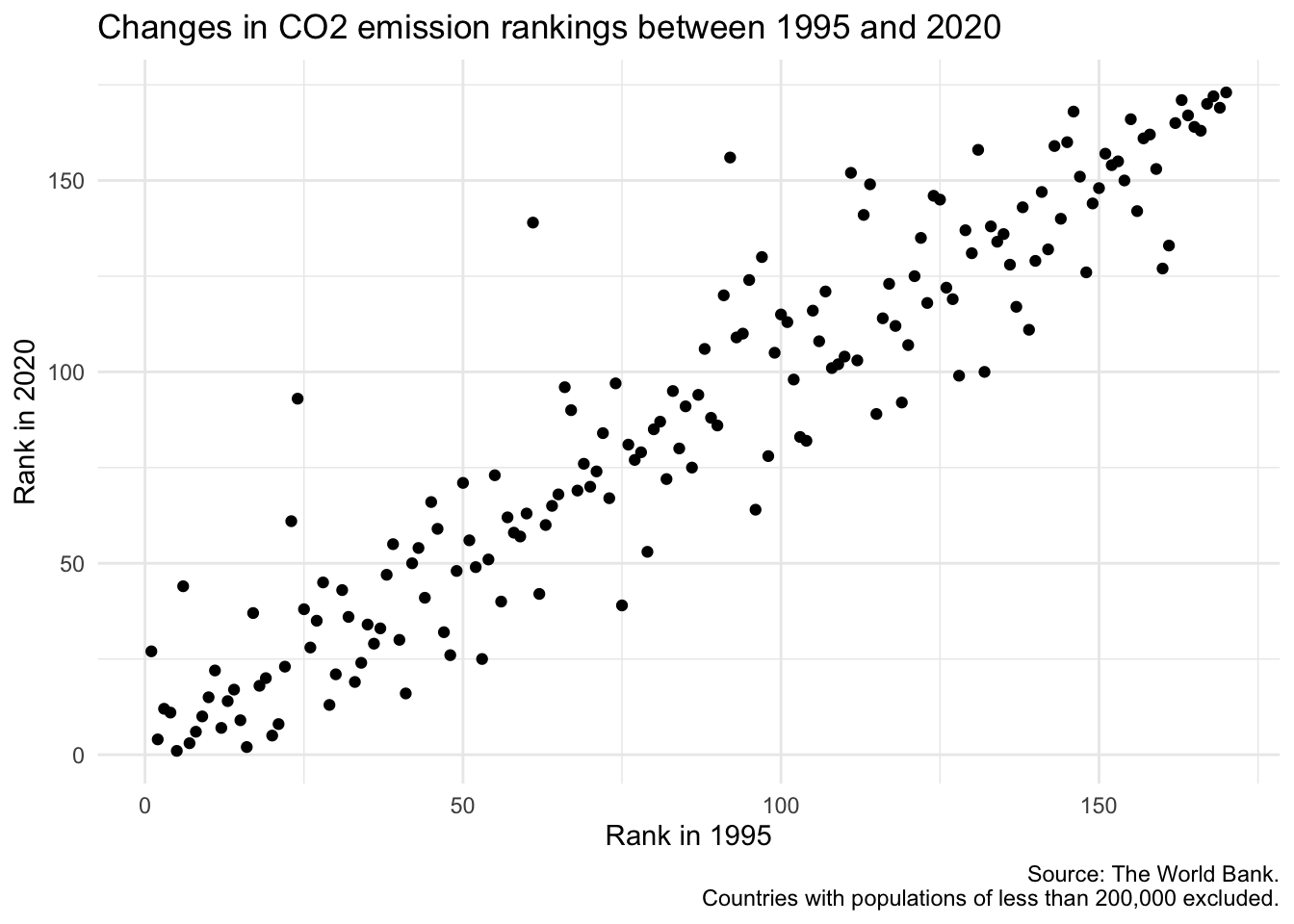
# ℹ 1 more variable: better_big_change <chr>Basic plot
Let’s create a basic plot that visualizes the changes in CO₂ emission rankings between 1995 and 2020.
Brainstorm improvements
Your turn: Brainstorm methods to improve the readability and interpretability of the chart through annotations.
Potential aspects to emphasize
-
What is a “good” rank? What is a “bad” rank?
Note- 1 is lowest carbon emissions per capita
- 170 is the highest carbon emissions per capita
What are the countries that have significantly improved or worsened their rank?
What other aspects do you feel should be emphasized?
Methods for annotation
- Text labels
- Arrows/lines
- Rectangles
- Colors/fills
Acknowledgments
- Exercise drawn from Data Visualization with R by Andrew Heiss and licensed under CC BY-NC 4.0.