library(tidyverse)

# set default theme to minimal - reduce extraneous background ink
theme_set(theme_minimal())

options(scipen = 999)AE 02: Considering the data-ink ratio: The lollipop chart
Application exercise
Important
Go to the course GitHub organization and locate the repo titled ae-02-YOUR_GITHUB_USERNAME to get started.
This AE is due January 27 at 11:59pm.
For the following exercises we will work with data on houses that were sold in Tompkins County, NY in 2022-24.1
The variables include:
-
sold_date- date of last recorded sale -
price- sale price (in dollars) -
beds- number of bedrooms -
baths- number of bathrooms. Full bathrooms with shower/toilet count as 1, bathrooms with just a toilet count as 0.5. -
area- living area of the home (in square feet) -
lot_size- size of property’s lot (in acres) -
year_built- year home was built -
hoa_month- monthly HOA dues. If the property is not part of an HOA, then the value isNA -
town- Census-defined town in which the house is located. -
municipality- Census-defined municipality in which the house is located. If the house is located outside of city or village limits, it is classified as “Unincorporated” -
longandlat- geographic coordinates of house
The dataset can be found in the data folder of your repo. It is called tompkins-home-sales.csv. We will import the data and create a new variable, decade_built_cat, which identifies the decade in which the home was built. It will include catch-all categories for any homes pre-1940 and post-1990.
tompkins <- read_csv("data/tompkins-home-sales.csv")Average sale price by decade
Let’s examine the average sales price of homes recently sold in Tompkins County by their age. To simplify this task, we will split the homes by decade of construction. It will include catch-all categories for any homes pre-1940 and post-1990. Then we will calculate the average sale price of homes sold by decade.
# create decade variable
tompkins <- tompkins |>
mutate(
decade_built = (year_built %/% 10) * 10,
decade_built_cat = case_when(
decade_built <= 1940 ~ "1940 or before",
decade_built >= 1990 ~ "1990 or after",
.default = as.character(decade_built)
)
)
# calculate mean sales price by decade
mean_price_decade <- tompkins |>
group_by(decade_built_cat) |>
summarize(mean_price = mean(price))
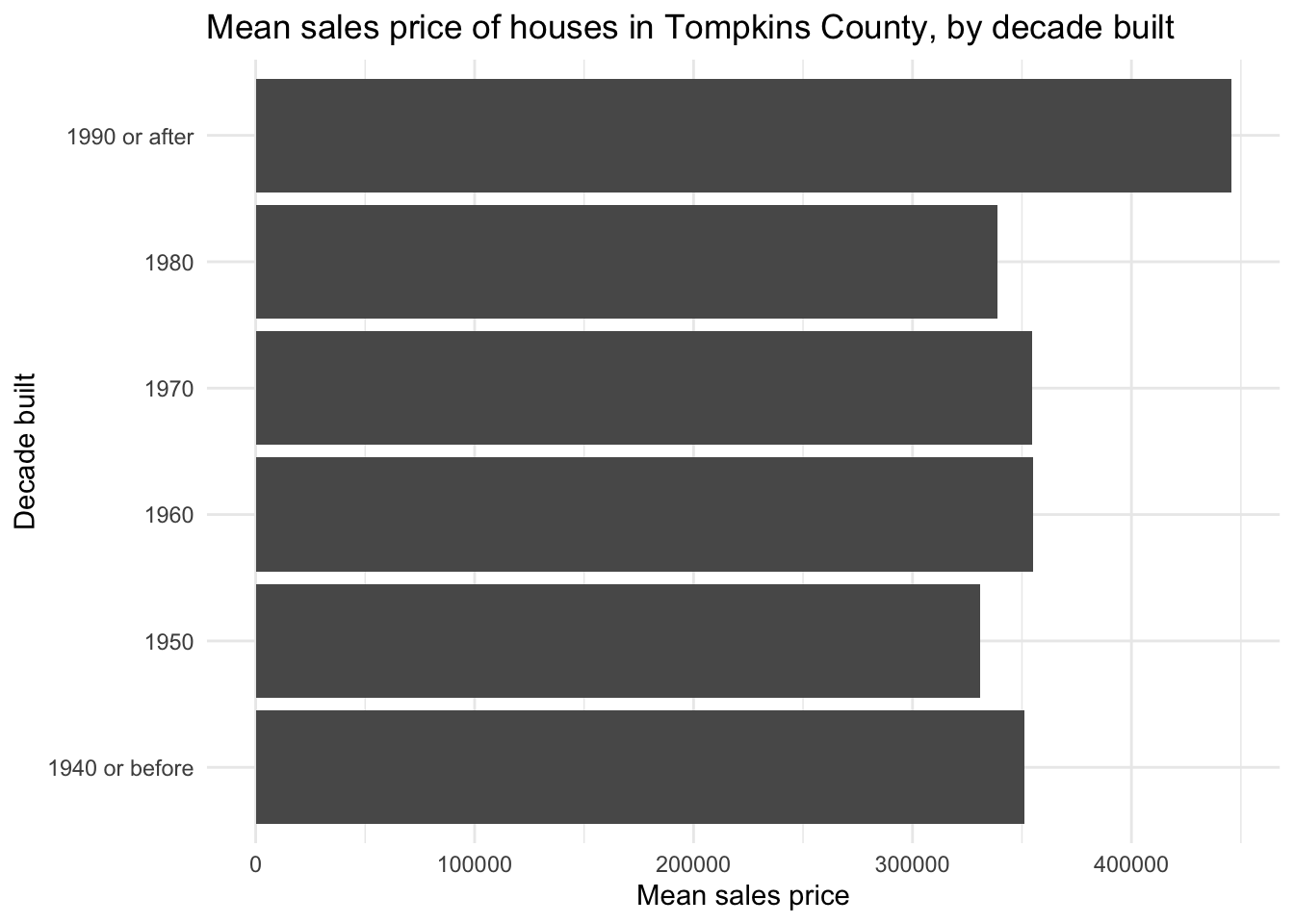
mean_price_decade# A tibble: 6 × 2
decade_built_cat mean_price
<chr> <dbl>
1 1940 or before 351273.
2 1950 330779.
3 1960 355146.
4 1970 354562.
5 1980 338600.
6 1990 or after 445540.Visualizing the data as a bar chart
A conventional approach to visualizing this data is a bar chart. Since we already calculated the average sales price, we can use geom_col() to create the bar chart. We also graph it horizontally to avoid overlapping labels for the decades.
Visualizing the data as a dot plot
The bar chart violates the data-ink ratio principle. The bars are not necessary to convey the information. We can use a dot plot instead. The dot plot is a variation of the bar chart, where the bars are replaced by dots. The dot plot is a (potentially) better choice because it uses less ink to convey the same information.
ggplot(
  data = mean_price_decade,
  mapping = aes(x = mean_price, y = decade_built_cat)
) +
  geom_point(size = 4) +
  labs(
    x = "Mean sales price",
    y = "Decade built",
    title = "Mean sales price of houses in Tompkins County, by decade built"
  )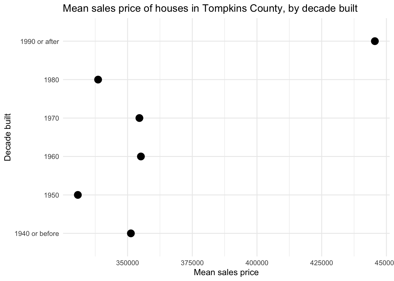
The dot plot minimizes the data-ink ratio, but it is not perfect. Unlike with a bar chart, there is no expectation that the origin of the \(x\)-axis begins at 0. The relative distance between the dots communicates the difference in mean sales price, and compared to the bar chart, the difference in mean sales price is exaggerated.
Visualizing the data as a lollipop chart
The lollipop chart is a happy compromise, utilizing a skinny line + dot to communicate the values.
Your turn: Define the conceptual grammar of graphics for a lollipop chart to visualize the average sales price by decade built. Focus specifically on the layer(s) needed to create the “lollipop” effect, the geometric object(s), and the mapping aesthetics required.
TipChoosing appropriate geom(s)
Try to construct the chart without using geom_col(). You would have to spend more time tweaking some of the function’s parameters so it looks appropriate.
There is another geom_*() that works pretty well here.
Add response here.
Your turn: Implement your lollipop chart using ggplot().
# add code hereAcknowledgments
- Exercise adapted from Advanced Data Visualization by Mine Çetinkaya-Rundel.