library(tidyverse)

# set default theme to minimal - reduce extraneous background ink
theme_set(theme_minimal())Considering the data-ink ratio: The lollipop chart
Suggested answers
Application exercise
Answers
Important
These are suggested answers. This document should be used as reference only, it’s not designed to be an exhaustive key.
For the following exercises we will work with data on houses that were sold in Tompkins County, NY in 2022 and 2023.1
The variables include:
property_type- type of property (e.g. single family residential, townhouse, condo)address- street address of propertycity- city of propertystate- state of property (all are New York)zip_code- ZIP code of propertyprice- sale price (in dollars)beds- number of bedroomsbaths- number of bathrooms. Full bathrooms with shower/toilet count as 1, bathrooms with just a toilet count as 0.5.area- living area of the home (in square feet)lot_size- size of property’s lot (in acres)year_built- year home was builthoa_month- monthly HOA dues. If the property is not part of an HOA, then the value isNA
The dataset can be found in the data folder of your repo. It is called tompkins-home-sales.csv. We will import the data and create a new variable, decade_built_cat, which identifies the decade in which the home was built. It will include catch-all categories for any homes pre-1940 and post-1990.
tompkins <- read_csv("data/tompkins-home-sales.csv")Average home size by decade
Let’s examine the average size of homes recently sold in Tompkins County by their age. To simplify this task, we will split the homes by decade of construction. It will include catch-all categories for any homes pre-1940 and post-1990. Then we will calculate the average size of homes sold by decade.
# create decade variable
tompkins <- tompkins |>
  mutate(
    decade_built = (year_built %/% 10) * 10,
    decade_built_cat = case_when(
      decade_built <= 1940 ~ "1940 or before",
      decade_built >= 1990 ~ "1990 or after",
      .default = as.character(decade_built)
    )
  )

# calculate mean area by decade
mean_area_decade <- tompkins |>
  group_by(decade_built_cat) |>
  summarize(mean_area = mean(area))
mean_area_decade
# A tibble: 6 × 2
decade_built_cat mean_area
<chr> <dbl>
1 1940 or before 1872.
2 1950 1645.
3 1960 1874.
4 1970 1908.
5 1980 1852.
6 1990 or after 2226.Visualizing the data as a bar chart
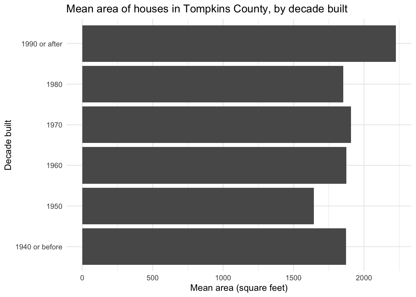
A conventional approach to visualizing this data is a bar chart. Since we already calculated the average area, we can use geom_col() to create the bar chart. We also graph it horizontally to avoid overlapping labels for the decades.
ggplot(
  data = mean_area_decade,
  mapping = aes(x = mean_area, y = decade_built_cat)
) +
  geom_col() +
  labs(
    x = "Mean area (square feet)", y = "Decade built",
    title = "Mean area of houses in Tompkins County, by decade built"
  )
Visualizing the data as a dot plot
The bar chart violates the data-ink ratio principle. The bars are not necessary to convey the information. We can use a dot plot instead. The dot plot is a variation of the bar chart, where the bars are replaced by dots. The dot plot is a (potentially) better choice because it uses less ink to convey the same information.
ggplot(
  data = mean_area_decade,
  mapping = aes(x = mean_area, y = decade_built_cat)
) +
  geom_point(size = 4) +
  labs(
    x = "Mean area (square feet)", y = "Decade built",
    title = "Mean area of houses in Tompkins County, by decade built"
  )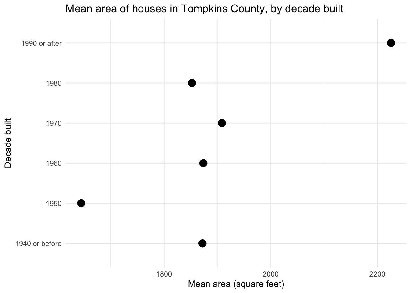
The dot plot minimizes the data-ink ratio, but it is not perfect. Unlike with a bar chart, there is no expectation that the origin of the \(x\)-axis begins at 0. The relative distance between the dots communicates the difference in mean area, and compared to the bar chart, the difference in mean area is exaggerated.
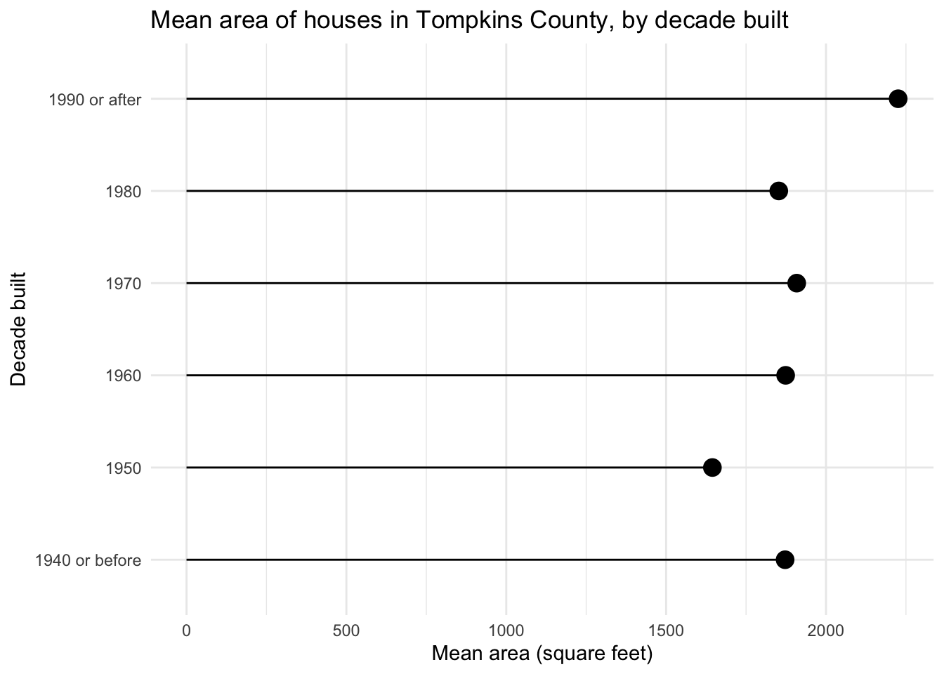
Visualizing the data as a lollipop chart
The lollipop chart is a happy compromise, utilizing a skinny line + dot to communicate the values.
Tip
Try to construct the chart without using geom_col(). You would have to spend more time tweaking some of the function’s parameters so it looks appropriate.
There is another geom_*() that works pretty well here.
ggplot(
  data = mean_area_decade,
  mapping = aes(x = mean_area, y = decade_built_cat)
) +
  geom_point(size = 4) +
  geom_segment(
    mapping = aes(
      x = 0, xend = mean_area,
      y = decade_built_cat, yend = decade_built_cat
    )
  ) +
  labs(
    x = "Mean area (square feet)", y = "Decade built",
    title = "Mean area of houses in Tompkins County, by decade built"
  )
Note
You can try making it work with geom_col() instead of geom_segment(), but it’s not as easy as it sounds. You need to set the width argument to a very small value, and set the color argument to "black" to remove the default fill color. You also need to set the x and xend aesthetics to 0 and mean_area, respectively.
This reduces the data-ink ratio compared to the bar chart, while still communicating the same information.
Session information
sessioninfo::session_info()─ Session info ───────────────────────────────────────────────────────────────
setting value
version R version 4.3.2 (2023-10-31)
os macOS Ventura 13.5.2
system aarch64, darwin20
ui X11
language (EN)
collate en_US.UTF-8
ctype en_US.UTF-8
tz America/New_York
date 2024-02-01
pandoc 3.1.1 @ /Applications/RStudio.app/Contents/Resources/app/quarto/bin/tools/ (via rmarkdown)
─ Packages ───────────────────────────────────────────────────────────────────
package * version date (UTC) lib source
bit 4.0.5 2022-11-15 [1] CRAN (R 4.3.0)
bit64 4.0.5 2020-08-30 [1] CRAN (R 4.3.0)
cli 3.6.2 2023-12-11 [1] CRAN (R 4.3.1)
colorspace 2.1-0 2023-01-23 [1] CRAN (R 4.3.0)
crayon 1.5.2 2022-09-29 [1] CRAN (R 4.3.0)
digest 0.6.34 2024-01-11 [1] CRAN (R 4.3.1)
dplyr * 1.1.4 2023-11-17 [1] CRAN (R 4.3.1)
evaluate 0.23 2023-11-01 [1] CRAN (R 4.3.1)
fansi 1.0.6 2023-12-08 [1] CRAN (R 4.3.1)
farver 2.1.1 2022-07-06 [1] CRAN (R 4.3.0)
fastmap 1.1.1 2023-02-24 [1] CRAN (R 4.3.0)
forcats * 1.0.0 2023-01-29 [1] CRAN (R 4.3.0)
generics 0.1.3 2022-07-05 [1] CRAN (R 4.3.0)
ggplot2 * 3.4.4 2023-10-12 [1] CRAN (R 4.3.1)
glue 1.7.0 2024-01-09 [1] CRAN (R 4.3.1)
gtable 0.3.4 2023-08-21 [1] CRAN (R 4.3.0)
here 1.0.1 2020-12-13 [1] CRAN (R 4.3.0)
hms 1.1.3 2023-03-21 [1] CRAN (R 4.3.0)
htmltools 0.5.7 2023-11-03 [1] CRAN (R 4.3.1)
htmlwidgets 1.6.4 2023-12-06 [1] CRAN (R 4.3.1)
jsonlite 1.8.8 2023-12-04 [1] CRAN (R 4.3.1)
knitr 1.45 2023-10-30 [1] CRAN (R 4.3.1)
labeling 0.4.3 2023-08-29 [1] CRAN (R 4.3.0)
lifecycle 1.0.4 2023-11-07 [1] CRAN (R 4.3.1)
lubridate * 1.9.3 2023-09-27 [1] CRAN (R 4.3.1)
magrittr 2.0.3 2022-03-30 [1] CRAN (R 4.3.0)
munsell 0.5.0 2018-06-12 [1] CRAN (R 4.3.0)
pillar 1.9.0 2023-03-22 [1] CRAN (R 4.3.0)
pkgconfig 2.0.3 2019-09-22 [1] CRAN (R 4.3.0)
purrr * 1.0.2 2023-08-10 [1] CRAN (R 4.3.0)
R6 2.5.1 2021-08-19 [1] CRAN (R 4.3.0)
readr * 2.1.5 2024-01-10 [1] CRAN (R 4.3.1)
rlang 1.1.3 2024-01-10 [1] CRAN (R 4.3.1)
rmarkdown 2.25 2023-09-18 [1] CRAN (R 4.3.1)
rprojroot 2.0.4 2023-11-05 [1] CRAN (R 4.3.1)
rstudioapi 0.15.0 2023-07-07 [1] CRAN (R 4.3.0)
scales 1.2.1 2024-01-18 [1] Github (r-lib/scales@c8eb772)
sessioninfo 1.2.2 2021-12-06 [1] CRAN (R 4.3.0)
stringi 1.8.3 2023-12-11 [1] CRAN (R 4.3.1)
stringr * 1.5.1 2023-11-14 [1] CRAN (R 4.3.1)
tibble * 3.2.1 2023-03-20 [1] CRAN (R 4.3.0)
tidyr * 1.3.0 2023-01-24 [1] CRAN (R 4.3.0)
tidyselect 1.2.0 2022-10-10 [1] CRAN (R 4.3.0)
tidyverse * 2.0.0 2023-02-22 [1] CRAN (R 4.3.0)
timechange 0.2.0 2023-01-11 [1] CRAN (R 4.3.0)
tzdb 0.4.0 2023-05-12 [1] CRAN (R 4.3.0)
utf8 1.2.4 2023-10-22 [1] CRAN (R 4.3.1)
vctrs 0.6.5 2023-12-01 [1] CRAN (R 4.3.1)
vroom 1.6.5 2023-12-05 [1] CRAN (R 4.3.1)
withr 2.5.2 2023-10-30 [1] CRAN (R 4.3.1)
xfun 0.41 2023-11-01 [1] CRAN (R 4.3.1)
yaml 2.3.8 2023-12-11 [1] CRAN (R 4.3.1)
[1] /Library/Frameworks/R.framework/Versions/4.3-arm64/Resources/library
──────────────────────────────────────────────────────────────────────────────