AE 12: Critique great visualizations
The five qualities of great visualizations
Alberto Cairo, in his book The Truthful Art, outlines five qualities of great visualizations:
- Truthful: The visualization should not distort the data.
- Functional: The visualization should be easy to read and interpret.
- Beautiful: The visualization should be aesthetically pleasing.
- Insightful: The visualization should help the viewer understand the data.
- Enlightening: The visualization should help the viewer see the data in a new way.
Visualizing attitudes on social issues
Nationscape is a major public opinion survey project that has collected data on a wide range of topics, including attitudes on social issues, the economy, and immigration. In 2024, Jan Zilinsky shared a visualization of some of the Nationscape data on X, replicated below:
nationscape |>
  mutate(label = fct_rev(f = label)) |>
  ggplot(mapping = aes(x = mean_response, y = label, fill = gender)) +
  geom_col(position = position_dodge(width = 0.6), col = "black") +
  scale_x_continuous(labels = label_percent()) +
  scale_fill_manual(values = c("#3182ff", "#d52033")) +
  facet_wrap(facets = vars(age), nrow = 1) +
  labs(
    title = "Views on social issues, the economy, and immigration",
    subtitle = "Nationscape surveys, 2019-21",
    x = "% Agreement",
    y = NULL,
    fill = NULL,
    caption = "Chart & calculations replicated from: @janzilinsky"
  ) +
  theme_minimal()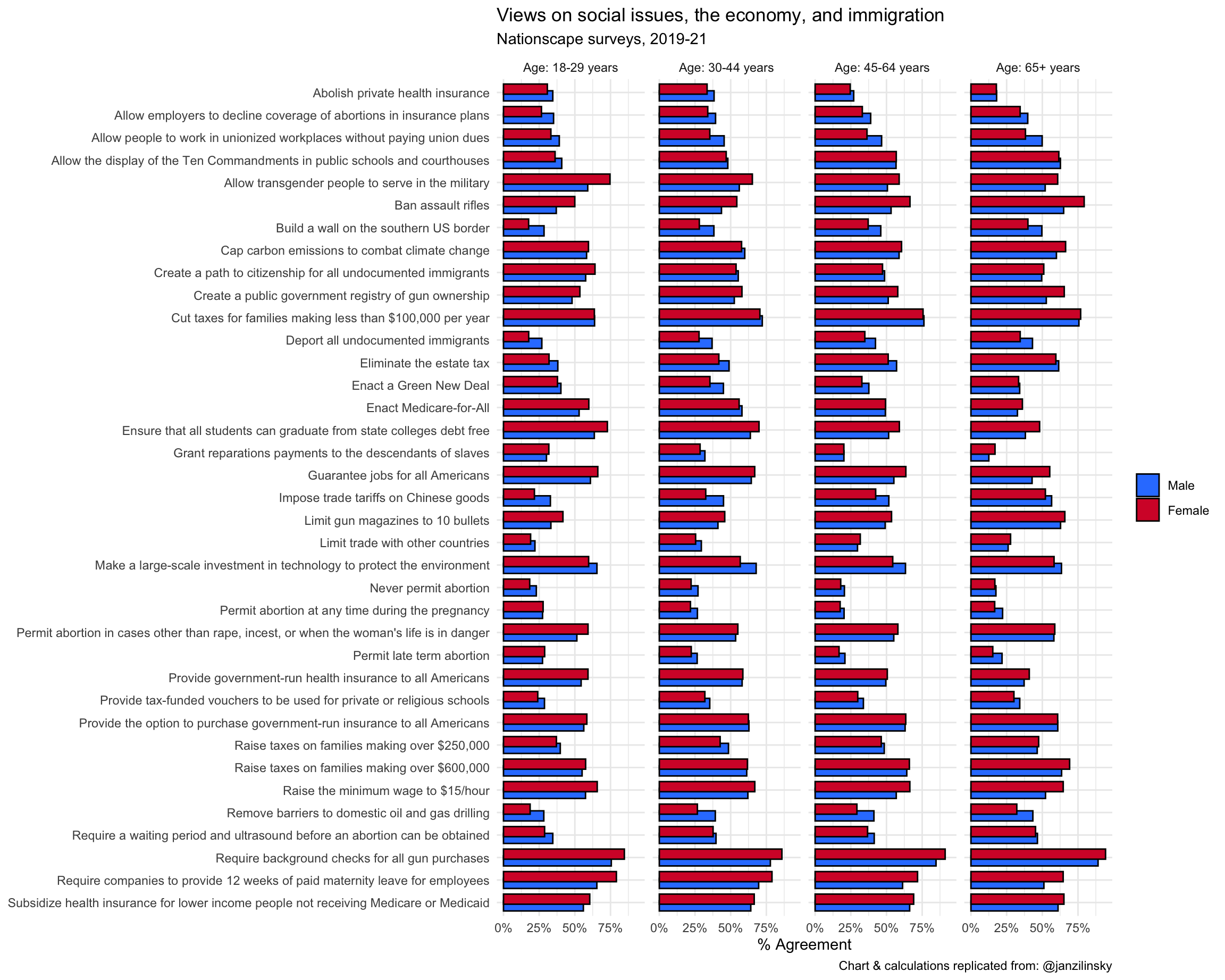
Your turn: Critique the visualization using Cairo’s five qualities. For each quality identify at least one strength and one weakness of the visualization.
Truthful
Add response here.
Functional
Add response here.
Beautiful
Add response here.
Insightful
Add response here.
Enlightening
Add response here.
Improving the visualization
Your turn: Identify at least three design choices that could be implemented to improve the visualization. Be detailed. Possible approaches could include:
- Different chart type
- Additional layers
- Employ faceting (or not)
- New color palette
- Annotations (text, arrows, highlighting, etc.)
- Different graphical
theme()
Add response here.
Your turn: Implement the design choices you identified above to create an improved version of the visualization.
# add code here