Refine your plots: Tell an effective story

Lecture 10

Dr. Benjamin Soltoff

Cornell University
INFO 3312/5312 - Fall 2026

September 29, 2026

Announcements

Announcements

Learning objectives

  • Utilize data visualizations as tools for telling stories
  • Identify narrative approaches to storytelling
  • Assess methods for constructing charts that enhance the story
  • Design appropriate visualizations to tell a story

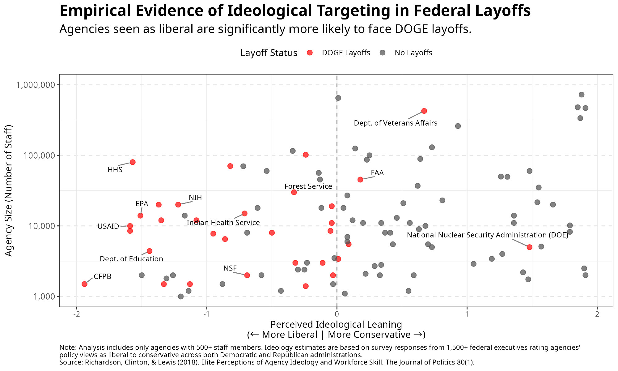
Visualization critique

  • What is the story?
  • How does the chart tell the story?

Telling a story

Crafting a narrative

A story is a set of observations, facts, or events, true or invented, that are presented in a specific order such that they create an emotional reaction in the audience.

  • Opening — Challenge — Action — Resolution
  • Lead — Development — Resolution
  • Action — Background — Development — Climax — Ending

Data communication uses data to tell a story

Multiple ways of telling a story

  • Sequential plots: Motivation, then resolution

  • A single plot: Resolution, and hidden in it motivation

Simplicity vs. complexity

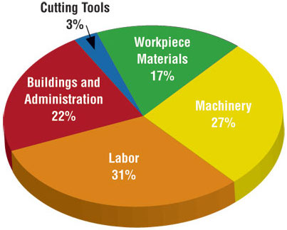
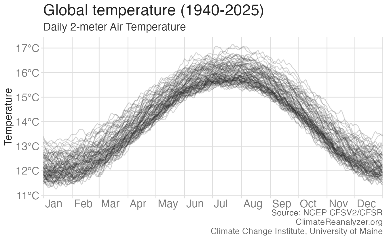
When you’re trying to show too much data at once you may end up not showing anything

  • Never assume your audience can rapidly process complex visual displays

  • Don’t add variables to your plot that are tangential to your story

  • Don’t jump straight to a highly complex figure; first show an easily digestible subset (e.g., show one facet first)

  • Aim for memorable, but clear

Consistency vs. repetitiveness

Be consistent but don’t be repetitive

  • Use consistent features throughout plots (e.g., same color represents same level on all plots)

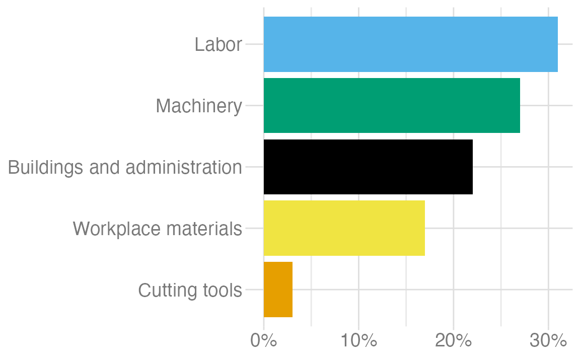
  • Aim to use a different type of visualization for each distinct analysis

Designing effective visualizations

Keep it simple

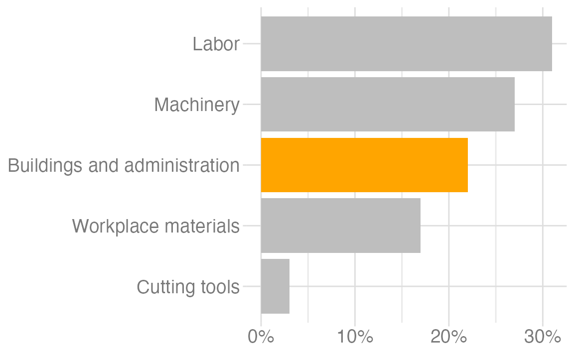
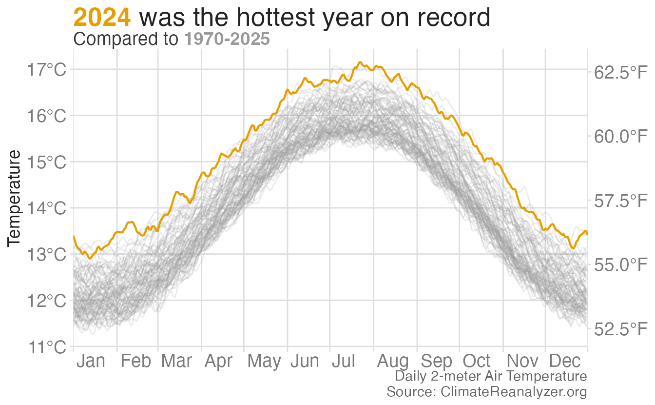
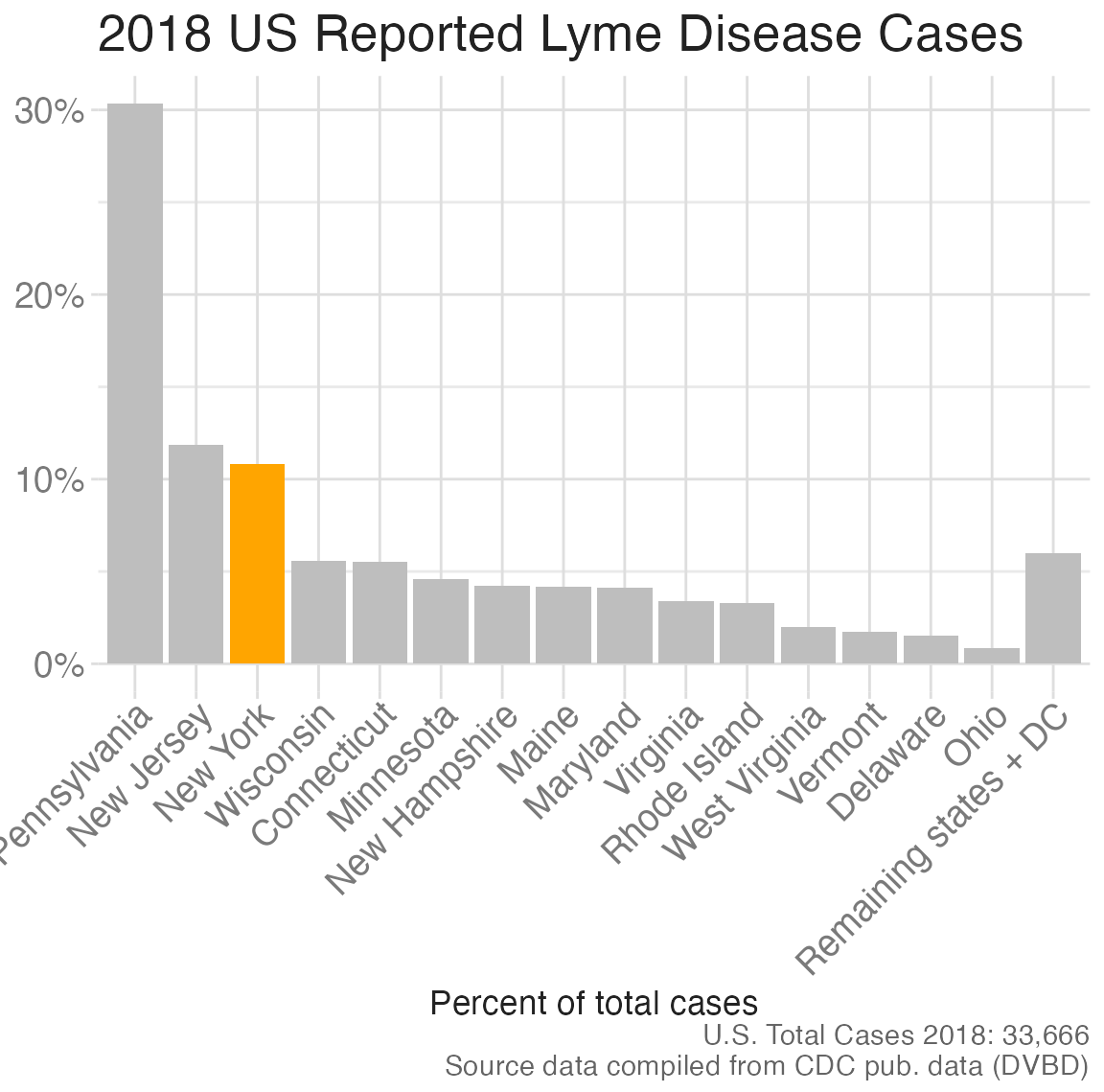
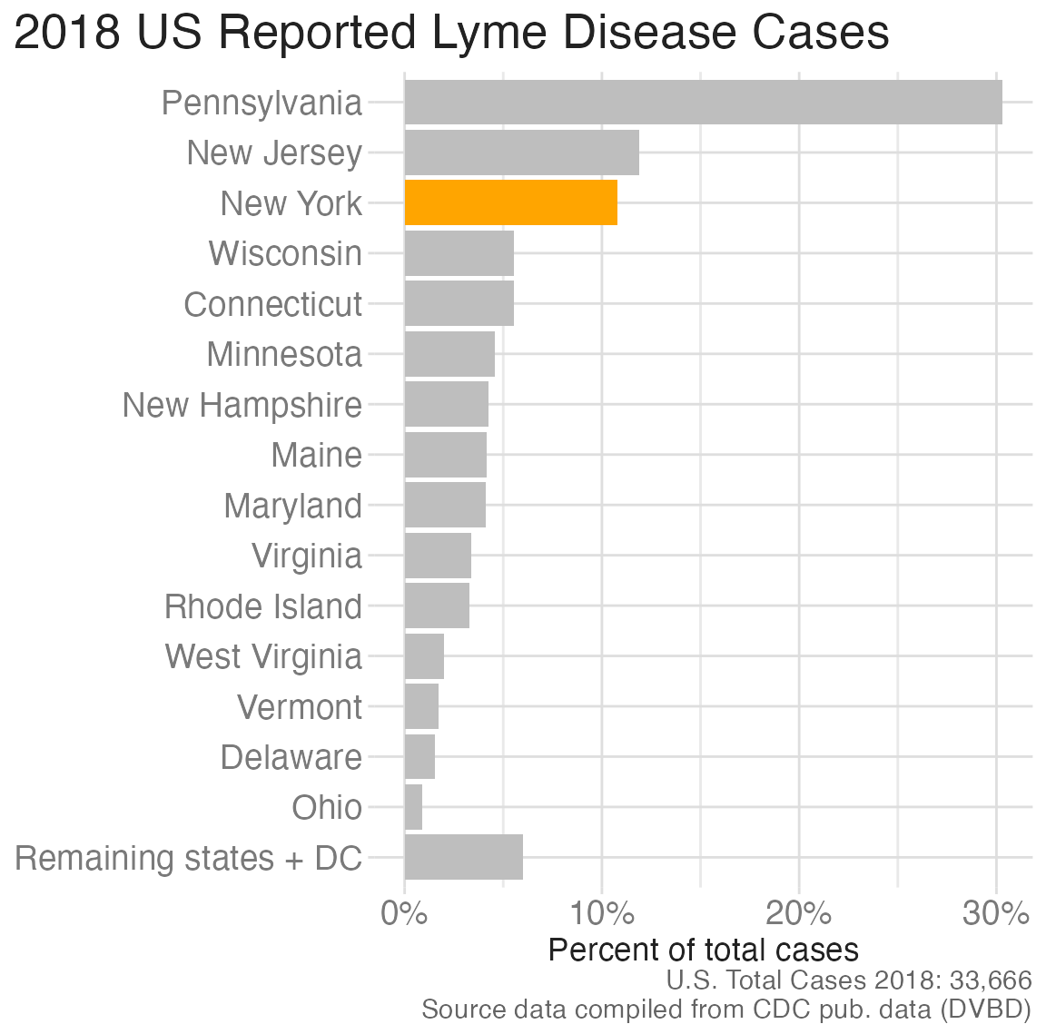
Use color to draw attention

Clarify the story

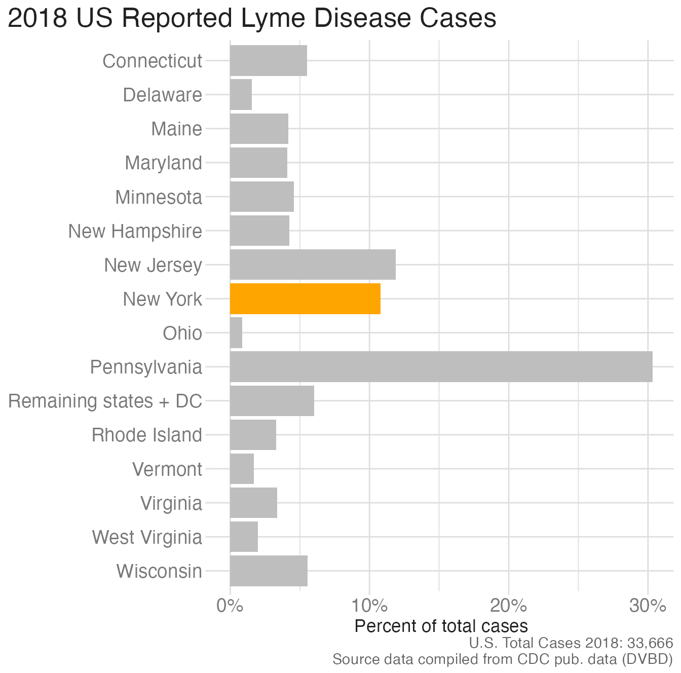
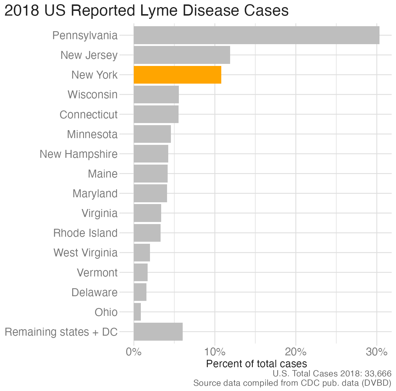
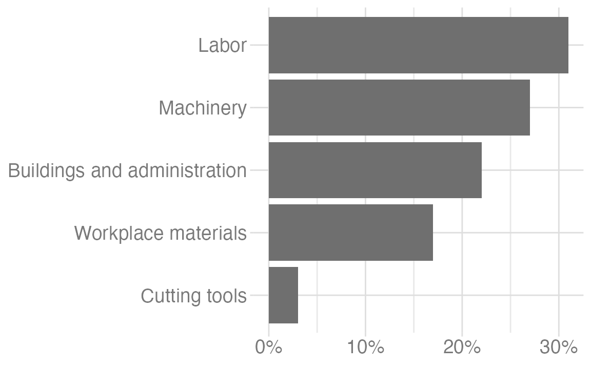
Order matters

Reduce cognitive load
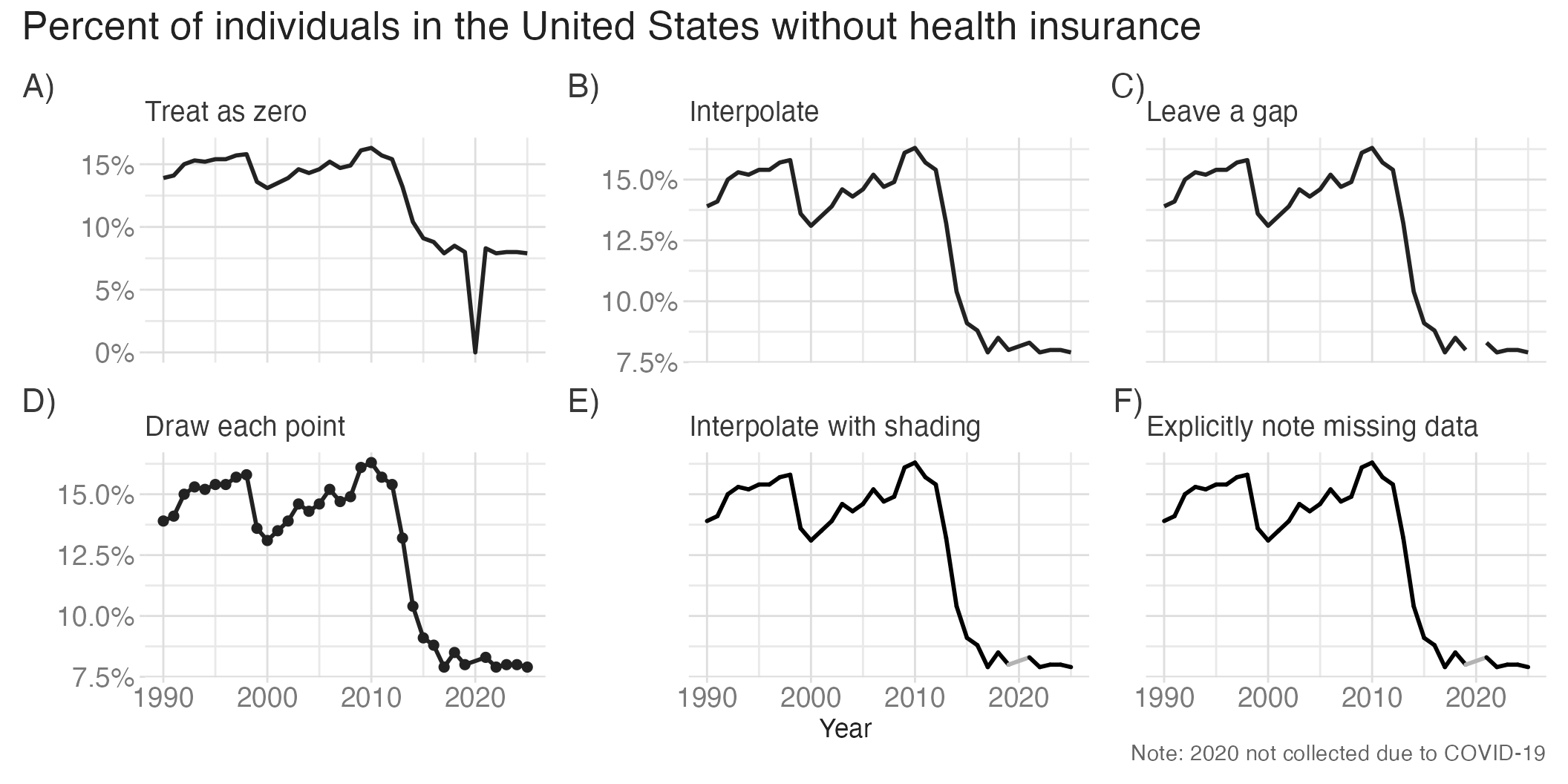
Clearly indicate missing data

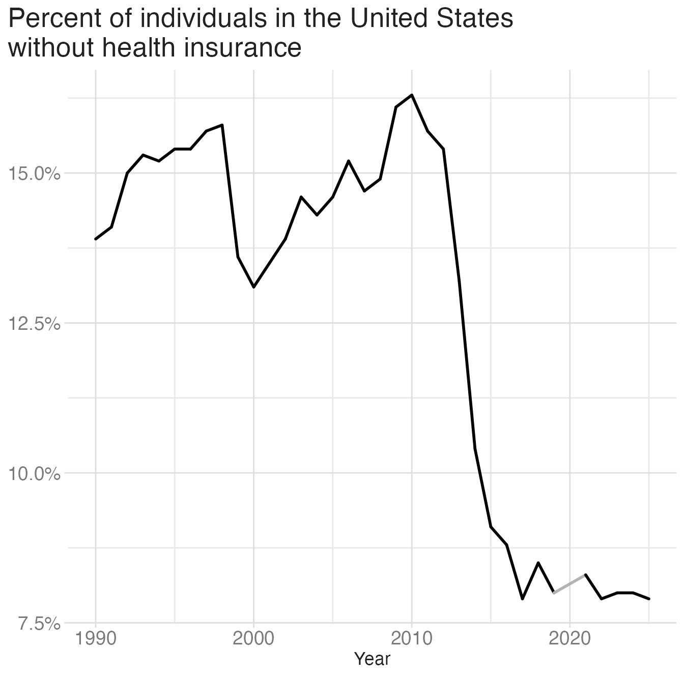
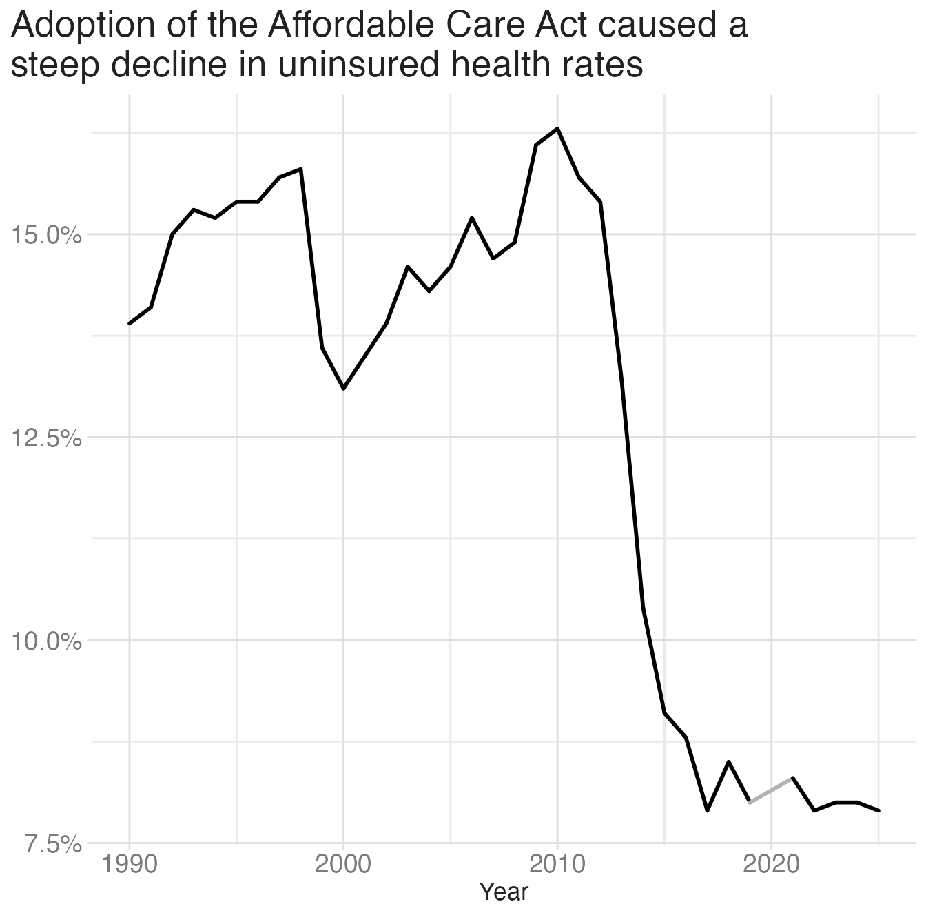
Use descriptive titles

Annotate figures
Application exercise

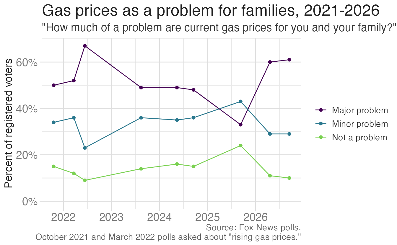
Line chart of the percentage of registered voters who say current gas prices are a major problem, a minor problem, or not a problem for their family, across nine Fox News polls from October 2021 to September 2026.

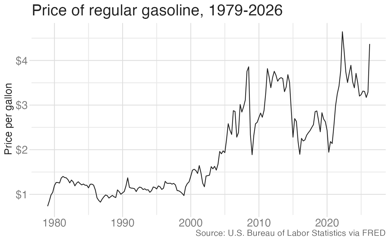
Line chart of the average price per gallon of regular gasoline by quarter from 1979 to 2026, not adjusted for inflation.

What’s the story?

  • How do we turn this question into a meaningful communication?
  • Is the price per gallon over time sufficient to answer it?
  • What else should we account for when deciding whether gas is “expensive”?

Define the measure

Instructions

  • Work in groups of 2-3 people
  • Define four ways to measure gas prices over time
  • Identify a strength and weakness of each measure

Frame the story

Opening: Americans are concerned about current prices at the pump.

Challenge: How have gas prices changed over time? Is this anxiety warranted?

Instructions

Finish the story

  • Define the action and resolution
  • Sketch two charts that support your story
    • The first chart should set up the problem
    • The second should deliver the action or resolution

Wrap up

Wrap up

  • Use data to effectively tell a story
  • Use the right plot(s) for your story

Acknowledgments