Refine your plots: Color + annotation

Lecture 09

Dr. Benjamin Soltoff

Cornell University
INFO 3312/5312 - Fall 2026

September 24, 2026

Announcements

Announcements

Learning objectives

  • Identify how color can be effectively used in data visualizations
  • Distinguish types of color scales and their appropriate use cases
  • Identify the importance of details in charts
  • Introduce methods for annotating charts
  • Design annotations for effective communication

Uses of color in data visualization

Uses of color in data visualization

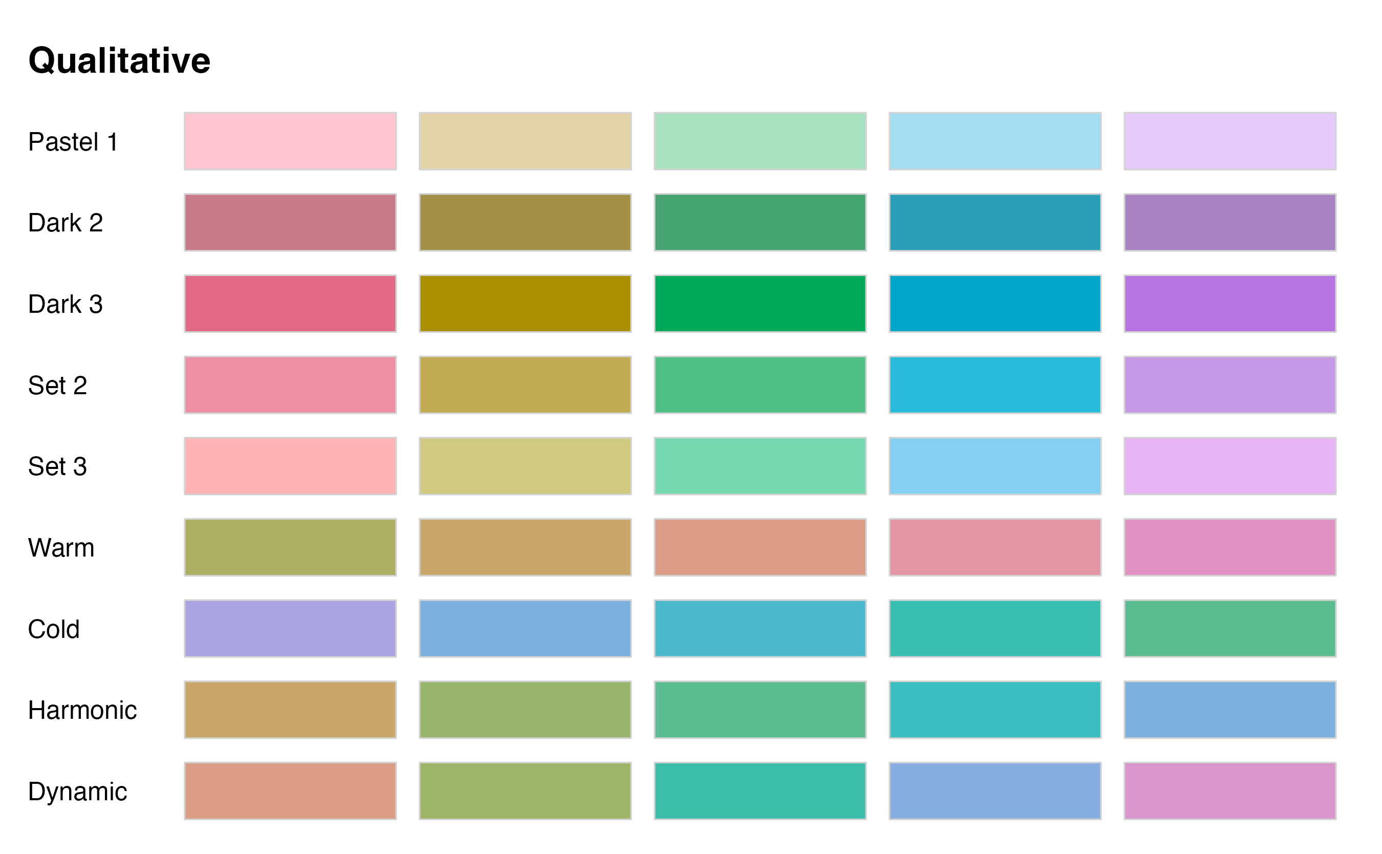
  1. Distinguish categories (qualitative)
  1. Represent numeric values (sequential)
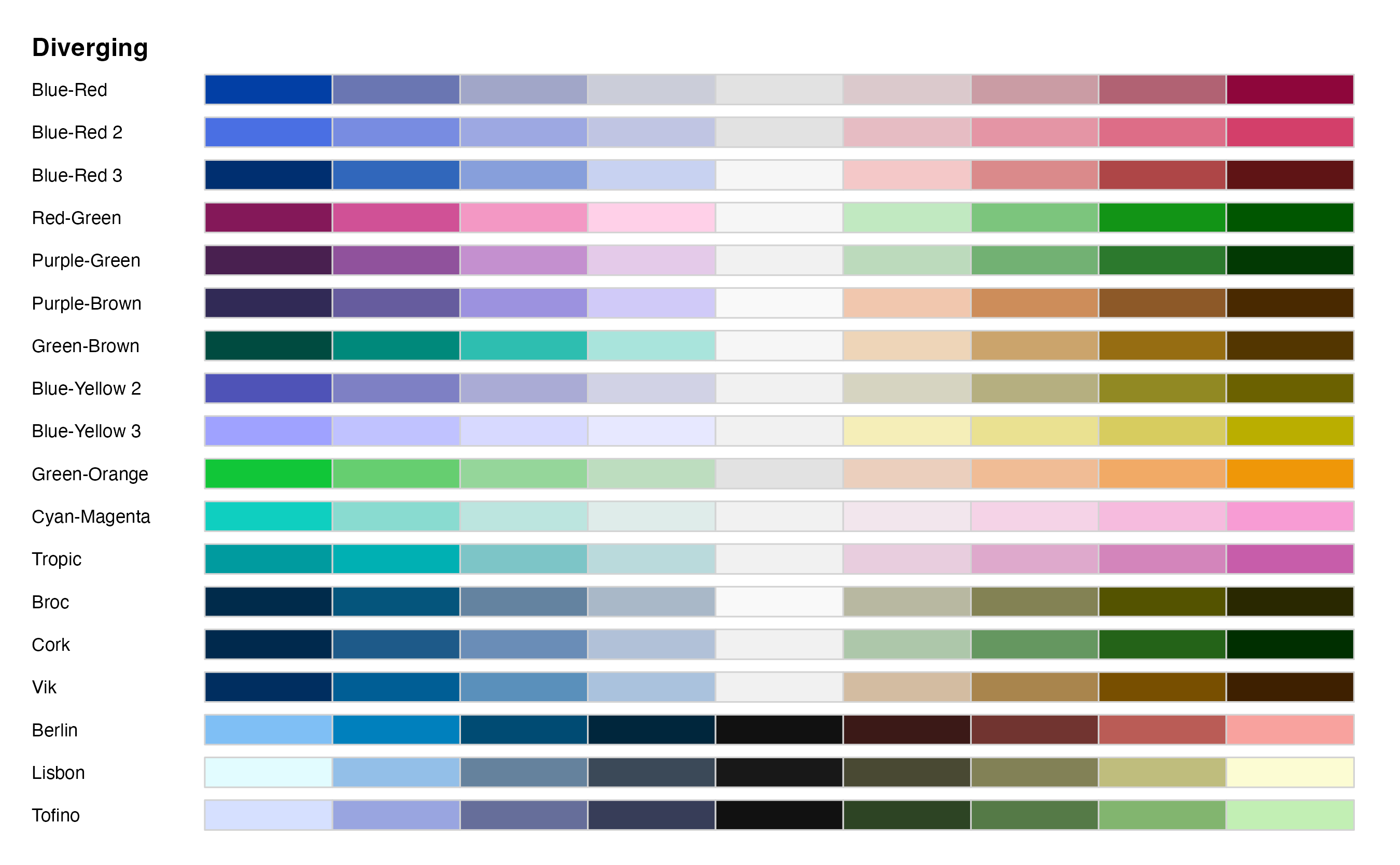
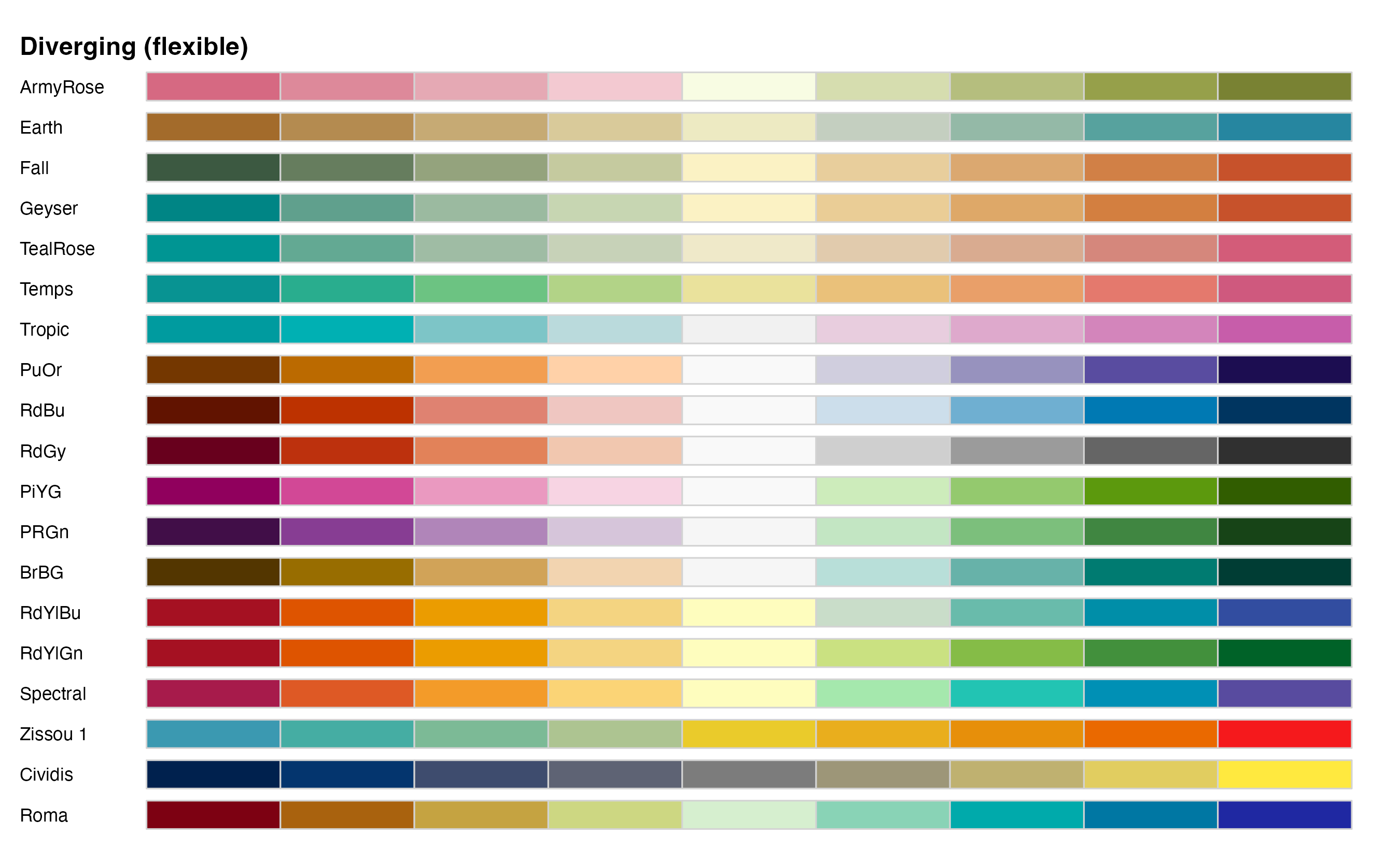
  1. Represent numeric values (diverging)
  1. Highlight

When to use quantitative or qualitative color scales?

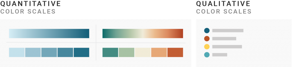
Quantitative vs. qualitative palettes

  • Quantitative \(\equiv\) numerical
  • Qualitative \(\equiv\) categorical

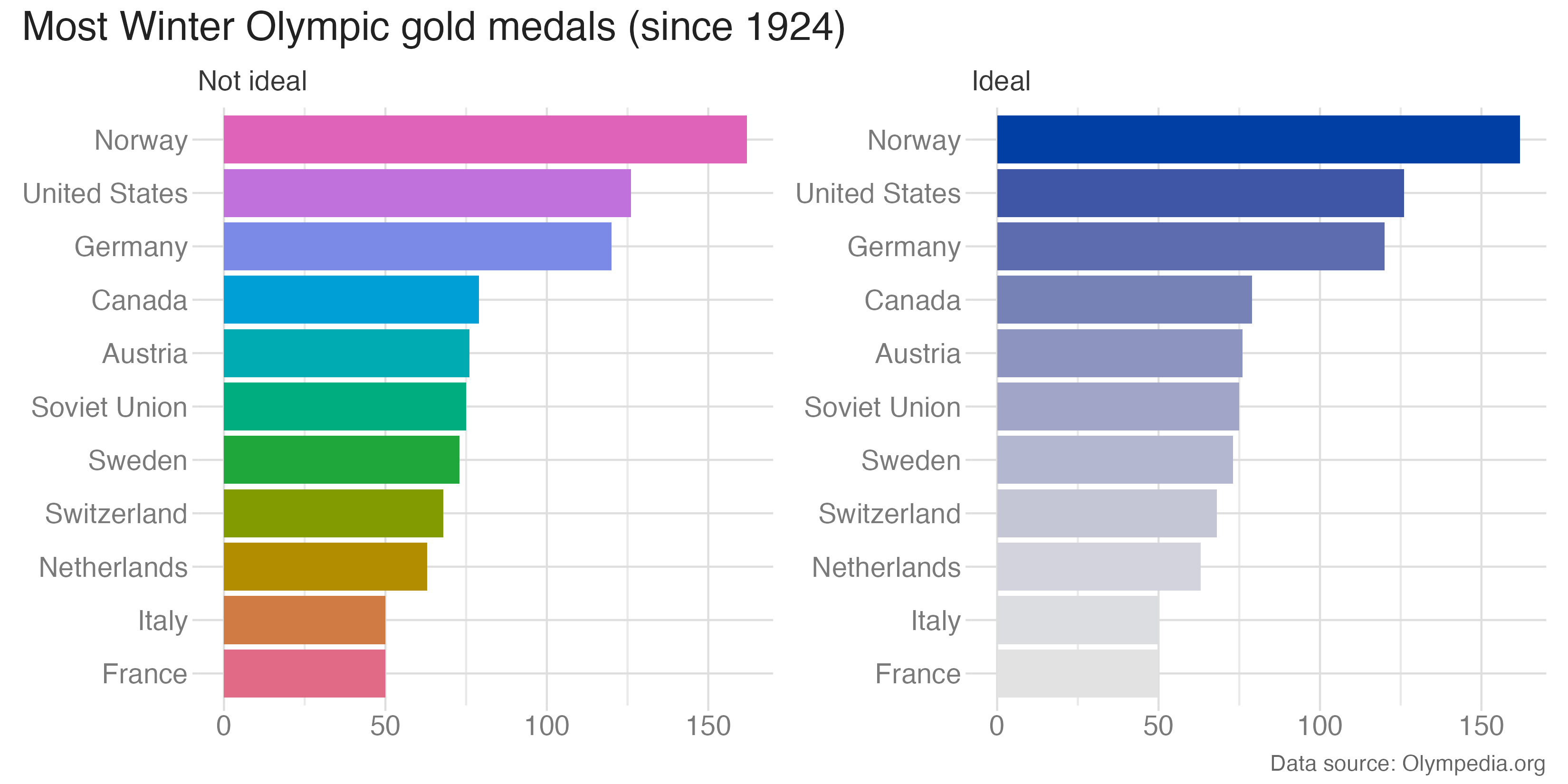
Use qualitative for nominal variables
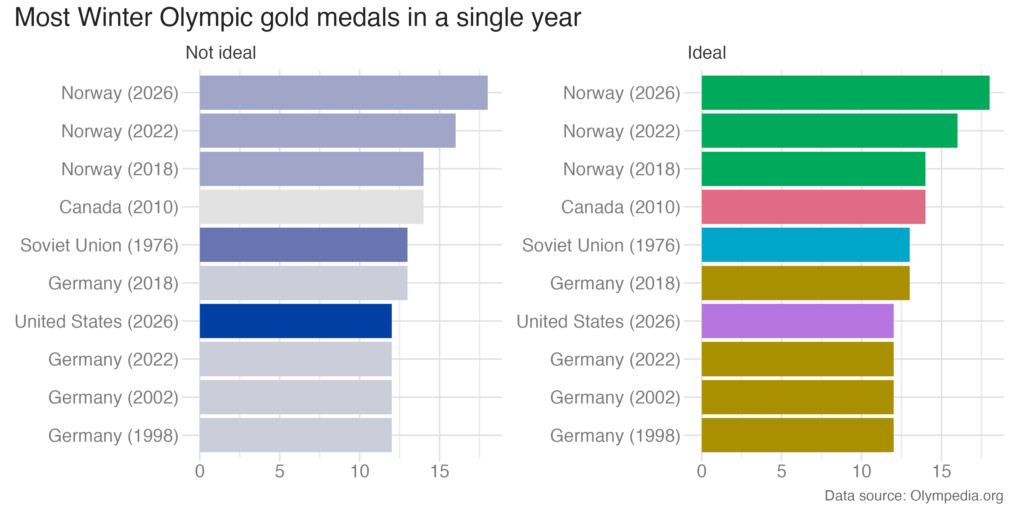
Rows: 1270 Columns: 10
── Column specification ────────────────────────────────────────────────────────────────────────────
Delimiter: ","
chr (9): games, url, sport_event, gold, country_gold, silver, country_silver, bronze, country_br...
dbl (1): year

ℹ Use `spec()` to retrieve the full column specification for this data.
ℹ Specify the column types or set `show_col_types = FALSE` to quiet this message.
Rows: 270 Columns: 3
── Column specification ────────────────────────────────────────────────────────────────────────────
Delimiter: ","
chr (2): abbreviation, country
lgl (1): competed_in_modern_olympics

ℹ Use `spec()` to retrieve the full column specification for this data.
ℹ Specify the column types or set `show_col_types = FALSE` to quiet this message.

Use quantitative for ordinal variables
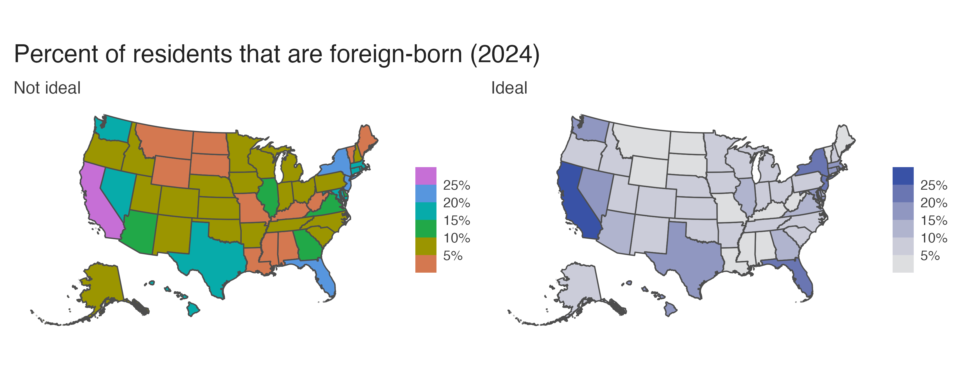
Consider binning continuous variables
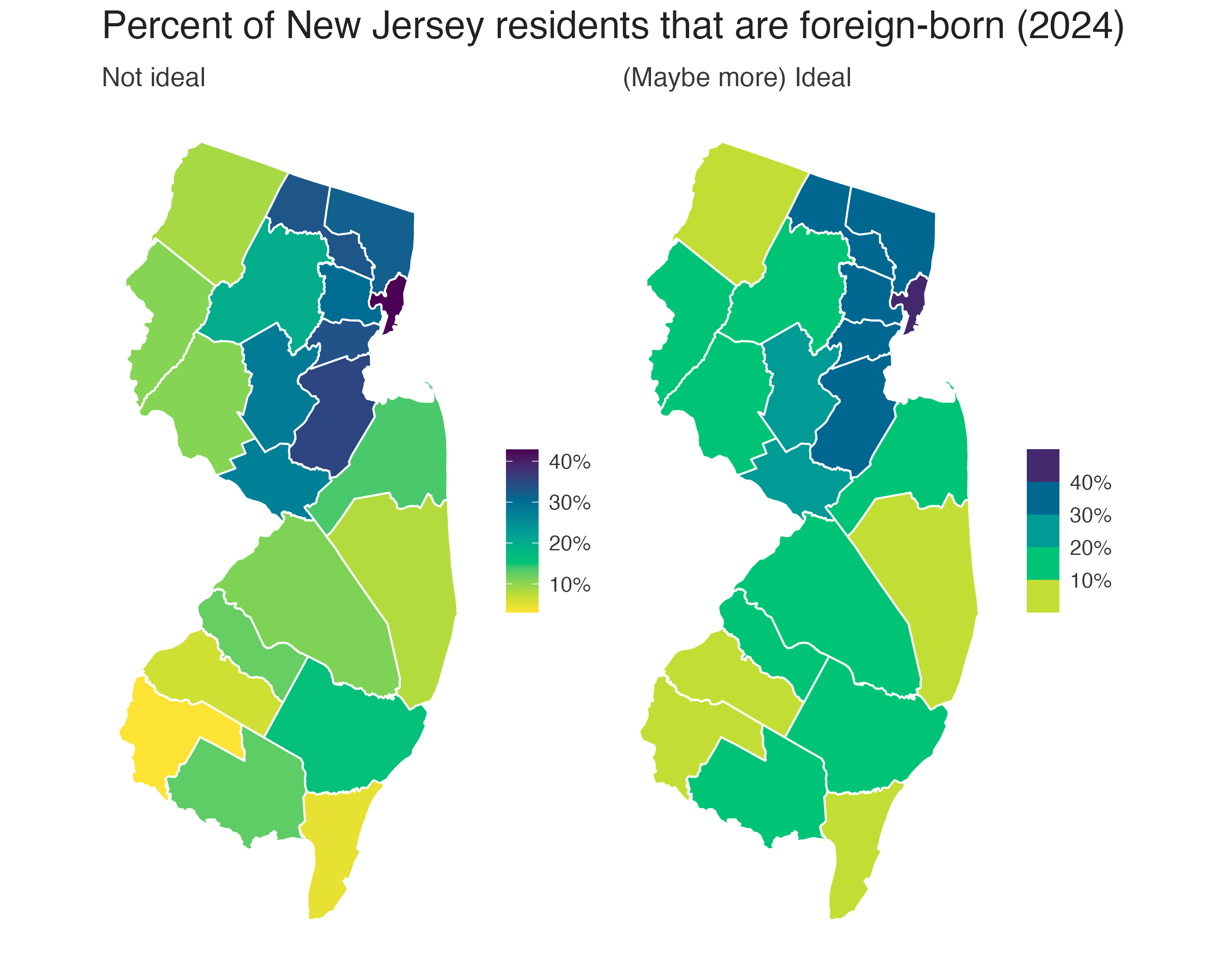
Quantitative \(\neq\) continuous
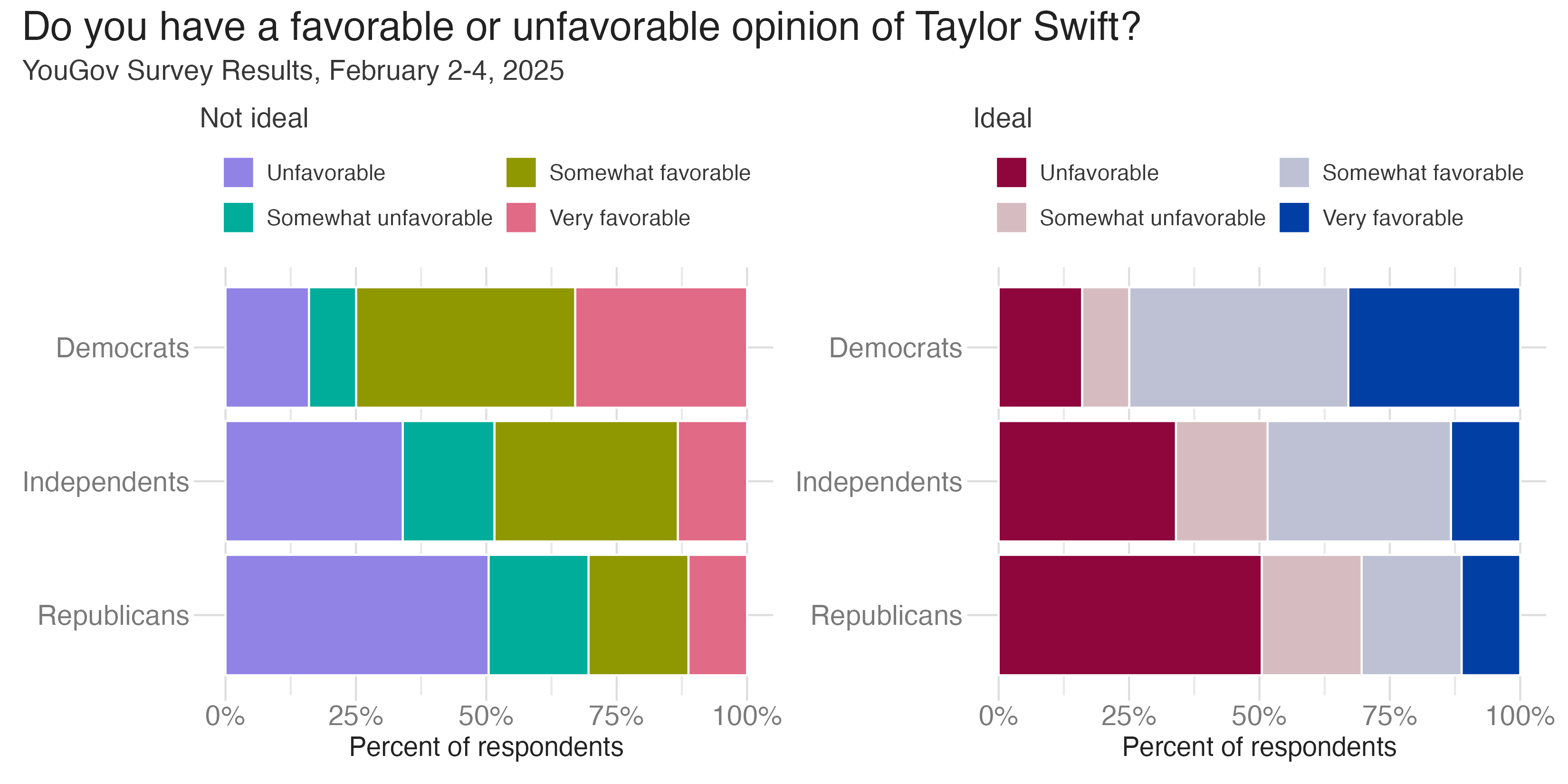
Joining with `by = join_by(party)`

Shades to emphasize order

Shades to distinguish subcategories
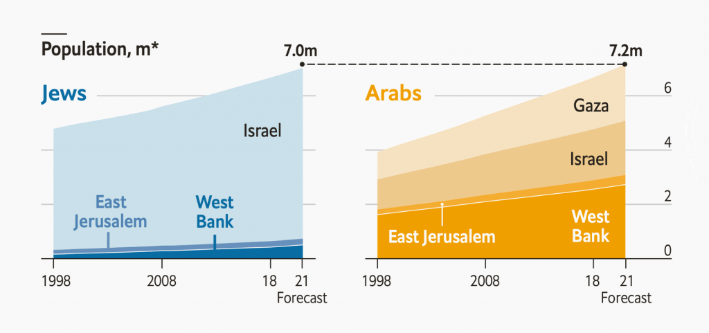
Choosing a color scale

Choosing a color scale

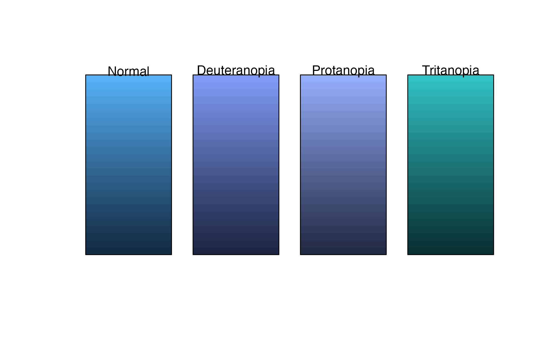
  • Emphasis on interpretability and accessibility
  • Default palettes are less than desirable
  • Variables may require transformations

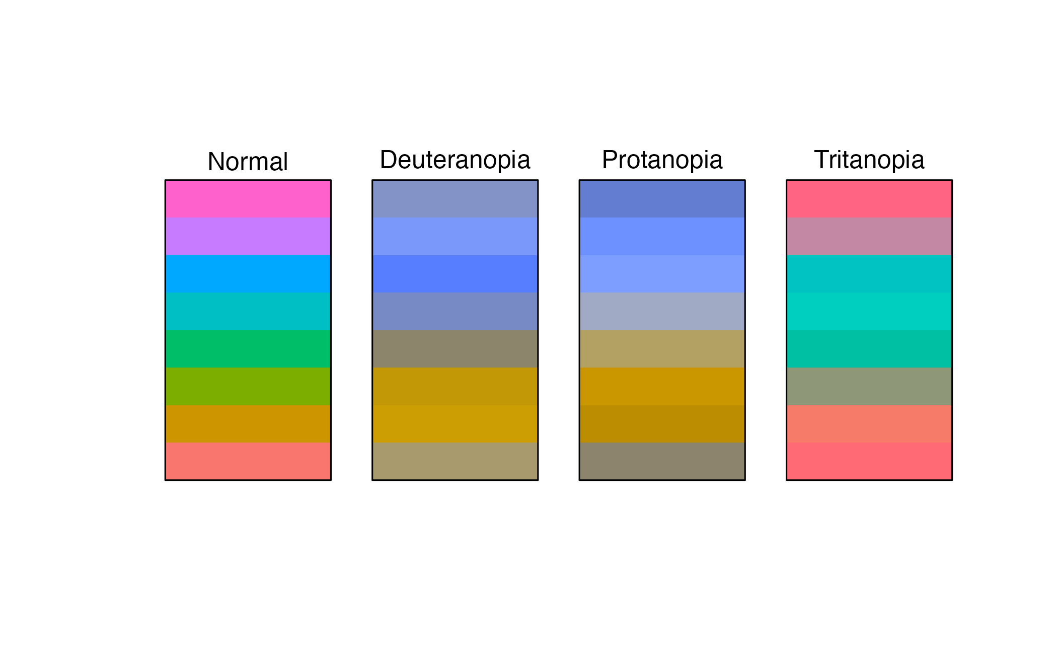
Inspecting qualitative palettes

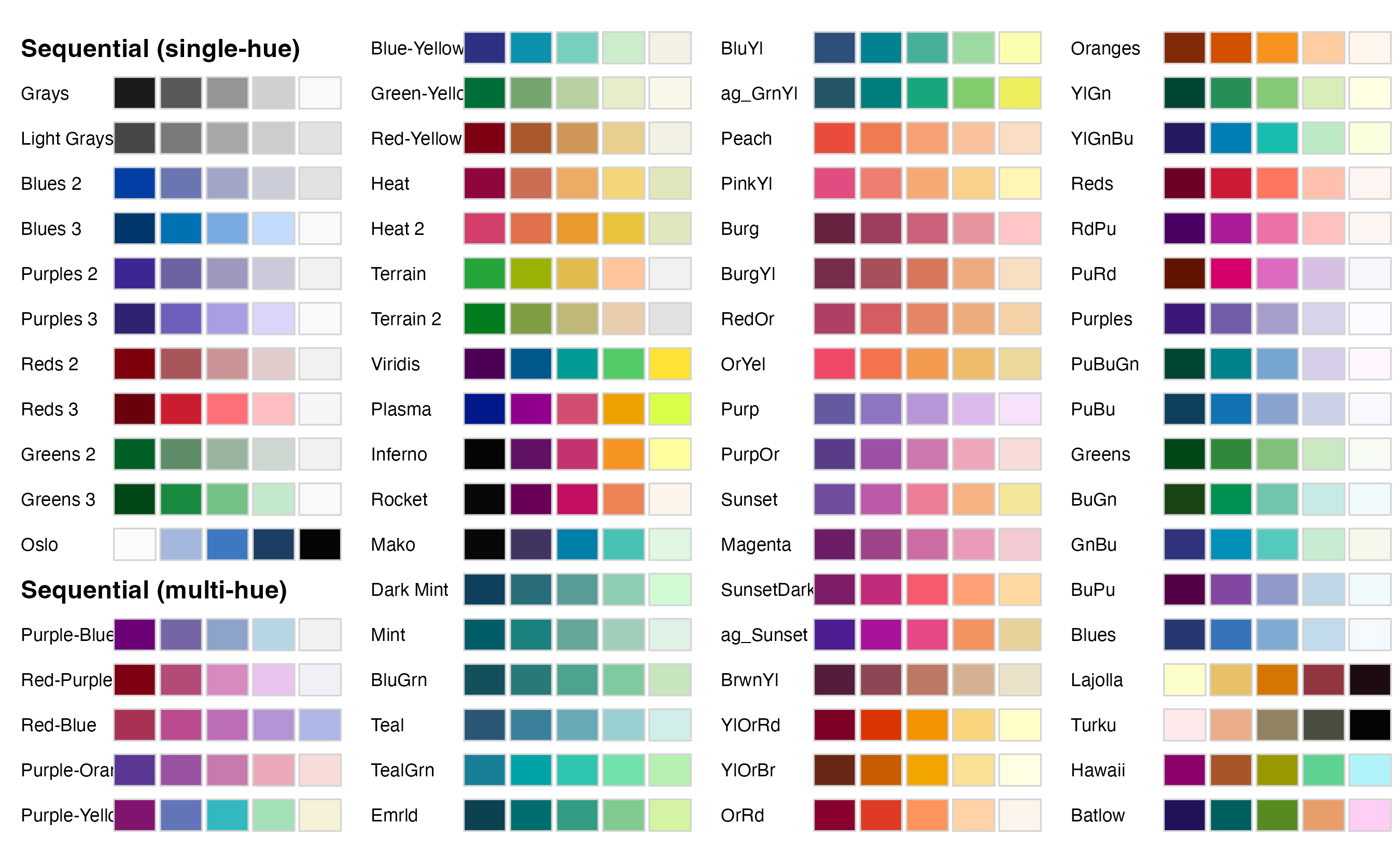
Inspecting quantitative palettes
Implementing optimal color palettes in R

{ggplot2} color scale functions are a bit of a mess

Scale function Aesthetic Data type Palette type
scale_color_hue() color discrete qualitative
scale_fill_hue() fill discrete qualitative
scale_color_gradient() color continuous sequential
scale_color_gradient2() color continuous diverging
scale_fill_viridis_c() color continuous sequential
scale_fill_viridis_d() fill discrete sequential
scale_color_brewer() color discrete qualitative, diverging, sequential
scale_fill_brewer() fill discrete qualitative, diverging, sequential
scale_color_distiller() color continuous qualitative, diverging, sequential

… and there are many many more

The {colorspace} package creates some order

Scale name: scale_<aesthetic>_<datatype>_<colorscale>()

  • <aesthetic>: name of the aesthetic (fill, color)
  • <datatype>: type of variable plotted (discrete, continuous, binned)
  • <colorscale>: type of the color scale (qualitative, sequential, diverging, divergingx)
Scale function Aesthetic     Data type Palette type    
scale_color_discrete_qualitative() color discrete qualitative
scale_fill_continuous_sequential() fill continuous sequential
scale_fill_binned_diverging() fill binned diverging

Examples

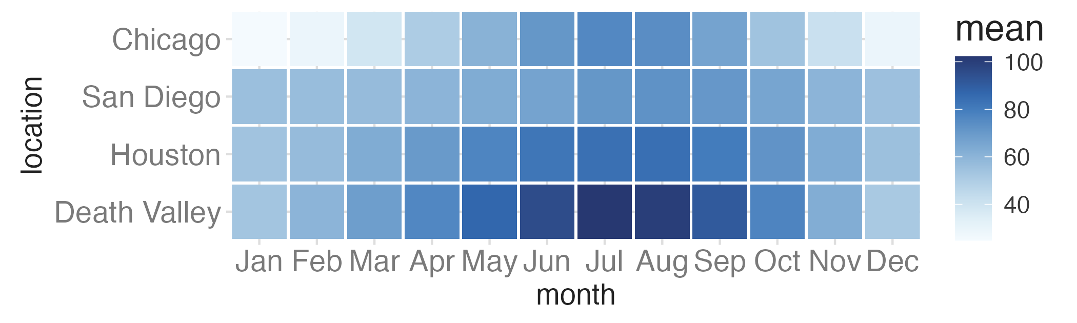
ggplot(temps_months, aes(x = month, y = location, fill = mean)) +
  geom_tile(width = 0.95, height = 0.95) +
  coord_cartesian(ratio = 1, expand = FALSE) +
  scale_fill_continuous_sequential(palette = "Blues")

Examples

ggplot(temps_months, aes(x = month, y = location, fill = mean)) +
  geom_tile(width = 0.95, height = 0.95) +
  coord_cartesian(ratio = 1, expand = FALSE) +
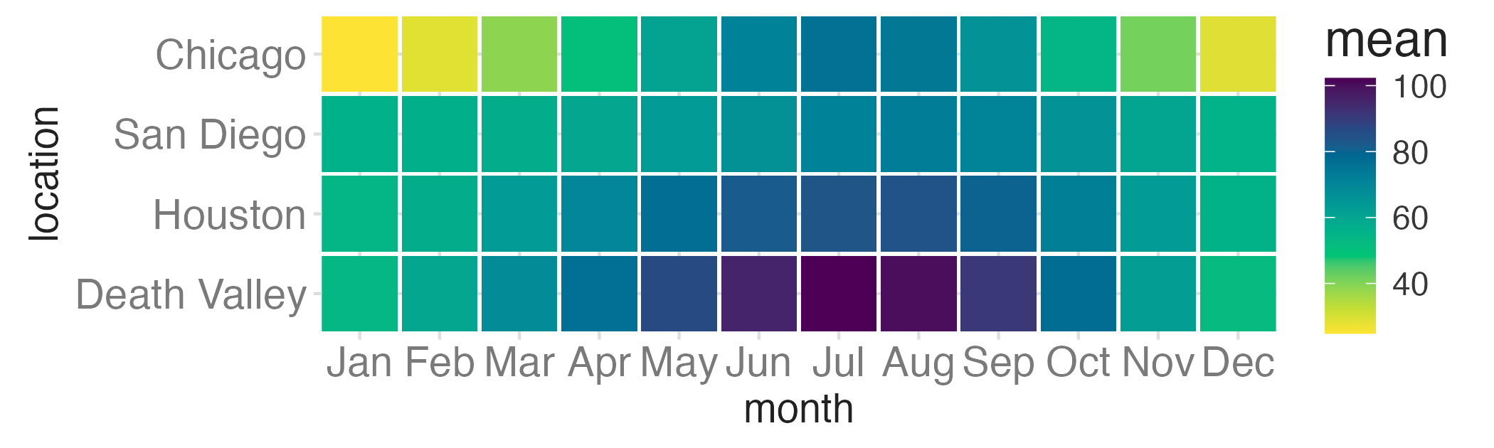
  scale_fill_continuous_sequential(palette = "Viridis")

Examples

ggplot(temps_months, aes(x = month, y = location, fill = mean)) +
  geom_tile(width = 0.95, height = 0.95) +
  coord_cartesian(ratio = 1, expand = FALSE) +
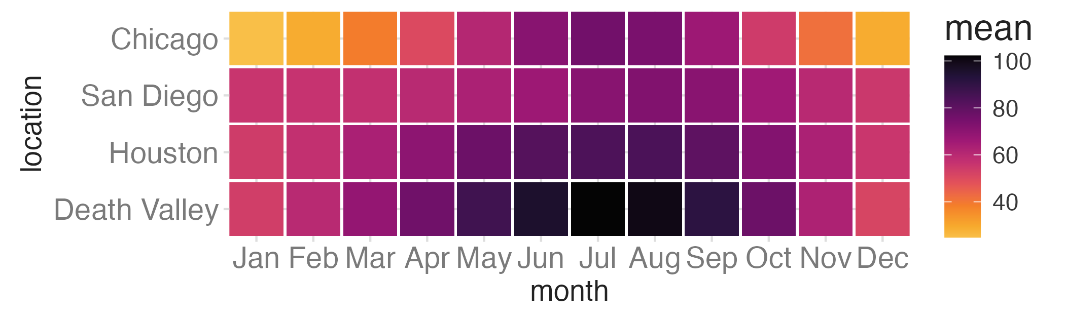
  scale_fill_continuous_sequential(palette = "Inferno", begin = 0.15)

Examples

ggplot(temps_months, aes(x = month, y = location, fill = mean)) +
  geom_tile(width = 0.95, height = 0.95) +
  coord_cartesian(ratio = 1, expand = FALSE) +
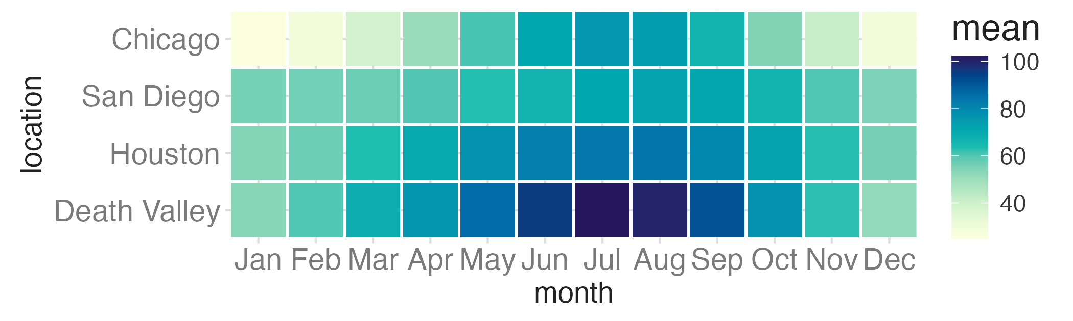
  scale_fill_continuous_sequential(palette = "YlGnBu")

Setting colors for discrete, qualitative scales

Examples

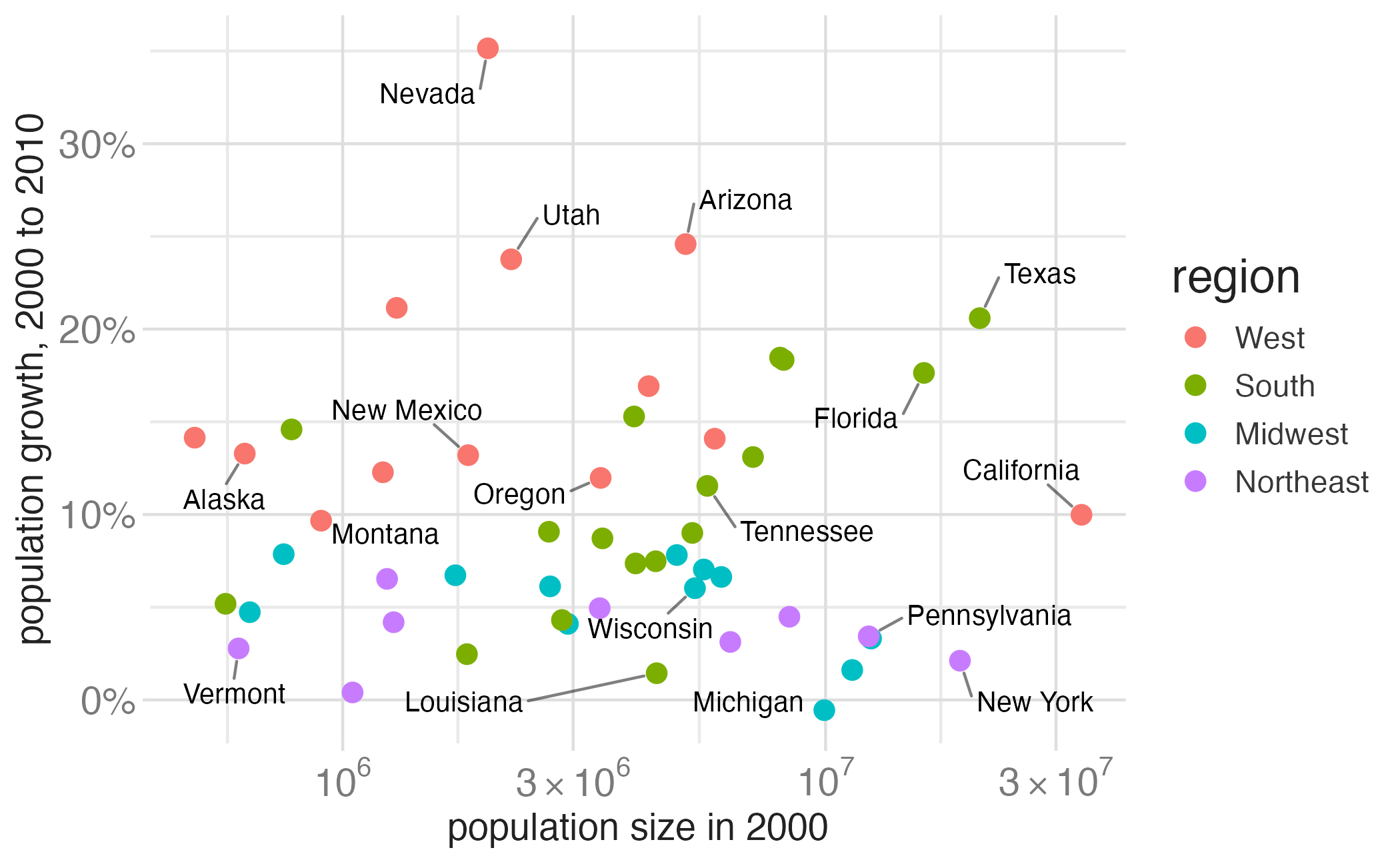
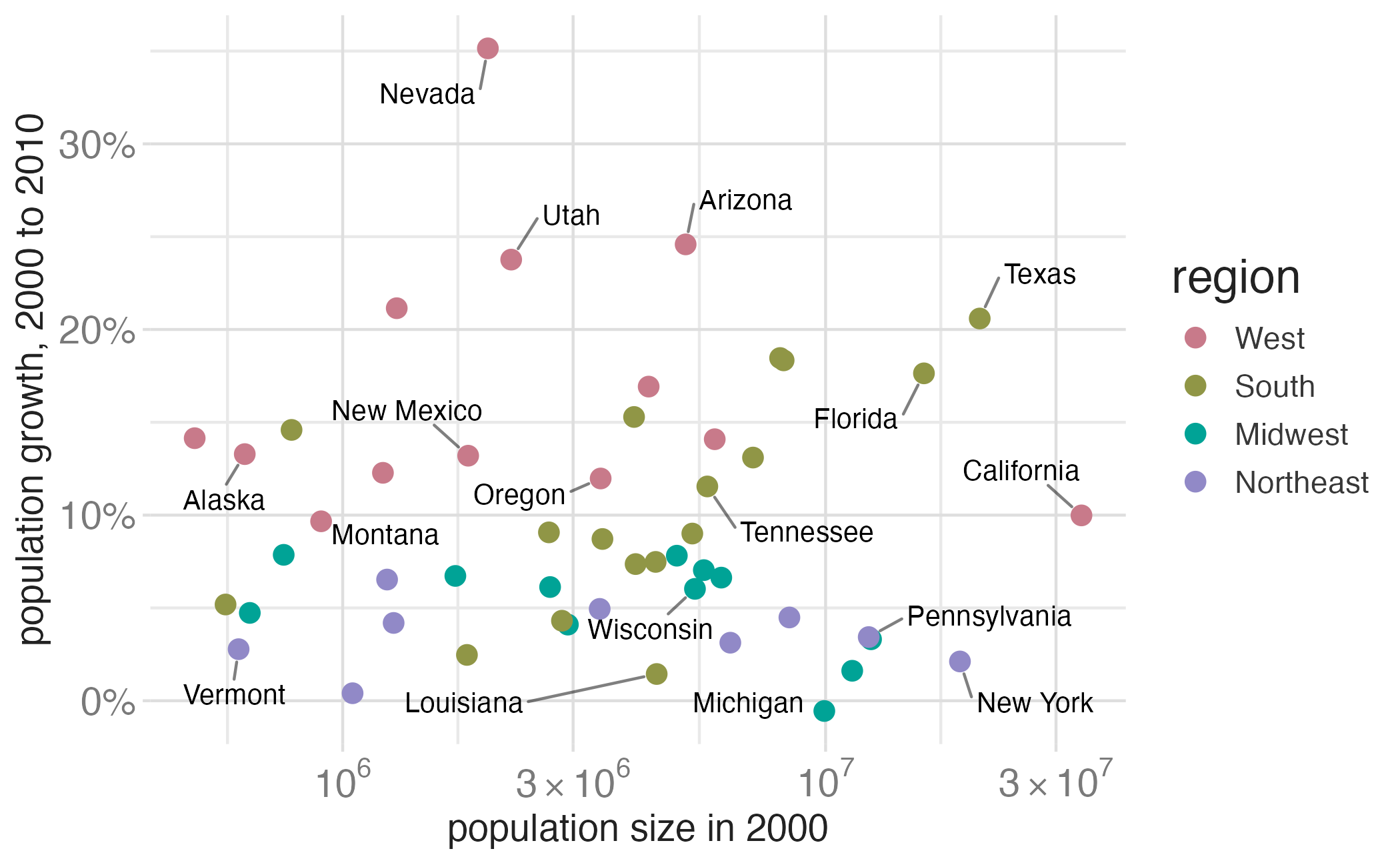
p_pop +
  scale_color_hue()

Examples

p_pop +
  scale_color_discrete_qualitative(palette = "Dark 2")

Examples

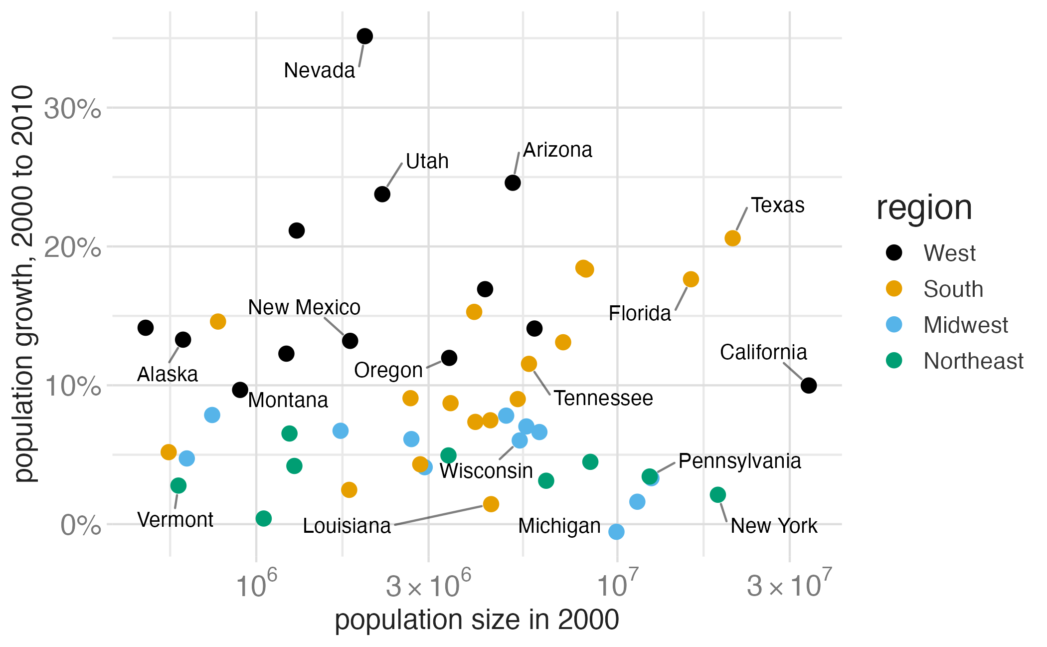
library(ggthemes) # for scale_color_colorblind()

p_pop +
  scale_color_colorblind()

Okabe-Ito RGB codes

Color name Hex code R, G, B (0-255)
Black #000000 0, 0, 0
Orange #E69F00 230, 159, 0
Sky Blue #56B4E9 86, 180, 233
Bluish Green #009E73 0, 158, 115
Yellow #F0E442 240, 228, 66
Blue #0072B2 0, 114, 178
Vermilion #D55E00 213, 94, 0
Reddish Purple #CC79A7 204, 121, 167

Examples

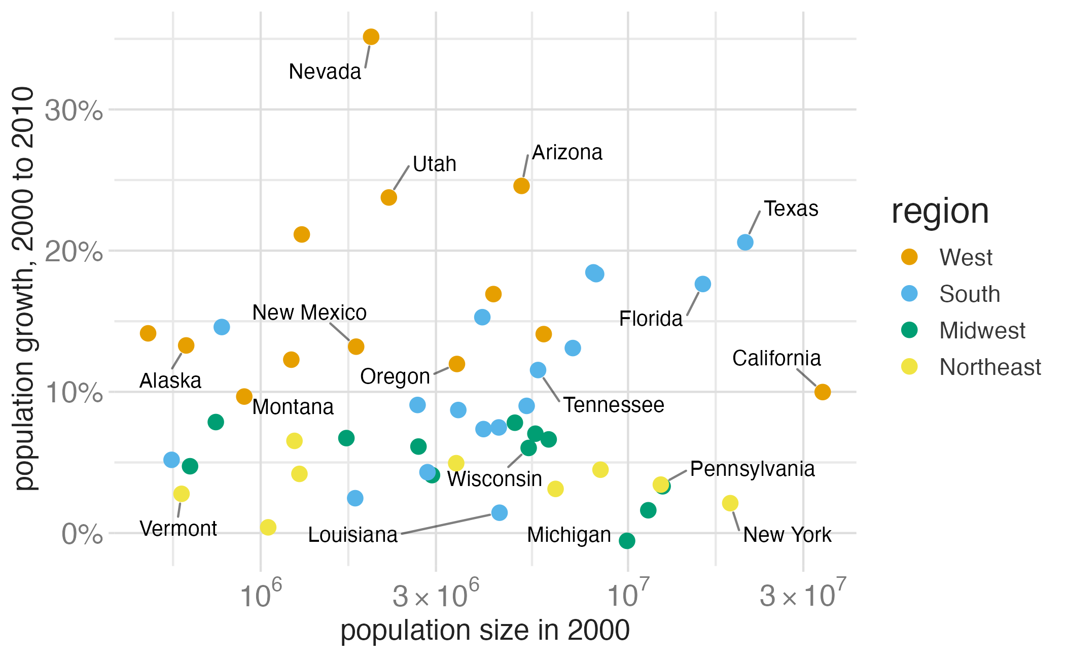
p_pop +
  scale_color_manual(
    values = c(
      West = "#E69F00", South = "#56B4E9",
      Midwest = "#009E73", Northeast = "#F0E442"
    )
  )

Fretting the little things

Little details matter

Obsession with tiny details

Human-focused design

“This is what customers pay us for – to sweat all these details so it’s easy and pleasant for them to use our computers.”

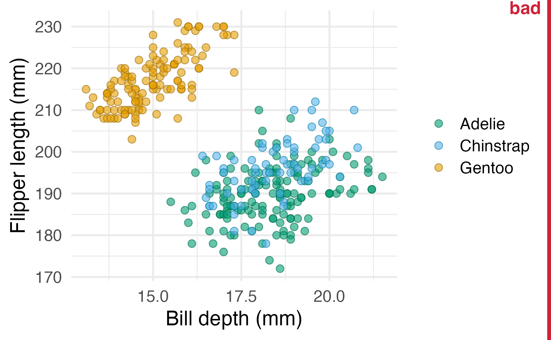
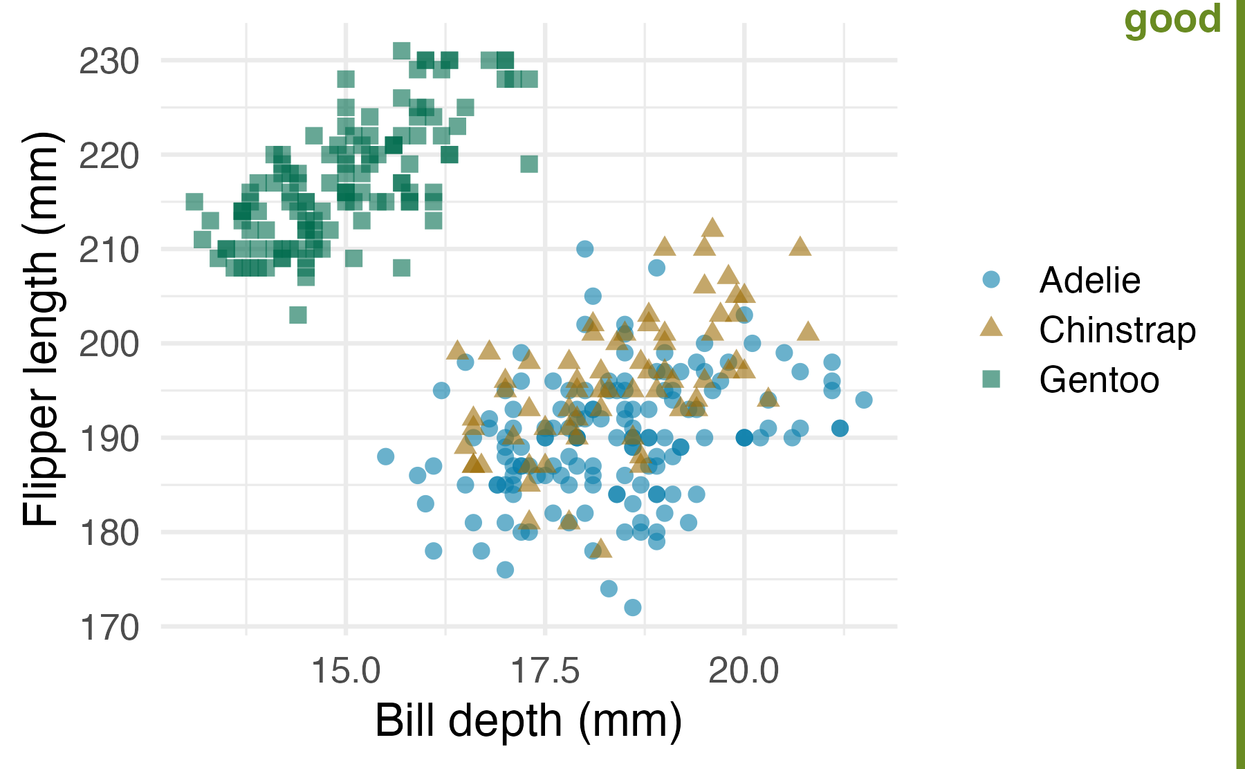
Graph details: Redundant coding

Warning: Removed 2 rows containing missing values or values outside the scale range
(`geom_point()`).

Warning: Removed 2 rows containing missing values or values outside the scale range
(`geom_point()`).

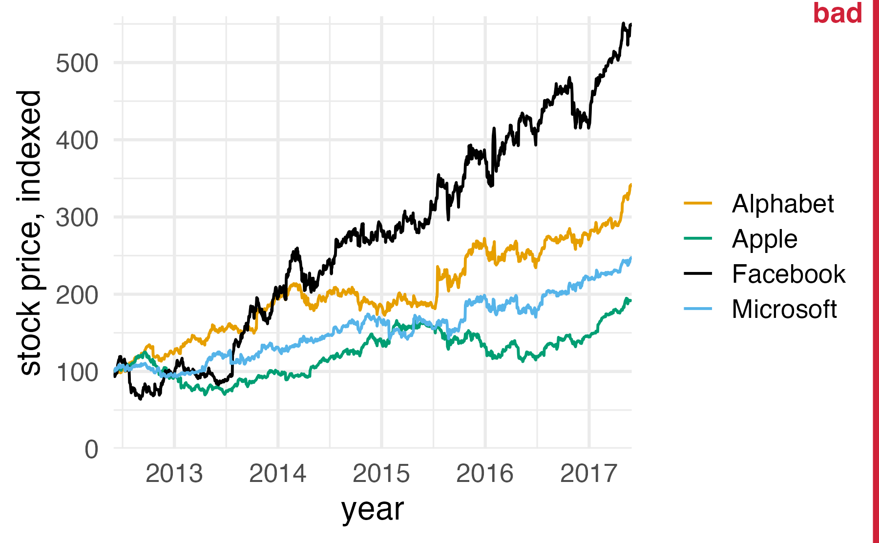
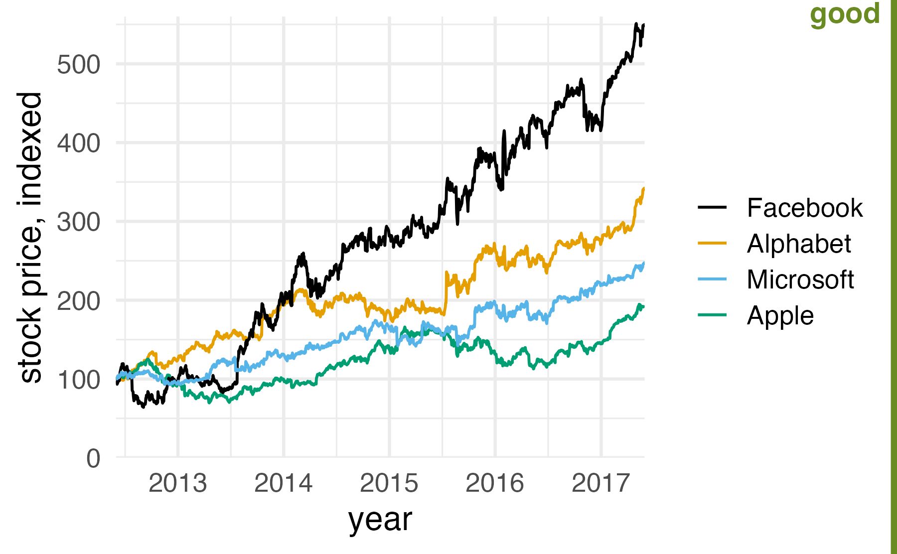
Graph details: Consistent ordering

Rows: 9569 Columns: 6
── Column specification ────────────────────────────────────────────────────────────────────────────
Delimiter: ","
chr  (2): company, ticker
dbl  (3): price, index_price, price_indexed
date (1): date

ℹ Use `spec()` to retrieve the full column specification for this data.
ℹ Specify the column types or set `show_col_types = FALSE` to quiet this message.

Axes

Axis breaks

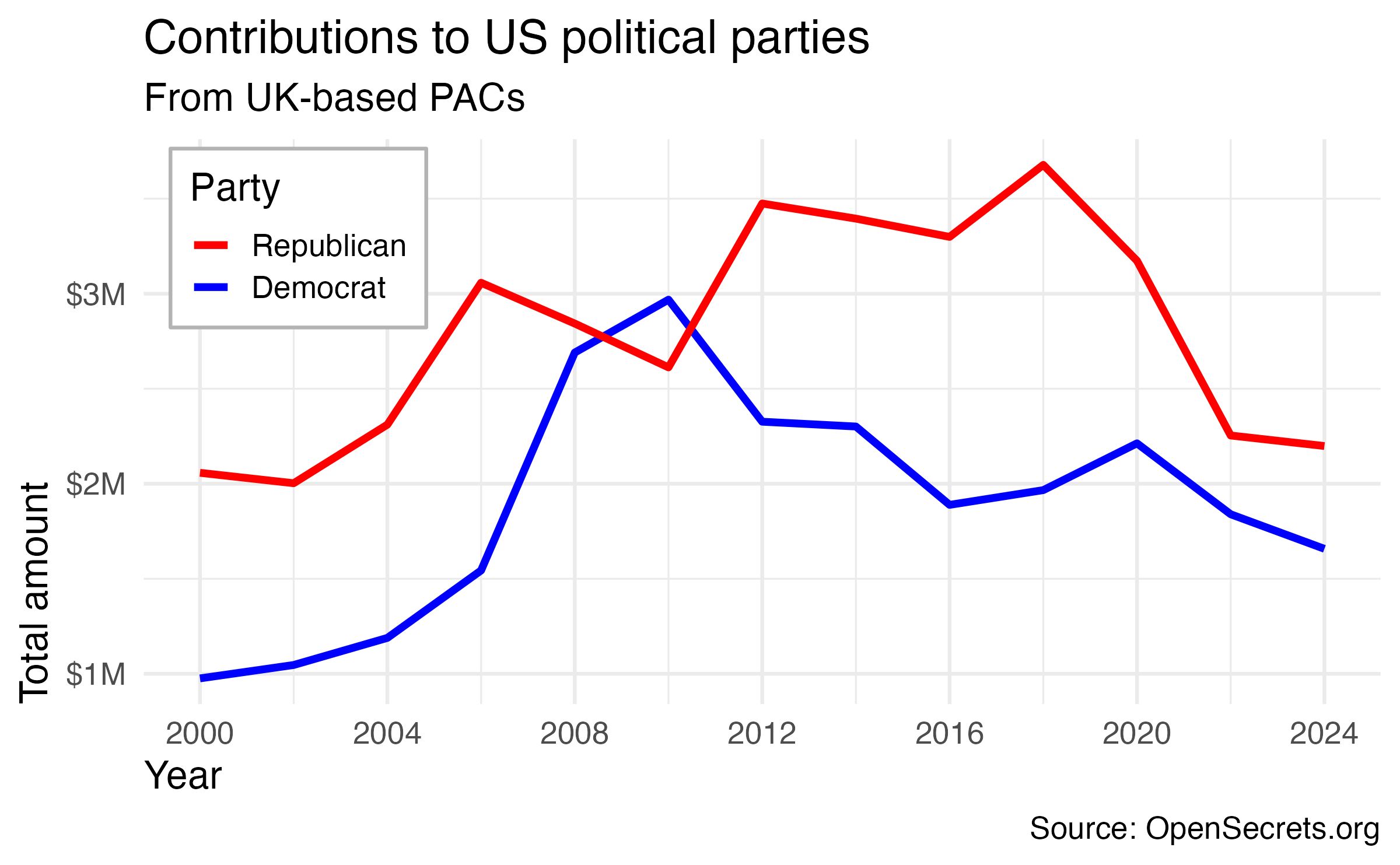
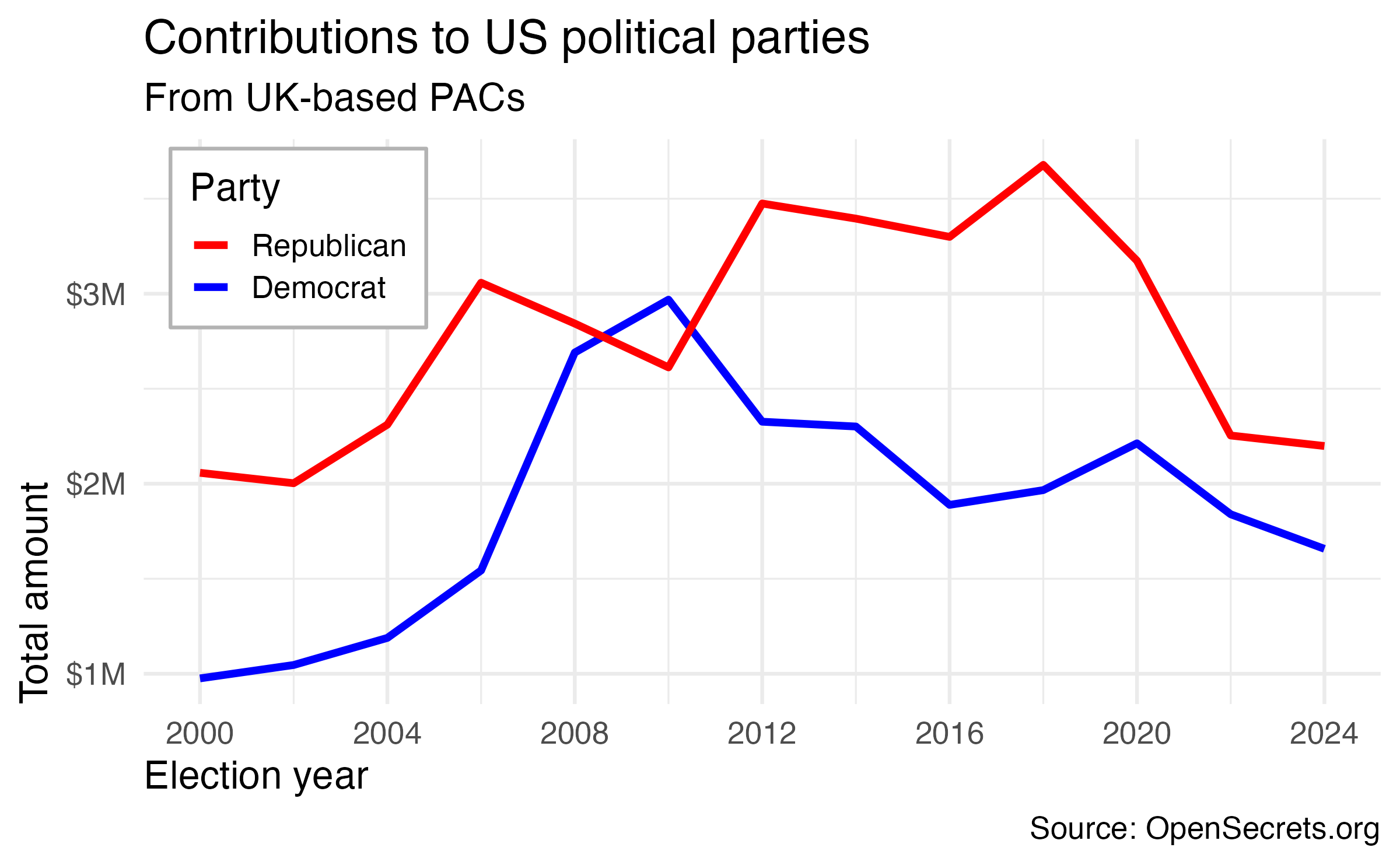
How can the following figure be improved with custom breaks in axes, if at all?
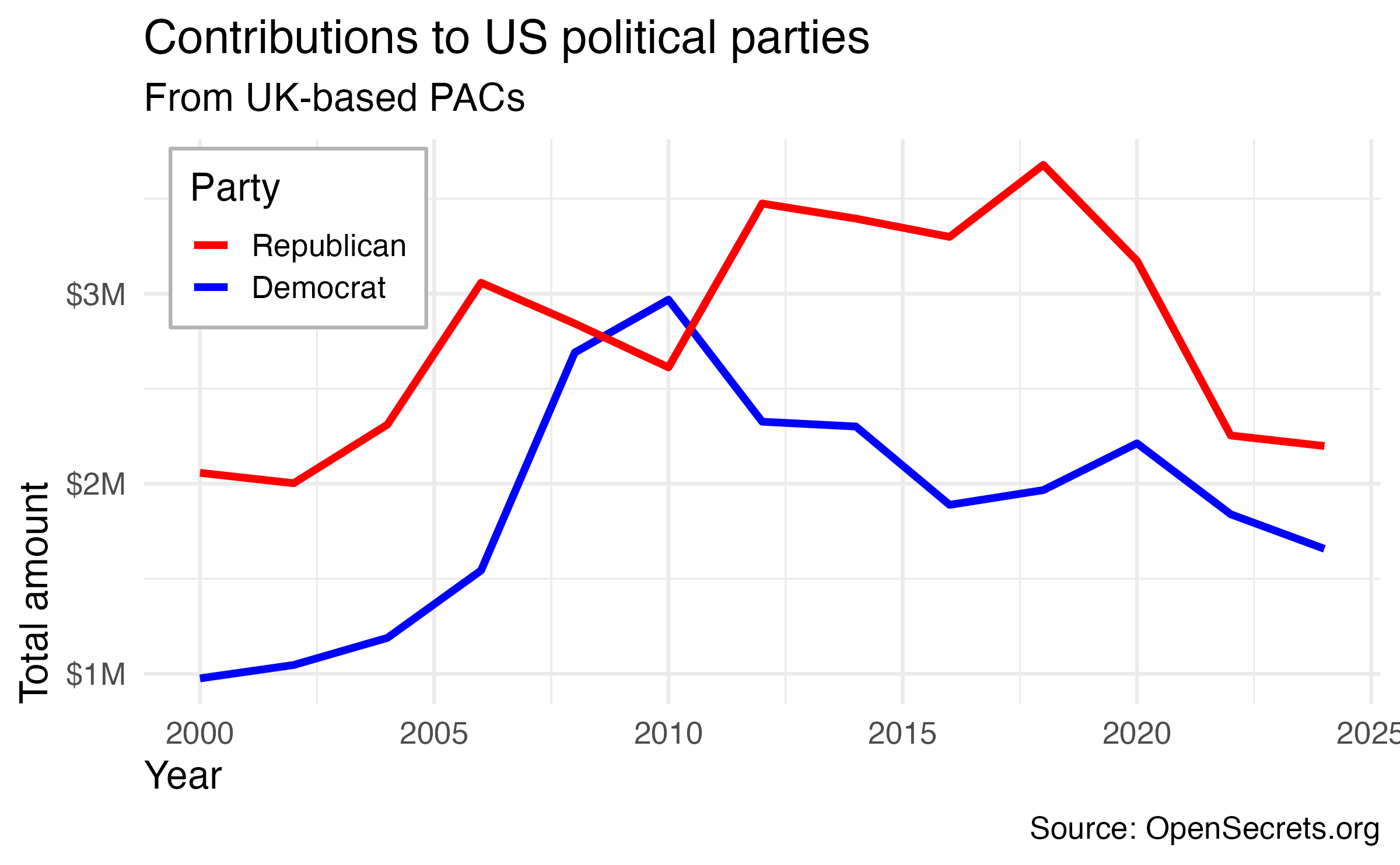
Context matters
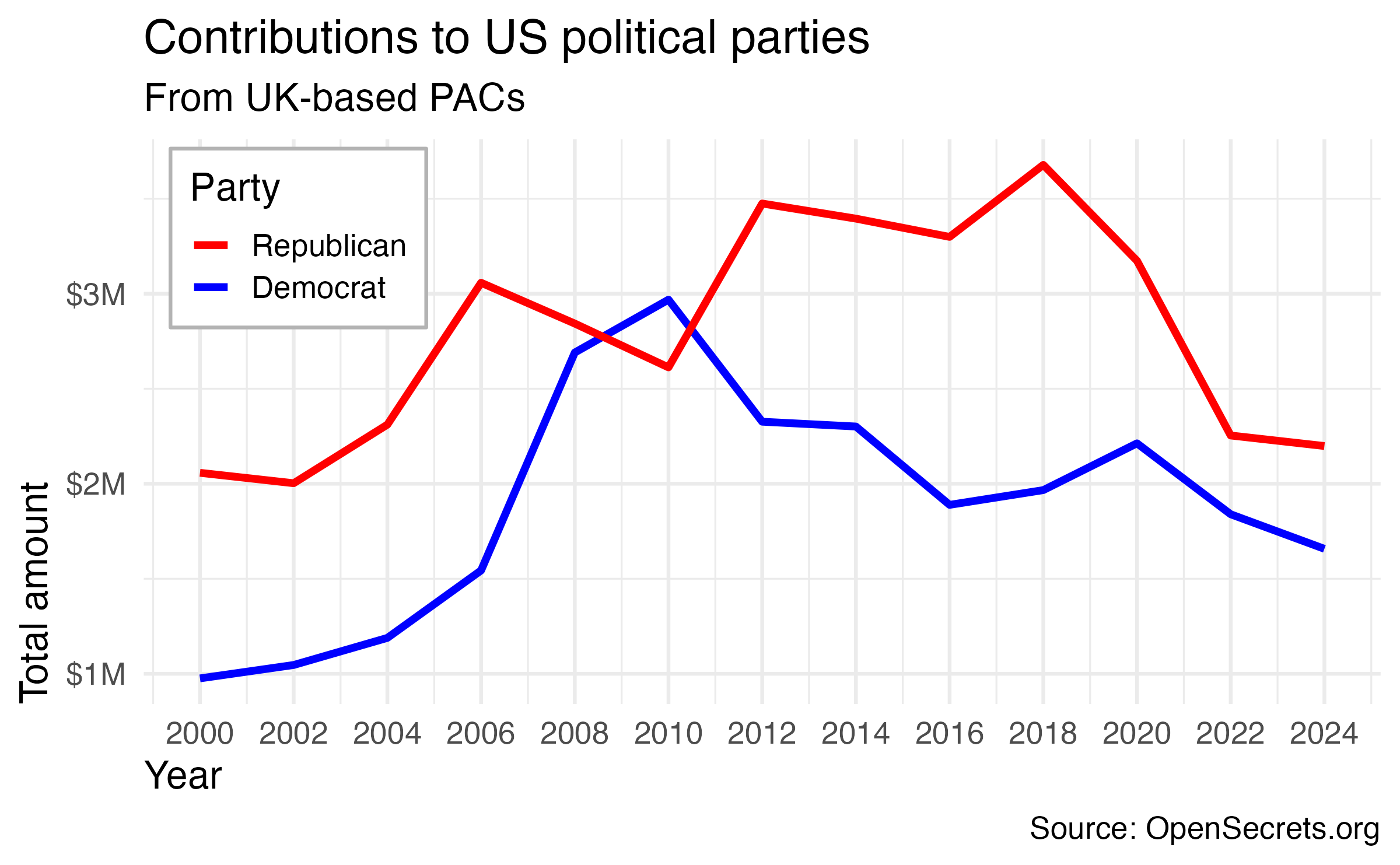
pac_plot +
  scale_x_continuous(breaks = seq(from = 2000, to = 2024, by = 2))

Conciseness matters

pac_plot +
  scale_x_continuous(breaks = seq(2000, 2024, 4))

Precision matters

pac_plot +
  scale_x_continuous(breaks = seq(2000, 2024, 4)) +
  labs(x = "Election year")

Annotating plots

Annotating plots

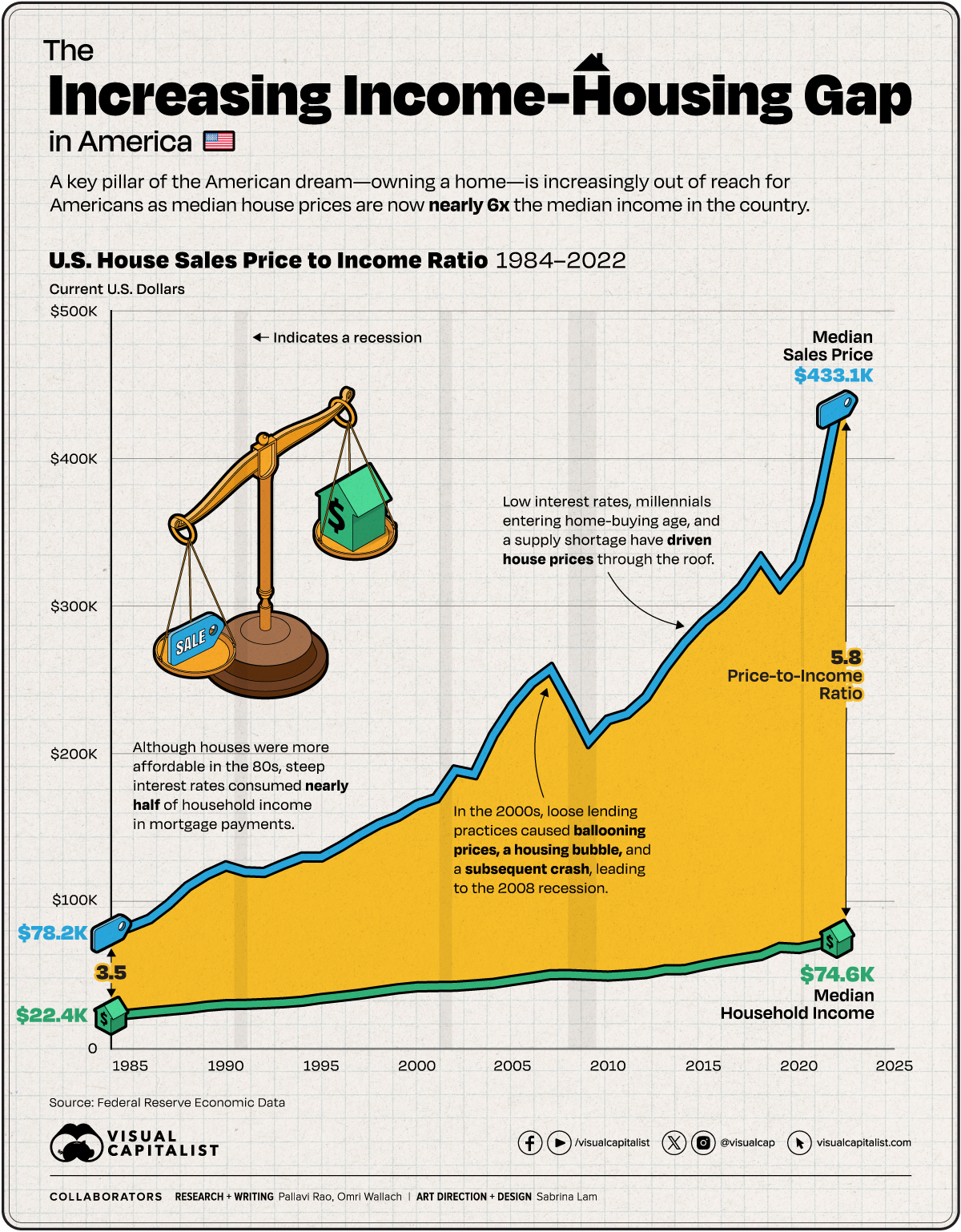
How can plots be annotated to enhance their clarity and interpretability?

  • Text
  • Arrows/lines
  • Rectangles
  • Colors/fills

Rows: 29567 Columns: 6
── Column specification ────────────────────────────────────────────────────────────────────────────
Delimiter: ","
chr (2): Entity, Code
dbl (4): Year, GDP, PPP (constant 2021 international $), Annual CO₂ emissions, Annual consumptio...

ℹ Use `spec()` to retrieve the full column specification for this data.
ℹ Specify the column types or set `show_col_types = FALSE` to quiet this message.
Joining with `by = join_by(entity)`
Scale for x is already present.
Adding another scale for x, which will replace the existing scale.
Scale for x is already present.
Adding another scale for x, which will replace the existing scale.

04:00

04:00

Text in plots

Including text on a plot

Label actual data points

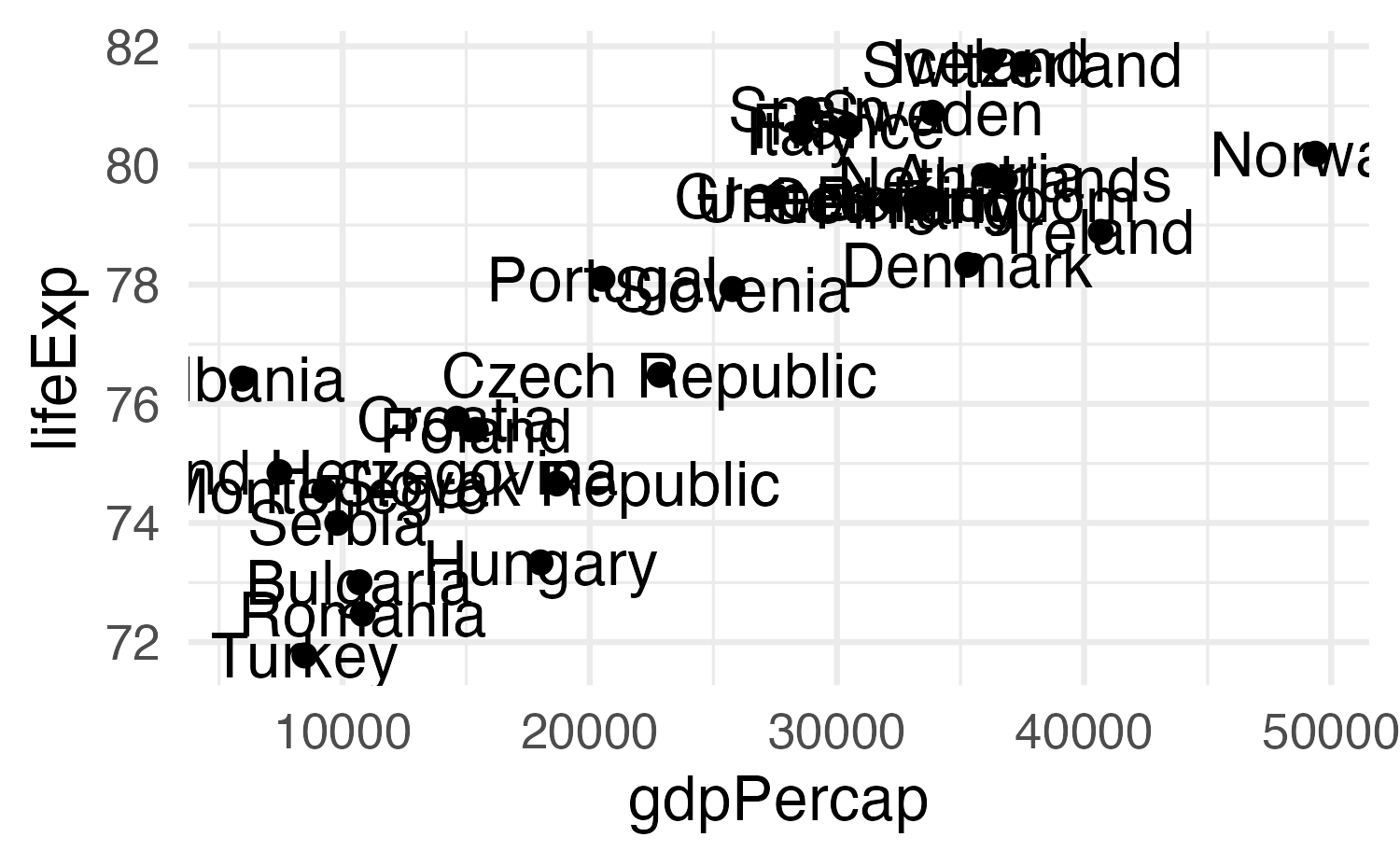
geom_text(), geom_label(), geom_text_repel(), etc.

Label actual data points

library(gapminder)

gapminder_europe <- gapminder |>
  filter(
    year == 2007,
    continent == "Europe"
  )

ggplot(
  gapminder_europe,
  aes(x = gdpPercap, y = lifeExp)
) +
  geom_point() +
  geom_text(aes(label = country))

Label actual data points

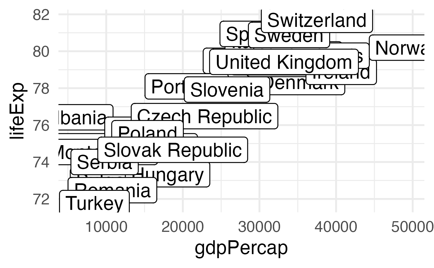
ggplot(
  gapminder_europe,
  aes(x = gdpPercap, y = lifeExp)
) +
  geom_point() +
  geom_label(aes(label = country))

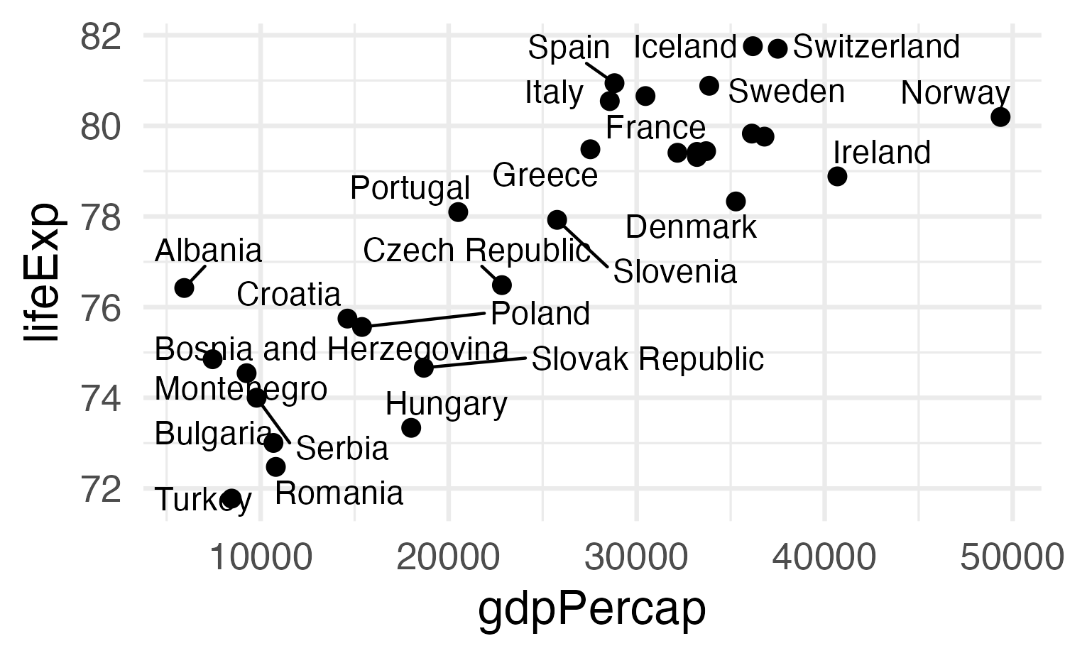
Solution 1: Repel labels

library(ggrepel)

ggplot(
  gapminder_europe,
  aes(x = gdpPercap, y = lifeExp)
) +
  geom_point() +
  geom_text_repel(aes(label = country))

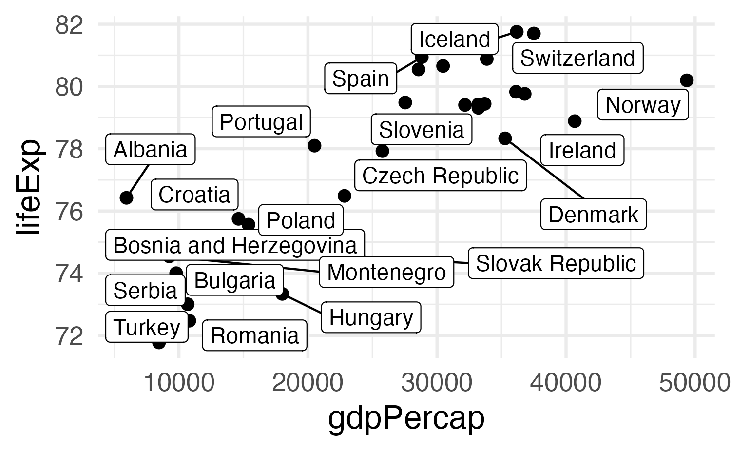
Solution 1: Repel labels

library(ggrepel)

ggplot(
  gapminder_europe,
  aes(x = gdpPercap, y = lifeExp)
) +
  geom_point() +
  geom_label_repel(aes(label = country))

Solution 2a: Don’t use so many labels
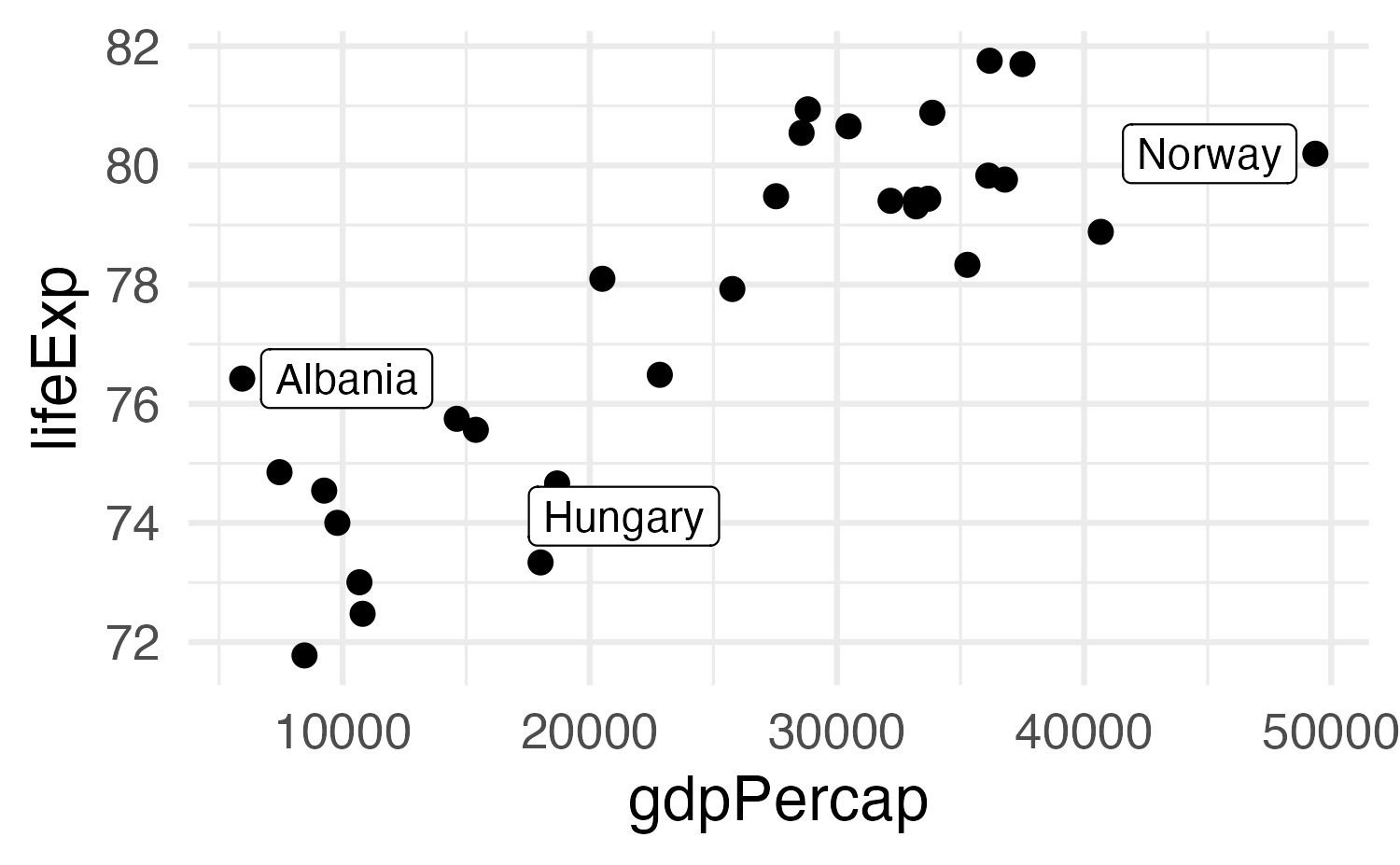
gapminder_europe <- gapminder_europe |>
  mutate(
    should_be_labeled = country %in% c(
      "Albania",
      "Norway",
      "Hungary"
    )
  )

ggplot(
  gapminder_europe,
  aes(x = gdpPercap, y = lifeExp)
) +
  geom_point() +
  geom_label_repel(
    data = filter(
      gapminder_europe,
      should_be_labeled == TRUE
    ),
    aes(label = country)
  )

Solution 2b: Use other aesthetics too

ggplot(
  gapminder_europe,
  aes(x = gdpPercap, y = lifeExp)
) +
  geom_point(aes(color = should_be_labeled)) +
  geom_label_repel(
    data = filter(
      gapminder_europe,
      should_be_labeled == TRUE
    ),
    aes(
      label = country,
      fill = should_be_labeled
    ),
    color = "white"
  ) +
  scale_color_manual(values = c(
    "grey50",
    "red"
  )) +
  scale_fill_manual(values = c("red")) +
  guides(color = "none", fill = "none")
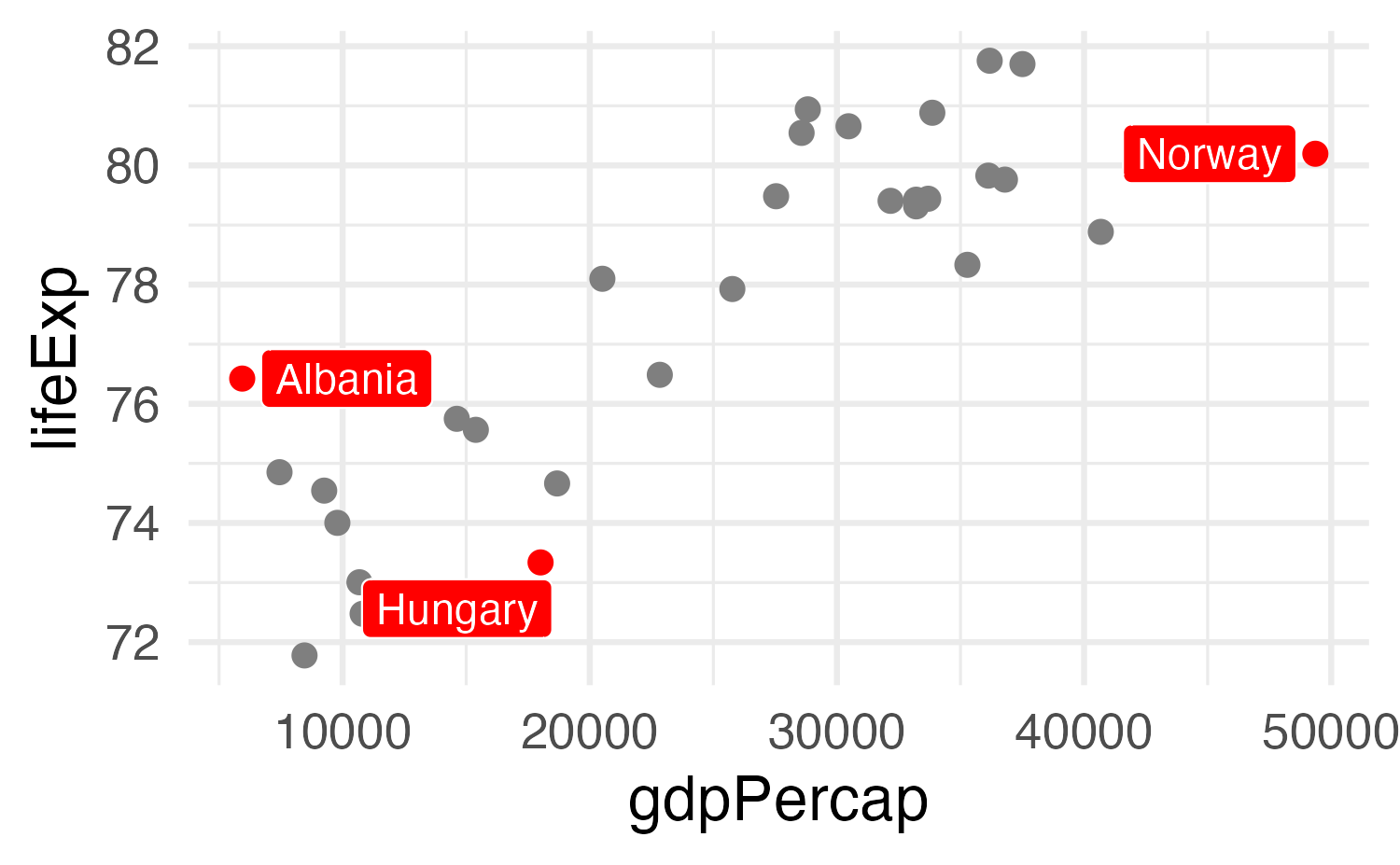
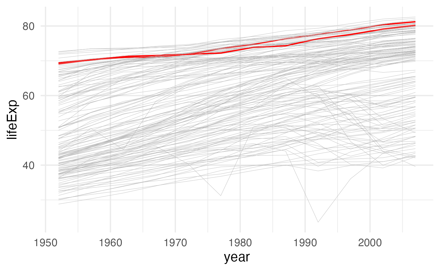
(Highlight non-text things too!)

# Color just Oceania
gapminder_highlighted <- gapminder |>
  mutate(
    is_oceania = continent == "Oceania"
  )

ggplot(
  gapminder_highlighted,
  aes(
    x = year, y = lifeExp,
    group = country,
    color = is_oceania,
    linewidth = is_oceania
  )
) +
  geom_line() +
  scale_color_manual(values = c(
    "grey70",
    "red"
  )) +
  scale_linewidth_manual(values = c(0.1, 0.5)) +
  guides(color = "none", linewidth = "none") +
  theme_minimal()
Including text on a plot

Label actual data points

geom_text(), geom_label(), geom_text_repel(), etc.

Add arbitrary annotations

annotate()

Adding arbitrary annotations

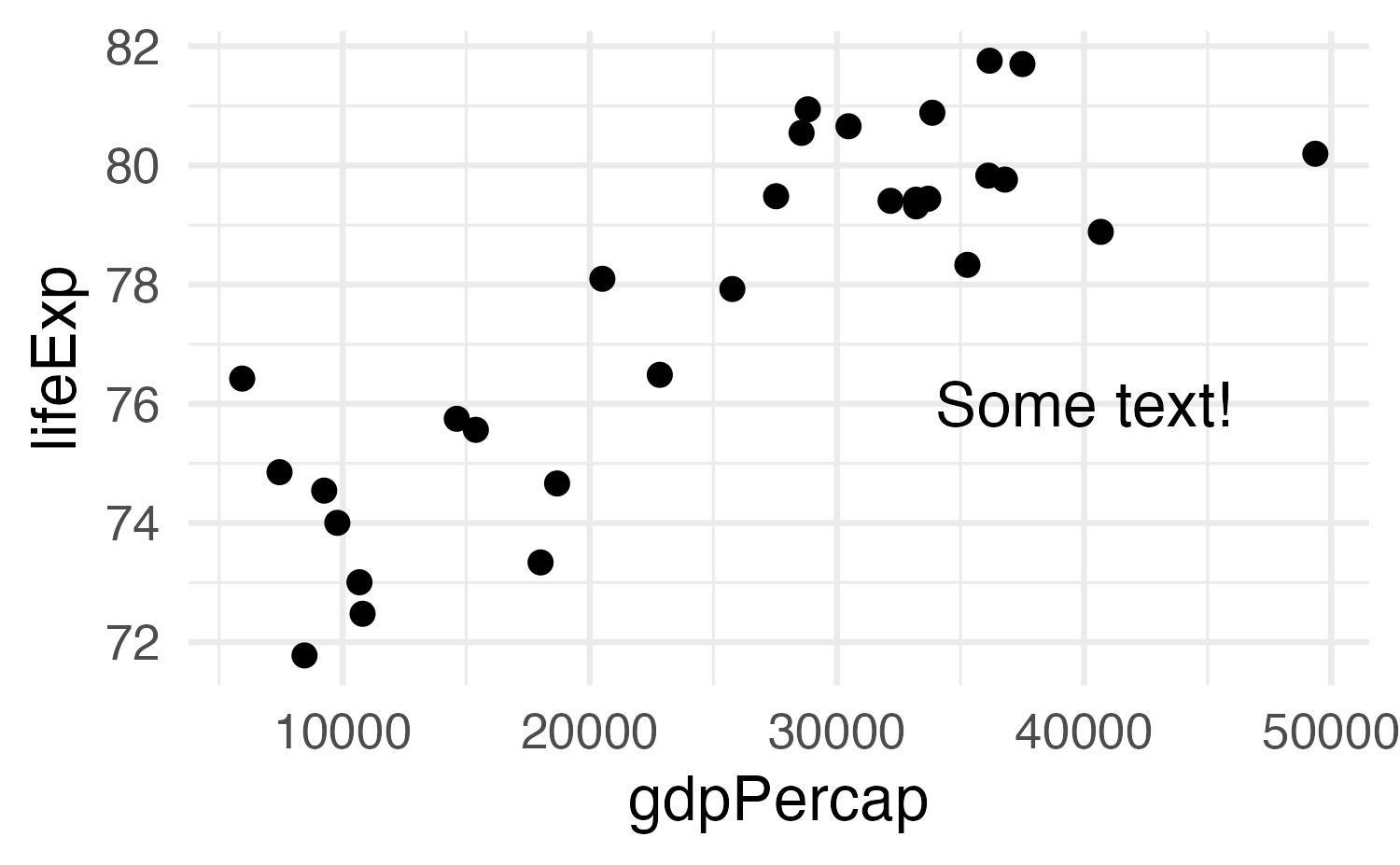
ggplot(
  gapminder_europe,
  aes(x = gdpPercap, y = lifeExp)
) +
  geom_point() +
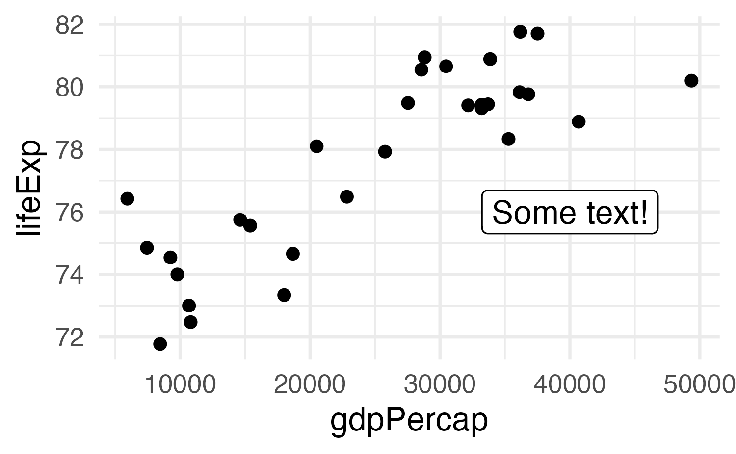
  annotate(
    geom = "text",
    x = 40000, y = 76,
    label = "Some text!"
  )

Adding arbitrary annotations

ggplot(
  gapminder_europe,
  aes(x = gdpPercap, y = lifeExp)
) +
  geom_point() +
  annotate(
    geom = "label",
    x = 40000, y = 76,
    label = "Some text!"
  )

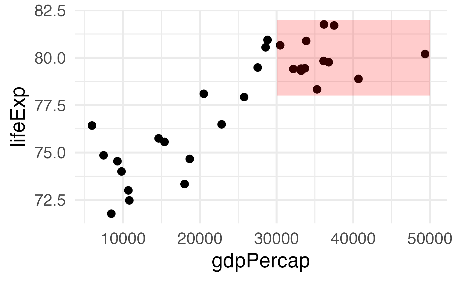
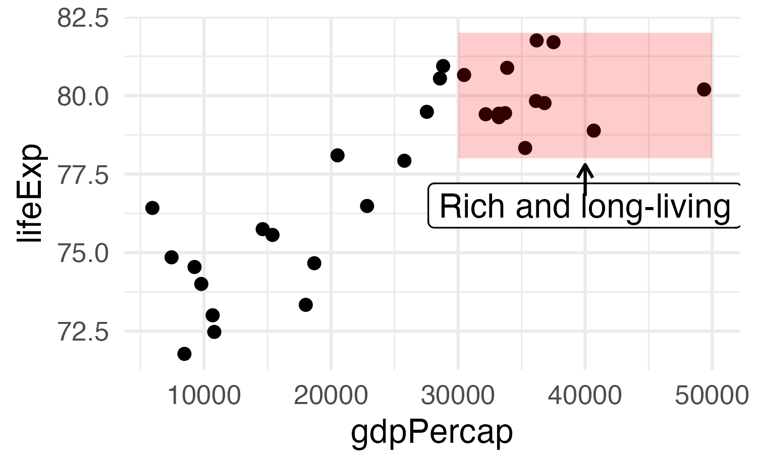
Any geom works

ggplot(
  gapminder_europe,
  aes(x = gdpPercap, y = lifeExp)
) +
  geom_point() +
  annotate(
    geom = "rect",
    xmin = 30000, xmax = 50000,
    ymin = 78, ymax = 82,
    fill = "red", alpha = 0.2
  )

Use multiple annotations

ggplot(
  gapminder_europe,
  aes(x = gdpPercap, y = lifeExp)
) +
  geom_point() +
  annotate(
    geom = "rect",
    xmin = 30000, xmax = 50000,
    ymin = 78, ymax = 82,
    fill = "red", alpha = 0.2
  ) +
  annotate(
    geom = "label",
    x = 40000, y = 76.5,
    label = "Rich and long-living"
  ) +
  annotate(
    geom = "segment",
    x = 40000, xend = 40000,
    y = 76.8, yend = 77.8,
    arrow = arrow(
      length = unit(0.1, "in")
    )
  )
2026 Winter Olympics figure skating ⛸️ drama!

The gold medal win in Ice Dance 🧊💃 by the French 🇫🇷🥇 team of Laurence Fournier Beaudry & Guillaume Cizeron over the American 🇺🇸🥈 team of Madison Chock & Evan Bates has become a controversy

The free dance was scored by 9 judges

The French judge gave Beaudry & Cizeron 🇫🇷 a 137.45 but only gave Chock & Bates 🇺🇸 a 129.74

All other judges were relatively close in their scores of the two teams 🤔

Figure skating uses a “trimmed mean” to determine final scores, meaning the top and bottom judges’ scores are discarded from the averages. Still, an outlier score can have an impact, since it affects which other scores are counted. I have yet to see a thorough mathematical analysis of whether or not the French judge lowballing Chock & Bates actually prevented them from winning gold. Can anyone help out here?

Also, judge No. 4 was just in a bad mood overall 😆

#dataviz #figureskating #olympics #winterolympics #iceskating #skating #usfigureskating #icedance

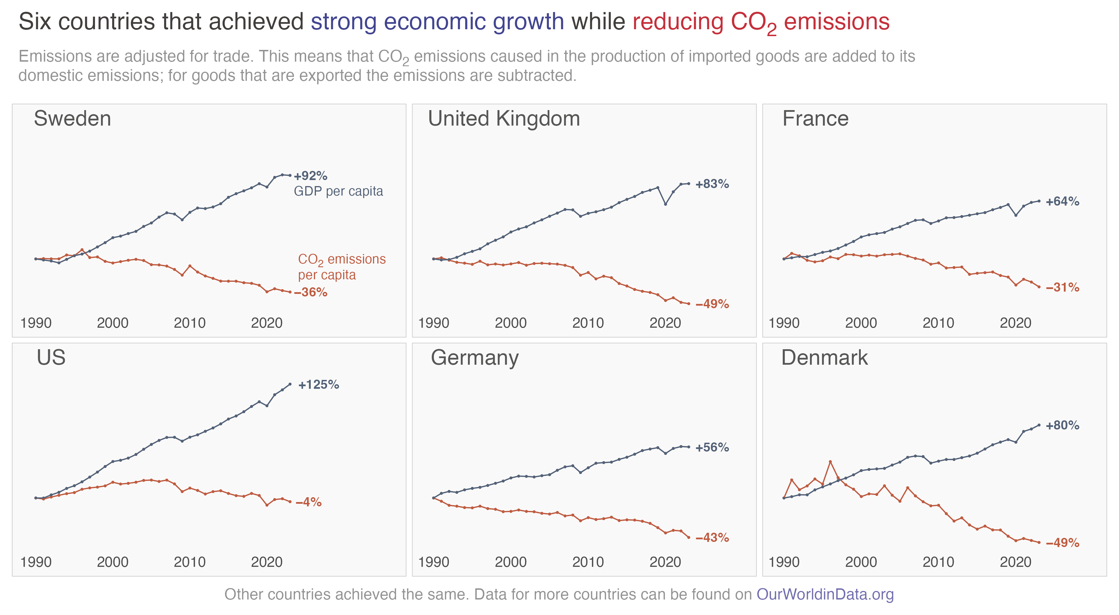
World development indicators

Carbon emissions

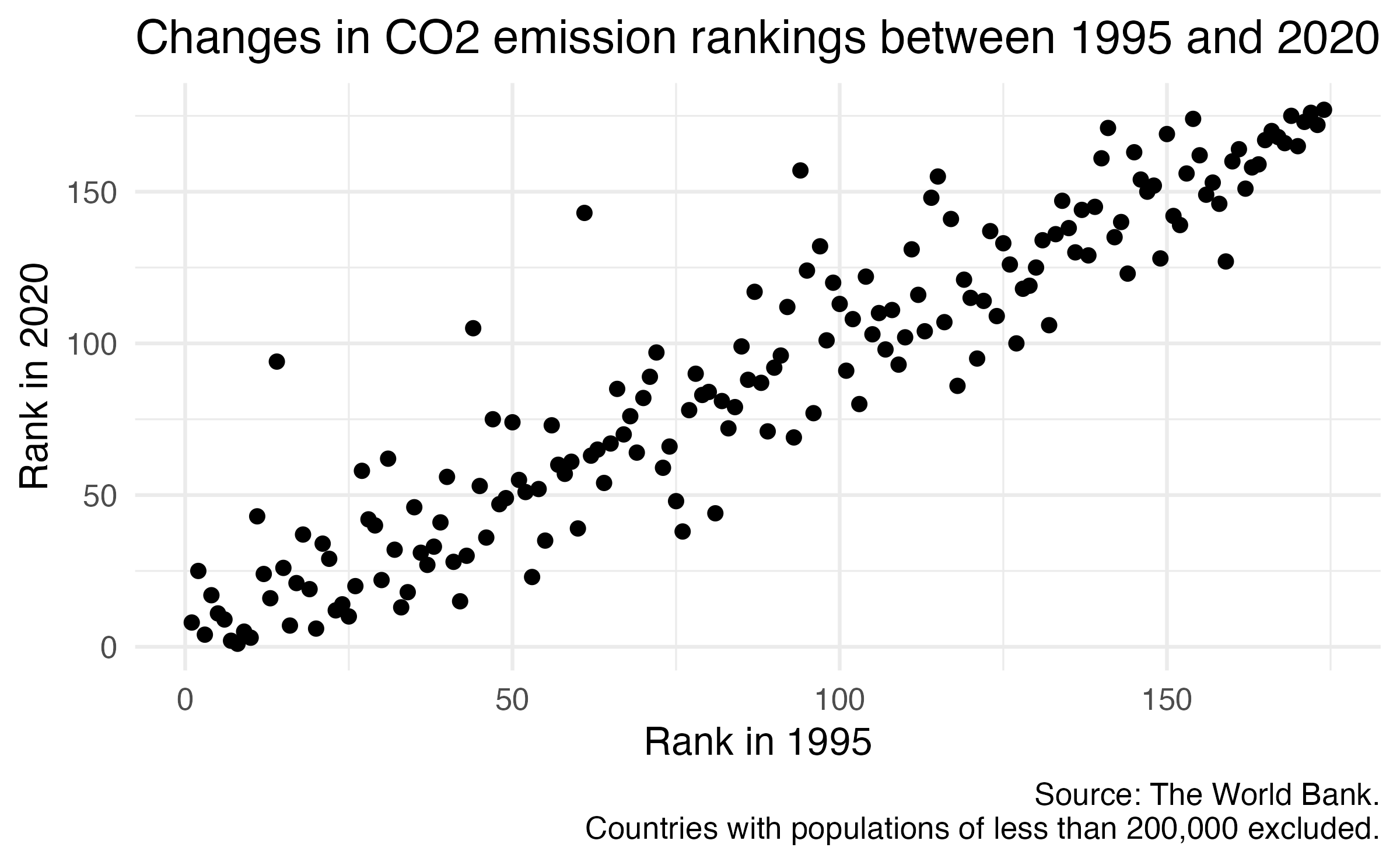
Basic plot

Application exercise

ae-08

Brainstorm methods to improve the readability and interpretability of the chart through annotations

Potential aspects to emphasize

  • What is a “good” rank? What is a “bad” rank?

    Note

    • 1 is lowest carbon emissions per capita
    • 170 is the highest carbon emissions per capita
  • What are the countries that have significantly improved or worsened their rank?

  • What other aspects do you feel should be emphasized?

Methods for annotation

  • Text labels
  • Arrows/lines
  • Rectangles
  • Colors/fills

Wrap up

Recap

  • Visual storytelling requires a combination of data, visualization, and annotation
  • Attention to detail is key to ensure that the message is clear
  • Annotation is a powerful method for enhancing clarity and interpretability of plots
  • {ggplot2} has powerful annotation tools
  • Alternatively, export to vector format and use a vector graphics editor (e.g. Illustrator, GIMP)

Acknowledgements