Rows: 1,242
Columns: 22
$ state                                        <chr> "Alabama", "Alaska", "Arizona", "Arkansas", "…
$ year                                         <dbl> 2020, 2020, 2020, 2020, 2020, 2020, 2020, 202…
$ total_employed_rn                            <dbl> 48850, 6240, 55520, 25300, 307060, 52330, 334…
$ employed_standard_error_percent              <dbl> 2.9, 13.0, 3.7, 4.2, 2.0, 2.8, 6.5, 11.4, 1.2…
$ hourly_wage_avg                              <dbl> 28.96, 45.81, 38.64, 30.60, 57.96, 37.43, 40.…
$ hourly_wage_median                           <dbl> 28.19, 45.23, 37.98, 29.97, 56.93, 36.78, 39.…
$ annual_salary_avg                            <dbl> 60230, 95270, 80380, 63640, 120560, 77860, 84…
$ annual_salary_median                         <dbl> 58630, 94070, 79010, 62330, 118410, 76500, 82…
$ wage_salary_standard_error_percent           <dbl> 0.8, 1.4, 0.9, 1.4, 1.0, 0.7, 1.0, 2.5, 1.5, …
$ hourly_10th_percentile                       <dbl> 20.75, 31.50, 27.66, 21.47, 36.62, 26.84, 29.…
$ hourly_25th_percentile                       <dbl> 23.73, 36.94, 32.58, 25.71, 45.18, 31.05, 34.…
$ hourly_75th_percentile                       <dbl> 33.15, 53.31, 44.67, 35.40, 71.07, 43.47, 47.…
$ hourly_90th_percentile                       <dbl> 38.67, 60.70, 50.14, 39.65, 83.35, 50.03, 54.…
$ annual_10th_percentile                       <dbl> 43150, 65530, 57530, 44660, 76180, 55820, 605…
$ annual_25th_percentile                       <dbl> 49360, 76830, 67760, 53490, 93970, 64580, 709…
$ annual_75th_percentile                       <dbl> 68960, 110890, 92920, 73630, 147830, 90410, 9…
$ annual_90th_percentile                       <dbl> 80420, 126260, 104290, 82480, 173370, 104070,…
$ location_quotient                            <dbl> 1.20, 0.98, 0.91, 1.00, 0.87, 0.95, 1.01, 1.2…
$ total_employed_national_aggregate            <dbl> 140019790, 140019790, 140019790, 140019790, 1…
$ total_employed_healthcare_national_aggregate <dbl> 8632190, 8632190, 8632190, 8632190, 8632190, …
$ total_employed_healthcare_state_aggregate    <dbl> 128600, 17730, 171010, 80410, 844740, 144490,…
$ yearly_total_employed_state_aggregate <dbl> 1903210, 296300, 2835110, 1177860, 16430660, …Implementing accessibility
Lecture 12
March 5, 2024

- What is the story?
- How would you describe the chart to someone who could not see it?
Flatten the curve
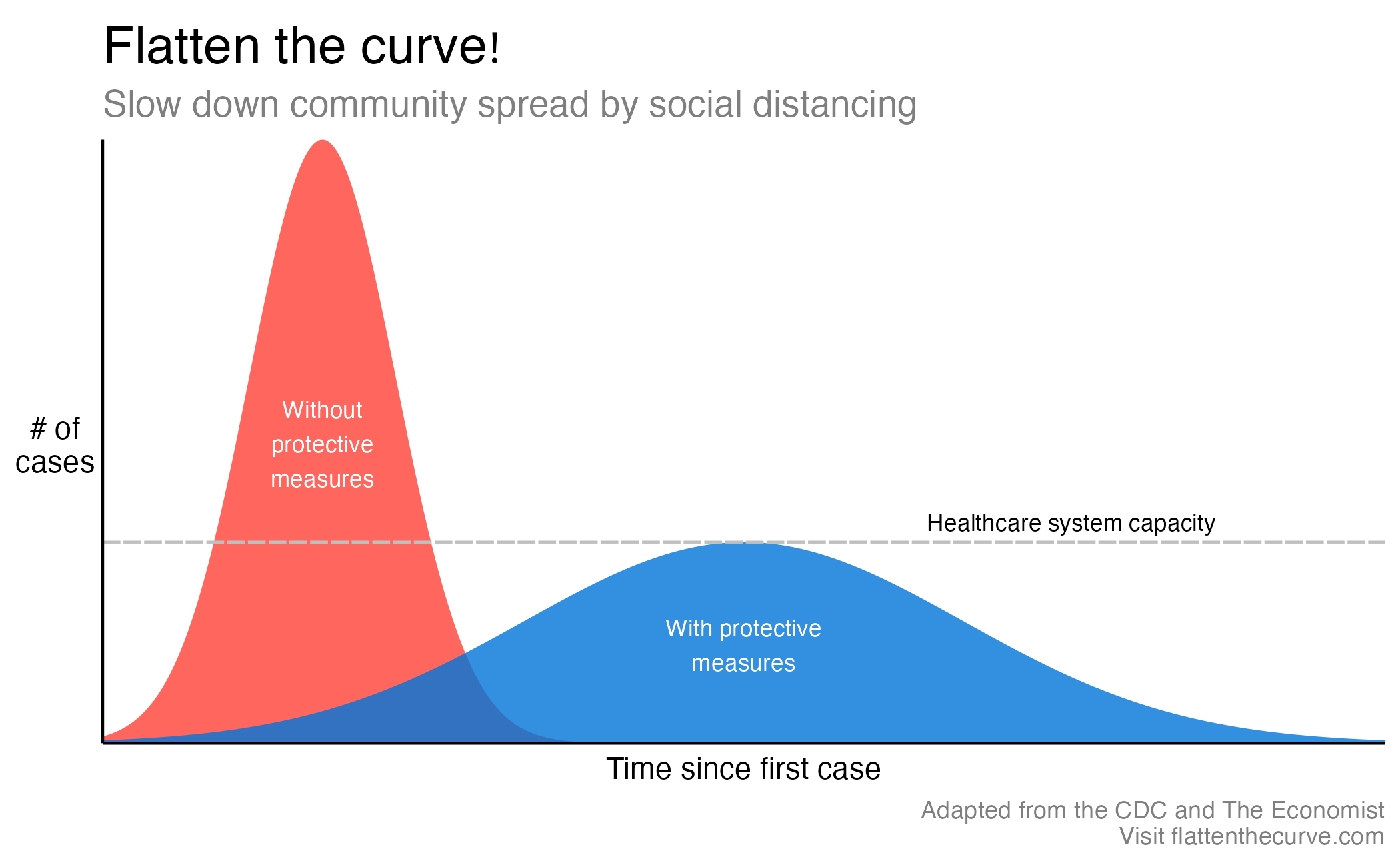
- Why outbreaks like coronavirus spread exponentially, and how to “flatten the curve”
- COVID-19 Dashboard TODO replace with a link that does not require login
Alt text in the wild
Bar chart
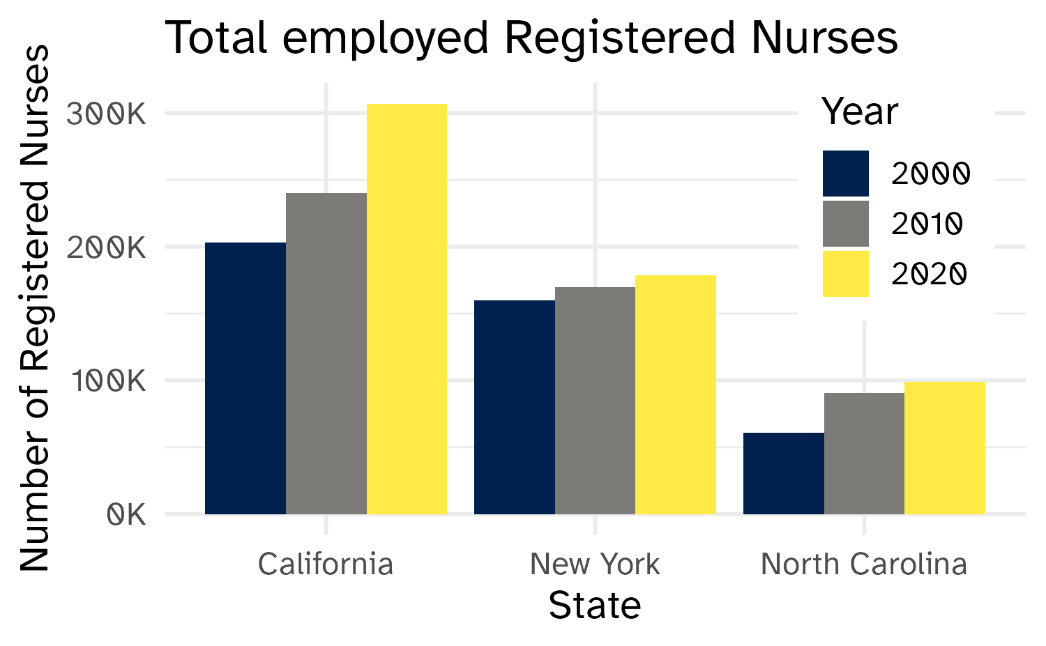
- Provide the title and axis labels
- Briefly describe the chart and give a summary of any trends it displays
- Convert bar charts to accessible tables or lists
- Avoid describing visual attributes of the bars (e.g., dark blue, gray, yellow) unless there’s an explicit need to do so
Developing the alt text
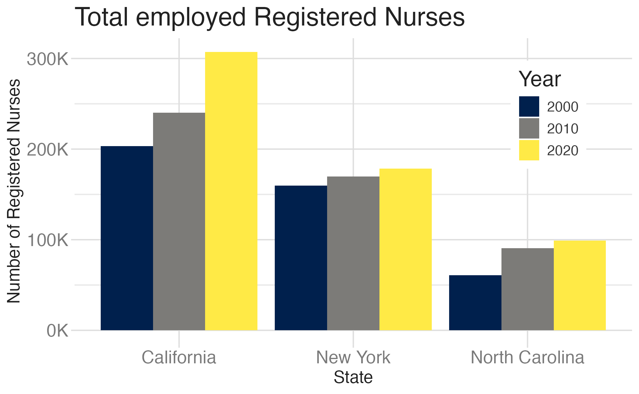
- Total employed registered nurses in three states over time.
- Total employed registered nurses in California, New York, and North Carolina, in 2000, 2010, and 2020.
- A bar chart of total employed registered nurses in California, New York, and North Carolina, in 2000, 2010, and 2020, showing increasing numbers of nurses over time.
- The figure is a bar chart titled ‘Total employed Registered Nurses’ that displays the numbers of registered nurses in three states (California, New York, and North Carolina) over a 20 year period, with data recorded in three time points (2000, 2010, and 2020). In each state, the numbers of registered nurses increase over time. The following numbers are all approximate. California started off with 200K registered nurses in 2000, 240K in 2010, and 300K in 2020. New York had 150K in 2000, 160K in 2010, and 170K in 2020. Finally North Carolina had 60K in 2000, 90K in 2010, and 100K in 2020.
Can we outsource to LLMs?

Generated using Claude Sonnet 4.5
Total employed Registered Nurses across three states over twenty years. The vertical axis shows the number of registered nurses, ranging from 0 to 300,000. The horizontal axis displays three states: California, New York, and North Carolina. For each state, three bars represent data from years 2000, 2010, and 2020.
California shows approximately 205,000 nurses in 2000, growing to about 245,000 in 2010, and reaching roughly 308,000 by 2020. New York displays approximately 159,000 nurses in 2000, increasing to about 172,000 in 2010, and reaching approximately 182,000 in 2020. North Carolina shows about 63,000 nurses in 2000, growing to approximately 91,000 in 2010, and reaching roughly 102,000 by 2020. All three states demonstrate consistent growth in employed registered nurses over the two-decade period, with California maintaining the highest numbers and North Carolina the lowest among the three states shown.
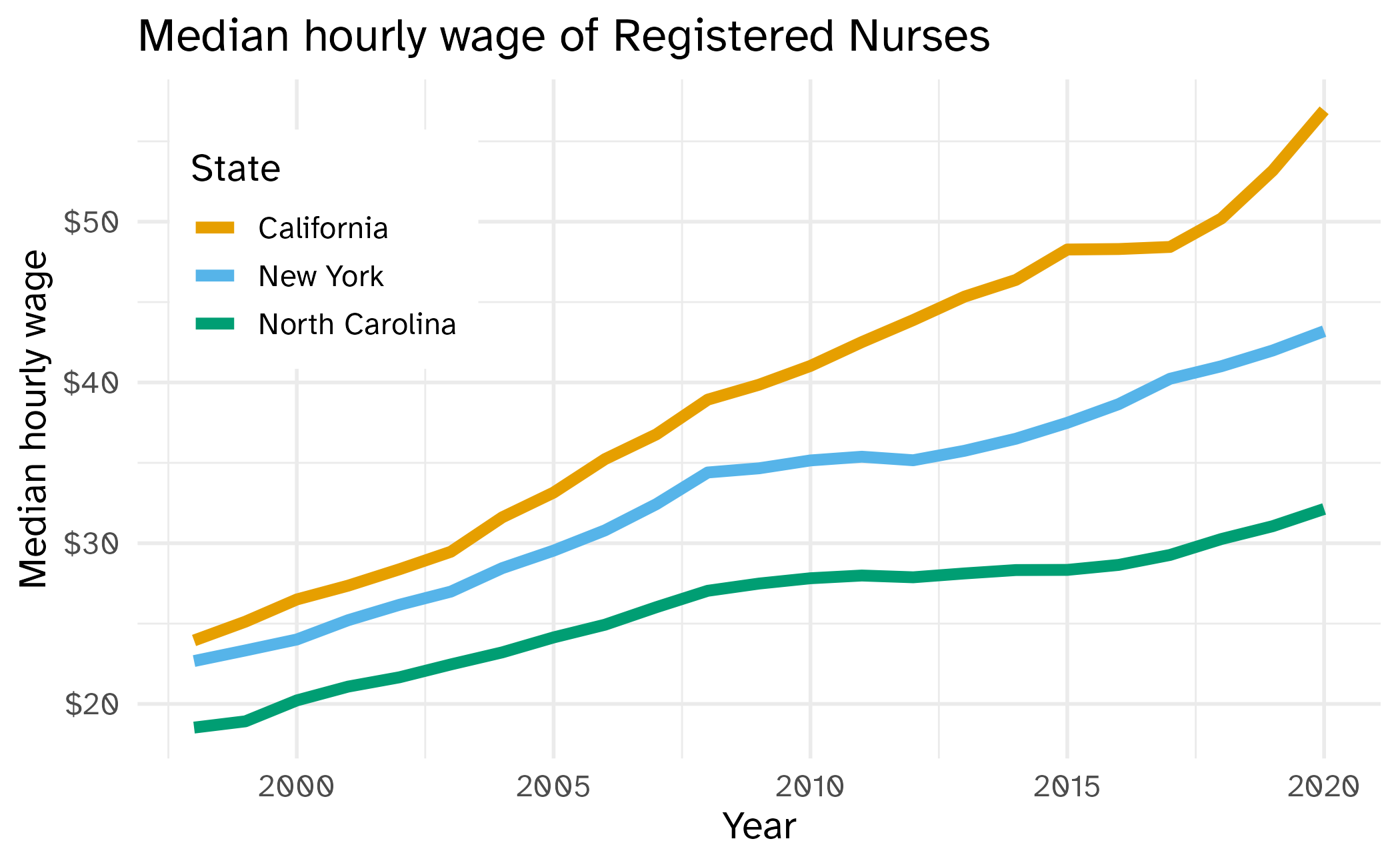
The default {ggplot2} color scale
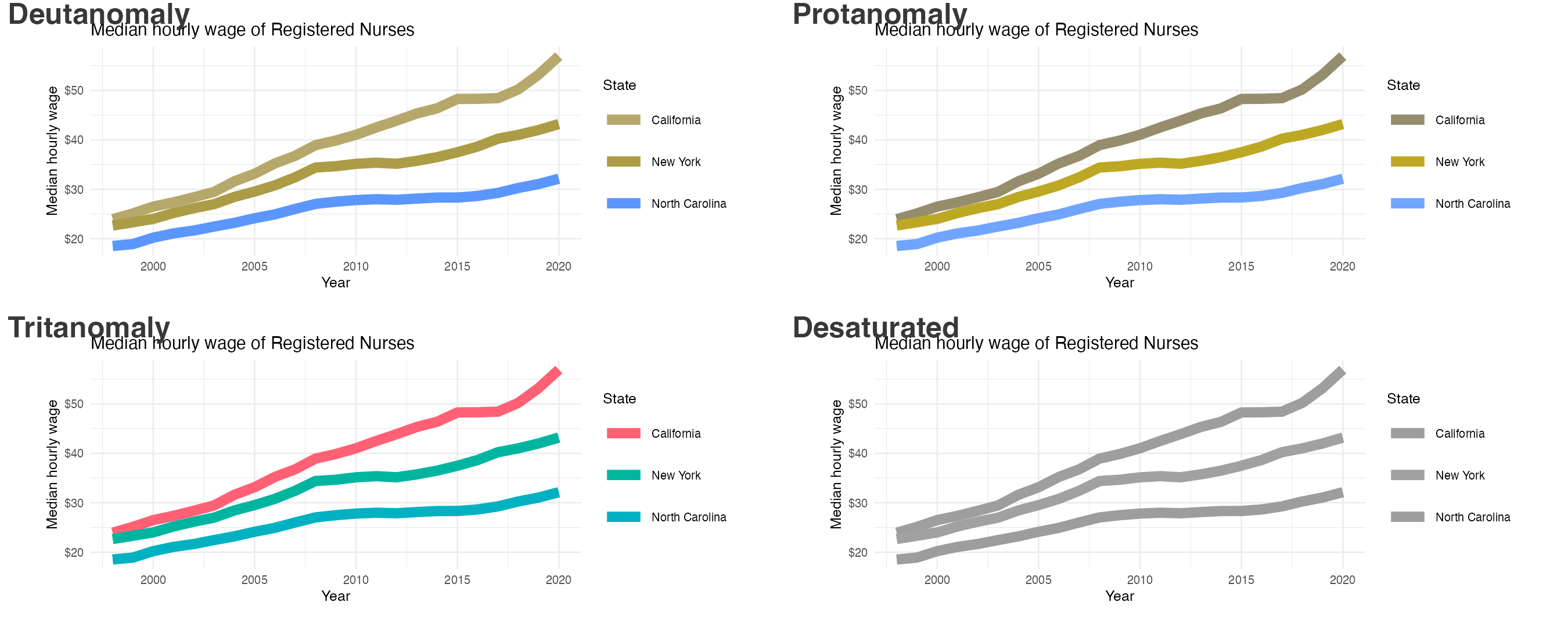
Color scales
Use colorblind friendly color scales (e.g., Okabe Ito, {viridis})
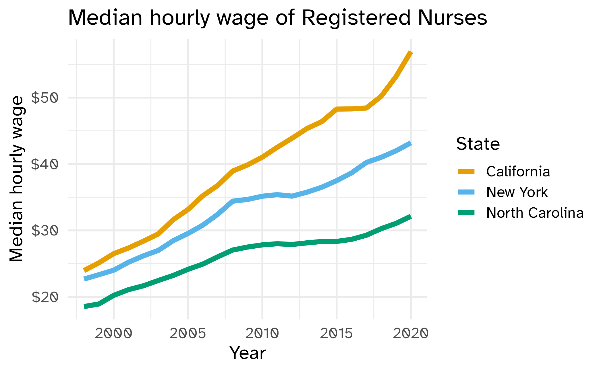
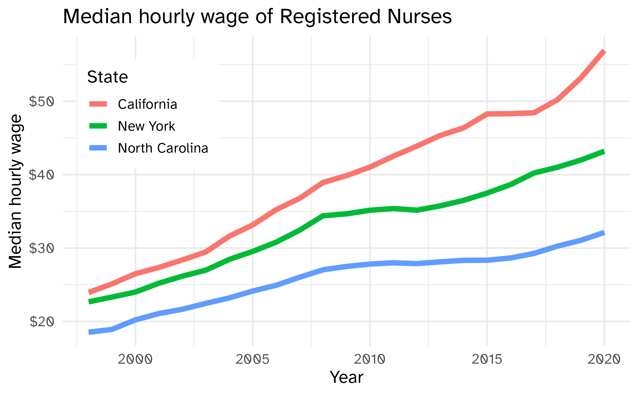
nurses_subset |>
  ggplot(aes(x = year, y = hourly_wage_median, color = state)) +
  geom_line(size = 2) +
  colorblindr::scale_color_OkabeIto() +
  scale_y_continuous(labels = label_currency()) +
  labs(
    x = "Year", y = "Median hourly wage", color = "State",
    title = "Median hourly wage of Registered Nurses"
  ) +
  theme(
    legend.position = c(0.15, 0.75),
    legend.background = element_rect(fill = "white", color = "white")
  )
Color contrast


Double encoding
Use multiple channels where possible
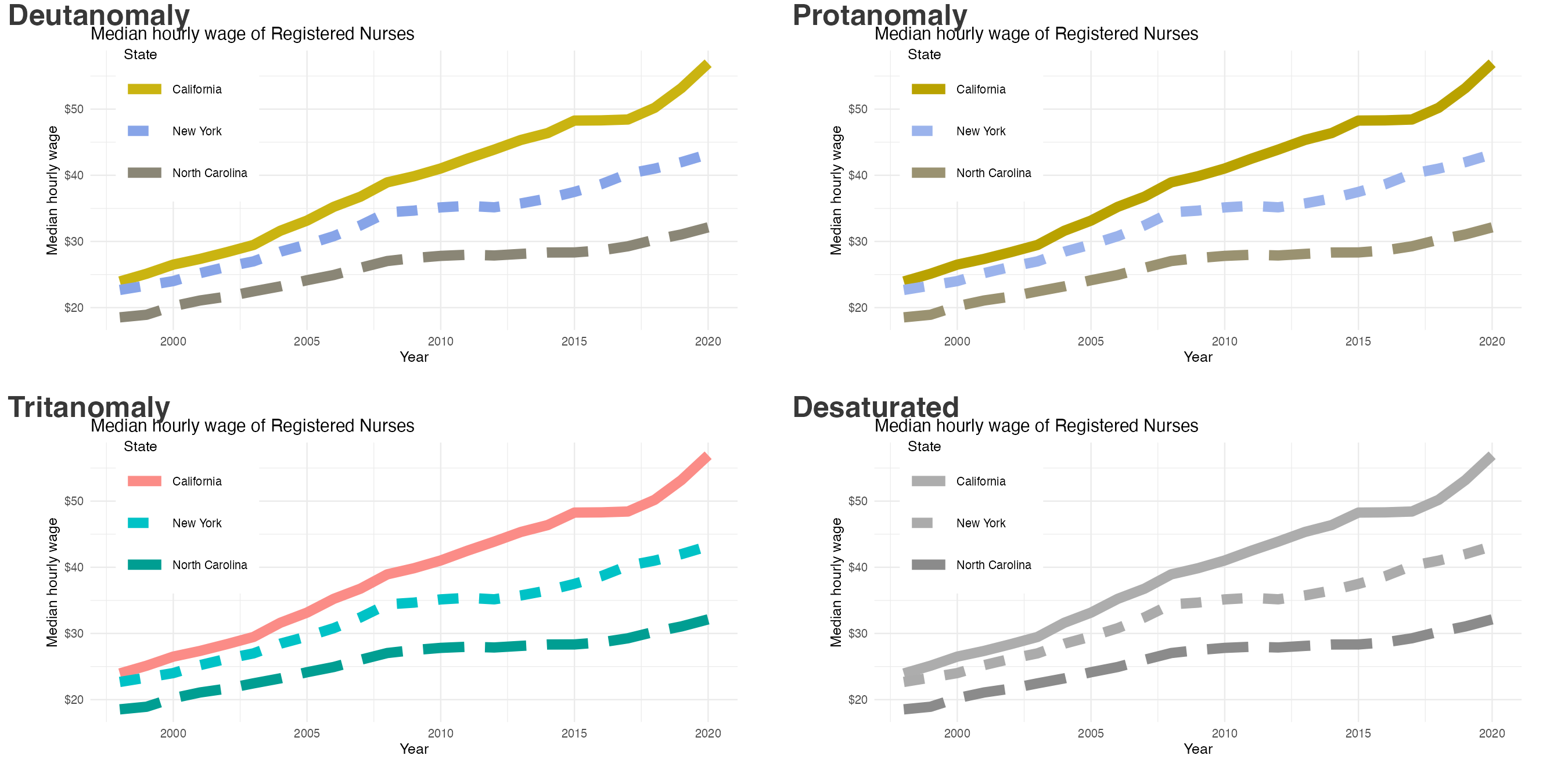
Without direct labeling
With direct labeling
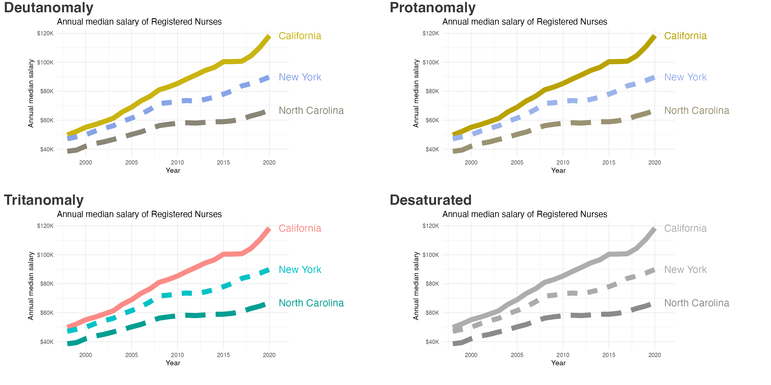
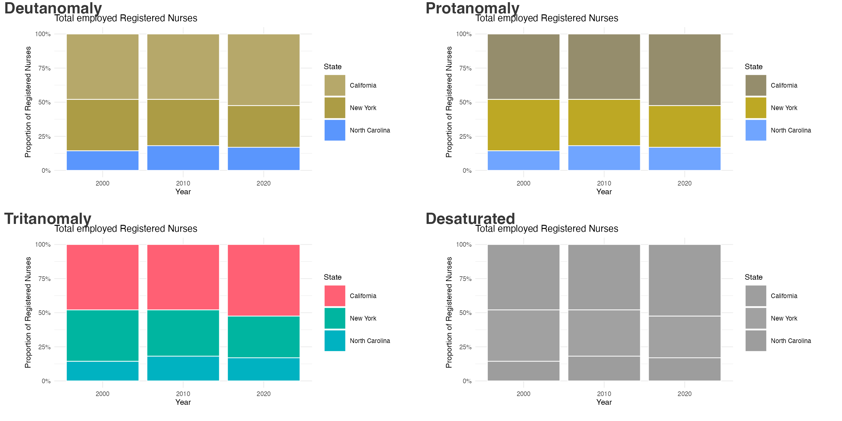
Without whitespace/pattern
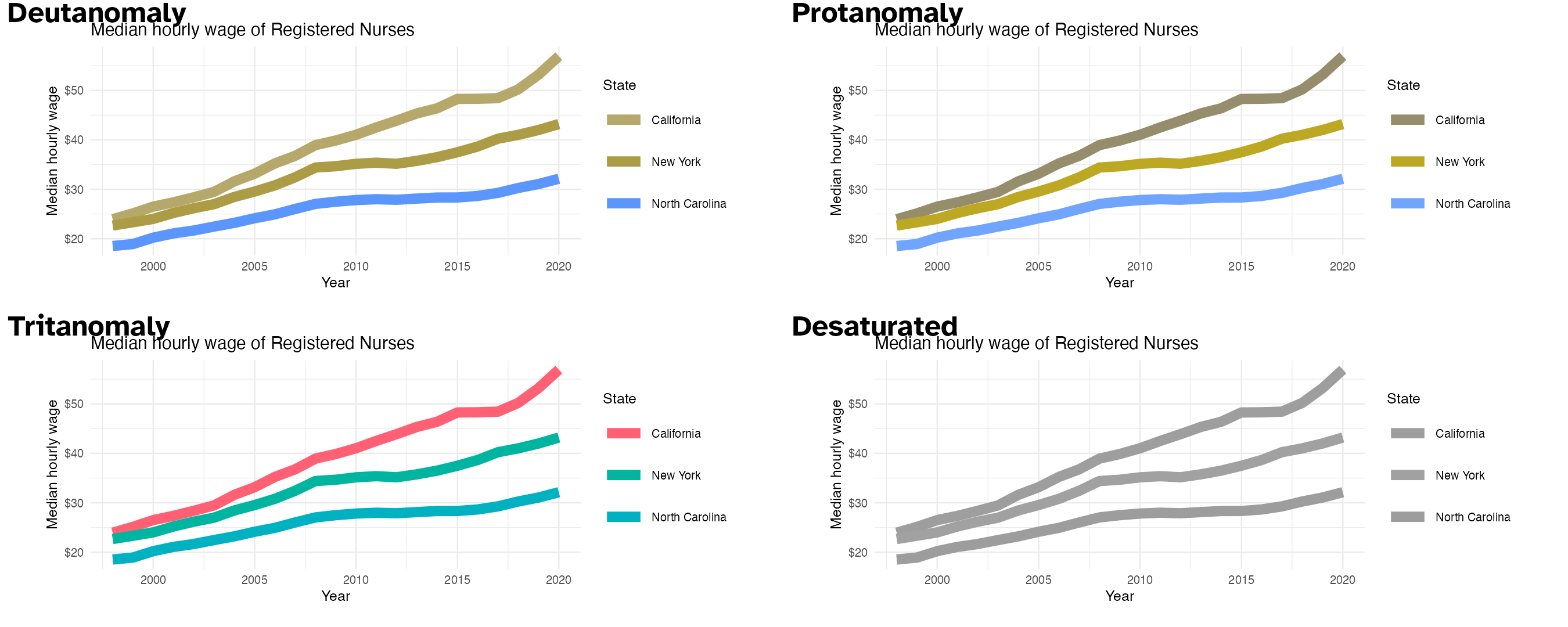
With whitespace
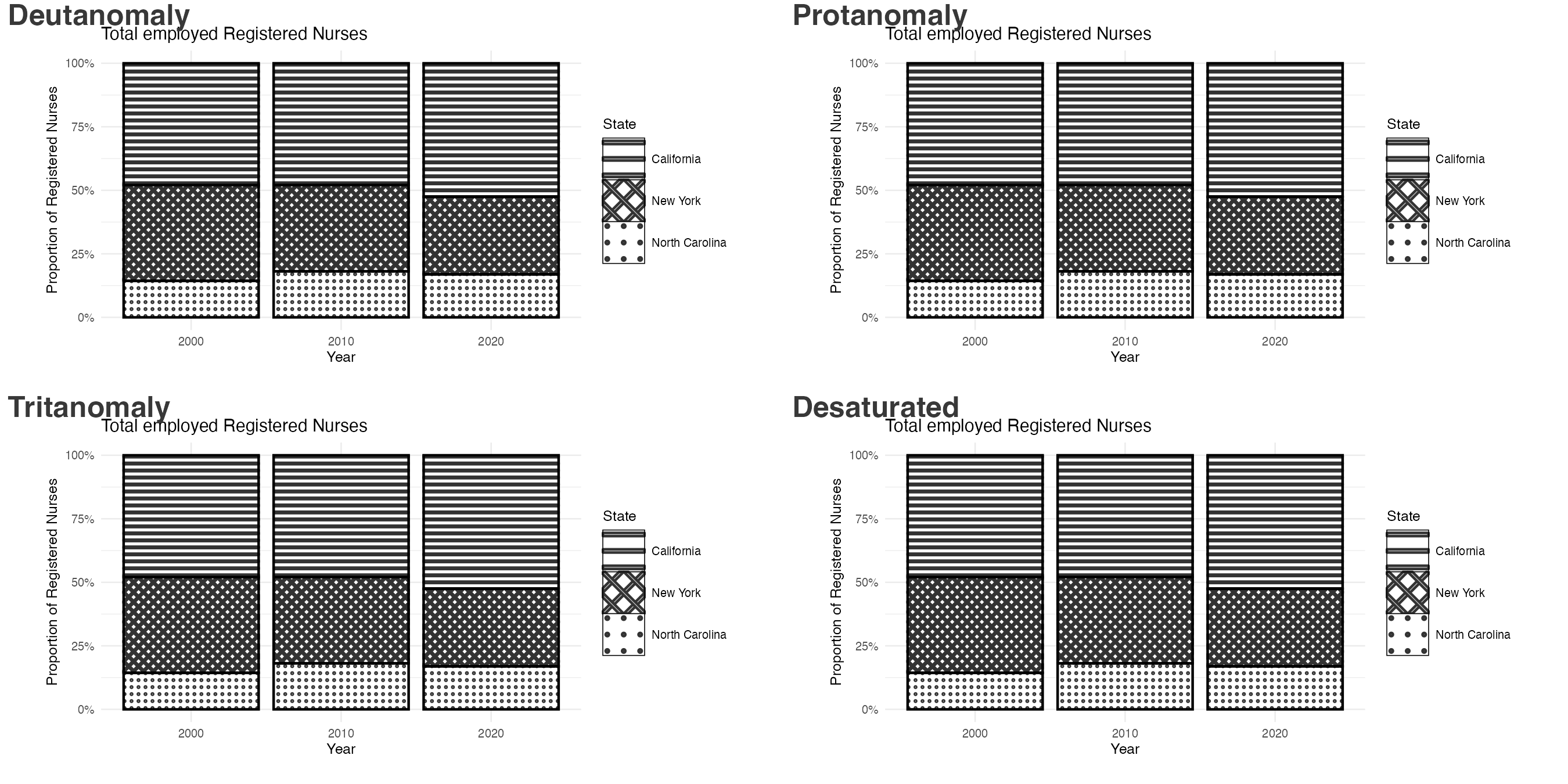
With pattern via {ggpattern}
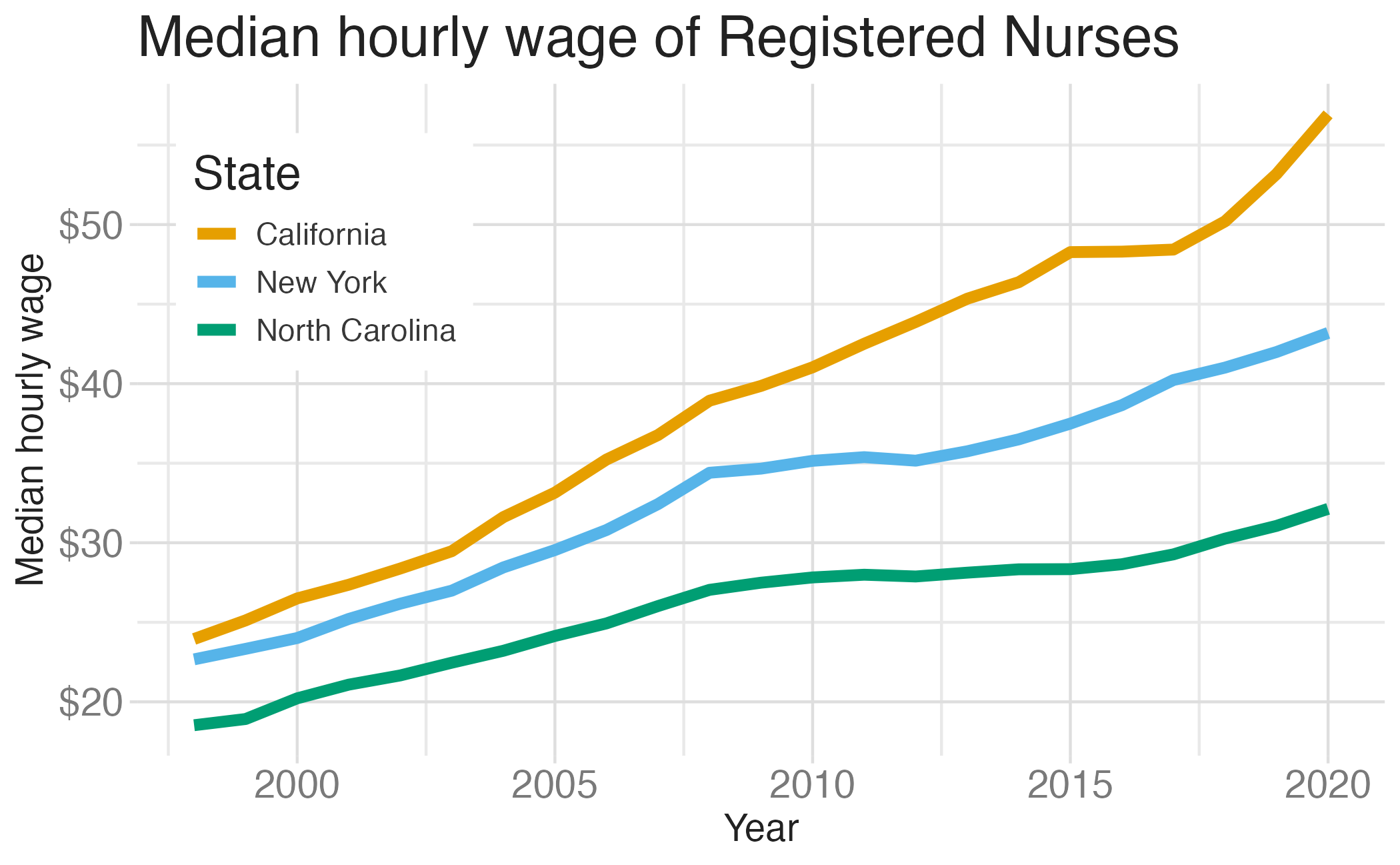
Accessibility and fonts
nurses_subset |>
  ggplot(aes(x = year, y = hourly_wage_median, color = state)) +
  geom_line(size = 2) +
  colorblindr::scale_color_OkabeIto() +
  scale_y_continuous(labels = label_currency()) +
  labs(
    x = "Year", y = "Median hourly wage", color = "State",
    title = "Median hourly wage of Registered Nurses"
  ) +
  theme_minimal(
    base_size = 16,
    base_family = "Atkinson Hyperlegible"
  )