Developing charts (and some data wrangling)
Lecture 07
Cornell University
INFO 3312/5312 - Fall 2026
September 17, 2026
Announcements
Announcements
- No homework this week
- Project 01 structure
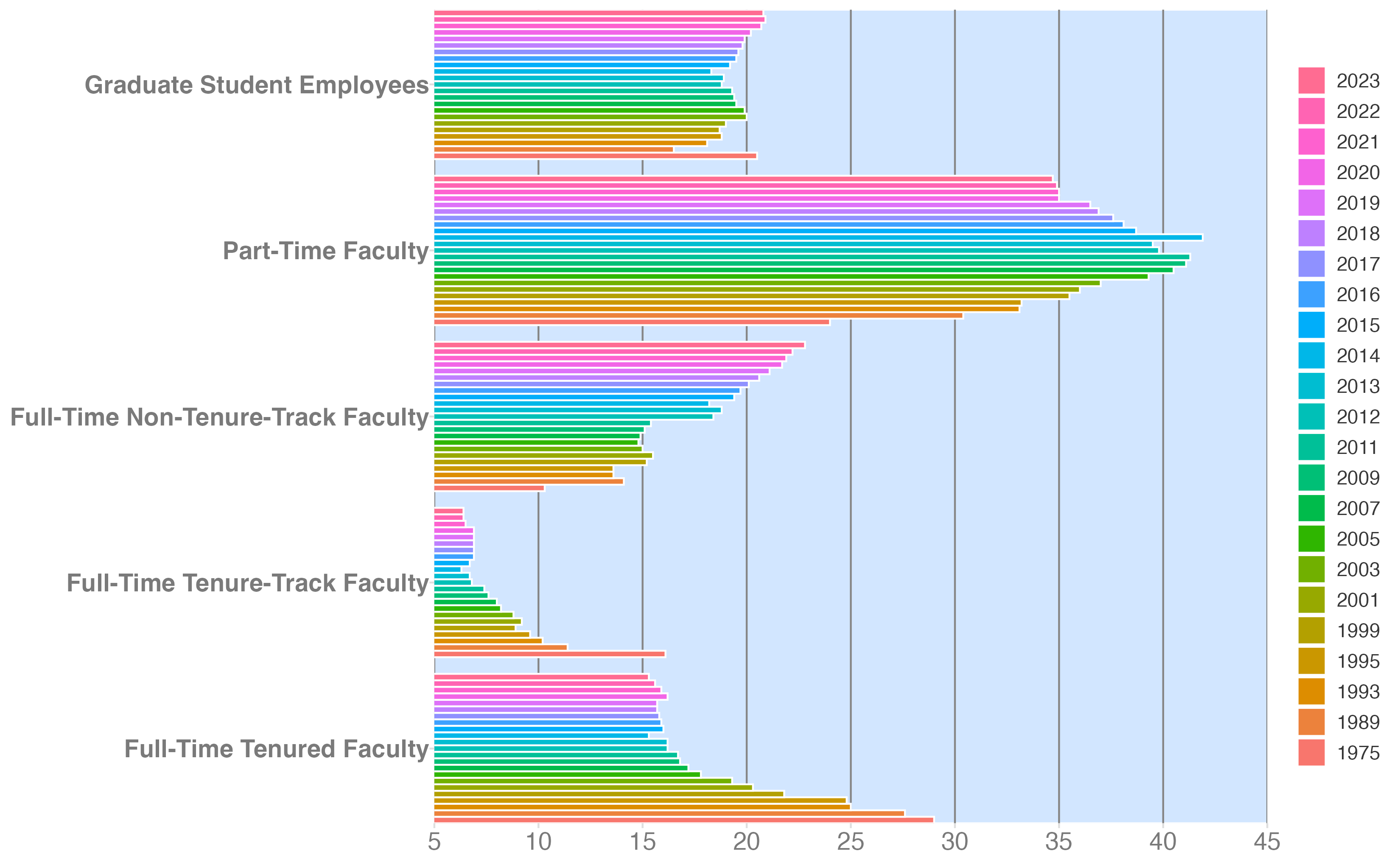
Source: American Association of University Professors (AAUP)
Learning objectives
- Review common methods for data wrangling and tidying
- Redesign a visualization for improved clarity
- Sketch a visualization
- Define and implement grammar of graphics for a chart
Data wrangling with {dplyr}
Image credit: @allison_horst
Data tidying with {tidyr}
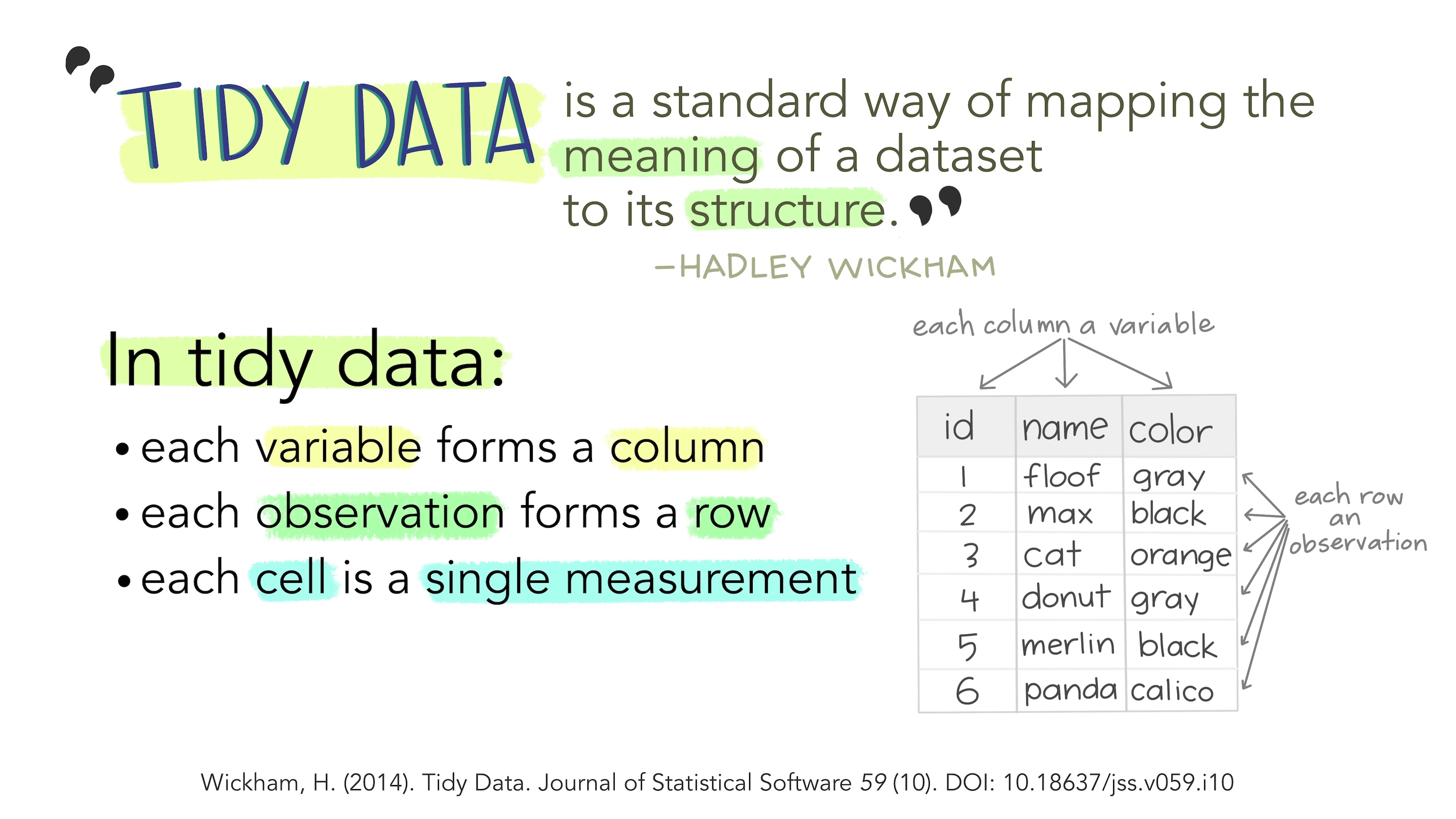
Illustration credit: Tidy Data for reproducibility, efficiency, and collaboration
Application exercise
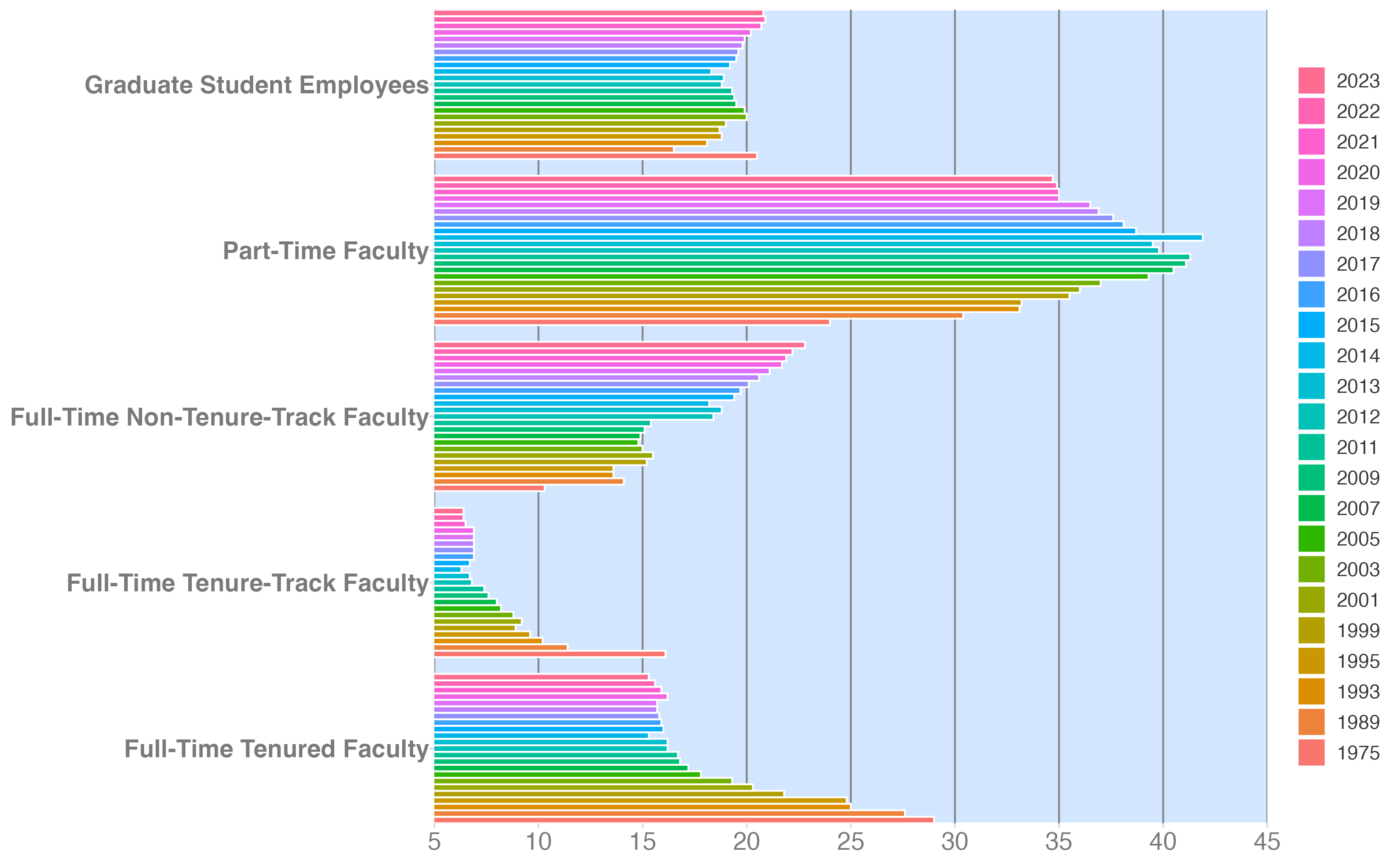
Improve a sad plot
Draft a new chart
Instructions
Sketch a chart that highlights the decline in tenure-track faculty.
- What type of geom would you use?
- Scales? Guides?
- Labels?
Include sufficient level of detail to communicate your design choices for implementation.
08:00
Peer critique
Instructions
Swap with a peer and critique their design choices. Apply at least two of Cairo’s qualities of great visualizations.
- Truthful
- Functional
- Beautiful
- Insightful
- Enlightening
Effective critiques
Critiques are not just about tearing down someone else’s work. They are about providing constructive feedback (both positive and negative) that helps the creator improve their work.
08:00
Revise your chart
Instructions
On the back of the page, sketch a revised version of your chart based on the feedback you received.
- New geom(s)?
- New scales or guides?
- Improved labels?
Define the chart’s grammar of graphics
What are the variables and aesthetic mappings? What geoms would you use? What scales and guides would you include?
10:00
Implement your design
Instructions
- Go to the course GitHub org and find your
ae-06(repo name will be suffixed with your GitHub name). - Clone the repo in Positron, run
renv::restore()to install the required packages, open the Quarto document in the repo, and implement your your proposed chart.
Tip
- Tidy the data set
- Transform or calculate new variables (if necessary)
20:00
Wrap up
Recap
- Data is often messy and needs to be transformed and reshaped for effective communication
- {dplyr} contains functions for transforming data
- {tidyr} contains functions for reshaping data
- Design choices are crucial to effective storytelling with data
- There is not inherently one “right” choice, but some choices are more effective than others
