| Function | Description |
|---|---|
transition_manual() |
Build an animation frame by frame (no tweening applied). |
transition_states() |
Transition between frames of a plot (like moving between facets). |
transition_time() |
Like transition_states, except animation pacing respects time. |
transition_components() |
Independent animation of plot elements (by group). |
transition_reveal() |
Gradually extends the data used to reveal more information. |
transition_layers() |
Animate the addition of layers to the plot. Can also remove layers. |
transition_filter() |
Transition between a collection of subsets from the data. |
transition_events() |
Define entrance and exit times of each visual element (row of data). |
From static to motion: Animated charts
Lecture 19
April 7, 2026
{gganimate}
{gganimate} extends the grammar of graphics as implemented by {ggplot2} to include the description of animation
It provides a range of new grammar classes that can be added to the plot object in order to customize how it should change with time
![]()
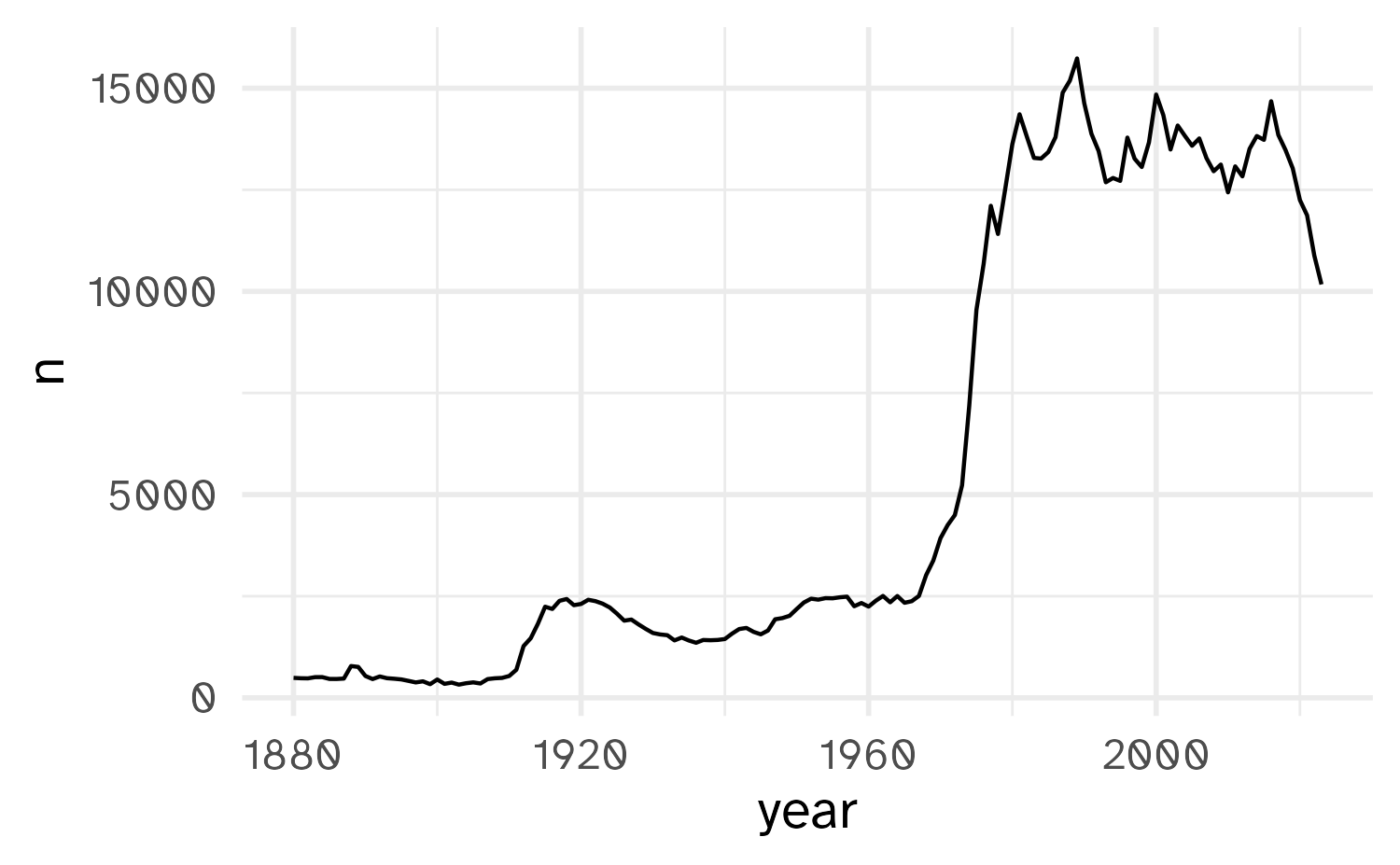
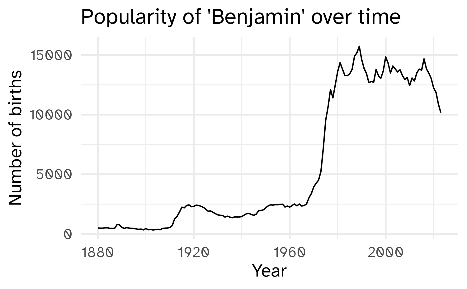
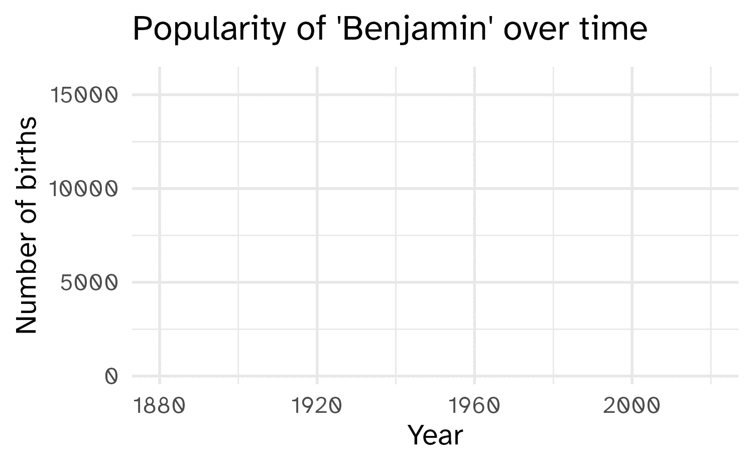
A simple example
A simple example
A simple example
A simple example
A simple example
Transitions
Which transition was used in the following animations?
![]()
transition_layers()New layers are being added (and removed) over the dots.
Transitions
Which transition was used in the following animations?
![]()
transition_filter()The data is being filtered across each frame.
Views
Which view was used in the following animations?
view_follow()Plot axis follows the range of the data.
Shadows
Which shadow was used in the following animations?
shadow_wake()The older tails of the points shrink in size, leaving a “wake” behind it.
Shadows
Which shadow was used in the following animations?
shadow_mark()Permanent marks are left by previous points in the animation.
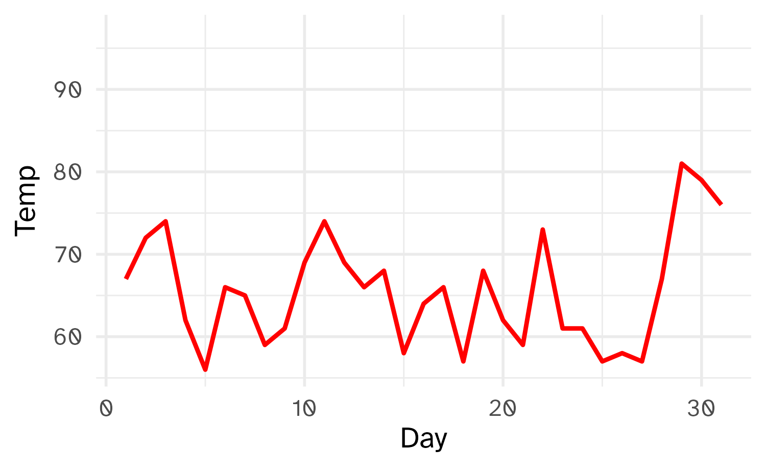
Animation controls
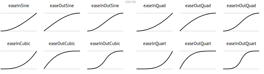
How data moves from one position to another.
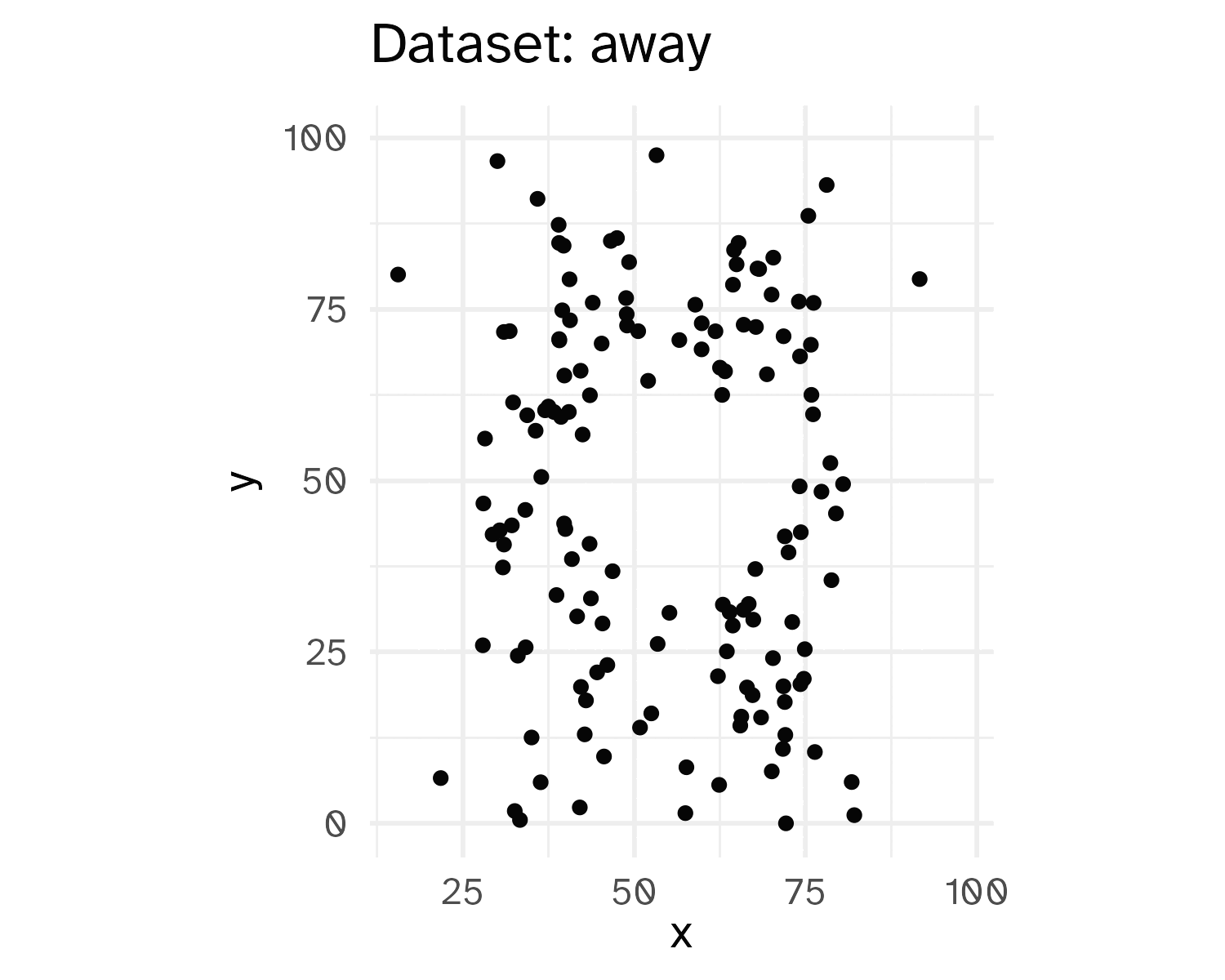
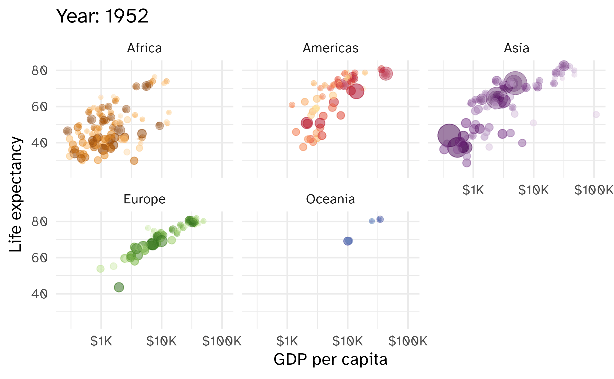
A not-so-simple example, the datasaurus dozen
Pass in the dataset to ggplot

A not-so-simple example, the datasaurus dozen
For each dataset we have x and y values, in addition we can map dataset to color
A not-so-simple example, the datasaurus dozen
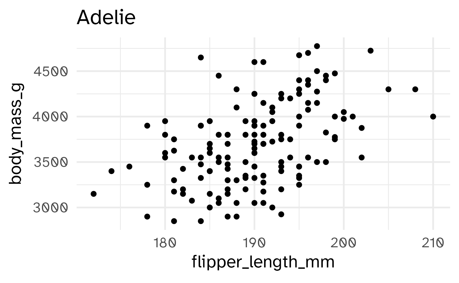
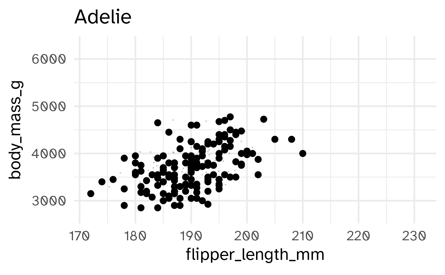
Trying a simple scatter plot first, but there is too much information
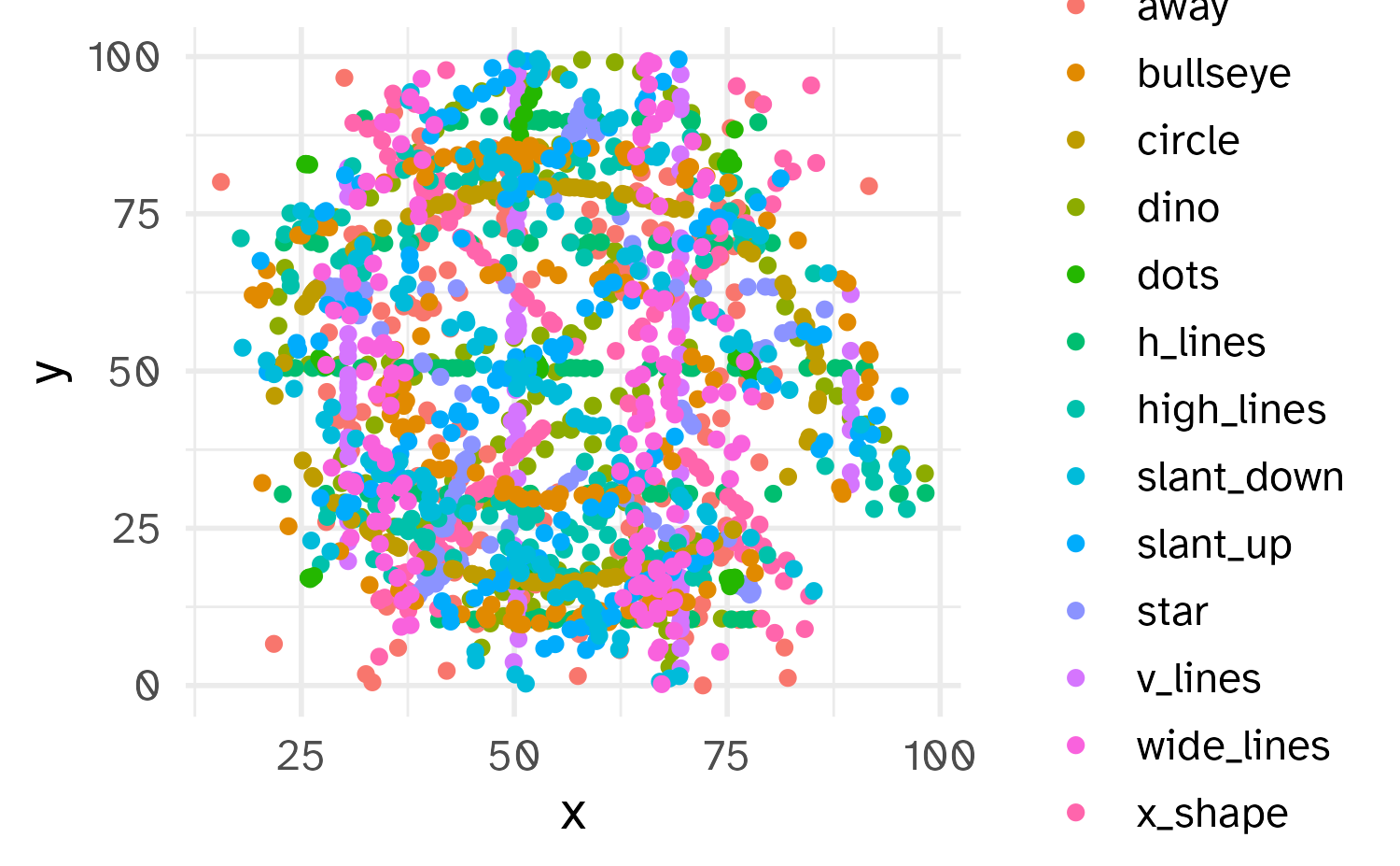
A not-so-simple example, the datasaurus dozen
We can use facets to split up by dataset, revealing the different distributions
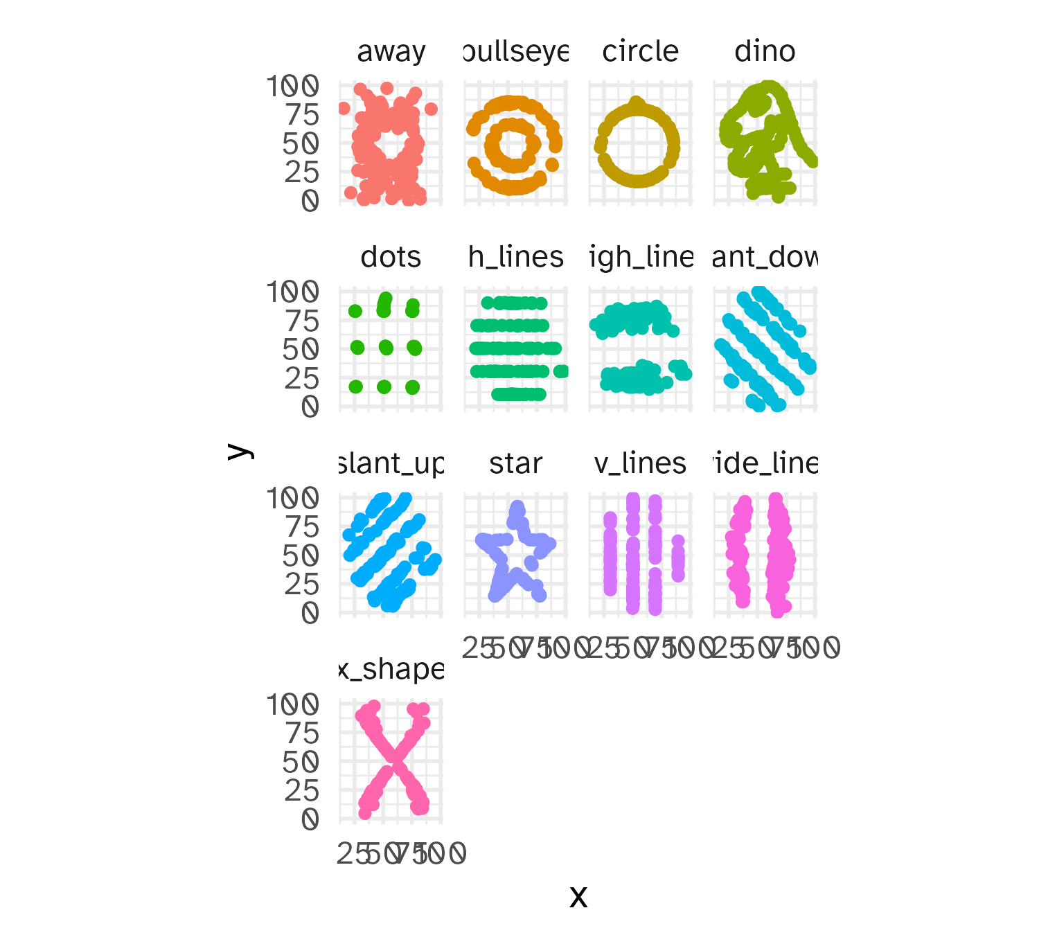
A not-so-simple example, the datasaurus dozen
We can just as easily turn it into an animation, transitioning between dataset states!