Introduction to interactivity
Lecture 18
March 28, 2024
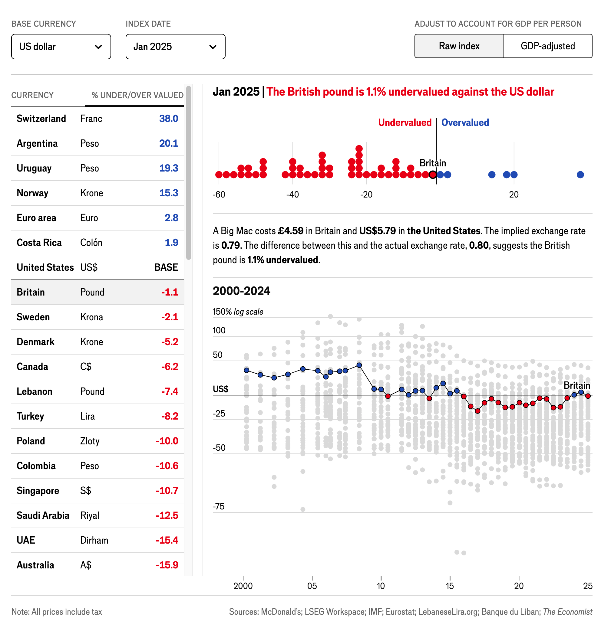
The Big Mac Index
- How is the information organized?
- How does interactivity assist in understanding the data?
Creating a basic interactive chart
wdi_2022 <- wdi_clean |>
  filter(year == 2022) |>
  drop_na(prop_women_parl) |>
  # Scale this down from 0-100 to 0-1 so that scales::label_percent() can format
  # it as an actual percent
  mutate(prop_women_parl = prop_women_parl / 100)

static_plot <- ggplot(
  data = wdi_2022,
  mapping = aes(y = fct_rev(region), x = prop_women_parl, color = region)
) +
  geom_quasirandom() +
  scale_x_continuous(labels = label_percent()) +
  scale_color_discrete_qualitative(guide = "none") +
  labs(x = "% women in parliament", y = NULL, caption = "Source: The World Bank") +
  theme_bw(base_size = 14)
static_plot
Modifying the tooltip
static_plot_tooltip <- ggplot(
  data = wdi_2022,
  mapping = aes(y = fct_rev(region), x = prop_women_parl, color = region)
) +
  geom_quasirandom(
    mapping = aes(text = country)
  ) +
  scale_x_continuous(labels = label_percent()) +
  scale_color_discrete_qualitative() +
  labs(x = "% women in parliament", y = NULL, caption = "Source: The World Bank") +
  theme_bw(base_size = 14) +
  theme(legend.position = "none")