Visualizing spatial data I
Lecture 17
Dr. Benjamin Soltoff
Cornell University
INFO 3312/5312 - Spring 2026
March 24, 2026
Announcements
Announcements
- Mini-project due tomorrow
- Project 02
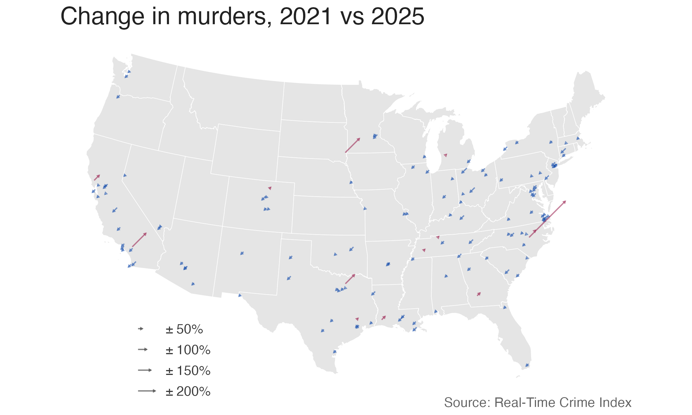
Source: @jeffasher
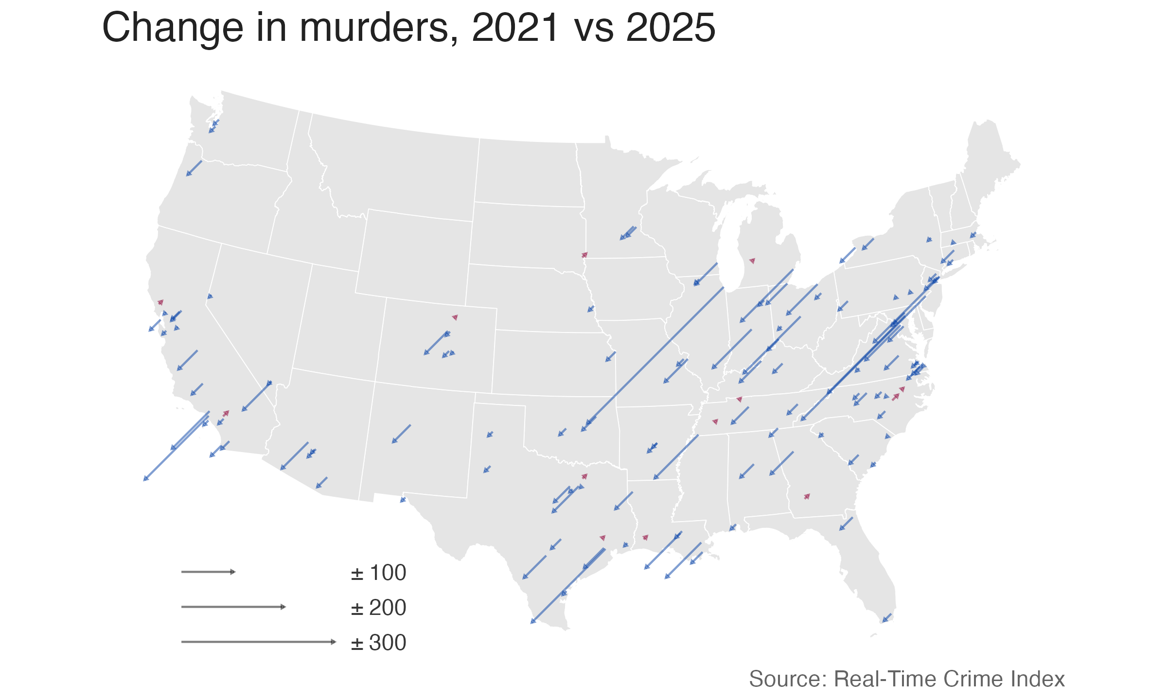
Source: @jeffasher
Learning objectives
- Introduce the major components of a geospatial visualization
- Identify how to draw raster maps using {ggmaps} and
get_*map() - Practice generating raster maps
Geospatial visualizations
Geospatial visualizations
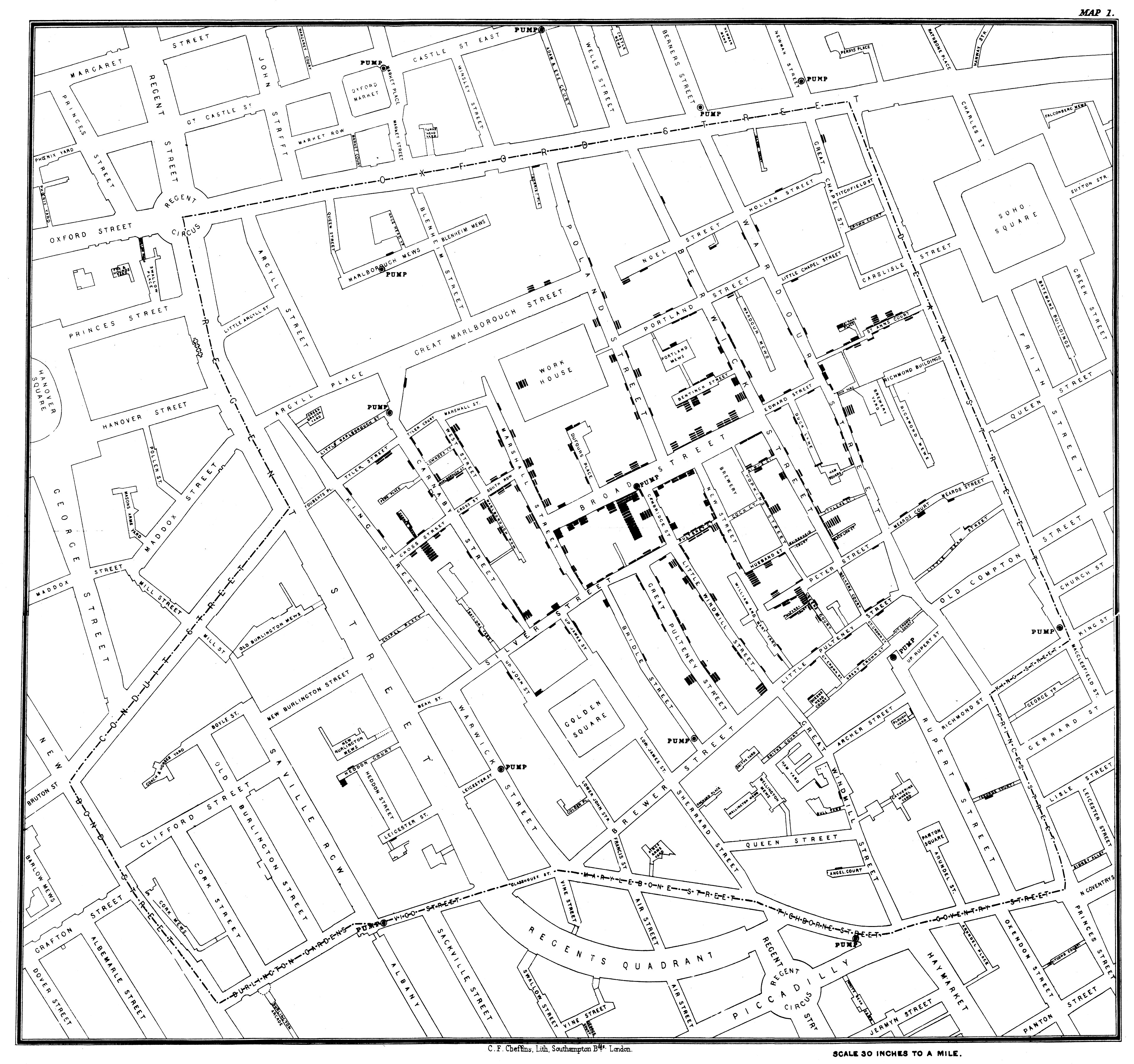
- Earliest form of information visualizations
- Geospatial data visualizations
- Google Maps
Not that Jon Snow

Dr. John Snow
Designing modern maps
- Depict spatial features
- Incorporate additional attributes and information
- Major features
- Scale
- Projection
- Symbols
Scale
- Proportion between distances and sizes on a map and their actual distances and sizes on Earth
- Small-scale map
- Large-scale map
Large-scale map
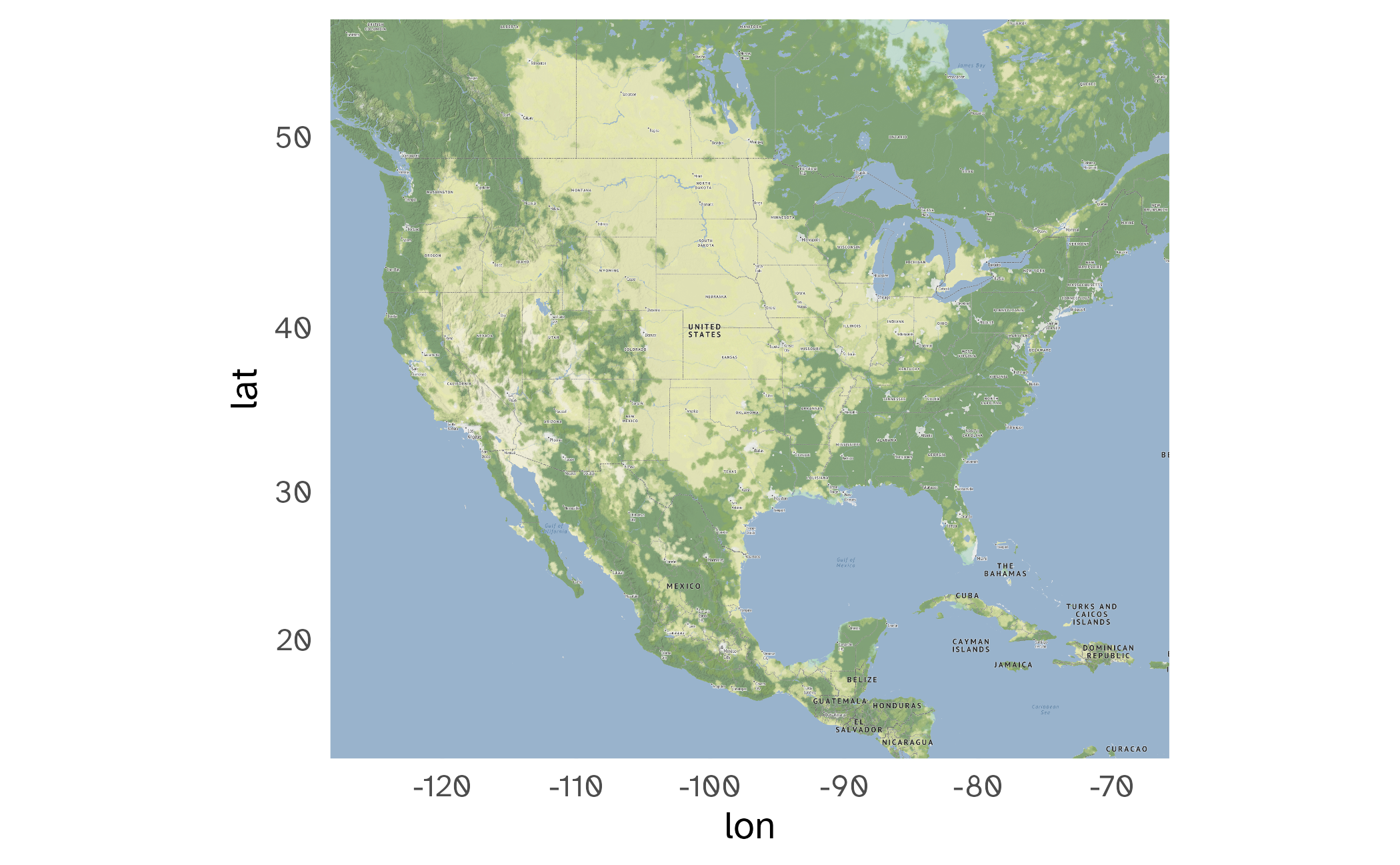
Small-scale map
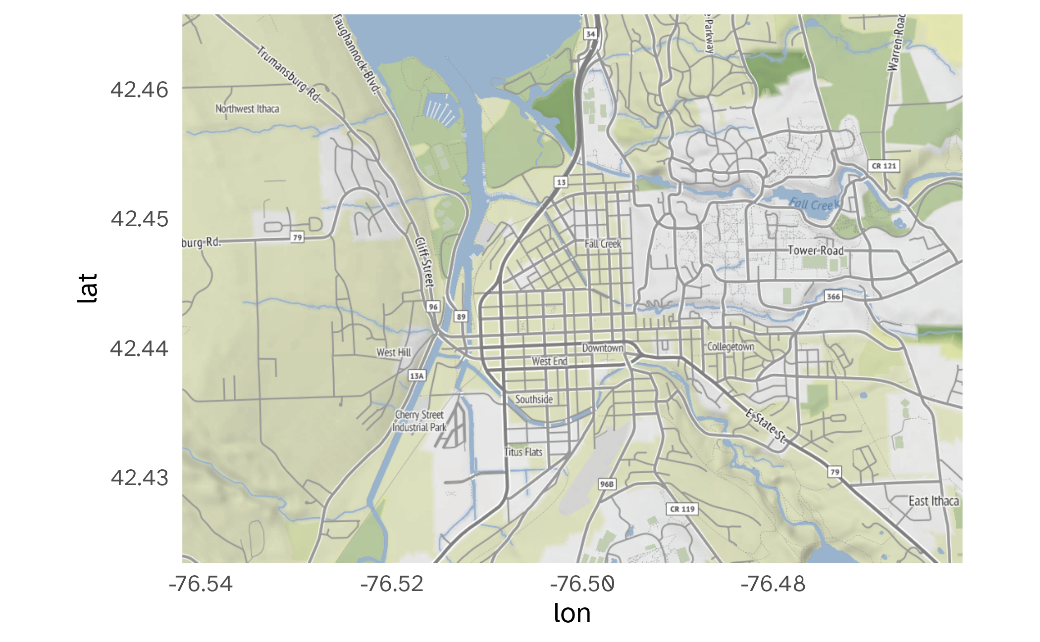
Asgard

Midgard

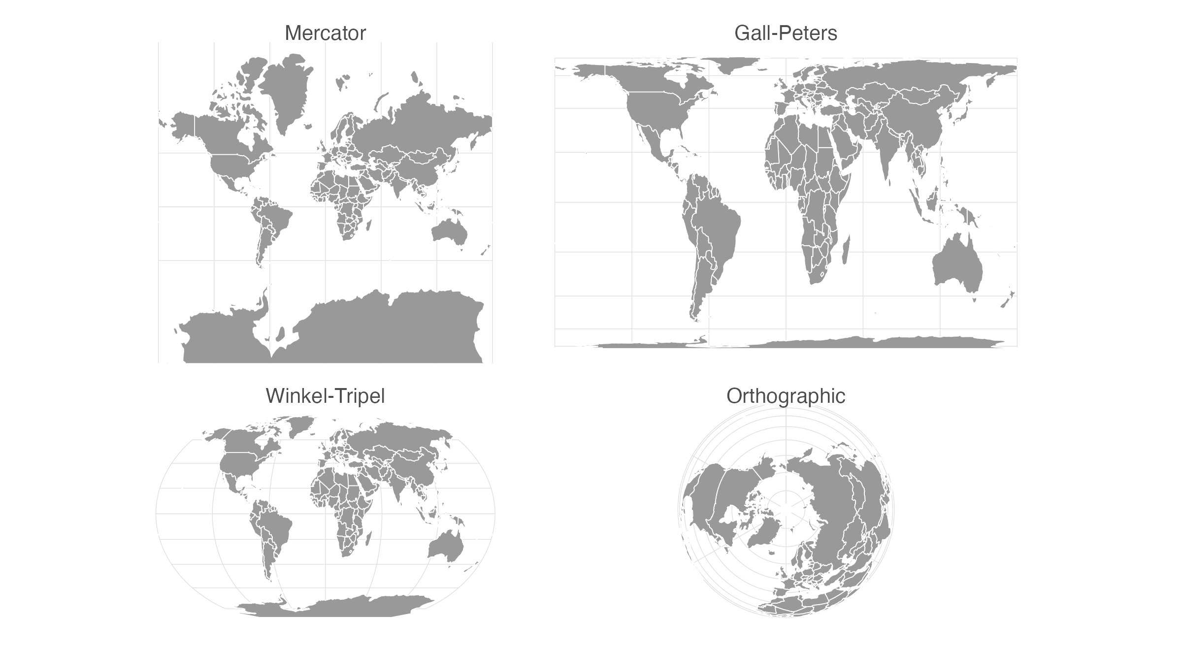
Not flat

Projection
- Process of taking a three-dimensional object and visualizing it on a two-dimensional surface
- No 100% perfect method for this
- Always introduces distortions
Properties of projection methods
- Shape
- Area
- Angle
- Distance
- Direction
Symbols
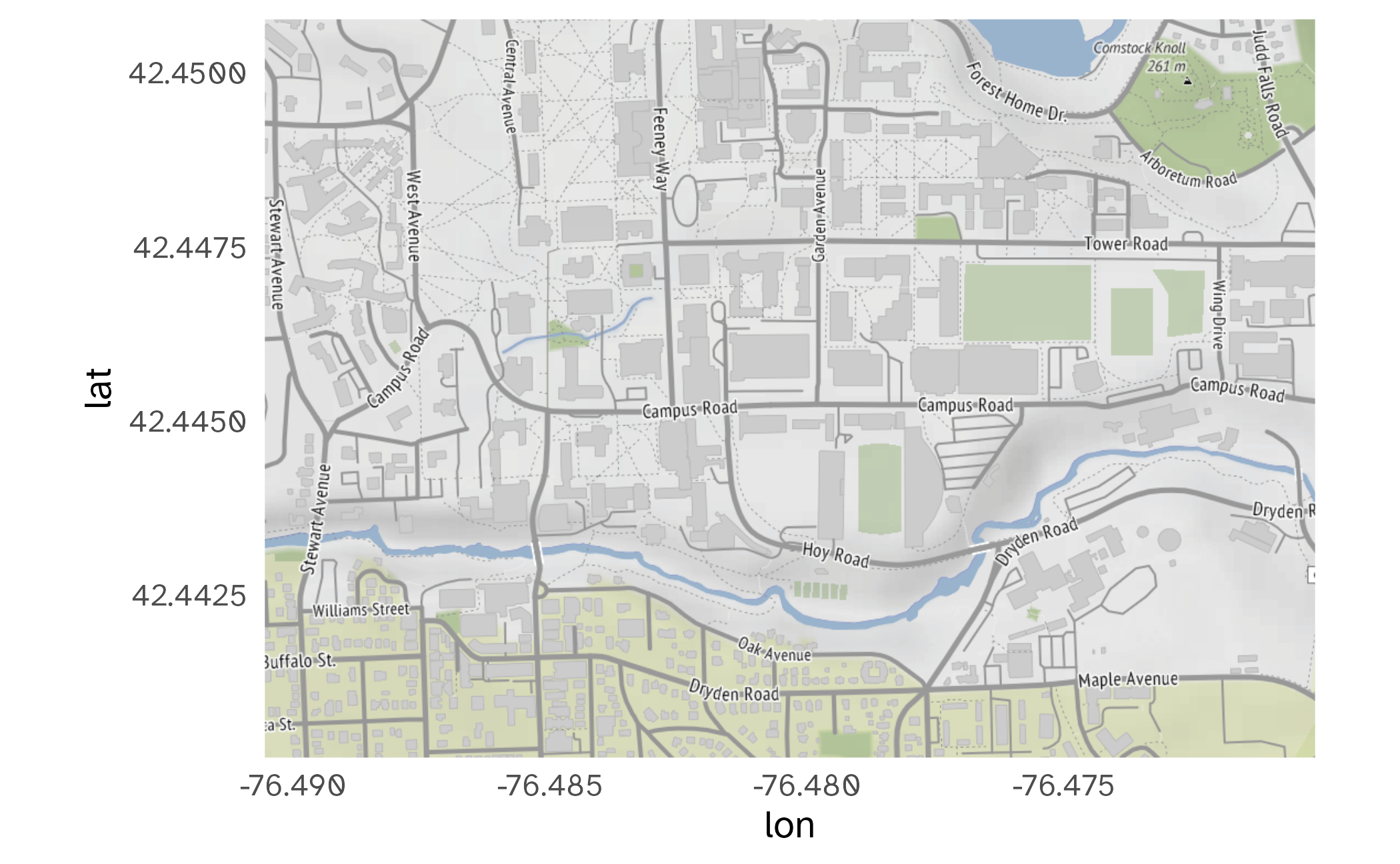
{ggmap} for raster maps
{ggmap}
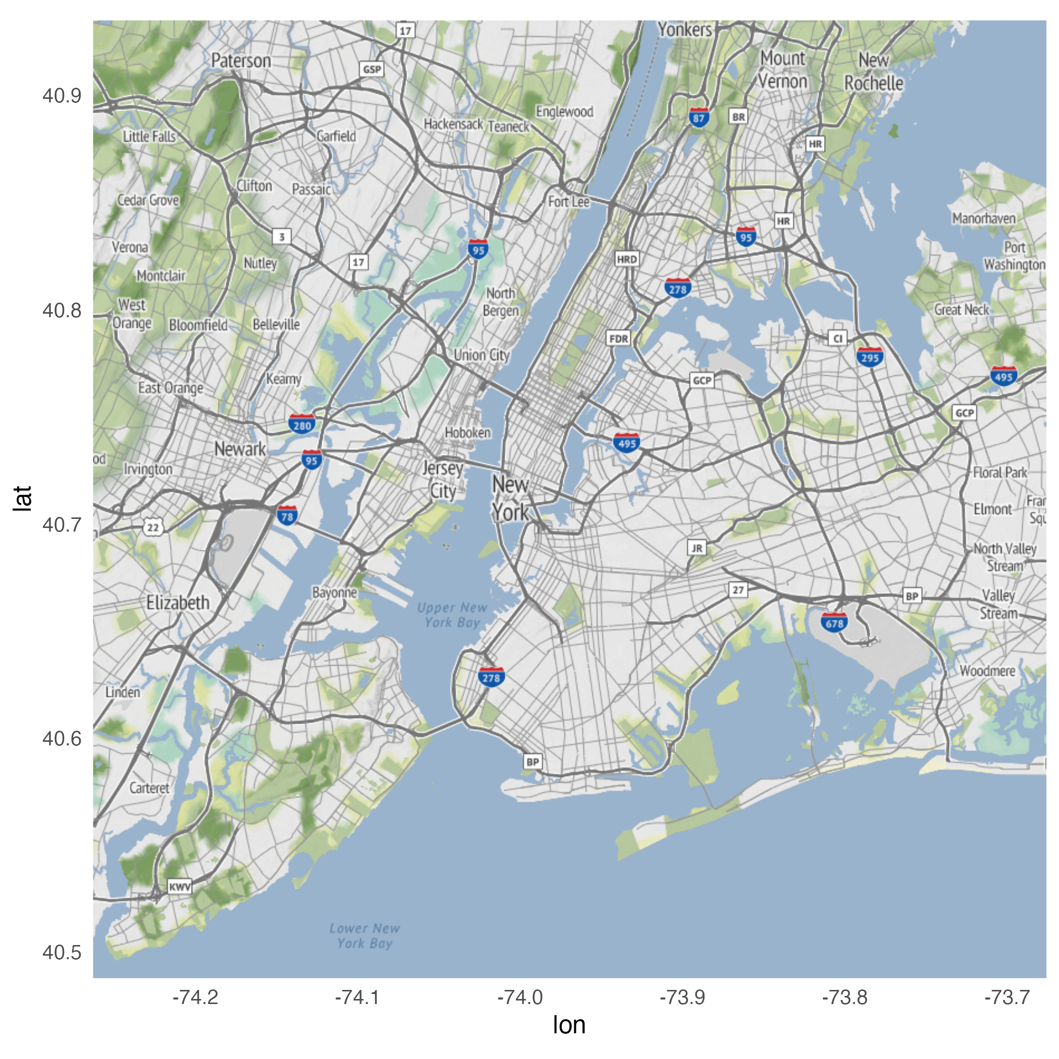
- Package for drawing maps using {ggplot2} and raster map tiles
- Static image files generated by mapping services
- Focus on incorporating data into existing maps
- Severely limits ability to change the appearance of the geographic map
- Don’t have to worry about the maps, just the data to go on top
Bounding box
Level of detail
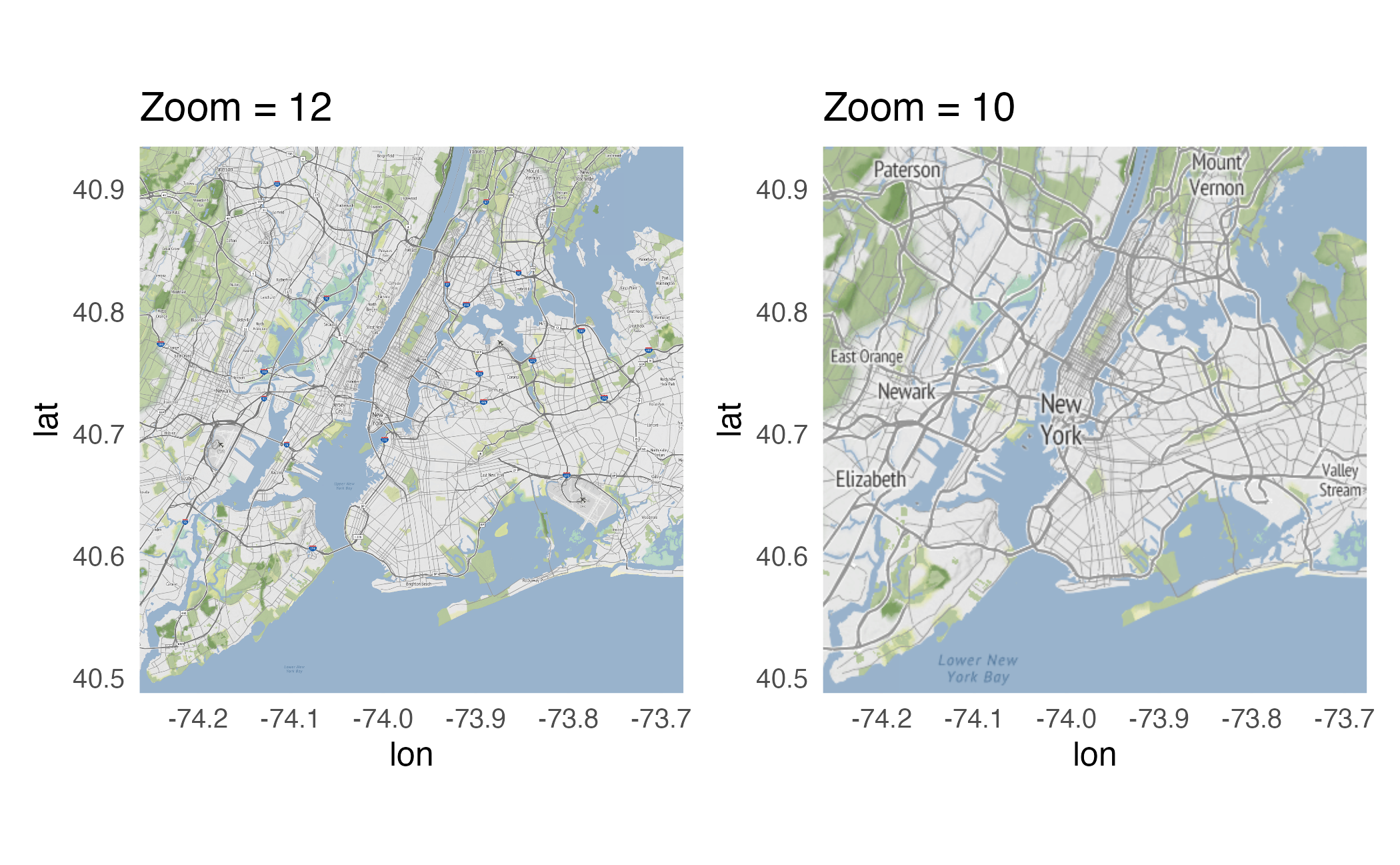
Identifying bounding box
Use bboxfinder.com to determine the exact longitude/latitude coordinates for the bounding box you wish to obtain.
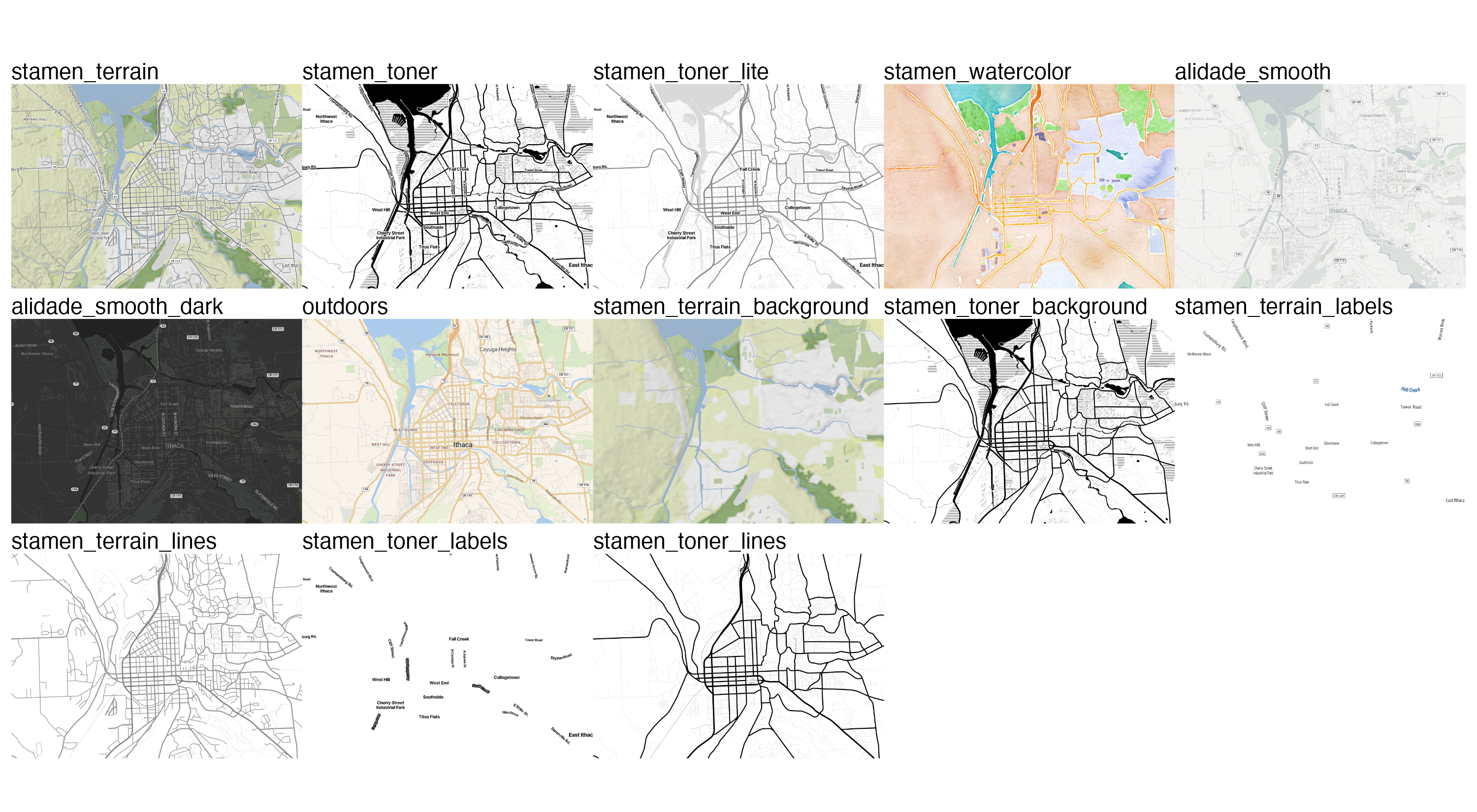
Types of map tiles

Import crime data
- New York City open data portal
- Crime data from 2022
Rows: 256,797
Columns: 7
$ cmplnt_num   <chr> "247350382", "243724728", "246348713", "240025455", "246137143", "238514312",…
$ boro_nm      <chr> "BROOKLYN", "QUEENS", "QUEENS", "BROOKLYN", "BRONX", "BROOKLYN", "QUEENS", "B…
$ cmplnt_fr_dt <dttm> 1011-05-18 04:56:02, 1022-04-11 04:56:02, 1022-06-08 04:56:02, 1022-10-21 04…
$ law_cat_cd   <chr> "MISDEMEANOR", "MISDEMEANOR", "MISDEMEANOR", "FELONY", "FELONY", "FELONY", "M…
$ ofns_desc    <chr> "CRIMINAL MISCHIEF & RELATED OF", "PETIT LARCENY", "PETIT LARCENY", "GRAND LA…
$ latitude     <dbl> 40.66904, 40.77080, 40.68766, 40.65421, 40.83448, 40.69739, 40.73495, 40.6667…
$ longitude    <dbl> -73.90619, -73.81115, -73.83406, -73.95957, -73.85637, -73.95129, -73.87498, …
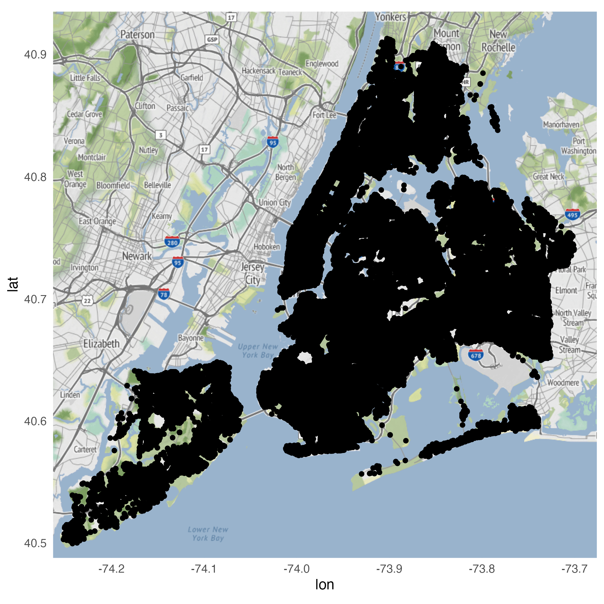
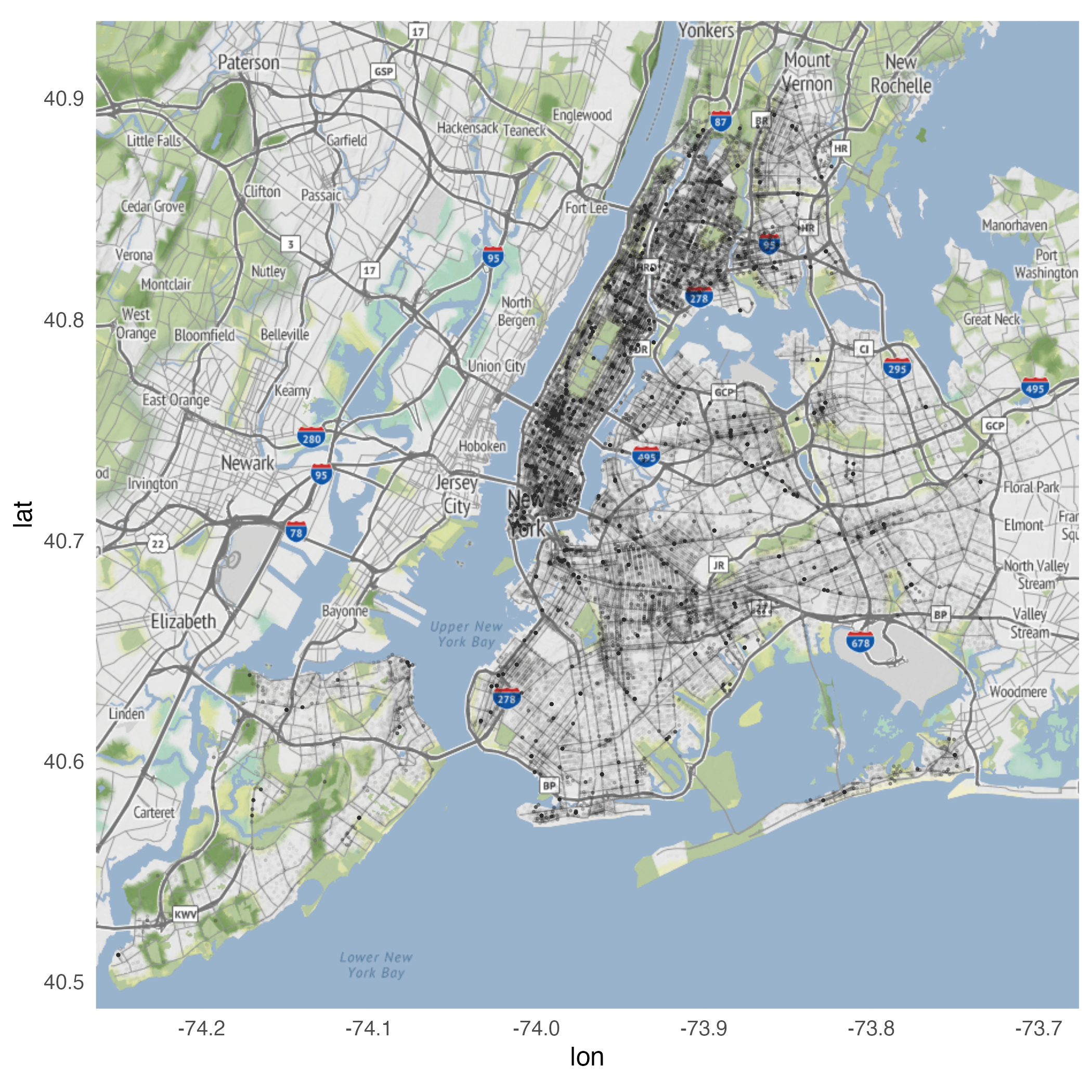
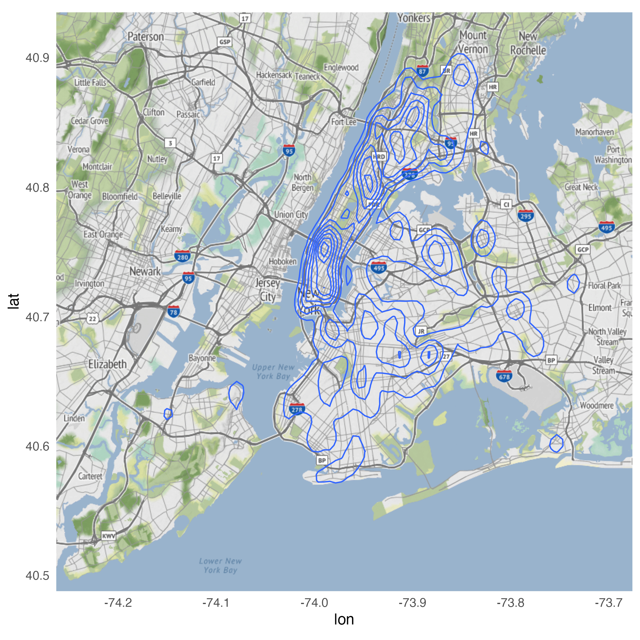
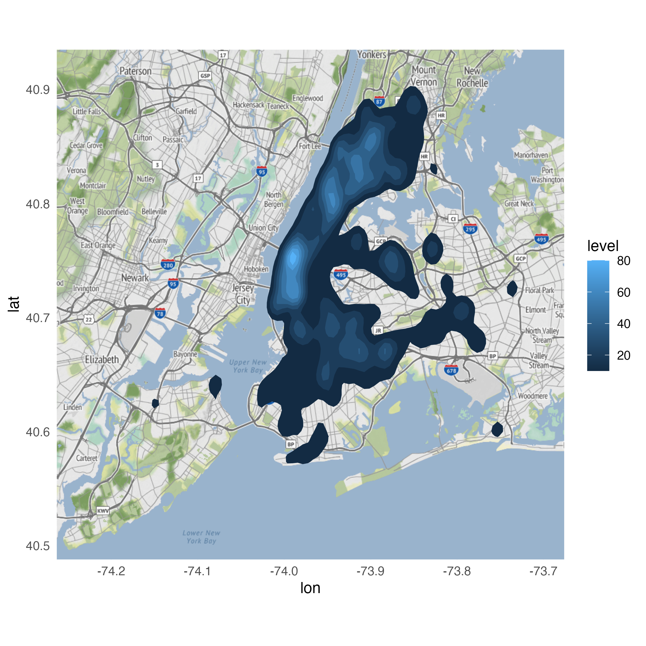
Plot high-level map of crime
Using geom_point()
Using geom_point()
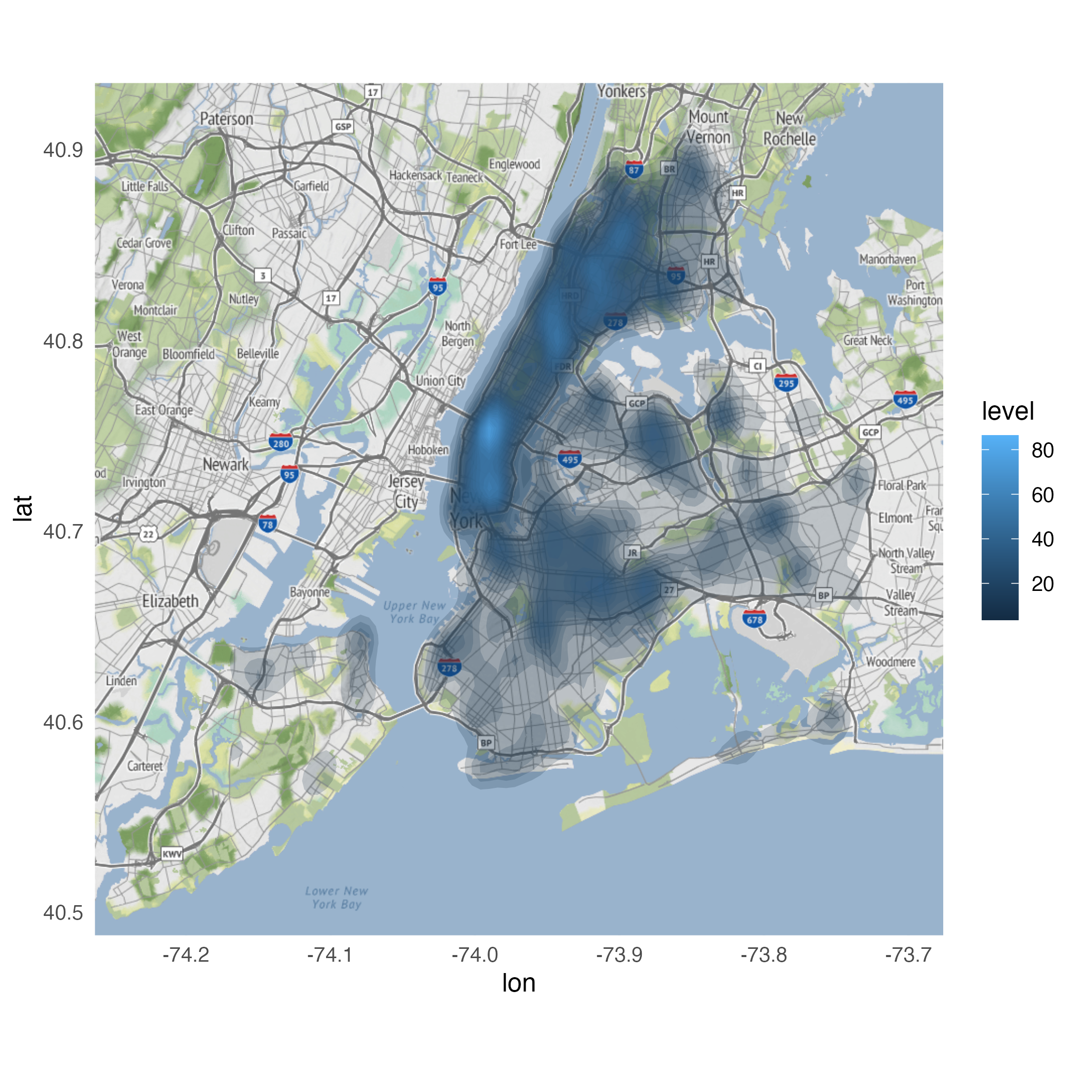
Using geom_density_2d()
Using stat_density_2d()
Using stat_density_2d()
Looking for variation
ggmap(nyc) +
  stat_density_2d(
    data = crimes |>
      filter(ofns_desc %in% c(
        "DANGEROUS DRUGS",
        "GRAND LARCENY OF MOTOR VEHICLE",
        "ROBBERY",
        "VEHICLE AND TRAFFIC LAWS"
      )),
    aes(
      x = longitude,
      y = latitude,
      fill = after_stat(level)
    ),
    alpha = .4,
    bins = 10,
    geom = "polygon"
  ) +
  facet_wrap(facets = vars(ofns_desc))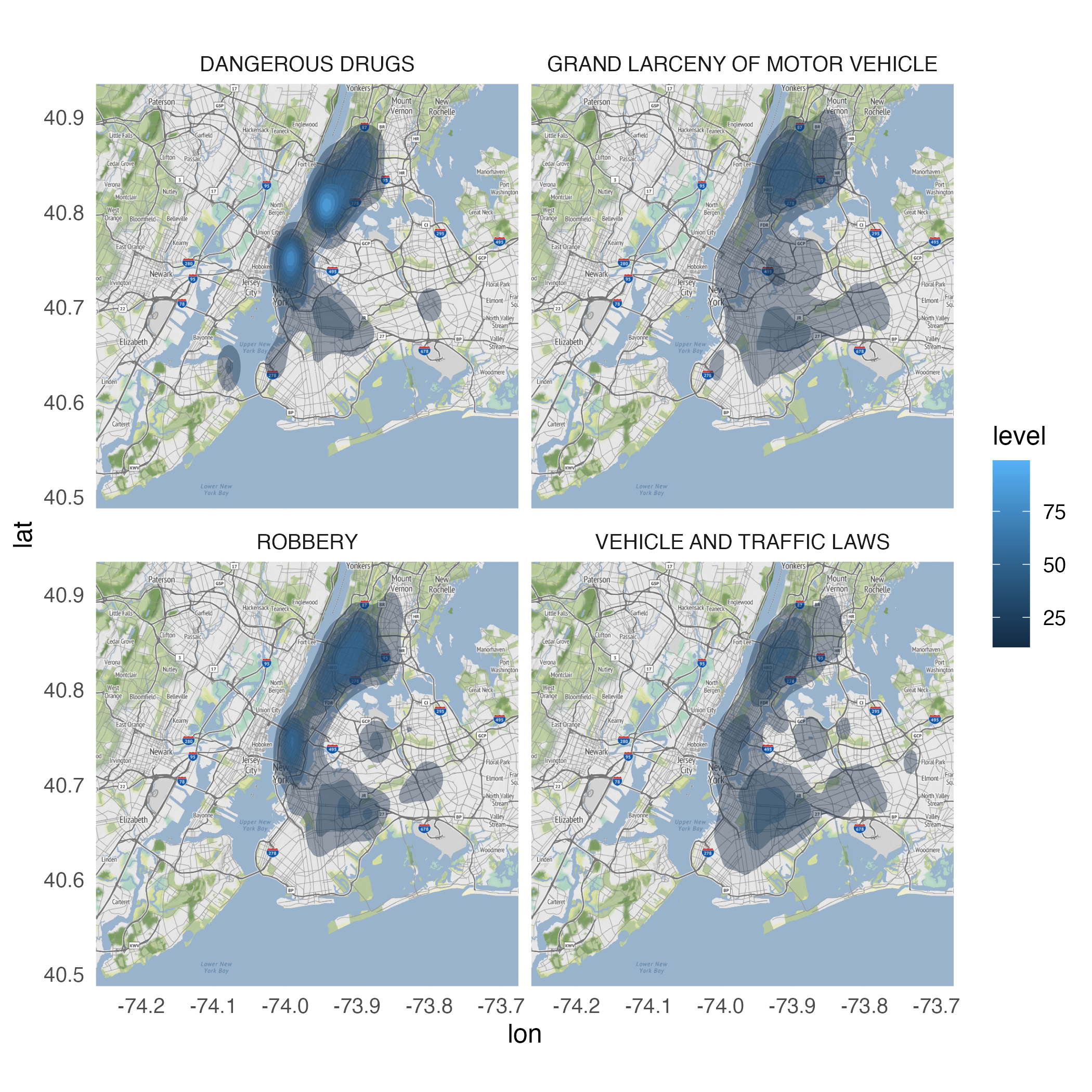
Application exercise
ae-16
Instructions
- Go to the course GitHub org and find your
ae-16(repo name will be suffixed with your GitHub name). - Clone the repo in Positron, run
renv::restore()to install the required packages, open the Quarto document in the repo, and follow along and complete the exercises. - Render, commit, and push your edits by the AE deadline – end of the day
Geofaceting and cartograms
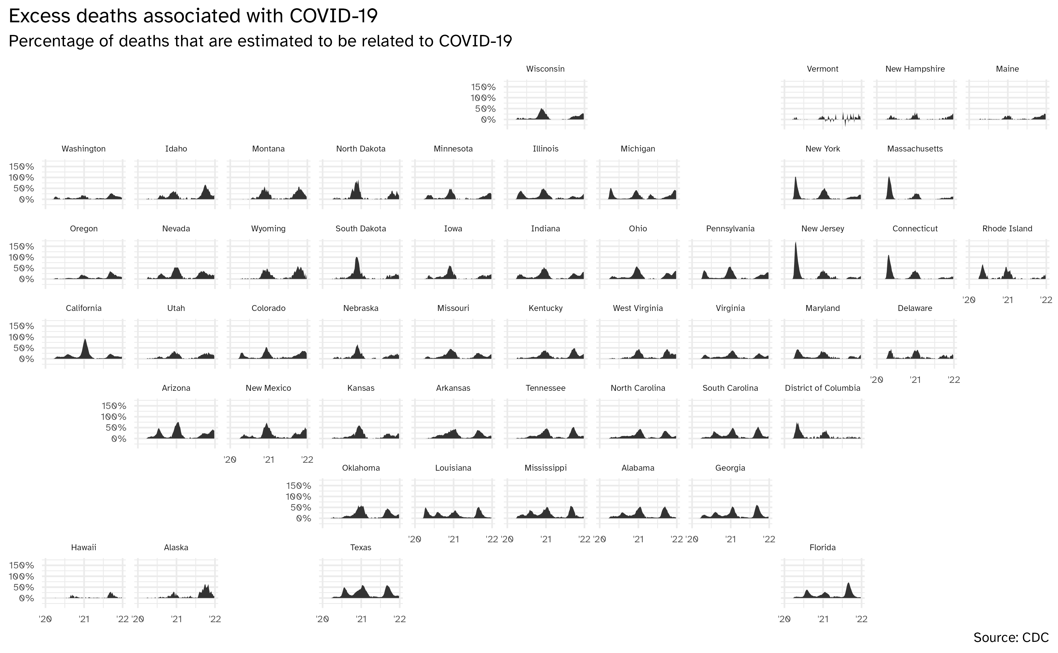
ggplot(data = excess_deaths, mapping = aes(x = week_ending_date, y = excess_covid)) +
  geom_area() +
  facet_geo(facets = vars(state)) +
  scale_y_continuous(
    labels = label_percent(scale = 1)
  ) +
  scale_x_date(breaks = c(ymd("2020-01-01", "2021-01-01", "2022-01-01", "2023-01-01")), labels = c("'20", "'21", "'22", "'23")) +
  labs(
    x = NULL, y = NULL,
    title = "Excess deaths associated with COVID-19",
    subtitle = "Percentage of deaths that are estimated to be related to COVID-19",
    caption = "Source: CDC"
  ) +
  theme(
    strip.text.x = element_text(size = rel(0.6)),
    axis.text = element_text(size = rel(0.6)),
    plot.title.position = "plot"
  )
Daily US vaccine data by state
excess_deaths <- read_csv(file = "data/Excess_Deaths_Associated_with_COVID-19.csv") |>
  janitor::clean_names() |>
  filter(type == "Predicted (weighted)") |>
  mutate(outcome = if_else(outcome == "All causes", "all", "no_covid")) |>
  select(week_ending_date, state, outcome, percent_excess_estimate) |>
  pivot_wider(names_from = outcome, values_from = percent_excess_estimate) |>
  mutate(excess_covid = all - no_covid) |>
  filter(between(week_ending_date, as.Date("2020-01-01"), as.Date("2022-12-31")))

glimpse(excess_deaths)
Rows: 8,478
Columns: 5
$ week_ending_date <date> 2020-01-04, 2020-01-11, 2020-01-18, 2020-01-25, 2020-02-01, 2020-02-08, …
$ state <chr> "Alabama", "Alabama", "Alabama", "Alabama", "Alabama", "Alabama", "Alabam…
$ all <dbl> 0.0000000, 0.5354003, 0.0000000, 0.0000000, 0.0000000, 0.4486229, 0.00000…
$ no_covid <dbl> 0.0000000, 0.5354003, 0.0000000, 0.0000000, 0.0000000, 0.4486229, 0.00000…
$ excess_covid <dbl> 0.00000000, 0.00000000, 0.00000000, 0.00000000, 0.00000000, 0.00000000, 0…Source: https://www.cdc.gov/nchs/nvss/vsrr/covid19/excess_deaths.htm
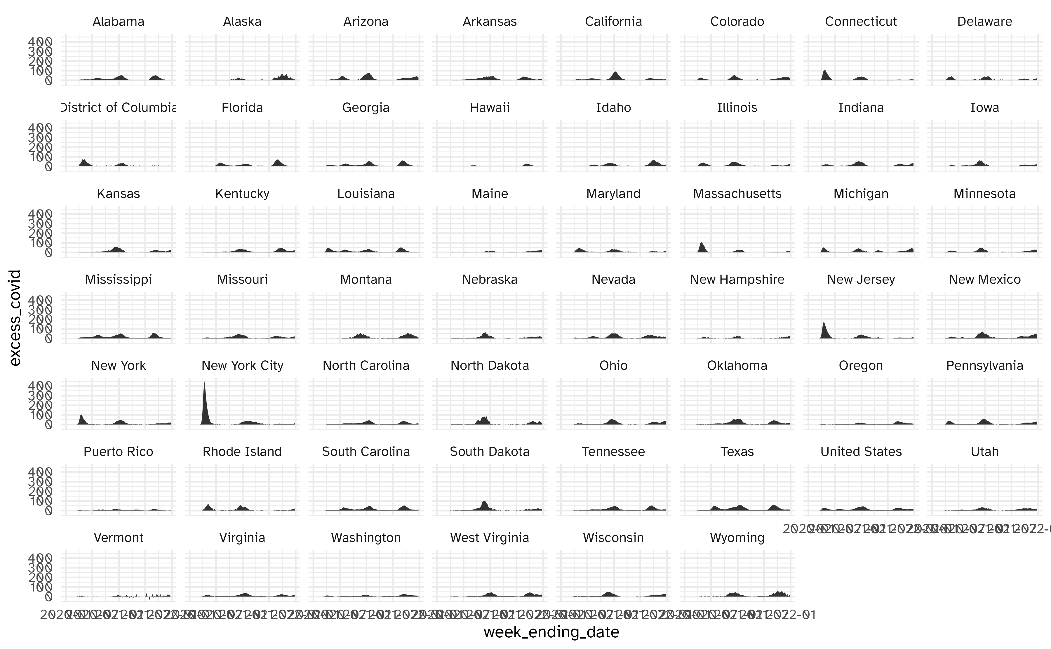
Facet by location
Geofacet by state
Using geofacet::facet_geo()
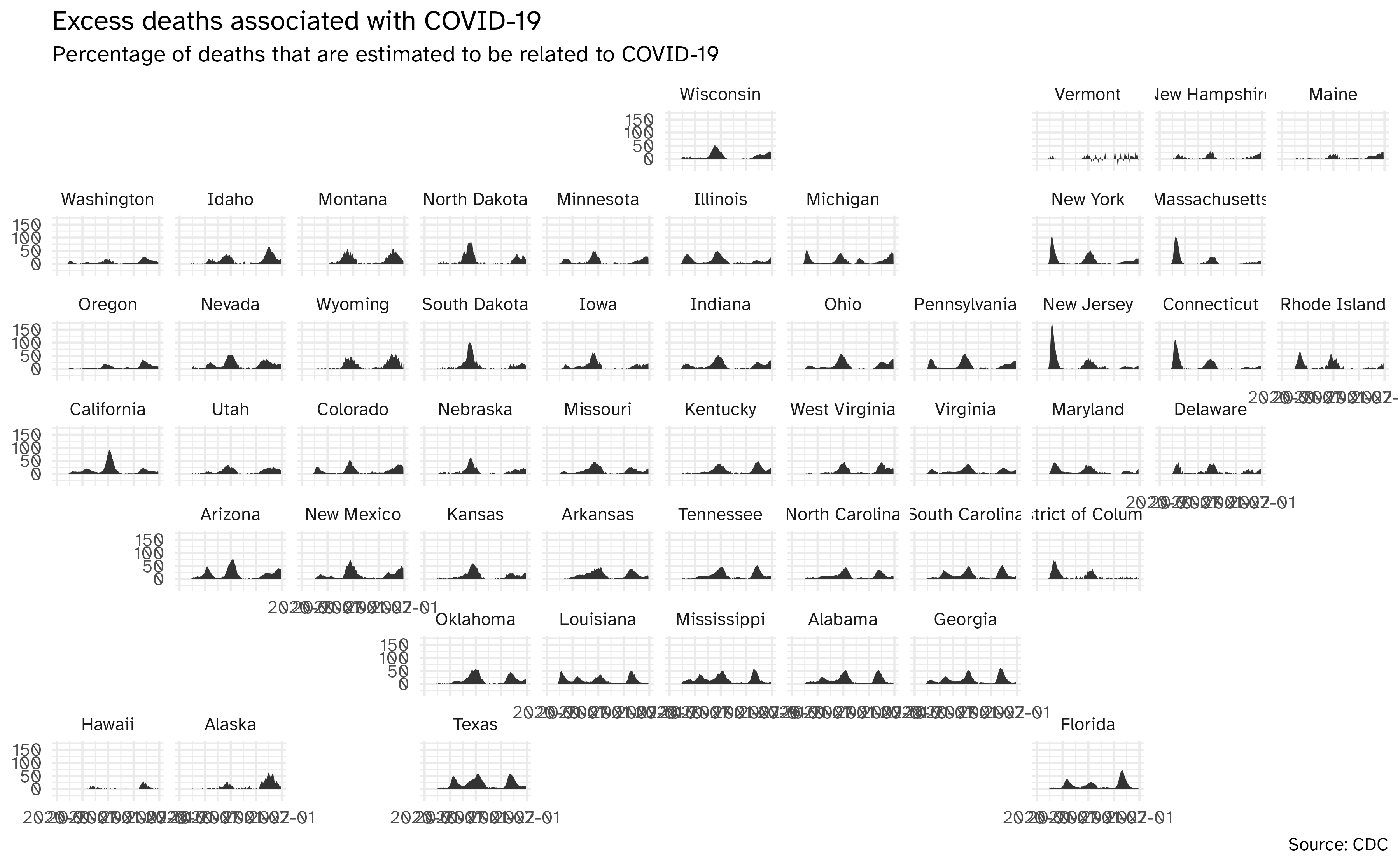
ggplot(
  data = excess_deaths,
  mapping = aes(
    x = week_ending_date,
    y = excess_covid,
    group = state
  )
) +
  geom_area() +
  facet_geo(facets = vars(state)) +
  labs(
    x = NULL, y = NULL,
    title = "Excess deaths associated with COVID-19",
    subtitle = "Percentage of deaths that are estimated to be related to COVID-19",
    caption = "Source: CDC"
  )
Geofacet by state, with improvements
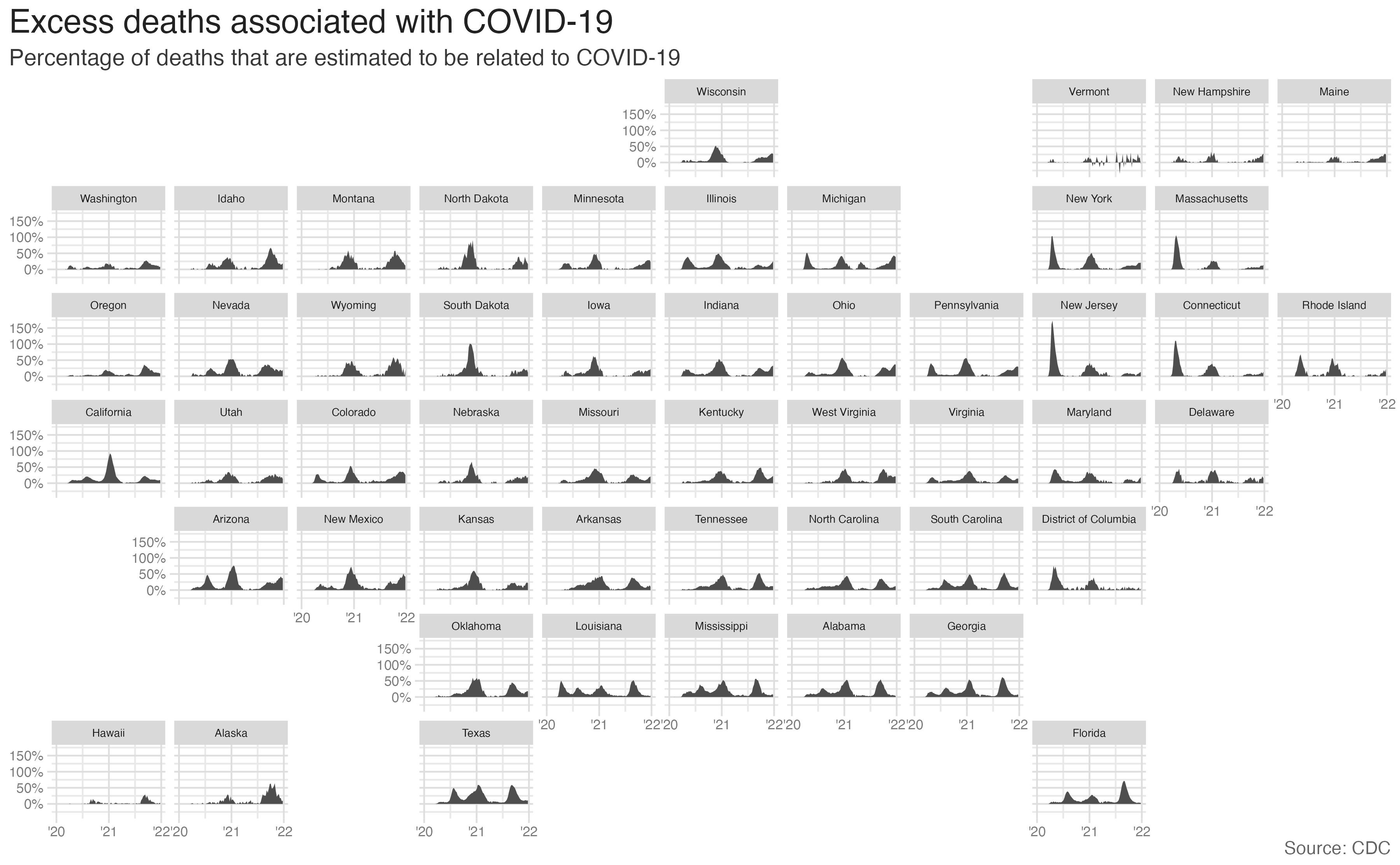
ggplot(data = excess_deaths, mapping = aes(x = week_ending_date, y = excess_covid)) +
  geom_area() +
  facet_geo(facets = vars(state)) +
  scale_y_continuous(
    labels = label_percent(scale = 1)
  ) +
  scale_x_date(breaks = c(ymd("2020-01-01", "2021-01-01", "2022-01-01", "2023-01-01")), labels = c("'20", "'21", "'22", "'23")) +
  labs(
    x = NULL, y = NULL,
    title = "Excess deaths associated with COVID-19",
    subtitle = "Percentage of deaths that are estimated to be related to COVID-19",
    caption = "Source: CDC"
  ) +
  theme(
    strip.text.x = element_text(size = rel(0.6)),
    axis.text = element_text(size = rel(0.6)),
    plot.title.position = "plot"
  )
Bring in 2020 Presidential election results
# A tibble: 51 × 5
   state                electoal_votes biden trump win
   <chr>                         <dbl> <dbl> <dbl> <chr>
 1 Alabama                           9     0     9 Republican
 2 Alaska                            3     0     3 Republican
 3 Arizona                          11    11     0 Democrat
 4 Arkansas                          6     0     6 Republican
 5 California                       55    55     0 Democrat
 6 Colorado                          9     9     0 Democrat
 7 Connecticut                       7     7     0 Democrat
 8 Delaware                          3     3     0 Democrat
 9 District of Columbia              3     3     0 Democrat
10 Florida                          29     0    29 Republican
# ℹ 41 more rows
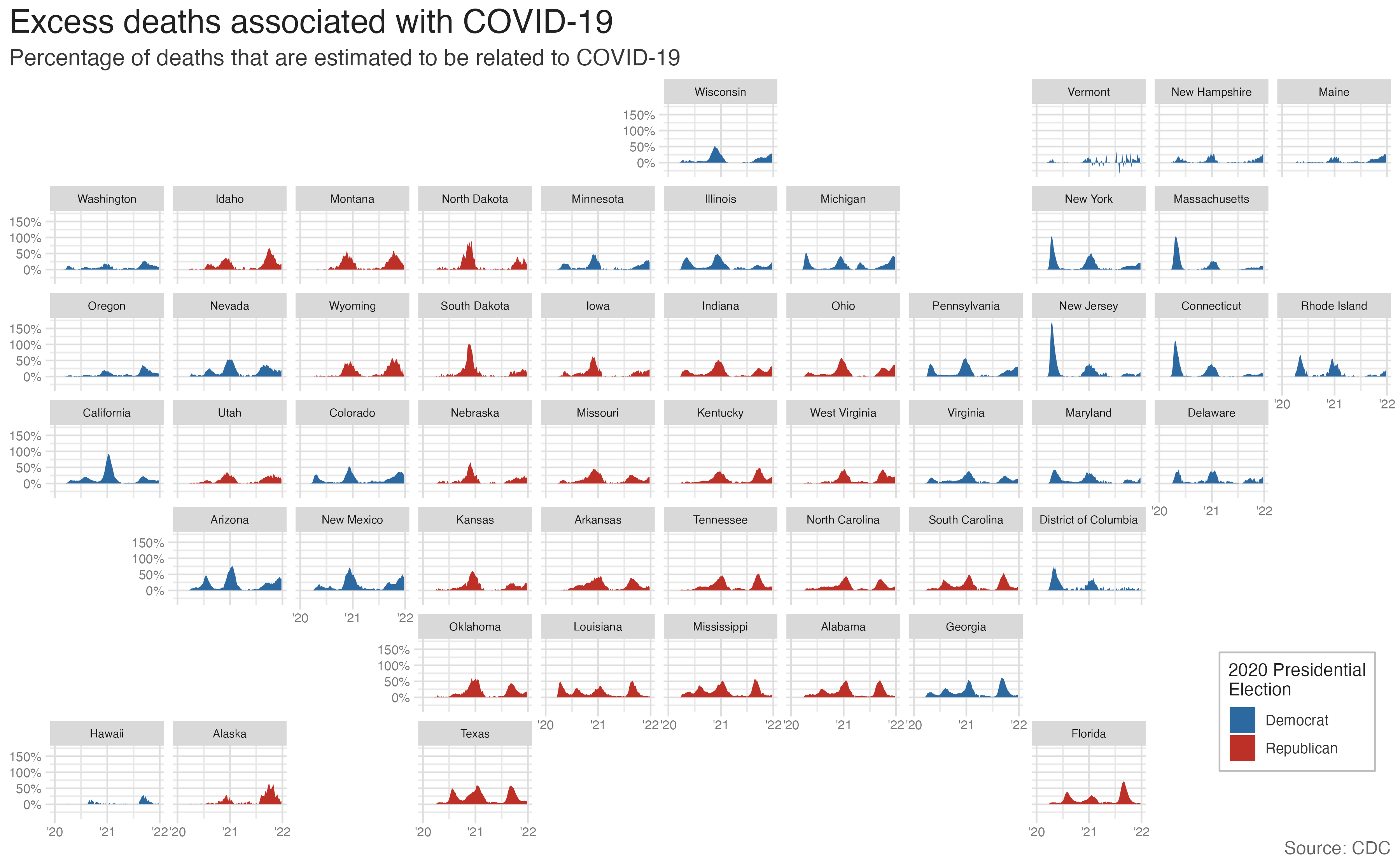
Geofacet by state, color by presidential election result
excess_deaths |>
  left_join(y = election_2020) |>
  ggplot(
    mapping = aes(
      x = week_ending_date,
      y = excess_covid
    )
  ) +
  geom_area(mapping = aes(fill = win)) +
  facet_geo(facets = vars(state)) +
  scale_y_continuous(
    labels = label_percent(scale = 1)
  ) +
  scale_x_date(breaks = c(ymd("2020-01-01", "2021-01-01", "2022-01-01", "2023-01-01")), labels = c("'20", "'21", "'22", "'23")) +
  scale_fill_manual(values = c("#2D69A1", "#BD3028"), guide = guide_legend(position = "inside")) +
  labs(
    x = NULL, y = NULL,
    title = "Excess deaths associated with COVID-19",
    subtitle = "Percentage of deaths that are estimated to be related to COVID-19",
    caption = "Source: CDC",
    fill = "2020 Presidential\nElection"
  ) +
  theme(
    strip.text.x = element_text(size = 7),
    axis.text = element_text(size = 8),
    plot.title.position = "plot",
    legend.position.inside = c(0.93, 0.15),
    legend.text = element_text(size = 9),
    legend.title = element_text(size = 11),
    legend.background = element_rect(color = "gray", size = 0.5)
  )
Wrap-up
Recap
- Modern geospatial visualizations are defined by their scale, project, and symbols
- {ggmap} allows you to create geospatial visualizations without needing to collect the spatial features directly
- {geofacet} allows you to create cartograms which incorporate geographic location
