Animated graphics

Lecture 16

Dr. Benjamin Soltoff

Cornell University
INFO 3312/5312 - Spring 2024

March 21, 2024

Announcements

Announcements

  • Nothing

Visualization critique

Population through the ages

  • What are the stories?
  • What is the added value of animating the chart?

Animation

Philosophy

  • The purpose of interactivity is to display more than can be achieved with persistent plot elements, and to invite the reader to engage with the plot.

  • Animation allows more information to be displayed, but developer keeps control

  • Beware that it is easy to forget what was just displayed, so keeping some elements persistent, maybe faint, can be useful for the reader

gganimate

  • gganimate extends the grammar of graphics as implemented by ggplot2 to include the description of animation

  • It provides a range of new grammar classes that can be added to the plot object in order to customize how it should change with time

Animation example

Animation example

Source: Extension from here

Animation example

Animation example

How does gganimate work?

  • Start with a ggplot2 specification

  • Add layers with graphical primitives (geoms)

  • Add formatting specification

  • Add animation specification

A simple example

ggplot(
  data = freedom_ranked |> filter(country == "Venezuela")
  )

A simple example

ggplot(
  data = freedom_ranked |> filter(country == "Venezuela"),
  mapping = aes(x = year, y = civil_liberty)
  )

A simple example

ggplot(
  data = freedom_ranked |> filter(country == "Venezuela"),
  mapping = aes(x = year, y = civil_liberty)
  ) +
  geom_line()

A simple example

ggplot(
  data = freedom_ranked |> filter(country == "Venezuela"),
  mapping = aes(x = year, y = civil_liberty)
  ) +
  geom_line() +
  labs(
    x = "Year", y = "Civil liberty score",
    title = "Venezuela's civil liberty score"
    )

A simple example

ggplot(
  data = freedom_ranked |> filter(country == "Venezuela"),
  mapping = aes(x = year, y = civil_liberty)
  ) +
  geom_line() +
  labs(
    x = "Year", y = "Civil liberty score",
    title = "Venezuela's civil liberty score"
    ) +
  transition_reveal(year)

Grammar of animation

Grammar of animation

  • Transitions: transition_*() defines how the data should be spread out and how it relates to itself across time
  • Views: view_*() defines how the positional scales should change along the animation
  • Shadows: shadow_*() defines how data from other points in time should be presented in the given point in time
  • Entrances/Exits: enter_*()/exit_*() defines how new data should appear and how old data should disappear during the course of the animation
  • Easing: ease_aes() defines how different aesthetics should be eased during transitions

Transitions

How the data changes through the animation.

Function Description

transition_manual()

Build an animation frame by frame (no tweening applied).

transition_states()

Transition between frames of a plot (like moving between facets).

transition_time()

Like transition_states, except animation pacing respects time.

transition_components()

Independent animation of plot elements (by group).

transition_reveal()

Gradually extends the data used to reveal more information.

transition_layers()

Animate the addition of layers to the plot. Can also remove layers.

transition_filter()

Transition between a collection of subsets from the data.

transition_events()

Define entrance and exit times of each visual element (row of data).

Transitions

Which transition was used in the following animations?

transition_layers()

New layers are being added (and removed) over the dots.

Transitions

Which transition was used in the following animations?

transition_filter()

The data is being filtered across each frame.

Views

How the plot window changes through the animation.

Function Description

view_follow()

Change the view to follow the range of current data.

view_step()

Similar to view_follow, except the view is static between transitions.

view_step_manual()

Same as view_step, except view ranges are manually defined.

view_zoom()

Similar to view_step, but appears smoother by zooming out then in.

view_zoom_manual()

Same as view_zoom, except view ranges are manually defined.

Views

Which view was used in the following animations?

view_follow()

Plot axis follows the range of the data.

Shadows

How the history of the animation is shown. Useful to indicate speed of changes.

Function Description

shadow_mark()

Previous (and/or future) frames leave permananent background marks.

shadow_trail()

Similar to shadow_mark, except marks are from tweened data.

shadow_wake()

Shows a shadow which diminishes in size and/or opacity over time.

Shadows

Which shadow was used in the following animations?

shadow_wake()

The older tails of the points shrink in size, leaving a “wake” behind it.

Shadows

Which shadow was used in the following animations?

shadow_mark()

Permanent marks are left by previous points in the animation.

Entrances and exits

How elements of the plot appear and disappear.

Function Description

enter_appear/exit_disappear()

Poof! Instantly appears or disappears.

enter_fade/exit_fade()

Opacity is used to fade in or out the elements.

enter_grow/exit_shrink()

Element size will grow from or shrink to zero.

enter_recolor/exit_recolor()

Change element colors to blend into the background.

enter_fly/exit_fly()

Elements will move from/to a specific x,y position.

enter_drift/exit_drift()

Elements will shift relative from/to their x,y position.

enter_reset/exit_reset()

Clear all previously added entrace/exits.

Animation controls

How data moves from one position to another.
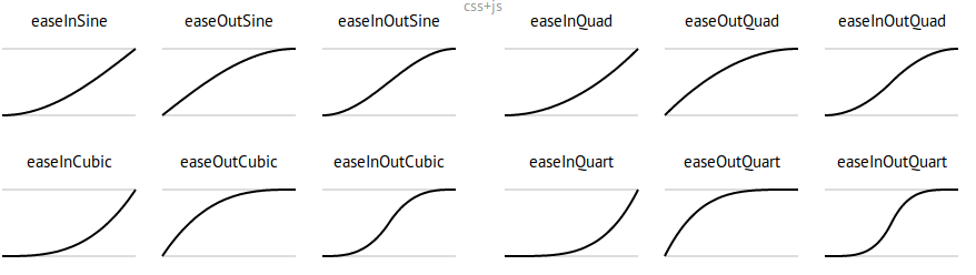
p + ease_aes({aesthetic} = {ease})
p + ease_aes(x = "cubic")

ease examples

Deeper dive

A not-so-simple example, the datasaurus dozen

Pass in the dataset to ggplot

ggplot(datasaurus_dozen)

A not-so-simple example, the datasaurus dozen

For each dataset we have x and y values, in addition we can map dataset to color

ggplot(datasaurus_dozen,
       aes(x, y, color = dataset)) 

A not-so-simple example, the datasaurus dozen

Trying a simple scatter plot first, but there is too much information

ggplot(datasaurus_dozen,
       aes(x, y, color = dataset)) +
  geom_point()

A not-so-simple example, the datasaurus dozen

We can use facets to split up by dataset, revealing the different distributions

ggplot(datasaurus_dozen,
       aes(x, y, color = dataset)) +
  geom_point() +
  facet_wrap(facets = vars(dataset)) +
  coord_fixed() +
  guides(color = "none")

A not-so-simple example, the datasaurus dozen

We can just as easily turn it into an animation, transitioning between dataset states!

ggplot(datasaurus_dozen,
       aes(x, y)) +
  geom_point() +
  transition_states(dataset, 3, 1) +
  labs(title = "Dataset: {closest_state}")

Tips

Animation options

Sometimes you need more frames, sometimes fewer

  • Save plot object, and use animate() with arguments like
    • nframes: number of frames to render (default 100)
    • fps: framerate of the animation in frames/sec (default 10)
    • duration: length of the animation in seconds (unset by default)
    • etc.
  • In Quarto, specify the arguments to animate() in the chunk options when using gganimate
```{r}
#| gganimate: !expr list(nframes = 50, fps = 20)
# add code here
```

Considerations in making effective animations

  • Pace: speed of animation

    Quick animations may be hard to follow. Slow animations are boring and tedious.

  • Perplexity: amount of information

    It is easy for animations to be overwhelming and confusing. Multiple simple animations can be easier to digest.

  • Purpose: Usefulness of using animation

    Is animation needed? Does it provide additional value?

Demonstrating Monte Carlo simulation

Monte Carlo simulation

Suppose that we want to compute the expected value of a function \(g\) of \(X\) where

\[\text{E}[g(X)] = \int_{-\infty}^{\infty} g(x) f_X(x) \,dx\]

but \(f(x)\) is complicated.

\[f(x) = \frac{\exp\left(- \frac{(x- \mu)^2}{2\sigma^2} \right) }{\sqrt{2\pi}}\]

Substituting into \(\text{E}[g(X)]\) we have the definite integral

\[\int_{-\infty}^{\infty} x \times \frac{\exp\left(- \frac{(x- \mu)^2}{2\sigma^2} \right) }{\sqrt{2\pi}} \,dx\]

Monte Carlo simulation

Suppose we can generate random draws of \(X\) \((x_1, \ldots, x_n)\) and we computed the arithmetic mean of \(g(x)\) over the sample, then we would have the Monte Carlo estimate

\[\tilde{g_n}(x) = \frac{1}{n} \sum_{i=1}^n g(x_i)\]

which is the Monte Carlo estimator of \(\text{E}[g(x)]\).

As \(n \rightarrow \infty\), \(\tilde{g_n}(x) \leadsto \text{E}[g(x)]\).

Monte Carlo simulation

set.seed(123)

map(.x = 1:10, .f = \(x)
    tibble(
      id = x,
      x = rnorm(1000)
    )
)
[[1]]
# A tibble: 1,000 × 2
      id       x
   <int>   <dbl>
 1     1 -0.560 
 2     1 -0.230 
 3     1  1.56  
 4     1  0.0705
 5     1  0.129 
 6     1  1.72  
 7     1  0.461 
 8     1 -1.27  
 9     1 -0.687 
10     1 -0.446 
# ℹ 990 more rows

[[2]]
# A tibble: 1,000 × 2
      id       x
   <int>   <dbl>
 1     2 -0.996 
 2     2 -1.04  
 3     2 -0.0180
 4     2 -0.132 
 5     2 -2.55  
 6     2  1.04  
 7     2  0.250 
 8     2  2.42  
 9     2  0.685 
10     2 -0.447 
# ℹ 990 more rows

[[3]]
# A tibble: 1,000 × 2
      id      x
   <int>  <dbl>
 1     3 -0.512
 2     3  0.237
 3     3 -0.542
 4     3  1.22 
 5     3  0.174
 6     3 -0.615
 7     3 -1.81 
 8     3 -0.644
 9     3  2.05 
10     3 -0.561
# ℹ 990 more rows

[[4]]
# A tibble: 1,000 × 2
      id       x
   <int>   <dbl>
 1     4 -0.150 
 2     4 -0.328 
 3     4 -1.45  
 4     4 -0.697 
 5     4  2.60  
 6     4 -0.0374
 7     4  0.913 
 8     4 -0.185 
 9     4  0.610 
10     4 -0.0527
# ℹ 990 more rows

[[5]]
# A tibble: 1,000 × 2
      id      x
   <int>  <dbl>
 1     5  0.197
 2     5  0.650
 3     5  0.671
 4     5 -1.28 
 5     5 -2.03 
 6     5  2.21 
 7     5  0.231
 8     5  0.376
 9     5 -1.19 
10     5  1.13 
# ℹ 990 more rows

[[6]]
# A tibble: 1,000 × 2
      id      x
   <int>  <dbl>
 1     6 -0.494
 2     6  1.13 
 3     6 -1.15 
 4     6  1.48 
 5     6  0.916
 6     6  0.335
 7     6  0.575
 8     6  0.204
 9     6 -0.447
10     6 -0.344
# ℹ 990 more rows

[[7]]
# A tibble: 1,000 × 2
      id       x
   <int>   <dbl>
 1     7 -0.699 
 2     7  0.996 
 3     7 -0.693 
 4     7 -0.103 
 5     7  0.604 
 6     7 -0.608 
 7     7  0.0849
 8     7  1.58  
 9     7 -0.464 
10     7 -1.16  
# ℹ 990 more rows

[[8]]
# A tibble: 1,000 × 2
      id      x
   <int>  <dbl>
 1     8 -1.62 
 2     8  0.379
 3     8  1.90 
 4     8  0.602
 5     8  1.73 
 6     8 -0.147
 7     8 -0.273
 8     8  1.15 
 9     8  0.505
10     8  0.801
# ℹ 990 more rows

[[9]]
# A tibble: 1,000 × 2
      id      x
   <int>  <dbl>
 1     9  0.511
 2     9  1.81 
 3     9 -1.70 
 4     9  0.287
 5     9 -0.269
 6     9 -0.380
 7     9 -0.694
 8     9 -0.194
 9     9  0.937
10     9 -0.822
# ℹ 990 more rows

[[10]]
# A tibble: 1,000 × 2
      id      x
   <int>  <dbl>
 1    10  1.93 
 2    10 -0.616
 3    10 -0.563
 4    10 -0.990
 5    10  2.73 
 6    10 -0.722
 7    10  1.33 
 8    10 -1.22 
 9    10  1.40 
10    10  0.332
# ℹ 990 more rows

Monte Carlo simulation

set.seed(123)

map(.x = 1:10, .f = \(x)
    tibble(
      id = x,
      x = rnorm(1000)
    )
) |>
  list_rbind()
# A tibble: 10,000 × 2
      id       x
   <int>   <dbl>
 1     1 -0.560 
 2     1 -0.230 
 3     1  1.56  
 4     1  0.0705
 5     1  0.129 
 6     1  1.72  
 7     1  0.461 
 8     1 -1.27  
 9     1 -0.687 
10     1 -0.446 
# ℹ 9,990 more rows

Monte Carlo simulation

set.seed(123)

map(.x = 1:10, .f = \(x)
    tibble(
      id = x,
      x = rnorm(1000)
    )
) |>
  list_rbind() |>
  group_by(id) |>
  mutate(x_bar = cummean(x),
         n_id = row_number())
# A tibble: 10,000 × 4
# Groups:   id [10]
      id       x   x_bar  n_id
   <int>   <dbl>   <dbl> <int>
 1     1 -0.560  -0.560      1
 2     1 -0.230  -0.395      2
 3     1  1.56    0.256      3
 4     1  0.0705  0.210      4
 5     1  0.129   0.194      5
 6     1  1.72    0.447      6
 7     1  0.461   0.449      7
 8     1 -1.27    0.235      8
 9     1 -0.687   0.132      9
10     1 -0.446   0.0746    10
# ℹ 9,990 more rows

Monte Carlo simulation

mc_sim
# A tibble: 10,000 × 4
# Groups:   id [10]
   id          x   x_bar  n_id
   <chr>   <dbl>   <dbl> <int>
 1 1     -0.560  -0.560      1
 2 1     -0.230  -0.395      2
 3 1      1.56    0.256      3
 4 1      0.0705  0.210      4
 5 1      0.129   0.194      5
 6 1      1.72    0.447      6
 7 1      0.461   0.449      7
 8 1     -1.27    0.235      8
 9 1     -0.687   0.132      9
10 1     -0.446   0.0746    10
# ℹ 9,990 more rows

Monte Carlo simulation

mc_sim |>
  ggplot(
    mapping = aes(x = n_id, y = x_bar,
                  color = factor(id))
  )

Monte Carlo simulation

mc_sim |>
  ggplot(
    mapping = aes(x = n_id, y = x_bar,
                  color = factor(id))
  ) +
  geom_line()

Monte Carlo simulation

mc_sim |>
  ggplot(
    mapping = aes(x = n_id, y = x_bar,
                  color = factor(id))
  ) +
  geom_line() +
  scale_color_discrete_qualitative(
    palette = "Set3",
    guide = "none"
  ) +
  labs(
    title = "Expected value of a standard normal distribution",
    x = "Number of draws",
    y = "Estimate",
    caption = "Each line is a separate simulation"
  )

Monte Carlo simulation

mc_sim |>
  ggplot(
    mapping = aes(x = n_id, y = x_bar,
                  color = factor(id))
  ) +
  geom_line() +
  scale_color_discrete_qualitative(
    palette = "Set3",
    guide = "none"
  ) +
  labs(
    title = "Expected value of a standard normal distribution",
    x = "Number of draws",
    y = "Estimate",
    caption = "Each line is a separate simulation"
  ) +
  transition_reveal(along = n_id)

Monte Carlo simulation

mc_sim |>
  ggplot(
    mapping = aes(x = n_id, y = x_bar,
                  color = factor(id))
  ) +
  geom_line() +
  scale_color_discrete_qualitative(
    palette = "Set3",
    guide = "none"
  ) +
  labs(
    title = "Expected value of a standard normal distribution",
    x = "Number of draws",
    y = "Estimate",
    caption = "Each line is a separate simulation"
  ) +
  transition_reveal(along = n_id) +
  view_follow(fixed_y = TRUE)

Application exercise

ae-13

  • Go to the course GitHub org and find your ae-13 (repo name will be suffixed with your GitHub name).
  • Clone the repo in RStudio Workbench, open the Quarto document in the repo, and follow along and complete the exercises.

Wrap-up

Wrap-up

  • Animation is our first step towards dynamic communications using data
  • Provides a controlled, dynamic user experience to engage with the data
  • Avoid animation for the sake of animation
  • Use gganimate to animate ggplot2 charts

Acknowledgements