Visualizing time series data

Lecture 15

Dr. Benjamin Soltoff

Cornell University
INFO 3312/5312 - Spring 2024

March 19, 2024

Announcements

Announcements

  • Nothing

Visualization critique

Blame Canada! Blame Canada!

  • What is the story?
  • How clear is the story? How does the design help or hinder?
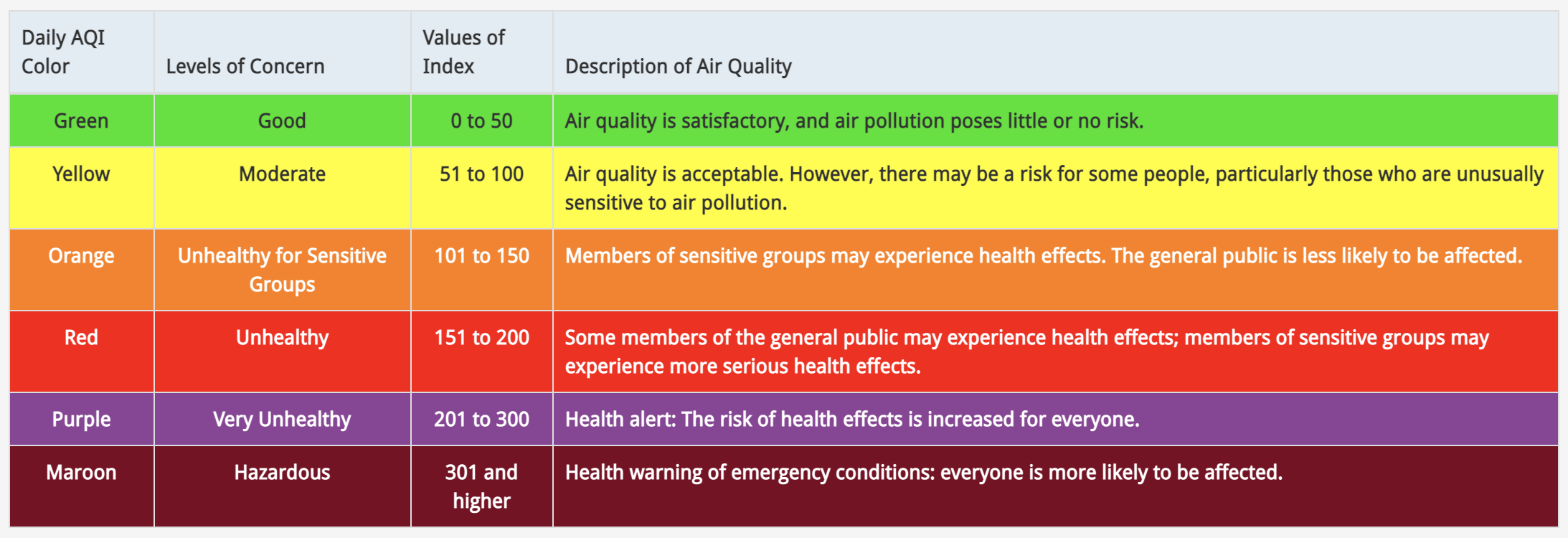
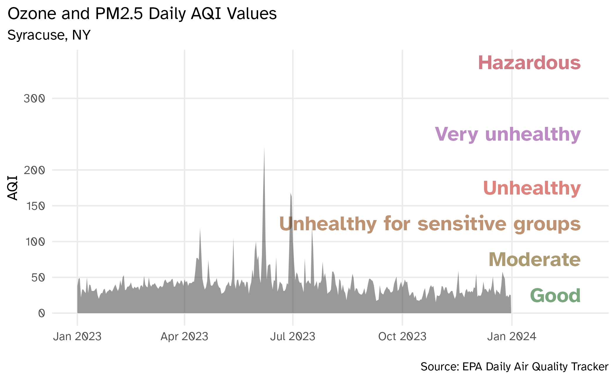
Working with dates

Air Quality Index

  • The AQI is the Environmental Protection Agency’s index for reporting air quality

  • Higher values of AQI indicate worse air quality
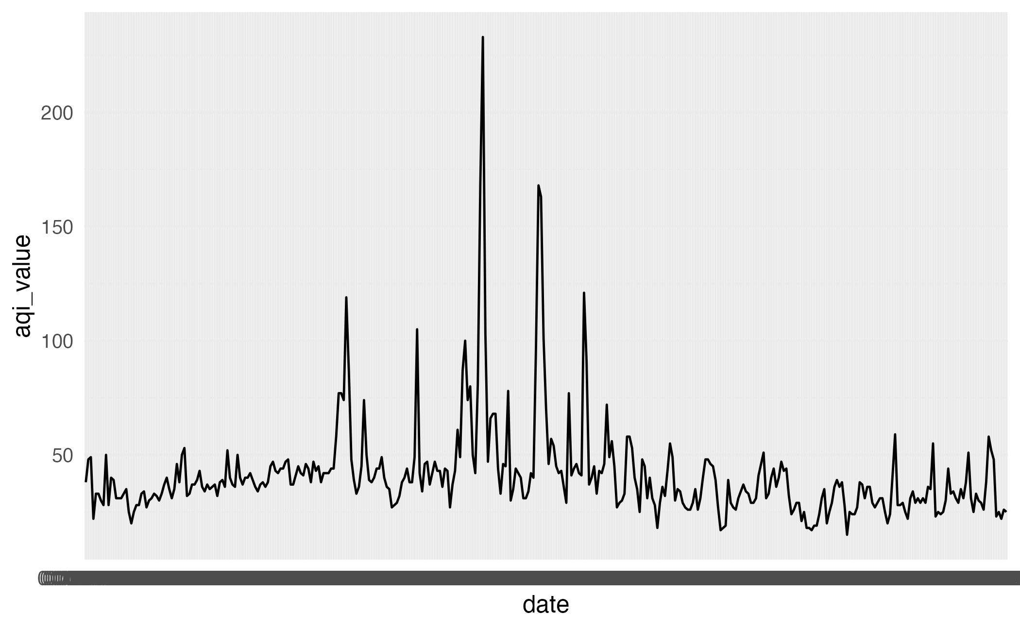
AQI Basics for Ozone and Particle Pollution

AQI levels

The previous graphic in tibble form, to be used later…

aqi_levels <- tribble(
  ~aqi_min, ~aqi_max, ~color,    ~level,
  0,        50,       "#D8EEDA", "Good",
  51,       100,      "#F1E7D4", "Moderate",
  101,      150,      "#F8E4D8", "Unhealthy for sensitive groups",
  151,      200,      "#FEE2E1", "Unhealthy",
  201,      300,      "#F4E3F7", "Very unhealthy",
  301,      400,      "#F9D0D4", "Hazardous"
)

AQI data

2023 Syracuse

  • Load data
syr_2023 <- read_csv(file = "data/aqi-syracuse/ad_aqi_tracker_data-2023.csv")
  • Metadata
dim(syr_2023)
[1] 365  11
names(syr_2023)
 [1] "Date"                       "AQI Value"                 
 [3] "Main Pollutant"             "Site Name"                 
 [5] "Site ID"                    "Source"                    
 [7] "20-year High (2000-2019)"   "20-year Low (2000-2019)"   
 [9] "5-year Average (2015-2019)" "Date of 20-year High"      
[11] "Date of 20-year Low"       

Clean variable names

syr_2023 <- syr_2023 |>
  janitor::clean_names()

names(syr_2023)
 [1] "date"                      "aqi_value"                
 [3] "main_pollutant"            "site_name"                
 [5] "site_id"                   "source"                   
 [7] "x20_year_high_2000_2019"   "x20_year_low_2000_2019"   
 [9] "x5_year_average_2015_2019" "date_of_20_year_high"     
[11] "date_of_20_year_low"      

First look

This plot looks quite bizarre. What might be going on?
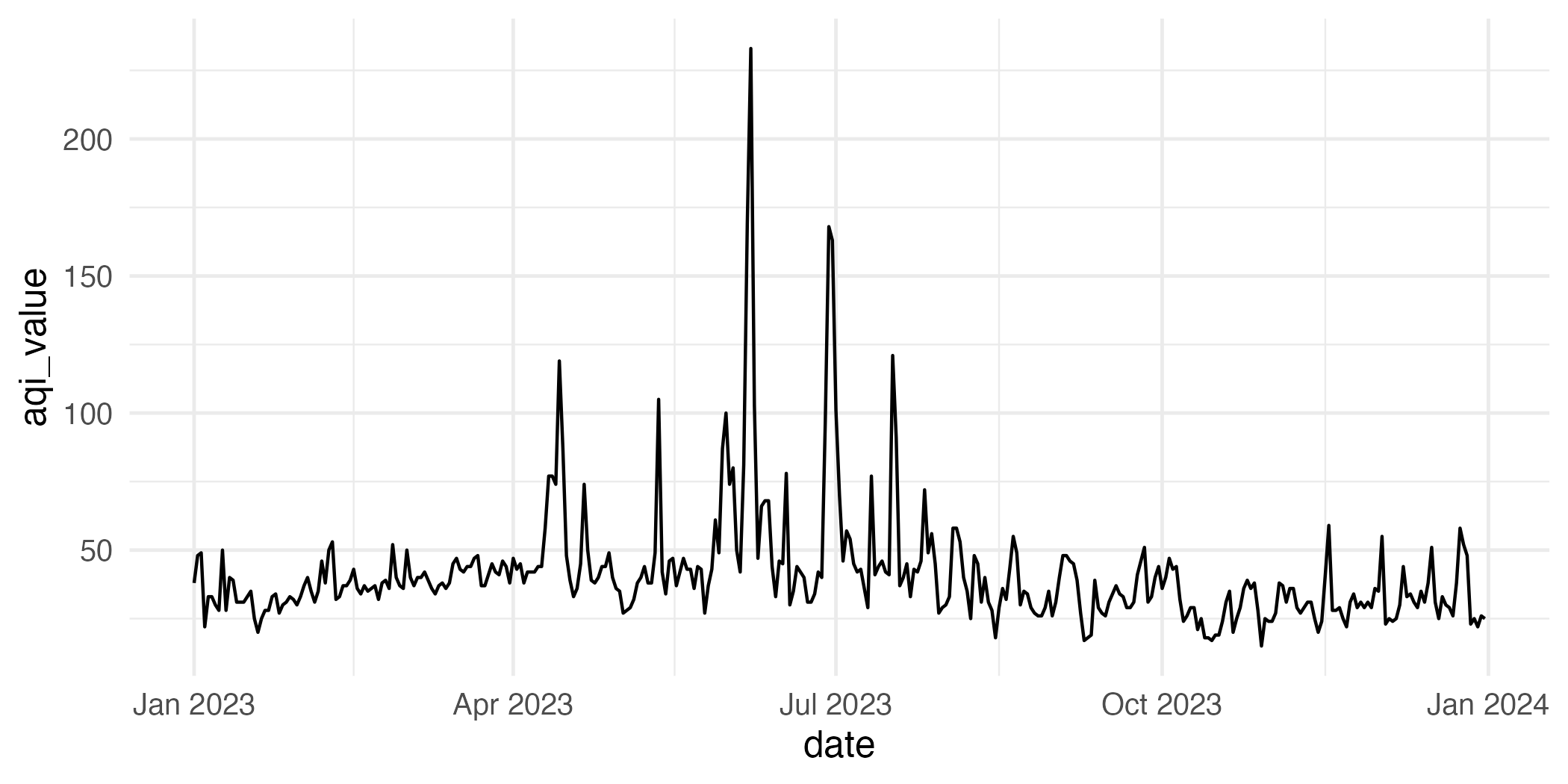
ggplot(syr_2023, aes(x = date, y = aqi_value, group = 1)) +
  geom_line()

Peek at data

syr_2023 |>
  select(date, aqi_value, site_name, site_id)
# A tibble: 365 × 4
   date       aqi_value site_name     site_id    
   <chr>          <dbl> <chr>         <chr>      
 1 01/01/2023        38 EAST SYRACUSE 36-067-1015
 2 01/02/2023        48 EAST SYRACUSE 36-067-1015
 3 01/03/2023        49 EAST SYRACUSE 36-067-1015
 4 01/04/2023        22 EAST SYRACUSE 36-067-1015
 5 01/05/2023        33 EAST SYRACUSE 36-067-1015
 6 01/06/2023        33 EAST SYRACUSE 36-067-1015
 7 01/07/2023        30 EAST SYRACUSE 36-067-1015
 8 01/08/2023        28 EAST SYRACUSE 36-067-1015
 9 01/09/2023        50 EAST SYRACUSE 36-067-1015
10 01/10/2023        28 FULTON        36-075-0003
# ℹ 355 more rows

Transforming date

Using lubridate::mdy():

syr_2023 |>
  mutate(date = mdy(date))
# A tibble: 365 × 11
   date       aqi_value main_pollutant site_name     site_id     source
   <date>         <dbl> <chr>          <chr>         <chr>       <chr> 
 1 2023-01-01        38 PM2.5          EAST SYRACUSE 36-067-1015 AQS   
 2 2023-01-02        48 PM2.5          EAST SYRACUSE 36-067-1015 AQS   
 3 2023-01-03        49 PM2.5          EAST SYRACUSE 36-067-1015 AQS   
 4 2023-01-04        22 PM2.5          EAST SYRACUSE 36-067-1015 AQS   
 5 2023-01-05        33 PM2.5          EAST SYRACUSE 36-067-1015 AQS   
 6 2023-01-06        33 PM2.5          EAST SYRACUSE 36-067-1015 AQS   
 7 2023-01-07        30 PM2.5          EAST SYRACUSE 36-067-1015 AQS   
 8 2023-01-08        28 PM2.5          EAST SYRACUSE 36-067-1015 AQS   
 9 2023-01-09        50 PM2.5          EAST SYRACUSE 36-067-1015 AQS   
10 2023-01-10        28 Ozone          FULTON        36-075-0003 AQS   
# ℹ 355 more rows
# ℹ 5 more variables: x20_year_high_2000_2019 <dbl>,
#   x20_year_low_2000_2019 <dbl>, x5_year_average_2015_2019 <dbl>,
#   date_of_20_year_high <chr>, date_of_20_year_low <chr>

Data cleaning

syr_2023 <- read_csv(file = "data/aqi-syracuse/ad_aqi_tracker_data-2023.csv") |>
  janitor::clean_names() |>
  mutate(date = mdy(date))

syr_2023
# A tibble: 365 × 11
   date       aqi_value main_pollutant site_name     site_id     source
   <date>         <dbl> <chr>          <chr>         <chr>       <chr> 
 1 2023-01-01        38 PM2.5          EAST SYRACUSE 36-067-1015 AQS   
 2 2023-01-02        48 PM2.5          EAST SYRACUSE 36-067-1015 AQS   
 3 2023-01-03        49 PM2.5          EAST SYRACUSE 36-067-1015 AQS   
 4 2023-01-04        22 PM2.5          EAST SYRACUSE 36-067-1015 AQS   
 5 2023-01-05        33 PM2.5          EAST SYRACUSE 36-067-1015 AQS   
 6 2023-01-06        33 PM2.5          EAST SYRACUSE 36-067-1015 AQS   
 7 2023-01-07        30 PM2.5          EAST SYRACUSE 36-067-1015 AQS   
 8 2023-01-08        28 PM2.5          EAST SYRACUSE 36-067-1015 AQS   
 9 2023-01-09        50 PM2.5          EAST SYRACUSE 36-067-1015 AQS   
10 2023-01-10        28 Ozone          FULTON        36-075-0003 AQS   
# ℹ 355 more rows
# ℹ 5 more variables: x20_year_high_2000_2019 <dbl>,
#   x20_year_low_2000_2019 <dbl>, x5_year_average_2015_2019 <dbl>,
#   date_of_20_year_high <chr>, date_of_20_year_low <chr>

Another look

How would you improve this visualization?

ggplot(syr_2023, aes(x = date, y = aqi_value, group = 1)) +
  geom_line()

Application exercise

Visualizing Syracuse AQI

ae-12

  • Go to the course GitHub org and find your ae-12 (repo name will be suffixed with your NetID).
  • Clone the repo in RStudio Workbench, open the Quarto document in the repo, and follow along and complete the exercises.
  • Render, commit, and push your edits by the AE deadline – end of tomorrow.

Livecoding

Reveal below for code developed during live coding session.

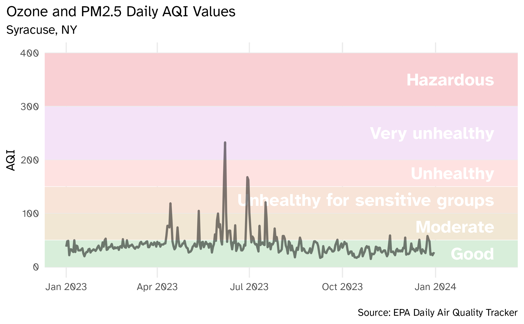
Visualizing Syracuse AQI (take 2)

aqi_levels <- aqi_levels |>
  mutate(aqi_mid = ((aqi_min + aqi_max) / 2))

# draw the graph
syr_2023 |>
  # remove rows with missing AQIs
  drop_na(aqi_value) |>
  ggplot(aes(x = date, y = aqi_value, group = 1)) +
  # add breaks and labels for AQI levels
  scale_y_continuous(breaks = c(0, 50, 100, 150, 200, 300, 400)) +
  geom_text(
    data = aqi_levels,
    aes(
      x = ymd("2024-02-28"), y = aqi_mid, 
      label = level, color = darken(color, 0.3)
    ),
    hjust = 1, size = 6,
    family = "Atkinson Hyperlegible", fontface = "bold"
  ) +
  # use the hexidecimal colors from the dataset for the palette
  scale_color_identity() +
  # format the x-axis for dates
  scale_x_date(
    name = NULL, date_labels = "%b %Y",
    limits = c(ymd("2023-01-01"), ymd("2024-03-01"))
  ) +
  # plot the AQI in Syracuse
  geom_area(linewidth = 1, alpha = 0.5) +
  # human-readable labels
  labs(
    x = NULL, y = "AQI",
    title = "Ozone and PM2.5 Daily AQI Values",
    subtitle = "Syracuse, NY",
    caption = "\nSource: EPA Daily Air Quality Tracker"
  ) +
  # don't like the default theme
  theme_minimal(base_size = 12, base_family = "Atkinson Hyperlegible") +
  theme(
    plot.title.position = "plot",
    panel.grid.minor.y = element_blank(),
    panel.grid.minor.x = element_blank()
  )

Wrap-up

Wrap-up

  • Ensure dates/times are structured correctly using lubridate
  • Clearly depict the temporal flow of time in the chart
  • More advanced methods - learn time series regression (STSCI 4550/5550)