Annotating charts
Lecture 10
February 24, 2026
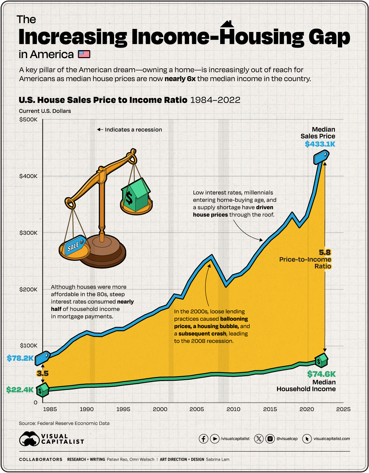
Axis breaks
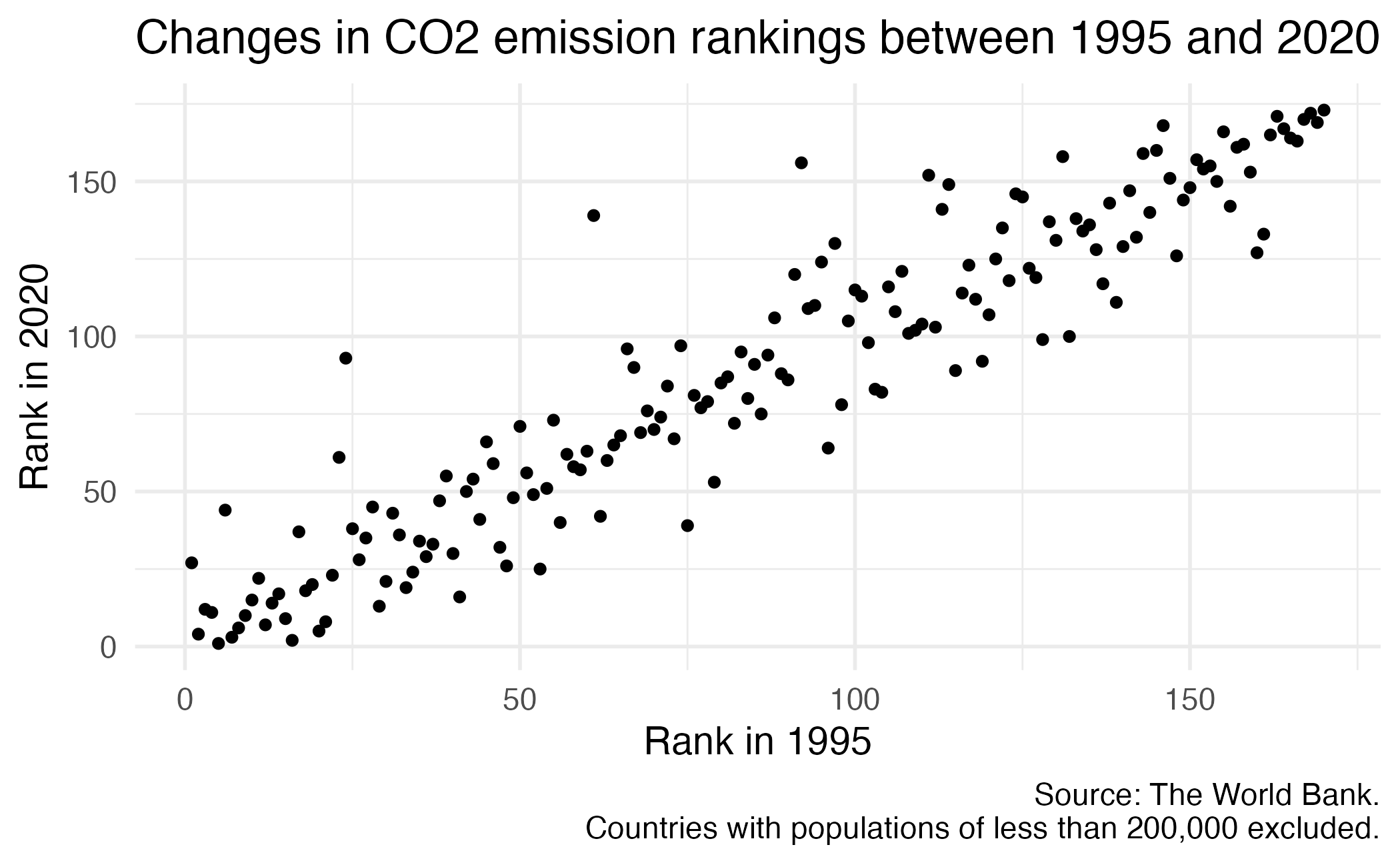
How can the following figure be improved with custom breaks in axes, if at all?

Context matters

Conciseness matters

Precision matters

Little details matter


Obsession with tiny details


Graph details: Redundant coding

Graph details: Consistent ordering

04:00
04:00
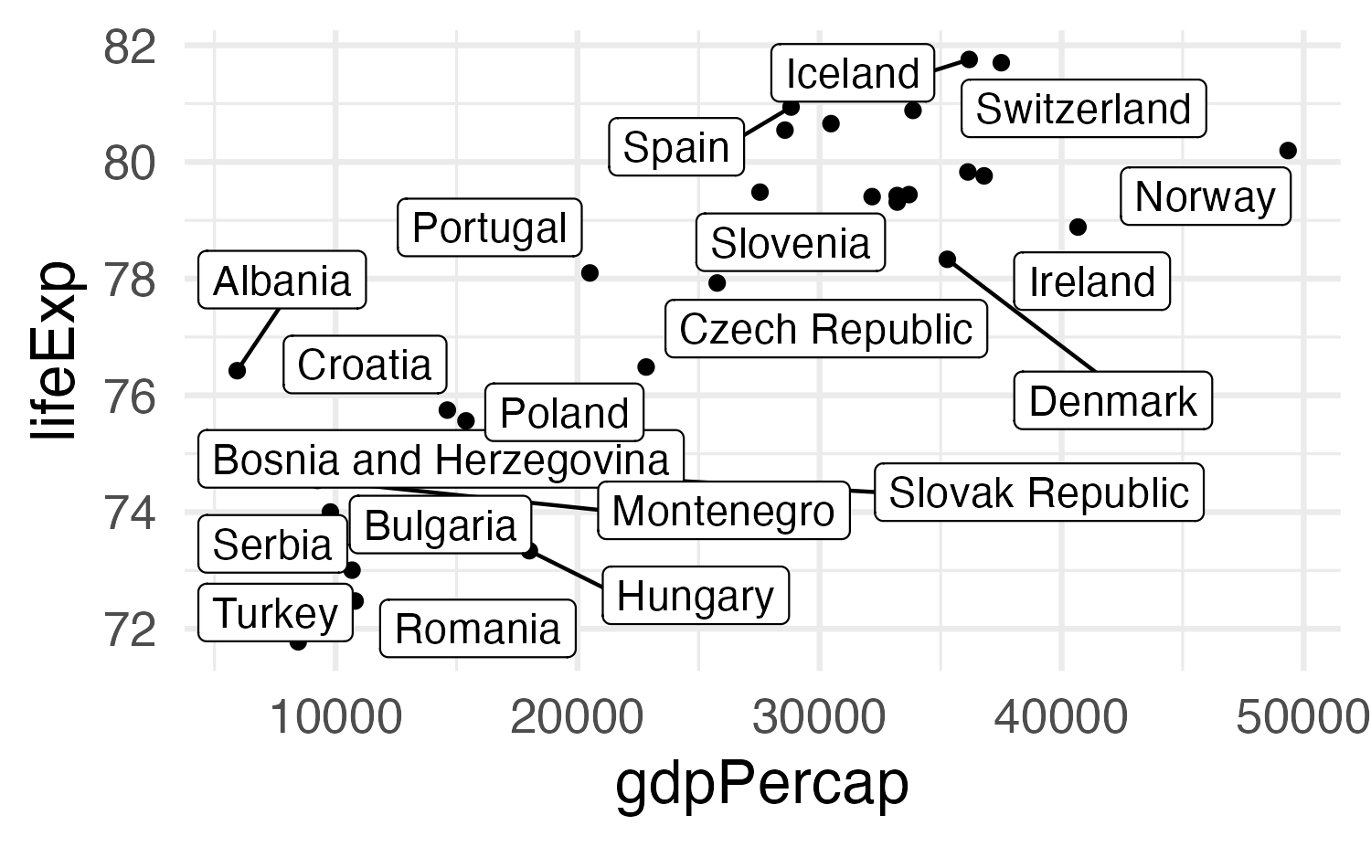
Label actual data points
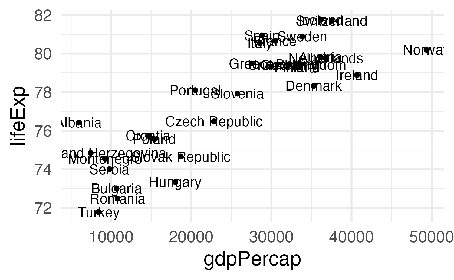
Label actual data points
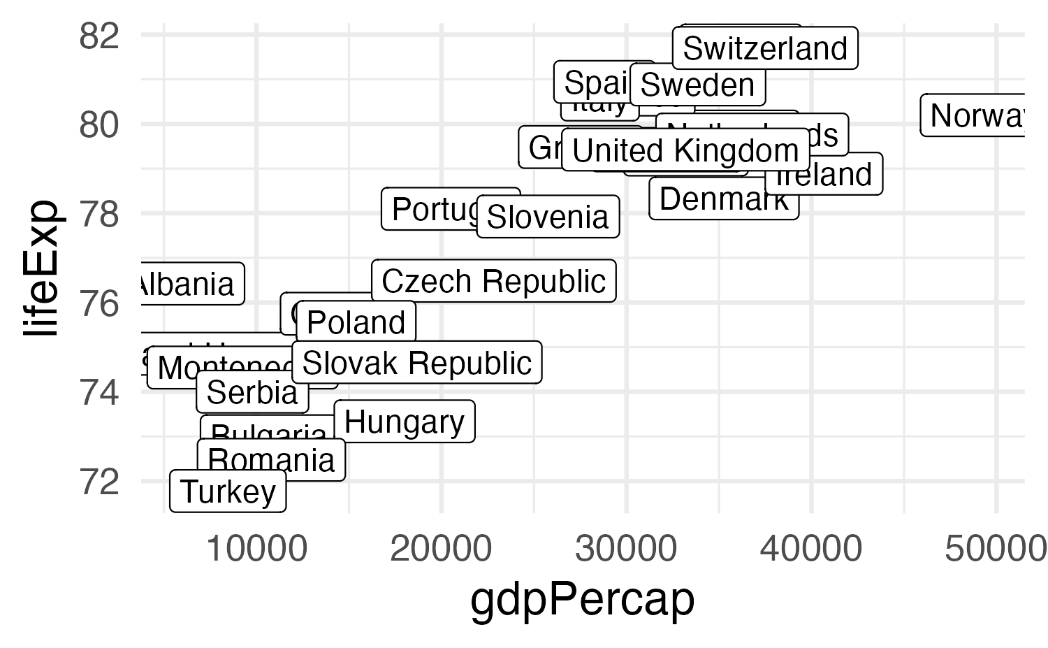
Solution 1: Repel labels
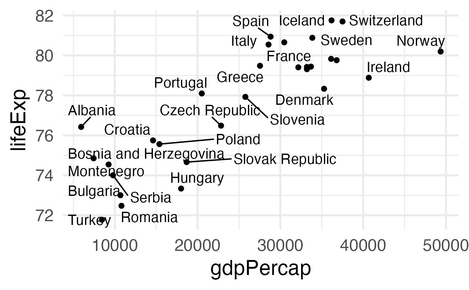
Solution 1: Repel labels
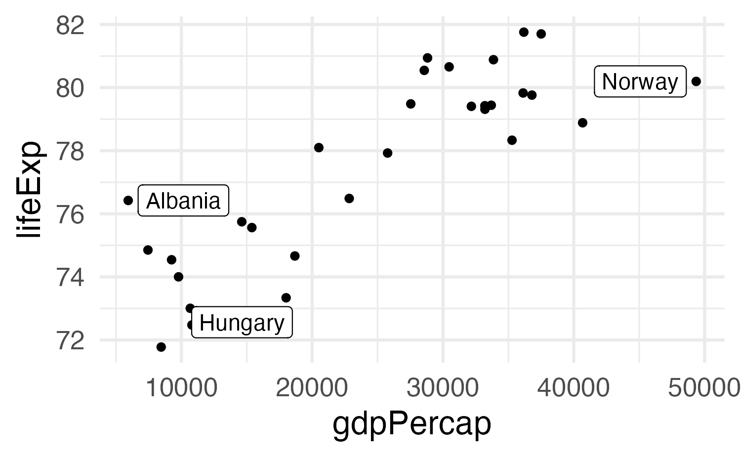
Solution 2a: Don’t use so many labels
Solution 2b: Use other aesthetics too
ggplot(
  gapminder_europe,
  aes(x = gdpPercap, y = lifeExp)
) +
  geom_point(aes(color = should_be_labeled)) +
  geom_label_repel(
    data = filter(
      gapminder_europe,
      should_be_labeled == TRUE
    ),
    aes(
      label = country,
      fill = should_be_labeled
    ),
    color = "white"
  ) +
  scale_color_manual(values = c(
    "grey50",
    "red"
  )) +
  scale_fill_manual(values = c("red")) +
  guides(color = "none", fill = "none")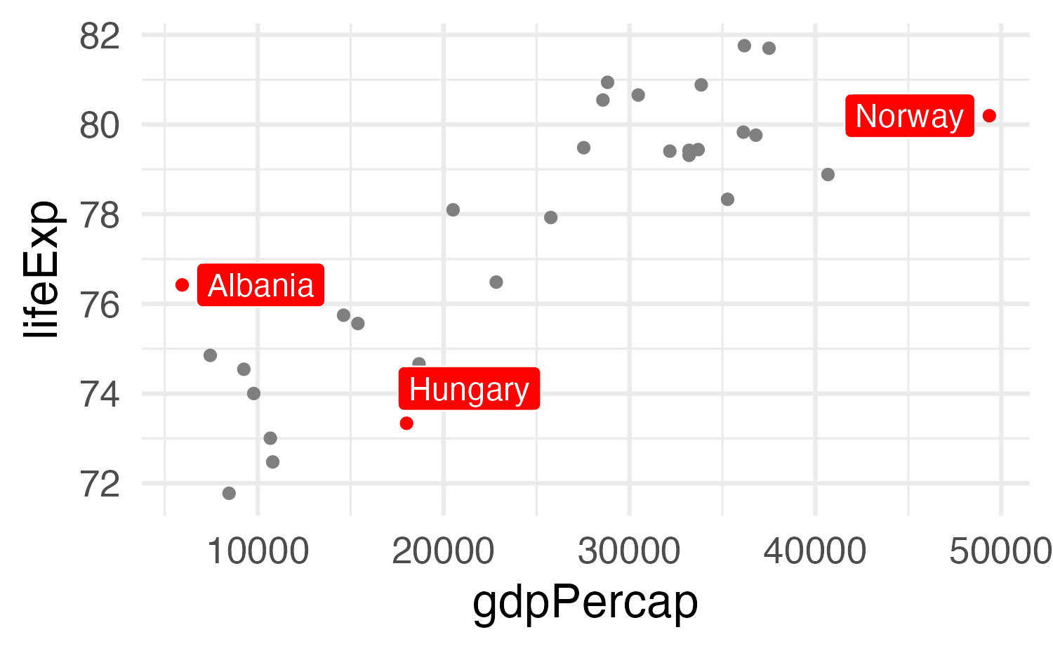
(Highlight non-text things too!)
# Color just Oceania
gapminder_highlighted <- gapminder |>
  mutate(
    is_oceania = continent == "Oceania"
  )

ggplot(
  gapminder_highlighted,
  aes(
    x = year, y = lifeExp,
    group = country,
    color = is_oceania,
    size = is_oceania
  )
) +
  geom_line() +
  scale_color_manual(values = c(
    "grey70",
    "red"
  )) +
  scale_size_manual(values = c(0.1, 0.5)) +
  guides(color = "none", size = "none") +
  theme_minimal()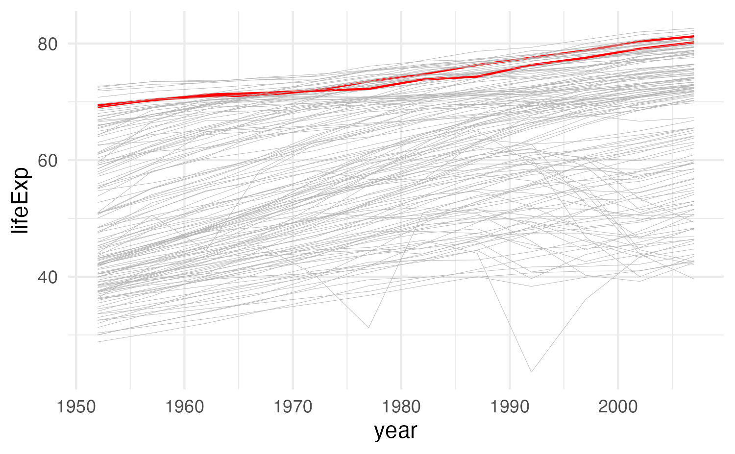
Adding arbitrary annotations
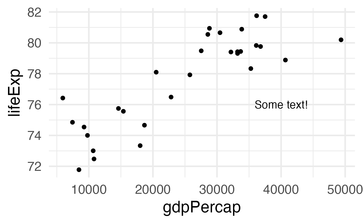
Adding arbitrary annotations
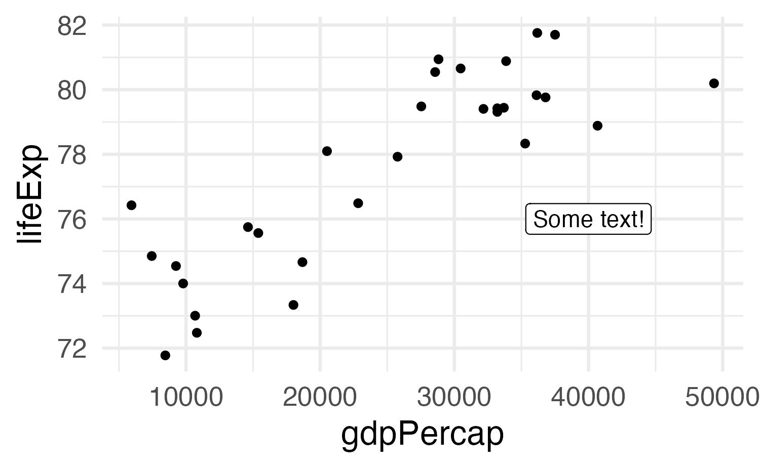
Any geom works
Any geom works
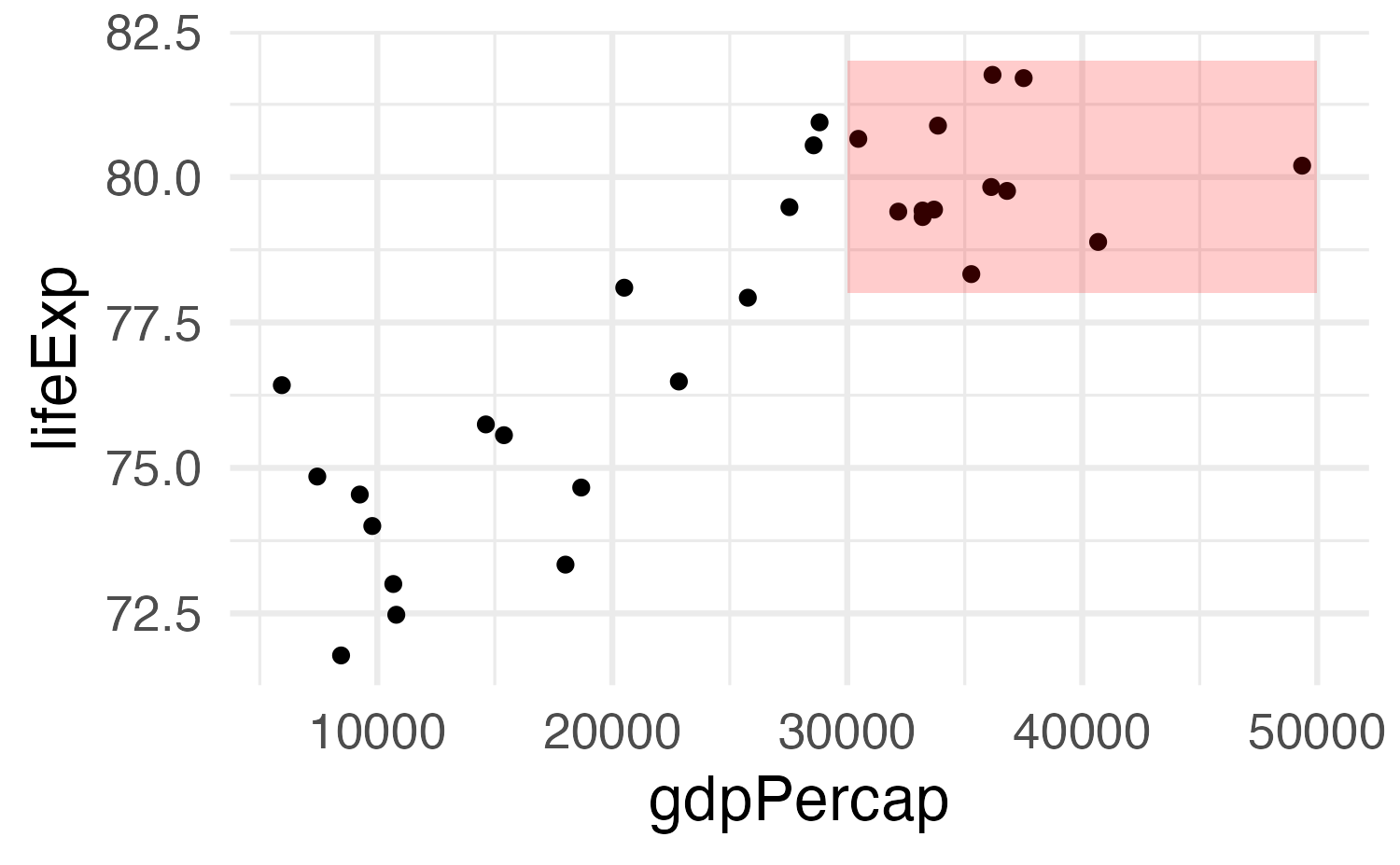
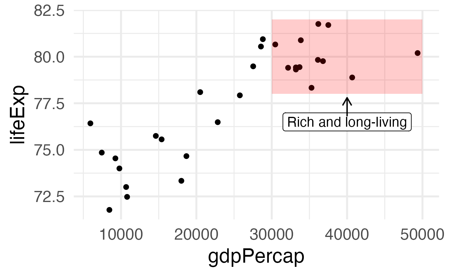
Use multiple annotations
ggplot(
  gapminder_europe,
  aes(x = gdpPercap, y = lifeExp)
) +
  geom_point() +
  annotate(
    geom = "rect",
    xmin = 30000, xmax = 50000,
    ymin = 78, ymax = 82,
    fill = "red", alpha = 0.2
) +
annotate(
geom = "label",
x = 40000, y = 76.5,
label = "Rich and long-living"
) +
annotate(
geom = "segment",
x = 40000, xend = 40000,
y = 76.8, yend = 77.8,
arrow = arrow(
length = unit(0.1, "in")
)
)
Basic plot