Deep dive: themes
Lecture 09
February 19, 2026
Complete themes
Complete themes
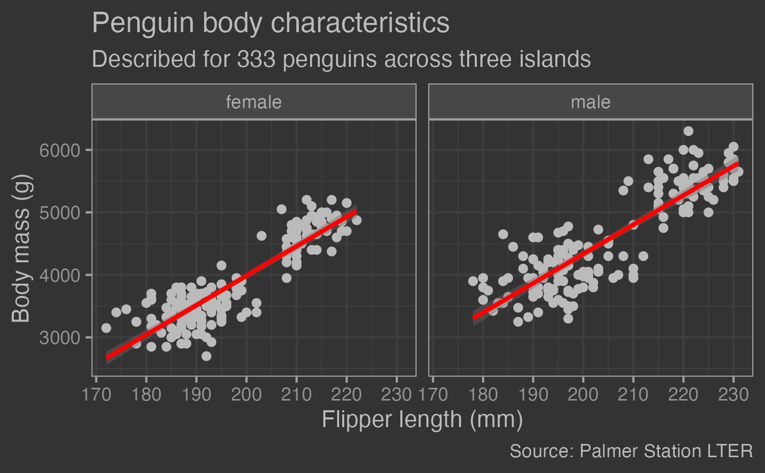
Extension theme
Or this
Tweaking complete themes
Tweaking complete themes

Ink/paper/accent
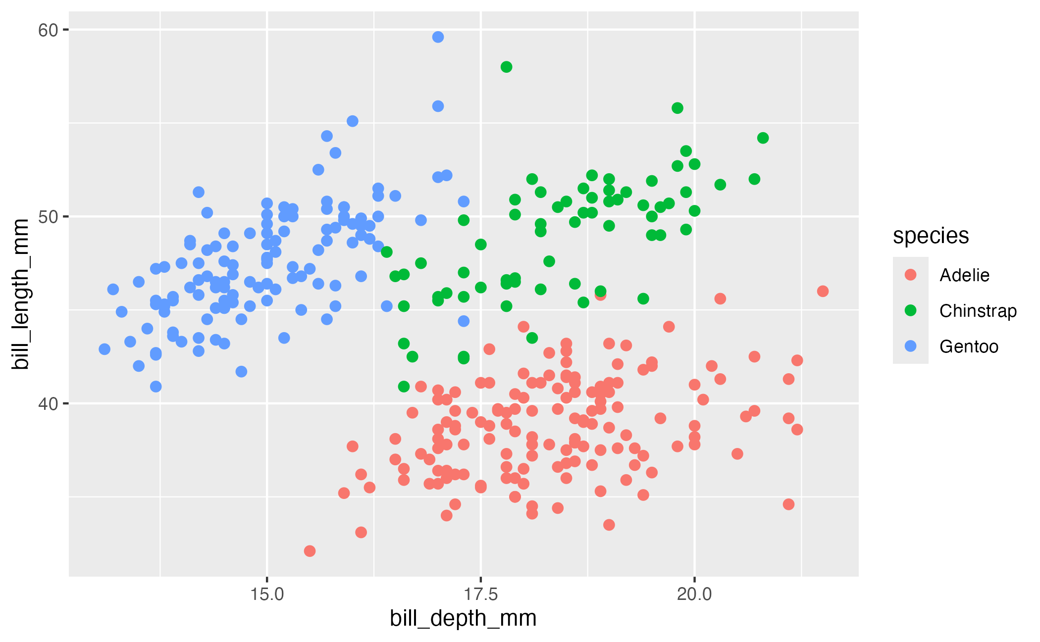
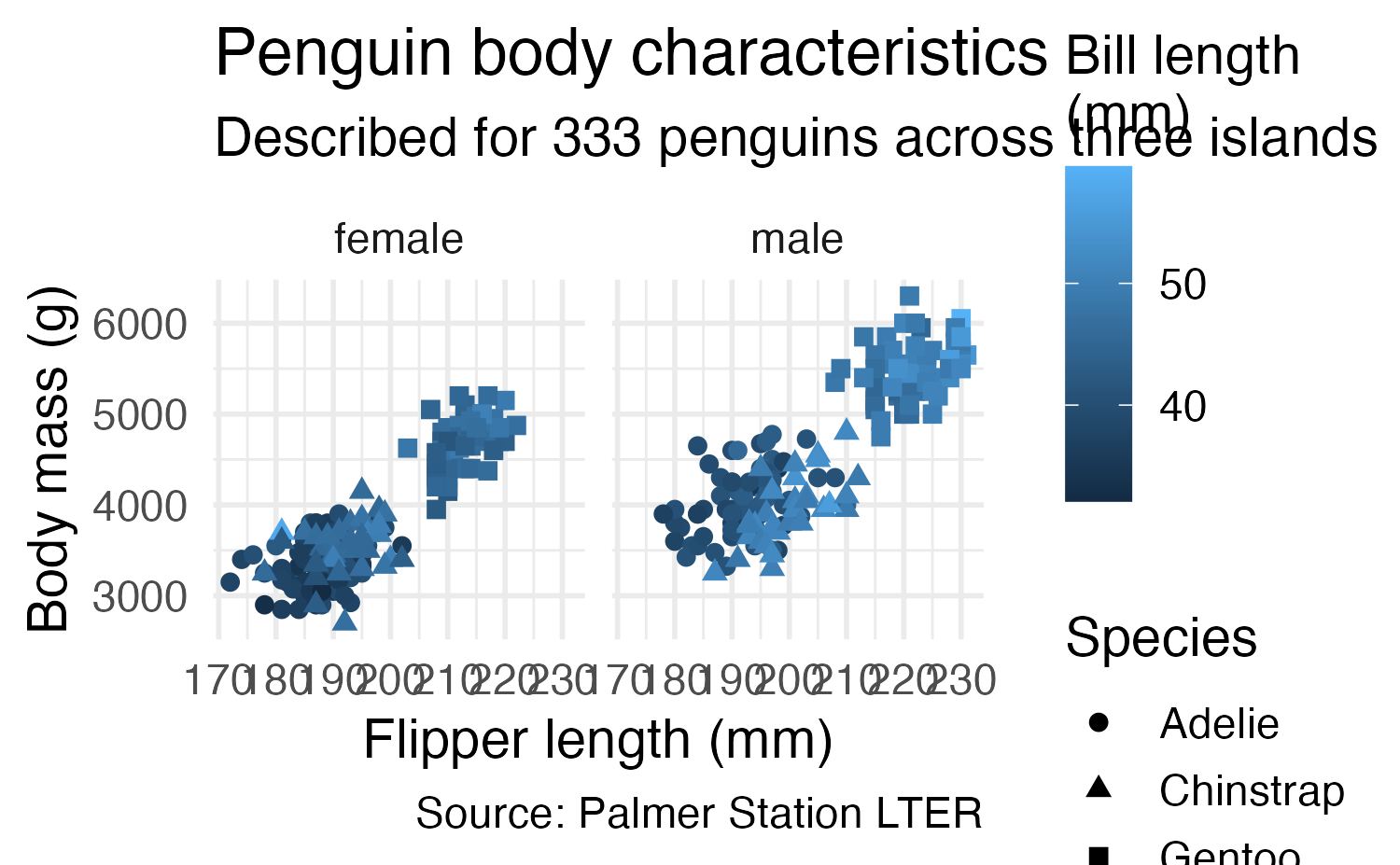
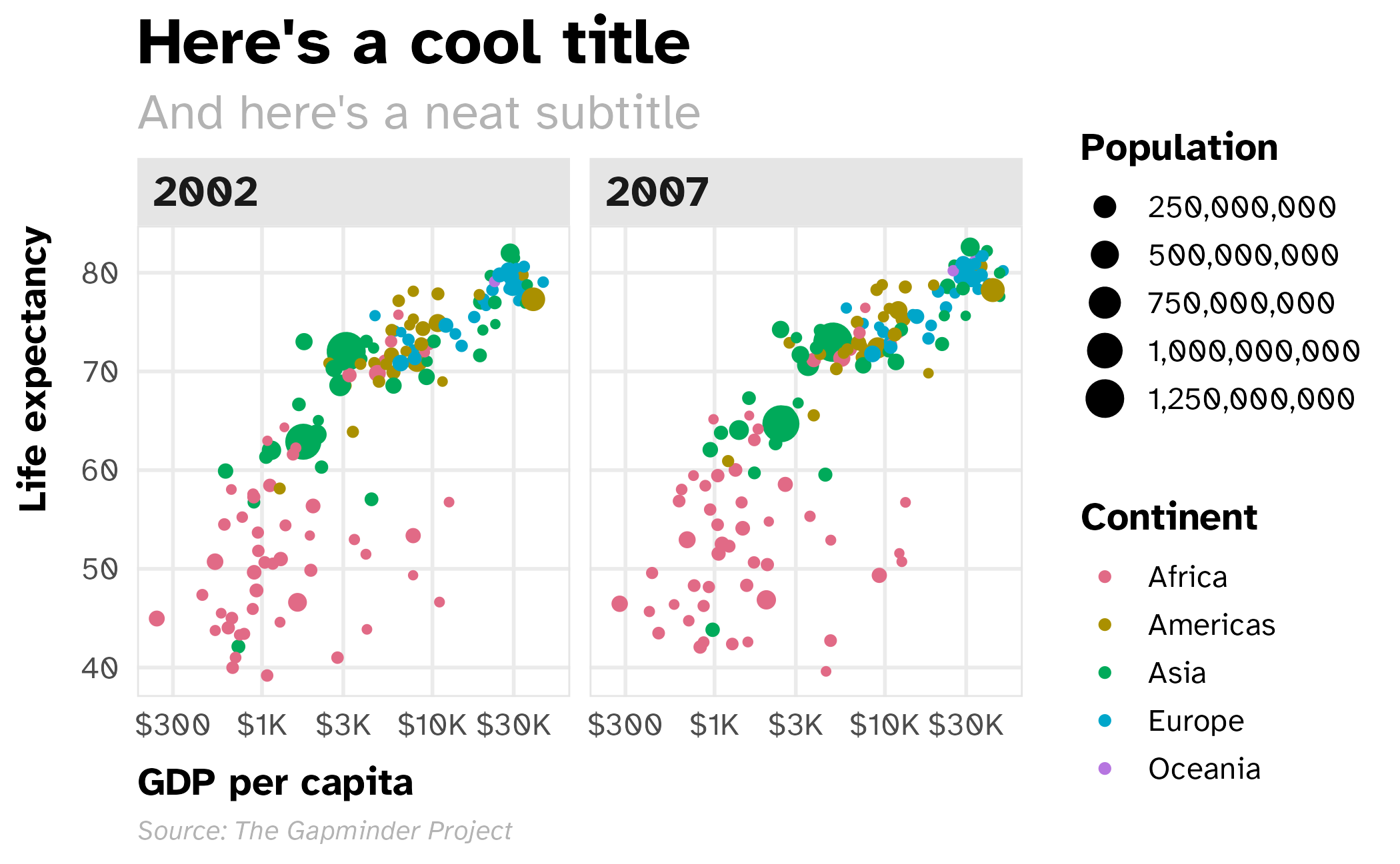
Basic plot
gapminder_filtered <- gapminder |>
  filter(year > 2000)

base_plot <- ggplot(
  data = gapminder_filtered,
  mapping = aes(
    x = gdpPercap,
    y = lifeExp,
    color = continent,
    size = pop
  )
) +
  geom_point() +
  # Use dollars, and get rid of the cents part (i.e. $300 instead of $300.00)
  scale_x_log10(labels = label_currency(scale_cut = cut_short_scale())) +
  # Format with commas
  scale_size_continuous(labels = label_comma()) +
  # Use dark 3
  scale_color_discrete_qualitative(palette = "Dark 3") +
  labs(
    x = "GDP per capita",
    y = "Life expectancy",
    color = "Continent",
    size = "Population",
    title = "Here's a cool title",
    subtitle = "And here's a neat subtitle",
    caption = "Source: The Gapminder Project"
  ) +
  facet_wrap(facets = vars(year)) +
  theme_grey()

base_plot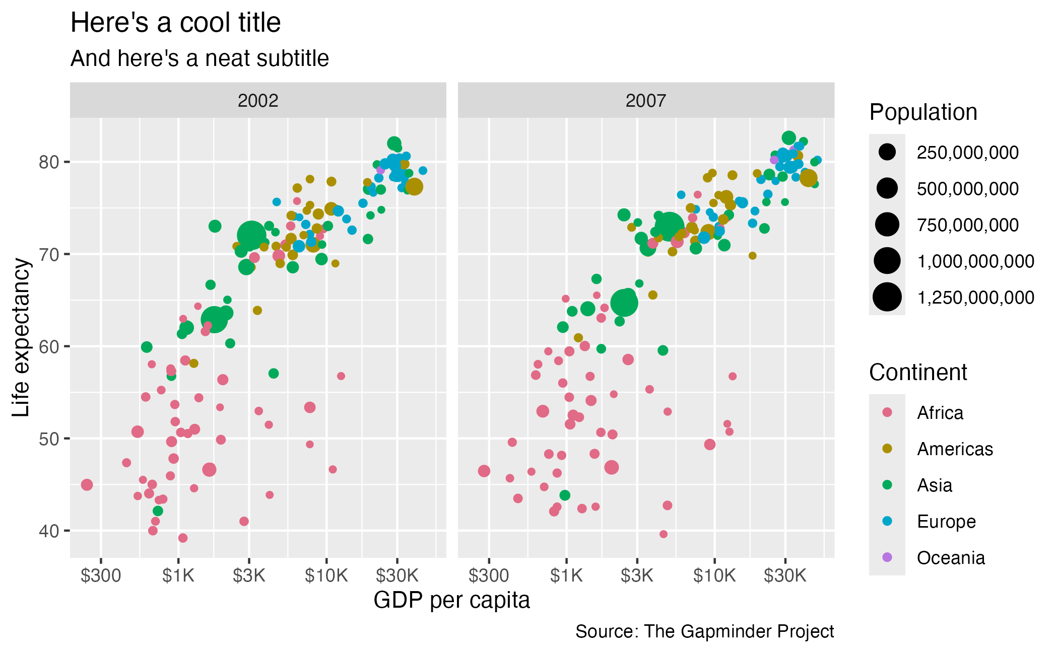
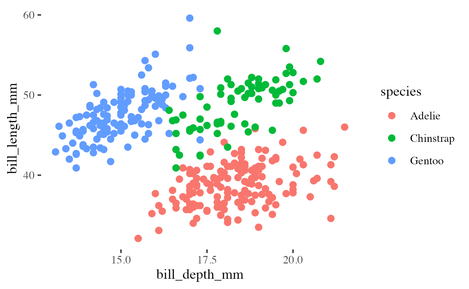
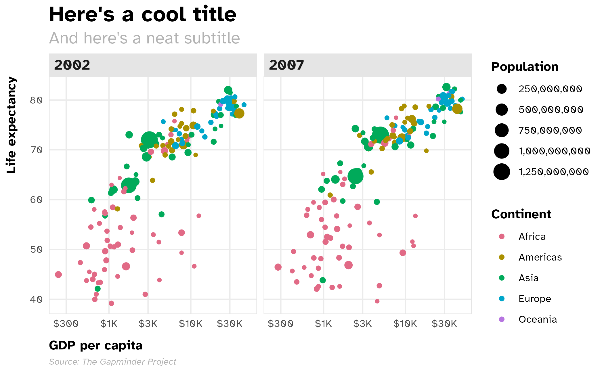
Change the theme
Applied to existing plot
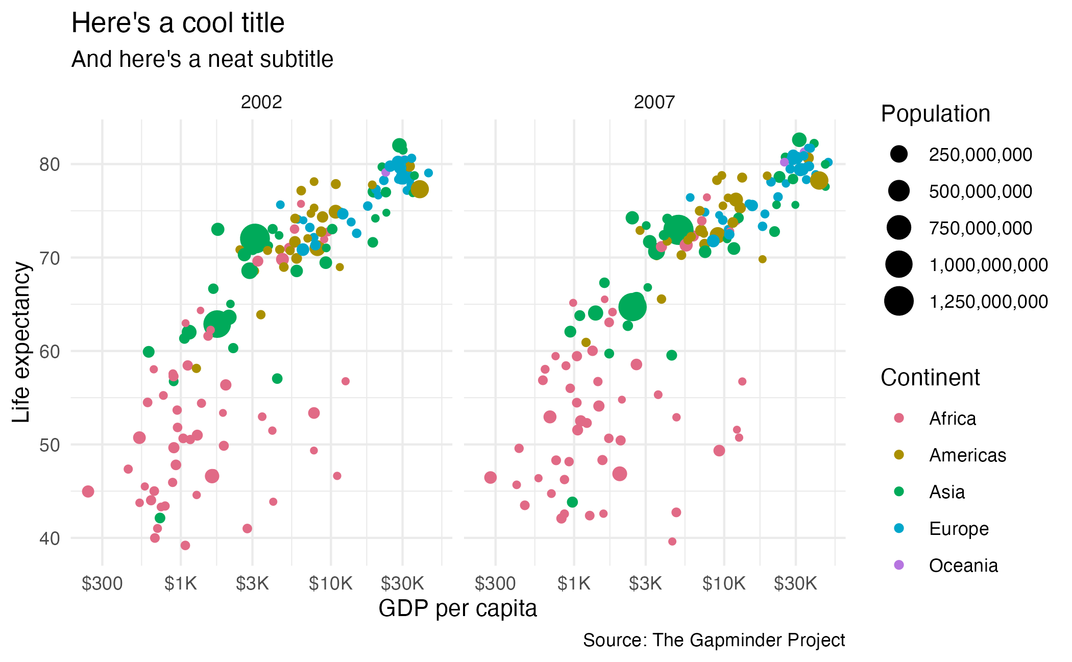
Render in a document
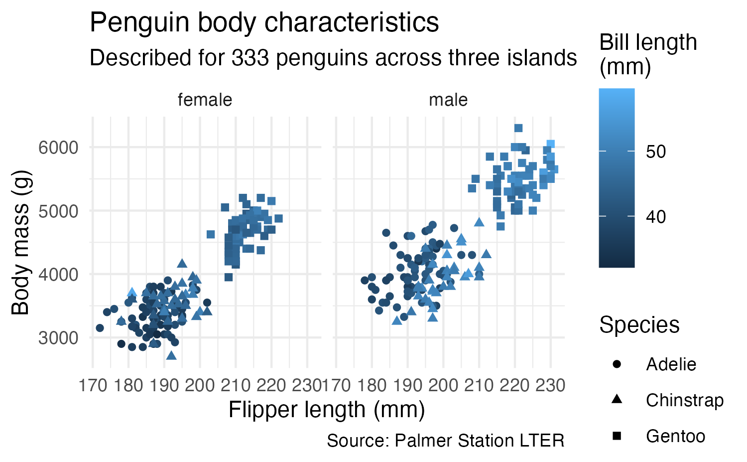
Applied to another plot
ggplot(
  data = drop_na(penguins, sex),
  mapping = aes(x = bill_len, y = body_mass, color = str_to_title(sex))
) +
  geom_point(size = 3, alpha = 0.5) +
  scale_color_discrete_qualitative(palette = "Dark 3") +
  scale_y_continuous(labels = label_comma()) +
  facet_wrap(facets = vars(species)) +
  labs(
    x = "Bill length (mm)", y = "Body mass (g)", color = "Sex",
    title = "Gentoo penguins are the largest",
    subtitle = "But females are typically smaller than males",
    caption = "Here's a caption"
  ) +
  theme_pretty()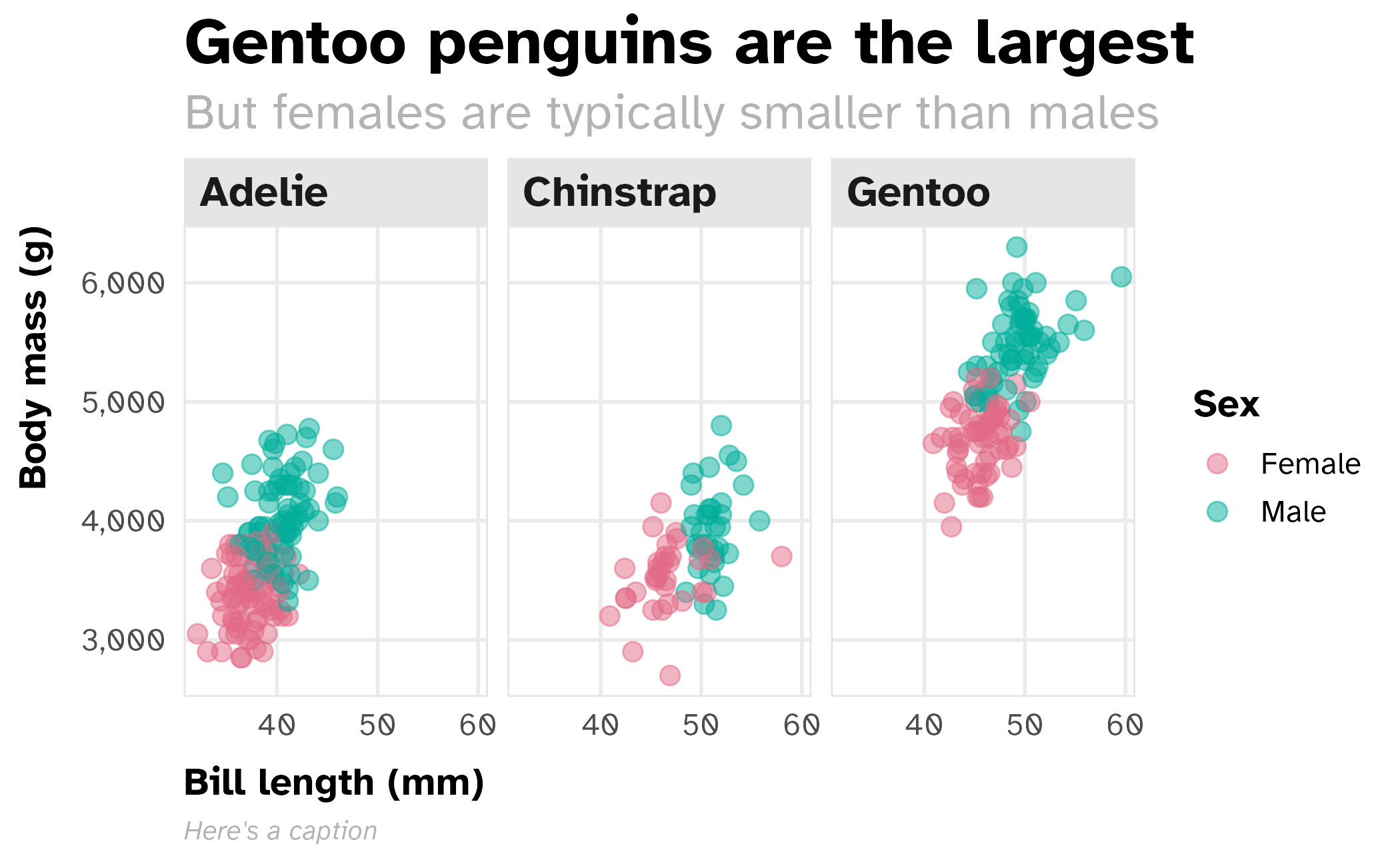
Application exercise